Thursday, November 08, 2018
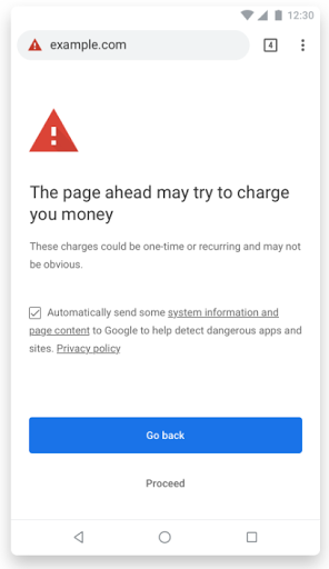
Every month, millions of Chrome users encounter pages with insufficient mobile subscription information. Surprising charges that come from unclear communication are a poor user experience. That's why starting from Chrome 71 (December 2018), Chrome will show a warning before these pages, so that users can make informed decisions when signing up to mobile based subscription services. Users will be offered the choice to proceed to the page or go back if they were unaware that they were entering a billing page.
Unclear mobile subscriptions
Picture this: Andrea is browsing the web on a mobile connection to access a gaming page and they're presented with a page that asks them for their mobile phone details.
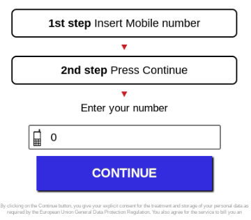
They fill in the blanks with their mobile number and press Continue, and get access to the content.
The next month, the phone bill arrives and they see a charge they were not expecting. Was the subscription to the online gaming service really that expensive? Did they really agree to pay that specific price for the service? How much did they agree to be charged to access the content?
Clearer billing information for Chrome users
We want to make sure Chrome users understand when they are going through a billing flow and trust that they'll be able to make informed decisions while browsing the web.
To adequately inform users, it's important to provide a sufficient level of details within the billing page as outlined by our new mobile billing charges best practices. Pages that answer positively to the following questions generally provide sufficient information for users:
- Is the billing information visible and obvious to users? For example, adding no subscription information on the subscription page or hiding the information is a bad start because users should have access to the information when agreeing to subscribe.
- Can customers easily see the costs they're going to incur before accepting the terms? For example, displaying the billing information in grey characters over a grey background, therefore making it less readable, is not considered a good user practice.
- Is the fee structure easily understandable? For example, the formula presented to explain how the cost of the service will be determined should be as simple and straightforward as possible.
If Chrome detects pages that don't provide sufficient billing information to users, the following warning will be displayed to the user on Chrome mobile, Chrome desktop and Android's WebView:
When we identify such pages, we will notify the webmaster through Search Console where there will be an option to let us know about the changes they've made to clarify the billing process. For websites that aren't verified on Search Console, we will do our best to get in touch with the webmasters affected and will be available to answer questions in our public support forum available in 15 languages. Once an appeal has been sent via Search Console, we will review the changes and remove the warning accordingly.
If your billing service takes users through a clearly visible and understandable billing process as described in our best practices, you don't need to make any changes. Also, the new warning in Chrome doesn't impact your website's ranking in Google Search.
If you have any questions, please come and have a chat with us in the Webmaster Help Forum.