Как перейти на адаптивный дизайн, если вы используете мобильную версию сайта
Оптимизируйте свои подборки
Сохраняйте и классифицируйте контент в соответствии со своими настройками.
Четверг, 14 сентября 2017 г.
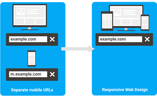
Поскольку адаптивный дизайн неизменно набирает популярность, у веб-мастеров все чаще возникают вопросы о том, как перейти на него и отказаться от мобильной версии сайта.
Ниже приведены рекомендации, которые помогут вам выполнить этот переход так, чтобы ваш сайт не утратил свои позиции в результатах поиска Google.
Как обеспечить корректное индексирование веб-страниц после перехода на адаптивный дизайн
К переходу следует подготовиться. Если вы планируете использовать те же URL, что и на версии сайта для ПК, вам потребуется лишь настроить переадресацию 301 с мобильных URL на URL страниц с адаптивным дизайном.
Ниже приведены подробные инструкции.
Подготовьте сайт с адаптивным дизайном.
Настройте переадресацию 301 таким образом, чтобы прежние мобильные URL указывали на обновленные страницы с адаптивным дизайном. Эту процедуру необходимо выполнить для каждого мобильного URL по отдельности.
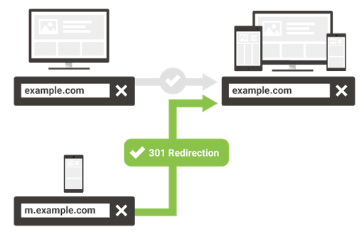
Убедитесь, что для URL сайта не заданы какие-либо настройки, связанные с адаптацией для мобильных устройств, например HTTP-заголовок Vary или переадресация, которая зависит от определенных условий.
Если вы используете динамический показ и хотите перейти на адаптивный дизайн, то добавлять или изменять переадресацию не нужно.
О преимуществах перехода на адаптивный дизайн
После перехода вы будете тратить меньше времени и усилий на техническое обслуживание сайта и создание отчетов. Вам больше не придется работать с несколькими версиями одной и той же страницы. Также вам станет гораздо проще использовать передовые методики и технологии, например атрибут hreflang для многоязычных сайтов, технологию AMP для ускорения загрузки страниц, а также структурированные данные, которые обеспечивают доступ к специальным функциям в расширенных результатах поиска.
[[["Прост для понимания","easyToUnderstand","thumb-up"],["Помог мне решить мою проблему","solvedMyProblem","thumb-up"],["Другое","otherUp","thumb-up"]],[["Отсутствует нужная мне информация","missingTheInformationINeed","thumb-down"],["Слишком сложен/слишком много шагов","tooComplicatedTooManySteps","thumb-down"],["Устарел","outOfDate","thumb-down"],["Проблема с переводом текста","translationIssue","thumb-down"],["Проблемы образцов/кода","samplesCodeIssue","thumb-down"],["Другое","otherDown","thumb-down"]],[],[[["\u003cp\u003eMoving to responsive web design from separate mobile URLs involves redirecting mobile URLs to responsive URLs using 301 redirects.\u003c/p\u003e\n"],["\u003cp\u003eWebsite owners need to remove any mobile-specific configurations like conditional redirects or vary HTTP header after setting up redirects.\u003c/p\u003e\n"],["\u003cp\u003eResponsive web design simplifies website maintenance, reporting, and implementation of features like hreflang, AMP, and structured data.\u003c/p\u003e\n"],["\u003cp\u003eDynamic serving websites transitioning to responsive design do not require additional redirects.\u003c/p\u003e\n"]]],["Webmasters migrating from separate mobile URLs to responsive web design should configure `301` redirects from old mobile URLs to the new responsive URLs on a per-URL basis. Remove mobile-URL-specific configurations like conditional redirects. Setting up self-referential canonicals on responsive URLs is recommended. Switching from dynamic serving to responsive design requires no redirects. This shift simplifies maintenance, reporting, and adopting practices such as hreflang, AMP, and structured data.\n"],null,["# How to move from m-dot URLs to responsive site\n\nThursday, September 14, 2017\n\n\nWith more sites moving towards responsive web design, many webmasters have questions about\nmigrating from\n[separate mobile URLs](/search/docs/crawling-indexing/mobile/mobile-sites-mobile-first-indexing),\nalso frequently known as \"m-dot URLs\", to using\n[responsive web design](/search/docs/crawling-indexing/mobile/mobile-sites-mobile-first-indexing).\nHere are some recommendations on how to move from separate urls to one responsive URL in a way\nthat gives your sites the best chance of performing well on Google's search results.\n\nMoving to responsive sites in a Googlebot-friendly way\n------------------------------------------------------\n\n\nOnce you have your responsive site ready, moving is something you can definitely do with just a\nbit of forethought. Considering your URLs stay the same for desktop version, all you have to do is\nto configure `301` redirects from the mobile URLs to the responsive web URLs.\n\nHere are the detailed steps:\n\n1. Get your responsive site ready\n2. Configure `301` redirects on the old mobile URLs to point to the responsive versions (the new pages). These redirects need to be done on a per-URL basis, individually from each mobile URLs to the responsive URLs.\n3. Remove any mobile-URL specific configuration your site might have, such as conditional redirects or a vary HTTP header.\n4. As a good practice, [setup `rel=canonical`](/search/docs/crawling-indexing/consolidate-duplicate-urls) on the responsive URLs pointing to themselves (self-referential canonicals).\n\n\nIf you're currently using dynamic serving and want to move to responsive design, you don't need to\nadd or change any redirects.\n\nSome benefits for moving to responsive web design\n-------------------------------------------------\n\n\nMoving to a responsive site should make maintenance and reporting much easier for you down the\nroad. Aside from no longer needing to manage separate URLs for all pages, it will also make it\nmuch easier to adopt practices and technologies such as hreflang for internationalization, AMP for\nspeed, structured data for advanced search features and more.\n\n\nAs always, if you need more help you can ask a question in our\n[webmaster forum](https://support.google.com/webmasters/community).\n\nPosted by [Cherry Prommawin](https://www.linkedin.com/in/cherry-prom/), Webmaster Relations"]]