Page Summary
-
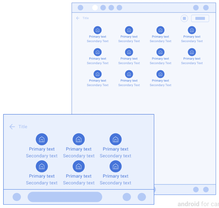
Grids present items in a grid layout and are useful when users rely primarily on images to make their selections.
-
This template can be embedded in the Tab template or the Map + Content template.
-
Grid items each contain an icon or a large-size image, and can optionally include primary and secondary text.
-
There is a limit on the number of grid items allowed, which can be retrieved using the ConstraintManager API.
-
Developers should limit text length, associate an action with each item, clearly indicate item state, and include a header.
Grids present items in a grid layout.
This template is useful when users rely primarily on images to make their selections.
This template can be embedded in the Tab template to provide tabbed navigation.
This template can be included in the Map + Content template to provide a grid on a map.
Includes:
- Optional header (header is replaced with tabs when this template is embedded in the Tab template)
- Grid items (see the note below), each containing an icon or a large-size image
- Primary text for each grid item (optional)
- Secondary text for each grid item (optional)
- Optional floating action button
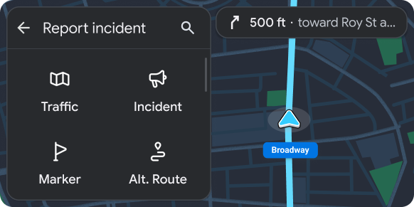
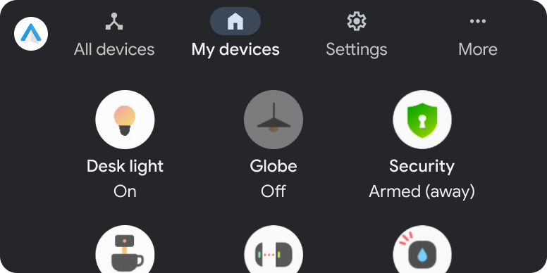
Grid template examples
The following Android Auto and Android Automotive OS (AAOS) examples were built using the Grid template.
Grid template UX requirements
App developers:
| SHOULD | Limit length of primary and secondary text strings to avoid truncation. |
| SHOULD | Have an action associated with each grid item (information-only items are not recommended). |
| SHOULD | Clearly indicate item state (for grid items that have multiple states, such as selected and unselected) by variations in image, icon, or text. |
| SHOULD | Include a header with an optional title and primary and secondary actions. |
| SHOULD NOT | Include both an action strip and a floating action button at the same time. |
| MAY | Show a loading spinner instead of the icon or image for a grid item when an action associated with the item is in progress. |