Stay organized with collections
Save and categorize content based on your preferences.
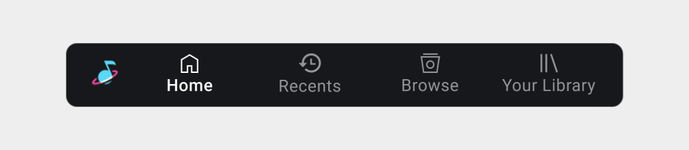
The first step in structuring your media app is determining which content
categories you want to appear as top-level navigation options on the app
bar.
Car makers and Google take care of implementing the app bar and determining
most aspects of its appearance.
Basically, you need to decide the following:
Which top-level content categories you want represented as tabs on the app bar
What icons and labels you will supply for each tab
Categories should showcase tailored content, rather than broad categories that
will be too large to browse easily while driving.
Tailored content might include content that is:
Frequently used – for example, playlists or channels
Preferred – for example, favorite artists
Timely – for example, recent songs
Curated – for example, “recommended for you”
Navigation tab example
In this example, the tailored content includes recently-played
songs, a way to discover more music, and a listing of all of the user's
music.
Navigation tab requirements
Keep in mind the following requirements and recommendation:
Requirement level
Requirements
MUST
App developers must:
Implement no more than 4 tabs (for AAOS)
Provide a label and a monochrome (preferably white) vector icon for
each tab (for AAOS)
SHOULD
App developers should:
Keep tab labels as short as possible, to prevent their being
truncated
Rationale
Simplify UX: Support a consistent navigation model for media apps.
Accommodate all screens: Allow car makers to use only labels when both
icons and labels won’t fit.
[[["Easy to understand","easyToUnderstand","thumb-up"],["Solved my problem","solvedMyProblem","thumb-up"],["Other","otherUp","thumb-up"]],[["Missing the information I need","missingTheInformationINeed","thumb-down"],["Too complicated / too many steps","tooComplicatedTooManySteps","thumb-down"],["Out of date","outOfDate","thumb-down"],["Samples / code issue","samplesCodeIssue","thumb-down"],["Other","otherDown","thumb-down"]],["Last updated 2024-07-23 UTC."],[[["\u003cp\u003eMedia apps should showcase tailored content categories like frequently used or preferred content as top-level navigation options on the app bar.\u003c/p\u003e\n"],["\u003cp\u003eDevelopers must implement no more than 4 tabs on the app bar and provide a label and a monochrome icon for each.\u003c/p\u003e\n"],["\u003cp\u003eTab labels should be kept short to avoid truncation and maintain a consistent navigation model.\u003c/p\u003e\n"],["\u003cp\u003eContent categories are browsable media items, represented with icons and labels, that are children of the root media item in the app's content hierarchy.\u003c/p\u003e\n"]]],[],null,["\u003cbr /\u003e\n\nThe first step in structuring your media app is determining which content\ncategories you want to appear as top-level navigation options on the app\nbar.\n\nCar makers and Google take care of implementing the app bar and determining\nmost aspects of its appearance.\n\nBasically, you need to decide the following:\n\n- Which top-level content categories you want represented as tabs on the app bar\n- What icons and labels you will supply for each tab\n\nCategories should showcase tailored content, rather than broad categories that\nwill be too large to browse easily while driving.\n\nTailored content might include content that is:\n\n- Frequently used -- for example, playlists or channels\n- Preferred -- for example, favorite artists\n- Timely -- for example, recent songs\n- Curated -- for example, \"recommended for you\"\n\n| **Note:** Top-level content categories are browsable media items that are the children of the root media item in your content hierarchy. Icons and labels are provided as resources associated with these browsable media items. For details, consult [Build your content hierarchy](https://developer.android.com/training/cars/media/#build_hierarchy).\n\nNavigation tab example In this example, the tailored content includes recently-played songs, a way to discover more music, and a listing of all of the user's music.\n\nNavigation tab requirements\n\nKeep in mind the following requirements and recommendation:\n\n| Requirement level | Requirements |\n|-------------------|----------------------------------------------------------------------------------------------------------------------------------------------------------------|\n| **MUST** | App developers must: Implement no more than 4 tabs (for AAOS) \u003c!-- --\u003e Provide a label and a monochrome (preferably white) vector icon for each tab (for AAOS) |\n| **SHOULD** | App developers should: - Keep tab labels as short as possible, to prevent their being truncated |\n\nRationale\n\n- **Simplify UX**: Support a consistent navigation model for media apps.\n- **Accommodate all screens**: Allow car makers to use only labels when both icons and labels won't fit."]]