Page Summary
-
Messages present brief messages with optional relevant actions and are useful for communicating error messages, permission prompts, and other UI state information.
-
This template can be embedded in the Tab and Map + Content templates.
-
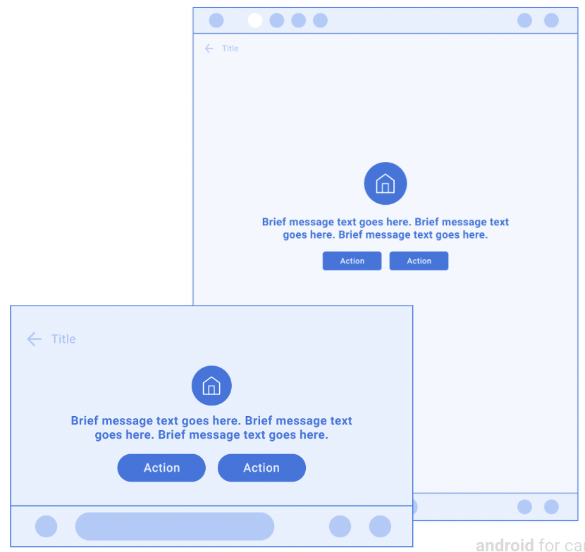
The template includes up to 2 lines of wrapping text, an optional image/icon/loading spinner, and up to 2 optional buttons.
-
The Message template is for quick messages, while longer messages or more detailed information with prominent actions should use the Long Message or Pane templates respectively.
-
App developers must include message text and can optionally include a header, image, or up to 2 actions, with specific guidelines for primary actions.
Messages present a brief message and optional relevant actions.
This template is useful for communicating error messages, permission prompts, and other information about UI states.
This template can be embedded in the Tab template to provide tabbed navigation.
This template can be included in the Map + Content template to display a message on a map.
Includes:
- Optional header (header is replaced with tabs when this template is embedded in the Tab template)
- Up to 2 lines of wrapping text
- Image, icon, or loading spinner (optional)
- Up to 2 buttons in template body (optional), where one can be designated as primary

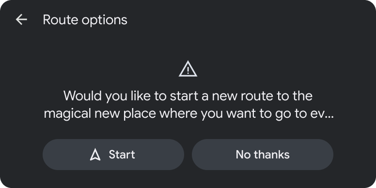
Message template examples


Message template UX requirements
App developers:
| MUST | Include message text. |
| SHOULD | Designate a primary action when providing 2 actions. |
| SHOULD | Place the primary action closest to the driver (on the left for left-hand-drive vehicles) when there are 2 actions. |
| SHOULD | Include a header with an optional title and primary and secondary actions. |
| MAY | Include an image or icon asset. |
| MAY | Include up to 2 actions. |
| MAY | Use this template to prompt users about app permissions and open related flows on the phone when parked (as shown in Grant permissions on phone). |