Page Summary
-
Click Menu is a user-friendly VR interface element within Daydream Elements, ideal for deep menu hierarchies and contextual commands, similar to PC or mobile menus.
-
It utilizes radial icon arrangements for quick selection and can be customized extensively using the
ClickMenuRootscript, controlling aspects like menu hierarchy, appearance, and interaction. -
Developers build menus by creating a Click Menu Tree and individual Click Menu Items, defining icons, tooltips, and behavior using provided assets and scripting fields.
-
To handle user interactions, subscribe a listener to the
ClickMenuRoot'sOnItemSelectedevent, which provides the selected item's ID, enabling developers to trigger corresponding actions within their application.
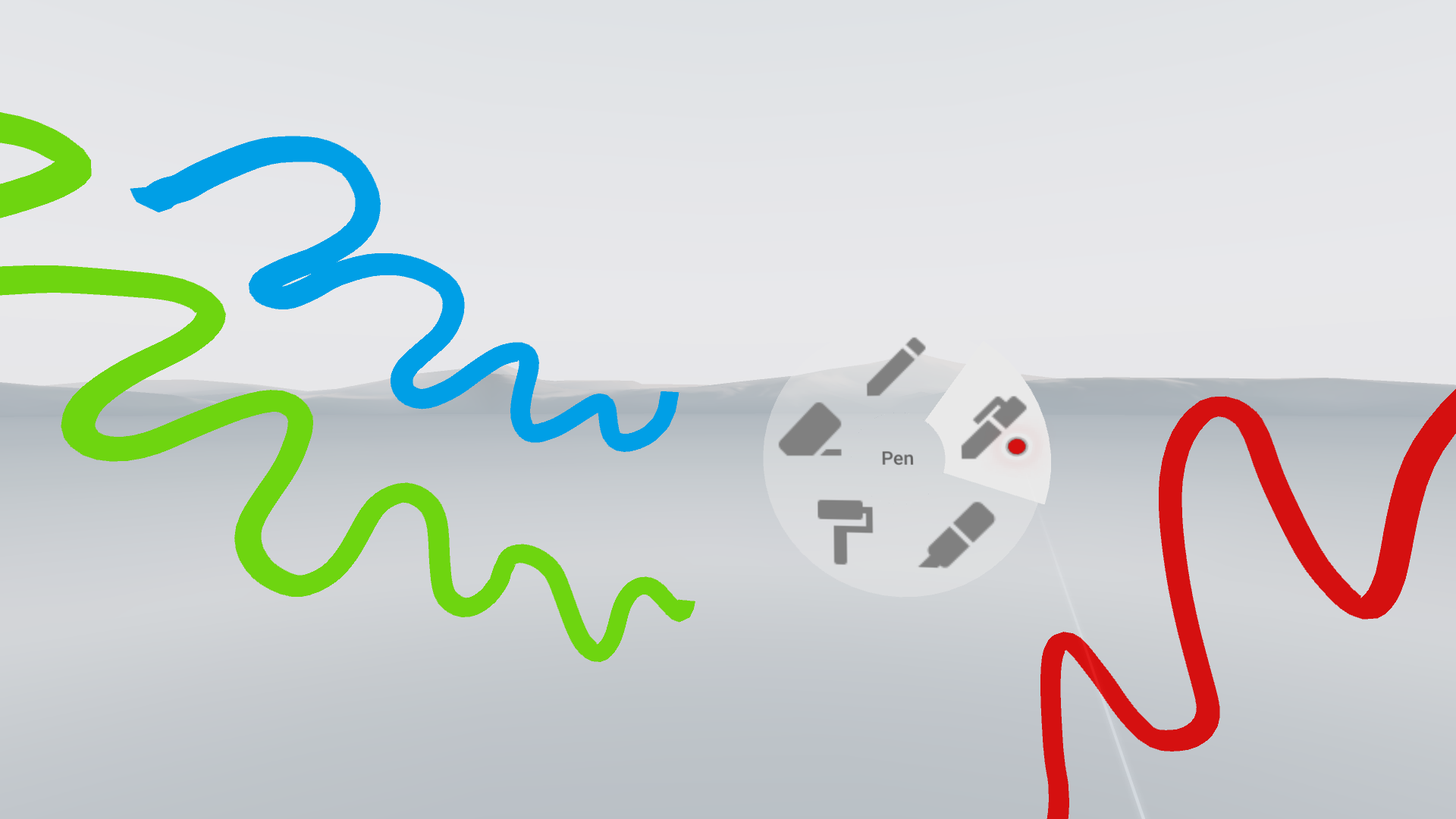
The Click Menu template is optimized for ease of use and can handle deep hierarchies of menu options. Users point and click on icons just like they're accustomed to on a PC or mobile device. In the provided example, icons are arranged radially to enable fast and accurate selections.
A Click Menu can be used in VR in the same way a toolbar menu provides a 2D app's top-level command structure. Additionally, Click Menus can also be used for contextual commands on an object in VR, analagous to a right-click context menu in 2D. In both cases, the Click Menu enables the user to choose between many commands in a compact and easy to navigate manner.
In the provided example, Click Menu is used in a basic painting app to select various painting options different brushes and colors. Icons are arranged radially to enable fast and accurate selections.
Getting started:
Click Menu is available as part of Daydream Elements.
To use Click Menu, add the MenuRoot prefab to your sceen. This prefab
contains the ClickMenuRoot script which listens to the controller and is responsible for spawning the menu.
Customization
The ClickMenuRoot script has the following fields which can be customized according to your use case:
- Menu Tree: A Unity asset that represents the menu hierarchy. See the building a menu section for more details.
- Back Icon: (Optional) The sprite to use as the back button in the center of the menus. Leave blank if you don't need that functionality.
- Laser Pointer: (Optional) Typically, menus need to appear closer to the user than the background elements in the scene. This means that the laser reticle may need to adjust the distance from the controller when a menu is opened. Link the active laser pointer here to allow the reticle to update its distance.
- Pie Material: (Optional) If this is set, a background will be drawn for the entire menu with this material. Selecting an icon will also cause a section of the background to be highlighted.
- Menu Activation Button: The input event that will allow the menu to open. This is typically a press or release of the app or touchpad buttons.
- Menu Icon Prefab: A prefab used to spawn each menu icon. Leave as default for sprite icons.
- Reticle Delta: The maximum amount the reticle can move by each frame when the menu is opening.
- Menu Distance: The distance away from the controller in meters to spawn the Click Menu.
- Close Angle: The menu will automatically close when you point away from the center by more than this angle.
- Open FoV Angle: The menu will only open if the laser is within the field of view by less than this angle. This prevents accidental menu openings.
Building a menu
- Create a Click Menu Tree by going to File > Assets > Create > DaydreamElements > ClickMenu > Tree.
- Create a Click Menu Item for each menu icon you want to add by going to File > Assets > Create > DaydreamElements > ClickMenu > Item.
- Set the
ClickMenuItemfields as desired:- ID: This value is passed to the
ItemSelectedEventso that you can identify what item was selected during theOnItemSelectedevent. - Icon: This is the primary image for the button. Avoid text and opt for recognizable icons.
- Background: (Optional) This is the image that will appear behind the icon image.
- Tool Tip: This text draws in the center of the menu when this icon is hovered over.
- Close After Selected: If true, the menu will close after selecting the item. Otherwise the menu will stay open. This only applies to non-parent nodes.
- ID: This value is passed to the
- Each
ClickMenuItemcan then be added to the menu tree by dragging them into the Tree field. Items can be nested as children or as siblings to construct a hierarchy.
Listening for Events:
In order to listen to menu selection events, subscribe a listener to
ClickMenuRoot's OnItemSelected. This listener will receive a callback and
an item ID whenever a final selection has been made. You can then use this ID
to handle each of the menu actions.