The Daydream View VR headset is no longer available for purchase as of October 15, 2019. As of November 2023, previously supported devices will no longer be able to download and install Google VR Serivces (Android application ID com.google.vr.vrcore) for new users.
Stay organized with collections
Save and categorize content based on your preferences.
The Swipe Menu template is optimized for situations where the user has a small
number of options that they need to switch quickly between while still retaining
their point-and-click functionality. This is achieved by using swipe gestures on
the touchpad to switch between actions or modes while displaying feedback on the
controller model.
In general, this type of menu is best suited for apps that involve fast
reflexes and require unobtrusive execution of commands or mode switching. For instance,
swiping up could switch between ranged and melee combat in one app, while in another
swiping down could invoke an energy shield.
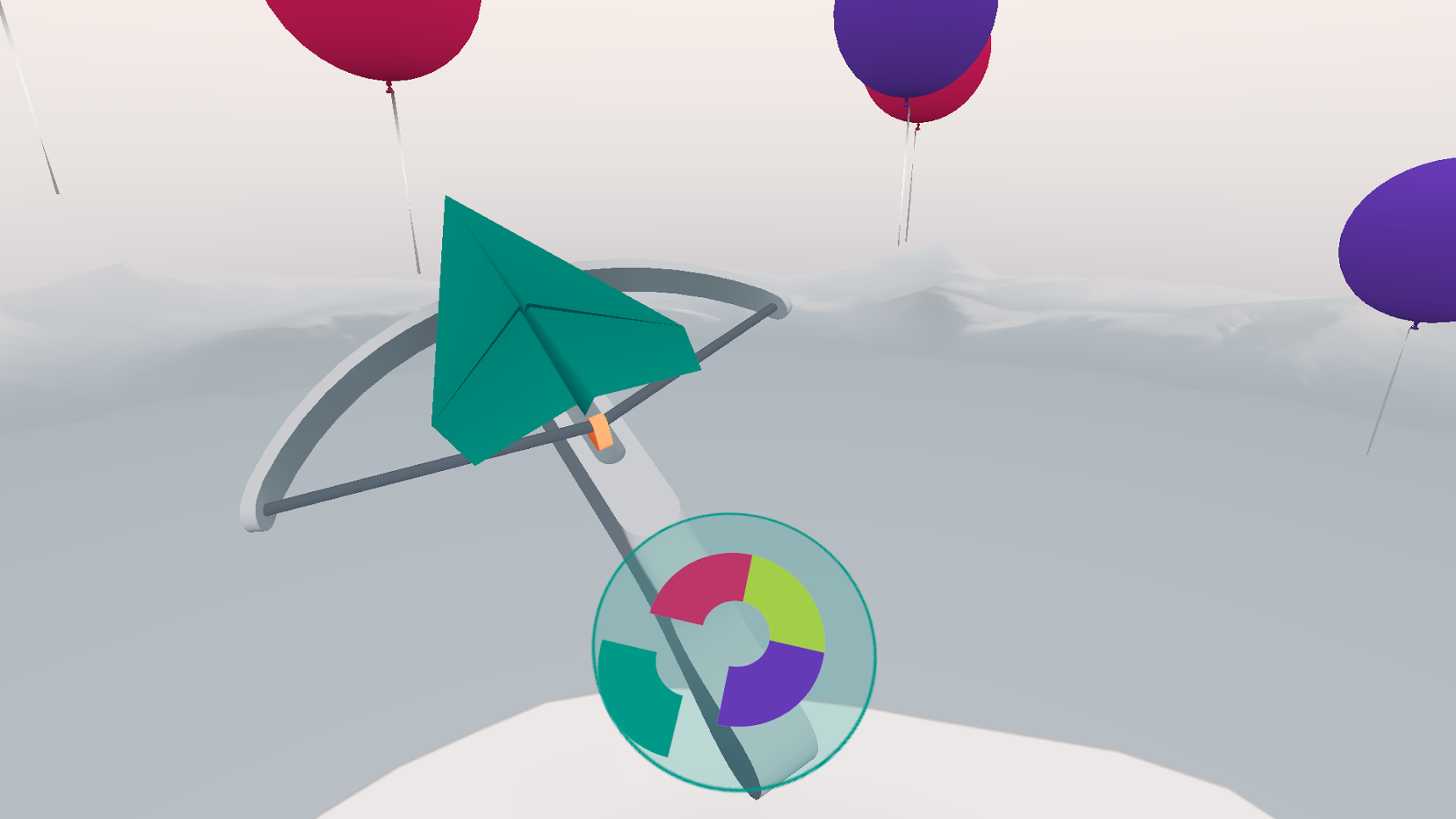
In the provided example, Swipe Menu is used to switch between different colored
paper planes that must be launched at matching balloons.
Getting started
Swipe Menu is available as part of Daydream Elements.
To use Swipe Menu the SwipeMenu prefab must be added as a child of the
controller prefab, or whatever other object is locked to the wrist.
Customization
That are a number of settings associated with the SwipeMenu prefab that can be
configured to fit your particular use case:
Icon Radius: The radius in meters between the menu center and the sliding
icons.
Slot Radius: The radius in meters between the menu center and the
icon slots.
Icons: List of sprites to use for the sliding icons (must
match size of Slot Icons).
Slot Icons: List of sprites to use for the slot icons (must match size of
Icons).
The number of icons and slot icons will indicate the total number of options
available on the menu. The order of the icons should be listed starting from
the top and working around clockwise.
Icons and slots can be any shape; arcs as in the demo, circles, or even squares.
Icons should avoid text other than very short words as they will be
small and difficult to read.
Detecting that a menu option has been triggered can be done by adding a listener
to the OnSwipeSelect event. The method takes an index argument which
can be used to determine which item was triggered. The index is the same as the
0-indexed order the icons were listed.
All rights reserved. Java is a registered trademark of Oracle and/or its affiliates.
Last updated 2024-10-09 UTC.
[[["Easy to understand","easyToUnderstand","thumb-up"],["Solved my problem","solvedMyProblem","thumb-up"],["Other","otherUp","thumb-up"]],[["Missing the information I need","missingTheInformationINeed","thumb-down"],["Too complicated / too many steps","tooComplicatedTooManySteps","thumb-down"],["Out of date","outOfDate","thumb-down"],["Samples / code issue","samplesCodeIssue","thumb-down"],["Other","otherDown","thumb-down"]],["Last updated 2024-10-09 UTC."],[[["\u003cp\u003eThe Swipe Menu template is designed for quick switching between a limited number of options using swipe gestures on the touchpad, ideal for apps requiring fast reflexes.\u003c/p\u003e\n"],["\u003cp\u003eIt's implemented by adding the \u003ccode\u003eSwipeMenu\u003c/code\u003e prefab as a child of the controller or wrist-locked object, ensuring clear visibility without obstructing the main view.\u003c/p\u003e\n"],["\u003cp\u003eCustomization options include icon and slot radius, along with corresponding icon sprites arranged clockwise from the top, supporting various shapes but avoiding lengthy text.\u003c/p\u003e\n"],["\u003cp\u003eOption selection is detected through the \u003ccode\u003eOnSwipeSelect\u003c/code\u003e event, providing an index corresponding to the triggered item's position in the icon list.\u003c/p\u003e\n"]]],["The Swipe Menu template enables quick switching between a few options using touchpad swipes. Actions or modes are switched via swipe gestures, with feedback displayed on the controller. The `SwipeMenu` prefab, positioned for easy viewing, can be customized using settings like `Icon Radius`, `Slot Radius`, `Icons`, and `Slot Icons`. The menu options' order is defined top-down, clockwise. The `OnSwipeSelect` event, with an index parameter, triggers when an option is selected.\n"],null,["# Swipe menu\n\nThe Swipe Menu template is optimized for situations where the user has a small\nnumber of options that they need to switch quickly between while still retaining\ntheir point-and-click functionality. This is achieved by using swipe gestures on\nthe touchpad to switch between actions or modes while displaying feedback on the\ncontroller model.\n\nIn general, this type of menu is best suited for apps that involve fast\nreflexes and require unobtrusive execution of commands or mode switching. For instance,\nswiping up could switch between ranged and melee combat in one app, while in another\nswiping down could invoke an energy shield.\n\nIn the provided example, Swipe Menu is used to switch between different colored\npaper planes that must be launched at matching balloons.\n\nGetting started\n---------------\n\nSwipe Menu is available as part of Daydream Elements.\n\nTo use Swipe Menu the `SwipeMenu` prefab must be added as a child of the\ncontroller prefab, or whatever other object is locked to the wrist.\n| **Note:** You should position the menu such that the user can easily look down and see the menu options while not obstructing their view of the scene when looking straight ahead.\n\n### Customization\n\nThat are a number of settings associated with the `SwipeMenu` prefab that can be\nconfigured to fit your particular use case:\n\n- **Icon Radius:** The radius in meters between the menu center and the sliding icons.\n- **Slot Radius:** The radius in meters between the menu center and the icon slots.\n- **Icons:** List of sprites to use for the sliding icons (must match size of Slot Icons).\n- **Slot Icons:** List of sprites to use for the slot icons (must match size of Icons).\n\nThe number of icons and slot icons will indicate the total number of options\navailable on the menu. The order of the icons should be listed starting from\nthe top and working around clockwise.\n\nIcons and slots can be any shape; arcs as in the demo, circles, or even squares.\nIcons should avoid text other than very short words as they will be\nsmall and difficult to read.\n\nDetecting that a menu option has been triggered can be done by adding a listener\nto the `OnSwipeSelect` event. The method takes an index argument which\ncan be used to determine which item was triggered. The index is the same as the\n0-indexed order the icons were listed."]]