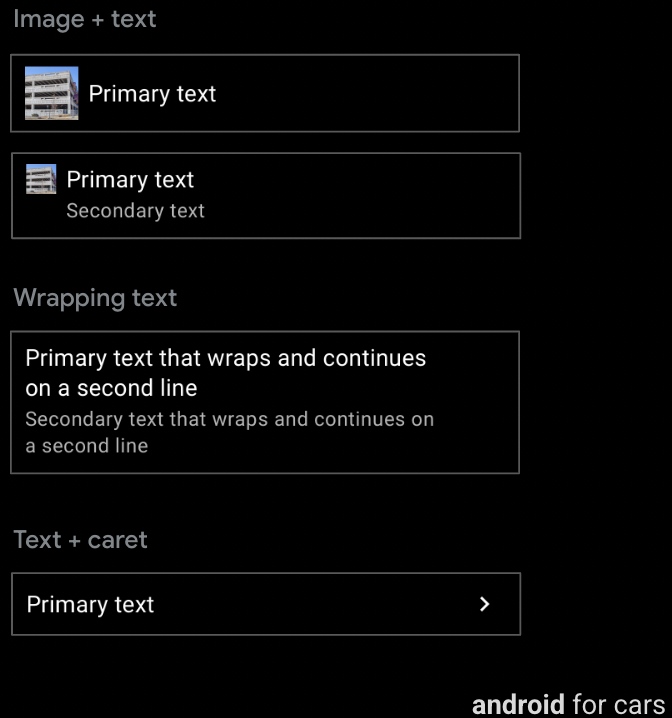
Modello di riquadro
senza separatori di linea nel modello del riquadro perché non è possibile usare le righe
Consulenza
Le righe sono altamente personalizzabili e possono essere utilizzate per creare vari tipi di elenchi:
elenchi con dati, elenchi con immagini e così via.
Opzioni riga solo per il modello di elenco
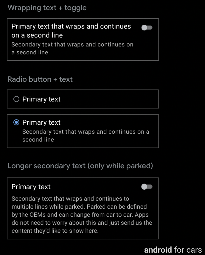
Oltre alle funzionalità tipiche disponibili per il componente Riga (testo principale e secondario e immagine o icona), una riga nel modello di elenco può includere anche quanto segue:
(Facoltativo) Opzione di attivazione/disattivazione
Pulsante di opzione (facoltativo, utilizzato solo in elenchi selezionabili, che devono avere pulsanti di opzione in tutte le righe)
Testo secondario più lungo (visibile solo quando parcheggiato), da troncare a 2 righe durante la guida
Consulenza
Una riga con un pulsante di attivazione/disattivazione non può contenere un pulsante di opzione e viceversa. Inoltre,
i caratteri non vengono utilizzati negli elenchi dotati di opzioni o pulsanti di opzione.
Tuttavia, una riga con una di queste opzioni può contenere anche un'immagine o un'icona e un testo a capo.
[[["Facile da capire","easyToUnderstand","thumb-up"],["Il problema è stato risolto","solvedMyProblem","thumb-up"],["Altra","otherUp","thumb-up"]],[["Mancano le informazioni di cui ho bisogno","missingTheInformationINeed","thumb-down"],["Troppo complicato/troppi passaggi","tooComplicatedTooManySteps","thumb-down"],["Obsoleti","outOfDate","thumb-down"],["Problema di traduzione","translationIssue","thumb-down"],["Problema relativo a esempi/codice","samplesCodeIssue","thumb-down"],["Altra","otherDown","thumb-down"]],["Ultimo aggiornamento 2025-07-25 UTC."],[[["\u003cp\u003eRows, supported by six templates, display primary text, optional secondary text, and can include icons, images, and carets.\u003c/p\u003e\n"],["\u003cp\u003eRow templates include List, Place List (map), Search, Route Preview, and Pane templates (without line dividers).\u003c/p\u003e\n"],["\u003cp\u003eRows are highly customizable, accommodating various list types and options like toggle switches, radio buttons, and longer secondary text (List template only).\u003c/p\u003e\n"],["\u003cp\u003eRows with toggle switches or radio buttons exclude carets but allow images, icons, and wrapping text; toggle switches and radio buttons are mutually exclusive within a row.\u003c/p\u003e\n"]]],[],null,["# Rows\n\n\u003cbr /\u003e\n\nSix templates support the row component, which contains a small amount of\ntext, plus other options.\n\nFor most templates, rows can also accommodate actionable buttons. \n**Can include:**\n\n- **Primary text** (mandatory), up to 2 lines, where the second line either wraps or comes after a line break\n- **Secondary text** (optional), up to 2 lines with customizable text color\n- **Optional inline icon or image** in either primary or secondary text\n- **Caret** (optional), indicating presence of a submenu\n\n\n\u003cbr /\u003e\n\nTemplate support\n----------------\n\nThe following templates support rows:\n\n- [List](/cars/design/create-apps/apps-for-drivers/templates/list-template)\n- [Place List (map)](/cars/design/create-apps/apps-for-drivers/templates/place-list-map-template)\n- [Search](/cars/design/create-apps/apps-for-drivers/templates/search-template)\n- [Route Preview](/cars/design/create-apps/apps-for-drivers/templates/route-preview-map-template)\n- [Pane template](/cars/design/create-apps/apps-for-drivers/templates/pane-template) with no line dividers in the Pane template because its rows are not actionable\n\nGuidance\n--------\n\nRows are highly customizable and can be used to create a variety of list types:\nlists with data, lists with images, and so on.\n\nRow options for List template only\n----------------------------------\n\nIn addition to the typical features available for the Row component\n(primary and secondary text, and image or icon), a row on the List\ntemplate can also include any of the following:\n\n- Toggle switch (optional)\n- Radio button (optional, used only in selectable lists, which must have radio buttons on all rows)\n- Longer secondary text (visible only when parked), to be truncated to 2 lines while driving\n\n\u003cbr /\u003e\n\n### Guidance\n\nA row with a toggle switch can't contain a radio button, and vice versa. Also,\ncarats are not used on lists with either toggle switches or radio buttons.\nHowever, a row with either of these options can also contain an image or icon\nand wrapping text."]]