
Page Summary
-
Blockly provides default categories UI with basic styling options.
-
Advanced styling of the Blockly toolbox can be achieved using CSS.
-
Individual parts of a category toolbox can be styled using CSS classes, either default or custom.
-
Themes can be used to specify workspace colours, including category colours, although CSS is recommended for category styling.
Blockly provides a default categories UI, and with it some basic options for styling. If you want information about how to do more advanced styling/configuration of the UI check out the Customizing a Blockly toolbox codelab and the 2021 Toolbox APIs talk.

Category CSS
You can use CSS to style category toolboxes.
A category toolbox is composed of multiple HTML elements, each of which models a
different part of the toolbox. For example, each category has its own div and
separate spans for its icon and label. (For a complete list, see the table
below.)
Blockly assigns a default CSS class to all parts of the same type. For example,
it assigns blocklyToolboxCategoryLabel to all label spans. Use these classes
to style all parts of the same type in the same way, such as to to assign the
same color to all labels. Blockly uses these classes in its default CSS for
category
toolboxes.
You can optionally assign custom CSS classes to individual parts. For example,
you can assign different CSS classes to each label span. Use these classes to
style different parts of the same type in different ways, such as to assign a
different color to each label.
Default CSS classes
The following table lists the types, descriptions, and default CSS classes of each part of a category toolbox. If you're having trouble visualizing this, open the developer tools in your browser and inspect the toolbox.
| Part type | Description | Default CSS class |
|---|---|---|
| contents | The div that contains all categories. |
blocklyToolboxCategoryGroup |
| container | The div that contains a single category and its subcategories. |
blocklyToolboxCategoryContainer |
| row | The div that contains the category. |
blocklyToolboxCategory |
| rowcontentcontainer | The div that contains the label and the icon. |
blocklyTreeRowContentContainer |
| icon | The span that contains the icon. |
blocklyToolboxCategoryIcon |
| label | The span that contains the label. |
blocklyToolboxCategoryLabel |
CSS is also used to label the state of some parts of the toolbox.
| State | Description | Default CSS class |
|---|---|---|
| selected | Added to the "row" div when the category is selected. |
blocklyToolboxSelected |
| openicon | Added to the "icon" span when a category with subcategories is open. |
blocklyToolboxCategoryIconOpen |
| closedicon | Added to the "icon" span when a category with subcategories is closed. |
blocklyToolboxCategoryIconClosed |
Custom CSS classes
To assign custom CSS classes, use the cssConfig property in JSON toolbox
definitions or css- attributes in XML toolbox definitions and use the part
type to identify the part you want to assign classes to.
For example, suppose you want all labels to be white but each category to have its own background color. You can use the default class for the labels, but need to add custom classes for each category's row.
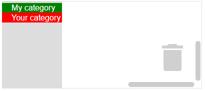
The following category definitions assign custom CSS classes to each category's
row. Notice that the default class for rows (blocklyToolboxCategory) is
included in each definition. This is because Blockly overwrites the row's
class attribute when assigning classes. If you don't include the default
class, you won't get the default CSS for that class.
JSON
Set custom CSS classes using the cssConfig property.
{
  "kind": "category",
  "name": "My category",
  "cssConfig": {
    "row": "blocklyToolboxCategory myRow"  // Use the part type ("row") as a key.
  },
  "contents": [...],
},
{
  "kind": "category",
  "name": "Your category",
  "cssConfig": {
    "row": "blocklyToolboxCategory yourRow"
  },
  "contents": [...],
},
XML
Set custom CSS classes using an attribute whose name is the part type with
css- prepended to it.
<category name="My category" css-row="blocklyToolboxCategory myRow">
  ...
</category>
<category name="Your category" css-row="blocklyToolboxCategory yourRow">
  ...
</category>
In your CSS file, use the custom classes to assign row colors and the default class to assign the label color:
.myRow {background-color: green}
.yourRow {background-color: red}
.blocklyToolboxCategoryLabel {color: white}
Themes
Themes allow you to specify all of the colours of your workspace at once, including the colours of your categories. If you need finer-grained control, use CSS.
To use them, you have to associate your category with a particular category style:
JSON
{
  "kind": "category",
  "name": "Logic",
  "categorystyle": "logic_category"
}
XML
<category name="Logic" categorystyle="logic_category"></category>
Colours
You can also specify the colour directly, but this is not recommended. The colour is a stringified number (0-360) specifying the hue. Note the British spelling.
JSON
{
  "contents": [
    {
      "kind": "category",
      "name": "Logic",
      "colour": "210"
    },
    {
      "kind": "category",
      "name": "Loops",
      "colour": "120"
    }
  ]
}
XML
<xml id="toolbox" style="display: none">
  <category name="Logic" colour="210">...</category>
  <category name="Loops" colour="120">...</category>
  <category name="Math" colour="230">...</category>
  <category name="Colour" colour="20">...</category>
  <category name="Variables" colour="330" custom="VARIABLE"></category>
  <category name="Functions" colour="290" custom="PROCEDURE"></category>
</xml>
Note that we also support using localizable colour references.