
Page Summary
-
Context menus in Blockly provide a list of actions for components like workspaces, blocks, and workspace comments, accessible via right-click, long press, or a keyboard shortcut.
-
Context menus are suitable for less frequent actions and are supported by various component types, including custom ones.
-
Blockly uses a registry with templates to build context menus based on the component, and menus can be customized per workspace or block.
-
Templates in the registry define context menu items using properties like ID, precondition function to determine visibility, display text, weight for ordering, callback function for the action, and an optional separator.
-
You can add, delete, or modify templates in the Blockly context menu registry to customize the available options.
A context menu contains a list of actions that a user can perform on a component
such as a workspace, block, or workspace comment. The context menu is shown in
response to a right-click or a long press on a touch device. If you use the
@blockly/keyboard-navigation plugin, it is also
shown with a keyboard shortcut, which defaults to Ctrl+Enter on Windows or
Command+Enter on Mac.
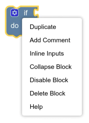
Context menus are a good place to add actions that the user performs infrequently, such as downloading a screenshot. If you think an action will be used more commonly, you might want to create a more discoverable way to invoke it.
Context menus are supported by workspaces, blocks, workspace comments, bubbles, and connections. You can also implement them on your own custom components. Blockly provides standard context menus that you can customize. You can also customize context menus on workspaces and blocks on a per-workspace or per-block basis.
How context menus work
Blockly has a registry that contains templates for all possible menu items. Each template describes how to construct a single item in a context menu. When the user invokes a context menu on a component, the component:
Asks the registry construct an array of menu items that apply to the component. The registry asks each template if it applies to the component and, if so, adds a corresponding menu item to the array.
If the component is a workspace or block, checks to see if the specific workspace or block on which the menu was invoked has a function for customizing the context menu. If so, it passes the array to the function, which can add, delete, or modify elements of the array.
Displays the context menu using the (possibly modified) array of context menu items.
Blockly defines a standard set of templates for the context menus for workspaces, blocks, and workspace comments. It preloads the templates for workspaces and blocks into the registry. If you want to use the templates for workspace comments, you must load them into the registry yourself.
For information on how to add, delete, and modify templates in the registry, see Customize the registry.
Scope
Context menus are implemented by different types of components, including workspaces, workspace comments, connections, blocks, bubbles, and your own custom components. The context menus for each of these component types may contain different items, and items may behave differently based on the component type. Thus, the context menu system needs to know which component it was invoked on.
To address this, the registry uses a Scope object. The component on which the
context menu was invoked is stored in the focusedNode property as an object
that implements IFocusableNode. (IFocusableNode is
implemented by all components that users can focus on, including those that
implement context menus. For more information, see Focus
system.)
The Scope object is passed to several of the functions in a template. In any
function that gets a Scope object, you can decide what to do based on the type
of the object in the focusedNode property. For example, you can check if the
component is a block with:
if (scope.focusedNode instanceof Blockly.BlockSvg) {
  // do something with the block
}
The Scope object has other optional properties that are no longer recommended
for use, but may still be set:
blockis set only if the component whose menu is shown is aBlockSvg.workspaceis set only if the component is aWorkspaceSvg.commentis set only if the component is aRenderedWorkspaceComment.
These properties don't cover all types of components that may have a context
menu, so you should prefer to use the focusedNode property.
The RegistryItem type
Templates have the type ContextMenuRegistry.RegistryItem,
which contains the following properties. Note that the preconditionFn,
displayText, and callback properties are mutually exclusive with the
separator property.
ID
The id property should be a unique string that indicates what your context
menu item does.
const collapseTemplate = {
  id: 'collapseBlock',
  // ...
};
Precondition function
You can use the preconditionFn to restrict when and how a context menu item
should be displayed.
It should return one of a set of strings: 'enabled', 'disabled', or
'hidden'.
| Value | Description | Image |
|---|---|---|
'enabled' |
Shows that the item is active. | 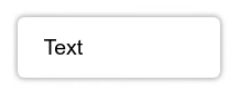 |
'disabled' |
Shows that the item is not active. | 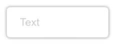 |
'hidden' |
Hides the item. |
The preconditionFn is also passed a Scope which you can use to
determine what type of component the menu was opened on and the state of that
component.
For example, you may want an item to only appear for blocks, and only when those blocks are in a particular state:
const collapseTemplate = {
  // ...
  preconditionFn: (scope) => {
    if (scope.focusedNode instanceof Blockly.BlockSvg) {
      if (!scope.focusedNode.isCollapsed()) {
        // The component is a block and it is not already collapsed
        return 'enabled';
      } else {
        // The block is already collapsed
        return 'disabled';
      }
    }
    // The component is not a block
    return 'hidden';
  },
  // ...
}
Display text
The displayText is what should be shown to the user as part of the menu item.
The display text can be a string, or HTML, or a function that returns either a
string or HTML.
const collapseTemplate = {
  // ...
  displayText: 'Collapse block',
  // ...
};
If you want to display a translation from Blockly.Msg you need to use a
function. If you try to assign the value directly, the messages may not be
loaded and you'll get a value of undefined instead.
const collapseTemplate = {
  // ...
  displayText: () => Blockly.Msg['MY_COLLAPSE_BLOCK_TEXT'],
  // ...
};
If you use a function, it is also passed a Scope value. You can use
this to add information about the element to your display text.
const collapseTemplate = {
  // ...
  displayText: (scope) => {
    if (scope.focusedNode instanceof Blockly.Block) {
      return `Collapse ${scope.focusedNode.type} block`;
    }
    // Shouldn't be possible, as our preconditionFn only shows this item for blocks
    return '';
  },
  // ...
}
Weight
The weight determines the order in which context menu items are displayed.
More positive values are displayed lower in the list than less positive values.
(You can imagine that items with higher weights are "heavier" so they sink to
the bottom.)
const collapseTemplate = {
  // ...
  weight: 10,
  // ...
}
Weights for the built-in context menu items go in increasing order starting at 1 and increasing by 1.
Callback function
The callback property is a function that performs the action of your context
menu item. It is passed several parameters:
scope: AScopeobject that provides a reference to the component having its menu opened.menuOpenEvent: TheEventthat triggered opening the context menu. This may be aPointerEventorKeyboardEvent, depending on how the user opened the menu.menuSelectEvent: TheEventthat selected this particular context menu item from the menu. This may be aPointerEventorKeyboardEvent, depending on how the user selected the item.location: TheCoordinatein pixel coordinates where the menu was opened. This lets you, for example, create a new block at the click location.
const collapseTemplate = {
  // ...
  callback: (scope, menuOpenEvent, menuSelectEvent, location) => {
    if (scope.focusedNode instanceof Blockly.BlockSvg) {
      scope.focusedNode.collapse();
    }
  },
}
You can use scope to design templates that work differently depending on the
component on which they were opened:
const collapseTemplate = {
  // ...
  callback: (scope) => {
    if (scope.focusedNode instance of Blockly.BlockSvg) {
      // On a block, collapse just the block.
      const block = scope.focusedNode;
      block.collapse();
    } else if (scope.focusedNode instanceof Blockly.WorkspaceSvg) {
      // On a workspace, collapse all the blocks.
      let workspace = scope.focusedNode;
      collapseAllBlocks(workspace);
    }
  }
}
Separator
The separator property draws a line in the context menu.
Templates with the separator property cannot have preconditionFn,
displayText, or callback properties and can only be scoped with the
scopeType property. The latter restriction means they can only be used on
context menus for workspaces, blocks, and workspace comments.
const separatorAfterCollapseBlockTemplate = {
  id: 'separatorAfterCollapseBlock',
  scopeType: Blockly.ContextMenuRegistry.ScopeType.BLOCK,
  weight: 11, // Between the weights of the two items you want to separate.
  separator: true,
};
You need a different template for each separator in your context menu. Use the
weight property to position each separator.
Scope type
The scopeType property is deprecated. Previously, it was used to determine if
a menu item should be shown on a context menu for a block, a workspace comment,
or a workspace. Since context menus can be opened on other components, the
scopeType property is too restrictive. Instead, you should use the
preconditionFn to show or hide your option for the corresponding components.
If you have existing context menu templates that use scopeType, Blockly will
continue to show the item only for the appropriate component.
const collapseTemplate = {
  // ...
  scopeType: Blockly.ContextMenuRegistry.ScopeType.BLOCK,
  // ...
};
Customize the registry
You can add, delete, or modify templates in the registry. You can find the
default templates in contextmenu_items.ts.
Add a template
You can add a template to the registry by registering it. You should do this once on page load. It can happen before or after you inject your workspace.
const collapseTemplate = { /* properties from above */ };
Blockly.ContextMenuRegistry.registry.register(collapseTemplate);
Delete a template
You can remove a template from the registry by unregistering it by ID.
Blockly.ContextMenuRegistry.registry.unregister('someID');
Modify a template
You can modify an existing template by getting the template from the registry and then modifying it in-place.
const template = Blockly.ContextMenuRegistry.registry.getItem('someID');
template?.displayText = 'some other display text';
Disable block context menus
By default, blocks have a context menu that allows users to do things like add block comments or duplicate blocks.
You can disable the context menu of an individual block by doing:
block.contextMenu = false;
In the JSON definition of a block type, use the enableContextMenu key:
{
  // ...,
  "enableContextMenu": false,
}
Customize context menus per block type or workspace
After Blockly has generated an array of context menu
items, you can customize it for individual blocks or
workspaces. To do this, set BlockSvg.customContextMenu or
WorkspaceSvg.configureContextMenu to a function that
modifies the array in place.
Objects in the array passed to blocks have the type
ContextMenuOption or implement the interface
LegacyContextMenuOption. Objects passed to
workspaces have the type ContextMenuOption. Blockly uses the following
properties from these objects:
text: The display text.enabled: Iffalse, display the item with grey text.callback: The function to be called when the item is clicked.separator: The item is a separator. Mutually exclusive with the other three properties.
See the reference documentation for property types and function signatures.
For example, here is a function that adds a Hello, World! item to a
workspace's context menu:
workspace.configureContextMenu = function (menuOptions, e) {
  const item = {
    text: 'Hello, World!',
    enabled: true,
    callback: function () {
      alert('Hello, World!');
    },
  };
  // Add the item to the end of the context menu.
  menuOptions.push(item);
}
Show a context menu on a custom object
You can make context menus appear for custom components by following these steps:
- Implement
IFocusableNodeor extend a class that implementsIFocusableNode. This interface is used in the context menu system to identify your component. It also allows users to navigate to your component using the keyboard navigation plugin. Implement
IContextMenu, which contains theshowContextMenufunction. This function gets the context menu items from the registry, calculates the location on screen at which to show the menu, and finally shows the menu if there are any items to show.const MyBubble implements IFocusableNode, IContextMenu { ... showContextMenu(menuOpenEvent) { // Get the items from the context menu registry const scope = {focusedNode: this}; const items = Blockly.ContextMenuRegistry.registry.getContextMenuOptions(scope, menuOpenEvent); // Return early if there are no items available if (!items.length) return; // Show the menu at the same location on screen as this component // The location is in pixel coordinates, so translate from workspace coordinates const location = Blockly.utils.svgMath.wsToScreenCoordinates(new Coordinate(this.x, this.y)); // Show the context menu Blockly.ContextMenu.show(menuOpenEvent, items, this.workspace.RTL, this.workspace, location); } }Add an event handler that calls
showContextMenuwhen the user right-clicks your component. Note that the keyboard navigation plugin provides an event handler that callsshowContextMenuwhen the user pressesCtrl+Enter(Windows) orCommand+Enter(Mac).Add templates to the registry for your context menu items.