
Page Summary
-
Themes customize the visual appearance of Blockly elements like blocks, categories, and certain components.
-
A theme object includes properties for base theme, styles for blocks, categories, components, and fonts, and an option for start hats.
-
Block styles define the primary, secondary, and tertiary colors of blocks, and can optionally add a hat.
-
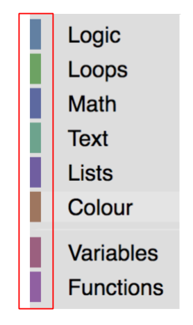
Category styles control the color of categories in the toolbox.
-
Themes can be created using a constructor or
defineThemeand are applied to a Blockly workspace using thethemeconfiguration option during injection or dynamically withsetTheme.
Themes are a way to customize the look and feel of Blockly. You can customize
block colours, category colours and certain components through the Themes
class. If you want to customize additional components, we provide the theme name
as a class on the injection div. This allows users to change the look of any
unsupported components through CSS. Our main goal in creating themes is to
empower developers to create Blockly experiences that are more accessible.
Theme Properties
A theme is an object with several properties: the base theme to extend from, a style object for blocks, categories, components, and fonts, and a whether or not to use hats for start blocks.
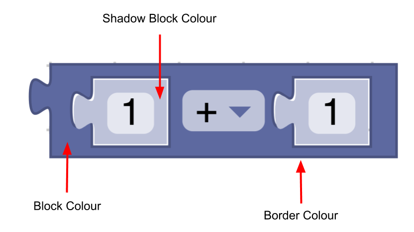
Block Style
A block style is made up of four fields:
colourPrimary(required) - The background colour of the block.colourSecondary(optional) - The background colour if the block is a shadow block.colourTertiary(optional) - The border or highlight colour of the block.hat(optional) - Adds a hat to a block, if the value is set tocap. Learn more about hats.
const listBlocks = {
   'colourPrimary': '#4a148c',
   'colourSecondary':'#AD7BE9',
   'colourTertiary':'#CDB6E9',
   'hat': 'cap'
}
A theme will include a mapping of block style name to block style object:
const blockStyles = {
   'list_blocks': {
      'colourPrimary': '#4a148c',
      'colourSecondary':'#AD7BE9',
      'colourTertiary':'#CDB6E9'
   },
   'logic_blocks': {
      'colourPrimary': '#01579b',
      'colourSecondary':'#64C7FF',
      'colourTertiary':'#C5EAFF'
   }
}
Category Style
A category style only holds a colour property.
- Colour (required) - The colour of the category in the toolbox. Usually these
colours should be the same as the
colourPrimaryon the majority of blocks in the category. This makes it easy for users to tell which blocks belong in a given category.
const mathCategory = {
   'colour':'290'
}
A theme will include a mapping of category name to category style object:
const categoryStyles = {
   'list_category': {
      'colour': '#4a148c'
   },
   'logic_category': {
      'colour': '#01579b',
   }
}
Component Styles
A theme can set the colour or value of the below components:
workspaceBackgroundColour: The workspace background colourtoolboxBackgroundColour: Toolbox background colourtoolboxForegroundColour: Toolbox category text colourflyoutBackgroundColour: Flyout background colourflyoutForegroundColour: Flyout label text colourflyoutOpacity: Flyout opacityscrollbarColour: Scrollbar colourscrollbarOpacity: Scrollbar opacityinsertionMarkerColour: The insertion marker colour (Does not accept colour names)insertionMarkerOpacity: The insertion marker opacitymarkerColour: The colour of the marker displayed in keyboard navigation modecursorColour: The colour of the cursor displayed in keyboard navigation mode
Most other components can be changed by using the theme name in your CSS. However, if there is a component you would like to change that is not already a part of this list and cannot be changed using CSS, please file an issue with more information.
const componentStyle = {
   'workspaceBackgroundColour': '#1e1e1e',
   'toolboxBackgroundColour': '#333'
}
Font Styles
A font style is an object that holds the family, weight and size of a font.
const fontStyle = {
   'family': 'Georgia, serif',
   'weight': 'bold',
   'size': 12
}
Start Hats
If you set startHats: true directly in a theme object, a hat will be added to
all blocks with no previous or output connections. If you want more control over
exactly which blocks get a hat, you can instead use the
block style property.
Custom Themes
In order to add a theme to your Blockly application, you will need to do the following:
- Create a theme
- Add style names
- Set your theme on a workspace
Create a Theme
A theme can be created using the constructor or by using defineTheme. Using
defineTheme makes it easy to extend a pre existing theme and set all values
with a single object. A theme has a name, and is an object with the block
styles, category styles, and other properties as discussed above.
A theme can also have a base theme, which will provide default values for any values not specified in the custom theme.
const theme = Blockly.Theme.defineTheme('themeName', {
   'base': Blockly.Themes.Classic,
   'blockStyles': {
      'logic_blocks': {
         'colourPrimary': '#4a148c'
      },
      'math_blocks': {...}
   },
   'categoryStyles': {...},
   'componentStyles': {...},
   'fontStyle': {...},
   'startHats': true
});
Here is an
example
of using defineTheme.
Add Style Names
Now that we have created a theme we need to add the name of the styles to the block and category definitions.
Categories
To use one of the category styles defined in your theme's categoryStyles, add
it to your category definition:
JSON
{
 "kind": "category",
 "name": "Logic",
 "categorystyle": "logic_category"
}
XML
<category name="Logic" categorystyle="logic_category"></category>
Blocks
To use one of the block styles defined in your theme's blockStyles, add it to
your block definition:
JSON
"style":"logic_blocks"
JavaScript
this.setStyle('logic_blocks');
Set your Theme
You also need to tell Blockly which theme to use. By defining several themes that use the same block style and category names, you can allow the user to choose the theme that works best for them, and change it dynamically without having to change the block definitions themselves.
Initial theme
The best way to set an initial theme is by including the theme configuration
option in your call to Blockly.inject. You can supply the theme in JSON or
JavaScript.
JSON
Blockly.inject('blocklyDiv', {
  theme: {
     "blockStyles" : {
        "list_blocks": {
           "colourPrimary": "#4a148c",
           "colourSecondary":"#AD7BE9",
           "colourTertiary":"#CDB6E9"
        }
     },
     "categoryStyles" : {
        "list_category": {
           "colour": "#4a148c"
        }
     },
     "componentStyles" : {
        "workspaceBackgroundColour": "#1e1e1e"
     }
  },
  ...
});
JavaScript
Blockly.inject('blocklyDiv', {
  theme: Blockly.Theme.defineTheme('themeName', {
     'blockStyles': blockStyles,
     'categoryStyles': categoryStyles,
     'componentStyles': componentStyles
  }),
  ...
});
If no theme is provided then it will default to the Classic Theme.
Dynamic themes
If you want to dynamically change your theme (for instance in the case of
allowing users to choose a theme from a dropdown menu) then you can call
yourWorkspace.setTheme(theme).
Create Block Styles Script
Blockly provides a script that will take in a map of hues or hex values and will calculate the secondary and tertiary colours for them. The script can be found in the scripts/themes folder.
Built-in themes
Blockly provides a number of themes for accessibility, specifically certain types of colour vision deficiency:
We also have: