
List
Example
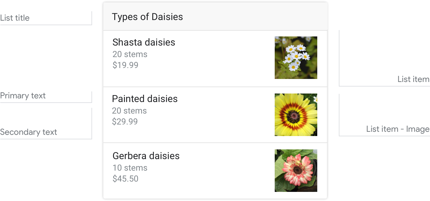
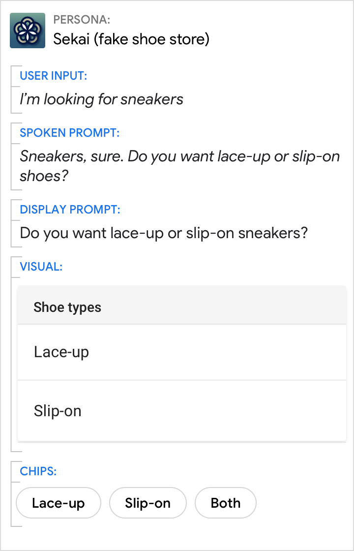
Here’s an example of what a list looks like when all required and optional fields are completed.
Requirements
This visual component currently supports customization.
| Field name | Required? | Restrictions/Customizations |
|---|---|---|
| List title | No |
|
| Primary text | Yes |
|
|
Secondary text
Also called body or formatted text. |
No |
|
| Item image | No |
|
Number of items
- Maximum: 10
- Minimum: 2
Consistency
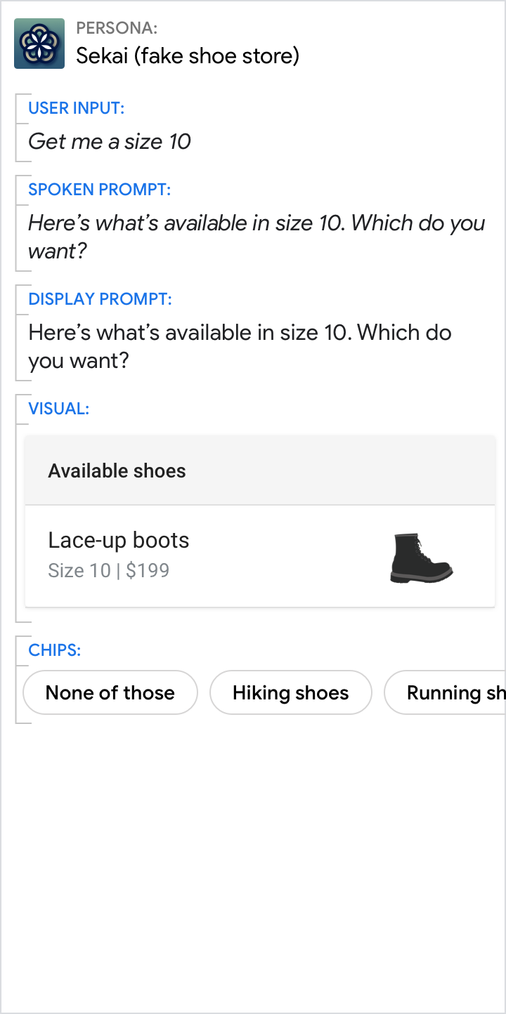
All items in a carousel must include the same fields—e.g., if one item includes an image, then all items in the carousel must include images.
Interactivity
- Swipe: Slide the carousel to reveal different cards.
- Tap: When users tap an item, the item’s title is accepted as the user input, starting the next turn in the dialog.
- Voice/Keyboard: Replying with the card title is the same as selecting that item.
Guidance
Lists are mostly used for browsing and selecting among titles. Though you can have as few as 2 and as many as 30 list items, we recommend that you use between 2 and 10.
Use lists to help the user select from content that:
- can be most meaningfully browsed via scanning short titles or descriptions (e.g., song titles, contact names, event names, session topics)
- the user may have to scan and compare while browsing (e.g. stock prices)
Use titles that are unique and conversation friendly.
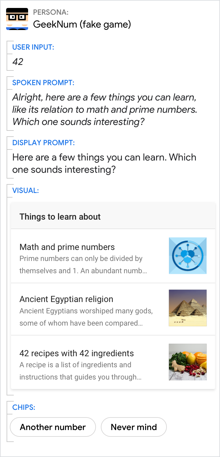
Do.
Each item title should be as short as possible while staying distinct from the other items.

Don't.
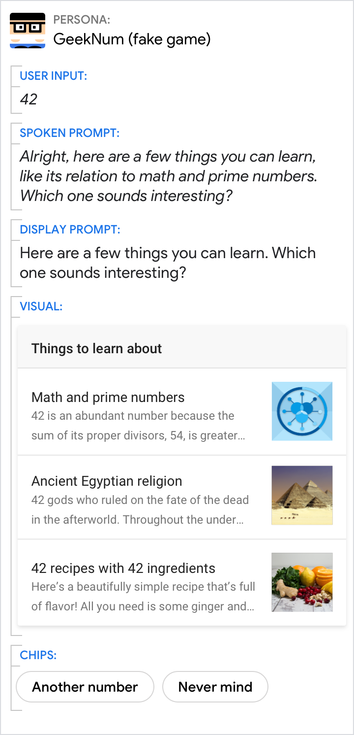
Don’t repeat words or phrases across titles, e.g., “42 and its relation to…”. They don’t help uniquely identify the item, and the title will be too long to fit on the screen.
Keep descriptions concise by only including helpful, relevant information.

Do.
List item descriptions should only contain information that differentiates them from each other and is relevant within the context of the user’s request of your Action.
Don't.
Avoid presenting irrelevant information in your list item descriptions; this takes valuable space away from information the user actually needs to make a choice.
If your list only has 2 items, consider whether a simple either/or question is sufficient to help the user make their decision.
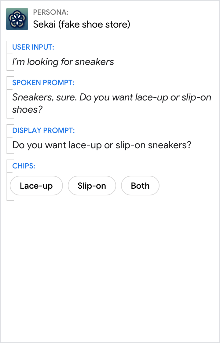
Do.
If you’re only presenting two options, simply asking the question may be the best way to help the user make a decision.
Don't.
In this case, visuals aren’t necessary to present the important information. Chips will help the user respond if they need suggestions.
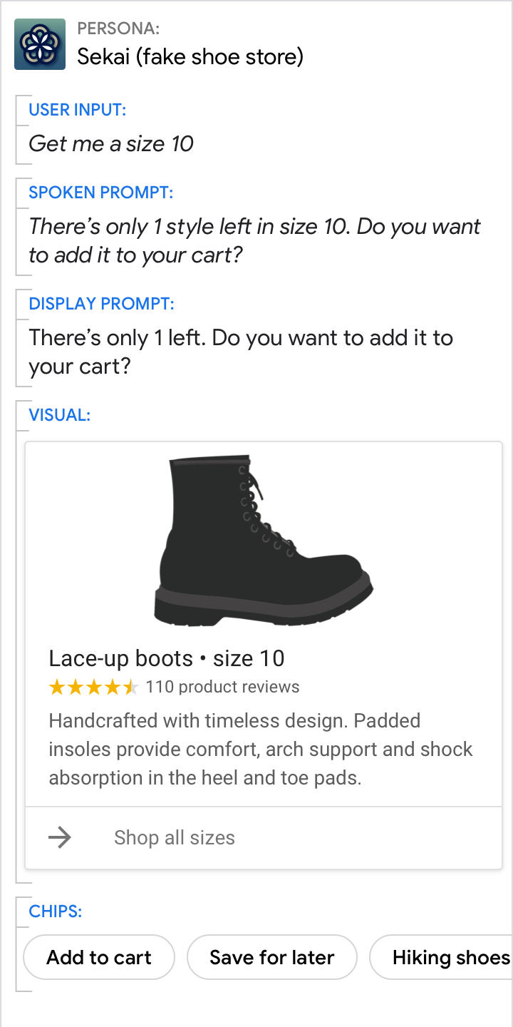
Avoid lists of 1 item.
Do.
Instead of a 1-item list, present the user with more information on the 1 option that’s available to them.
Don't.
Don’t make the user choose when there’s only 1 option.