
Language
Focus on the user.
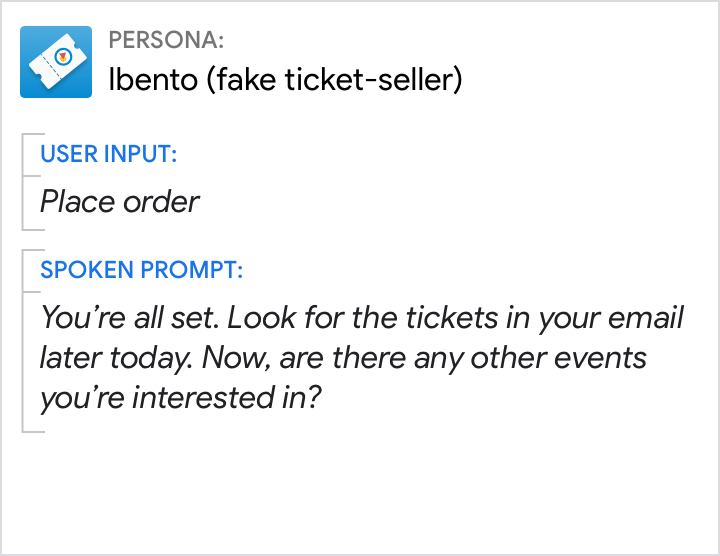
Do.
Focus on the user.
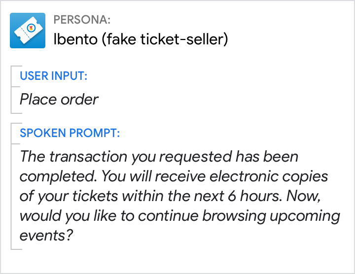
Don't.
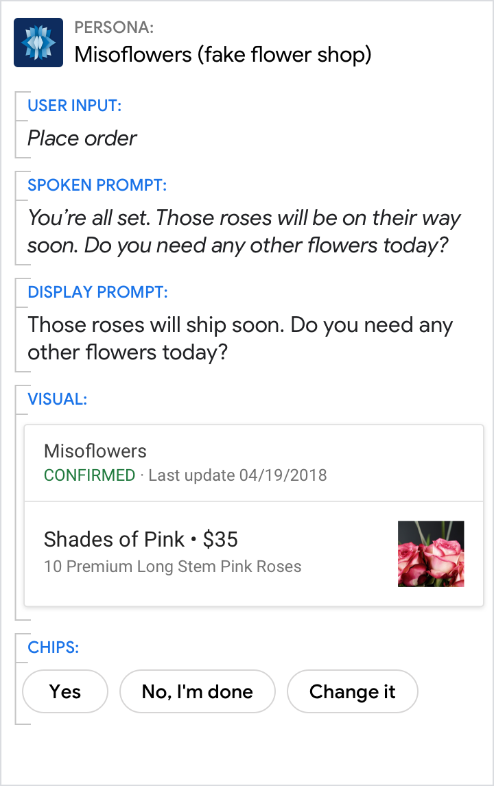
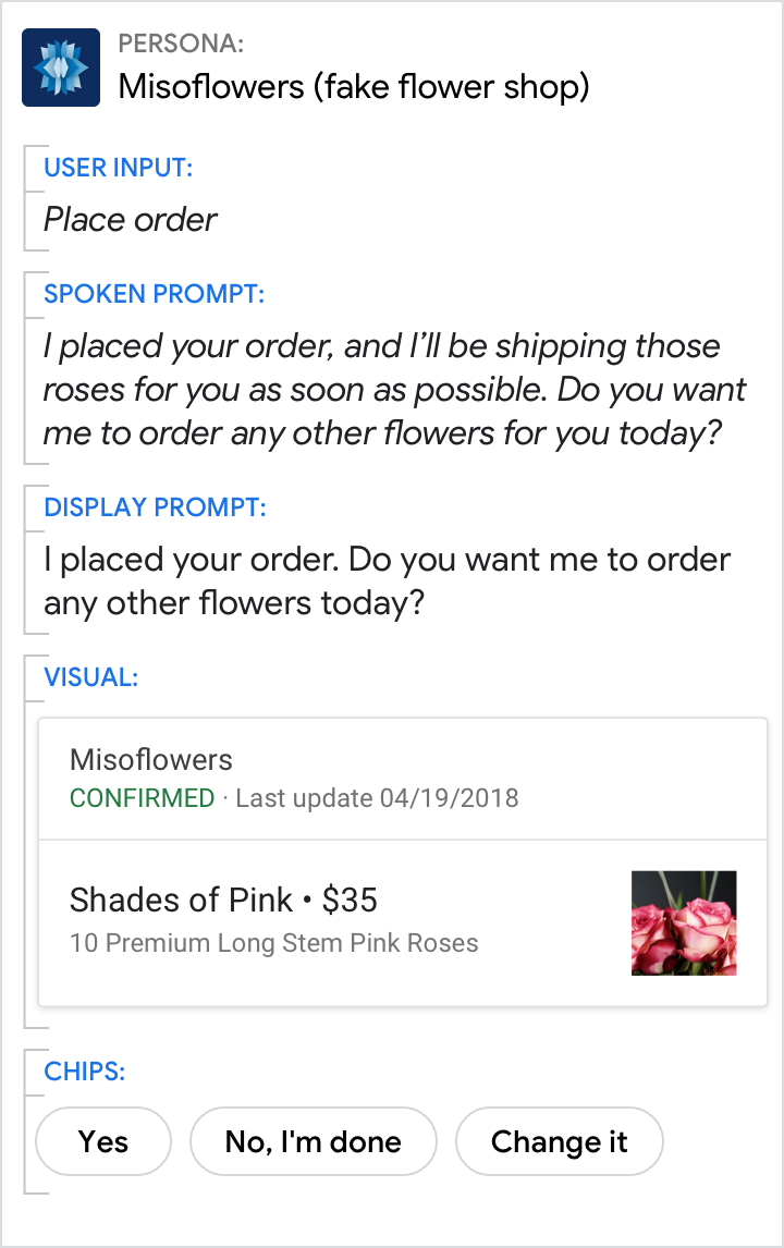
Don't place unnecessary focus on the persona.
Don't launch into monologues
Do.
Don't.
Use short, simple words.
Do.
Use everyday language and shorter terms that are accessible to all reading levels.
Don't.
Avoid technical jargon and sophisticated language.
Avoid jargon and legalese.
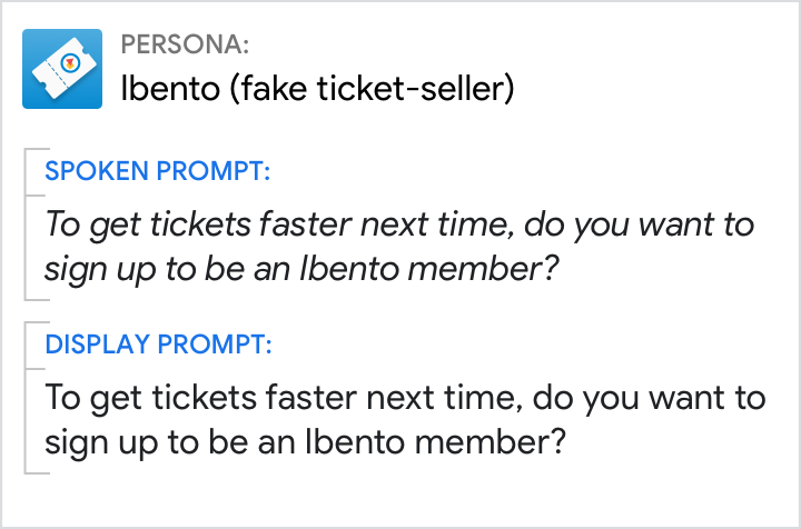
Do.
Use common terminology that is familiar to most people (like "sign up as a member").
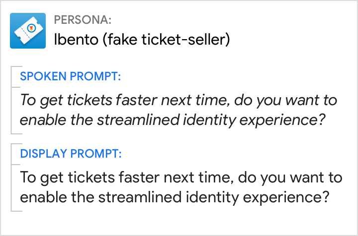
Don't.
Don’t use ambiguous or jargon-specific terms (like "streamlined identity experience").
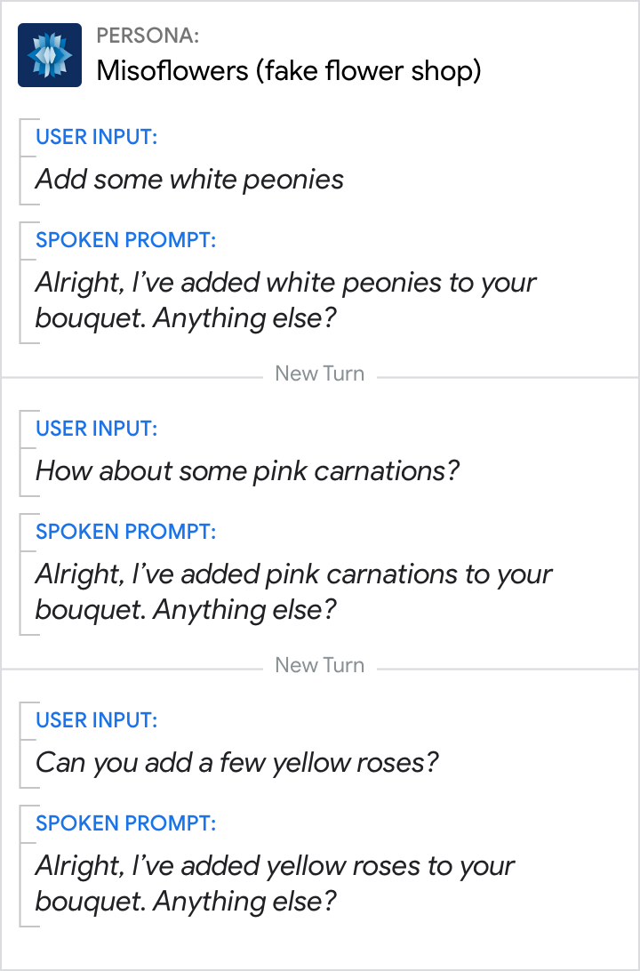
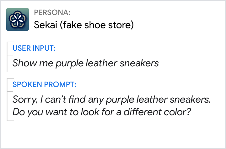
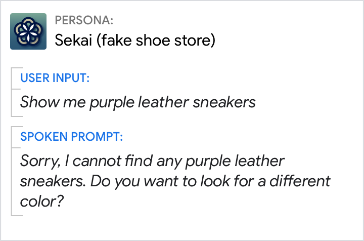
Randomize prompts when appropriate.
Do.
For added variety, mix up similar responses.
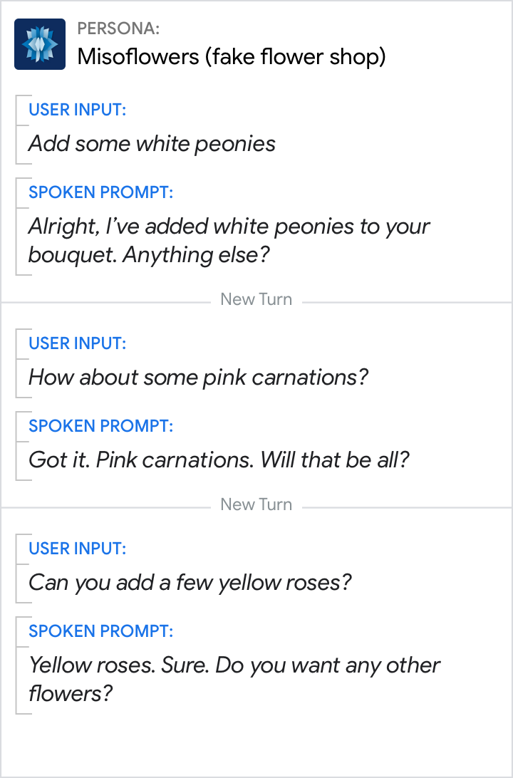
Don't.
Don’t loop the the same response.
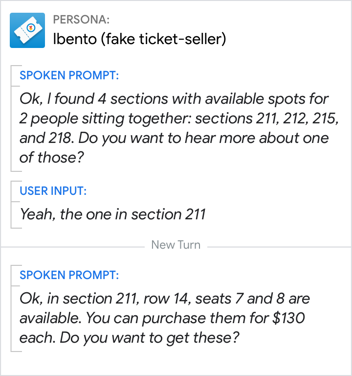
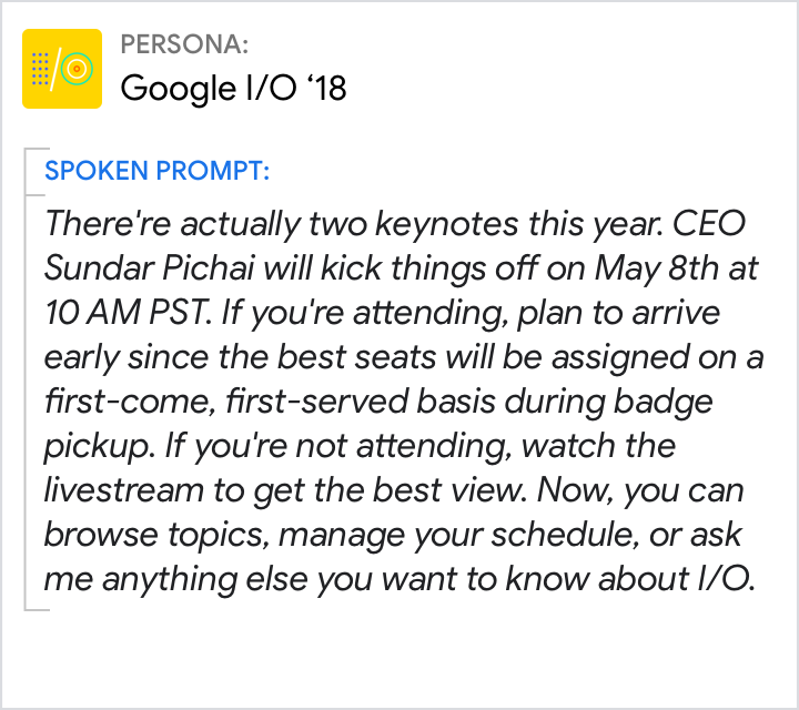
Lead with benefits.

Do.
Provide clear motivation for any actions you want the user to take. Tell the user why they might want to do something before telling them how to do it.
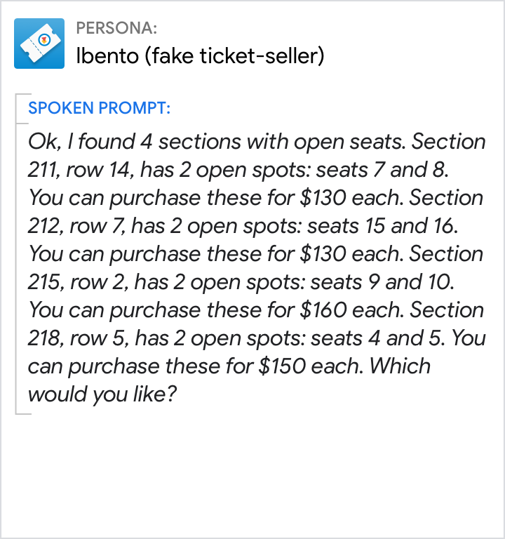
Don't.
Starting a sentence with the action (e.g., arrive early) makes it more likely that the user will forget it by the time they learn why they should take action (e.g., to get the best seat).
Avoid niceties.
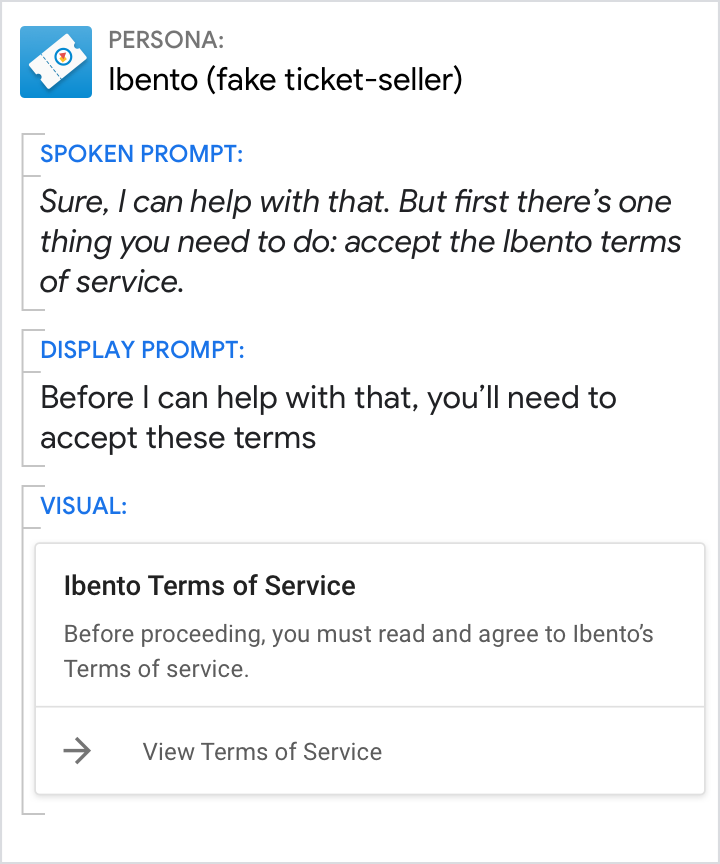
Do.
Use a friendly and familiar tone.
Don't.
Don’t respond in an overly formal manner.
Use contractions.
Do.
Use a friendly and familiar tone.
Don't.
Without contractions, the persona’s response sounds stilted and robotic.
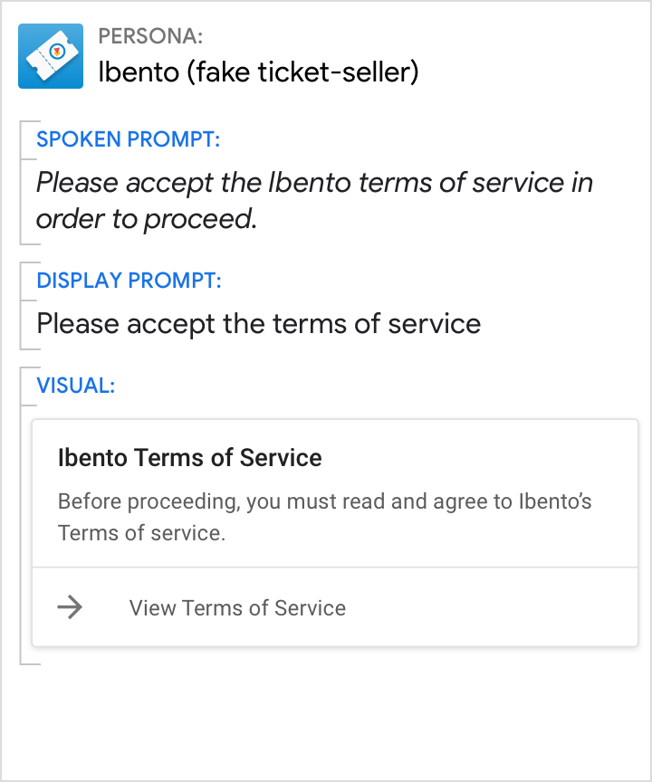
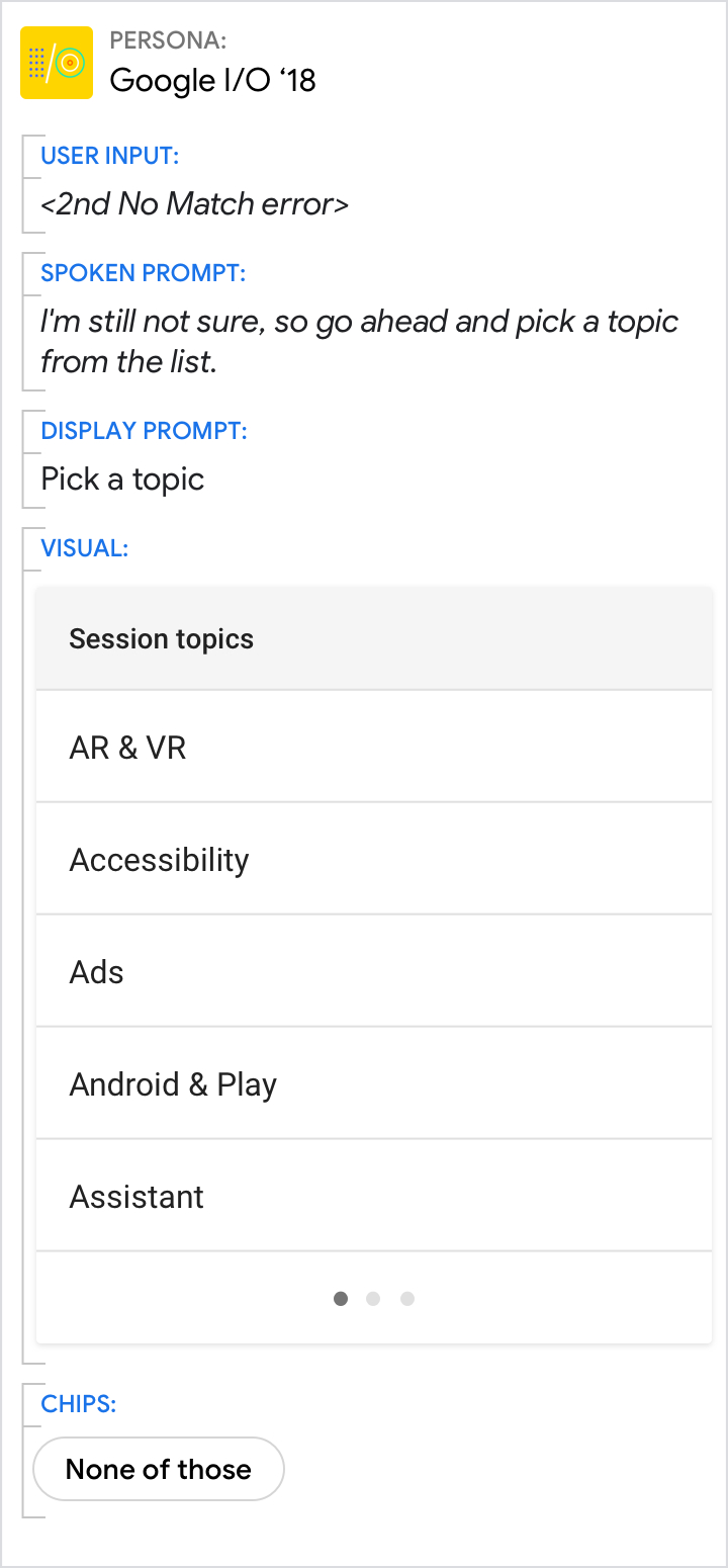
Don't provide UI-specific directions.
Do.
Action-specific directions like “pick” “select” or “choose” future-proof the copy.
Don't.
UI-specific directions like “tap” “scroll” “swipe” or “drag” become outdated over time.