
Page Summary
-
Use Air Quality API data to enhance place search experiences by providing real-time and historical air quality information globally and locally.
-
Display air quality data early in the search experience on location pins using color codes and detailed information on selection, or as a heatmap layer for a broad overview.
-
Tailor the level of air quality information displayed to your users' needs, considering factors like AQI, pollutants, and health recommendations.
-
Be mindful of API usage and costs associated with queries for location data, air quality data, and heatmap tiles.
-
Leverage the Air Quality API to improve user experience by enabling informed decisions about places to visit based on air quality conditions.
In this document, you will look into how to use Air Quality API to build rich place search experiences. We will show how air quality can be a signal of value for users from the very beginning until the end of the funnel and how Air Quality API data can be embedded into existing experiences.
Use Cases and added value
Air Quality API signals can fit into various search experiences such as when users are looking for a location to visit. Air Quality API offers:
- Real time * and historical data - fresh, accurate data that represents the current state as well as back in time data within a 30 days window in an hourly resolution. (* an hourly snapshot of outdoor air quality)
- Global and local data - covering entire areas in 100+ countries yet highly localized (up to 500m) Air Quality API data provides key signals for users to compare and make decisions on the most appropriate place.
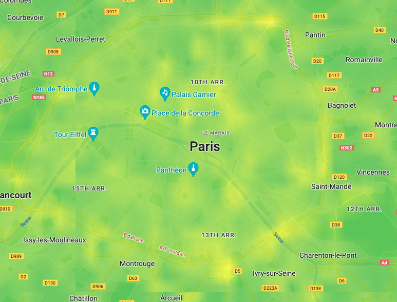
Air quality can be drastically different even for near locations
Sample Walkthrough
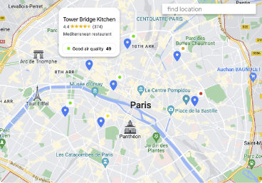
Show air quality data early in the experience
There are two main ways to show the Air Quality API data:
Current conditions / hourly: get individual values to display against each location.
(go to section: Display Air Quality API data on location pins)Heatmap tiles: overlay a a colored layer representing current outdoor air quality conditions on top of your map. Country specific layers indexes are available.
(go to section: Display Air Quality API heatmap layer on a map)
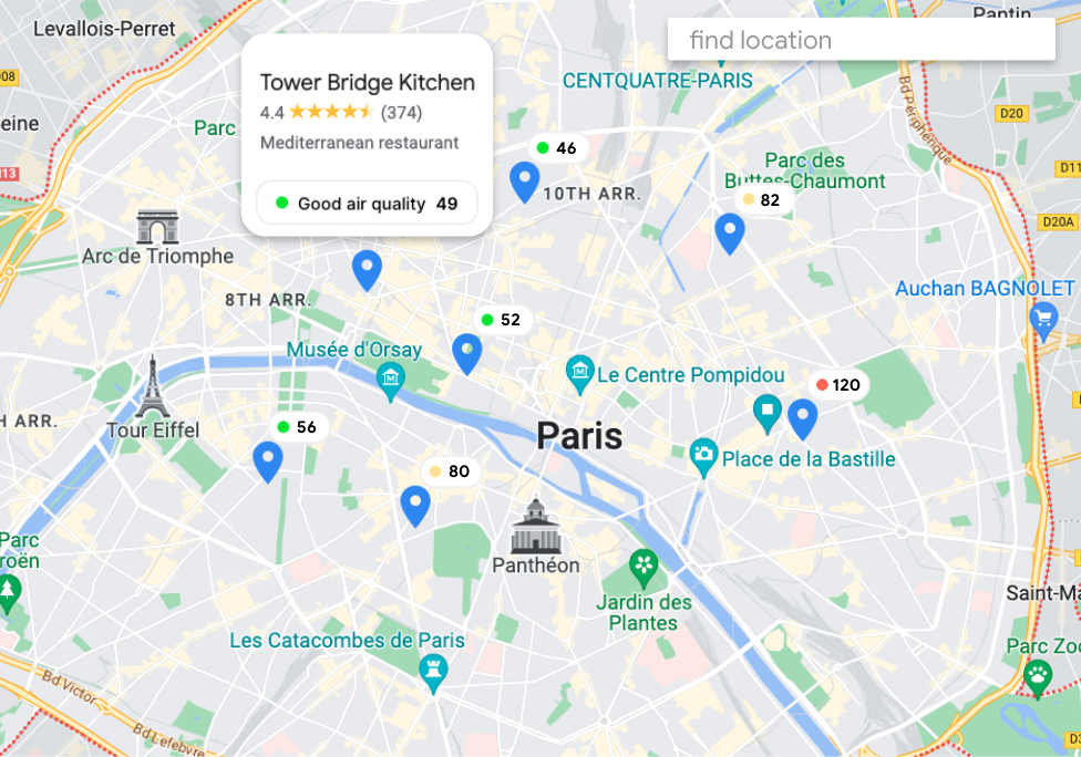
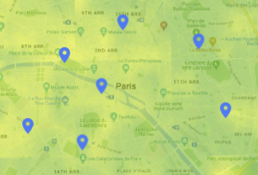
Display Air Quality API data on location pins
- Choose your location index: Universal AQI or a Local AQI (up to 70 different Air Quality Indexes (AQI) are available). An air quality index (AQI) is the scale by which a certain country, for example, the U.S. EPA, categorizes different air quality levels, based on different calculation methods, data sources, and designated purposes.
- Start visualizing the main Air Quality API value and color code straight from the place search experience.
default display could include the color code only.
Display more Air Quality API information on pin selection:
- Universal AQI / Local AQI meaning.
- Pollutant levels, which are a measure of particles and gasses in the air: Dominant pollutant, Concentration, Sources & Effects.
- Health recommendations, which are recommended actions for current air quality conditions.
- You can adjust the level of information displayed by default to serve your needs. Keep in mind that data points for a location are often useful in comparison to other locations.
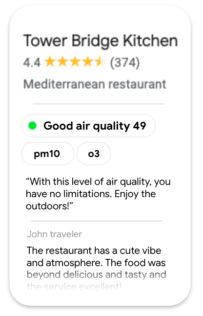
Air quality section display example
- Alternatively, you can query Air Quality data only on interaction with a location.

- You can use Air Quality API index to filter nearby places, ie.: if you are looking for parks in your area, you will show only parks with good air quality.
Air Quality Response
...
"color":{
  "red": 0.9490196,
  "green": 0.98039216,
  "blue": 0.019607844
}
...
  var red = parseInt(colorResponse.red*255)|| 1;
  var green = parseInt(colorResponse.green*255)|| 1;
  var blue = parseInt(colorResponse.blue*255)|| 1;
  // --> output rgb(241,250,5)
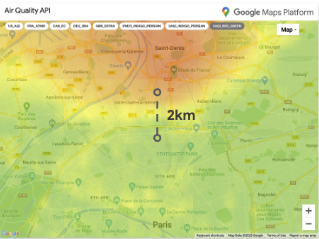
Display Air Quality API heatmap layer on a map
Heatmap colored tiles are a great way:
- to provide a large area overview.
- to quickly show nuances within that area.
Use the Maps JavaScript API with the ImateMapType to display the individual tiles needed to cover the entire viewport of your Google map. Heatmap tiles will refresh as user engage with the map by panning, zooming or changing location.
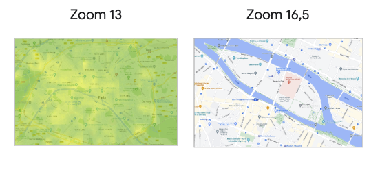
Keep in mind the allowed zoom level value are up to 16.
The Air Quality API heatmap tile layer might disappear at hyperlocal search.
You can select Heatmap map Types within a limited set of Air Quality Indexes:
Make sure you indicate the color scale for users to understand the value and its color ranking:
- gradient scale UAQI (0-100):
Poor / Excellent

Color palette CSS code snippet:
.gradient-scale {
background: linear-gradient(to right,
    rgb(99, 20, 161) 0%, /* purple */
    rgb(149, 0, 25) 20%, /* red */
    rgb(248, 47, 21) 40%, /* orange */
    rgb(255, 248, 35) 60%, /* yellow */
    rgb(34,163,120) 80%, /* steelblue */
    rgb(255,255,255) 100% /* white */
   );
}
- solid colors to represent key point in UAQI (0-100) scale:
Poor / Excellent

Queries count and cost associated
- Maps JavaScript API: 1 map at load of the experience.
- Air Quality API:
- 1 query every place (all on map load or only on user selection).
- Heatmap tile layer: every tile image is 256*256px and to cover a standard map presented on a mobile device or web you need 12-14 tiles. Each tile pulled is counted as 1 SKU unit.
- Nearby Search (New) API: 1 query every 20 places displayed. Different billing according to Place data that are part of the query response.
Conclusion
We showed that Air Quality API can be an important data point for users to decide on a place to visit. Therefore, the Air Quality data should be visible the earliest possible in the search experience with care to the amount of information displayed at once and how it is made visible.
Next Actions
Suggested Further Reading:
- Improve local discovery with Nearby Search (New) API
- See your data in real time with Data-driven styling
Contributors
Google maintains this article. The following contributors originally wrote it.
Principal author:
Thomas Anglaret | Solutions Engineer