Visualizations help you interpret the model's inference and understand the performance of the media channels according to the model.
Meridian provides several ways to view the model results visualization:
Generate a two-page HTML report with a custom time range that can be exported to your Google drive.
Generate a model results summary to customize your own reports, visualizations, or export them to another format. These numerical summaries of your media metrics let you access more detail.
Plot media visualizations. These let you create customized plots, some of which are not available in the standard HTML output. For example, you can plot specific channels, change or delete the credible interval, add Adstock decay, and add Hill saturation curves.
Model fit charts
Model fit charts measure statistical goodness of fit and are only generated as part of the two-page HTML output.
These charts facilitate the assessment of the model's performance and assist in determining whether the model is under-fitted.
Example output: (Click the image to enlarge.)
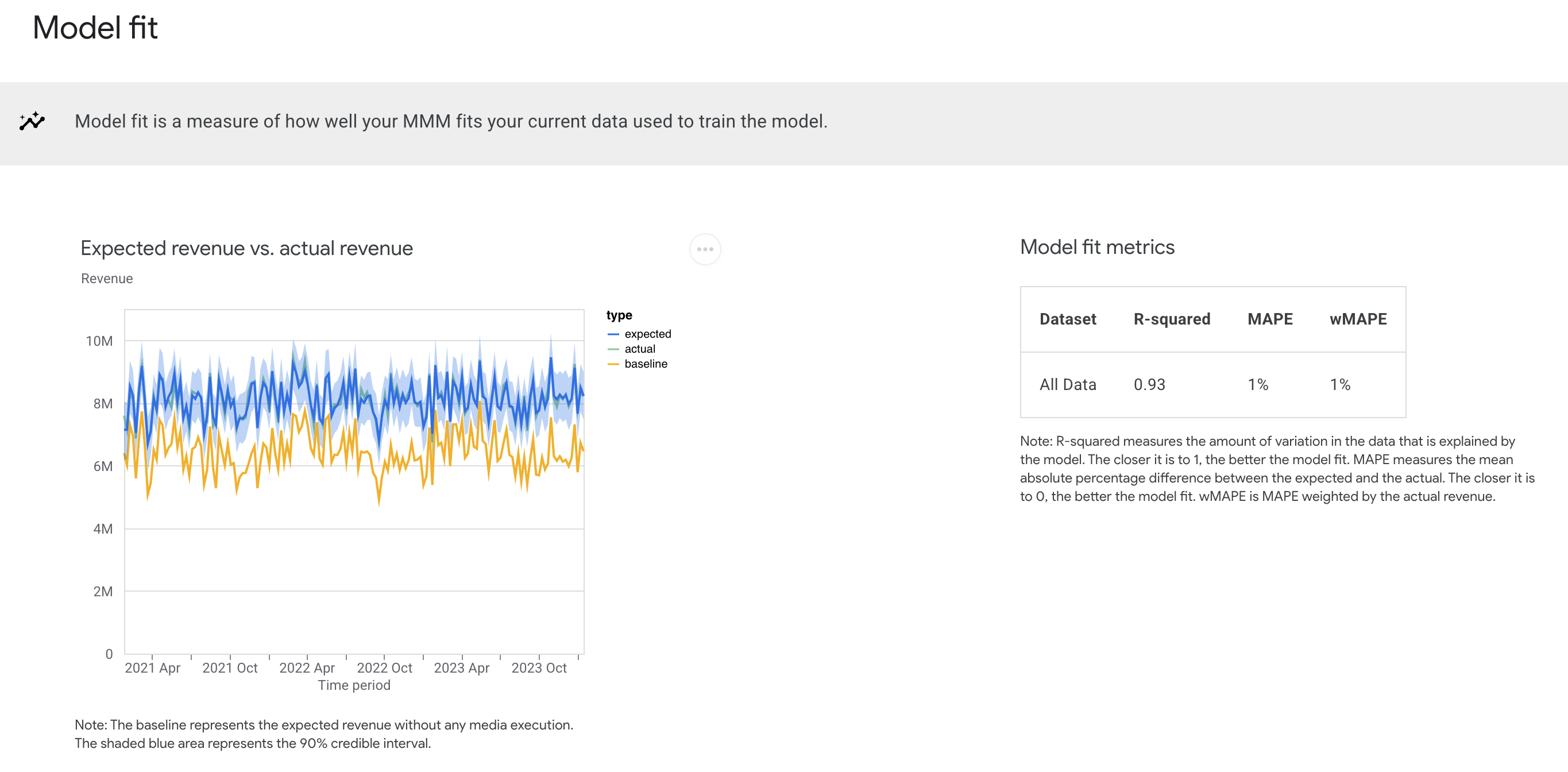

The Expected revenue vs actual revenue chart compares predicted or expected revenue (or KPI) to actual revenue (or KPI) figures. The gold line shows the revenue without media effects. The blue and the green lines respectively represent the expected revenue and actual revenue. (Expected revenue is the posterior mean.) The closer that the blue and green lines match, the better the model fit.
The Model fit metrics table shows metrics for all of the following types:
R-squared: Measure the amount of variation in the data that is explained by the model. The closer the value is to 1, the more accurate the model is.
Mean Absolute Percentage Error (MAPE): Measures the mean absolute percentage difference between the expected and the actual. The closer the value is to 0, the more accurate the model is.
Weighted Mean Absolute Percentage Error (wMAPE): This measurement is weighted by the actual revenue. Weighted is generally preferred over unweighted because it is less influenced by geos and weeks with relatively small revenue. For more information, see wMAPE.
Model fit statistics can also be useful for comparing candidate models. However, keep in mind that goodness of fit metrics don't give a complete picture of how good a model is for causal inference, and it might likely be the case that the best model for causal inference is different from the best model for prediction.
Channel contribution charts
Channel contributions charts help you understand what drove your revenue.
Example output: (Click the image to enlarge.)
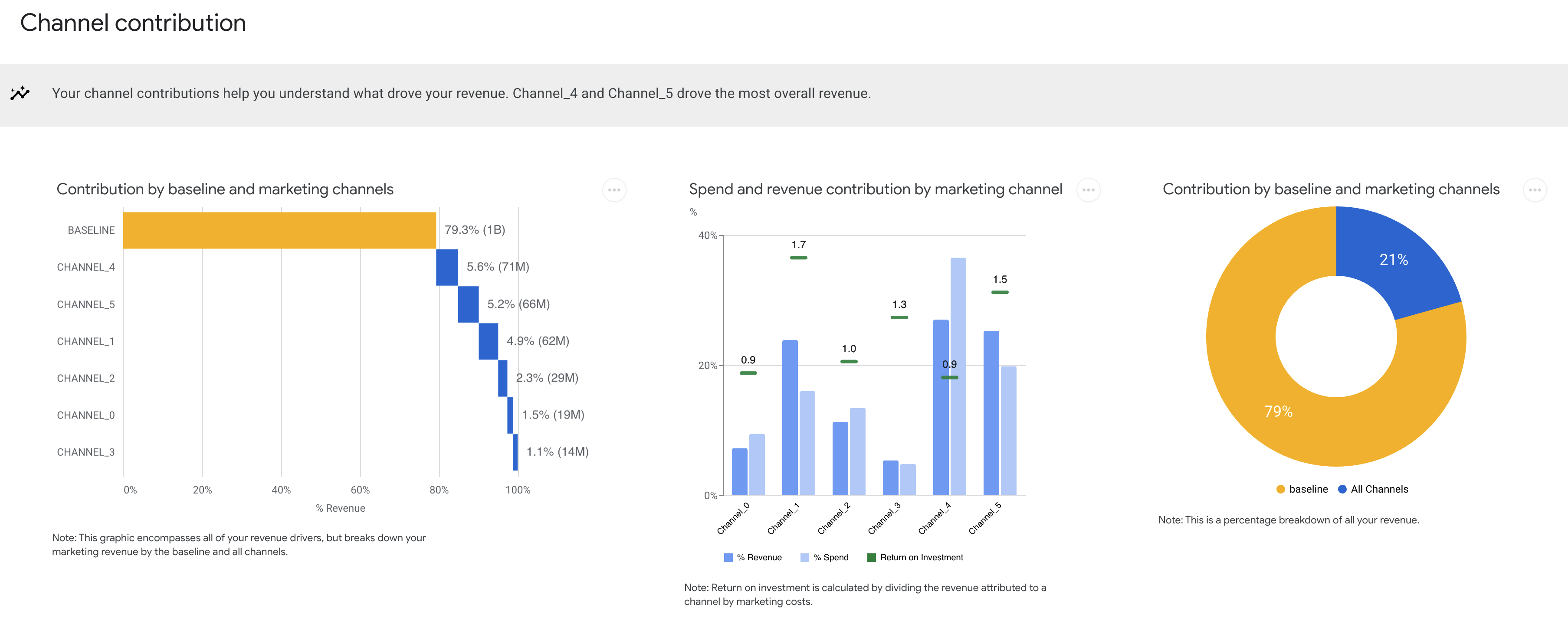

Baseline and marketing contribution charts
The baseline and marketing contribution measurements consist of two charts:
Contribution waterfall chart: This chart shows incremental revenue or KPI contributions for each individual marketing channel.
Contribution pie chart: This chart (on the far right above) shows the total combined percentage of marketing channel contributions compared to the percentage of the baseline contribution to the total expected revenue or KPI.
Use these charts to understand the overall financial impact of your combined marketing strategies and tactics versus the baseline.
Baseline is what would have happened, such as for your brand or product line, in the absence of any marketing channel contributions. Any company expects to have some sales in the absence of marketing. Some brands expect to see more than others due to factors such as previously established brand recognition and seasonal demand patterns.
Estimating baseline revenue or KPI helps put media contributions into perspective and drive actionable marketing decisions. For example, you might see that the rise in your overall sales was due to a 12% contribution from TV ads, which can help justify the ad spend and marketing plan.
Spend and revenue contribution
The Spend and revenue contribution chart shows each channel's percent of media spend and the percent of contribution to the total incremental revenue or KPI. The green bars highlight each channel's return on investment (ROI), indicating the efficiency of the channel spend.
This chart gives a high level overview of relative channel size and performance. You can gain deeper insights from ROI and marginal ROI plots, and explore the budget optimizer for allocation strategy recommendations.
ROI charts
The return on investment (ROI) charts help you understand how your marketing activities impacted your business objectives. ROI is defined as incremental outcome per dollar spent. CPIK is defined as cost per incremental outcome. For more information, see Incremental outcome definition.
If you generate these as plots, you can customize or disable the credible interval and adjust the circle sizes.
Comparing ROI, marginal ROI, effectiveness, and CPIK across channels provides a deep, holistic view channel performance.
Example output: (Click the image to enlarge.)


ROI by channel: Compares the ROI between channels.
CPIK by channel: Compares the CPIK between channels.
Both the ROI by channel chart and the CPIK by channel chart can be customized to change or remove the default credible interval.
ROI vs. effectiveness: Compares each channel's ROI against the channel's effectiveness. Effectiveness is defined as incremental revenue per media unit (impression). High ROI does not necessarily imply high effectiveness. Conversely, low spend does not necessarily imply low effectiveness.
ROI vs. marginal ROI: Compares the ROI to marginal return on investment (mROI), where mROI is the predictive return on investment from an additional unit spent.
mROI is an indicator of the efficiency of additional spend. For example, channels with high ROI but low mROI are likely in the saturation phase. So any additional investment won't likely bring in the return that the initial investments did. Conversely, channels with high ROI and high mROI perform well and will likely continue to yield high returns with additional spending.
Response curves
Response curves help visualize the cause-and-effect relationships between marketing activities and business results. By understanding historical relationships between marketing efforts and sales through response curves, you can estimate performance for different levels of media spend.
If you plot this information, you can customize it to display as independent plots, together as one plot, or show only the top channels based on spend. You can also hide the credible interval.
Example output:

These are aggregate channel-level response curves, where the x-axis represents total spend over all geos and time periods used to train the model, and the y-axis represents the expected incremental revenue that would hypothetically be generated. Media units in each geo and time period are scaled proportional to the total spend and allocated according to the historical flighting pattern across geos and time periods.
Meridian response curves show your current spend level and where you start to see diminishing returns on the spending per channel. This gives an additional perspective to help reduce the risk of overspending. For example, if you have a channel with high ROI, but the response curve shows that it is saturated or near saturation (such as low marginal ROI), you can consider reallocating some of that budget to a high performing channel that is still well below saturation.
It's important to be judicious when you interpret the response curves beyond the range of the available historical media data. For example, say the media execution for a particular channel is concentrated at a specific level across different geographies and time periods. In this case, there isn't an observation for what happens when media execution is significantly higher or lower than that level. Instead, such inferences are based on extrapolating the relationships observed within the available range beyond that range.
Adstock decay curves
You can plot the Adstock decay visualization. This visualization isn't included with the generated two-page HTML output.
These curves show the decay rate of the media effects, with the monotonic Adstock decay that Meridian uses having the peak effect on the first day. If the posterior is higher than the prior, then the effects of running an ad on that media channel last longer than was assumed.
Example output: (Click the image to enlarge.)


The Adstock decay method accounts for lagged effect (carryover), which is the delayed impact of advertising on sales. Consumers don't necessarily purchase the product right after they see the ad, creating a lagged effect.
These plots help you:
Understand how much the data (versus the prior) impacted Meridian's estimate on carryover effects.
Understand how the chosen adstock decay function (geometric or binomial) impacted Meridian's estimate on longer term effect.
Determine if
max_lagneeds to be increased or decreased.Generate hypotheses for strategies on when and how frequently to allocate a channel's spend across time.
Hill saturation curves
You can plot the Hill saturation visualization. This visualization isn't included with the generated two-page HTML output.
These curves asymptote to 1 as the media units (often impressions) per capita goes to infinity, and show the effect of media units per capita relative to this asymptote. A Hill curve is used to show the saturation (reduced effectiveness).
Example output: (Click the image to enlarge.)
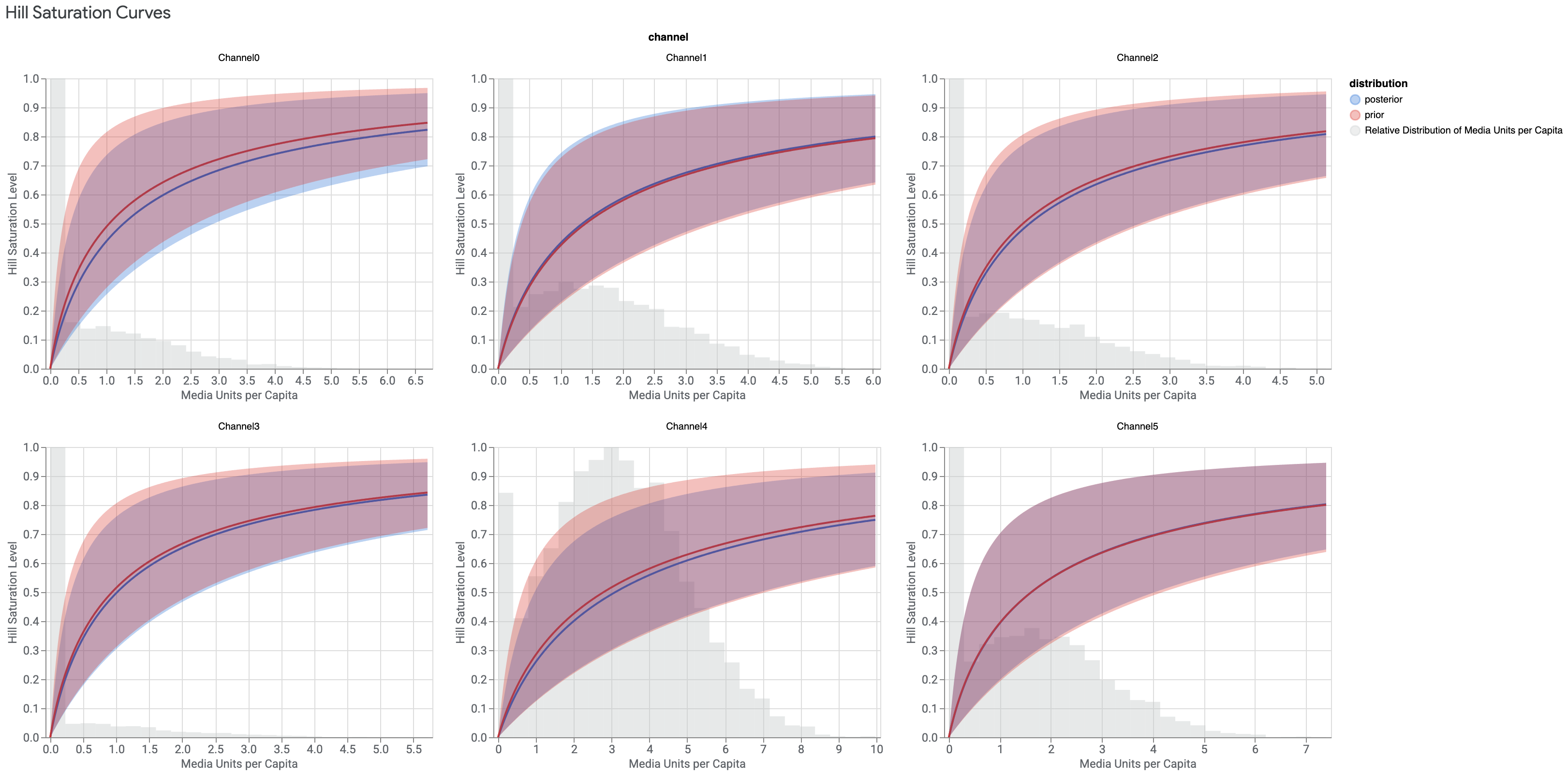

The Hill curve captures a mathematical relationship between the KPI and the average weekly media units (often impressions) per capita. A non-linear relationship is assumed to capture granular level marketing psychology phenomena, such as consumers seeing the same ad repeatedly.
This graph also displays the histogram of media units (such as impressions), per capita across all geos and time periods. This lets you visualize how frequently and to what extent your historical media execution was over- or under-saturated at a granular level. Keep in mind that small and large geos are equally represented in this histogram, and it can be worthwhile digging more deeply into your raw data to understand what might be driving particular outliers or patterns.
The histogram can also be helpful for developing an informed point of view about how much to trust inference at various points on the Hill curve. The Hill curve is a parametric function that can be used to estimate the media effect above or below where historical media execution is concentrated (also called extrapolation). For example, some channels are always on (the media execution is never at zero) and so there is no data for the Hill curve at or near zero.
Ideally, you would use data, rather than parametric extrapolation, to inform every point on the diminishing response curve, but this is not possible. User discretion is required to understand the degree of extrapolation inherent in the results and to determine an acceptable level when making decisions for your business. Apply similar discretion when reading the response curves.
