Optimizations help guide how to allocate the budget for the next period. Meridian provides several ways to view the budget optimizations:
-
Fixed budget scenario: Helps you find the optimal allocation across channels for a given budget to maximize the overall ROI.
Flexible budget scenario with target ROI: Helps maximize your total incremental revenue while also maintaining a target minimum overall ROI.
Flexible budget scenario with target marginal ROI: Helps determine the maximum amount you can spend on each channel and while still achieving a target minimum marginal ROI on each channel.
Calculate optimal frequency for channels that utilize reach and frequency data.
Generate a two-page optimization HTML report with a custom time range that can be exported to your Google drive.
Generate an optimization results summary to customize your own reports, visualizations, or export them to another format. These numerical summaries let you access more detail, breaking down the results by channel so you can compare the optimized and non-optimized results.
Plot optimization visualizations to compare scenarios with customized constraints, budgets, data, and channel names.
Optimization scenario summary
The Optimization scenario summary table is displayed in the HTML output only. It shows a macro-level comparison of the current (non-optimized) and optimized budget, ROI, and incremental revenue or KPI for the scenario type you configured. Additionally, this section shows the constraints you specified on spending at the channel level and the benchmark time period for budget optimization.
The following example shows the estimated results from a fixed budget optimization scenario. In this case, there is no significant change between the current ROI and optimized ROI. In general, the optimized ROI will always be at least as high as the current ROI.
(Click the image to enlarge.)


Change in optimized spend for each channel
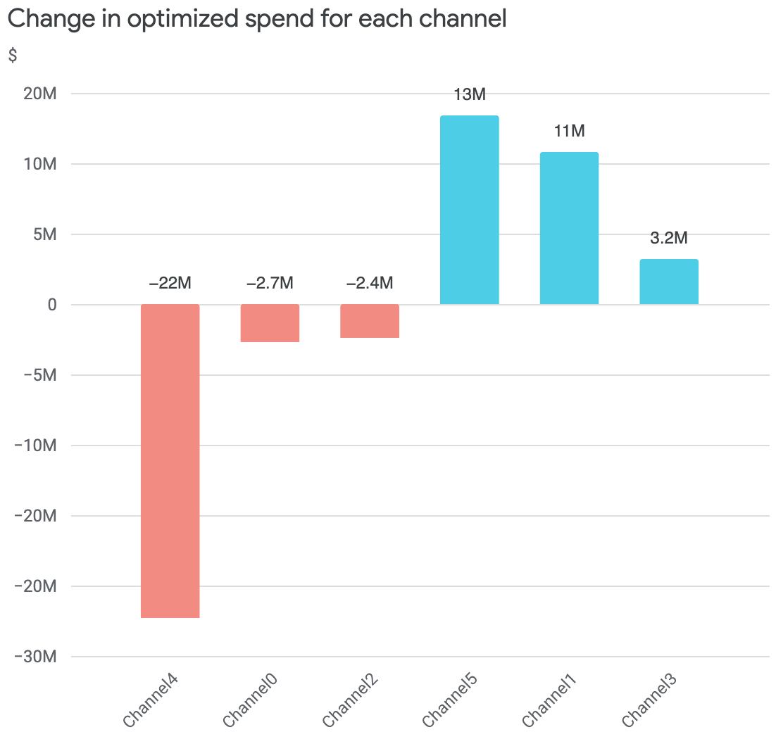
This chart shows the budget optimization recommended spend change by channel. Change is defined as the difference between optimized and current spend.
The following example is for a fixed budget optimization, so the net budget change is zero.
Optimized budget allocation
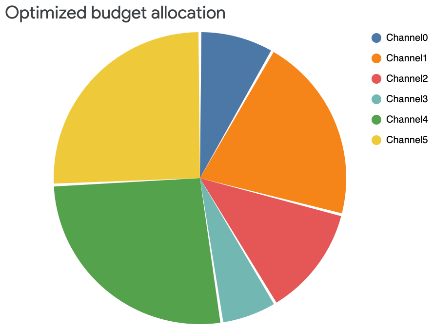
The Optimized budget allocation table compares the percent of spend on each channel between the non-optimized and optimized budget scenarios. This helps you identify actionable budget changes for each channel based on the optimized budget scenario.

The corresponding pie chart shows only the optimized spend allocation from the Optimized budget allocation table. In the following example you can see that approximately half of the overall optimized budget is allocated to channel 4 and channel 5. It’s another way of looking at the optimized budget allocation.
Optimized incremental revenue across all channels
The Optimized incremental revenue across all channels chart shows the estimated impact of each channel under the optimal budget allocation, and the impact difference associated with moving from the historical to the optimal budget allocation.
The visualization shows the current incremental revenue or KPI on the far left side. Then it shows the recommended differences per channel to reach the optimized incremental revenue or KPI on the far right side.
The following example shows that the current revenue is 262 million. You can see that the optimized budget allocation reduces the incremental revenue on some channels, but increases the incremental revenue on other channels, increasing the overall incremental revenue to 267 million.

Optimized budget on response curves
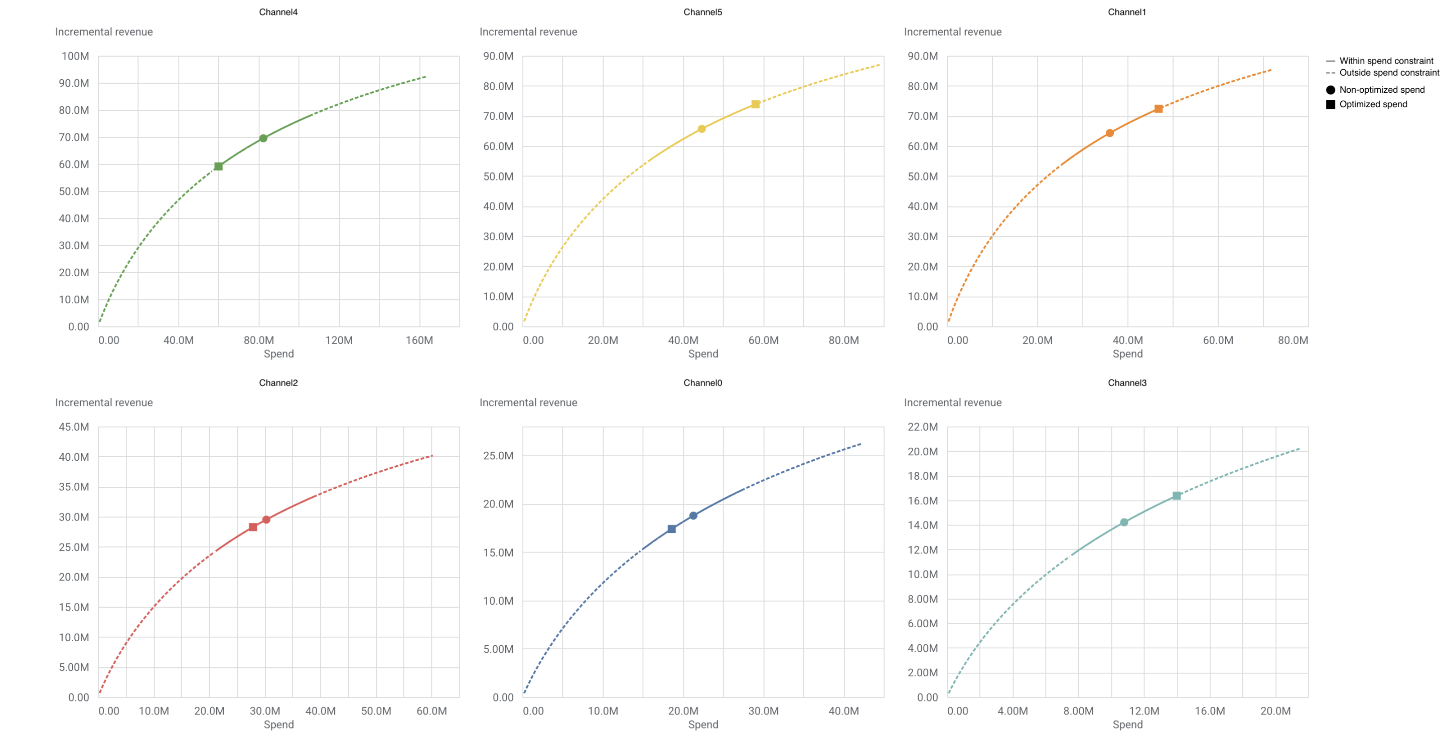
Response curves show incremental revenue as a function of spend. The current and optimal spend levels are plotted as points on this curve. Response curves show how the return per monetary unit spent eventually diminishes, which can further guide budget decisions.
In the response curve charts, the solid line represents the spend constraint bounds that you set for the optimization. The dotted line represents spending outside of the constraints.
The plot also indicates two points:
- The circle represents the current spend level
- The square represents the optimized spend level
(Click the image to enlarge.)

Optimal frequency
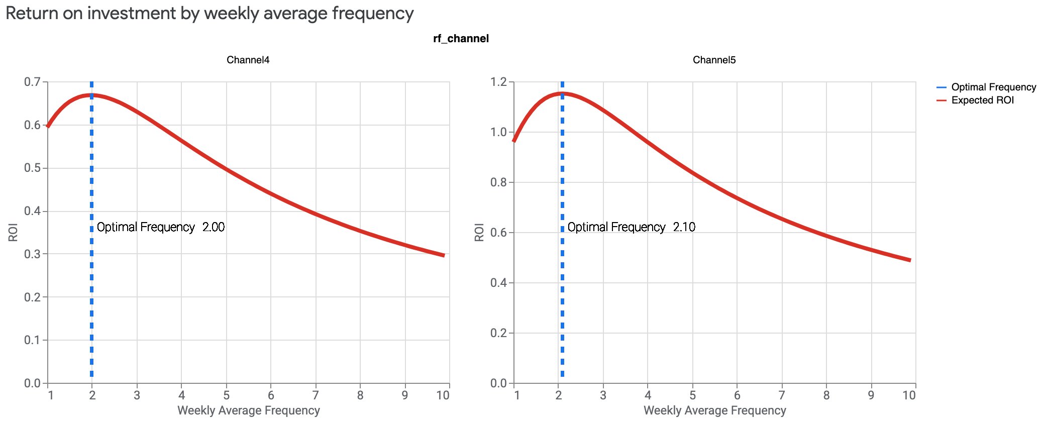
This plot shows ROI as a function of average frequency, assuming this average frequency is applied to all geos and time periods.
Optimal frequency is the average number of times an advertisement should be shown to the target audience for each geo and time period to maximize the ROI. Note that in the Meridian model specification, the optimal frequency does not depend on the budget allocation.
If you have reach and frequency data for one or more media channels, you can generate optimal frequency visualizations.
The following example shows that the optimal frequency on each channel is 2 and 2.1 respectively with a much larger ROI predicted for channel 5.
(Click the image to enlarge.)
