After the model is built, you must assess convergence, debug the model if needed, and then assess the model fit.
Assess convergence
You assess the model convergence to help ensure the integrity of your model.
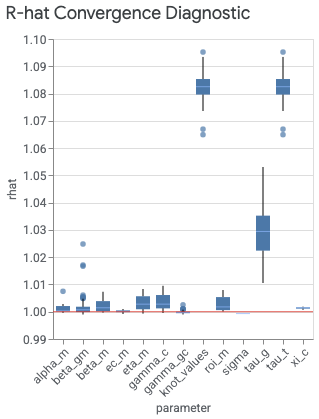
The plot_rhat_boxplot command under visualizer.ModelDiagnostics() summarizes
and calculates the Gelman & Rubin
(1992)
potential scale reduction for chain convergence, commonly referred to as R-hat.
This convergence diagnostic measures the degree to which the variance (of the
means) between the chains exceeds what you would expect if the chains were
identically distributed.
There is a single R-hat value for each model parameter. The box plot summarizes
the distribution of R-hat values across indexes. For example, the box
corresponding to the beta_gm x-axis label summarizes the distribution of R-hat
values across both the geo index g and the channel index m.
Values close to 1.0 indicate convergence. R-hat < 1.2 indicates approximate
convergence and is a reasonable threshold for many problems (Brooks & Gelman,
1998).
A lack of convergence typically has one of two culprits. Either the model is
very poorly misspecified for the data, which can be in the likelihood (model
specification) or in the prior. Or, there is not enough burnin, meaning
n_adapt + n_burnin is not large enough.
If you have difficulty getting convergence, see Getting MCMC convergence.
Generate an R-hat boxplot
Run the following commands to generate an R-hat boxplot:
model_diagnostics = visualizer.ModelDiagnostics(mmm)
model_diagnostics.plot_rhat_boxplot()
Example output:
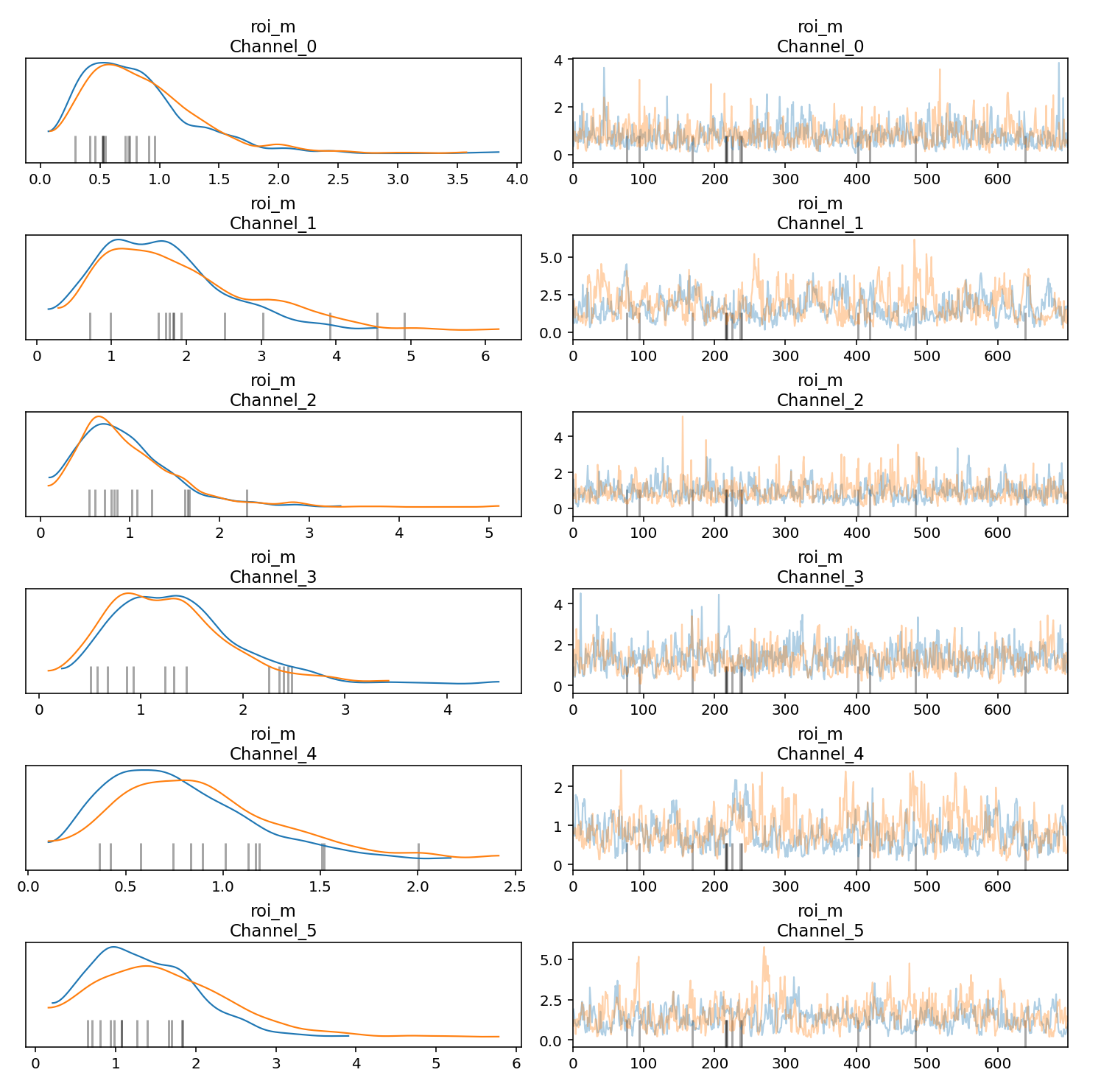
Generate trace and density plots
You can generate trace and density plots for Markov Chain Monte Carlo (MCMC) samples to help assess convergence and stability across chains. Each trace in the trace plot represents the sequence of values generated by the MCMC algorithm as it explores the parameter space. It shows how the algorithm moves through different values of the parameters over successive iterations. In the trace plots, try to avoid flat areas, where the chain stays in the same state for too long or has too many consecutive steps in one direction.
The density plots on the left visualizes the density distribution of sampled values for one or more parameters obtained through the MCMC algorithm. In the density plot, you want to see that the chains have converged to a stable density distribution.
The following example shows how to generate trace and density plots:
parameters_to_plot=["roi_m"]
for params in parameters_to_plot:
  az.plot_trace(
      meridian.inference_data,
      var_names=params,
      compact=False,
      backend_kwargs={"constrained_layout": True},
  )
Example output:
Check prior and posterior distributions
When there is little information in the data, the prior and the posterior will be similar. For more information, see When the posterior is the same as the prior.
Channels with low spend are particularly susceptible to have an ROI posterior similar to the ROI prior. To remediate the issue, we recommend either dropping the channels with very low spend or combining them with other channels when preparing the data for MMM.
Run the following commands to plot the ROI posterior distribution against the ROI prior distribution for each media channel:
model_diagnostics = visualizer.ModelDiagnostics(mmm)
model_diagnostics.plot_prior_and_posterior_distribution()
Example output: (Click the image to enlarge.)

By default, plot_prior_and_posterior_distribution() generates the posterior
and prior for ROI. However, you can pass specific model parameters to
plot_prior_and_posterior_distribution(), as shown in the following example:
model_diagnostics.plot_prior_and_posterior_distribution('beta_m')
Assess model fit
After your model convergence is optimized, assess the model fit. For more information, see Assess the model fit in Post-modeling.
With marketing mix modeling (MMM), you must rely on indirect measures to assess causal inference and look for results that make sense. Two good ways to do this are by:
- Running metrics for R-squared, Mean Absolute Percentage Error (MAPE), and Weighted Mean Absolute Percentage Error (wMAPE)
- Generating plots for expected versus actual revenue or KPI, contingent upon
the
kpi_typeand the availability ofrevenue_per_kpi.
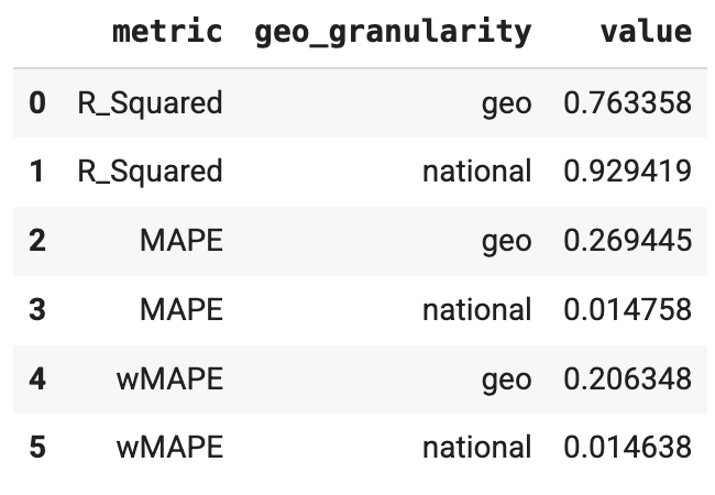
Run R-squared, MAPE, and wMAPE metrics
Goodness of fit metrics can be used as a confidence check that the model
structure is appropriate and not overparameterized. ModelDiagnostics calculate
R-Squared, MAPE, and wMAPE goodness of fit metrics. If holdout_id is set
in Meridian, then R-squared, MAPE and wMAPE are also calculated
for the Train and Test subsets. Be aware that goodness of fit metrics are a
measure of predictive accuracy, which is not typically the goal of an MMM.
However, these metrics still serve as a useful confidence check.
Run the following commands to generate R-squared, MAPE, and wMAPE metrics:
model_diagnostics = visualizer.ModelDiagnostics(mmm)
model_diagnostics.predictive_accuracy_table()
Example output:
Generate expected versus actual plots
Using expected versus actual plots can be helpful as an indirect method to assess the model fit.
National: Expected versus actual plots
You can plot the actual revenue or KPI alongside the model's expected revenue or KPI at the national level to help assess the model fit. Baseline is the model's counterfactual estimation for revenue (or KPI) if there was no media execution. Estimating revenue to be as close to actual revenue as possible isn't necessarily the goal of an MMM, but it does serve as a useful confidence check.
Run the following commands to plot actual revenue (or KPI) versus expected revenue (or KPI) for national data:
model_fit = visualizer.ModelFit(mmm)
model_fit.plot_model_fit()
Example output:

Geo: Expected versus actual plots
You can create the expected versus actual plots at the geo level to access model fit. Because there can be many geos, you might want to only show the largest geos.
Run the following commands to plot actual revenue (or KPI) versus expected revenue (or KPI) for geos:
model_fit = visualizer.ModelFit(mmm)
model_fit.plot_model_fit(n_top_largest_geos=2,
                         show_geo_level=True,
                         include_baseline=False,
                         include_ci=False)
Example output:

After you are satisfied with your model fit, analyze the model results.