Page Summary
-
The simplest splitter algorithm for decision trees uses a threshold on a numerical feature to divide data into two groups, aiming to improve label separation.
-
Information gain, based on Shannon entropy, quantifies the improvement in label separation achieved by a split, with higher values indicating better splits.
-
The algorithm efficiently finds the optimal threshold by sorting feature values and testing midpoints between consecutive values, with a time complexity of O(n log n).
-
Decision tree training with this splitter, applied to each node and feature, has a time complexity of O(m n log² n), where 'm' is the number of features and 'n' is the number of training examples.
-
This algorithm is insensitive to the scale or distribution of feature values, eliminating the need for feature normalization or scaling before training.
In this unit, you'll explore the simplest and most common splitter algorithm, which creates conditions of the form $\mathrm{feature}_i \geq t$ in the following setting:
- Binary classification task
- Without missing values in the examples
- Without precomputed index on the examples
Assume a set of $n$ examples with a numerical feature and a binary label "orange" and "blue". Formally, let's describe the dataset $D$ as:
where:
- $x_i$ is the value of a numerical feature in $\mathbb{R}$ (the set of real numbers).
- $y_i$ is a binary classification label value in {orange, blue}.
Our objective is to find a threshold value $t$ (threshold) such that dividing the examples $D$ into the groups $T(rue)$ and $F(alse)$ according to the $x_i \geq t$ condition improves the separation of the labels; for example, more "orange" examples in $T$ and more "blue" examples in $F$.
Shannon entropy is a measure of disorder. For a binary label:
- Shannon entropy is at a maximum when the labels in the examples are balanced (50% blue and 50% orange).
- Shannon entropy is at a minimum (value zero) when the labels in the examples are pure (100% blue or 100% orange).

Figure 8. Three different entropy levels.
Formally, we want to find a condition that decreases the weighted sum of the entropy of the label distributions in $T$ and $F$. The corresponding score is the information gain, which is the difference between $D$'s entropy and {$T$,$F$} entropy. This difference is called the information gain.
The following figure shows a bad split, in which the entropy remains high and the information gain low:

Figure 9. A bad split does not reduce the entropy of the label.
By contrast, the following figure shows a better split in which the entropy becomes low (and the information gain high):

Figure 10. A good split reduces the entropy of the label.
Formally:
\[\begin{eqnarray} T & = & \{ (x_i,y_i) | (x_i,y_i) \in D \ \textrm{with} \ x_i \ge t \} \\[12pt] F & = & \{ (x_i,y_i) | (x_i,y_i) \in D \ \textrm{with} \ x_i \lt t \} \\[12pt] R(X) & = & \frac{\lvert \{ x | x \in X \ \textrm{and} \ x = \mathrm{pos} \} \rvert}{\lvert X \rvert} \\[12pt] H(X) & = & - p \log p - (1 - p) \log (1-p) \ \textrm{with} \ p = R(X)\\[12pt] IG(D,T,F) & = & H(D) - \frac {\lvert T\rvert} {\lvert D \rvert } H(T) - \frac {\lvert F \rvert} {\lvert D \rvert } H(F) \end{eqnarray}\]
where:
- $IG(D,T,F)$ is the information gain of splitting $D$ into $T$ and $F$.
- $H(X)$ is the entropy of the set of examples $X$.
- $|X|$ is the number of elements in the set $X$.
- $t$ is the threshold value.
- $pos$ is the positive label value, for example, "blue" in the example above. Picking a different label to be the "positive label" does not change the value of the entropy or the information gain.
- $R(X)$ is the ratio of positive label values in examples $X$.
- $D$ is the dataset (as defined earlier in this unit).
In the following example, we consider a binary classification dataset with a single numerical feature $x$. The following figure shows for different threshold $t$ values (x-axis):
- The histogram of the feature $x$.
- The ratio of "blue" examples in the $D$, $T$, and $F$ sets according to the threshold value.
- The entropy in $D$, $T$ and $F$.
- The information gain; that is, the entropy delta between $D$ and {$T$,$F$} weighted by the number of examples.
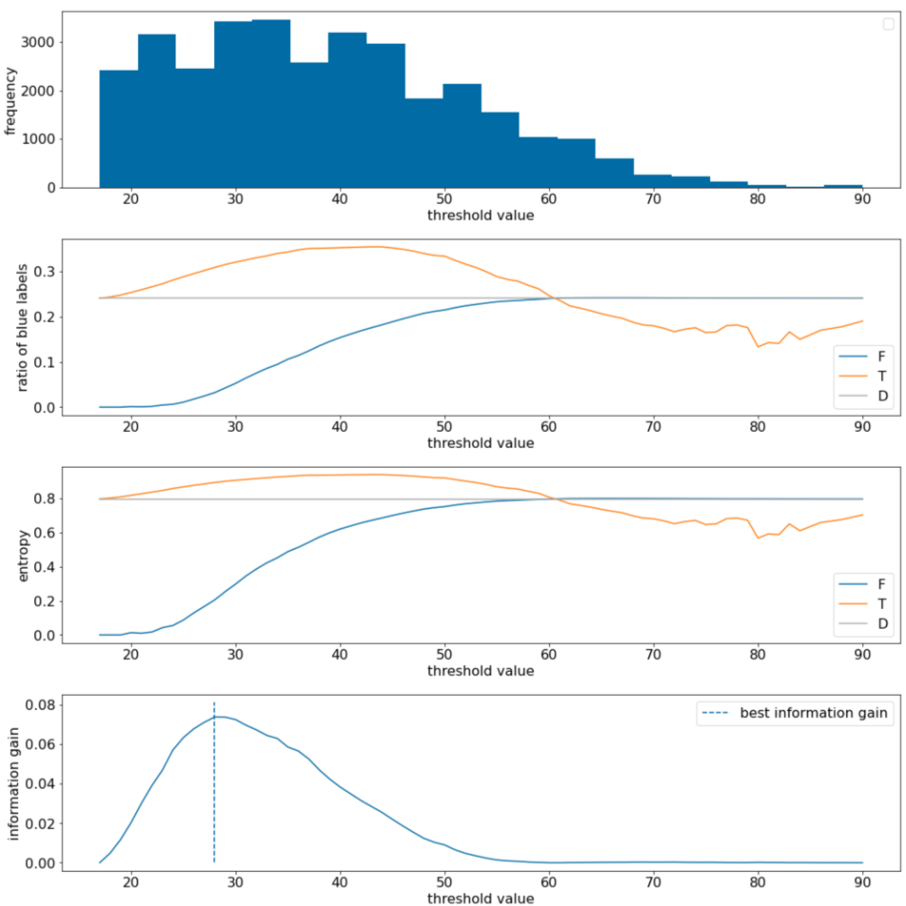
Figure 11. Four threshold plots.
These plots show the following:
- The "frequency" plot shows that observations are relatively well spread with concentrations between 18 and 60. A wide value spread means there are a lot of potential splits, which is good for training the model.
The ratio of "blue" labels in the dataset is ~25%. The "ratio of blue label" plot shows that for threshold values between 20 and 50:
- The $T$ set contains an excess of "blue" label examples (up to 35% for the threshold 35).
- The $F$ set contains a complementary deficit of "blue" label examples (only 8% for the threshold 35).
Both the "ratio of blue labels" and the "entropy" plots indicate that the labels can be relatively well separated in this range of threshold.
This observation is confirmed in the "information gain" plot. We see that the maximum information gain is obtained with t~=28 for an information gain value of ~0.074. Therefore, the condition returned by the splitter will be $x \geq 28$.
The information gain is always positive or null. It converges to zero as the threshold value converges towards its maximum / minimum value. In those cases, either $F$ or $T$ becomes empty while the other one contains the entire dataset and shows an entropy equal to the one in $D$. The information gain can also be zero when $H(T)$ = $H(F)$ = $H(D)$. At threshold 60, the ratios of "blue" labels for both $T$ and $F$ are the same as that of $D$ and the information gain is zero.
The candidate values for $t$ in the set of real numbers ($\mathbb{R}$) are infinite. However, given a finite number of examples, only a finite number of divisions of $D$ into $T$ and $F$ exist. Therefore, only a finite number of values of $t$ are meaningful to test.
A classical approach is to sort the values xi in increasing order xs(i) such that:
Then, test $t$ for every value halfway between consecutive sorted values of $x_i$. For example, suppose you have 1,000 floating-point values of a particular feature. After sorting, suppose the first two values are 8.5 and 8.7. In this case, the first threshold value to test would be 8.6.
Formally, we consider the following candidate values for t:
The time complexity of this algorithm is $\mathcal{O} ( n \log n) $ with $n$ the number of examples in the node (because of the sorting of the feature values). When applied on a decision tree, the splitter algorithm is applied to each node and each feature. Note that each node receives ~1/2 of its parent examples. Therefore, according to the master theorem, the time complexity of training a decision tree with this splitter is:
where:
- $m$ is the number of features.
- $n$ is the number of training examples.
In this algorithm, the value of the features do not matter; only the order matters. For this reason, this algorithm works independently of the scale or the distribution of the feature values. This is why we do not need to normalize or scale the numerical features when training a decision tree.