เอกสารฉบับนี้กล่าวถึงวิธีปฏิบัติตามรูปแบบ Glass และนำแนวทางปฏิบัติที่ดีที่สุดทั่วไปสำหรับ UI ไปใช้เมื่อใช้ GDK
ธีมกระจก
Glass นำธีมมาตรฐานไปใช้กับ Glassware ของคุณ ดังนั้น ทำงานสอดคล้องกับอินเทอร์เฟซผู้ใช้ส่วนอื่นๆ ธีมมีลักษณะดังต่อไปนี้
- ใช้แบบตัวพิมพ์ของ Roboto
- แสดงกิจกรรมแบบเต็มหน้าจอโดยไม่มีแถบสถานะหรือแถบการทำงาน
- ใช้พื้นหลังสีทึบสีดำ
หากต้องการใช้ธีม Glass อย่าประกาศธีมในไฟล์ Manifest ของ Android
หากมีรูปแบบที่กำหนดเองสำหรับชิ้นส่วนต่างๆ ของเครื่องแก้ว
และต้องการธีมเริ่มต้นของ Glass สำหรับสิ่งอื่นๆ
รับค่าจาก Theme.DeviceDefault ด้วยแอตทริบิวต์ parent:
<resources>
    <style name="CustomTheme" parent="@android:style/Theme.DeviceDefault">
        <!-- Theme customization goes here. -->
    </style>
</resources>
ดูคู่มือนักพัฒนาซอฟต์แวร์ Android ที่ สไตล์และธีม สำหรับข้อมูลเพิ่มเติมเกี่ยวกับการสร้างธีม
การ์ดสไตล์กระจก
CardBuilder
จะสร้างการ์ดที่มีรูปแบบเหมาะสมสำหรับชุดพร็อพเพอร์ตี้ ใช้เลย์เอาต์
โดย CardBuilder.Layout
หากเป็นไปได้เพื่อให้เนื้อหาของคุณ
มีรูปลักษณ์และความรู้สึกเหมือนเนื้อหาอื่นๆ
Glass
วิธีใช้ "CardBuilder"
- สร้างอินสแตนซ์ของ
CardBuilderโดยให้เลย์เอาต์ที่คุณต้องการจากCardBuilder.Layout - ตั้งค่าคุณสมบัติของการ์ด เช่น ข้อความ เชิงอรรถ และการประทับเวลา
- โทร
CardBuilder.getView()เพื่อแปลงบัตรเป็น AndroidViewหรือCardBuilder.getRemoteViews()เพื่อแปลงเป็นRemoteViewsออบเจ็กต์ - ใช้
Viewในกิจกรรม เลย์เอาต์ หรือในCardScrollViewหรือใช้RemoteViewsในLiveCard
ฟีเจอร์ UI ทั่วไป
เลย์เอาต์จำนวนมากจาก CardBuilder รองรับอินเทอร์เฟซผู้ใช้ทั่วไป
ฟีเจอร์ที่อธิบายไว้ด้านล่าง ดูเอกสารประกอบของเลย์เอาต์แต่ละรายการได้ใน
CardBuilder.Layout
สำหรับรายการฟีเจอร์ที่รองรับการ์ดแต่ละประเภท
ไอคอนระบุแหล่งที่มา
ไอคอนการระบุแหล่งที่มาเป็นไอคอนที่ไม่บังคับขนาด 36 × 36 พิกเซลที่ปรากฏใน
ที่มุมขวาล่างของการ์ดและทางด้านขวาของการประทับเวลา ตั้งค่าสิ่งนี้
ไอคอนโดยการโทร
CardBuilder.setAttributionIcon()
ระบุแอปพลิเคชันของคุณได้ โดยเฉพาะในการ์ดที่เผยแพร่ เพื่อให้ผู้ใช้
และดูแหล่งที่มาของข้อมูลบนการ์ดนั้น
ตัวบ่งชี้กลุ่ม
ตัวบ่งชี้สแต็ก ควบคุมโดย
CardBuilder.showStackIndicator()
คือแนวพับมุมที่ปรากฏที่มุมขวาบนของการ์ด ใช้เป็นชื่อ
ตัวบ่งชี้ที่เป็นภาพว่าการ์ดของคุณแสดงถึงกลุ่มการ์ดอื่นๆ ที่
ผู้ใช้แตะเข้าไปได้โดยตรง
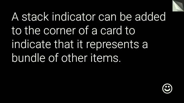
View view = new CardBuilder(context, CardBuilder.Layout.TEXT)
    .setText("A stack indicator can be added to the corner of a card...")
    .setAttributionIcon(R.drawable.ic_smile)
    .showStackIndicator(true)
    .getView();
เลย์เอาต์
ตัวอย่างต่อไปนี้แสดงเลย์เอาต์ที่ใช้ได้โดยใช้
CardBuilder
TEXT และ TEXT_FIXED
CardBuilder.Layout.TEXT
แสดงข้อความเต็มหน้าพร้อมตัวเลือก
ภาพโมเสคในพื้นหลัง ข้อความจะปรับขนาดแบบไดนามิกเพื่อให้พอดีกับ
พื้นที่ว่าง
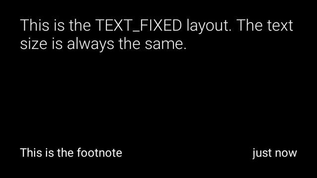
CardBuilder.Layout.TEXT_FIXED
คล้ายกันแต่แก้ไขข้อความให้มีขนาดเล็กลง
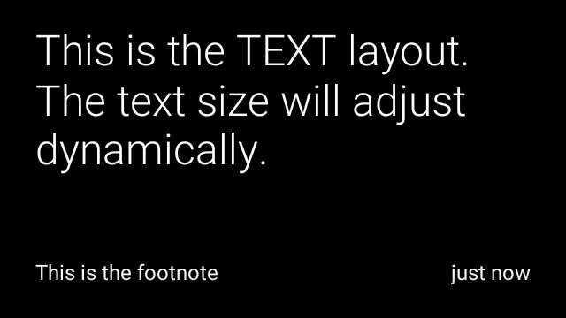

View view1 = new CardBuilder(context, CardBuilder.Layout.TEXT)
    .setText("This is the TEXT layout. The text size will adjust dynamically.")
    .setFootnote("This is the footnote")
    .setTimestamp("just now")
    .getView();
View view2 = new CardBuilder(context, CardBuilder.Layout.TEXT)
    .setText("You can also add images to the background of a TEXT card.")
    .setFootnote("This is the footnote")
    .setTimestamp("just now")
    .addImage(R.drawable.image1)
    .addImage(R.drawable.image2)
    .addImage(R.drawable.image3)
    .addImage(R.drawable.image4)
    .addImage(R.drawable.image5)
    .getView();
View view3 = new CardBuilder(context, CardBuilder.Layout.TEXT_FIXED)
    .setText("This is the TEXT_FIXED layout. The text size is always the same.")
    .setFootnote("This is the footnote")
    .setTimestamp("just now")
    .getView();
COLUMNS และ COLUMNS_FIXED
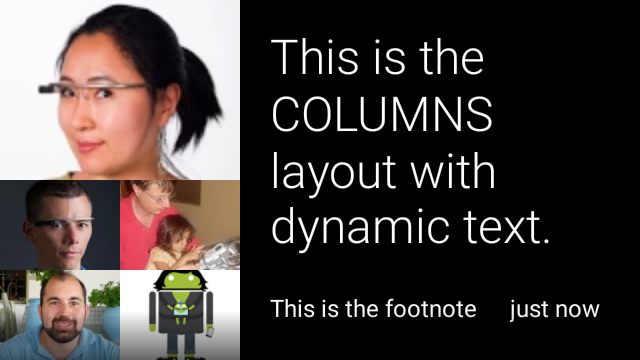
CardBuilder.Layout.COLUMNS
แสดงภาพโมเสคหรือไอคอนบน
ด้านซ้ายของการ์ดและข้อความทางด้านขวา ข้อความจะมีการปรับขนาดแบบไดนามิก
ให้พอดีกับพื้นที่ที่มีอยู่ หากต้องการรักษาขนาดข้อความให้คงที่ ให้ใช้
CardBuilder.Layout.COLUMNS_FIXED

View view1 = new CardBuilder(context, CardBuilder.Layout.COLUMNS)
.setText("This is the COLUMNS layout with dynamic text.")
.setFootnote("This is the footnote")
.setTimestamp("just now")
.addImage(R.drawable.image1)
.addImage(R.drawable.image2)
.addImage(R.drawable.image3)
.addImage(R.drawable.image4)
.addImage(R.drawable.image5)
.getView();
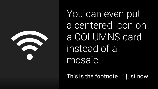
View view2 = new CardBuilder(context, CardBuilder.Layout.COLUMNS)
.setText("You can even put a centered icon on a COLUMNS card instead of a mosaic.")
.setFootnote("This is the footnote")
.setTimestamp("just now")
.setIcon(R.drawable.ic_wifi)
.getView();
View view3 = new CardBuilder(context, CardBuilder.Layout.COLUMNS_FIXED)
.setText("This is the COLUMNS_FIXED layout. The text size is always the same.")
.setFootnote("This is the footnote")
.setTimestamp("just now")
.addImage(R.drawable.image1)
.addImage(R.drawable.image2)
.addImage(R.drawable.image3)
.addImage(R.drawable.image4)
.addImage(R.drawable.image5)
.getView();
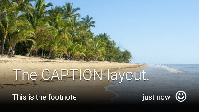
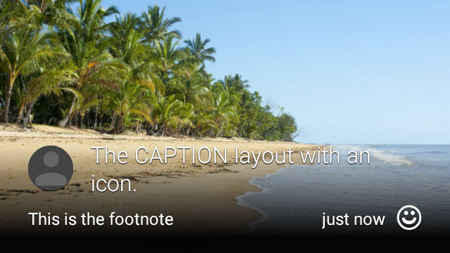
CAPTION
CardBuilder.Layout.CAPTION
เลย์เอาต์มีภาพโมเสคในพื้นหลัง
และข้อความคำบรรยายสั้นๆ ที่จัดเรียงไว้
ที่ด้านล่างของการ์ด ไอคอนยังสามารถเป็น
อยู่ถัดจากคำบรรยายภาพ เช่น ตัวตนของบุคคล
ที่เชื่อมโยงกับเนื้อหาของการ์ด
View view1 = new CardBuilder(context, CardBuilder.Layout.CAPTION)
    .setText("The caption layout.")
    .setFootnote("This is the footnote")
    .setTimestamp("just now")
    .addImage(R.drawable.beach)
    .setAttributionIcon(R.drawable.ic_smile)
    .getView();

View view2 = new CardBuilder(context, CardBuilder.Layout.CAPTION)
    .setText("The caption layout with an icon.")
    .setFootnote("This is the footnote")
    .setTimestamp("just now")
    .addImage(R.drawable.beach)
    .setIcon(R.drawable.ic_avatar)
    .setAttributionIcon(R.drawable.ic_smile)
    .getView();
TITLE
CardBuilder.Layout.TITLE
เลย์เอาต์มีภาพโมเสคในพื้นหลัง
โดยมีชื่ออยู่ตรงกลางและไอคอนที่ไม่บังคับที่ด้านล่างของการ์ด เลย์เอาต์นี้
มักจะใช้เพื่อแสดงรายชื่อติดต่อหรือแชร์เป้าหมาย เชิงอรรถและการประทับเวลาคือ
ไม่รองรับในเลย์เอาต์นี้

View view = new CardBuilder(context, CardBuilder.Layout.TITLE)
    .setText("TITLE Card")
    .setIcon(R.drawable.ic_phone)
    .addImage(R.drawable.beach)
    .getView();
AUTHOR
ใช้เมนู
CardBuilder.Layout.AUTHOR
เลย์เอาต์สำหรับแสดงข้อความหรือการสนทนา
โดยมุ่งเน้นที่ผู้เขียน สนับสนุนภาพโมเสคในพื้นหลัง
ไอคอนที่ใช้เป็นอวาตาร์ของผู้เขียน และส่วนหัวและส่วนหัวย่อยที่คุณสามารถ
แสดงรายการข้อมูลระบุตัวตน
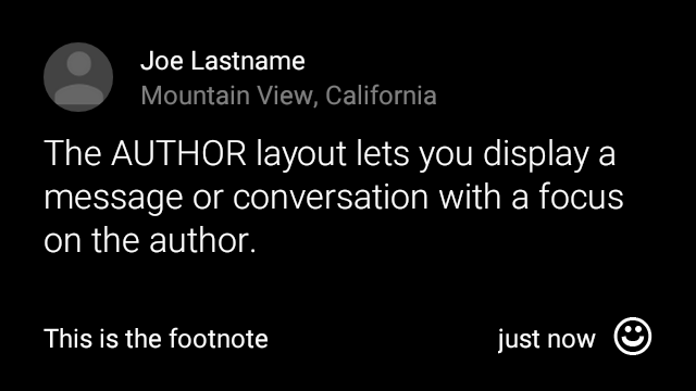
View view = new CardBuilder(context, CardBuilder.Layout.AUTHOR)
    .setText("The AUTHOR layout lets you display a message or conversation "
            + " with a focus on the author.")
    .setIcon(R.drawable.ic_avatar)
    .setHeading("Joe Lastname")
    .setSubheading("Mountain View, California")
    .setFootnote("This is the footnote")
    .setTimestamp("just now")
    .getView();
MENU
CardBuilder.Layout.MENU
เค้าโครงจะเหมือนกับเมนู Glass มาตรฐาน มี
ไอคอนและชื่อเรื่องที่อยู่ตรงกลาง และเชิงอรรถที่ไม่บังคับ ใช้เลย์เอาต์นี้สำหรับ
หน้าจอยืนยัน (เปลี่ยนจาก "การลบ" เป็น "ลบแล้ว" หลังจากที่ผู้ใช้
เลือกรายการในเมนู เป็นต้น) ถ้าต้องการเมนูจริง คุณควรใช้
เมนูตัวเลือกมาตรฐานแทน
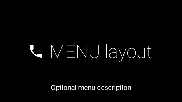
View view = new CardBuilder(context, CardBuilder.Layout.MENU)
    .setText("MENU layout")
    .setIcon(R.drawable.ic_phone)
    .setFootnote("Optional menu description")
    .getView();
EMBED_INSIDE
CardBuilder.Layout.EMBED_INSIDE
การจัดวางจะฝัง XML รูปแบบที่กำหนดเองที่คุณออกแบบเองลงใน Glass มาตรฐาน
เทมเพลตการ์ด ทำให้คุณสามารถออกแบบ UI ที่กำหนดเองสำหรับแอปพลิเคชัน แต่ยังคง
อยู่ในตำแหน่งที่ถูกต้องของเชิงอรรถ การประทับเวลา ไอคอนการแสดงที่มา และ
ตัวบ่งชี้สแต็กหากจำเป็นต้องใช้
หลังจากโทร
CardBuilder.getView()
ใช้
findViewById()
บนผลลัพธ์เพื่อเข้าถึงมุมมองภายในเลย์เอาต์แบบฝัง ในทำนองเดียวกัน ถ้าคุณ
โทร
CardBuilder.getRemoteViews()
คุณจะจัดการมุมมองของเลย์เอาต์แบบฝังได้โดยการส่งรหัสของเลย์เอาต์นั้นโดยตรง
ลงใน
RemoteViews
Setter Method
View view = new CardBuilder(context, CardBuilder.Layout.EMBED_INSIDE)
    .setEmbeddedLayout(R.layout.food_table)
    .setFootnote("Foods you tracked")
    .setTimestamp("today")
    .getView();
TextView textView1 = (TextView) view.findViewById(R.id.text_view_1);
textView1.setText("Water");
// ...and so on
สำหรับตัวอย่างโดยละเอียดเพิ่มเติม โปรดดู GitHub โปรเจ็กต์ ApiDemo
ALERT
CardBuilder.Layout.ALERT
มีไอคอนขนาดใหญ่ตรงกลาง
ข้อความและเชิงอรรถหลัก ใช้เลย์เอาต์นี้ใน
Dialog ถึง
แสดงข้อความแจ้งข้อมูลที่สำคัญ คำเตือน หรือข้อผิดพลาดใน Glassware ของคุณ

ตัวอย่างต่อไปนี้แสดงการใช้งาน AlertDialog และปิด
และเปิดการตั้งค่า Wi-Fi เมื่อผู้ใช้แตะการ์ด
- สร้างชั้นเรียนที่ขยายระยะเวลา
Dialog - สร้างการ์ดโดยใช้
CardBuilderที่มีเลย์เอาต์CardBuilder.Layout.ALERTจากนั้นตั้งค่ามุมมองเนื้อหาด้วยการ์ดนี้ (ไม่บังคับ) สร้าง
GestureDetectorเพื่อจัดการท่าทางสัมผัสของผู้ใช้ในการ์ดนี้public class AlertDialog extends Dialog { private final DialogInterface.OnClickListener mOnClickListener; private final AudioManager mAudioManager; private final GestureDetector mGestureDetector; /** * Handles the tap gesture to call the dialog's * onClickListener if one is provided. */ private final GestureDetector.BaseListener mBaseListener = new GestureDetector.BaseListener() { @Override public boolean onGesture(Gesture gesture) { if (gesture == Gesture.TAP) { mAudioManager.playSoundEffect(Sounds.TAP); if (mOnClickListener != null) { // Since Glass dialogs do not have buttons, // the index passed to onClick is always 0. mOnClickListener.onClick(AlertDialog.this, 0); } return true; } return false; } }; public AlertDialog(Context context, int iconResId, int textResId, int footnoteResId, DialogInterface.OnClickListener onClickListener) { super(context); mOnClickListener = onClickListener; mAudioManager = (AudioManager) context.getSystemService(Context.AUDIO_SERVICE); mGestureDetector = new GestureDetector(context).setBaseListener(mBaseListener); setContentView(new CardBuilder(context, CardBuilder.Layout.ALERT) .setIcon(iconResId) .setText(textResId) .setFootnote(footnoteResId) .getView()); } /** Overridden to let the gesture detector handle a possible tap event. */ @Override public boolean onGenericMotionEvent(MotionEvent event) { return mGestureDetector.onMotionEvent(event) || super.onGenericMotionEvent(event); } }(ไม่บังคับ) ในกิจกรรมให้ติดตั้ง
OnClickListenerเพื่อจัดการกับขั้นตอนเพิ่มเติมอื่นๆ เมื่อผู้ใช้แตะ สำหรับข้อมูลเพิ่มเติมเกี่ยวกับ กำลังเริ่มกิจกรรมการตั้งค่า เช่น Wi-Fi โปรดดู การเริ่มต้นการตั้งค่าเรียกใช้ตัวสร้าง
AlertDialogเพื่อแสดงการ์ดการแจ้งเตือนpublic class MyActivity extends Activity { ... private final DialogInterface.OnClickListener mOnClickListener = new DialogInterface.OnClickListener() { @Override public void onClick(DialogInterface dialog, int button) { // Open WiFi Settings startActivity(new Intent(Settings.ACTION_WIFI_SETTINGS)); } }; @Override protected void onCreate(Bundle bundle) { ... new AlertDialog(context, R.drawable.ic_cloud_sad_150, R.string.alert_text, R.string.alert_footnote_text, mOnClickListener).show(); ... } }
เลย์เอาต์ XML
ต่อไปนี้คือเลย์เอาต์การ์ดพื้นฐาน 2 แบบที่คุณสามารถใช้ได้ในกรณีที่คลาส CardBuilder มี ไม่ตรงตามความต้องการของคุณ
เลย์เอาต์หลัก
เลย์เอาต์นี้กำหนดระยะห่างจากขอบและส่วนท้ายแบบมาตรฐานสำหรับการ์ด ใส่รูปภาพของคุณเอง
การดูใน RelativeLayout ที่ว่างเปล่า
<?xml version="1.0" encoding="utf-8"?>
<FrameLayout xmlns:android="http://schemas.android.com/apk/res/android"
    xmlns:tools="http://schemas.android.com/tools"
    android:id="@+id/layout"
    android:layout_width="match_parent"
    android:layout_height="match_parent"
    >

    <RelativeLayout
        android:id="@+id/body_layout"
        android:layout_width="match_parent"
        android:layout_height="@dimen/glass_card_body_height"
        android:layout_marginLeft="@dimen/glass_card_margin"
        android:layout_marginTop="@dimen/glass_card_margin"
        android:layout_marginRight="@dimen/glass_card_margin"
        tools:ignore="UselessLeaf"
        >

        <!-- Put your widgets inside this RelativeLayout. -->

    </RelativeLayout>

    <LinearLayout
        android:id="@+id/footer_container"
        android:layout_width="match_parent"
        android:layout_height="wrap_content"
        android:layout_gravity="bottom|left"
        android:layout_marginLeft="@dimen/glass_card_margin"
        android:layout_marginBottom="@dimen/glass_card_footer_margin"
        android:layout_marginRight="@dimen/glass_card_margin"
        android:orientation="horizontal"
        >

        <!-- The footer view will grow to fit as much content as possible while the
             timestamp view keeps a fixed width. If the footer text is too long, it
             will be ellipsized with a 40px margin between it and the timestamp. -->

        <TextView
            android:id="@+id/footer"
            android:layout_width="0dip"
            android:layout_height="wrap_content"
            android:layout_weight="1"
            android:ellipsize="end"
            android:singleLine="true"
            android:textAppearance="?android:attr/textAppearanceSmall"
            />

        <TextView
            android:id="@+id/timestamp"
            android:layout_width="wrap_content"
            android:layout_height="wrap_content"
            android:layout_marginLeft="@dimen/glass_card_margin"
            android:ellipsize="end"
            android:singleLine="true"
            android:textAppearance="?android:attr/textAppearanceSmall"
            />

    </LinearLayout>

</FrameLayout>
เลย์เอาต์คอลัมน์ด้านซ้าย
คอลัมน์นี้กำหนดคอลัมน์ซ้าย 240 พิกเซลและคอลัมน์ด้านขวา 400 พิกเซลในรูปแบบของ RelativeLayout 2 คอลัมน์
ที่คุณสามารถนำเสนอ
ยอดดูได้
<?xml version="1.0" encoding="utf-8"?>
<RelativeLayout xmlns:android="http://schemas.android.com/apk/res/android"
    xmlns:tools="http://schemas.android.com/tools"
    android:layout_width="match_parent"
    android:layout_height="match_parent"
    >

    <RelativeLayout
        android:id="@+id/left_column"
        android:layout_width="@dimen/glass_card_left_column_width"
        android:layout_height="match_parent"
        >

        <!-- Put widgets for the left column inside this RelativeLayout. -->

    </RelativeLayout>

    <RelativeLayout
        android:layout_width="wrap_content"
        android:layout_height="@dimen/glass_card_body_height"
        android:layout_alignParentRight="true"
        android:layout_alignParentTop="true"
        android:layout_marginLeft="@dimen/glass_card_two_column_margin"
        android:layout_marginRight="@dimen/glass_card_margin"
        android:layout_marginTop="@dimen/glass_card_margin"
        android:layout_toRightOf="@+id/left_column"
        tools:ignore="UselessLeaf"
        >

        <!-- Put widgets for the right column inside this RelativeLayout. -->

    </RelativeLayout>

    <LinearLayout
        android:id="@+id/footer_container"
        android:layout_width="wrap_content"
        android:layout_height="wrap_content"
        android:layout_alignParentBottom="true"
        android:layout_alignParentRight="true"
        android:layout_gravity="bottom|left"
        android:layout_marginBottom="@dimen/glass_card_footer_margin"
        android:layout_marginLeft="@dimen/glass_card_two_column_margin"
        android:layout_marginRight="@dimen/glass_card_margin"
        android:layout_toRightOf="@+id/left_column"
        android:orientation="horizontal"
        >

        <!--
             The footer view will grow to fit as much content as possible while the
             timestamp view keeps a fixed width. If the footer text is too long, it
             will be ellipsized with a 40px margin between it and the timestamp.
        -->

        <TextView
            android:id="@+id/footer"
            android:layout_width="0dip"
            android:layout_height="wrap_content"
            android:layout_weight="1"
            android:ellipsize="end"
            android:singleLine="true"
            android:textAppearance="?android:attr/textAppearanceSmall"
            />

        <TextView
            android:id="@+id/timestamp"
            android:layout_width="wrap_content"
            android:layout_height="wrap_content"
            android:layout_marginLeft="@dimen/glass_card_margin"
            android:ellipsize="end"
            android:singleLine="true"
            android:textAppearance="?android:attr/textAppearanceSmall"
            />

    </LinearLayout>

</RelativeLayout>
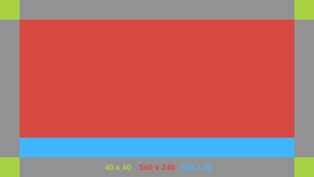
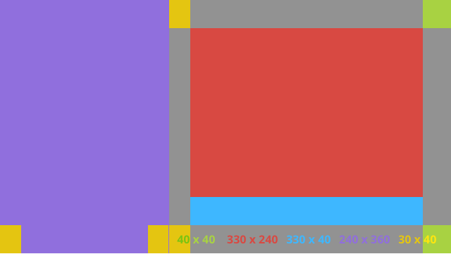
มิติข้อมูลมาตรฐาน
ใช้ไฟล์นี้ร่วมกับเลย์เอาต์ก่อนหน้าหรือเลย์เอาต์ของคุณเองเพื่อ
เพื่อให้สอดคล้องกับรูปแบบกระจกมาตรฐาน สร้างไฟล์นี้เป็น
res/values/dimens.xml ในโปรเจ็กต์ Android
<?xml version="1.0" encoding="utf-8"?>

<resources>

    <!-- The recommended margin for the top, left, and right edges of a card. -->
    <dimen name="glass_card_margin">40px</dimen>

    <!-- The recommended margin between the bottom of the card and the footer. This is
         an adjusted value so that the baseline of the text in the footer sits 40px
         from the bottom of the card, matching the other margins. -->
    <dimen name="glass_card_footer_margin">33px</dimen>

    <!-- The recommended margin for the left column of the two-column card. -->
    <dimen name="glass_card_two_column_margin">30px</dimen>

    <!-- The maximum height of the body content inside a card. -->
    <dimen name="glass_card_body_height">240px</dimen>

    <!-- The width of the left column in the two-column layout. -->
    <dimen name="glass_card_left_column_width">240px</dimen>

</resources>