Page Summary
-
Grid view displays content items with images and brief text, best used when image selection is primary.
-
Grids are vertically scrollable and can vary in size, spacing, columns, and can group content into categories.
-
The anatomy of a grid includes grid items, primary and secondary text, and a grid background.
-
Specifications are provided for content grids, app grids, app grids with frequently used items, and indicator icon placement.
-
Grids should adapt to different screen widths and heights, with specific recommendations for wide, extra-wide, super-wide, and short screens.
-
Typography, color, sizing, and elevation styles are defined for grid elements.
A grid view displays two or more columns of images representing content items, with brief text beneath each image. This view is best when users rely primarily on images to make their selections.
Grids are vertically scrollable and can vary in size, spacing, and number of columns. The content in the grid can also be grouped into categories.

Anatomy
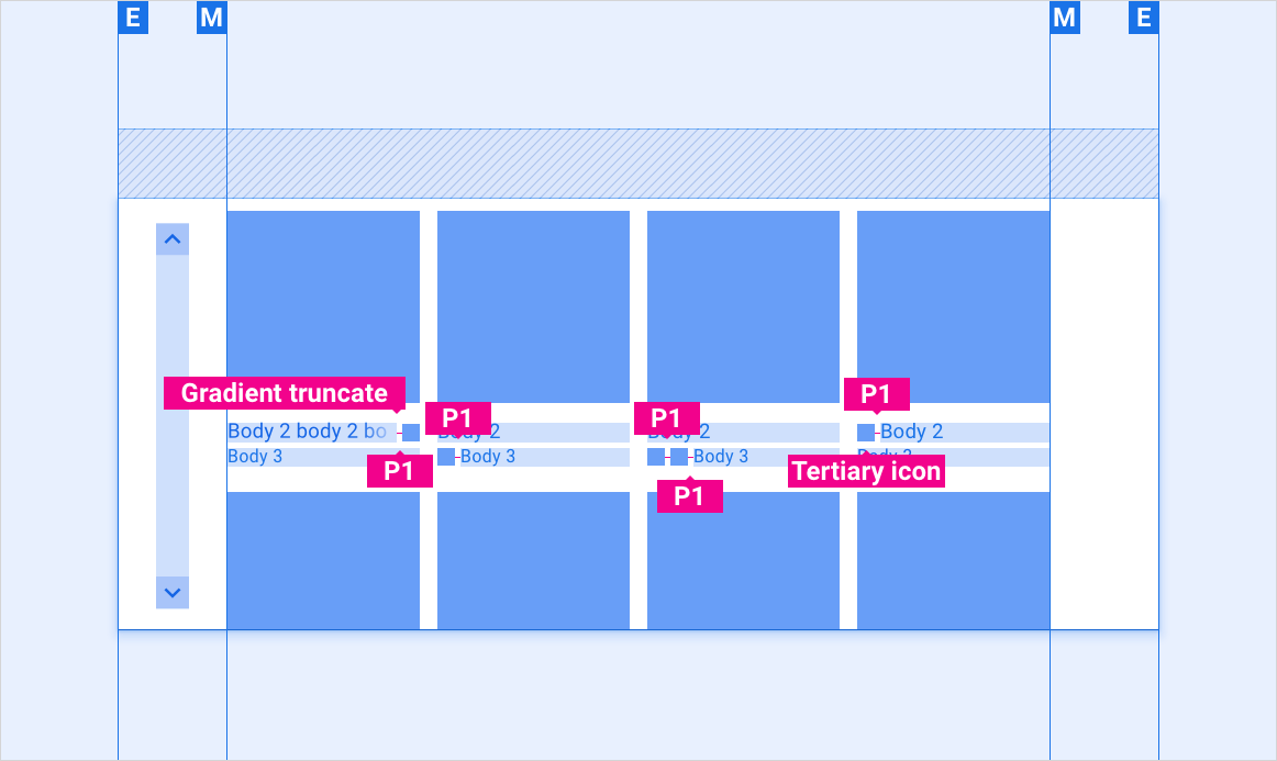
Grids contain text and UI controls. Because users must respond to them, they should never be obscured, either by other elements or by the screen edge.
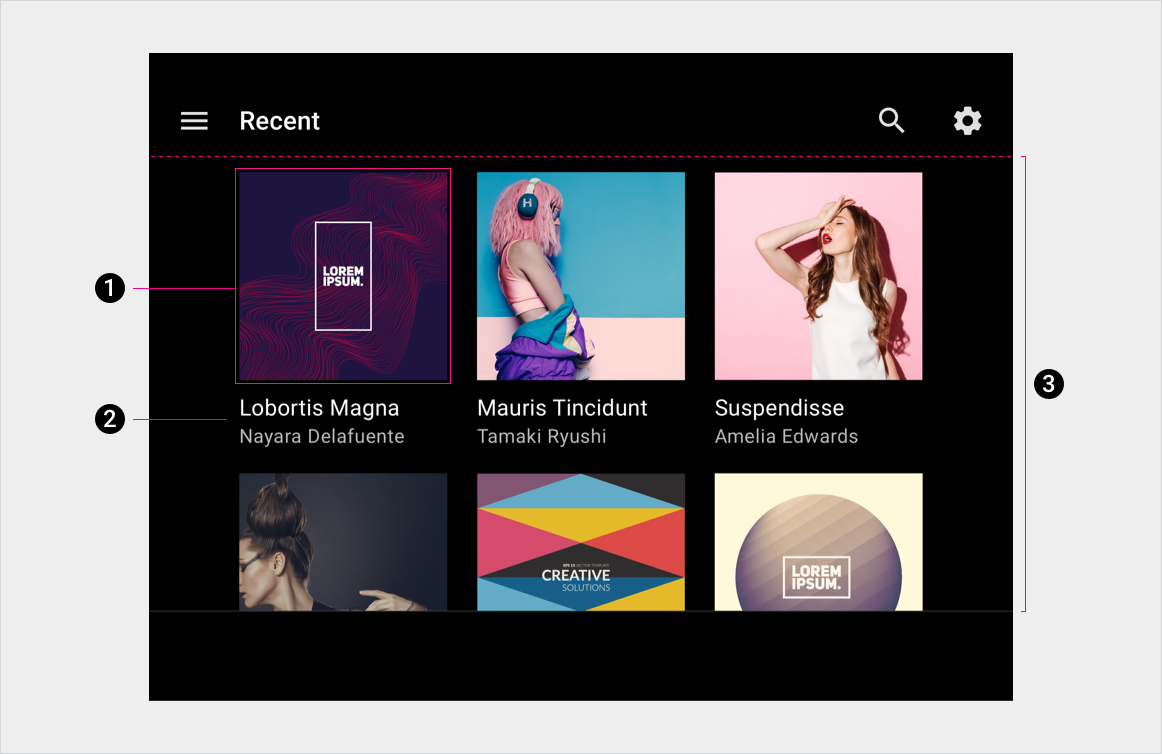
- Grid item
- Primary and secondary text
- Grid background
Specs
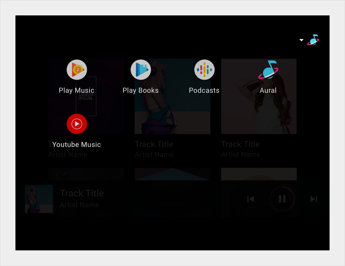
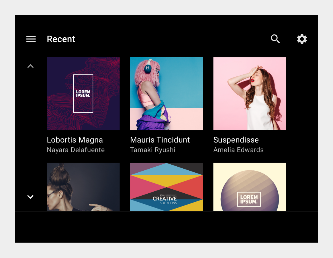
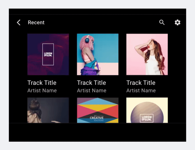
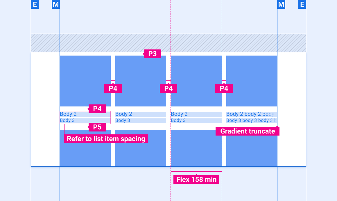
Content grid (3 or 4 columns)
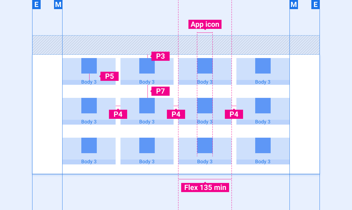
App grid (4 columns)
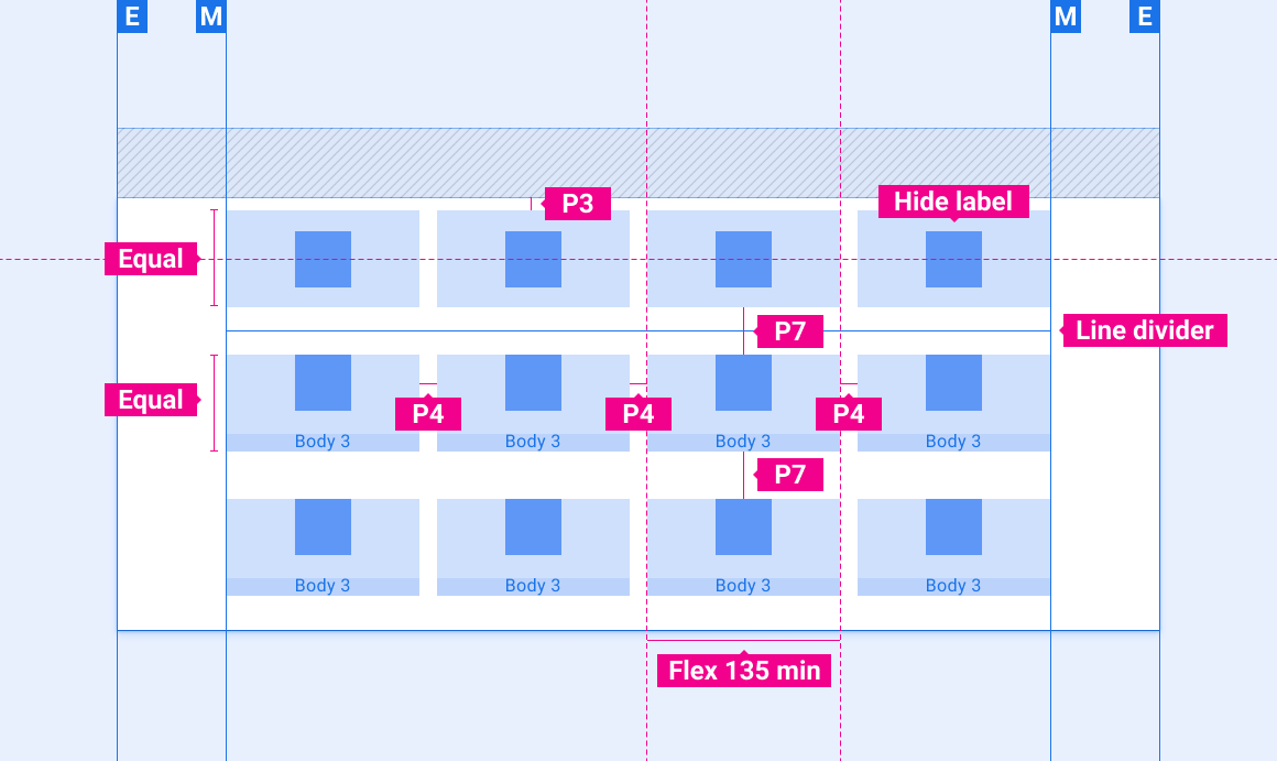
App grid with frequently used items in top row
Indicator icon placement in grid layout
Scaling layouts
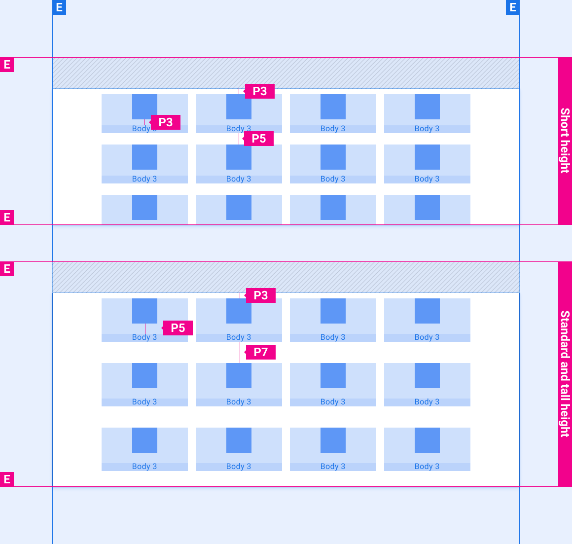
These reference layouts show how to adapt grids to accommodate screens of various widths and heights. (Width and height categories are defined in the Layout section.) Note that all pixel values are in rendered pixels, before any down-sampling or up-sampling occurs.
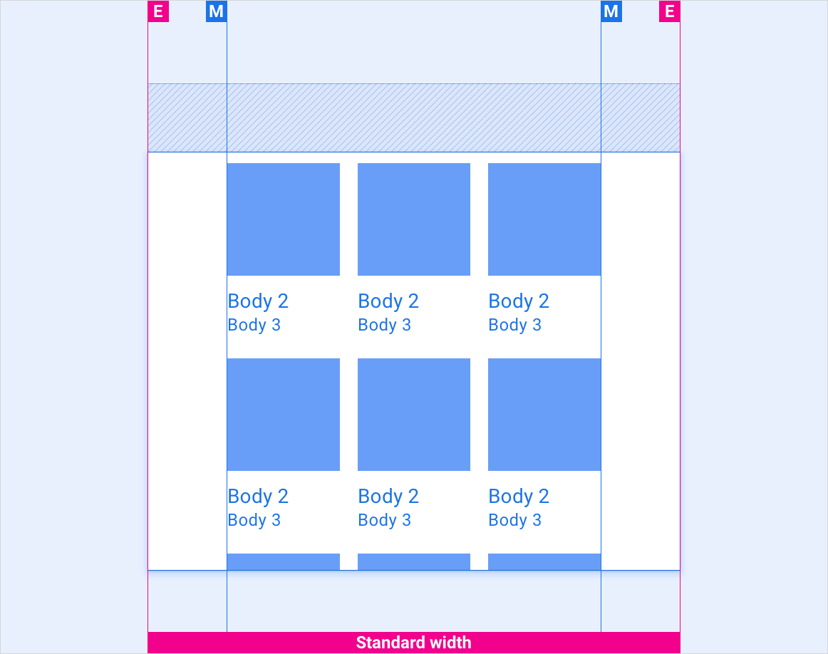
Standard-width screens
Wide screens

Extra-wide and super-wide screens

Vertical spacing of app grids on screens of various heights
Styles
Typography
| Type style | Typeface | Weight | Size (dp) |
|---|---|---|---|
| Body 1 | Roboto | Regular | 32 |
| Body 2 | Roboto | Regular | 28 |
| Body 3 | Roboto | Regular | 24 |
Color
| Element | Color(day mode) | Color (night mode) |
|---|---|---|
| Primary type / icons | White | White @ 88% |
| Secondary type / icons | White @ 72% | White @ 60% |
| Divider line | White @ 22% | White @ 12% |
| Grid background | Black | Black |
| Content scrim | N/A | Black @ 22% |
| Gradient truncate | Black @ 0-100% in 10% of text space | Black @ 0-100% in 10% of text space |
Sizing
| Element | Size (dp) |
|---|---|
| App icon | 76 |
| Min app cell | 135 |
| Min content cell | 158 |
Elevation
| Element | Color | Y axis | Blur |
|---|---|---|---|
| Grid tile | Black @ 22% | 2 | 2 |
Examples