Page Summary
-
Buttons are AOSP components that communicate an action when touched, and can be filled or unfilled to indicate primary or preferred actions.
-
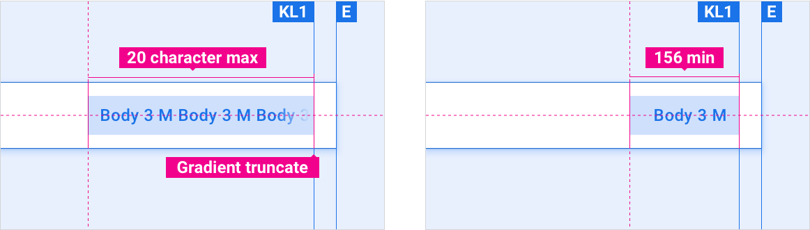
Buttons can appear independently or in groups and have a maximum label length of 20 characters with a minimum width of 156dp.
-
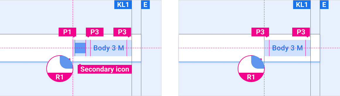
Buttons can include icons, typically placed to the left of the text, and can appear in other components like the app bar and dialogs.
-
OEMs can customize buttons by modifying visual appearance, such as color, icons, fonts, states, dimensions, shape, placement, and motion.
A button communicates an action that will occur when a user touches it.
Buttons are standard Android Open Source Project (AOSP) components. They can either be filled with a solid background color, or unfilled (with a transparent background). Filled buttons indicate a primary or preferred action. Buttons can appear independently or in groups – unlike tabs, which always appear in groups.
Anatomy
2. Filled button container, indicating the primary or preferred action
3. Button label
Specs
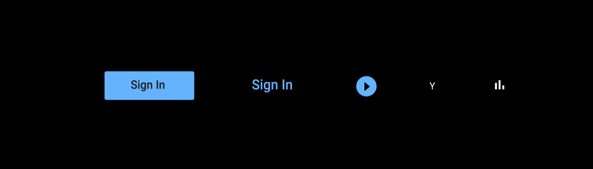
Button min and max length
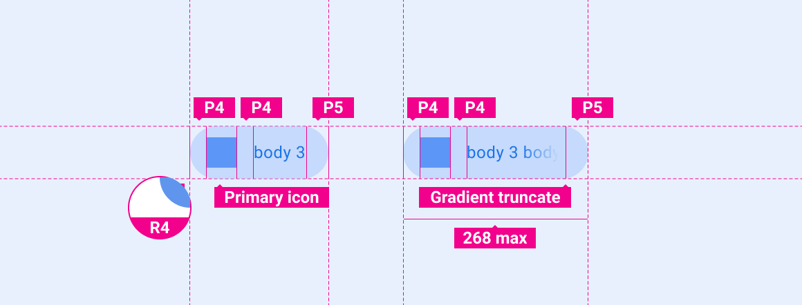
Button with icon vs. default button
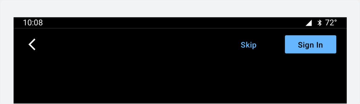
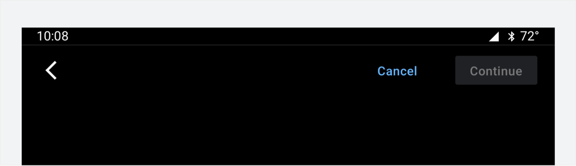
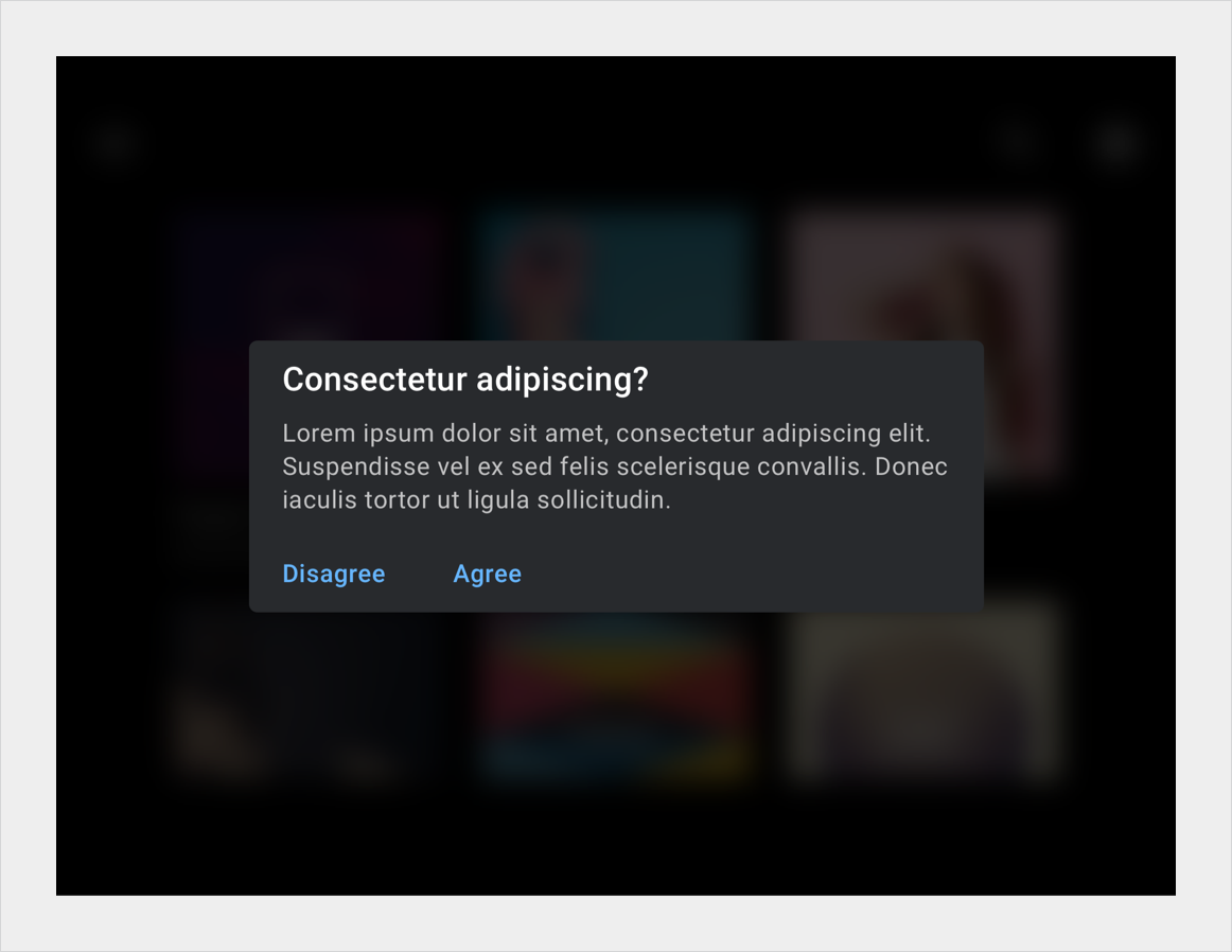
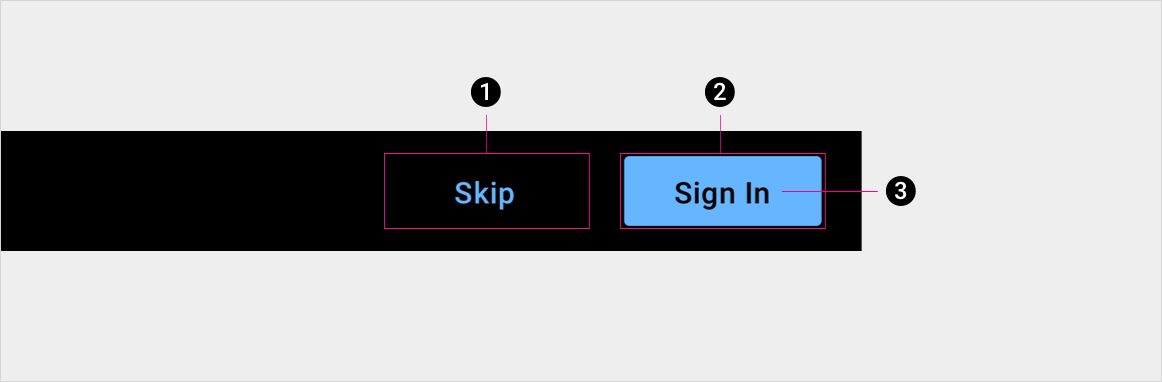
Buttons can appear as elements in other components, such as the app bar or dialogs.
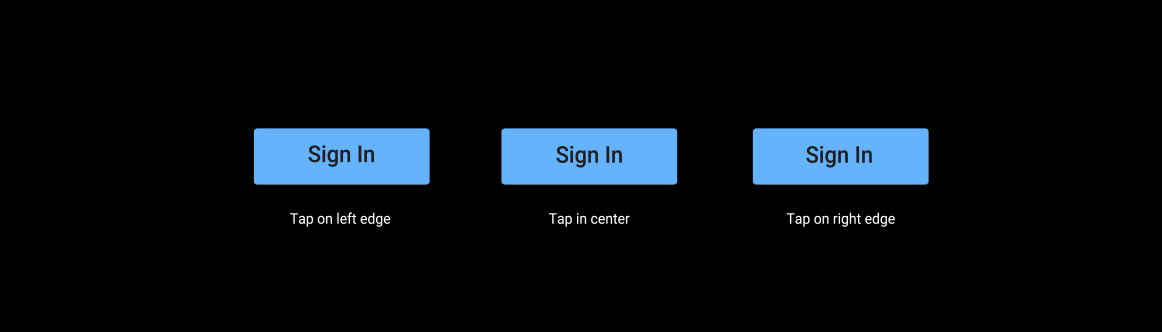
Button placement in app bar
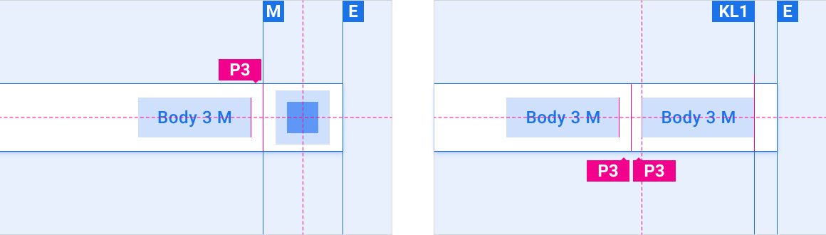
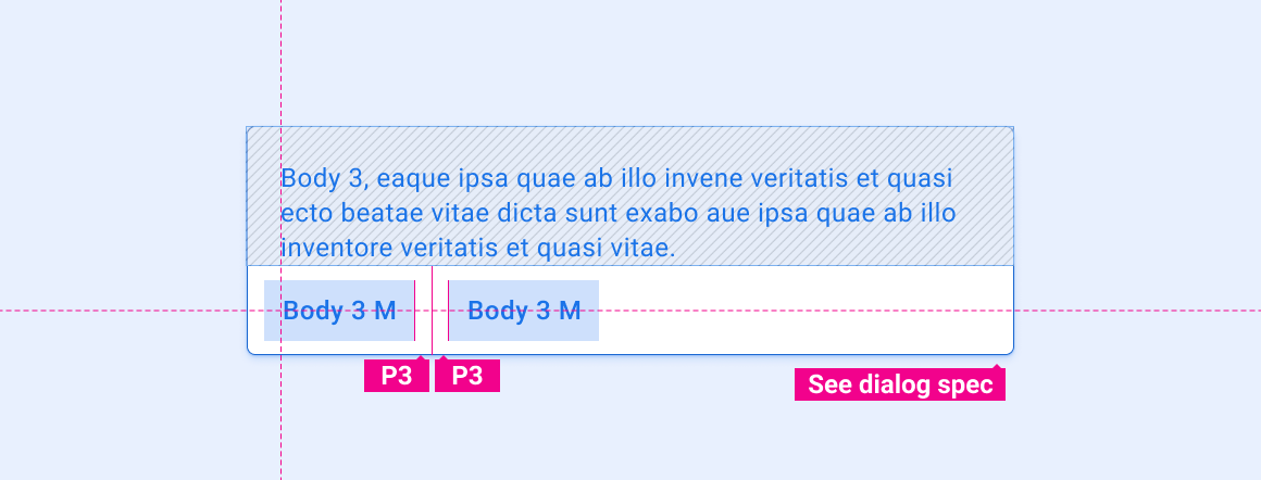
Button in dialog
Hero button
Customization
OEMs can reflect their brand by modifying a button's visual appearance, such as:
- Specifying an accent color
- Supplying custom icons
- Adding custom fonts
- Changing the appearance of active, inactive, and disabled buttons
- Setting button dimensions, corner shape, and placements
- Using motion to provide feedback to users
The Car UI Library Integration Guide provides OEM guidance for customizing components.
Design system provides specific guidance for using layout, color, typography, sizing, shape, and motion to customize components.
Examples