After running a Meridian GeoX analysis, you can evaluate the experiment's results using both numerical metrics and visualizations. This page describes the key output metrics and visual charts generated by the GeoX framework to help you interpret campaign performance.
Run the analysis
To execute the analysis, call geox.analyze with your data and configuration.
This function returns an AnalysisResult object containing point estimates and
confidence intervals for various incrementality metrics.
print("\nAnalyzing experiment results...")
analysis_result = geox.analyze(
    analysis_data, analysis_config
)
# Returns not only point estimates, but also confidence intervals of various incrementality metrics
analysis_result.results
At each treatment cell, the returned AnalysisMetrics object contained within
the results provides a comprehensive view of the experiment's impact:
- Lift: The absolute incremental conversion. For example, total additional sales or conversion counts caused by the interventions in the treatment cell directly attributed to the experiment.
- Percent lift: The relative incremental conversion expressed as a percentage over the estimated counterfactual baseline.
- Incremental conversion per dollar (iCPD): The incremental efficiency by normalizing with the marketing spend. Equivalent to iROAS if revenue data is used.
- P-value and confidence intervals: These measures of statistical significance are calculated using design-aware placebo inference. These apply to all the metrics mentioned earlier.
{
    'cell_1': AnalysisMetrics(
        lift=Estimate(
            point_estimate=26667.484375,
            lower_bound=23734.5703125,
            upper_bound=28317.734375,
            standard_deviation=1.0,
            p_value=0.0019960079807788134,
        ),
        percent_lift=Estimate(
            point_estimate=0.04917562007904053,
            lower_bound=0.04350090026855469,
            upper_bound=0.052402496337890625,
            standard_deviation=1.0,
            p_value=0.0019960079807788134,
        ),
        icpd=Estimate(
            point_estimate=1.3162440061569214,
            lower_bound=1.1714823246002197,
            upper_bound=1.3976964950561523,
            standard_deviation=1.0,
            p_value=0.0019960079807788134,
        ),
        descriptive_metrics=None,
    )
}
To visualize these results, geox.plot_analysis serves as a powerful tool to
plot the observed data against the estimated counterfactual and track the
incremental effects over the course of the experiment.
# Creates visualizations of the incrementality effect
geox.plot_analysis(analysis_result)
You'll see four charts on each single treatment cell in your experiment:
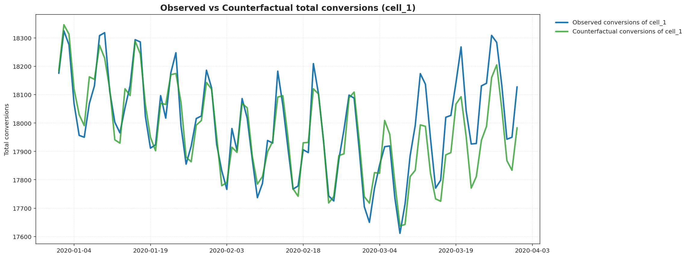
- The first chart demonstrates the treatment geo daily conversion versus the
predicted counterfactual from pretest to test periods. Usually, the two time
series should closely align during the pretest period, indicating a good
counterfactual model fit. However, if the marketing intervention has non-zero
incremental impact on conversion, you should start to see deviation between the
two series during the test period.
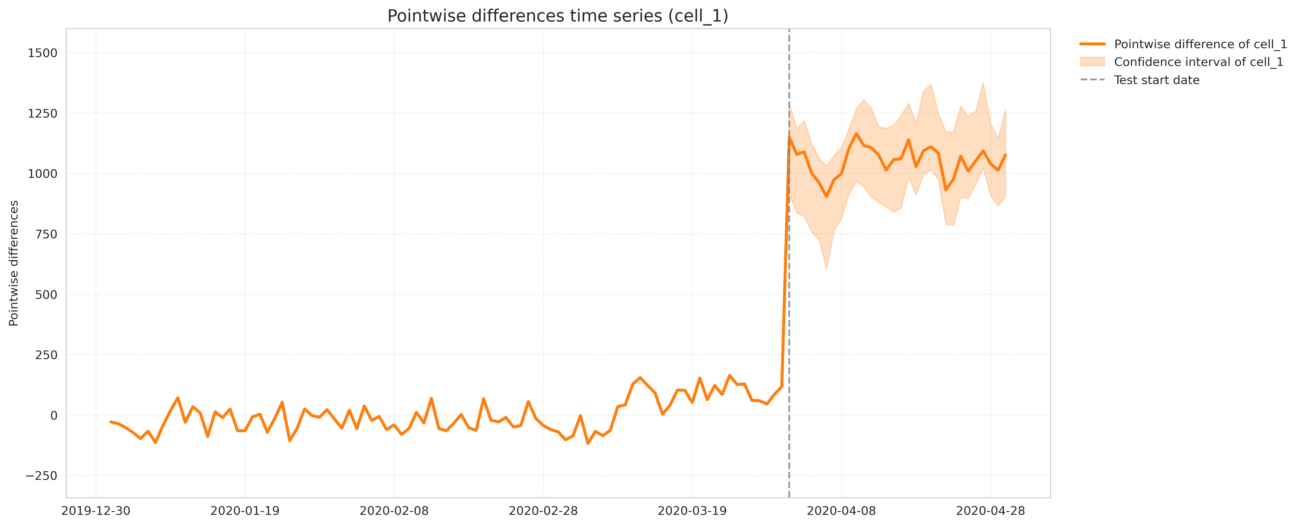
- The second chart is another way to look at the incremental effect, by
subtracting the observed treatment daily conversion and the predicted
counterfactuals. During the pretest period, the difference is expected to be
around 0, however, during the test period, the difference will indicate the
incremental effect caused by your marketing interventions.
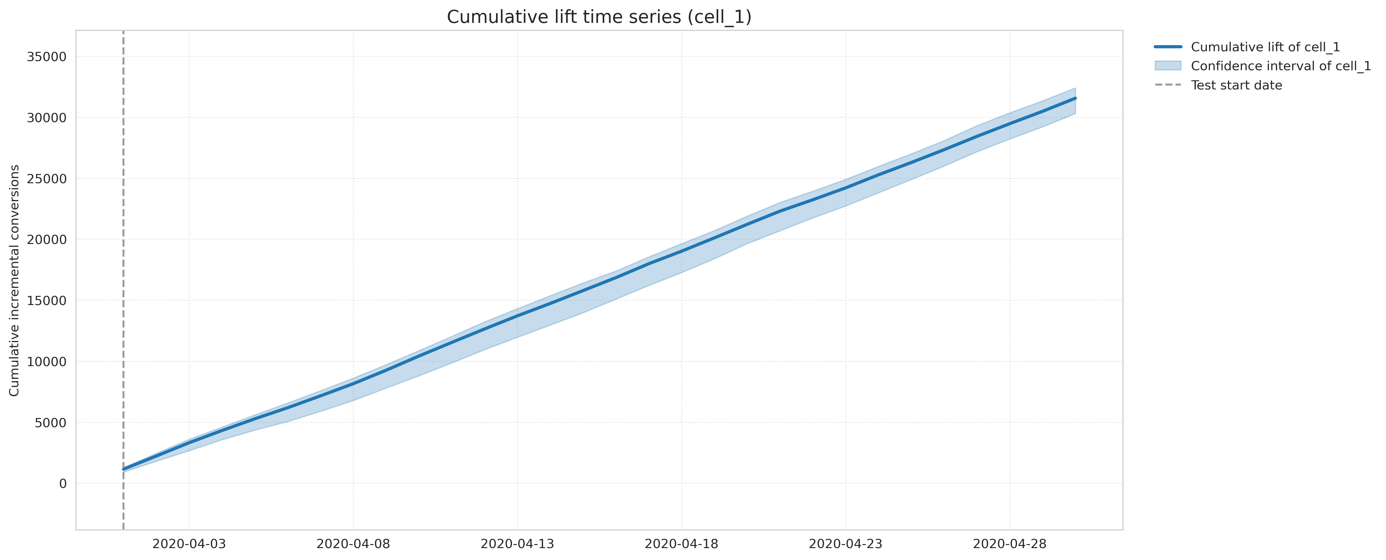
- The third chart shows the cumulative incrementality during the test period,
which is usually expected to grow over time, instead of the daily incremental
effects.
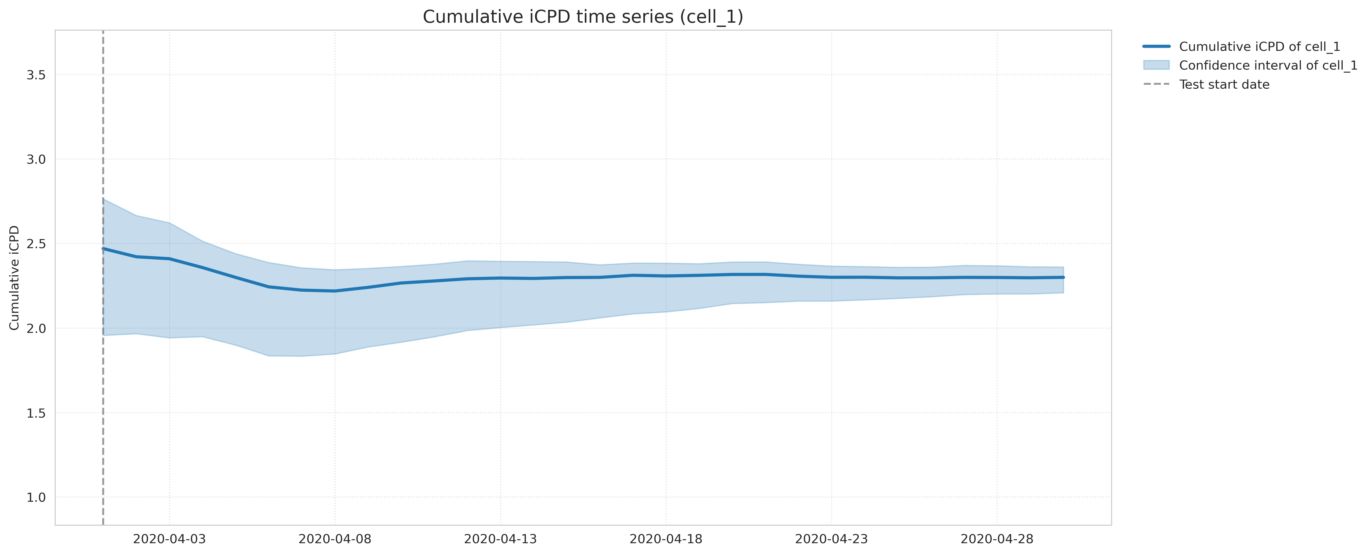
- The fourth chart visualizes the cumulative effect after normalizing by
marketing spend. This will depict the incrementality efficiency, in particular,
iCPD metric of your ad campaigns.