Page Summary
-
This document reviews data preparation for clustering, focusing on scaling features to the same range.
-
Normalization via Z-scores is suitable for Gaussian distributions, while log transforms are applied to power-law distributions.
-
For datasets that don't conform to standard distributions, quantiles are recommended to measure similarity between data points.
-
Handling missing data involves either removing affected examples or the feature, or predicting missing values using a machine learning model.
This section reviews the data preparation steps most relevant to clustering from the Working with numerical data module in Machine Learning Crash Course.
In clustering, you calculate the similarity between two examples by combining all the feature data for those examples into a numeric value. This requires the features to have the same scale, which can be accomplished by normalizing, transforming, or creating quantiles. If you want to transform your data without inspecting its distribution, you can default to quantiles.
Normalizing data
You can transform data for multiple features to the same scale by normalizing the data.
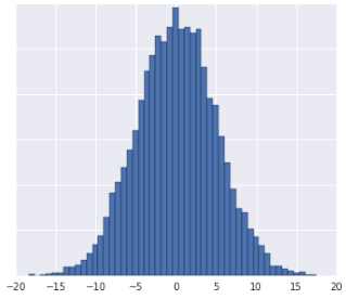
Z-scores
Whenever you see a dataset roughly shaped like a Gaussian distribution, you should calculate z-scores for the data. Z-scores are the number of standard deviations a value is from the mean. You can also use z-scores when the dataset isn't large enough for quantiles.
See Z-score scaling to review the steps.
Here is a visualization of two features of a dataset before and after z-score scaling:
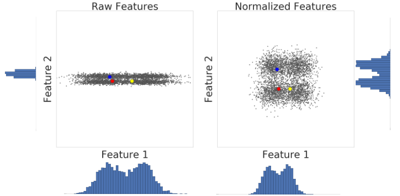
In the unnormalized dataset on the left, Feature 1 and Feature 2, respectively graphed on the x and y axes, don't have the same scale. On the left, the red example appears closer, or more similar, to blue than to yellow. On the right, after z-score scaling, Feature 1 and Feature 2 have the same scale, and the red example appears closer to the yellow example. The normalized dataset gives a more accurate measure of similarity between points.
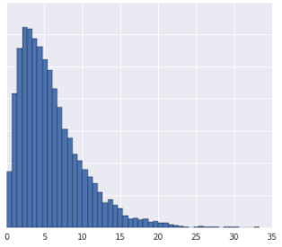
Log transforms
When a dataset perfectly conforms to a power law distribution, where data is heavily clumped at the lowest values, use a log transform. See Log scaling to review the steps.
Here is a visualization of a power-law dataset before and after a log transform:
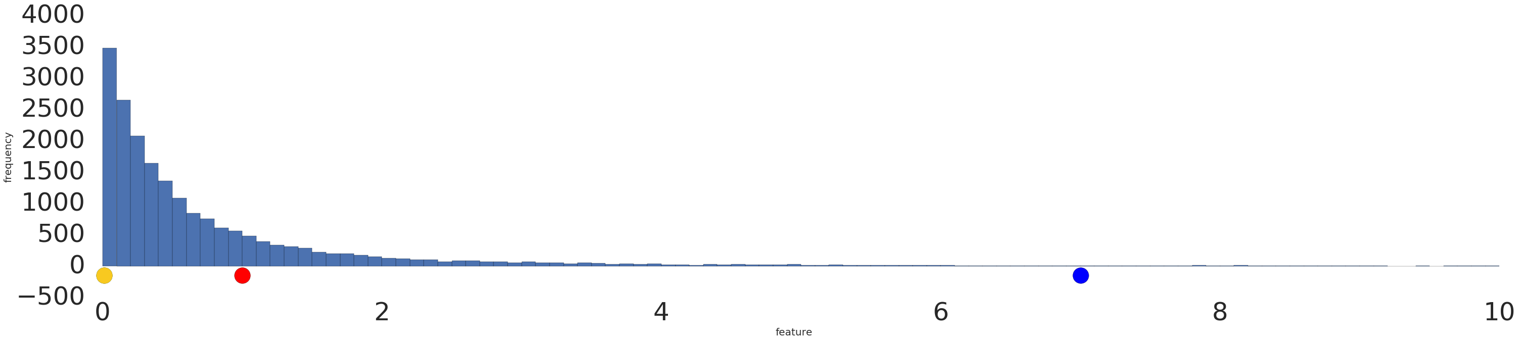
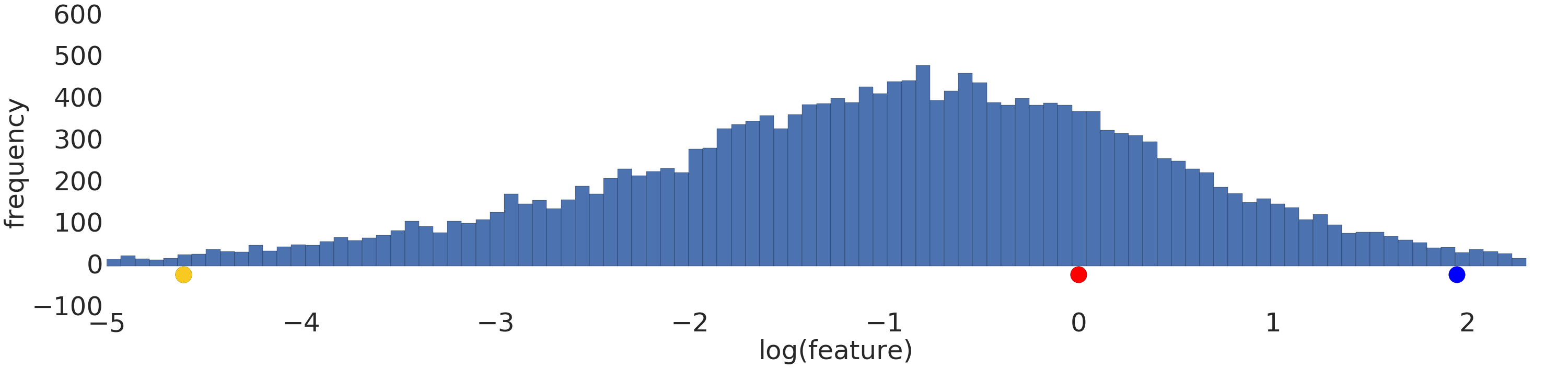
Before log scaling (Figure 2), the red example appears more similar to yellow. After log scaling (Figure 3), red appears more similar to blue.
Quantiles
Binning the data into quantiles works well when the dataset does not conform to a known distribution. Take this dataset, for example:
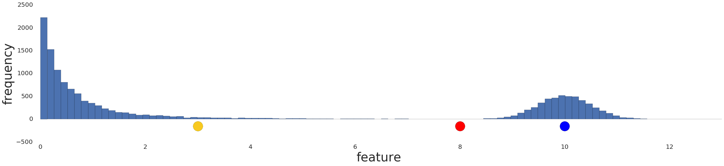
Intuitively, two examples are more similar if only a few examples fall between them, irrespective of their values, and more dissimilar if many examples fall between them. The visualization above makes it difficult to see the total number of examples that fall between red and yellow, or between red and blue.
This understanding of similarity can be brought out by dividing the dataset into quantiles, or intervals that each contain equal numbers of examples, and assigning the quantile index to each example. See Quantile bucketing to review the steps.
Here is the previous distribution divided into quantiles, showing that red is one quantile away from yellow and three quantiles away from blue:
![A graph showing the data after conversion
into quantiles. The line represent 20 intervals.]](/static/machine-learning/clustering/images/Quantize.png)
You can choose any number \(n\) of quantiles. However, for the quantiles to meaningfully represent the underlying data, your dataset should have at least \(10n\) examples. If you don't have enough data, normalize instead.
Check your understanding
For the following questions, assume you have enough data to create quantiles.
Question one
- The data distribution is Gaussian.
- You have some insight into what the data represents in the real that suggests the data shouldn't be transformed nonlinearly.
Question two
Missing data
If your dataset has examples with missing values for a certain feature, but those examples occur rarely, you can remove these examples. If those examples occur frequently, you can either remove that feature altogether, or you can predict the missing values from other examples using a machine learning model. For example, you can impute missing numerical data by using a regression model trained on existing feature data.