במסמך הזה מוסבר איך להשתמש בסגנון Glass וליישם שיטות מומלצות נפוצות בממשק המשתמש במהלך השימוש ב-GDK.
עיצוב זכוכית
Glass מיישמת עיצוב סטנדרטי על כלי הזכוכית שלכם, כדי תואם לשאר ממשק המשתמש. כולל את המאפיינים הבאים:
- משתמש בגופן Roboto
- הצגת הפעילויות במסך מלא ללא שורת סטטוס או סרגל פעולות
- הצגת רקע שחור בצבע אחיד
כדי להחיל את העיצוב Glass, אין להצהיר על עיצוב במניפסט של Android.
אם יש לך סגנון מותאם אישית לחלקים של כלי הזכוכית
ואתם רוצים את עיצוב ברירת המחדל של Glass עבור כל השאר,
תקבל בירושה מ-Theme.DeviceDefault עם המאפיין parent:
<resources>
    <style name="CustomTheme" parent="@android:style/Theme.DeviceDefault">
        <!-- Theme customization goes here. -->
    </style>
</resources>
ניתן לעיין במדריך למפתחים של Android ב סגנונות ועיצובים למידע נוסף על יצירת עיצובים.
קלפי זכוכית
CardBuilder
class יוצר כרטיסים מעוצבים היטב בהינתן קבוצה של מאפיינים. שימוש בפריסות
סופק על ידי CardBuilder.Layout
כשהדבר אפשרי, כדי שהתוכן שלך ייראה ויראה כמו תוכן אחר ב-
זכוכית.
כדי להשתמש באפליקציה CardBuilder:
- יוצרים מופע של
CardBuilder, ונותנים לו את הפריסה הרצויה מ-CardBuilder.Layout. - מגדירים את המאפיינים של הכרטיס, כמו טקסט, הערת שוליים וחותמת זמן.
- התקשרות אל
CardBuilder.getView()כדי להמיר את הכרטיס למכשיר AndroidView, אוCardBuilder.getRemoteViews()כדי להמיר אותוRemoteViewsלאובייקט. - להשתמש ב-
Viewבפעילויות, בפריסות אוCardScrollView, או להשתמשRemoteViewsב-LiveCard.
תכונות נפוצות של ממשק המשתמש
רבות מהפריסות שסופקו על ידי CardBuilder תומכות בממשק משתמש משותף
כמתואר בהמשך. ניתן לעיין בתיעוד של כל פריסות בנפרד ב
CardBuilder.Layout
כדי לקבל רשימה של התכונות שנתמכות בכל סוג כרטיס.
סמל השיוך
סמל הייחוס הוא סמל אופציונלי בגודל 36 × 36 פיקסלים שמופיע
בפינה השמאלית התחתונה של הכרטיס, מימין לחותמת הזמן. הגדרה
הסמל של התקשרות
CardBuilder.setAttributionIcon()
לזיהוי האפליקציה שלכם, במיוחד בכרטיסים פעילים, כדי שהמשתמש יוכל
ולראות את מקור המידע שבכרטיס.
אינדיקטור ערימה
האינדיקטור של המחסנית, נשלט על ידי
CardBuilder.showStackIndicator()
הוא קיפול לפינה שמופיע בפינה השמאלית העליונה של הכרטיס. שימוש בתור
אינדיקטור חזותי שהכרטיס מייצג חבילה של כרטיסים אחרים
יכול להתחבר ישירות אליהם.
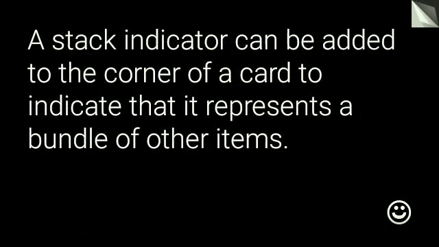
View view = new CardBuilder(context, CardBuilder.Layout.TEXT)
    .setText("A stack indicator can be added to the corner of a card...")
    .setAttributionIcon(R.drawable.ic_smile)
    .showStackIndicator(true)
    .getView();
פריסות
בדוגמאות הבאות מוצגות הפריסות שזמינות באמצעות
CardBuilder
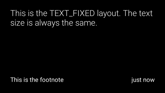
TEXT וגם TEXT_FIXED
CardBuilder.Layout.TEXT
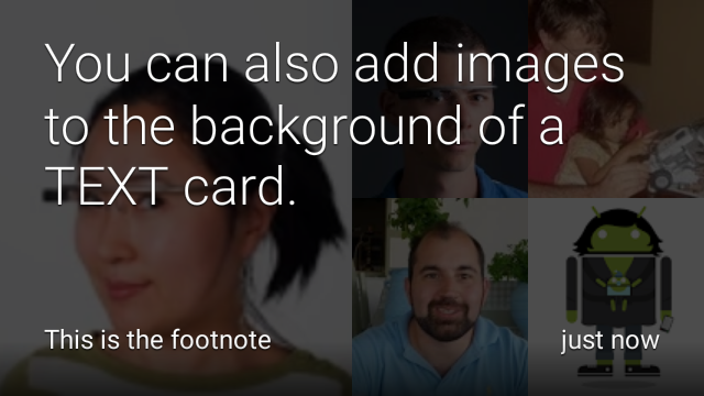
הפריסה מציגה טקסט ברוחב מלא עם אפשרות
פסיפס של תמונה ברקע. גודל הטקסט משתנה באופן דינמי כך שיתאים בצורה הטובה ביותר
שטח פנוי פנוי.
CardBuilder.Layout.TEXT_FIXED
דומה, אבל מתקנת את הטקסט שלו לגודל קטן יותר.
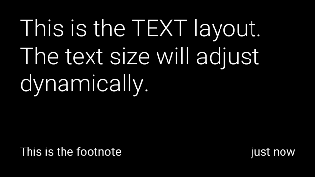
View view1 = new CardBuilder(context, CardBuilder.Layout.TEXT)
    .setText("This is the TEXT layout. The text size will adjust dynamically.")
    .setFootnote("This is the footnote")
    .setTimestamp("just now")
    .getView();
View view2 = new CardBuilder(context, CardBuilder.Layout.TEXT)
    .setText("You can also add images to the background of a TEXT card.")
    .setFootnote("This is the footnote")
    .setTimestamp("just now")
    .addImage(R.drawable.image1)
    .addImage(R.drawable.image2)
    .addImage(R.drawable.image3)
    .addImage(R.drawable.image4)
    .addImage(R.drawable.image5)
    .getView();
View view3 = new CardBuilder(context, CardBuilder.Layout.TEXT_FIXED)
    .setText("This is the TEXT_FIXED layout. The text size is always the same.")
    .setFootnote("This is the footnote")
    .setTimestamp("just now")
    .getView();
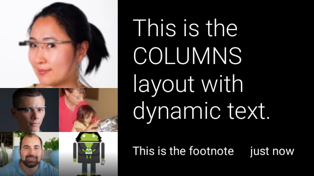
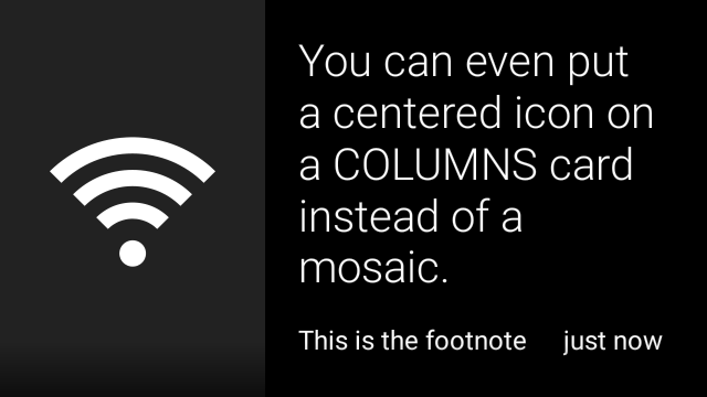
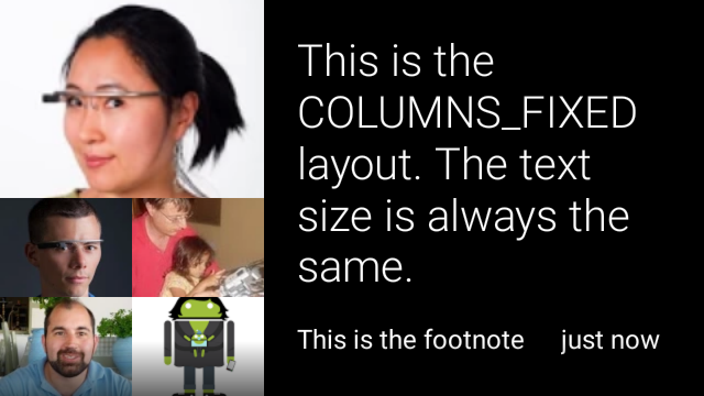
COLUMNS וגם COLUMNS_FIXED
CardBuilder.Layout.COLUMNS
שמראה פסיפס של תמונות או סמל
מצד שמאל של הכרטיס והטקסט מצד ימין. גודל הטקסט משתנה באופן דינמי
כך שיתאימו בצורה הטובה ביותר לשטח הזמין. כדי שגודל הטקסט יישאר קבוע, משתמשים באפשרות
CardBuilder.Layout.COLUMNS_FIXED
View view1 = new CardBuilder(context, CardBuilder.Layout.COLUMNS)
    .setText("This is the COLUMNS layout with dynamic text.")
    .setFootnote("This is the footnote")
    .setTimestamp("just now")
    .addImage(R.drawable.image1)
    .addImage(R.drawable.image2)
    .addImage(R.drawable.image3)
    .addImage(R.drawable.image4)
    .addImage(R.drawable.image5)
    .getView();
View view2 = new CardBuilder(context, CardBuilder.Layout.COLUMNS)
    .setText("You can even put a centered icon on a COLUMNS card instead of a mosaic.")
    .setFootnote("This is the footnote")
    .setTimestamp("just now")
    .setIcon(R.drawable.ic_wifi)
    .getView();
View view3 = new CardBuilder(context, CardBuilder.Layout.COLUMNS_FIXED)
    .setText("This is the COLUMNS_FIXED layout. The text size is always the same.")
    .setFootnote("This is the footnote")
    .setTimestamp("just now")
    .addImage(R.drawable.image1)
    .addImage(R.drawable.image2)
    .addImage(R.drawable.image3)
    .addImage(R.drawable.image4)
    .addImage(R.drawable.image5)
    .getView();
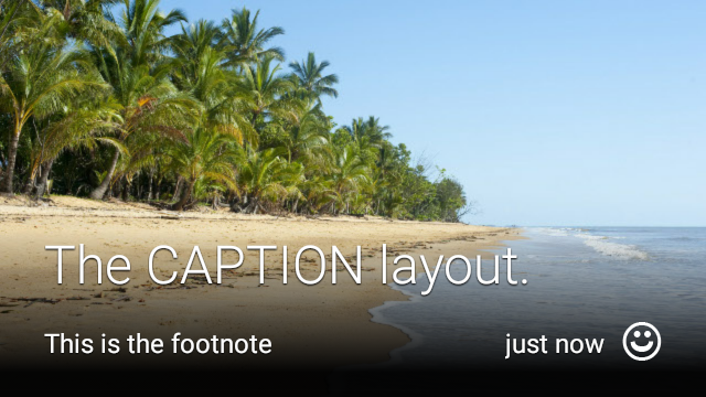
CAPTION
CardBuilder.Layout.CAPTION
בפריסה יש פסיפס של תמונה ברקע
וטקסט קצר של כיתוב מיושר בתחתית הכרטיס. סמל יכול להיות גם
שמוצב לצד הכיתוב כדי לייצג, לדוגמה, את הזהות של אדם
המשויך לתוכן הכרטיס.
View view1 = new CardBuilder(context, CardBuilder.Layout.CAPTION)
.setText("The caption layout.")
.setFootnote("This is the footnote")
.setTimestamp("just now")
.addImage(R.drawable.beach)
.setAttributionIcon(R.drawable.ic_smile)
.getView();
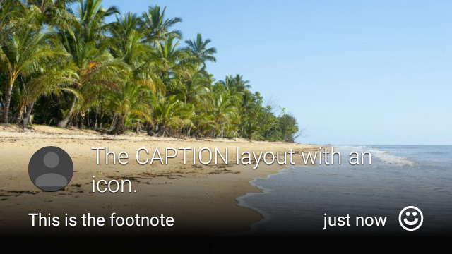
View view2 = new CardBuilder(context, CardBuilder.Layout.CAPTION)
.setText("The caption layout with an icon.")
.setFootnote("This is the footnote")
.setTimestamp("just now")
.addImage(R.drawable.beach)
.setIcon(R.drawable.ic_avatar)
.setAttributionIcon(R.drawable.ic_smile)
.getView();
TITLE
CardBuilder.Layout.TITLE
בפריסה יש פסיפס של תמונה ברקע
עם כותרת ממורכזת וסמל אופציונלי בתחתית הכרטיס. הפריסה הזו
משמש לעיתים קרובות לייצוג אנשי קשר או שיתוף יעדים. הערת השוליים וחותמת הזמן הן
אין תמיכה בפריסה הזו.

View view = new CardBuilder(context, CardBuilder.Layout.TITLE)
    .setText("TITLE Card")
    .setIcon(R.drawable.ic_phone)
    .addImage(R.drawable.beach)
    .getView();
AUTHOR
משתמשים ב
CardBuilder.Layout.AUTHOR
פריסה להצגת הודעה או שיחה
כאשר המוקד הוא במחבר. הוא תומך בפסיפס של תמונה ברקע,
סמל שמשמש כדמות של המחבר, וכותרת וכותרת משנה שבהן אפשר
של מידע מזהה.
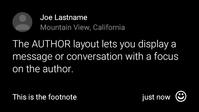
View view = new CardBuilder(context, CardBuilder.Layout.AUTHOR)
    .setText("The AUTHOR layout lets you display a message or conversation "
            + " with a focus on the author.")
    .setIcon(R.drawable.ic_avatar)
    .setHeading("Joe Lastname")
    .setSubheading("Mountain View, California")
    .setFootnote("This is the footnote")
    .setTimestamp("just now")
    .getView();
MENU
CardBuilder.Layout.MENU
הפריסה נראית כמו תפריט סטנדרטי ב-Glass. יש בו
סמל וכותרת ממורכזים, והערת שוליים אופציונלית. שימוש בפריסה הזו עבור
מסכי אישור (מעבר מ'מחיקה' ל'נמחק' אחרי שהמשתמש
בוחר אפשרות בתפריט, למשל). אם אתם צריכים תפריט אמיתי,
תפריט האפשרויות הרגילות.
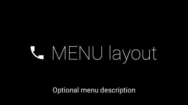
View view = new CardBuilder(context, CardBuilder.Layout.MENU)
    .setText("MENU layout")
    .setIcon(R.drawable.ic_phone)
    .setFootnote("Optional menu description")
    .getView();
EMBED_INSIDE
CardBuilder.Layout.EMBED_INSIDE
מטמיעה ב-Glass הרגיל את ה-XML של הפריסה המותאמת אישית שלכם
תבנית לכרטיס. כך תוכלו לעצב ממשק משתמש מותאם אישית לאפליקציה, אבל עדיין
המיקום הנכון של הערת השוליים, חותמת הזמן, סמל השיוך (Attribution) של הכרטיס
את האינדיקטור של סטאק, אם יש בו צורך.
אחרי השיחה
CardBuilder.getView()
להשתמש
findViewById()
בתוצאה כדי לגשת לתצוגות בתוך הפריסה המוטמעת. באופן דומה, אם
לשלוח קריאה
CardBuilder.getRemoteViews()
ניתן לשנות את התצוגות של הפריסה המוטמעת על ידי העברה ישירה של המזהים שלהן
לתוך
RemoteViews
שמרכיבות את העין.
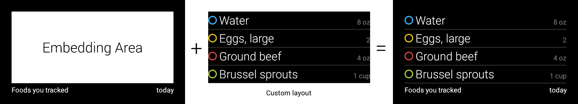
View view = new CardBuilder(context, CardBuilder.Layout.EMBED_INSIDE)
    .setEmbeddedLayout(R.layout.food_table)
    .setFootnote("Foods you tracked")
    .setTimestamp("today")
    .getView();
TextView textView1 = (TextView) view.findViewById(R.id.text_view_1);
textView1.setText("Water");
// ...and so on
דוגמה מפורטת יותר זמינה ב-GitHub. פרויקט ApiDemo.
ALERT
CardBuilder.Layout.ALERT
מכילה סמל גדול ממורכז עם
הודעה ראשית והערת שוליים. שימוש בפריסה הזו
Dialog עד
להציג הודעת מידע, אזהרה או שגיאה חשובה ב-Glassware.

הדוגמה הבאה מציגה הטמעה של AlertDialog וסוגרת את
ופותח את הגדרות ה-Wi-Fi כשהמשתמש מקיש על הכרטיס:
- יצירת כיתה שמרחיבים את
Dialog. - יוצרים את הכרטיס באמצעות
CardBuilderעם הפריסהCardBuilder.Layout.ALERT, ואז מגדירים את תצוגת התוכן באמצעות הכרטיס הזה. (אופציונלי) יוצרים
GestureDetectorכדי לטפל בתנועות של משתמשים בכרטיס הזה.public class AlertDialog extends Dialog { private final DialogInterface.OnClickListener mOnClickListener; private final AudioManager mAudioManager; private final GestureDetector mGestureDetector; /** * Handles the tap gesture to call the dialog's * onClickListener if one is provided. */ private final GestureDetector.BaseListener mBaseListener = new GestureDetector.BaseListener() { @Override public boolean onGesture(Gesture gesture) { if (gesture == Gesture.TAP) { mAudioManager.playSoundEffect(Sounds.TAP); if (mOnClickListener != null) { // Since Glass dialogs do not have buttons, // the index passed to onClick is always 0. mOnClickListener.onClick(AlertDialog.this, 0); } return true; } return false; } }; public AlertDialog(Context context, int iconResId, int textResId, int footnoteResId, DialogInterface.OnClickListener onClickListener) { super(context); mOnClickListener = onClickListener; mAudioManager = (AudioManager) context.getSystemService(Context.AUDIO_SERVICE); mGestureDetector = new GestureDetector(context).setBaseListener(mBaseListener); setContentView(new CardBuilder(context, CardBuilder.Layout.ALERT) .setIcon(iconResId) .setText(textResId) .setFootnote(footnoteResId) .getView()); } /** Overridden to let the gesture detector handle a possible tap event. */ @Override public boolean onGenericMotionEvent(MotionEvent event) { return mGestureDetector.onMotionEvent(event) || super.onGenericMotionEvent(event); } }(אופציונלי) בפעילות, מטמיעים
OnClickListenerכדי לטפל בתהליכים נוספים כשהמשתמש מקיש. מידע נוסף על התחלת פעילויות בהגדרות כמו Wi-Fi, הגדרות הפעלה.צריך להפעיל את ה-constructor של
AlertDialogכדי להציג את כרטיס ההתראה.public class MyActivity extends Activity { ... private final DialogInterface.OnClickListener mOnClickListener = new DialogInterface.OnClickListener() { @Override public void onClick(DialogInterface dialog, int button) { // Open WiFi Settings startActivity(new Intent(Settings.ACTION_WIFI_SETTINGS)); } }; @Override protected void onCreate(Bundle bundle) { ... new AlertDialog(context, R.drawable.ic_cloud_sad_150, R.string.alert_text, R.string.alert_footnote_text, mOnClickListener).show(); ... } }
פריסות XML
הנה שתי פריסות כרטיסים בסיסיות שבהן אפשר להשתמש במחלקה של CardBuilder לא מתאימות לצרכים שלכם.
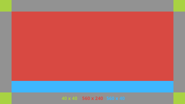
פריסה ראשית
הפריסה הזו מגדירה את המרווח הפנימי הסטנדרטי ואת הכותרת התחתונה של כרטיס. הוספת תיאור משלך
צפיות בRelativeLayout הריק.
<?xml version="1.0" encoding="utf-8"?>
<FrameLayout xmlns:android="http://schemas.android.com/apk/res/android"
    xmlns:tools="http://schemas.android.com/tools"
    android:id="@+id/layout"
    android:layout_width="match_parent"
    android:layout_height="match_parent"
    >

    <RelativeLayout
        android:id="@+id/body_layout"
        android:layout_width="match_parent"
        android:layout_height="@dimen/glass_card_body_height"
        android:layout_marginLeft="@dimen/glass_card_margin"
        android:layout_marginTop="@dimen/glass_card_margin"
        android:layout_marginRight="@dimen/glass_card_margin"
        tools:ignore="UselessLeaf"
        >

        <!-- Put your widgets inside this RelativeLayout. -->

    </RelativeLayout>

    <LinearLayout
        android:id="@+id/footer_container"
        android:layout_width="match_parent"
        android:layout_height="wrap_content"
        android:layout_gravity="bottom|left"
        android:layout_marginLeft="@dimen/glass_card_margin"
        android:layout_marginBottom="@dimen/glass_card_footer_margin"
        android:layout_marginRight="@dimen/glass_card_margin"
        android:orientation="horizontal"
        >

        <!-- The footer view will grow to fit as much content as possible while the
             timestamp view keeps a fixed width. If the footer text is too long, it
             will be ellipsized with a 40px margin between it and the timestamp. -->

        <TextView
            android:id="@+id/footer"
            android:layout_width="0dip"
            android:layout_height="wrap_content"
            android:layout_weight="1"
            android:ellipsize="end"
            android:singleLine="true"
            android:textAppearance="?android:attr/textAppearanceSmall"
            />

        <TextView
            android:id="@+id/timestamp"
            android:layout_width="wrap_content"
            android:layout_height="wrap_content"
            android:layout_marginLeft="@dimen/glass_card_margin"
            android:ellipsize="end"
            android:singleLine="true"
            android:textAppearance="?android:attr/textAppearanceSmall"
            />

    </LinearLayout>

</FrameLayout>
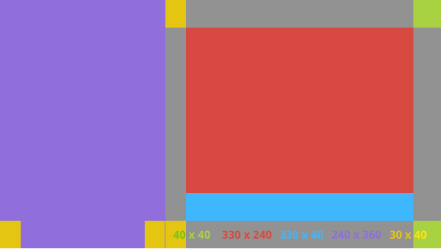
פריסת עמודה שמאלית
ההגדרה הזו מגדירה עמודה שמאלית של 240 פיקסלים ועמודה ימנית של 400 פיקסלים בצורת שתי RelativeLayout.
שאפשר להשקיע בהם את הצפיות.
<?xml version="1.0" encoding="utf-8"?>
<RelativeLayout xmlns:android="http://schemas.android.com/apk/res/android"
    xmlns:tools="http://schemas.android.com/tools"
    android:layout_width="match_parent"
    android:layout_height="match_parent"
    >

    <RelativeLayout
        android:id="@+id/left_column"
        android:layout_width="@dimen/glass_card_left_column_width"
        android:layout_height="match_parent"
        >

        <!-- Put widgets for the left column inside this RelativeLayout. -->

    </RelativeLayout>

    <RelativeLayout
        android:layout_width="wrap_content"
        android:layout_height="@dimen/glass_card_body_height"
        android:layout_alignParentRight="true"
        android:layout_alignParentTop="true"
        android:layout_marginLeft="@dimen/glass_card_two_column_margin"
        android:layout_marginRight="@dimen/glass_card_margin"
        android:layout_marginTop="@dimen/glass_card_margin"
        android:layout_toRightOf="@+id/left_column"
        tools:ignore="UselessLeaf"
        >

        <!-- Put widgets for the right column inside this RelativeLayout. -->

    </RelativeLayout>

    <LinearLayout
        android:id="@+id/footer_container"
        android:layout_width="wrap_content"
        android:layout_height="wrap_content"
        android:layout_alignParentBottom="true"
        android:layout_alignParentRight="true"
        android:layout_gravity="bottom|left"
        android:layout_marginBottom="@dimen/glass_card_footer_margin"
        android:layout_marginLeft="@dimen/glass_card_two_column_margin"
        android:layout_marginRight="@dimen/glass_card_margin"
        android:layout_toRightOf="@+id/left_column"
        android:orientation="horizontal"
        >

        <!--
             The footer view will grow to fit as much content as possible while the
             timestamp view keeps a fixed width. If the footer text is too long, it
             will be ellipsized with a 40px margin between it and the timestamp.
        -->

        <TextView
            android:id="@+id/footer"
            android:layout_width="0dip"
            android:layout_height="wrap_content"
            android:layout_weight="1"
            android:ellipsize="end"
            android:singleLine="true"
            android:textAppearance="?android:attr/textAppearanceSmall"
            />

        <TextView
            android:id="@+id/timestamp"
            android:layout_width="wrap_content"
            android:layout_height="wrap_content"
            android:layout_marginLeft="@dimen/glass_card_margin"
            android:ellipsize="end"
            android:singleLine="true"
            android:textAppearance="?android:attr/textAppearanceSmall"
            />

    </LinearLayout>

</RelativeLayout>
מאפיינים רגילים
השתמשו בקובץ הזה בשילוב עם הפריסות הקודמות או פריסות משלכם כדי:
בהתאם לסגנון הסטנדרטי של Glass. יצירת הקובץ הזה בתור
res/values/dimens.xml בפרויקט Android שלך.
<?xml version="1.0" encoding="utf-8"?>

<resources>

    <!-- The recommended margin for the top, left, and right edges of a card. -->
    <dimen name="glass_card_margin">40px</dimen>

    <!-- The recommended margin between the bottom of the card and the footer. This is
         an adjusted value so that the baseline of the text in the footer sits 40px
         from the bottom of the card, matching the other margins. -->
    <dimen name="glass_card_footer_margin">33px</dimen>

    <!-- The recommended margin for the left column of the two-column card. -->
    <dimen name="glass_card_two_column_margin">30px</dimen>

    <!-- The maximum height of the body content inside a card. -->
    <dimen name="glass_card_body_height">240px</dimen>

    <!-- The width of the left column in the two-column layout. -->
    <dimen name="glass_card_left_column_width">240px</dimen>

</resources>