Tab adalah tombol yang selalu muncul dalam grup dan bergantung pada status satu sama lain: hanya satu tombol yang dapat aktif pada waktu tertentu.

Anatomi
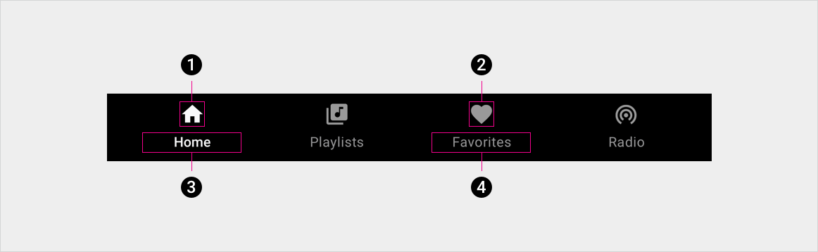
2. Ikon tab tidak aktif
3. Label tab aktif
4. Label tab tidak aktif
Spesifikasi
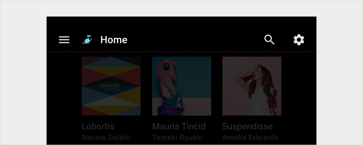
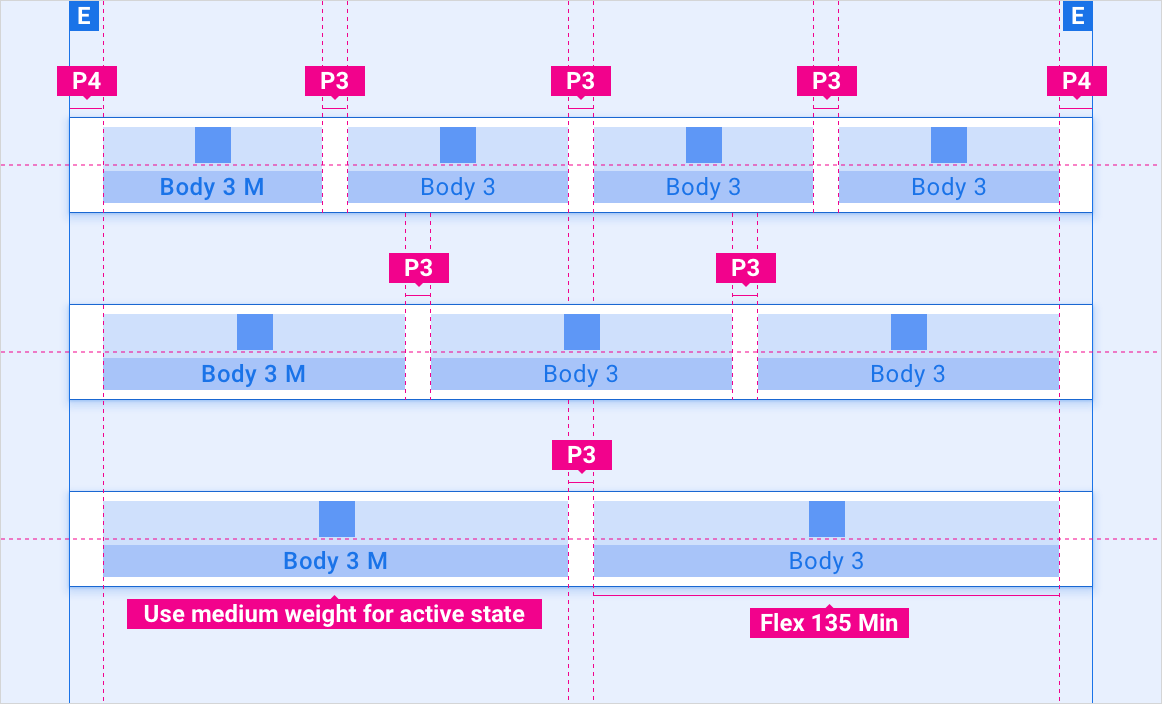
Tab bertingkat di panel aplikasi – rata kiri
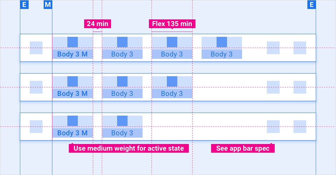
Tab bertingkat di panel aplikasi – penyelarasan fleksibel
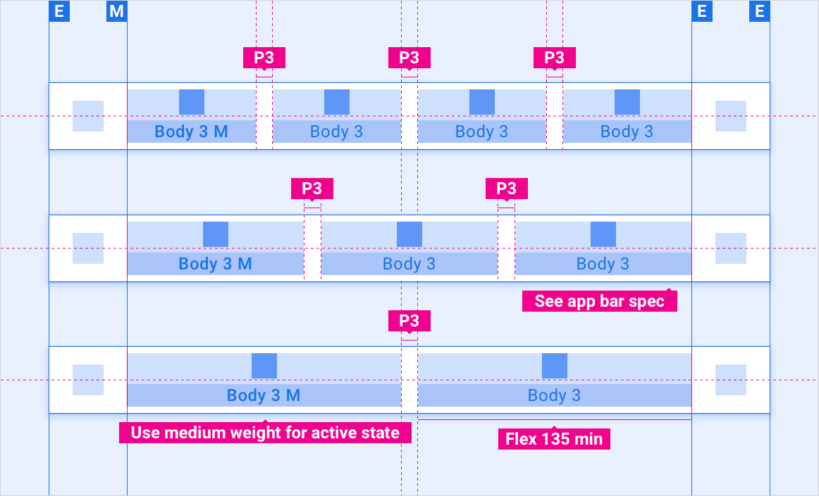
Tab diciutkan di panel aplikasi – menu panel samping
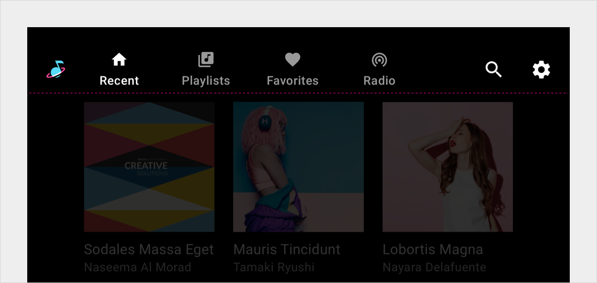
Bilah tab mandiri – rata kiri
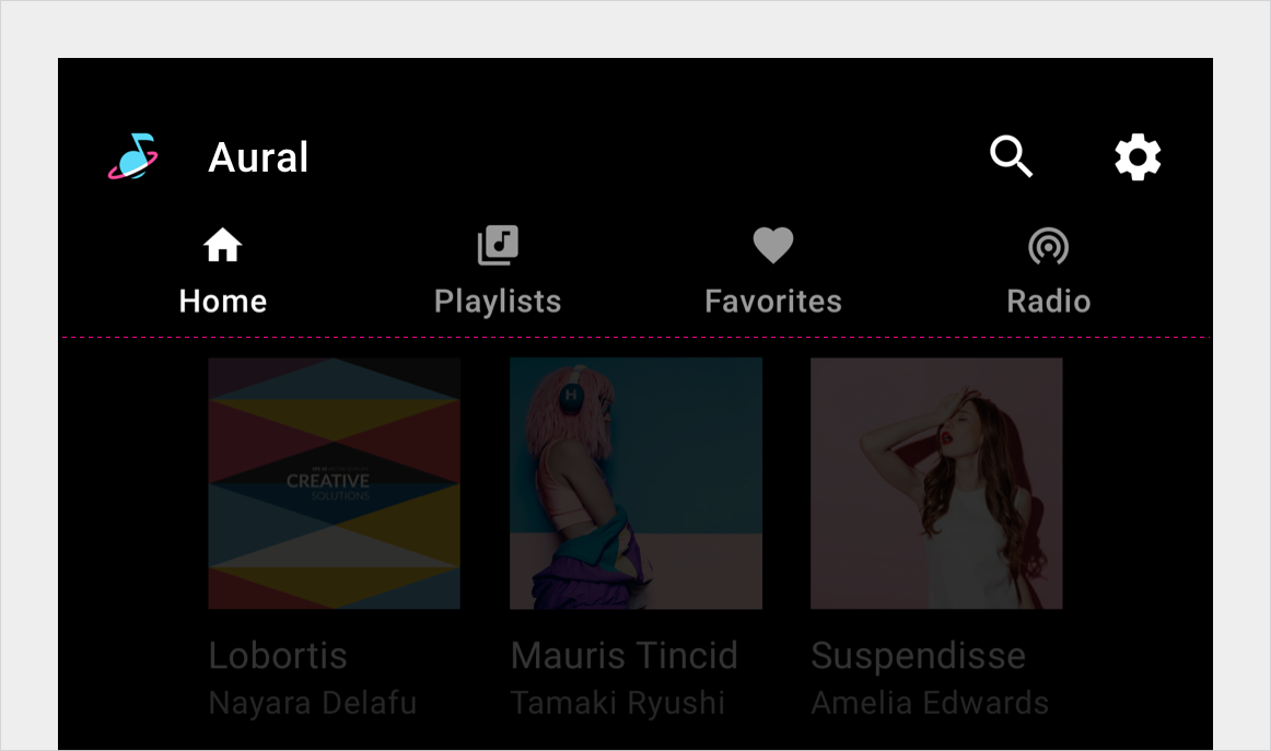
Bilah tab mandiri – perataan fleksibel
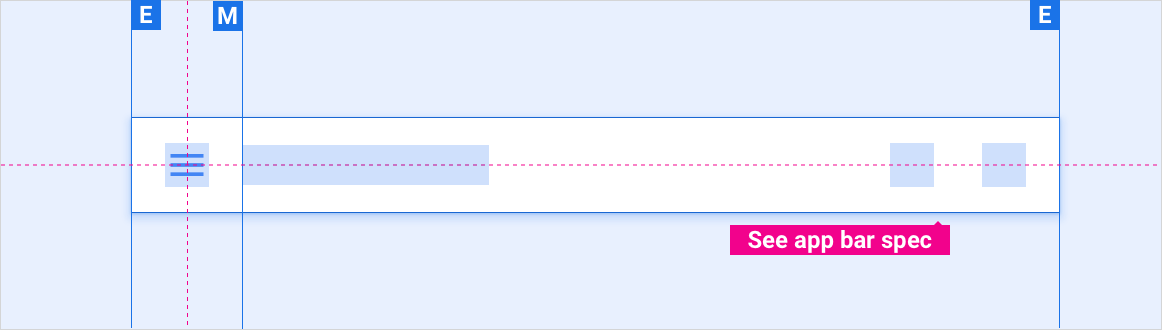
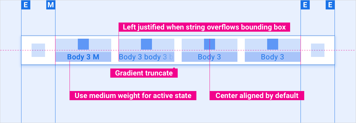
Overflow string label tab
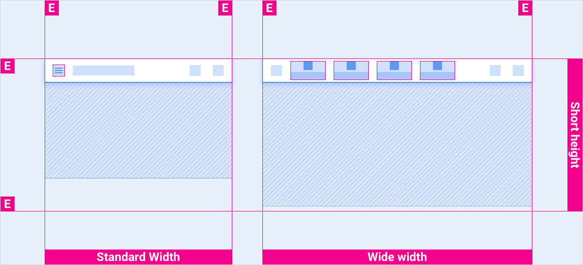
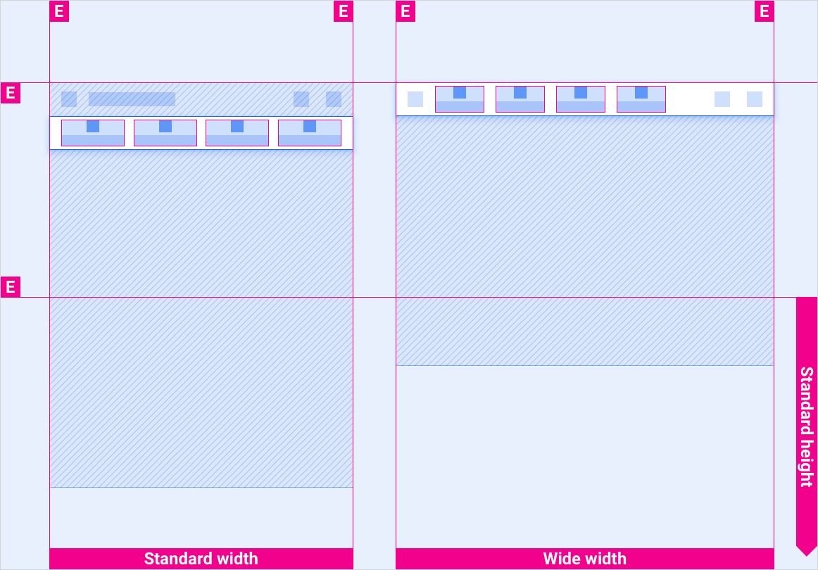
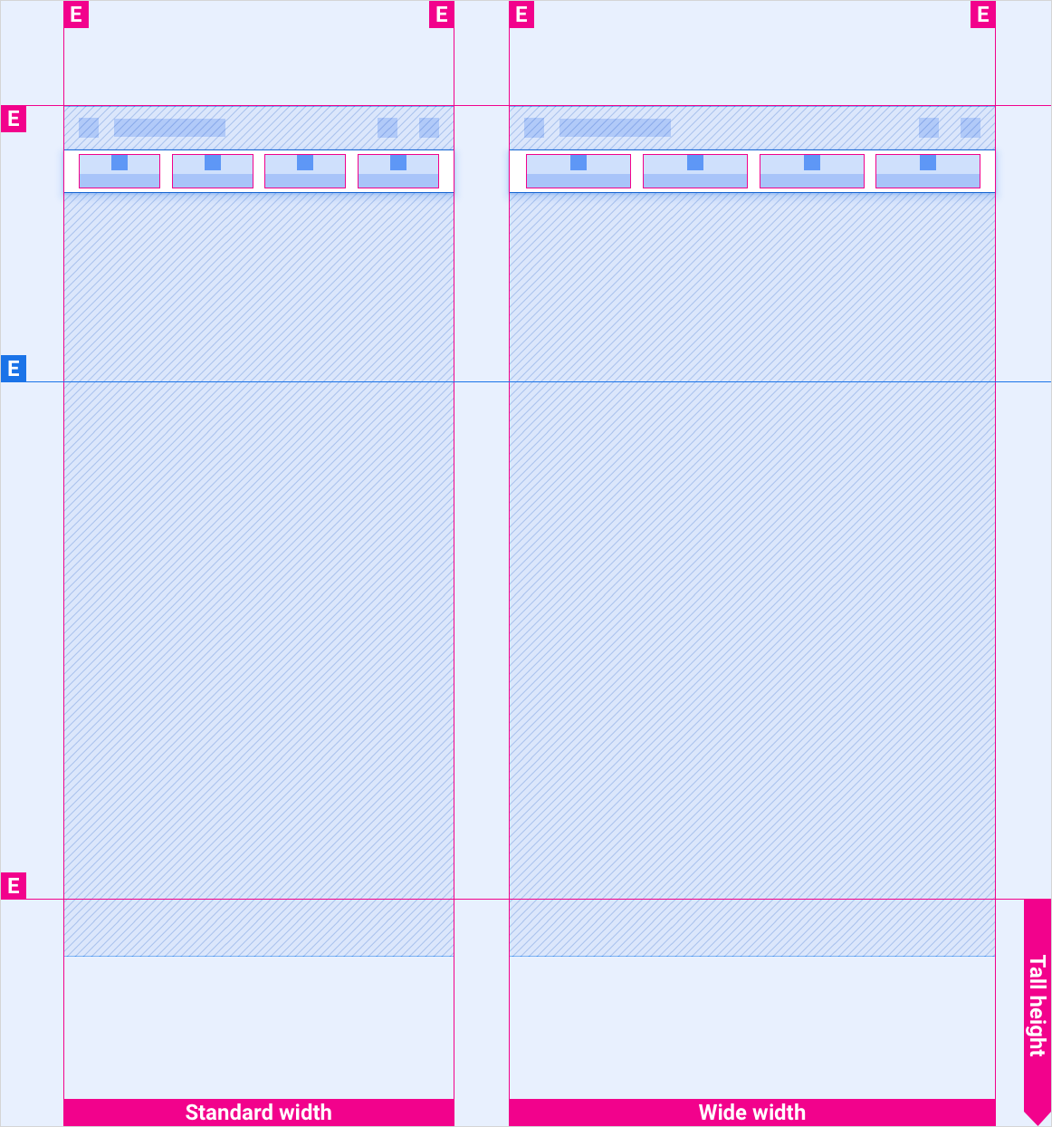
Menskalakan tata letak
Tata letak referensi ini menunjukkan cara menyesuaikan tab untuk mengakomodasi layar dengan berbagai lebar dan tinggi. (Kategori lebar dan tinggi ditentukan di bagian Tata Letak.) Perlu diketahui bahwa semua nilai piksel dalam piksel yang dirender, sebelum pengambilan sampel menurun atau pengambilan sampel naik terjadi.
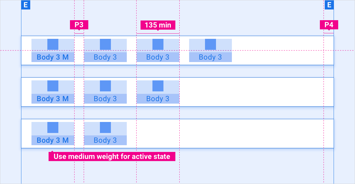
Layar standar vs. lebar dalam kurung tinggi pendek
Layar standar vs. lebar dalam kurung tinggi standar
Layar standar vs. lebar dalam kurung tinggi tinggi
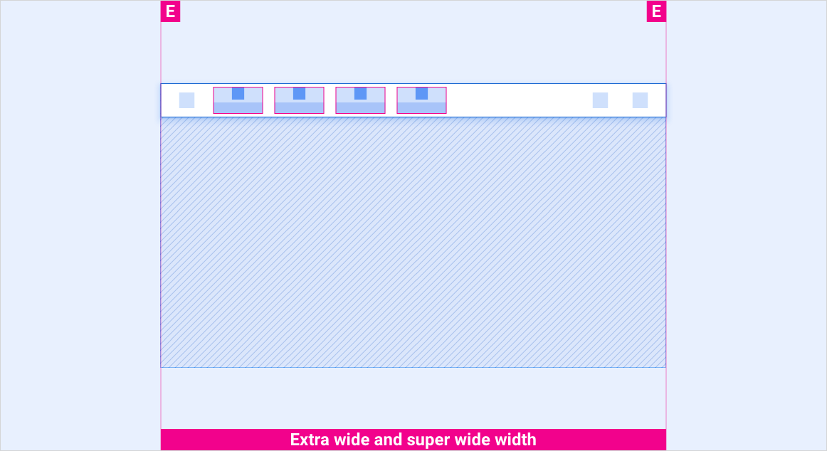
Layar ekstra lebar dan super lebar dalam semua tanda kurung tinggi
Gaya
Tipografi
| Gaya jenis | Jenis Huruf | Bobot | Ukuran (dp) |
|---|---|---|---|
| Bodi 3 M | Roboto | Sedang | 24 |
| Bodi 3 | Roboto | Rutin | 24 |
Warna
| Elemen | Warna(mode hari) | Warna (mode malam) |
|---|---|---|
| Jenis / ikon utama | Putih | Putih @ 88% |
| Jenis / ikon sekunder | Putih @ 72% | Putih @ 60% |
| Latar belakang panel tab | Hitam | Hitam |
| Latar belakang panel tab saat men-scroll | Hitam @ 84% | Hitam @ 88% |
| Ikon tab - status aktif | Putih | Putih @ 88% |
| Ikon tab - status tidak aktif | Putih @ 56% | Putih @ 50% |
Ukuran
| Elemen | Ukuran (dp) |
|---|---|
| Ikon utama | 44 |
| Ikon sekunder | 36 |
| Target sentuh ikon | 76 |
Contoh