Page Summary
-
Tabs are grouped buttons where only one can be active at a time.
-
Tabs have an anatomy that includes active/inactive icons and labels.
-
Tabs can be nested in an app bar with left or flexible alignment, or used as a standalone tab bar.
-
Layouts for tabs adapt to various screen widths and heights.
-
Typography, color, and sizing specifications are provided for tab elements.
Tabs are buttons that always occur in groups and are dependent on each other’s state: only one can be active at any given time.

Anatomy
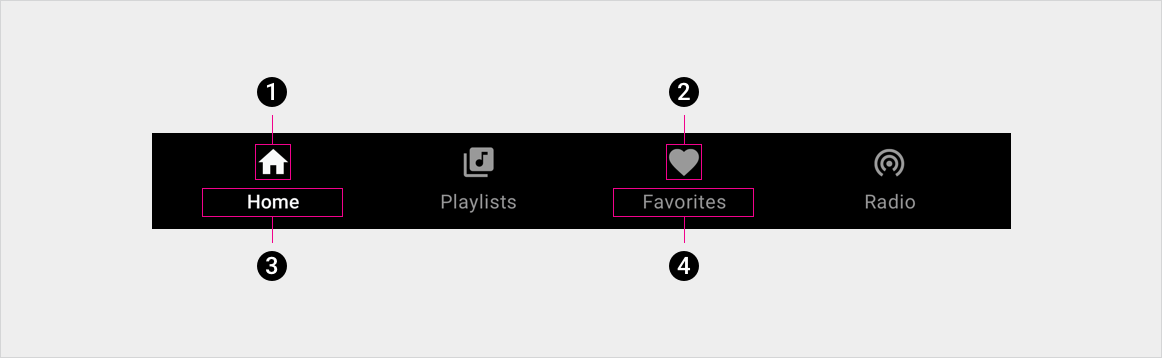
2. Inactive tab icon
3. Active tab label
4. Inactive tab label
Specs
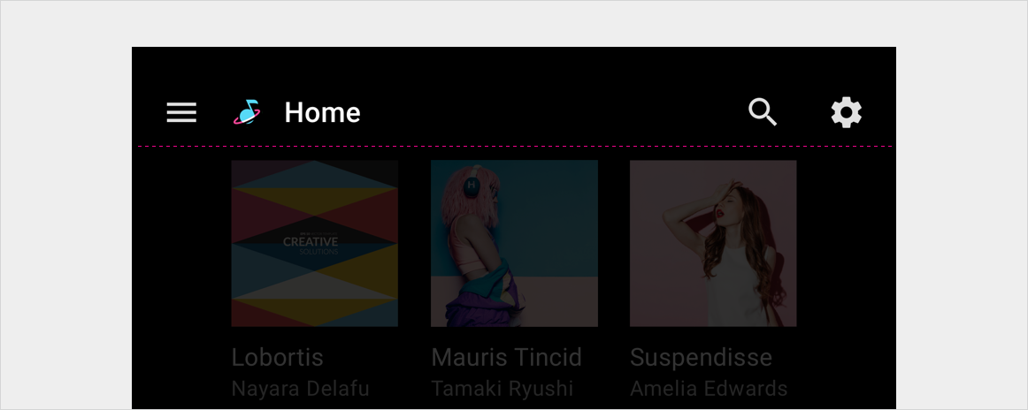
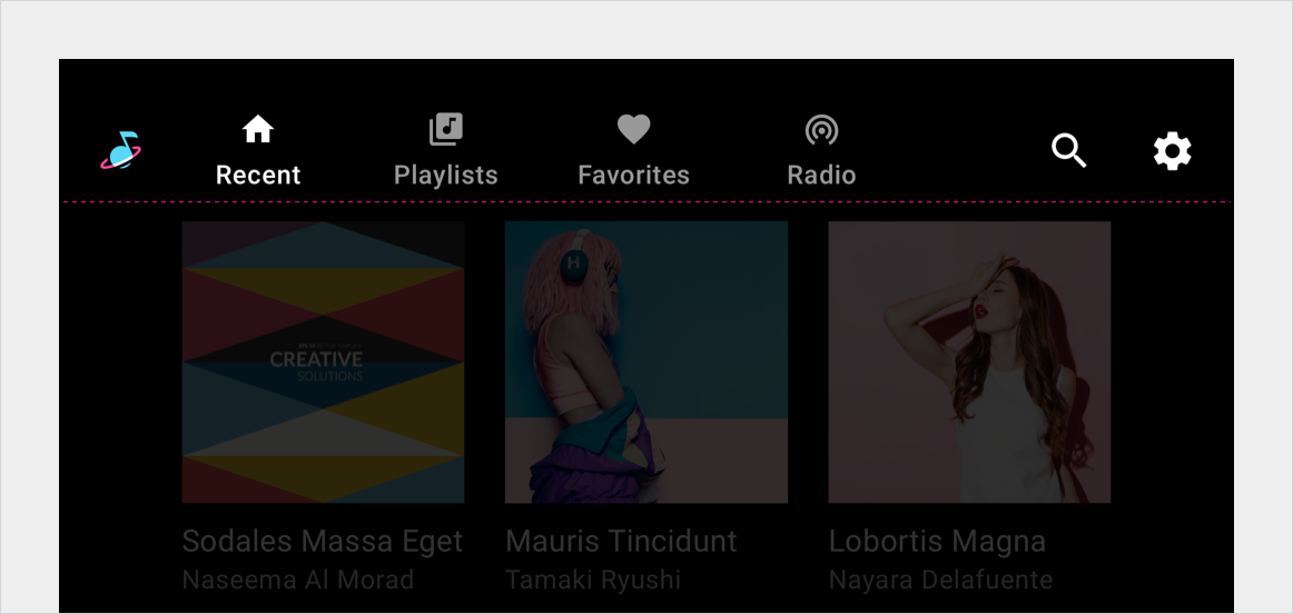
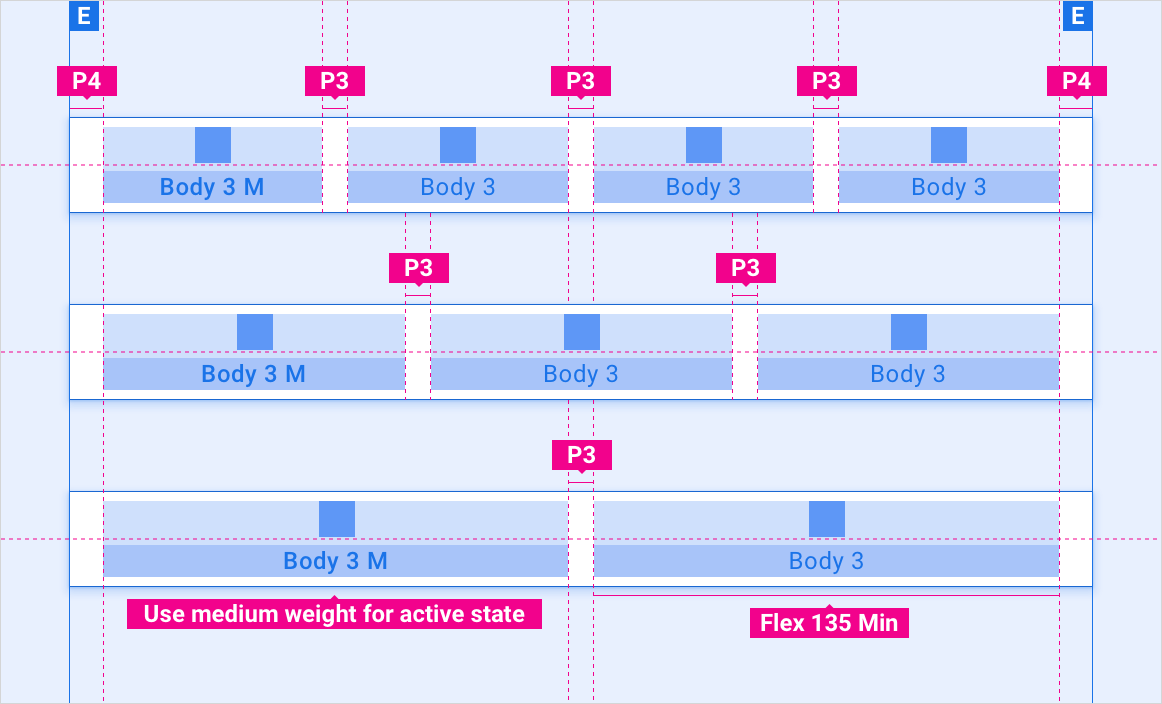
Tabs nested in app bar – left aligned
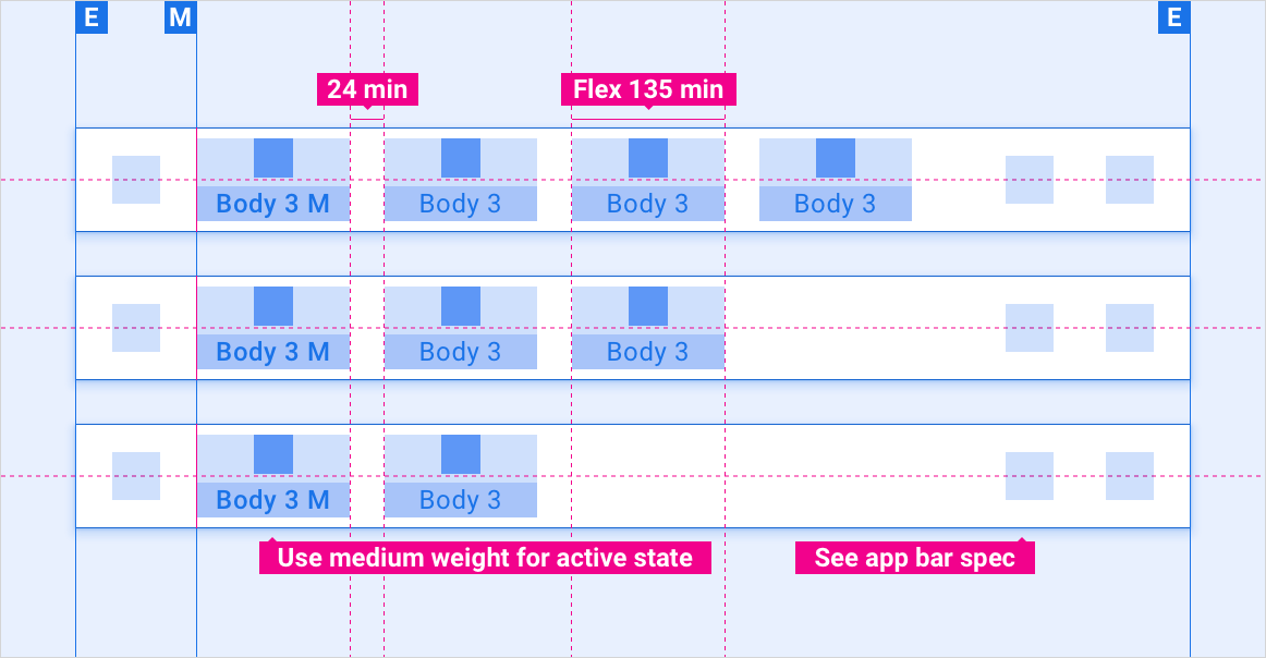
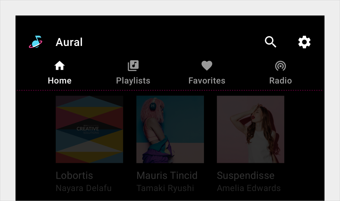
Tabs nested in app bar – flexible alignment
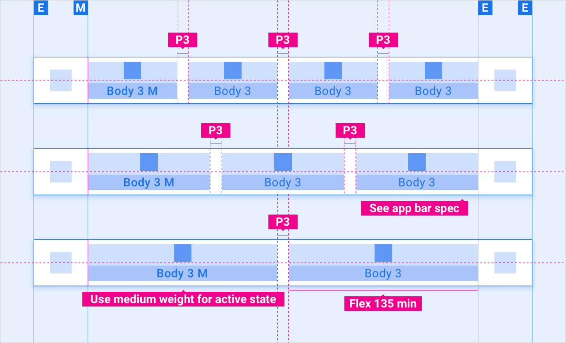
Tabs collapsed in app bar – drawer menu
Standalone tab bar – left aligned
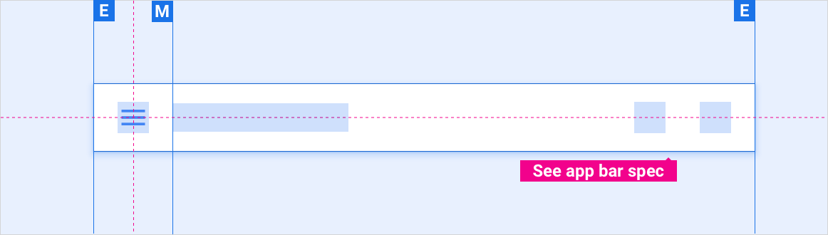
Standalone tab bar – flexible alignment
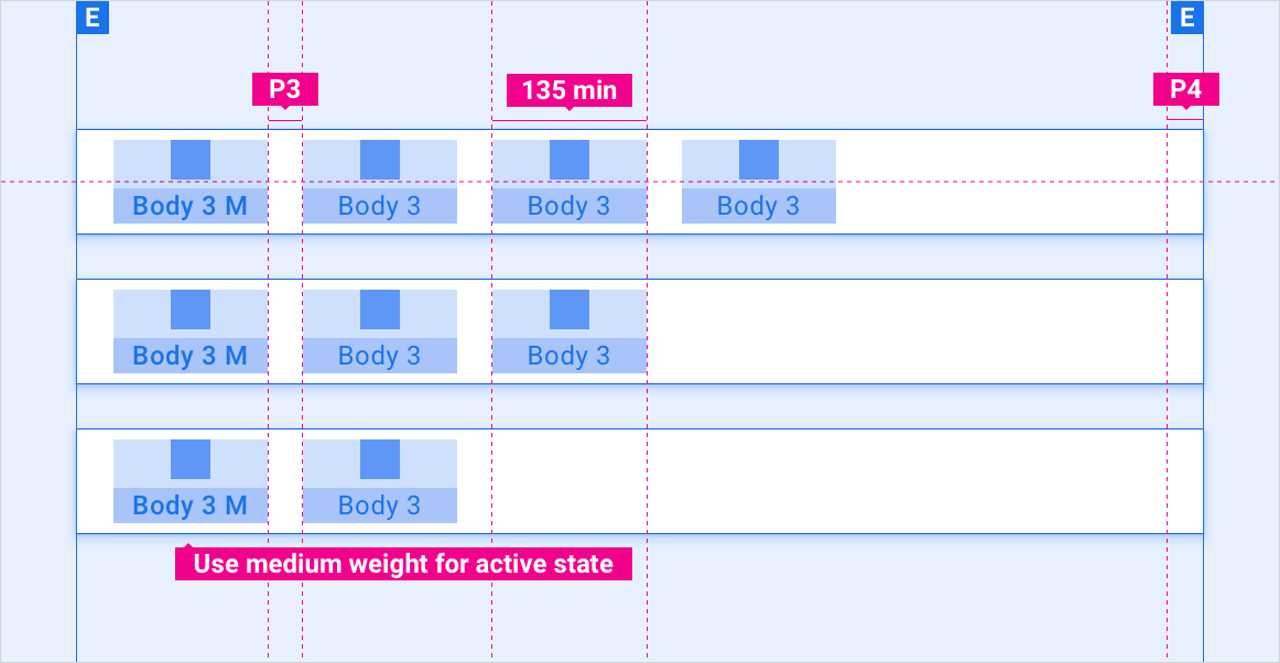
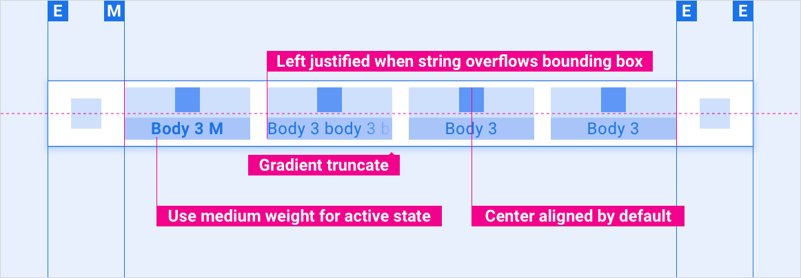
Tab label string overflow
Scaling layouts
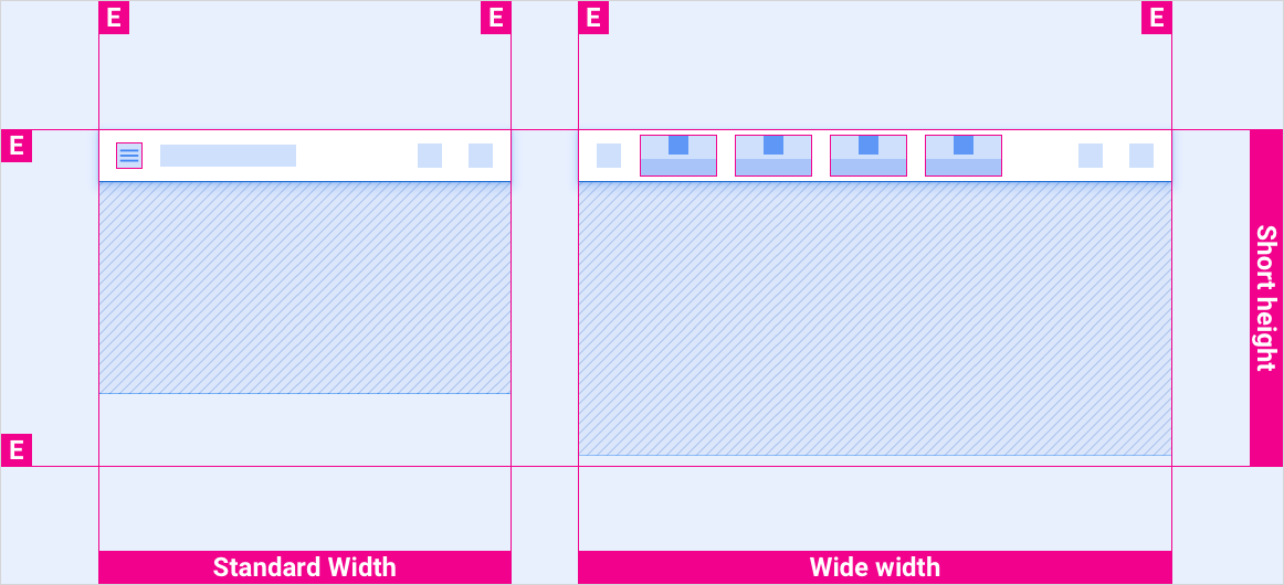
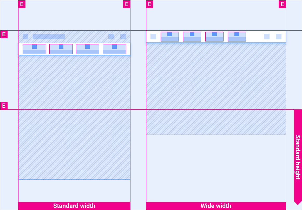
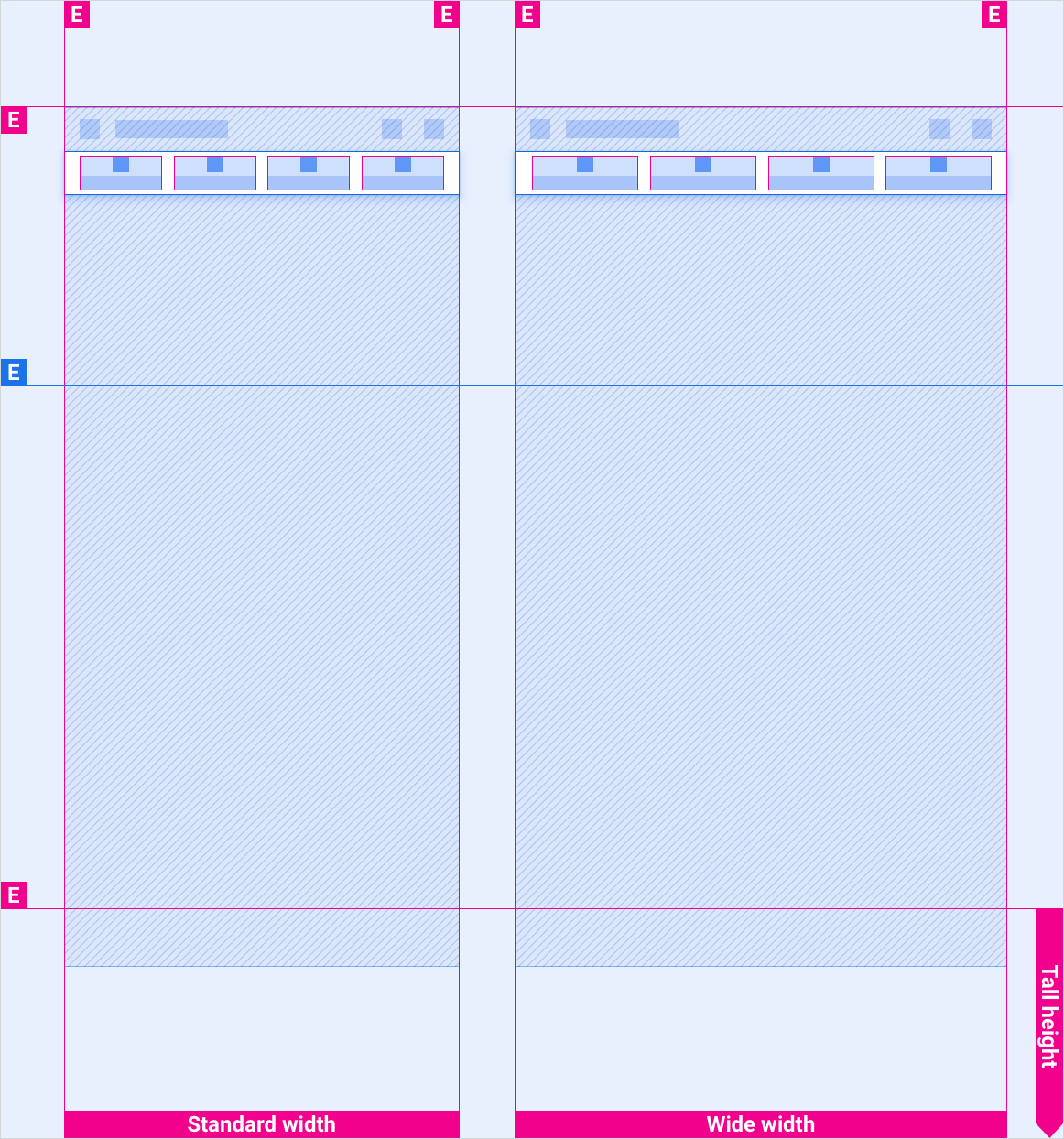
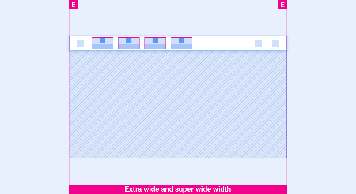
These reference layouts show how to adapt tabs to accommodate screens of various widths and heights. (Width and height categories are defined in the Layout section.) Note that all pixel values are in rendered pixels, before any down-sampling or up-sampling occurs.
Standard vs. wide screens in short height bracket
Standard vs. wide screens in standard height bracket
Standard vs. wide screens in tall height bracket
Extra-wide and super-wide screens in all height brackets
Styles
Typography
| Type style | Typeface | Weight | Size (dp) |
|---|---|---|---|
| Body 3 M | Roboto | Medium | 24 |
| Body 3 | Roboto | Regular | 24 |
Color
| Element | Color(day mode) | Color (night mode) |
|---|---|---|
| Primary type / icons | White | White @ 88% |
| Secondary type / icons | White @ 72% | White @ 60% |
| Tab bar background | Black | Black |
| Tab bar background on scroll | Black @ 84% | Black @ 88% |
| Tab icon - active state | White | White @ 88% |
| Tab icon - inactive state | White @ 56% | White @ 50% |
Sizing
| Element | Size (dp) |
|---|---|
| Primary icon | 44 |
| Secondary icon | 36 |
| Icon touch target | 76 |
Examples