Las tarjetas de notificaciones comunican pequeñas cantidades de información oportuna del sistema o de una app.
El diseño de estas tarjetas para el SO Android Automotive tiene como objetivo minimizar las distracciones de los conductores. Las tarjetas se presentan en tres versiones básicas:
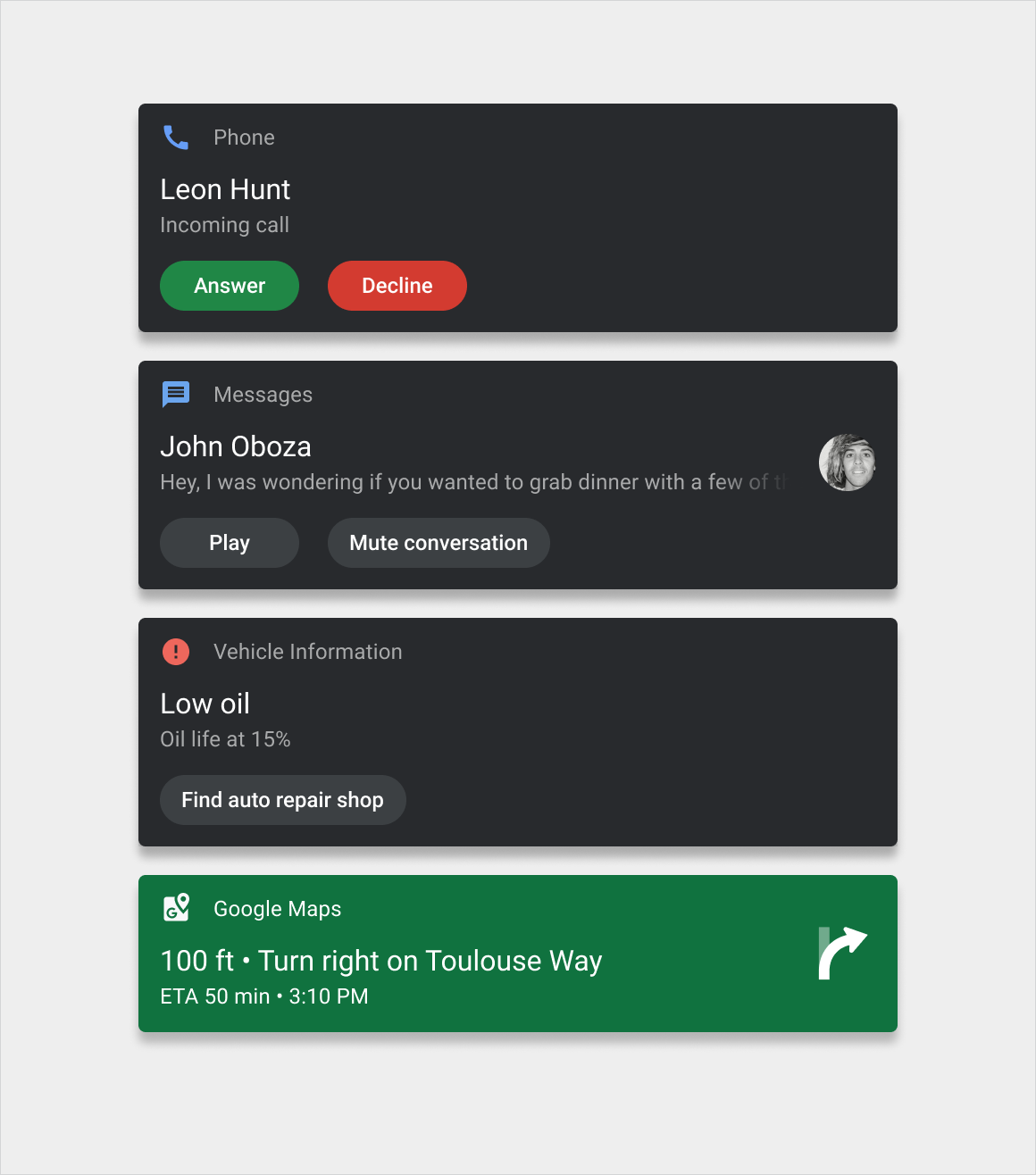
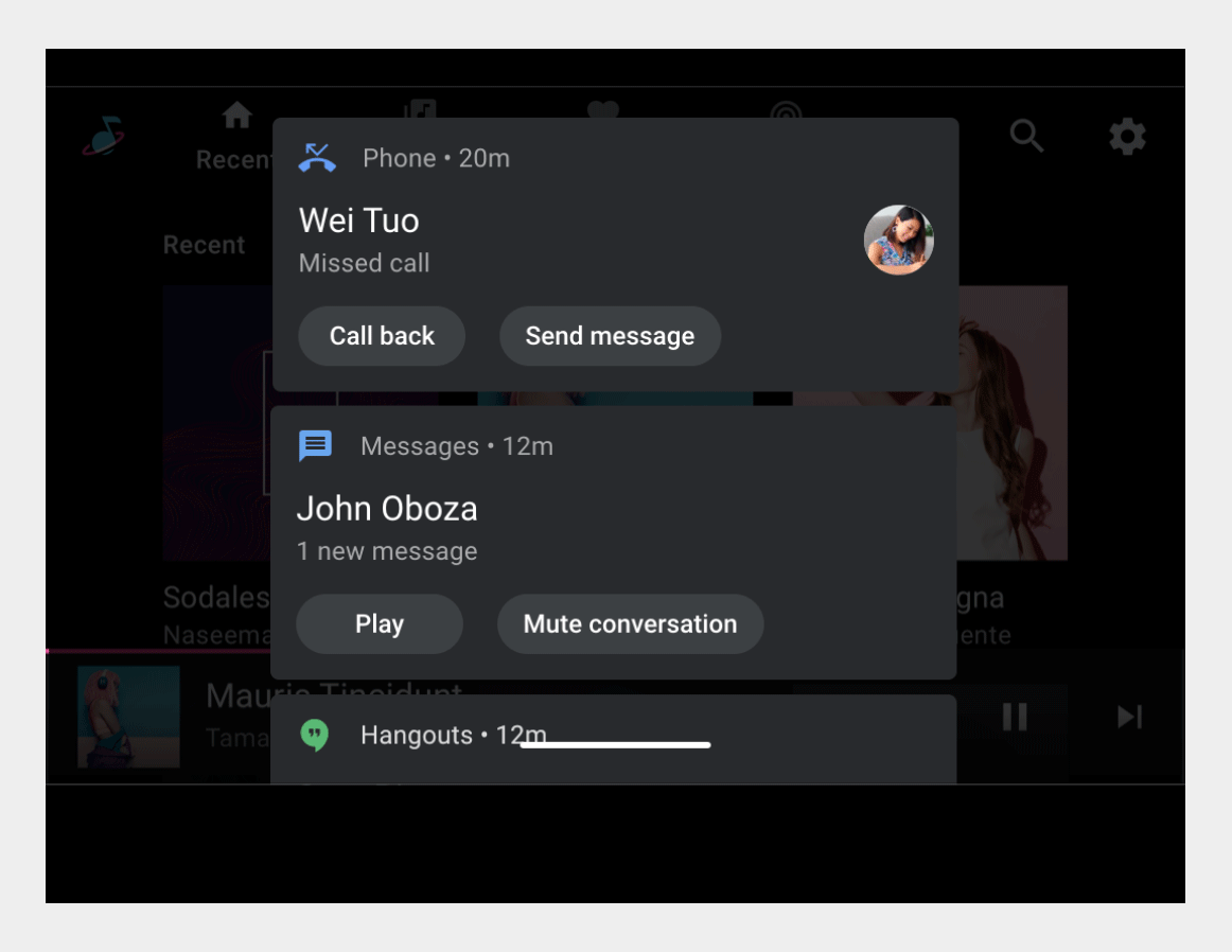
- Tarjeta de notificación de atención (HUN): Se usa para las notificaciones que aparecen brevemente en la pantalla actual.
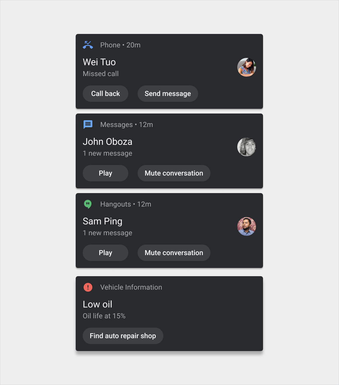
- Tarjeta del Centro de notificaciones: Se usa para las notificaciones que aparecen en el Centro de notificaciones.
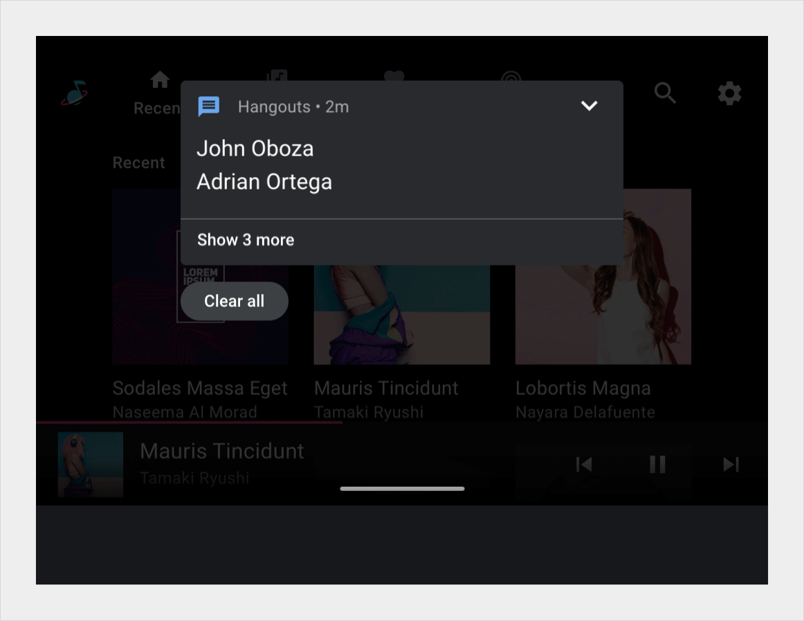
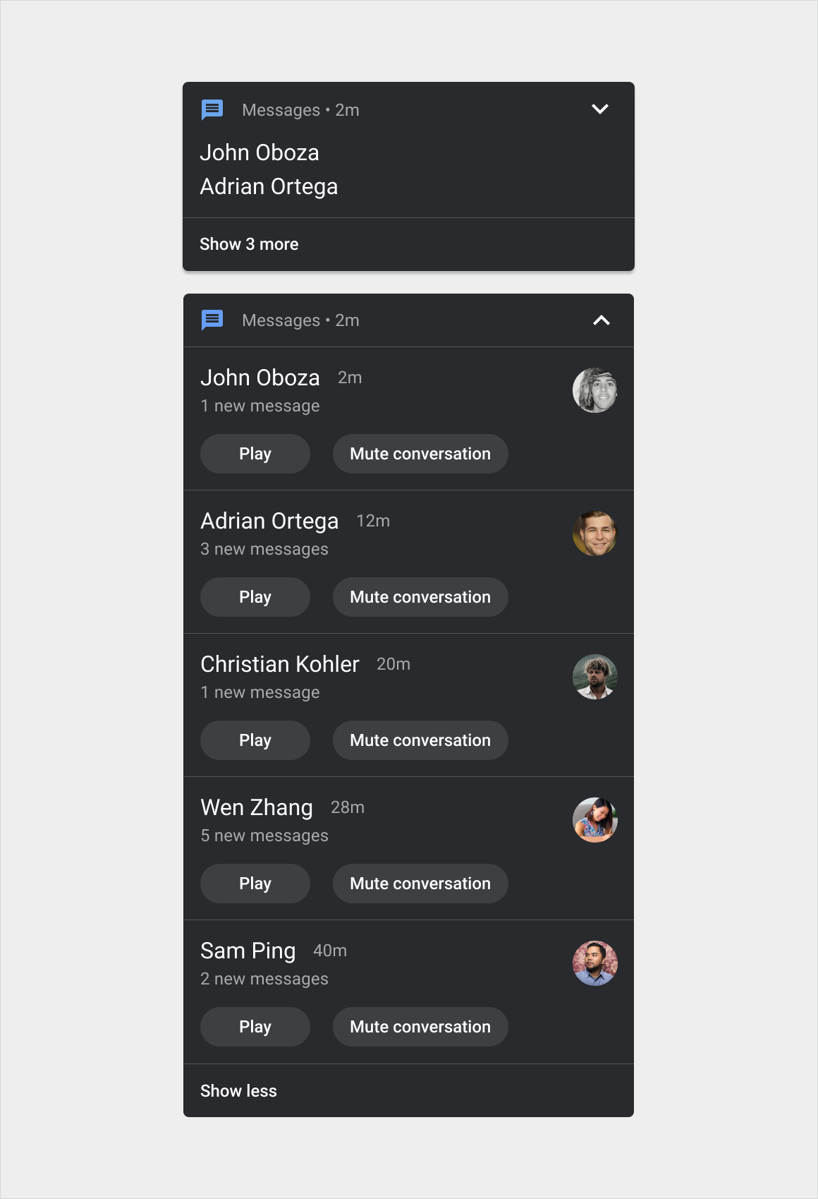
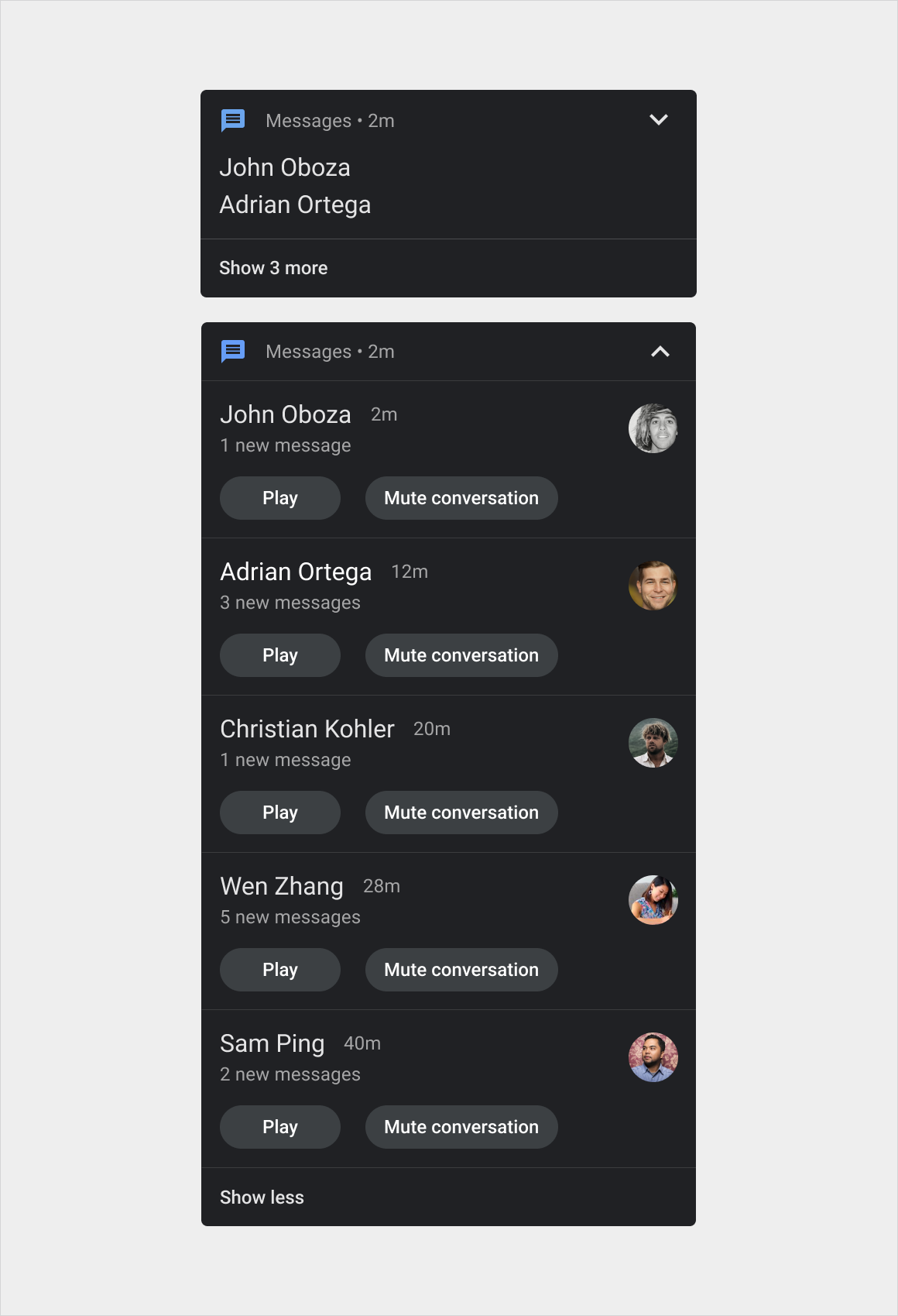
- Tarjeta de notificación agrupada: Combina varias tarjetas del Centro de notificaciones en una sola tarjeta.
Dentro de estas versiones, los diseños también pueden variar levemente según la categoría del mensaje. Por ejemplo, las notificaciones de llamadas tienen íconos y botones diferentes a los de las notificaciones de navegación.

Anatomía
La tarjeta de notificación es un componente flexible que puede incluir una variedad de elementos. Tiene tres versiones principales:
- Tarjeta HUN: Esta versión es más ancha que la tarjeta del Centro de notificaciones y aparece en la parte superior de la pantalla actual hasta que se descarta.
- Tarjeta del Centro de notificaciones: Esta versión es más angosta que la tarjeta HUN y aparece con otras tarjetas similares en el Centro de notificaciones, en una lista vertical.
- Tarjeta de notificaciones agrupadas: Esta versión de la tarjeta del Centro de notificaciones combina múltiples notificaciones relacionadas en una tarjeta, con controles que permiten expandirse para mostrar las notificaciones individuales.
Las variantes de estas versiones según el tipo de mensaje se muestran en Estilos.
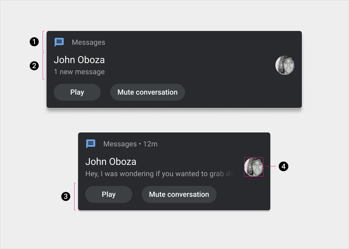
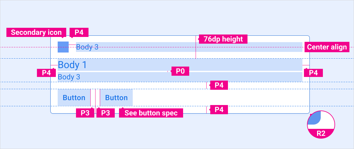
1. Encabezado
2. Contenido (con y sin la vista previa opcional del mensaje, que se puede ocultar mientras el vehículo está conduciendo)
3. Acciones
4. Ícono grande
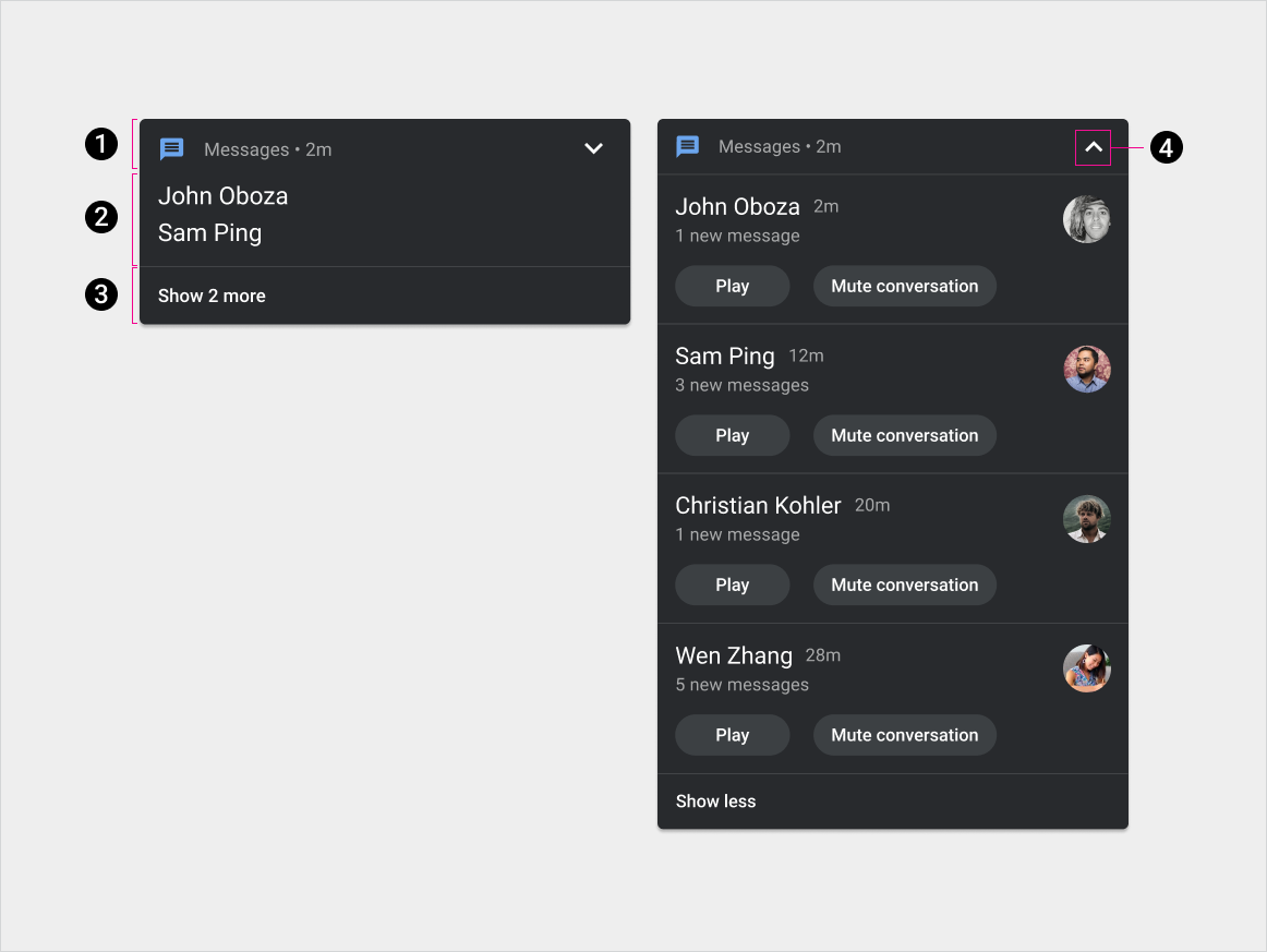
1. Encabezado
2. Contenido
3. Acción de expansión o contracción
4. Indicador de expandir o contraer
Especificaciones: tarjeta HUN
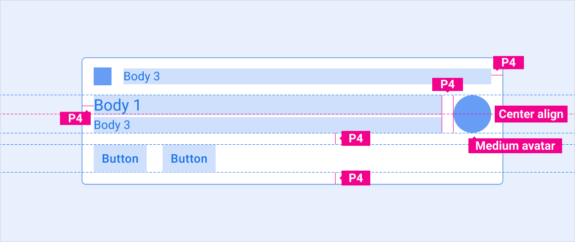
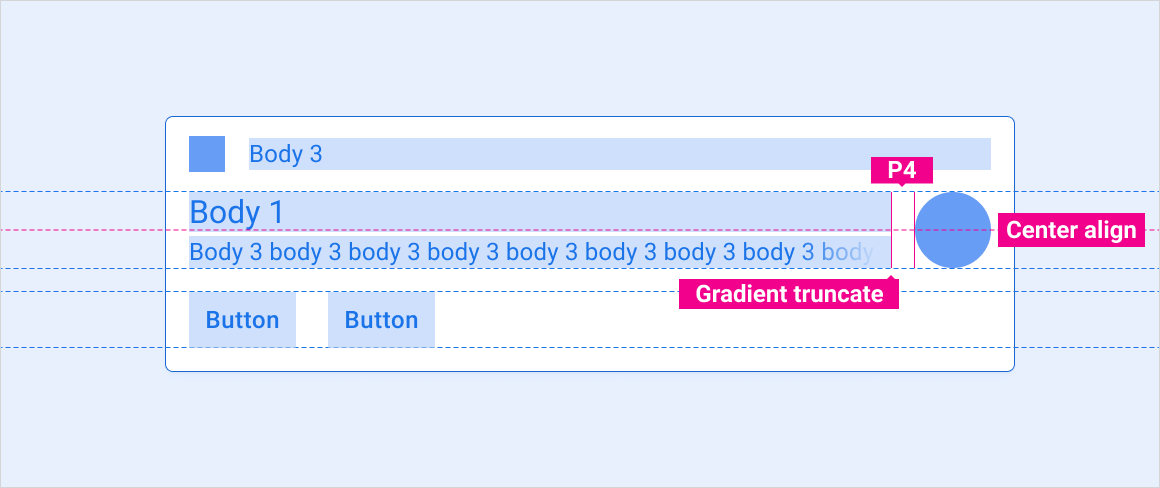
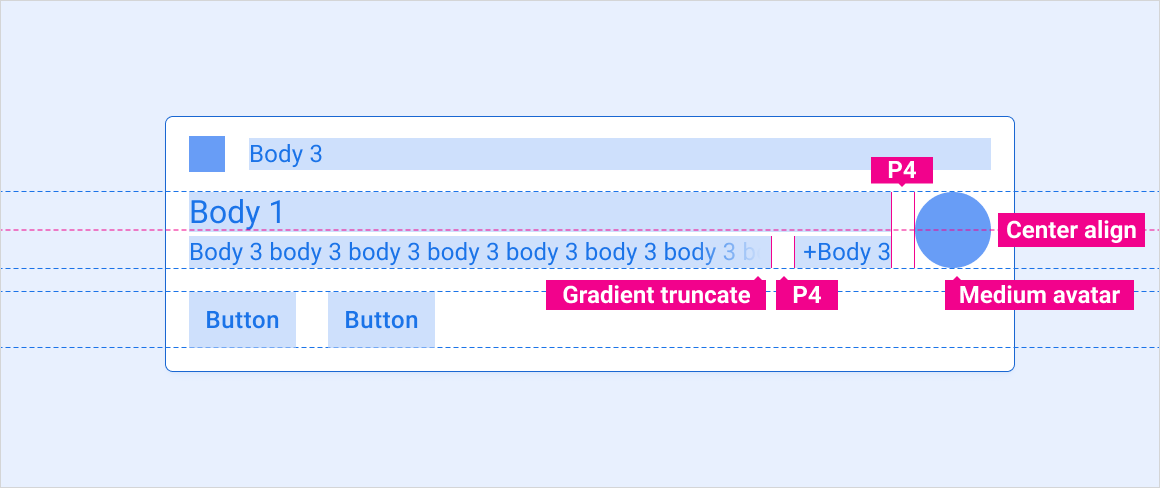
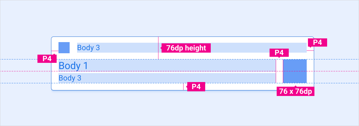
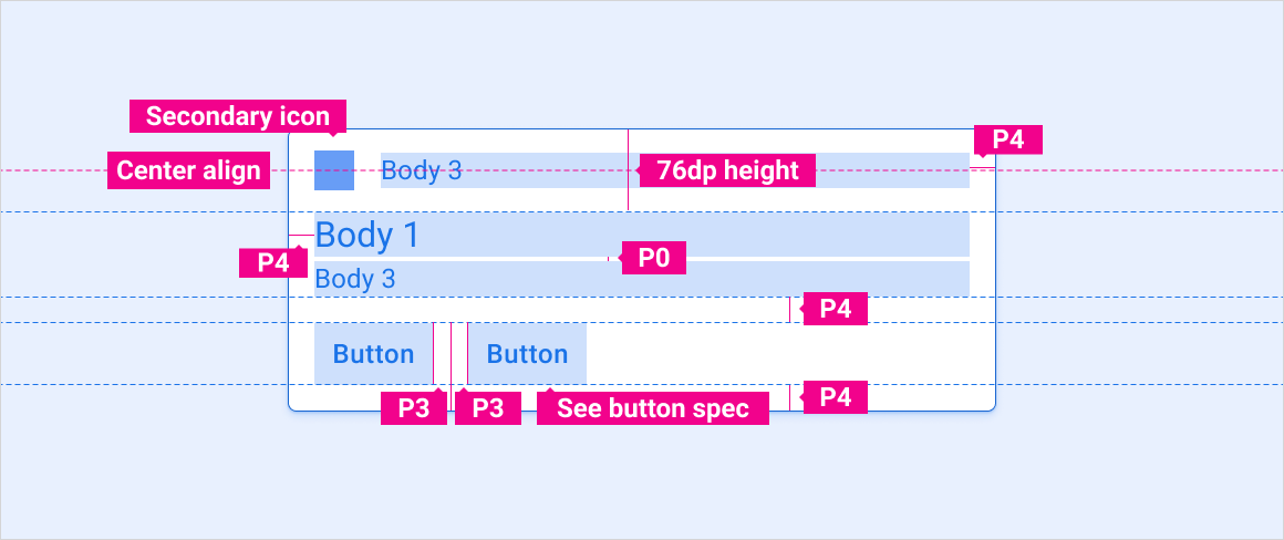
HUN estándar
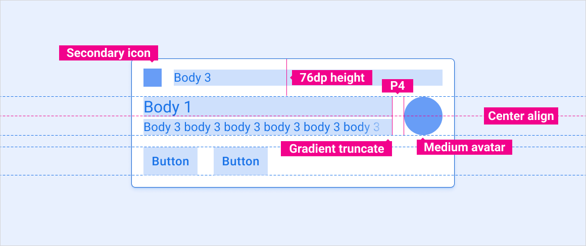
HUN con avatar
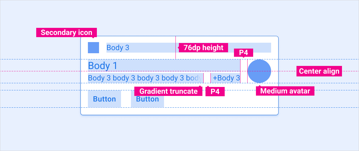
Enviar un mensaje a la HUN con vista previa
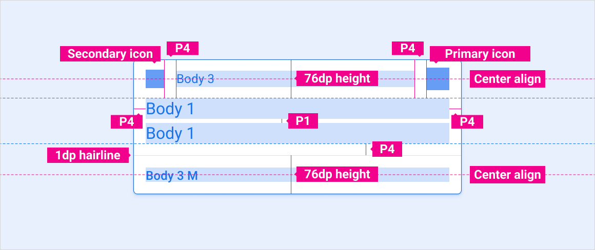
Enviar varios mensajes a la HUN
HUN de imagen grande
Especificaciones: tarjeta del Centro de notificaciones
Notificación estándar
Notificación de mensaje con vista previa
Notificación de mensaje con varios mensajes
Notificación de acción única

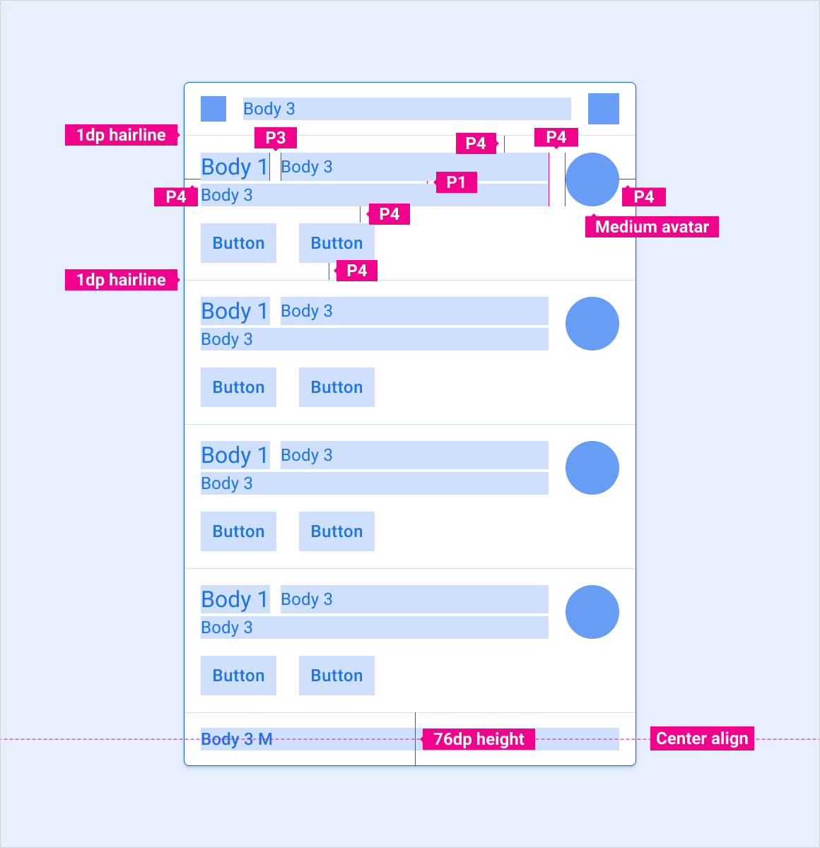
Especificaciones: Tarjeta de notificación agrupada
Notificación agrupada: contraída
Notificación agrupada: expandida
Cómo ajustar diseños
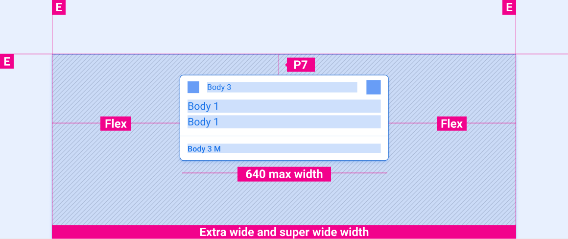
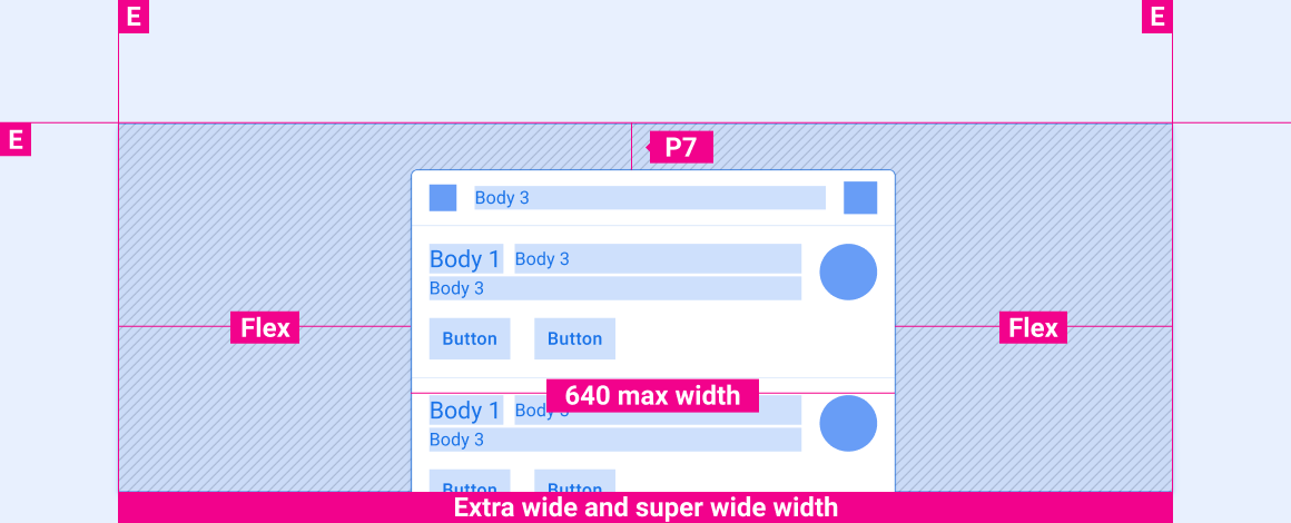
Estos diseños de referencia muestran cómo adaptar las notificaciones para que se adapten a pantallas de varios anchos y alturas. Las categorías de ancho y altura se definen en la sección Diseño. Ten en cuenta que todos los valores de píxeles están en píxeles renderizados, antes de que se realice cualquier reducción o sobremuestreo.
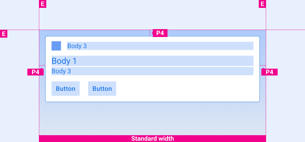
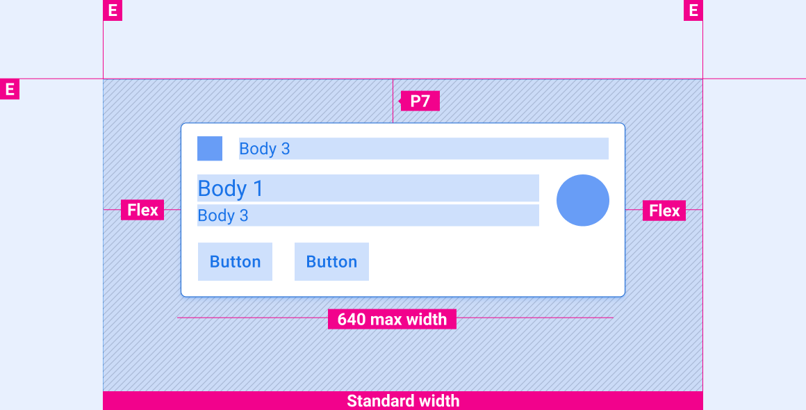
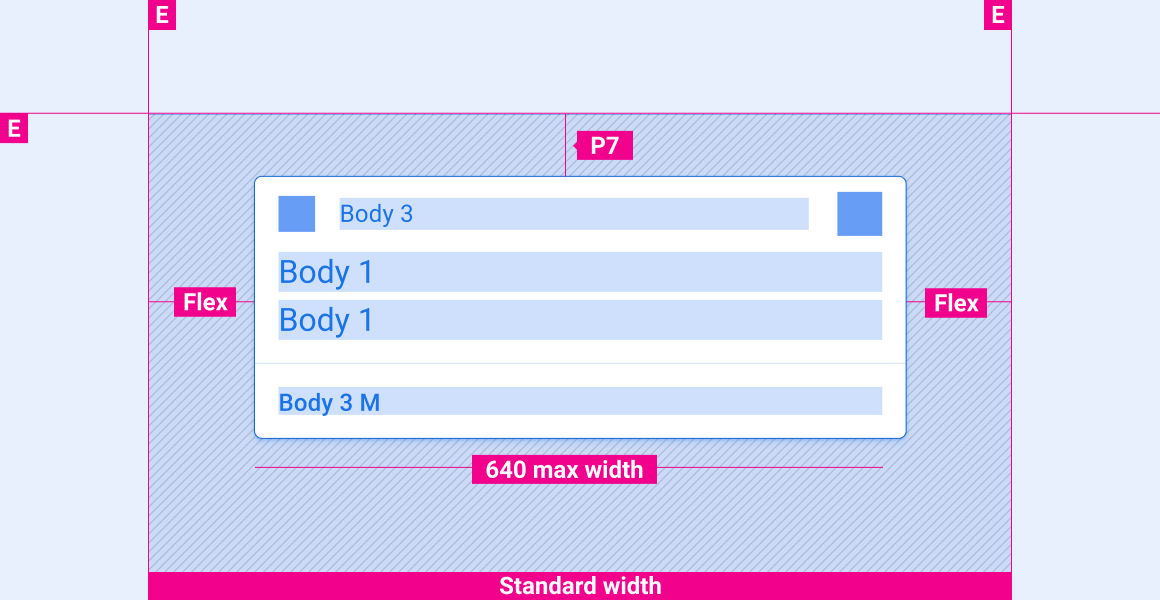
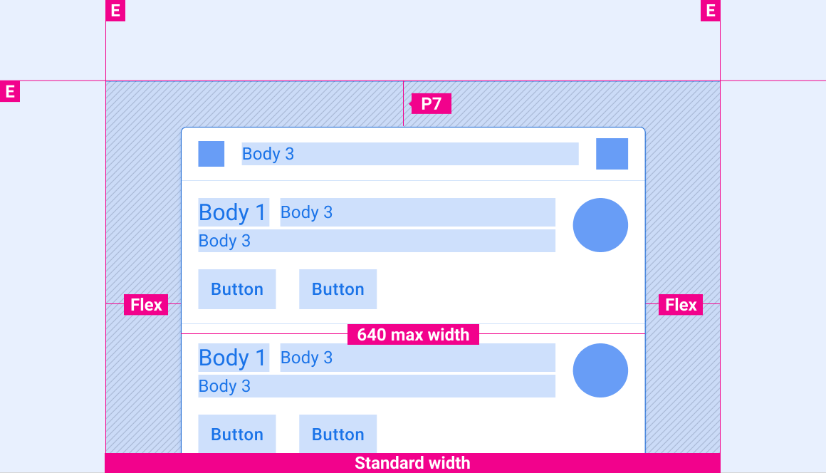
Pantallas de ancho estándar
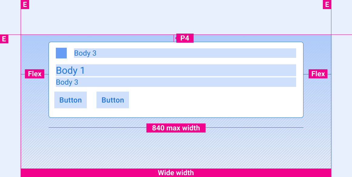
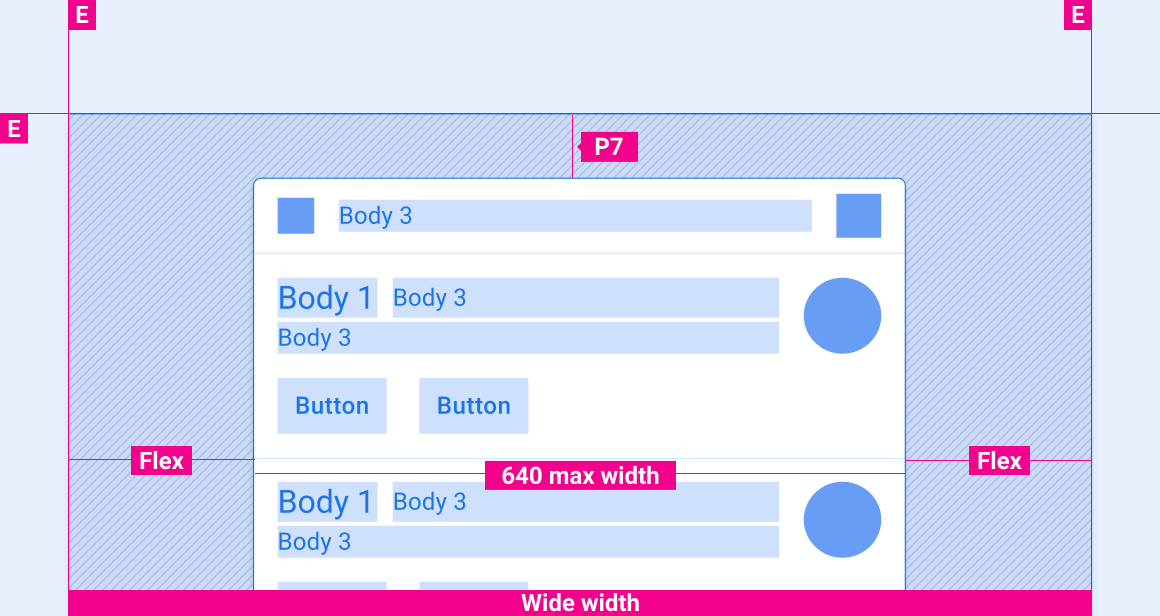
Pantallas panorámicas


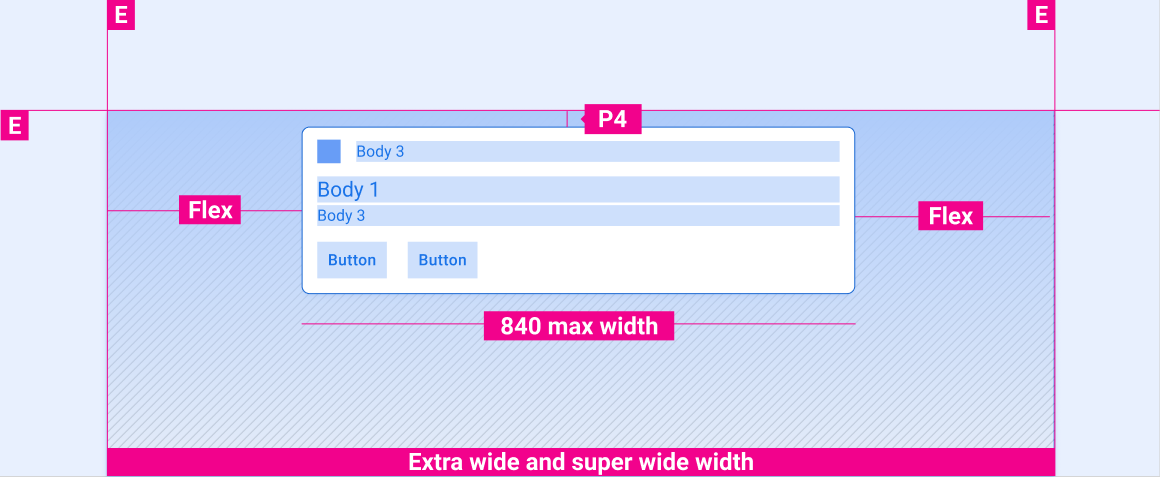
Pantallas extraanchos y superanchos

Espaciado vertical de las notificaciones en pantallas de distintas alturas
Las especificaciones de espacio vertical de esta sección son solo para tarjetas HUN. Para obtener información sobre el espaciado vertical de las tarjetas en el Centro de notificaciones, consulta las especificaciones del Centro de notificaciones.
Pantallas cortas

Pantallas altas y de altura estándar

Estilos
Tipografía
| Estilo de la tipografía | Tipo de letra | Peso | Tamaño (dp) |
|---|---|---|---|
| Cuerpo 1 | Roboto | Normal | 32 |
| Cuerpo 3 M | Roboto | Medio | 24 |
| Cuerpo 3 | Roboto | Normal | 24 |
Color
| Elemento | Color(modo diurno) | Color (modo nocturno) |
|---|---|---|
| Tipo principal / íconos | White | Blanco @ 88% |
| Tipo secundario | Blanco al 72% | Blanco al 60% |
| Ícono secundario | Acento de terceros | Acento de terceros |
| Línea divisoria del cabello | Blanco 22% | Blanco 12% |
| Fondo de la tarjeta | Gris 868 | Gris 900 |
| Lámina de gradientes | Negro 100% -0% | Negro 100% -20% |
Tamaño
| Elemento | Tamaño (dp) |
|---|---|
| Ícono principal | 44 |
| Ícono secundario | 36 |
| Avatar mediano | 76 |
| Radio de esquina redondeada (R2) | 8 |
Ejemplos
Movimiento
Los siguientes movimientos son una parte importante de la experiencia con las notificaciones:
- Movimiento de llegada de la HUN
- Movimiento de deslizamiento para descartar una notificación
- Movimiento de notificación agrupada para expandir y contraer
Llegada de HUN
Deslizar para descartar
Expandir y contraer una notificación agrupada