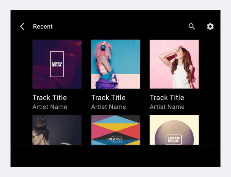
בתצוגת רשת מוצגות שתי עמודות או יותר של תמונות שמייצגות פריטי תוכן, עם טקסט קצר מתחת לכל תמונה. התצוגה הזו מומלצת כאשר המשתמשים מסתמכים בעיקר על תמונות לביצוע הבחירות שלהם.
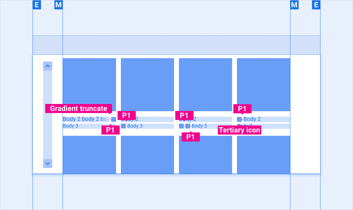
אפשר לגלול במשבצות באופן אנכי, והגודל, המרווחים ומספר העמודות עשויים להשתנות. בנוסף, ניתן לקבץ את התוכן ברשת לקטגוריות.

אנטומיה
הרשתות מכילות טקסט ופקדים של ממשק המשתמש. מאחר שהמשתמשים חייבים להגיב למסכים, אסור שהם יוסתרו אף פעם, לא על ידי רכיבים אחרים או בקצה המסך.
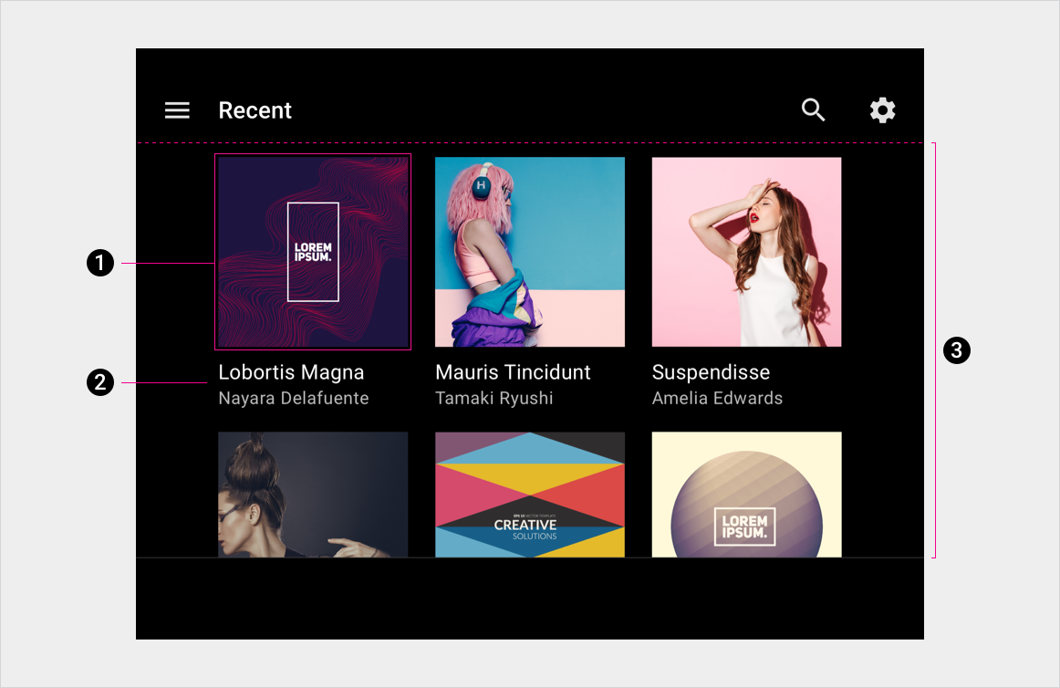
- פריט בתצוגת רשת
- טקסט ראשי וטקסט משני
- רקע של רשת
מפרטים
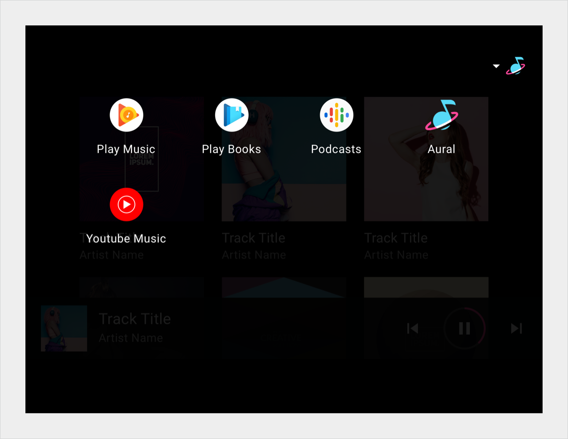
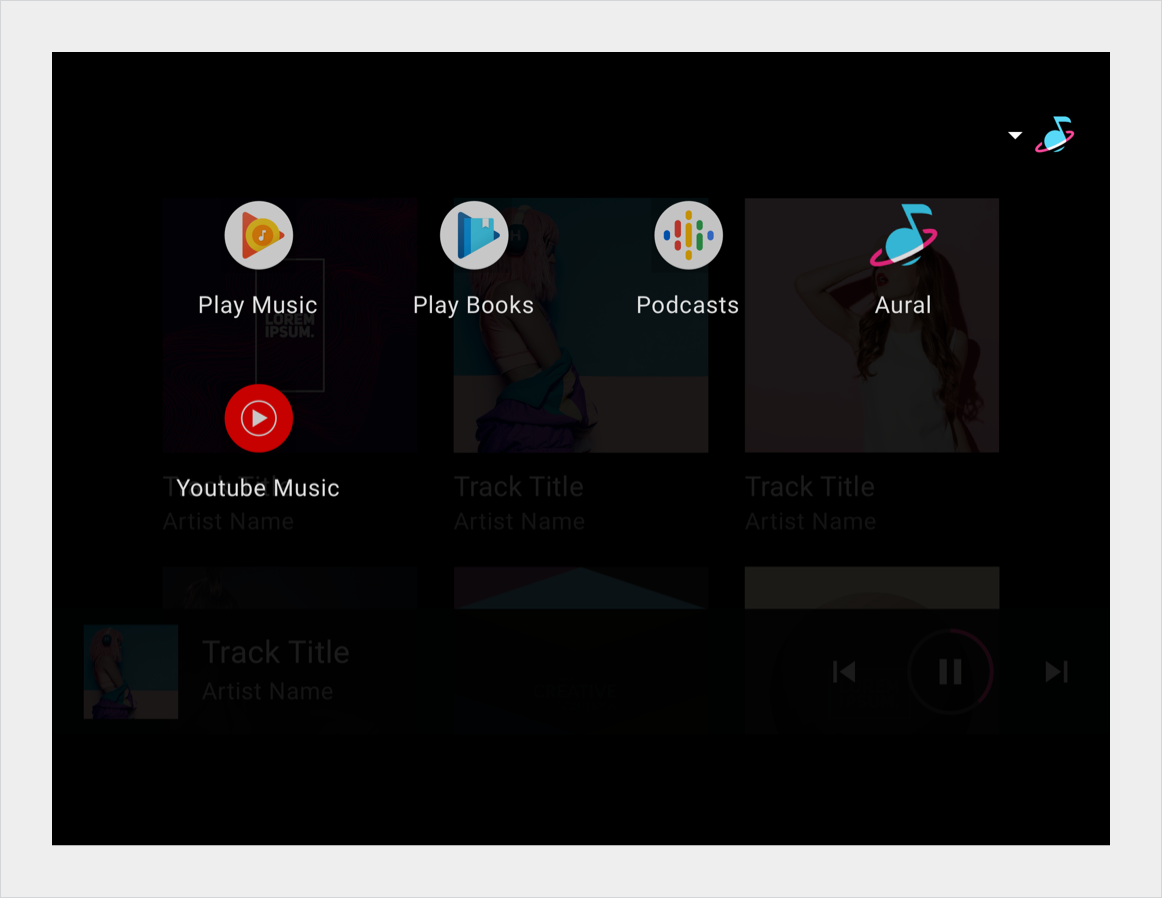
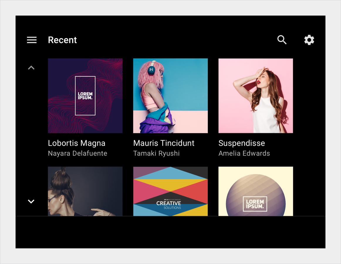
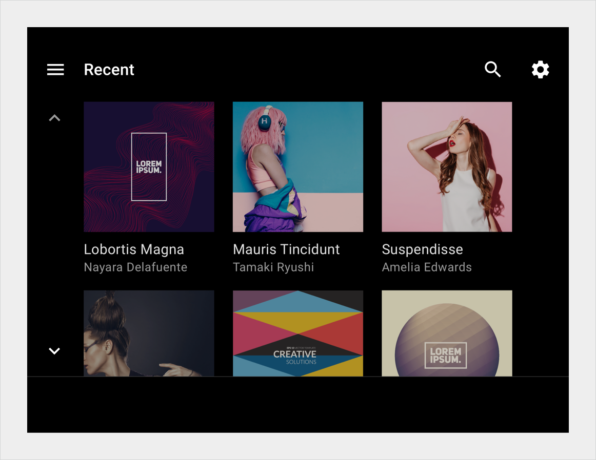
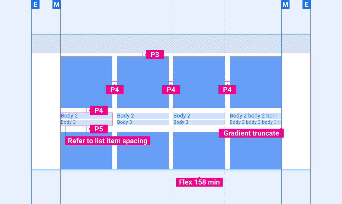
רשת תוכן (3 או 4 עמודות)
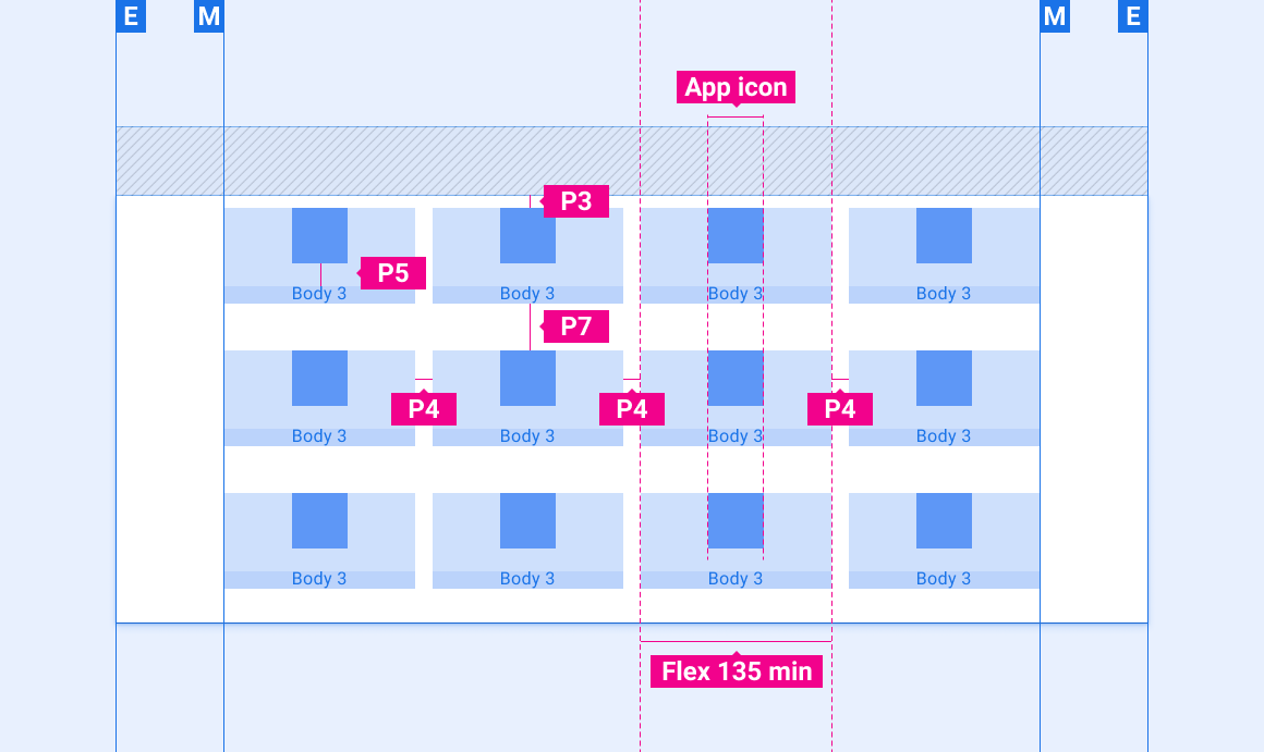
רשת אפליקציות (4 עמודות)
תצוגת אפליקציות עם פריטים בשימוש נפוץ בשורה העליונה
מיקום של סמל החיווי בפריסת רשת
התאמת פריסות
פריסות ההפניות האלה מראות איך להתאים רשתות כדי להתאים למסכים במידות רוחב וגובה שונות. (קטגוריות רוחב וגובה מוגדרות בקטע פריסה). לתשומת ליבך, כל ערכי הפיקסלים מופיעים בפיקסלים מעובדים, לפני שמבצעים דגימת הקטנה או דגימה למעלה.
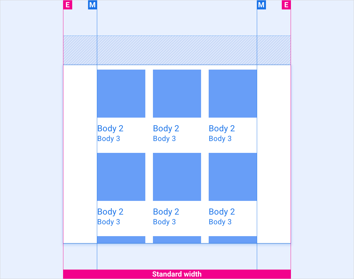
מסכים ברוחב רגיל
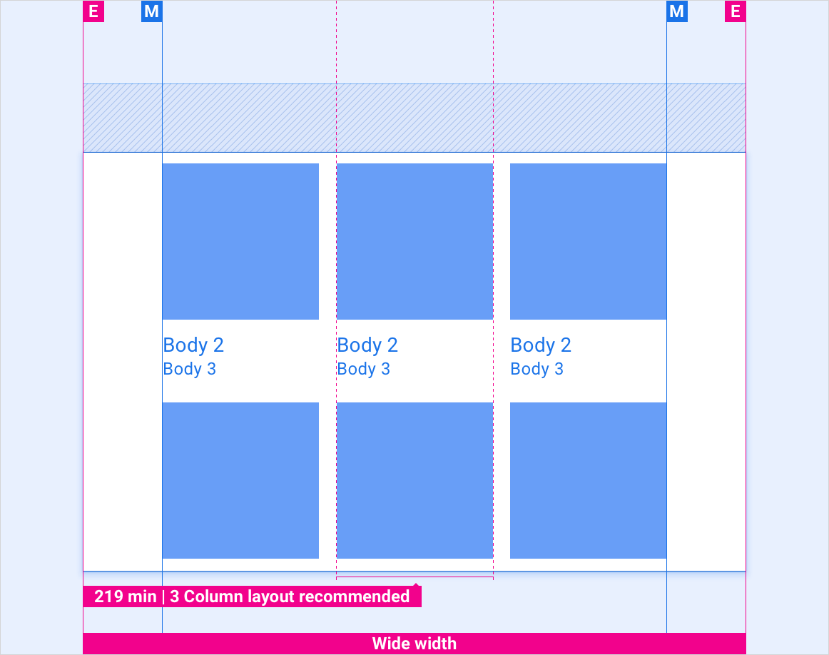
מסכים רחבים
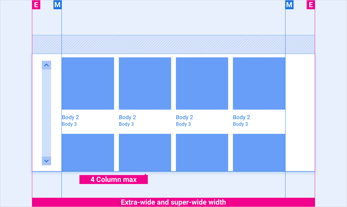
מסכים רחבים במיוחד וסופר רחב
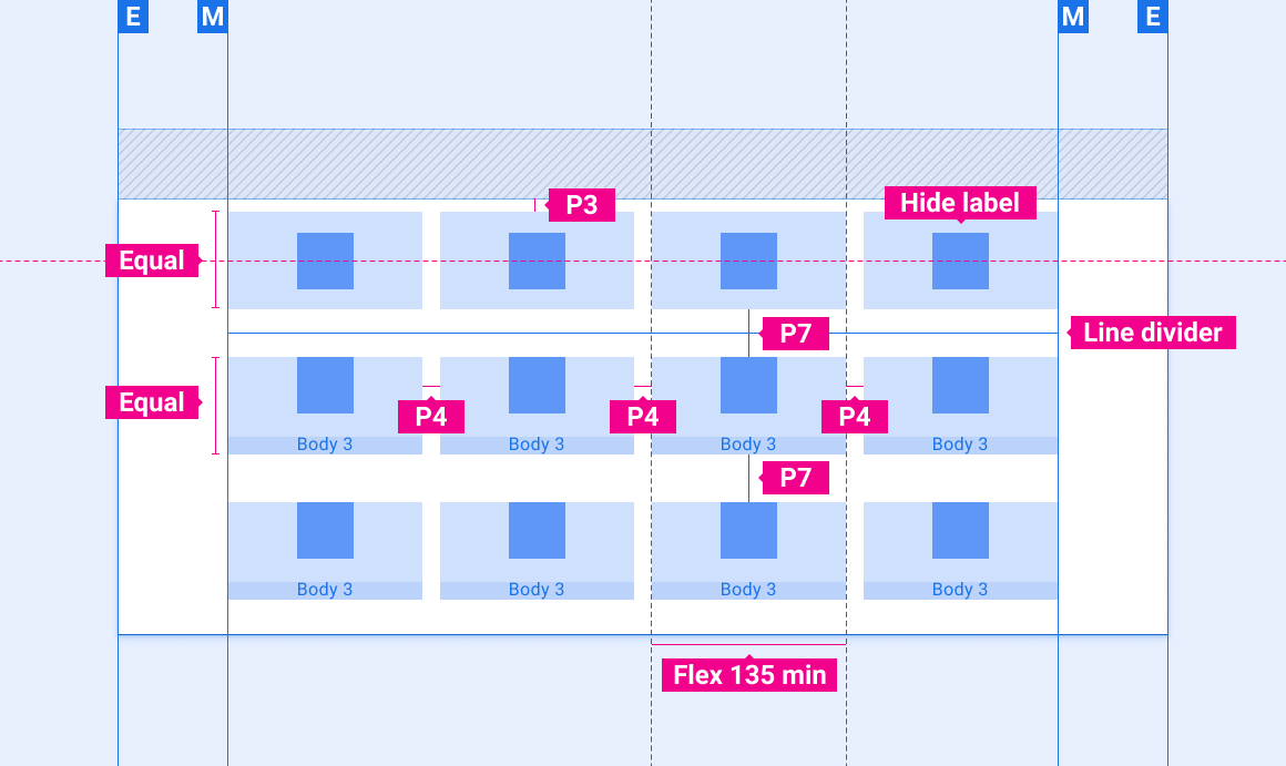
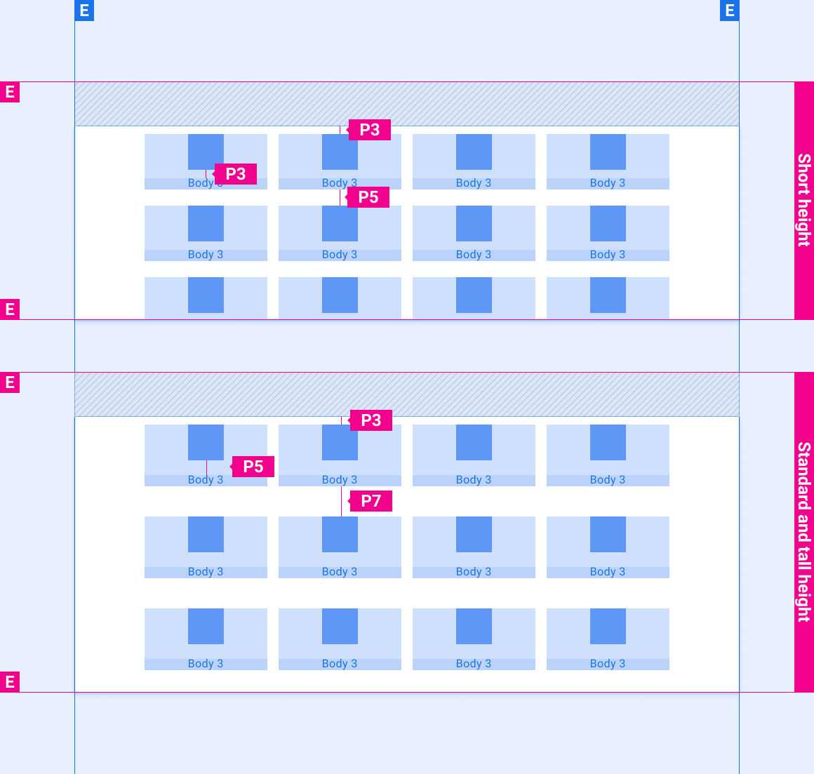
ריווח אנכי של רשתות אפליקציות במסכים בגבהים שונים
סגנונות
טיפוגרפיה
| סגנון סוג | גופן | משקל | גודל (dp) |
|---|---|---|---|
| גוף 1 | Roboto | רגיל | 32 |
| גוף 2 | Roboto | רגיל | 28 |
| גוף 3 | Roboto | רגיל | 24 |
צבע
| רכיב | צבע(מצב יום) | צבע (מצב לילה) |
|---|---|---|
| סוג / סמלים ראשיים | לבן | לבן @ 88% |
| סוג / סמלים משניים | לבן @ 72% | לבן @ 60% |
| קו מפריד | לבן @ 22% | לבן @ 12% |
| רקע של רשת | שחור | שחור |
| מיסוך תוכן | לא רלוונטי | שחור @ 22% |
| חיתוך הדרגתי | שחור @ 0-100% ב-10% משטח הטקסט | שחור @ 0-100% ב-10% משטח הטקסט |
התאמת גודל
| רכיב | גודל (dp) |
|---|---|
| סמל האפליקציה | 76 |
| תא אפליקציה מינימלי | 135 |
| מינימום של תא תוכן | 158 |
גובה
| רכיב | צבע | ציר ה-Y | טשטוש |
|---|---|---|---|
| אריח רשת | שחור @ 22% | 2 | 2 |
דוגמאות