Page Summary
-
This guide provides best practices for designing mobile health app questionnaires using the Structured Data Capture (SDC) library, focusing on layout, navigation, question structure, and component selection.
-
Choose between Long Scroll (faster, better for short questionnaires) or Paginated layouts (more precise, better for complex questionnaires and accessibility) based on your needs and optimize them for readability and navigation.
-
Structure questions with clear titles, instructions, and appropriate input components (e.g., Boolean Choice for yes/no, Dropdown for long lists, Text Field for unique data, minimizing free-text) to enhance data quality and user experience.
-
Implement robust data validation with clear, immediate error messages that guide users toward correct input, ensuring data integrity and a smoother user experience.
-
Prioritize structured data capture by minimizing free-text input and utilizing components like dropdowns, multiple-choice, and date pickers whenever possible for better data quality and user experience.
Introduction

Completing questionnaires is a core task for most healthcare workers using mobile health apps.
Data entry can be difficult and errors happen. Our goal with the Structured Data Capture (SDC) library and the design guidelines is to empower you to improve the user experience of data entry and the quality of captured data.
The four themes covered in this section are:
Layout & navigation
Long scroll & paginated layout
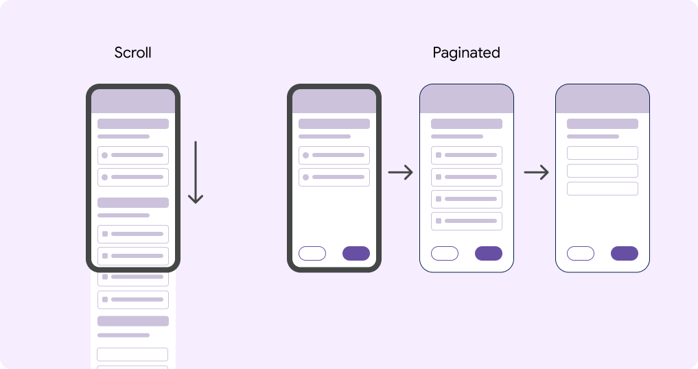
The Android FHIR SDK has two layout options for you to choose between:
- Long scroll (default)
- Paginated
A long scroll questionnaire shows all questions on one page and users navigate to each question by scrolling.
A paginated questionnaire displays the content across separate pages. Related questions or input fields can be grouped together on one page. Back and next buttons are anchored at the bottom of the page to navigate between pages.
Learn how to make a questionnaire paginated on GitHub
Which layout should you select?
Each layout option has its advantages and disadvantages. Below are some attributes of each layout type to consider as you're making the choice about which layout to use.
| Long scroll | Paginated | |
|---|---|---|
| Speed of navigation | Faster to navigate | Slower to navigate |
| Accuracy of navigation | Less precise navigation | More precise navigation |
| Refocus on question after task switching | Difficult to reorient after interruption | Easier to reorient after interruption |
| Completing the digital questionnaire after the visit (copying from paper) | Easier when copying from paper | More difficult when copying from paper |
| Small screens | Worse for small screens | Better for small screens |
| Accessibility | Worse for accessibility. Difficult to navigate. | Better for accessibility. Discrete screens that can be handled by screen readers, text-to-speech, and other technologies. |
| Space for instructions and explanations | Worse for guidance and instructions | Better for guidance and instructions |
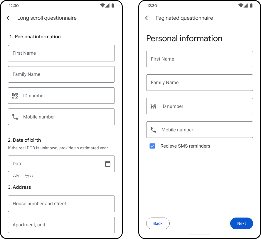
Long scroll
Number the questions to make it easier to navigate in a single page layout.
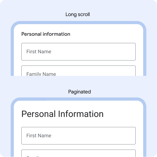
Make the font size of question titles smaller when using long scroll, so more content is visible on the screen. Example: Long scroll is 16px. Paginated is 28px.
Pagination
Keyboards, dropdowns and other components take up space on the page, so aim for one question per page.
Content should be visible above the fold.
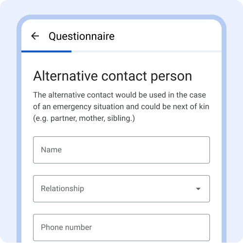
Example: These three text fields are all related to alternative contact person info, so they are grouped together on one page.
Avoid grouping unrelated content on one page, to avoid confusion.
Progress indicator
The progress indicator reflects progress made within a questionnaire.
Include a progress indicator on long questionnaires to help users navigate and see progress. Progress indicators show location within a questionnaire, and how much is left to complete.
Position at top above the question and anchor so it is always visible even when scrolling.
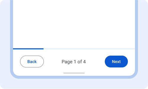
Can position at the bottom instead, above the back and next buttons. With this layout you can also display which page the user is on.
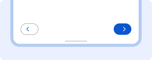
Navigation Buttons
Navigation buttons (back, next) are anchored at the bottom of the questionnaire. In an infinite scroll or on the last page of a paginated questionnaire the next button is labeled Submit.
Keep buttons in a consistent location and always use active buttons that are labeled with their action, such as back and next.
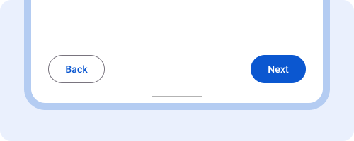
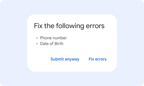
Always display active buttons, even if forms are incomplete. Upon tapping next, show a pop-up dialog with instructions for completing missing fields or validation errors.
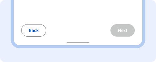
Inactive buttons make it hard for users to know how to fix the problem.
Avoid icon only buttons. Always label buttons with a descriptive action.
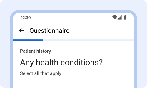
Questions & instructions
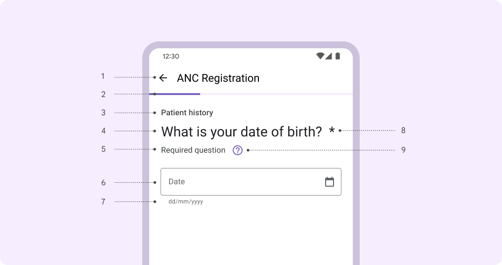
- Questionnaire title.
- Progress indicator.
- Group header.
- Question title.
- Instructions.
- Input field.
- Entry format.
- Required fields.
- Help.
Group header
Group header is a text header that is displayed above question titles.
Use the group header to group similar questions together. Only use the group header when it adds helpful information.
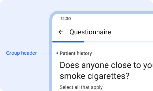
Use a short title to group similar questions together. Example: all questions related to patient history are grouped.
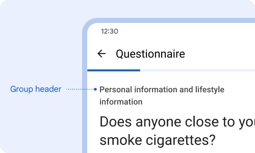
Avoid complex titles or long titles that go beyond one line.
Question title
The question title succinctly describes what information is requested. Question titles have the largest font size on the page to draw the user's eyes to the question.
Every page or question should have a question title. Keep question titles short or phrase it as a question.
Short titles make it easier for users to read.
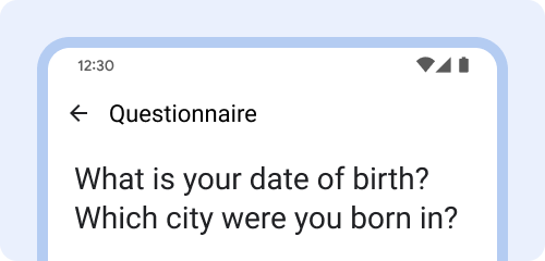
Avoid very long questions or nesting two questions together.
Always include a question title to make it easier for users to know what information they need to enter.
Instructions
Instructions is an optional text field shown below the question title.
Use the instructions field to explain relevant instructions such as if the question is required, how many selections can be made (one or many), and what users should do if unable to complete all info or answer the question.
Use instructions field to inform if a question is required and how many selections can be made.
Use instructions to let users know what to do if they encounter a scenario like they are unable to complete all the fields.
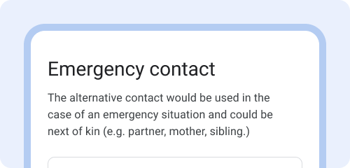
Use instructions to provide additional context or definitions for terms used in the question title.
Label text
Label text informs users about what information is requested for a text field or dropdown. When the field is selected, the label text moves from the middle of the text field to the top.
Every text field and dropdown box should have a label. Label text should be short, clear, and fully visible.
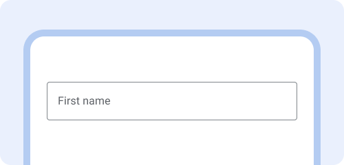
Label text should be short, clear, and fully visible.
Label text shouldn't be too long, truncated, or take up multiple lines.
Always label the text field so users know what information to enter.
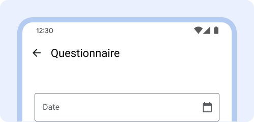
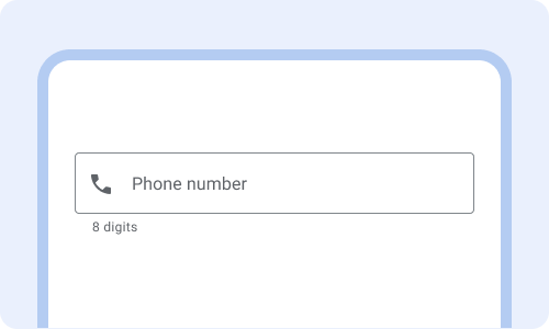
Entry format
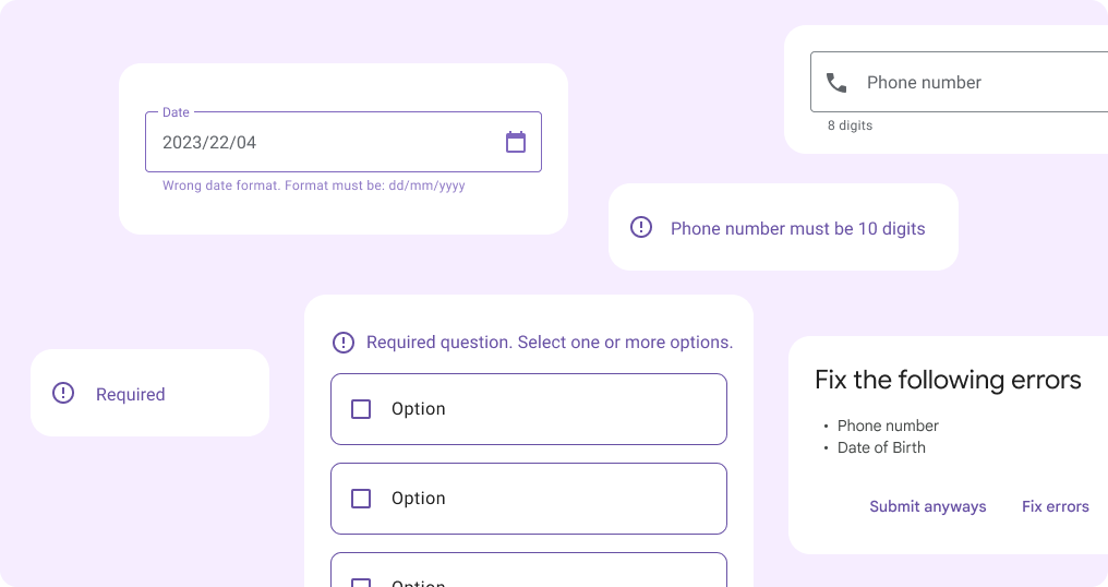
EntryFormat is shown below the text field to inform users of the specific format data needs to be entered in. Error messages will be displayed in the EntryFormat field and replace existing EntryFormat instructions.
Use EntryFormat for dates, phone numbers, units, and integers.
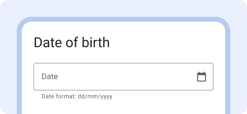
Show date format below the field and include a descriptive phrase.
Not showing data formats can lead to data being entered incorrectly.
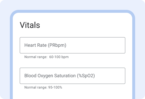
When entering medical ranges, provide examples of the normal range. This can help users catch errors or numbers that are out of range.
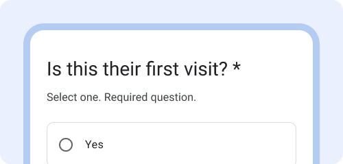
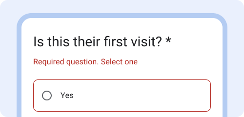
Required fields
Required fields indicate that a user must complete the field and is blocked from advancing until the field is completed.
To indicate that a field is required, display an asterisk (*) at the end of the question title. Include 'required question' in the instructions field as it is not obvious to everyone what an asterisk (*) indicates. If there's no question title, display the asterisk (*) in the label text.
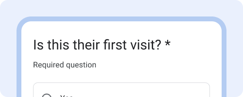
Show the field is required with asterisk (*) and include written instructions that indicate `required question.` Many are unfamiliar with what the asterisk(*) means and would benefit from the explanation.
Avoid showing only the asterisk (*) without any written description of what it means.
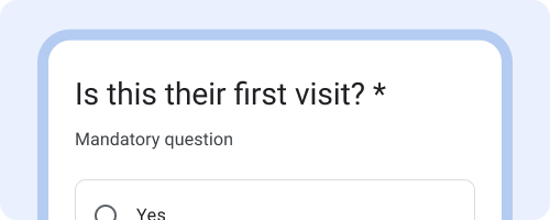
Use the terms that are most familiar to your users. Example: "Mandatory" might be the more familiar term and used in some countries instead of "Required".
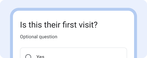
If most questions are required, indicate which ones are optional instead.
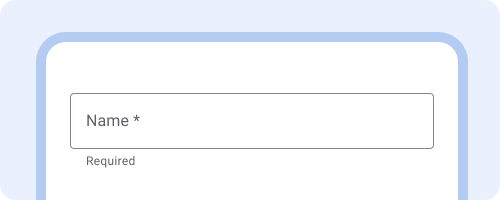
If there's no question title show the asterisk in the label text.
Help
A help icon is displayed next to the question title. Upon tapping the icon, a help information box appears with additional information. Tapping the icon again closes the help information box.
This is an optional component. Only use when helpful to display additional information that does not need to always be visible.
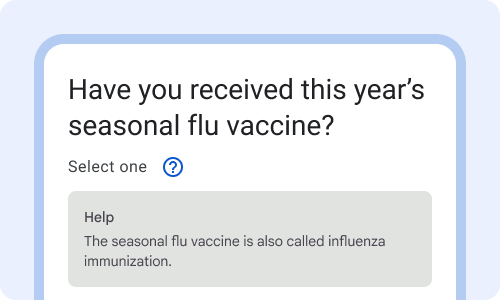
Use help for information that users might only need to see once or that provides additional information.
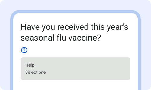
Avoid hiding instructions inside the Help box that should be visible to everyone.
Data capture
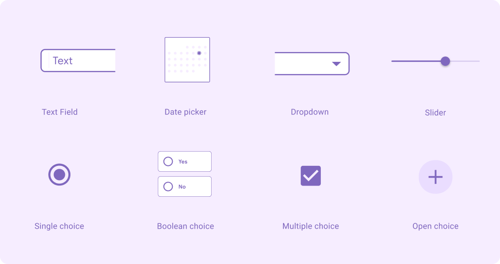
When to use which component?
| Type of data entry | Boolean choice | Single choice | Multiple choice | Open choice | Dropdown | Date picker | Text field | Slider | Auto-complete |
|---|---|---|---|---|---|---|---|---|---|
| Select Yes or No | |||||||||
| Select one option | caution |
||||||||
| Select multiple options | caution |
||||||||
| Text | |||||||||
| Dates | |||||||||
| Numbers | caution |
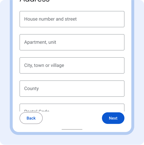
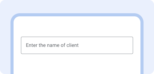
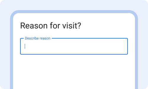
Text fields
Text fields indicate that users can enter information.
Use text fields when someone needs to enter text into the questionnaire, such as a name, phone number, or address. Limit data entry that requires text (keyboard) entry when a pre-populated selection (multiple choice or single choice) can be used instead.
Learn more about text fields on material.io
Use text fields for data entry that requires typing unique words or numbers.
Avoid using free text responses when it could be a multiple-selection, dropdown, or single choice selection instead.
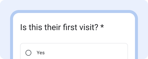
Single choice & boolean choice
Single choice and boolean choice are a selection control that appear as radio buttons when users are asked to select one choice from options.
Use boolean choice when there's a binary choice of 'Yes' or 'No.' Otherwise, use the single choice component. If there's more than ~10 options in the list, use a dropdown instead of single choice. A dropdown is more dense and easier to navigate when there are many options.
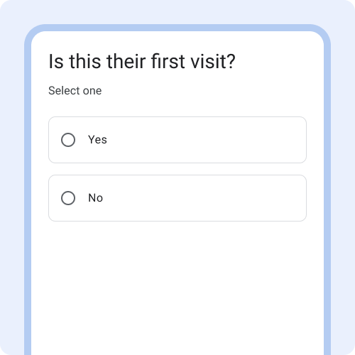
Use Boolean choice when the options are 'yes' and 'no'.
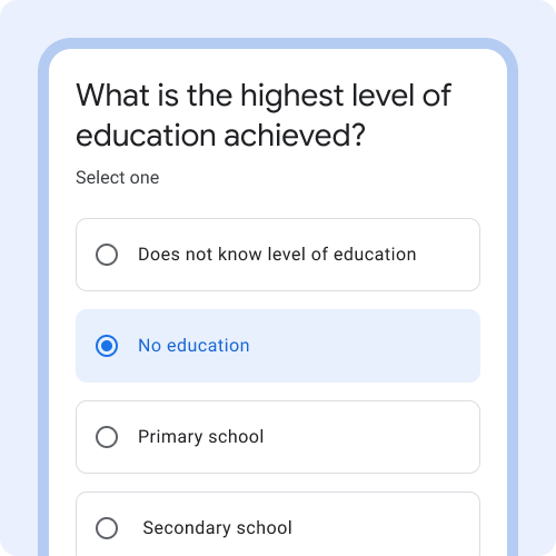
Use single choice when users can select one option in the list.
Avoid single choice for very long lists (10+). Use a dropdown instead.
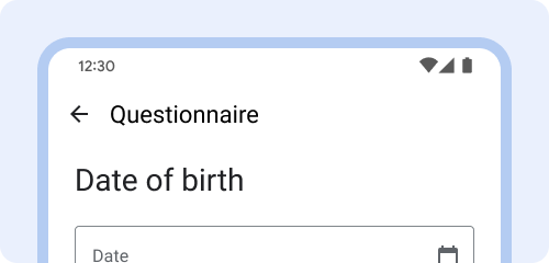
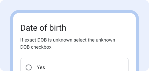
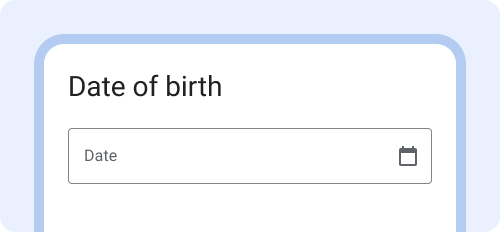
Date picker
The date picker allows users to enter dates through both the calendar date picker and the keyboard. The calendar date picker is activated when the calendar icon is tapped.
Use the calendar date picker only for dates that are close to today's date such as last menstrual period or next visit. Otherwise prioritize keyboard entry for dates like birthdate.
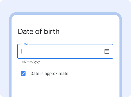
For entering dates enable both keyboard entry (tapping text box) and calendar date picker (tapping icon).
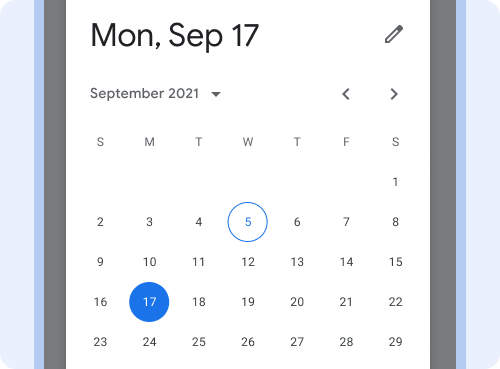
Avoid enabling the calendar date picker as the only input method for birth dates. Navigating to the month and year is difficult.
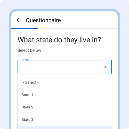
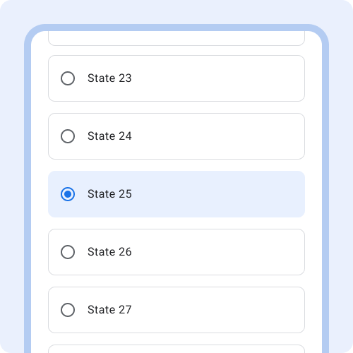
Dropdown
Dropdown menus allow users to make a selection from multiple options. As the user begins typing, options filter based on what's entered. This can help users quickly find the right option from a large list.
Dropdown menus are a great alternative to single choice when the list of options is very long (10+ options) as they take up less space.
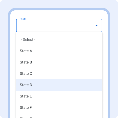
Use a dropdown when selecting one option in a very long list of options, such as selecting a state or city.
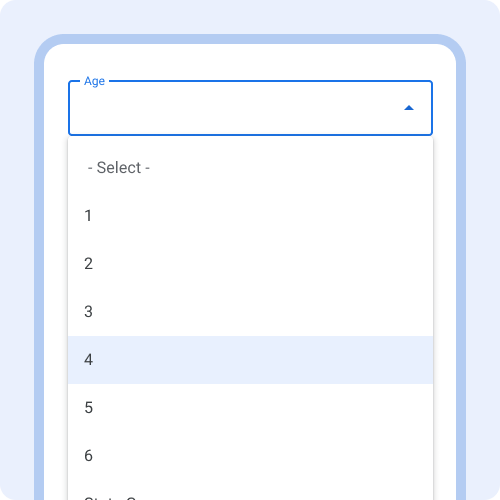
Avoid using a dropdown when it would be easier to type the content in rather than scrolling through all the options, such as age.
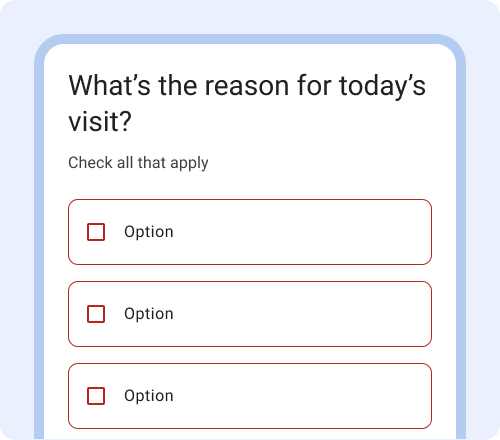
Multiple choice
Multiple choice is a selection control that appears as checkboxes when users can make multiple sections from a list of options.
Use multiple choice when users can only select from a predetermined list of options. If users can also add their own free response, use the open choice component instead. In the instructions field write "Select all that apply" so users know they can select multiple options.
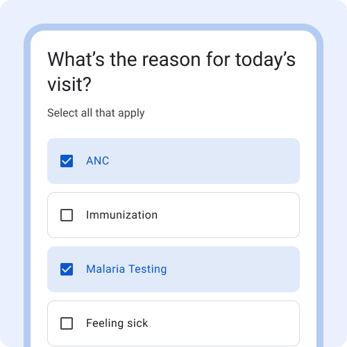
The default appearance is a container around checkboxes to make the tappable area obvious.
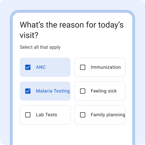
Avoid displaying multiple options per row, due to the variation in phone screen size and text size, the text can get cut off.
Open choice
Open choice is similar to multiple choice, but adds the ability for a user to select Other and type in free text.
Use open choice when there's a pre-set list of options, but users can also add additional options. Use open choice when the majority of options are known, but you foresee some users will select Other because none of the supplied options apply.
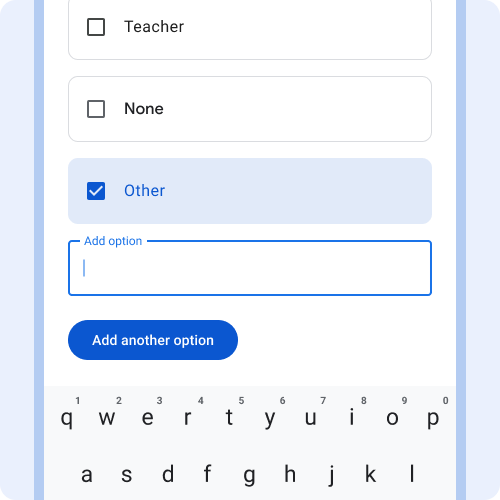
Use when it's important that accurate data is collected and none of the predefined options apply. Example: occupation.
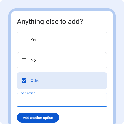
Avoid using if the majority of responses would require selecting Other. In that case, use a text field or paragraph field instead.
Slider
Sliders allow users to make selections from a range of values. The slider in the Android FHIR SDK is a discrete slider. A discrete slider allows users to select a specific value from a predetermined range. Tick marks may be used to indicate available values. Avoid using the slider for numerical data entry. Instead use a text field or a dropdown menu.
Learn more about sliders on material.io
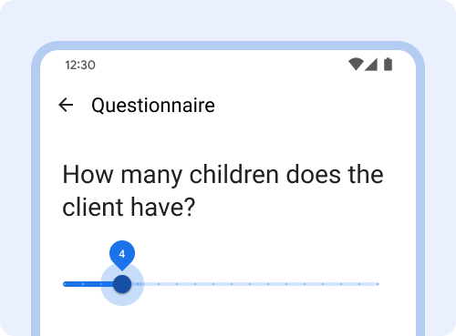
Avoid using the slider for specific values when there's a large range. Use text fields with keyboard entry instead.
Data validation and errors
Data validation
Data validations constrain the type of data or the values that can be entered in a text field. Data validation can improve the quality of data collected.
Use the EntryFormat field to display format or value restrictions. Show meaningful data validation error messages in-line and immediately so users can fix the error.
Show data validation restrictions upfront so users know how to enter the data.
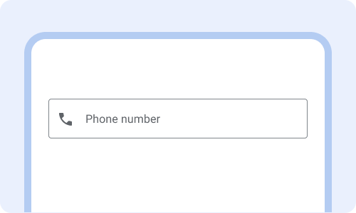
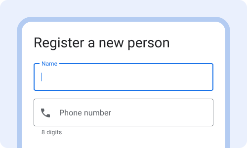
Without showing how many digits the phone number needs to be, users are likely to encounter an error and it will take longer to complete.
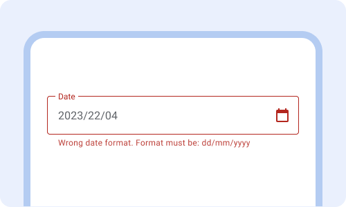
Show meaningful data validation errors immediately after completing the field. Error messages replace the existing entry format text.
Don't wait until the user has pressed "submit" to display validation errors for the first time.
Errors
Error messages alert users when something goes wrong and communicate how to fix the problem.
Use color, iconography and text to communicate errors.
Learn more about error messages on material.io
Explain why there’s an error (required question) and what can be done to fix it (select one.)
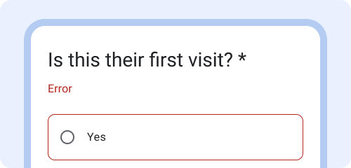
An error message that only says "error" is not helpful for users to know how to fix the error.
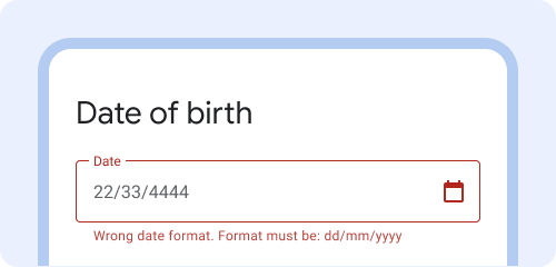
Example: "Wrong date format. Format must be dd/mm/yyyy".
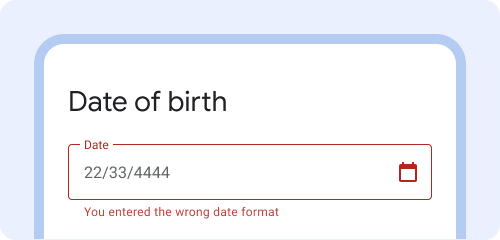
Avoid blaming the user with error messages that include "you" Example: "You entered the wrong date format."
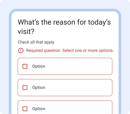
Use color, iconography and text to inform users that there is an error.
To support common visual impairments such as red-green color blindness, avoid relying only on color to communicate an error.
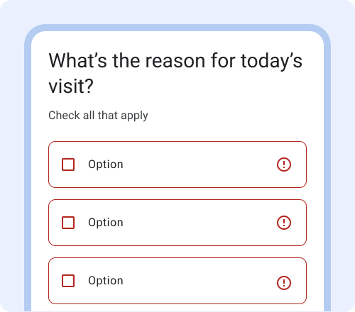
One icon is often enough. Don't overdo it on the use of icons to communicate the error.