

Advanced Place Details 구성요소
장소 세부정보 구성요소의 고급 버전은 장소 세부정보 기본과 동일한 기능을 제공합니다. 또한 구성요소의 작업 버튼을 구성하고 표시되는 리뷰와 미디어에 검색 및 필터링 옵션을 적용할 수 있습니다.
기본 Jetpack Compose 지원
장소 UI 키트는 AdvancedPlaceDetailsCompact에 Jetpack Compose @Composable 함수를 제공합니다. 이러한 컴포저블은 호이스팅된 상태, 기본 제공 수정자 지원, Compose 네이티브 슬롯 DSL을 사용합니다.
다음 코드 샘플은 세로 레이아웃에 구성 가능한 함수를 사용하는 방법을 보여줍니다.
Kotlin
import android.util.Log
import androidx.compose.foundation.layout.fillMaxWidth
import androidx.compose.foundation.layout.padding
import androidx.compose.material3.MaterialTheme
import androidx.compose.material3.Text
import androidx.compose.runtime.Composable
import androidx.compose.ui.Modifier
import androidx.compose.ui.graphics.painter.Painter
import androidx.compose.ui.unit.dp
import com.google.android.libraries.places.api.model.Place
import com.google.android.libraries.places.compose.AdvancedPlaceDetailsCompact
import com.google.android.libraries.places.compose.PlaceReference
import com.google.android.libraries.places.compose.action.CornerAction
import com.google.android.libraries.places.compose.action.MainAction
import com.google.android.libraries.places.compose.Orientation

@Composable
fun SampleAdvancedPlaceDetailsCompactCard(
    placeId: String,
    bookmarkIcon: Painter,
    onSavePlaceClicked: (Place) -> Unit
) {
    AdvancedPlaceDetailsCompact(
        // defines the place to be displayed
        reference = PlaceReference.PlaceId(placeId),
        // defines the orientation
        orientation = Orientation.VERTICAL,
        // defines custom styling
        modifier = Modifier
            .fillMaxWidth()
            .padding(16.dp),
        preferTruncation = true,
        enableLightbox = true,
        mainActions = { place ->
            listOf(
                MainAction.OpenDirections(),
                MainAction.OpenWebsite(),
                MainAction.Call()
            )
        },
        // action button configuration
        cornerActions = { place ->
            listOf(
                CornerAction.Custom(
                    icon = bookmarkIcon,
                    text = "Save Place",
                    onClick = { onSavePlaceClicked(place) }
                )
            )
        },
        onPlaceLoaded = { place ->
            Log.d("Places", "Successfully loaded place: ${place.id}")
        },
        onPlaceLoadFailed = { exception ->
            Log.e("Places", "Failed to load place", exception)
        }
    ) {
        // --- Slot: Injected directly above the place name ---
        basicSectionTop {
            Text(
                text = "Featured in 'Top 10 Coffee Shops in SF'",
                style = MaterialTheme.typography.labelSmall,
                color = MaterialTheme.colorScheme.secondary,
                modifier = Modifier.padding(top = 4.dp, bottom = 2.dp)
            )
        }

        // --- Slot: Injected directly below the action buttons ---
        basicSectionBottom {
            Text(
                text = "Notes: Great quiet atmosphere for meetings.",
                style = MaterialTheme.typography.bodySmall,
                color = MaterialTheme.colorScheme.onSurfaceVariant
            )
        }
    }
}
고급 장소 세부정보 구성
AdvancedPlaceDetailsFragment 또는 AdvancedPlaceDetailsCompactFragment를 사용하여 고급 기능에 액세스합니다.
작업 버튼 구성
AdvancedPlaceDetailsFragment 또는 AdvancedPlaceDetailsCompactFragment의 PlaceActionProvider 인터페이스를 사용하여 작업 버튼을 정의하고 맞춤설정합니다.
@composable 함수를 사용하는 경우 mainActions 및 cornerActions 람다를 사용하여 작업 버튼을 구성합니다.
시각적 저작자 표시 요구사항
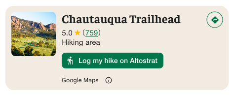
중요: 맞춤 작업 버튼이 Google 이외의 서드 파티와 사용자 정보를 공유하는 경우를 최종 사용자에게 명확하게 알려야 합니다. 시각적 출처 표시 요구사항을 참고하세요.
오른쪽의 예에서는 사용자 정보가 'Altostrat'으로 전송된다는 점을 명확하게 보여주는 맞춤 이미지를 확인할 수 있습니다.
검색 및 필터링 옵션 적용
AdvancedPlaceDetailsFragment 또는 AdvancedPlaceDetailsCompactFragment의 SearchMediaOptions 및 SearchReviewsOptions 클래스를 사용하여 미디어나 리뷰의 검색 및 필터링을 사용 설정합니다.
@composable 함수를 사용하는 경우 com.google.android.libraries.places.compose.search.SearchMediaOptions를 사용하여 미디어나 리뷰를 검색하고 필터링할 수 있습니다.
맞춤 콘텐츠 슬롯 만들기
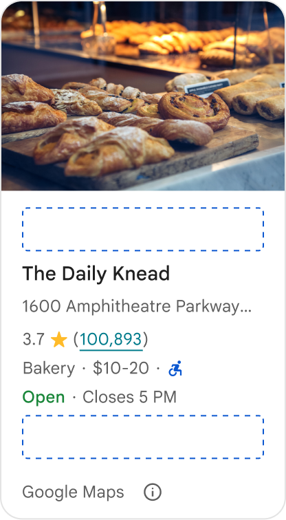
맞춤 콘텐츠 슬롯을 사용하면 AI 생성 요약, 일정 타임스탬프, 맞춤 배지와 같은 자체 콘텐츠를 사전 정의된 레이아웃 영역에 직접 추가할 수 있습니다.
콘텐츠 슬롯의 저작자 표시 요구사항 및 콘텐츠 제안
맞춤 콘텐츠 슬롯이 마운트되면 Google에서 제공하는 콘텐츠와 일부 콘텐츠가 서드 파티에서 제공된다는 점을 명확히 하기 위해 공개 정보가 자동으로 업데이트됩니다.
권장사항
정보의 출처에 관한 모호성을 방지하기 위해 Google 장소 세부정보와 맞춤 콘텐츠 간에 명확한 시각적 계층 구조를 유지합니다.
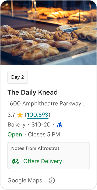
권장사항
사용자의 즉각적인 목표에 맞게 현지화된 가치 있는 통계를 고려하세요. 실시간 예약 기간이나 현재 예약 가능 여부와 같은 맞춤 콘텐츠는 사용자가 더 빠르고 정보에 입각한 결정을 내리는 데 도움이 됩니다.
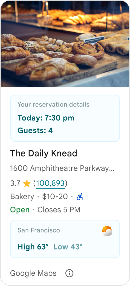
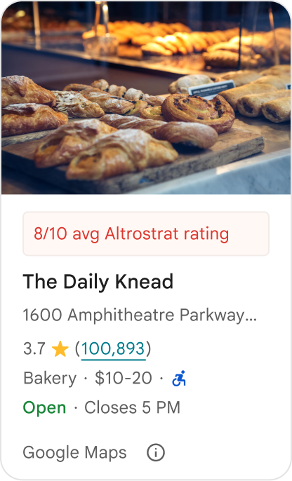
금지사항
Google에서 제공한 콘텐츠를 숨긴 경우에도 평점, 리뷰, 영업시간과 같은 기존 Google 장소 세부정보를 중복해서는 안 됩니다. 이렇게 하면 콘텐츠의 출처가 Google인지 서드 파티인지에 관해 사용자에게 혼동을 줄 수 있습니다.
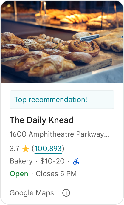
금지사항
공식 Google 보증으로 오인될 수 있는 출처가 표시되지 않은 주장이나 배지('추천' 등)를 표시하지 마세요. 맞춤 콘텐츠는 출처를 명시적으로 표시해야 합니다.
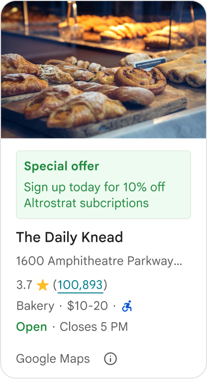
금지사항
맞춤 장소 컨테이너 내에 광고, 마케팅 문구, 프로모션 할인 또는 구독 메시지를 포함하지 마세요.
맞춤 콘텐츠를 추가하려면 AdvancedPlaceDetailsCompact 컴포저블을 사용하세요. basicSectionTop 또는 basicSectionBottom을 사용하여 콘텐츠의 위치를 지정합니다.
고급 장소 세부정보 예
작업 버튼 맞춤설정
PlaceActionProvider 인터페이스를 사용하여 각 장소에서 사용할 수 있는 작업을 관리합니다.
Kotlin
class PlaceDetailsWidgetTestActivity : BaseActivity() {

// simplified example of starting the fragment
fun setupPPDFragment() {
   fullWidgetSelectedContent = AdvancedPlaceDetailsFragment.ALL_CONTENT.toMutableList()
   AdvancedPlaceDetailsFragment.newInstance(fullWidgetSelectedContent, Orientation.VERTICAL)
   supportFragmentManager
      .beginTransaction()
      .replace(R.id.fragment_container, fragment!!)
      .commitNow()
}

// you can set the callback elsewhere, but this is the ideal callback spot
override fun onAttachFragment(fragment: Fragment) {
    super.onAttachFragment(fragment)
    when (fragment) {
      is PlaceActionController -> setPlaceActionProvider(fragment)
    }
}

// have this callback return an empty list to hide all buttons
// if this callback isn't set, default buttons appear
 private fun setPlaceActionProvider(fragment: PlaceActionController) {
    fragment.setPlaceActionProvider(
        object : PlaceActionProvider {
        override fun getMainPlaceActions(place: Place): List<PlaceAction> = buildList {
            // predefined actions can be mixed in with custom ones
            add(PlaceAction.OPEN_IN_MAPS)

            // example of button with both text label and icon
            add(
              PlaceAction.builder()
                .setLabelTextResId(R.string.custom_action)
                .setIconResId(R.drawable.gs_custom_action_icon)
                .setContentDescriptionResId(R.string.custom_action_description)
                .setOnClickListener { /* todo perform action */ }
                .build()
            )

            // icon only button
            add(
              PlaceAction.builder()
                .setIconResId(R.drawable.custom_action_icon_2)
                .setContentDescriptionResId(R.string.custom_action_description_2)
                .setOnClickListener { /* todo perform action */}
                .build()
            )

            // text label only button
            add(
              PlaceAction.builder()
                .setLabelTextResId(R.string.custom_action_3)
                .setContentDescriptionResId(R.string.custom_action_description_2)
                .setOnClickListener {/* todo perform action */ }
                .build()
            )
          }

         /**
         You can also specify whether corner buttons should appear.
         For either callback, returning an empty list results in no buttons appearing
         */
         override fun getCornerPlaceActions(place: Place): List<PlaceAction> {
           return emptyList()
         }

        override fun addPlaceActionsChangedListener(
          listener: PlaceActionProvider.OnChangedListener
        ) {
          // in this example, just one listener and widget
          this@HostAppActivity.listener = listener
        }

        override fun removePlaceActionsChangedListener(
          listener: PlaceActionProvider.OnChangedListener
        ) {
          // if there are multiple listeners, remove only the provided listener
          this@HostAppActivity.listener = null
        }
      })
  }
}
맞춤 작업 및 사전 정의된 작업 추가
이 샘플은 사용자가 장소를 즐겨찾기에 추가하거나 즐겨찾기에서 삭제할 수 있는 전환 버튼을 추가합니다.
Kotlin
private var listener: PlaceActionProvider.OnChangedListener? = null

private fun setPlaceActionProvider(fragment: PlaceActionController) {
    fragment.setPlaceActionProvider(
      object : PlaceActionProvider {
        private var placeFavorited = false

        override fun getMainPlaceActions(place: Place): List<PlaceAction> {
          val buttonList = mutableListOf<PlaceAction>()

          if (placeFavorited) {
            buttonList.add(
              PlaceAction.builder()
                .setLabelTextResId(R.string.place_details_button_config_favorite)
                .setIconResId(R.drawable.gs_web_vd_theme_24)
                .setOnClickListener {
                  placeFavorited = !placeFavorited
                  refreshButtonConfigs()
                }
                .build()
            )
          } else {
            buttonList.add(
              PlaceAction.builder()
                .setLabelTextResId(R.string.place_details_button_config_unfavorite)
                .setIconResId(R.drawable.gs_web_vd_theme_24)
                .setOnClickListener {
                  placeFavorited = !placeFavorited
                  refreshButtonConfigs()
                }
                .build()
            )
          }

          return buttonList
        }

        override fun addPlaceActionsChangedListener(
          listener: PlaceActionProvider.OnChangedListener
        ) {
          this@PlaceDetailsWidgetTestActivity.listener = listener
        }

        override fun removePlaceActionsChangedListener(
          listener: PlaceActionProvider.OnChangedListener
        ) {
          // if there are multiple listeners, remove only the provided listener
          this@PlaceDetailsWidgetTestActivity.listener = null
        }
      }
    )
  }

private fun refreshButtonConfigs() {
    listener?.onPlaceActionsChanged()
}
사전 정의된 표준 버튼 사용
표준 Google 정의 작업을 실행하는 작업 버튼을 만듭니다.
Kotlin
  override fun getMainPlaceActions(place: Place): List<PlaceAction> {
    val buttonList = mutableListOf<PlaceAction>()
// these buttons will have different background and text color than user-created buttons.
    // Text and icon button
    buttonList.add(PlaceAction.OPEN_IN_MAPS)
    // Icon-only buttons not enabled for main action buttons
    // Use of kotlin extension to do the same.  see
    PlaceAction.OPEN_IN_MAPS {
       setIconResId(0)
     }

    return buttonList
  }
리뷰 및 미디어 필터링
이 코드 샘플은 '스파게티'와 '맛있는'을 언급하는 미디어와 리뷰만 표시합니다.
Kotlin
    import com.google.android.libraries.places.widget.AdvancedPlaceDetailsFragment
    import com.google.android.libraries.places.widget.model.SearchMediaOptions
    import com.google.android.libraries.places.widget.model.SearchReviewsOptions
    import com.google.android.libraries.places.widget.model.Orientation
    import com.google.android.libraries.places.R

     // 1. Create options using the Java builders (called from Kotlin)
    val mediaOptions = SearchMediaOptions.builder()
        .setQuery("spaghetti")
        .setRankPreference(SearchMediaOptions.RankPreference.MOST_RELEVANT)
        .build()

    val reviewOptions = SearchReviewsOptions.builder()
        .setQuery("tasty")
        .setRankPreference(SearchReviewsOptions.RankPreference.NEWEST)
        .build()

    // 2. Create the fragment
    val fragment = AdvancedPlaceDetailsFragment.newInstance(
        AdvancedPlaceDetailsFragment.STANDARD_CONTENT,
        Orientation.VERTICAL,
        R.style.PlacesMaterialTheme
    )

    // 3. Apply options to the fragment
    fragment.applySearchMediaOptions(mediaOptions)
    fragment.applySearchReviewsOptions(reviewOptions)
콘텐츠 슬롯 만들기
Kotlin
import androidx.compose.material3.MaterialTheme
import androidx.compose.material3.Text
import androidx.compose.runtime.Composable
import com.google.android.libraries.places.compose.AdvancedPlaceDetailsCompact
import com.google.android.libraries.places.compose.PlaceReference

@Composable
fun ItineraryPlaceCard(placeId: String) {
    AdvancedPlaceDetailsCompact(
        reference = PlaceReference.PlaceId(placeId)
    ) {
        // Slot: Injected directly above the place name
        basicSectionTop {
            Text(
                text = "Day 2 • 2:30 PM",
                style = MaterialTheme.typography.labelSmall,
                color = MaterialTheme.colorScheme.primary
            )
        }

        // Slot: Injected directly below the main action buttons
        basicSectionBottom {
            NotesCard(
                notes = "Great quiet atmosphere for morning meetings. Famous for house-roasted pour-overs."
            )
        }
    }
}