
This codelab is part of the Developing Progressive Web Apps training course, developed by the Google Developers Training team. You will get the most value out of this course if you work through the codelabs in sequence.
For complete details about the course, see the Developing Progressive Web Apps overview.
Introduction
This lab shows you how to make images on your web page look good on all devices.
What you'll learn
- How to make your images responsive so that they are sized appropriately for multiple form factors
- How to use
srcsetandsizesto display the right image for the viewport width - How to use
pictureandsourcein combination with media queries so that images on the page automatically respond as the window is resized
What you should know
- Basic HTML and CSS
What you will need
- Text editor
- Computer with terminal/shell access
Download or clone the pwa-training-labs repository from github and install the LTS version of Node.js, if needed.
If you don't have a preferred local development server, install the Node.js http-server package:
npm install http-server -g
Navigate into the responsive-images-lab/app/ directory and start the server:
cd responsive-images-lab/app
http-server -p 8080 -a localhost -c 0
You can terminate the server at any time with Ctrl-c.
Open your browser and navigate to localhost:8080/.
Note: Unregister any service workers and clear all service worker caches for localhost so that they do not interfere with the lab. In Chrome DevTools, you can achieve this by clicking Clear site data from the Clear storage section of the Application tab.
If you have a text editor that lets you open a project, open the responsive-images-lab/app/ folder. This will make it easier to stay organized. Otherwise, open the folder in your computer's file system. The app/ folder is where you will be building the lab.
This folder contains:
imagesfolder contains sample images, each with several versions at different resolutionsindex.htmlis the main HTML page for our sample site/applicationstyles/main.cssis the cascading style sheet for the sample site
Before making the images responsive, let's make sure they won't overflow the screen.
Replace TODO 2 in styles/main.css with the following code:
img {
  max-width: 100%;
}
Save the code and refresh the page in your browser. Try resizing the window. The image widths should stay entirely within the window.
Explanation
The value in max-width represents a percentage of the containing element, in this case the article element.
Note: You could also specify the max-width in terms of the viewport width using vw units (for example, 100vw). In this case we are using a percentage value to keep the images the same width as the text.
The goal is to get the browser to fetch the version of the image with the smallest dimensions that is still bigger than the final display size of the image. srcset lets us list a set of images at different resolutions for the browser to choose from when fetching the image. The browser's choice depends on the viewport dimensions, the image size relative to the viewport, the pixel density of the user's device, and the source file's dimensions.
Add a srcset to an image
To complete TODO 3.1 in index.html, add the following srcset attribute to the img element containing the SFO image:
srcset="images/sfo-1600_large.jpg, images/sfo-1000_large.jpg, images/sfo-800_medium.jpg, images/sfo-500_small.jpg"Save the code and refresh the page in the browser. Open your browser's Developer Tools and look at the network requests. Try refreshing the page at different window sizes. You should see that the browser is fetching images/sfo-1600_large.jpg no matter the window size.
Explanation
In the images/ folder there are several versions of the SFO image, each at different resolutions. We list these in the srcset attribute to give the browser the option to choose which file to use. However, the browser has no way of determining the file sizes before it loads them, so it always chooses the first image in the list.
Add width descriptors to the srcset
To load the correct image size based on the viewport width we need to tell the browser how big each file is before it fetches them.
To complete TODO 3.2 in index.html, add width descriptors to the SFO img element:
srcset="images/sfo-1600_large.jpg 1600w, images/sfo-1000_large.jpg 1000w, images/sfo-800_medium.jpg 800w, images/sfo-500_small.jpg 500w"Save the code and refresh the page in the browser. Refresh the page at various window sizes and check the network requests to see which version of the image is fetched at each size. On a 1x display, the browser fetches sfo-500_small.jpg when the window is narrower than 500px, sfo-800_medium.jpg when it is narrower than 800px, and so forth.
Note: If a larger version of an image is available in the browser (HTTP) cache, some browsers might load that image even if it is not the one specified by srcset (because if the browser already has a higher resolution image stored locally, why not use it?). To disable this for the lab, make sure your HTTP cache is disabled in developer tools.
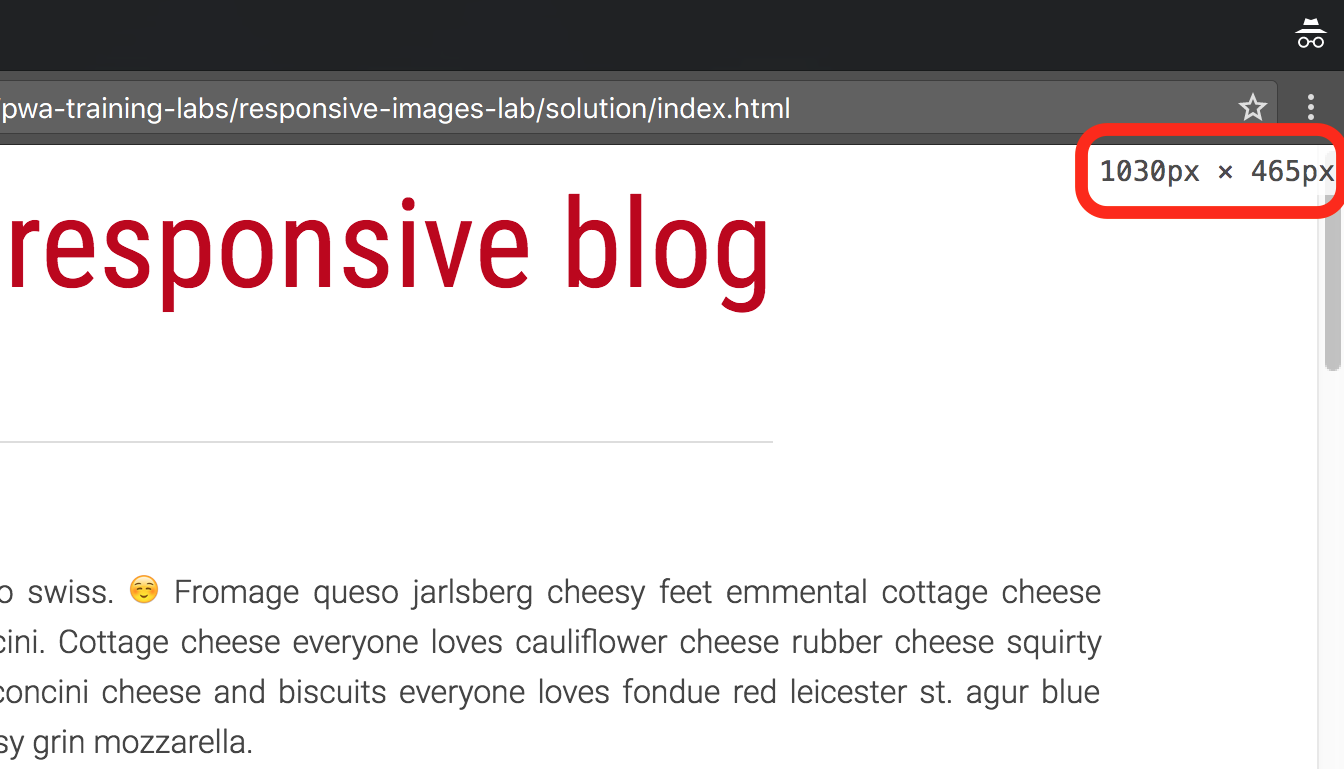
Note: In Chrome, with DevTools open, the browser window dimensions appear as it is being resized (see the image below). This feature will be very useful throughout this codelab.
Explanation
By adding a width descriptor to each file in the srcset, we are telling the browser the width of each image in pixels before it fetches the image. The browser can then use these widths to decide which image to fetch based on its window size. It fetches the image with the smallest width that is still larger than the viewport width.
Note: You can also optionally specify a pixel density instead of a width. However, you cannot specify both pixel densities and widths in the same srcset attribute. We explore using pixel densities in a later section.
Display an image at half the width of the viewport (50vw)
Replace TODO 4.1 in styles/main.css with the following code:
img#sfo {
  transition: width 0.5s;
  max-width: 50vw;
}
Save the code and refresh the page in the browser. Try refreshing the page at various window sizes and check the network requests at each size. The browser is fetching the same sized images as before.
Explanation
Because the CSS is parsed after the HTML at runtime, the browser has no way to know what the final display size of the image will be when it fetches it. Unless we tell it otherwise, the browser assumes the images will be displayed at 100% of the viewport width and fetches the images based on this. We need a way to tell the browser beforehand if the images will be displayed at a different size.
Add the sizes attribute to the image
We can give img a sizes attribute to tell the browser the display size of the image before it is fetched.
To complete TODO 4.2 in index.html add sizes="50vw" to the img element so that it looks like this:
<img id="sfo" src="images/sfo-500_small.jpg" srcset="images/sfo-1600_large.jpg 1600w, images/sfo-1000_large.jpg 1000w, images/sfo-800_medium.jpg 800w, images/sfo-500_small.jpg 500w" sizes="50vw" alt="View from aircraft window near San Francisco airport">Save the code and refresh the page in the browser. Refresh the page at various window sizes and check the network requests each time. You should see that for the same approximate window sizes you used to test the previous step, the browser is fetching a smaller image.
Explanation
The sizes value matches the image's max-width value in the CSS. The browser now has everything it needs to choose the correct image version. The browser knows its own viewport width and the pixel density of the user's device, and we have given it the source files' dimensions (using the width descriptor) and the image sizes relative to the viewport (using the sizes attribute).
For more information
Add a media query to the CSS
We can use media queries to resize images in real time based on the viewport width.
Replace TODO 5.1 in styles/main.css with the following code:
@media screen and (max-width: 700px) {
  img#sfo {
    max-width: 90vw;
    width: 90vw;
  }
}
Save the code and refresh the page in the browser. Shrink the window to less than 700px (in Chrome, the viewport dimensions are shown on the screen if DevTools is open). The image should resize to fill 90% of the window width.
Explanation
The media query tests the viewport width of the screen, and applies the CSS if the viewport is less than 700px wide.
For more information
Add the media query to the sizes attribute
We can tell the browser about the media query in the sizes attribute so that it fetches the correct image when the image changes size.
To complete TODO 5.2 in index.html, update the sizes attribute in the SFO image:
sizes="(max-width: 700px) 90vw, 50vw"Save the code and refresh the page in the browser. Resize the browser window so that it is 600px wide. On a 1x display, the browser should fetch sfo-800_medium.jpg.
We can use the picture element and the source element, in combination with media queries, to change the image source as the window is resized.
Replace TODO 6 in index.html with the following code:
<figure>
    <picture>
    <source media="(min-width: 750px)"
            srcset="images/horses-1600_large_2x.jpg 2x,
                    images/horses-800_large_1x.jpg" />
    <source media="(min-width: 500px)"
            srcset="images/horses_medium.jpg" />
    <img src="images/horses_small.jpg" alt="Horses in Hawaii">
    </picture>
    <figcaption>Horses in Hawaii</figcaption>
</figure>
Save the code and refresh the page in the browser. Try resizing the browser window. You should see the image change at 750px and 500px.
Explanation
The picture element lets us define multiple source files using the source tag. This is different than simply using an img tag with the srcset attribute because the source tag lets us add things like media queries to each set of sources. Instead of giving the browser the image sizes and letting it decide which files to use, we can define the images to use at each window size.
We have included several versions of the sample image, each at different resolutions and cropped to make the focus of the image visible at smaller sizes. In the code above, at larger than 750px, the browser fetches either horses-1600_large_2x.jpg (if the device has a 2x display) or horses-800_large_1x.jpg. If the window's width is less than 750px but greater than 500px, the browser fetches horses_medium.jpg. At less than 500px the browser fetches the fallback image, horses_small.jpg.
Note: If the user's browser doesn't support the picture element, it fetches whatever is in the img element. The picture element is just used to specify multiple sources for the img element contained in it. The img element is what displays the image.
For more information
You have learned how to make images on your web page look good on all devices!
Resources
Learn about automating the process
- Gulp responsive images (NPM) - requires libvips on Mac
- Gulp responsive images (GitHub) - requires graphicsmagick on all platforms
- Responsive Image Breakpoints Generator v2.0
Learn more about srcset and sizes
Learn more about art direction
To see all the codelabs in the PWA training course, see the Welcome codelab for the course/