
開發人員可透過 Material 元件 (MDC) 實作 Material Design。MDC 由 Google 的工程師和 UX 設計師團隊建立,提供數十種美觀實用的 UI 元件,適用於 Android、iOS、網頁和 Flutter。 material.io/develop |
在 MDC-103 程式碼研究室中,您自訂了 Material Design 元件 (MDC) 的顏色、高度和字體排版,為應用程式設定樣式。
在 Material Design 系統中,元件會執行一組預先定義的工作,並具有特定特徵,例如按鈕。不過,按鈕不僅是使用者執行動作的方式,也是形狀、大小和顏色的視覺表現,可讓使用者知道按鈕具有互動性,且輕觸或點選後會發生某些動作。
Material Design 指南從設計師的角度說明元件,這些函式說明瞭各種平台提供的基本函式,以及組成各個元件的解剖元素。舉例來說,背景包含後方圖層及其內容、前方圖層及其內容、動態規則和顯示選項。您可以根據每個應用程式的需求、用途和內容,自訂這些元件。這些元素大多是平台 SDK 中的傳統檢視區塊、控制項和函式。
雖然 Material Design 指南列出許多元件,但並非所有元件都適合重複使用程式碼,因此 MDC 中不會提供這些元件。您可以自行建立這些體驗,為應用程式打造專屬風格,而且全都是使用傳統程式碼。
建構項目
在本程式碼研究室中,您將為 Shrine 新增背景。系統會依類別篩選非對稱格線中顯示的產品。您將使用:
- 圖案
- 動作
- 傳統 Android SDK 類別

本程式碼研究室中的 MDC-Android 元件
- 圖案
軟硬體需求
- 具備 Android 開發的基本知識
- Android Studio (如果沒有,請在這裡下載)
- Android 模擬器或裝置 (可透過 Android Studio 取得)
- 範例程式碼 (請參閱下一個步驟)
您對建構 Android 應用程式的經驗程度為何?
是否已完成 MDC-103?
如果您已完成 MDC-103,程式碼應該已準備好用於本程式碼研究室。請跳到步驟 3。
從頭開始嗎?
下載程式碼研究室範例應用程式
範例應用程式位於 material-components-android-codelabs-104-starter/java 目錄中。開始前,請務必 cd 進入該目錄。
...或從 GitHub 複製
如要從 GitHub 複製本程式碼研究室,請執行下列指令:
git clone https://github.com/material-components/material-components-android-codelabs
cd material-components-android-codelabs/
git checkout 104-starter
在 Android Studio 中載入範例程式碼
- 設定精靈完成後,系統會顯示「Welcome to Android Studio」視窗,請按一下「Open an existing Android Studio project」。前往安裝範例程式碼的目錄,然後選取「java」>「shrine」(或在電腦上搜尋「shrine」) 開啟 Shrine 專案。
- 稍待片刻,Android Studio 會建構及同步處理專案,Android Studio 視窗底部的活動指標會顯示進度。
- 此時,Android Studio 可能會引發一些建構錯誤,因為您缺少 Android SDK 或建構工具,如下所示。按照 Android Studio 中的操作說明安裝/更新這些項目,然後同步專案。

新增專案依附元件
專案需要 MDC Android 支援程式庫的依附元件。您下載的範例程式碼應該已列出這項依附元件,但建議您執行下列步驟,確保一切正常。
- 前往
app模組的build.gradle檔案,確認dependencies區塊包含 MDC Android 的依附元件:
api 'com.google.android.material:material:1.1.0-alpha06'
- (選用) 視需要編輯
build.gradle檔案,加入下列依附元件並同步處理專案。
dependencies {
    api 'com.google.android.material:material:1.1.0-alpha06'
    implementation 'androidx.legacy:legacy-support-v4:1.0.0'
    implementation 'com.android.volley:volley:1.1.1'
    implementation 'com.google.code.gson:gson:2.8.5'
    implementation "org.jetbrains.kotlin:kotlin-stdlib-jdk7:1.3.21"
    testImplementation 'junit:junit:4.12'
    androidTestImplementation 'androidx.test:core:1.1.0'
    androidTestImplementation 'androidx.test.ext:junit:1.1.0'
    androidTestImplementation 'androidx.test:runner:1.2.0-alpha05'
    androidTestImplementation 'androidx.test.espresso:espresso-core:3.2.0-alpha05'
}
執行範例應用程式
|

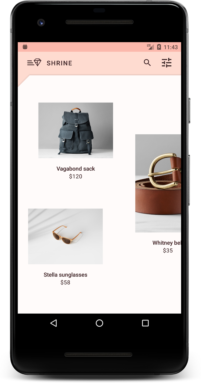
大功告成!裝置上應會顯示 Shrine 應用程式。

背景是應用程式最遠的介面,會顯示在所有其他內容和元件的後方。這個元件由兩個介面組成:後方圖層 (顯示動作和篩選器) 和前方圖層 (顯示內容)。你可以使用背景顯示互動式資訊和動作,例如導覽或內容篩選器。
隱藏格線內容
在 shr_product_grid_fragment.xml 中,將 android:visibility="gone" 屬性加入 NestedScrollView,暫時移除產品內容:
shr_product_grid_fragment.xml
<androidx.core.widget.NestedScrollView
   android:layout_width="match_parent"
   android:layout_height="match_parent"
   android:layout_marginTop="56dp"
   android:background="@color/productGridBackgroundColor"
   android:elevation="8dp"
   android:visibility="gone"
   app:layout_behavior="@string/appbar_scrolling_view_behavior">
我們會在該區域安裝背景。為避免頂端應用程式列與顯示在背景上的選單內容之間出現分隔線,我們會將背景設為與頂端應用程式列相同的顏色。
在 shr_product_grid_fragment.xml 中,將下列內容新增為根 FrameLayout 中的第一個元素 (在 AppBarLayout 之前):
shr_product_grid_fragment.xml
<LinearLayout
   style="@style/Widget.Shrine.Backdrop"
   android:layout_width="match_parent"
   android:layout_height="match_parent"
   android:gravity="center_horizontal"
   android:orientation="vertical"
   android:paddingTop="100dp"
   android:paddingBottom="100dp">

</LinearLayout>
在 styles.xml 中新增下列項目:
styles.xml
<style name="Widget.Shrine.Backdrop" parent="">
   <item name="android:background">?attr/colorAccent</item>
</style>
非常好!你已在 Shrine 的 UI 中新增美麗的背景。接著新增選單。
新增菜單
選單基本上就是文字按鈕清單。我們會在這邊新增一個。
在 res -> layout 目錄中建立名為 shr_backdrop.xml 的新版面配置,並新增下列項目:
shr_backdrop.xml
<?xml version="1.0" encoding="utf-8"?>
<merge xmlns:android="http://schemas.android.com/apk/res/android">

   <com.google.android.material.button.MaterialButton
       style="@style/Widget.Shrine.Button.TextButton"
       android:layout_width="wrap_content"
       android:layout_height="wrap_content"
       android:text="@string/shr_featured_label" />

   <com.google.android.material.button.MaterialButton
       style="@style/Widget.Shrine.Button.TextButton"
       android:layout_width="wrap_content"
       android:layout_height="wrap_content"
       android:text="@string/shr_apartment_label" />

   <com.google.android.material.button.MaterialButton
       style="@style/Widget.Shrine.Button.TextButton"
       android:layout_width="wrap_content"
       android:layout_height="wrap_content"
       android:text="@string/shr_accessories_label" />

   <com.google.android.material.button.MaterialButton
       style="@style/Widget.Shrine.Button.TextButton"
       android:layout_width="wrap_content"
       android:layout_height="wrap_content"
       android:text="@string/shr_shoes_label" />

   <com.google.android.material.button.MaterialButton
       style="@style/Widget.Shrine.Button.TextButton"
       android:layout_width="wrap_content"
       android:layout_height="wrap_content"
       android:text="@string/shr_tops_label" />

   <com.google.android.material.button.MaterialButton
       style="@style/Widget.Shrine.Button.TextButton"
       android:layout_width="wrap_content"
       android:layout_height="wrap_content"
       android:text="@string/shr_bottoms_label" />

   <com.google.android.material.button.MaterialButton
       style="@style/Widget.Shrine.Button.TextButton"
       android:layout_width="wrap_content"
       android:layout_height="wrap_content"
       android:text="@string/shr_dresses_label" />

   <View
       android:layout_width="56dp"
       android:layout_height="1dp"
       android:layout_margin="16dp"
       android:background="?android:attr/textColorPrimary" />

   <com.google.android.material.button.MaterialButton
       style="@style/Widget.Shrine.Button.TextButton"
       android:layout_width="wrap_content"
       android:layout_height="wrap_content"
       android:text="@string/shr_account_label" />

</merge>
然後使用 <include> 標記,將這個清單加到您剛在 shr_product_grid_fragment.xml 中新增的 LinearLayout:
shr_product_grid_fragment.xml
<LinearLayout
   style="@style/Widget.Shrine.Backdrop"
   android:layout_width="match_parent"
   android:layout_height="match_parent"
   android:gravity="center_horizontal"
   android:orientation="vertical"
   android:paddingTop="88dp">

   <include layout="@layout/shr_backdrop" />
</LinearLayout>
建構並執行。主畫面應如下所示:

背景已完成。讓我們還原先前隱藏的內容。
在本程式碼研究室中對 Shrine 進行任何變更之前,主要產品內容位於最遠的背面。加入背景後,這類內容會顯示在背景前方,因此更加醒目。
新增圖層
我們應該再次顯示產品格線層。從NestedScrollView中移除 android:visibility="gone" 屬性:
shr_product_grid_fragment.xml
<androidx.core.widget.NestedScrollView
   android:layout_width="match_parent"
   android:layout_height="match_parent"
   android:layout_marginTop="56dp"
   android:background="@color/productGridBackgroundColor"
   android:elevation="8dp"
   app:layout_behavior="@string/appbar_scrolling_view_behavior">
我們要在左上角加上凹口,為最上層設定樣式。Material Design 將這類自訂項目稱為形狀。Material 表面可用不同形狀顯示。形狀可為介面增添強調效果和風格,也可用於呈現品牌形象。Material 形狀的邊角可為彎曲或傾斜,且邊數不限。可以是規則或不規則的形狀。
新增圖案
修改格線形狀。我們提供自訂形狀背景,但形狀只會在 Android Marshmallow 以上版本正確顯示。我們只能在 Android Marshmallow 以上版本設定 shr_product_grid_background_shapeNestedScrollView背景。首先,請在 NestedScrollView 中新增 id,以便在程式碼中參照,如下所示:
shr_product_grid_fragment.xml
<androidx.core.widget.NestedScrollView
   android:id="@+id/product_grid"
   android:layout_width="match_parent"
   android:layout_height="match_parent"
   android:layout_marginTop="56dp"
   android:background="@color/productGridBackgroundColor"
   android:elevation="8dp"
   app:layout_behavior="@string/appbar_scrolling_view_behavior">
接著,在 ProductGridFragment.java 中以程式輔助方式設定背景。在 onCreateView() 結尾處 (return 陳述式之前) 新增下列邏輯,即可設定背景:
ProductGridFragment.java
// Set cut corner background for API 23+
if (Build.VERSION.SDK_INT >= Build.VERSION_CODES.M) {
    view.findViewById(R.id.product_grid).setBackgroundResource(R.drawable.shr_product_grid_background_shape);
}
最後,我們會更新 productGridBackgroundColor 顏色資源 (自訂形狀背景也會使用),如下所示:
colors.xml
<color name="productGridBackgroundColor">#FFFBFA</color>建構及執行:

我們為 Shrine 的主要介面提供自訂樣式的形狀。由於表面高度的關係,使用者可以看到白色前層後方有東西。我們來新增動態效果,讓使用者看到選單。
動態效果可讓應用程式更生動。動作可以誇張,也可以細微,或介於兩者之間。使用的動作類型應適合當下情況。套用至重複性例行動作的動態效果應細微,以免耗費太多時間。其他情況 (例如使用者首次開啟應用程式) 則更引人注目,有助於教導使用者如何使用應用程式。
為選單按鈕新增顯示動畫
動作是讓前方的形狀直接向下移動。我們已為您提供點擊監聽器,可在 NavigationIconClickListener.java 中完成工作表翻譯動畫。我們可以在 ProductGridFragment.java 的 setupToolbar() 方法中設定這個點擊事件監聽器:ProductGridFragment.java
ProductGridFragment.java
toolbar.setNavigationOnClickListener(new NavigationIconClickListener(getContext(), view.findViewById(R.id.product_grid)));您的 setUpToolbar() 方法現在應如下所示:
ProductGridFragment.java
private void setUpToolbar(View view) {
   Toolbar toolbar = view.findViewById(R.id.app_bar);
   AppCompatActivity activity = (AppCompatActivity) getActivity();
   if (activity != null) {
       activity.setSupportActionBar(toolbar);
   }

   toolbar.setNavigationOnClickListener(new NavigationIconClickListener(getContext(), view.findViewById(R.id.product_grid)));
}
建構並執行。按下選單按鈕:

再次按下導覽選單圖示,即可隱藏選單。
調整前景圖層的動態效果
動態效果是展現品牌的絕佳方式。讓我們看看使用不同時間曲線的顯示動畫。
在 ProductGridFragment.java 中更新 setupToolbar() 的程式碼,將 Interpolator 傳遞至導覽圖示的點擊事件監聽器,如下所示:
ProductGridFragment.java
private void setUpToolbar(View view) {
   Toolbar toolbar = view.findViewById(R.id.app_bar);
   AppCompatActivity activity = (AppCompatActivity) getActivity();
   if (activity != null) {
       activity.setSupportActionBar(toolbar);
   }

   toolbar.setNavigationOnClickListener(new NavigationIconClickListener(
           getContext(),
           view.findViewById(R.id.product_grid),
           new AccelerateDecelerateInterpolator()));
}
這樣會產生不同的效果,對吧?
品牌圖示也適用於常見圖示。讓我們自訂顯示圖示,並與標題合併,打造獨特的品牌外觀。
變更選單按鈕圖示
將選單按鈕變更為顯示包含菱形設計的圖示。在 shr_product_grid_fragment.xml 中更新工具列,使用我們提供的新品牌圖示 (shr_branded_menu),並設定 app:contentInsetStart 和 android:padding 屬性,讓工具列更符合設計師的規格:
shr_product_grid_fragment.xml
<androidx.appcompat.widget.Toolbar
   android:id="@+id/app_bar"
   style="@style/Widget.Shrine.Toolbar"
   android:layout_width="match_parent"
   android:layout_height="?attr/actionBarSize"
   android:paddingStart="12dp"
   android:paddingLeft="12dp"
   android:paddingEnd="12dp"
   android:paddingRight="12dp"
   app:contentInsetStart="0dp"
   app:navigationIcon="@drawable/shr_branded_menu"
   app:title="@string/shr_app_name" />
在 ProductGridFragment.java 中更新 setupToolbar() 的點擊事件監聽器,以便在選單開啟和關閉時,將可繪項目納入工具列,如下所示:
ProductGridFragment.java
private void setUpToolbar(View view) {
   Toolbar toolbar = view.findViewById(R.id.app_bar);
   AppCompatActivity activity = (AppCompatActivity) getActivity();
   if (activity != null) {
       activity.setSupportActionBar(toolbar);
   }

   toolbar.setNavigationOnClickListener(new NavigationIconClickListener(
           getContext(),
           view.findViewById(R.id.product_grid),
           new AccelerateDecelerateInterpolator(),
           getContext().getResources().getDrawable(R.drawable.shr_branded_menu), // Menu open icon
           getContext().getResources().getDrawable(R.drawable.shr_close_menu))); // Menu close icon
}
建構及執行:
太好了!如果可以顯示背景,就會顯示菱形選單圖示。如果選單可以隱藏,系統會改為顯示關閉圖示。
在這四個程式碼研究室中,您已瞭解如何使用 Material Design 元件,打造獨特優雅的使用者體驗,展現品牌的個性和風格。
後續步驟
本程式碼研究室 (MDC-104) 是這一連串程式碼研究室的最後一個。如要進一步探索 MDC-Android 中的元件,請前往 Android 視窗小工具目錄。
如要進一步挑戰本程式碼研究室,請修改 Shrine 應用程式,在從背景選單選取類別時變更顯示的產品圖片。
如要瞭解如何將這個應用程式連結至 Firebase,以建立可運作的後端,請參閱 Firebase Android 程式碼研究室。