
Material Components (MDC) ช่วยให้นักพัฒนาแอปใช้งาน Material Design ได้ MDC สร้างขึ้นโดยทีมวิศวกรและนักออกแบบ UX ที่ Google โดยมีคอมโพเนนต์ UI ที่สวยงามและใช้งานได้หลายสิบรายการ และพร้อมใช้งานสำหรับ Android, iOS, เว็บ และ Flutter material.io/develop |
ใน Codelab MDC-103 คุณได้ปรับแต่งสี ระดับความสูง และการพิมพ์ของคอมโพเนนต์ Material (MDC) เพื่อจัดรูปแบบแอป
คอมโพเนนต์ในระบบ Material Design จะทำงานที่กำหนดไว้ล่วงหน้าชุดหนึ่งและมีลักษณะบางอย่าง เช่น ปุ่ม อย่างไรก็ตาม ปุ่มไม่ได้เป็นเพียงวิธีให้ผู้ใช้ดำเนินการเท่านั้น แต่ยังเป็นการแสดงออกด้วยภาพของรูปร่าง ขนาด และสี ซึ่งช่วยให้ผู้ใช้ทราบว่าปุ่มนั้นโต้ตอบได้ และจะมีบางอย่างเกิดขึ้นเมื่อแตะหรือคลิก
หลักเกณฑ์การออกแบบ Material อธิบายคอมโพเนนต์จากมุมมองของนักออกแบบ โดยจะอธิบายฟังก์ชันพื้นฐานที่หลากหลายซึ่งมีให้บริการในแพลตฟอร์มต่างๆ รวมถึงองค์ประกอบทางกายวิภาคที่ประกอบเป็นคอมโพเนนต์แต่ละรายการ ตัวอย่างเช่น ฉากหลังประกอบด้วยเลเยอร์ด้านหลังและเนื้อหา เลเยอร์ด้านหน้าและเนื้อหา กฎการเคลื่อนไหว และตัวเลือกการแสดง คุณปรับแต่งแต่ละคอมโพเนนต์เหล่านี้ให้ตรงกับความต้องการ กรณีการใช้งาน และเนื้อหาของแต่ละแอปได้ โดยส่วนใหญ่แล้ว องค์ประกอบเหล่านี้คือมุมมอง ตัวควบคุม และฟังก์ชันแบบดั้งเดิมจาก SDK ของแพลตฟอร์ม
แม้ว่าหลักเกณฑ์การออกแบบ Material Design จะระบุชื่อคอมโพเนนต์หลายรายการ แต่ไม่ใช่ทุกรายการที่เหมาะสำหรับโค้ดที่นำกลับมาใช้ใหม่ได้ จึงไม่ได้อยู่ใน MDC คุณสร้างประสบการณ์เหล่านี้ได้ด้วยตนเองเพื่อให้แอปมีสไตล์ที่กำหนดเอง โดยใช้โค้ดแบบเดิมทั้งหมด
สิ่งที่คุณจะสร้าง
ในโค้ดแล็บนี้ คุณจะได้เพิ่มฉากหลังให้กับ Shrine โดยจะกรองผลิตภัณฑ์ที่แสดงในตารางกริดแบบอสมมาตรตามหมวดหมู่ คุณจะต้องใช้สิ่งต่อไปนี้
- รูปร่าง
- การเคลื่อนไหว
- คลาส Android SDK แบบเดิม

คอมโพเนนต์ MDC-Android ใน Codelab นี้
- รูปร่าง
สิ่งที่ต้องมี
- ความรู้พื้นฐานเกี่ยวกับการพัฒนาแอป Android
- Android Studio (ดาวน์โหลดที่นี่หากยังไม่มี)
- โปรแกรมจำลองหรืออุปกรณ์ Android (พร้อมใช้งานผ่าน Android Studio)
- โค้ดตัวอย่าง (ดูขั้นตอนถัดไป)
คุณจะให้คะแนนระดับประสบการณ์ในการสร้างแอป Android เท่าใด
หากเคยเรียน MDC-103 มาก่อน
หากคุณทำ MDC-103 เสร็จแล้ว โค้ดของคุณควรพร้อมสำหรับโค้ดแล็บนี้ ข้ามไปขั้นตอนที่ 3
หากเพิ่งเริ่มต้น
ดาวน์โหลดแอป Codelab สำหรับผู้เริ่มต้น
แอปเริ่มต้นอยู่ในไดเรกทอรี material-components-android-codelabs-104-starter/java อย่าลืม cd เข้าไปในไดเรกทอรีนั้นก่อนเริ่มต้น
...หรือโคลนจาก GitHub
หากต้องการโคลนโค้ดแล็บนี้จาก GitHub ให้เรียกใช้คำสั่งต่อไปนี้
git clone https://github.com/material-components/material-components-android-codelabs
cd material-components-android-codelabs/
git checkout 104-starter
โหลดโค้ดเริ่มต้นใน Android Studio
- เมื่อวิซาร์ดการตั้งค่าเสร็จสิ้นและหน้าต่างยินดีต้อนรับสู่ Android Studio ปรากฏขึ้น ให้คลิกเปิดโปรเจ็กต์ Android Studio ที่มีอยู่ ไปที่ไดเรกทอรีที่คุณติดตั้งโค้ดตัวอย่าง แล้วเลือก java -> shrine (หรือค้นหา shrine ในคอมพิวเตอร์) เพื่อเปิดโปรเจ็กต์ Shrine
- รอสักครู่เพื่อให้ Android Studio สร้างและซิงค์โปรเจ็กต์ ดังที่แสดงโดยตัวบ่งชี้กิจกรรมที่ด้านล่างของหน้าต่าง Android Studio
- ในขั้นตอนนี้ Android Studio อาจแสดงข้อผิดพลาดในการสร้างบางอย่างเนื่องจากคุณไม่มี Android SDK หรือเครื่องมือบิลด์ เช่น เครื่องมือที่แสดงด้านล่าง ทำตามวิธีการใน Android Studio เพื่อติดตั้ง/อัปเดตไลบรารีเหล่านี้และซิงค์โปรเจ็กต์

เพิ่มการพึ่งพาโปรเจ็กต์
โปรเจ็กต์ต้องมีทรัพยากร Dependency ในไลบรารีการรองรับ MDC Android โค้ดตัวอย่างที่คุณดาวน์โหลดควรมีรายการการอ้างอิงนี้อยู่แล้ว แต่แนวทางปฏิบัติแนะนำคือการทำตามขั้นตอนต่อไปนี้เพื่อให้แน่ใจ
- ไปที่ไฟล์
build.gradleของโมดูลappและตรวจสอบว่าบล็อกdependenciesมีการอ้างอิง MDC Android
api 'com.google.android.material:material:1.1.0-alpha06'
- (ไม่บังคับ) หากจำเป็น ให้แก้ไขไฟล์
build.gradleเพื่อเพิ่มการอ้างอิงต่อไปนี้และซิงค์โปรเจ็กต์
dependencies {
    api 'com.google.android.material:material:1.1.0-alpha06'
    implementation 'androidx.legacy:legacy-support-v4:1.0.0'
    implementation 'com.android.volley:volley:1.1.1'
    implementation 'com.google.code.gson:gson:2.8.5'
    implementation "org.jetbrains.kotlin:kotlin-stdlib-jdk7:1.3.21"
    testImplementation 'junit:junit:4.12'
    androidTestImplementation 'androidx.test:core:1.1.0'
    androidTestImplementation 'androidx.test.ext:junit:1.1.0'
    androidTestImplementation 'androidx.test:runner:1.2.0-alpha05'
    androidTestImplementation 'androidx.test.espresso:espresso-core:3.2.0-alpha05'
}
เรียกใช้แอปเริ่มต้น
|

สำเร็จ! คุณควรเห็นแอป Shrine ทำงานบนอุปกรณ์

ฉากหลังคือพื้นผิวที่อยู่ด้านหลังสุดของแอป ซึ่งจะปรากฏอยู่ด้านหลังเนื้อหาและคอมโพเนนต์อื่นๆ ทั้งหมด โดยประกอบด้วย 2 เลเยอร์ ได้แก่ เลเยอร์ด้านหลัง (ซึ่งแสดงการดำเนินการและฟิลเตอร์) และเลเยอร์ด้านหน้า (ซึ่งแสดงเนื้อหา) คุณใช้ฉากหลังเพื่อแสดงข้อมูลและการดำเนินการแบบอินเทอร์แอกทีฟได้ เช่น การนำทางหรือตัวกรองเนื้อหา
ซ่อนเนื้อหาในตารางกริด
ใน shr_product_grid_fragment.xml ให้เพิ่มแอตทริบิวต์ android:visibility="gone" ลงใน NestedScrollView เพื่อนำเนื้อหาผลิตภัณฑ์ออกชั่วคราว
shr_product_grid_fragment.xml
<androidx.core.widget.NestedScrollView
   android:layout_width="match_parent"
   android:layout_height="match_parent"
   android:layout_marginTop="56dp"
   android:background="@color/productGridBackgroundColor"
   android:elevation="8dp"
   android:visibility="gone"
   app:layout_behavior="@string/appbar_scrolling_view_behavior">
เราจะติดตั้งฉากหลังในภูมิภาคนี้ เราจะทำให้ฉากหลังมีสีเดียวกับแถบแอปด้านบนเพื่อไม่ให้เห็นเส้นแบ่งระหว่างแถบแอปด้านบนกับเนื้อหาเมนูที่ปรากฏบนฉากหลัง
ใน shr_product_grid_fragment.xml ให้เพิ่มรายการต่อไปนี้เป็นองค์ประกอบแรกในรูท FrameLayout ก่อน AppBarLayout
shr_product_grid_fragment.xml
<LinearLayout
   style="@style/Widget.Shrine.Backdrop"
   android:layout_width="match_parent"
   android:layout_height="match_parent"
   android:gravity="center_horizontal"
   android:orientation="vertical"
   android:paddingTop="100dp"
   android:paddingBottom="100dp">

</LinearLayout>
ใน styles.xml ให้เพิ่มรายการต่อไปนี้
styles.xml
<style name="Widget.Shrine.Backdrop" parent="">
   <item name="android:background">?attr/colorAccent</item>
</style>
เยี่ยมมาก! คุณได้เพิ่มฉากหลังที่สวยงามลงใน UI ของ Shrine จากนั้นเราจะเพิ่มเมนู
เพิ่มเมนู
เมนูคือรายการปุ่มข้อความ เราจะเพิ่มไว้ที่นี่
สร้างเลย์เอาต์ใหม่ชื่อ shr_backdrop.xml ในไดเรกทอรี res -> layout แล้วเพิ่มข้อมูลต่อไปนี้
shr_backdrop.xml
<?xml version="1.0" encoding="utf-8"?>
<merge xmlns:android="http://schemas.android.com/apk/res/android">

   <com.google.android.material.button.MaterialButton
       style="@style/Widget.Shrine.Button.TextButton"
       android:layout_width="wrap_content"
       android:layout_height="wrap_content"
       android:text="@string/shr_featured_label" />

   <com.google.android.material.button.MaterialButton
       style="@style/Widget.Shrine.Button.TextButton"
       android:layout_width="wrap_content"
       android:layout_height="wrap_content"
       android:text="@string/shr_apartment_label" />

   <com.google.android.material.button.MaterialButton
       style="@style/Widget.Shrine.Button.TextButton"
       android:layout_width="wrap_content"
       android:layout_height="wrap_content"
       android:text="@string/shr_accessories_label" />

   <com.google.android.material.button.MaterialButton
       style="@style/Widget.Shrine.Button.TextButton"
       android:layout_width="wrap_content"
       android:layout_height="wrap_content"
       android:text="@string/shr_shoes_label" />

   <com.google.android.material.button.MaterialButton
       style="@style/Widget.Shrine.Button.TextButton"
       android:layout_width="wrap_content"
       android:layout_height="wrap_content"
       android:text="@string/shr_tops_label" />

   <com.google.android.material.button.MaterialButton
       style="@style/Widget.Shrine.Button.TextButton"
       android:layout_width="wrap_content"
       android:layout_height="wrap_content"
       android:text="@string/shr_bottoms_label" />

   <com.google.android.material.button.MaterialButton
       style="@style/Widget.Shrine.Button.TextButton"
       android:layout_width="wrap_content"
       android:layout_height="wrap_content"
       android:text="@string/shr_dresses_label" />

   <View
       android:layout_width="56dp"
       android:layout_height="1dp"
       android:layout_margin="16dp"
       android:background="?android:attr/textColorPrimary" />

   <com.google.android.material.button.MaterialButton
       style="@style/Widget.Shrine.Button.TextButton"
       android:layout_width="wrap_content"
       android:layout_height="wrap_content"
       android:text="@string/shr_account_label" />

</merge>
จากนั้นเพิ่มรายการนี้ลงใน LinearLayout ที่คุณเพิ่งเพิ่มใน shr_product_grid_fragment.xml โดยใช้แท็ก <include>
shr_product_grid_fragment.xml
<LinearLayout
style="@style/Widget.Shrine.Backdrop"
android:layout_width="match_parent"
android:layout_height="match_parent"
android:gravity="center_horizontal"
android:orientation="vertical"
android:paddingTop="88dp">
<include layout="@layout/shr_backdrop" />
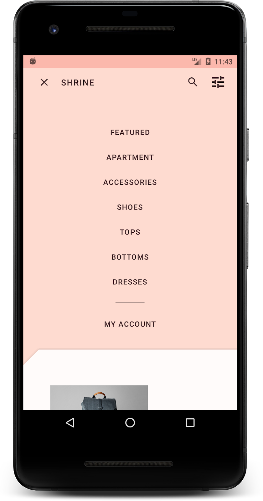
</LinearLayout>สร้างและเรียกใช้ หน้าจอหลักควรมีลักษณะดังนี้

สร้างฉากหลังเสร็จแล้ว มานำเนื้อหาที่เราซ่อนไว้ก่อนหน้านี้กลับมากัน
ก่อนที่เราจะทำการเปลี่ยนแปลงใดๆ ใน Shrine ในโค้ดแล็บนี้ เนื้อหาผลิตภัณฑ์หลักของ Shrine จะอยู่ในส่วนที่อยู่ด้านหลังสุด การเพิ่มฉากหลังจะช่วยเน้นเนื้อหามากขึ้นเนื่องจากเนื้อหาจะปรากฏที่ด้านหน้าของฉากหลัง
เพิ่มเลเยอร์ใหม่
เราควรแสดงเลเยอร์ตารางกริดของผลิตภัณฑ์อีกครั้ง นำแอตทริบิวต์ android:visibility="gone" ออกจาก NestedScrollView โดยทำดังนี้
shr_product_grid_fragment.xml
<androidx.core.widget.NestedScrollView
   android:layout_width="match_parent"
   android:layout_height="match_parent"
   android:layout_marginTop="56dp"
   android:background="@color/productGridBackgroundColor"
   android:elevation="8dp"
   app:layout_behavior="@string/appbar_scrolling_view_behavior">
มาจัดรูปแบบเลเยอร์ด้านหน้าให้มีรอยบากที่มุมซ้ายบนกัน ดีไซน์ Material เรียกการปรับแต่งประเภทนี้ว่ารูปร่าง พื้นผิวของ Material จะแสดงในรูปทรงต่างๆ ได้ รูปร่างช่วยเพิ่มความโดดเด่นและสไตล์ให้กับพื้นผิว และใช้เพื่อแสดงการสร้างแบรนด์ได้ รูปร่างของวัสดุมีมุมและขอบโค้งหรือเป็นมุม และมีด้านได้ไม่จำกัด โดยอาจเป็นแบบสมมาตรหรือไม่สมมาตรก็ได้
เพิ่มรูปร่าง
แก้ไขรูปร่างของตารางกริด เราได้จัดเตรียมพื้นหลังรูปทรงที่กำหนดเองไว้ให้ แต่รูปทรงจะแสดงอย่างถูกต้องใน Android Marshmallow ขึ้นไปเท่านั้น เราสามารถตั้งค่าshr_product_grid_background_shapeพื้นหลังใน NestedScrollView ได้เฉพาะ Android Marshmallow ขึ้นไป ก่อนอื่น ให้เพิ่ม id ลงใน NestedScrollView เพื่อให้เราอ้างอิงในโค้ดได้ ดังนี้
shr_product_grid_fragment.xml
<androidx.core.widget.NestedScrollView
   android:id="@+id/product_grid"
   android:layout_width="match_parent"
   android:layout_height="match_parent"
   android:layout_marginTop="56dp"
   android:background="@color/productGridBackgroundColor"
   android:elevation="8dp"
   app:layout_behavior="@string/appbar_scrolling_view_behavior">
จากนั้นตั้งค่าพื้นหลังแบบเป็นโปรแกรมใน ProductGridFragment.java เพิ่มตรรกะต่อไปนี้เพื่อตั้งค่าพื้นหลังเป็นส่วนท้ายของ onCreateView() ก่อนคำสั่ง return
ProductGridFragment.java
// Set cut corner background for API 23+
if (Build.VERSION.SDK_INT >= Build.VERSION_CODES.M) {
    view.findViewById(R.id.product_grid).setBackgroundResource(R.drawable.shr_product_grid_background_shape);
}
สุดท้าย เราจะอัปเดตproductGridBackgroundColorทรัพยากรสี (ซึ่งใช้กับพื้นหลังรูปร่างที่กำหนดเองด้วย) ดังนี้
colors.xml
<color name="productGridBackgroundColor">#FFFBFA</color>สร้างและเรียกใช้

เราได้ให้รูปร่างที่ปรับแต่งแล้วแก่ Shrine ในแพลตฟอร์มหลัก เนื่องจากการยกระดับพื้นผิว ผู้ใช้จึงเห็นว่ามีบางอย่างอยู่ด้านหลังเลเยอร์สีขาวด้านหน้า มาเพิ่มการเคลื่อนไหวเพื่อให้ผู้ใช้เห็นว่ามีอะไรอยู่บ้าง นั่นก็คือเมนู
การเคลื่อนไหวเป็นวิธีทำให้แอปของคุณมีชีวิตชีวา การเคลื่อนไหวอาจยิ่งใหญ่และน่าทึ่ง ละเอียดอ่อนและเรียบง่าย หรืออยู่ระหว่างนั้น ประเภทการเคลื่อนไหวที่คุณใช้ควรเหมาะสมกับสถานการณ์ การเคลื่อนไหวที่ใช้กับการดำเนินการปกติที่ทำซ้ำควรมีขนาดเล็กและละเอียดอ่อน เพื่อไม่ให้ใช้เวลานานเกินไปเป็นประจำ สถานการณ์อื่นๆ เช่น ครั้งแรกที่ผู้ใช้เปิดแอป อาจดึงดูดความสนใจได้มากกว่า และช่วยให้ผู้ใช้ทราบวิธีใช้แอปของคุณ
เพิ่มการเคลื่อนไหวแบบเปิดเผยไปยังปุ่มเมนู
การเคลื่อนไหวคือรูปร่างด้านหน้าเคลื่อนที่ลงมาตรงๆ เราได้จัดเตรียม Listener การคลิกไว้ให้คุณแล้ว ซึ่งจะทำให้ภาพเคลื่อนไหวการแปลสำหรับชีตสำเร็จใน NavigationIconClickListener.java เราตั้งค่าเครื่องมือฟังการคลิกนี้ภายในเมธอด setupToolbar() ของ ProductGridFragment.java ได้ดังนี้
ProductGridFragment.java
toolbar.setNavigationOnClickListener(new NavigationIconClickListener(getContext(), view.findViewById(R.id.product_grid)));ตอนนี้ setUpToolbar() ของคุณควรมีลักษณะดังนี้
ProductGridFragment.java
private void setUpToolbar(View view) {
   Toolbar toolbar = view.findViewById(R.id.app_bar);
   AppCompatActivity activity = (AppCompatActivity) getActivity();
   if (activity != null) {
       activity.setSupportActionBar(toolbar);
   }

   toolbar.setNavigationOnClickListener(new NavigationIconClickListener(getContext(), view.findViewById(R.id.product_grid)));
}
สร้างและเรียกใช้ กดปุ่มเมนู

การกดไอคอนเมนูการนำทางอีกครั้งจะซ่อนเมนู
ปรับการเคลื่อนไหวของเลเยอร์ด้านหน้า
การเคลื่อนไหวเป็นวิธีที่ยอดเยี่ยมในการแสดงออกถึงแบรนด์ มาดูกันว่าภาพเคลื่อนไหวการเปิดเผยมีลักษณะอย่างไรเมื่อใช้เส้นโค้งเวลาที่แตกต่างกัน
อัปเดตโค้ดใน setupToolbar() ใน ProductGridFragment.java เพื่อส่งผ่าน Interpolator ไปยังเครื่องมือฟังการคลิกของไอคอนการนำทาง ดังนี้
ProductGridFragment.java
private void setUpToolbar(View view) {
   Toolbar toolbar = view.findViewById(R.id.app_bar);
   AppCompatActivity activity = (AppCompatActivity) getActivity();
   if (activity != null) {
       activity.setSupportActionBar(toolbar);
   }

   toolbar.setNavigationOnClickListener(new NavigationIconClickListener(
           getContext(),
           view.findViewById(R.id.product_grid),
           new AccelerateDecelerateInterpolator()));
}
ซึ่งจะสร้างเอฟเฟกต์ที่แตกต่างออกไปใช่ไหม
ภาพไอคอนของแบรนด์ยังรวมถึงไอคอนที่คุ้นเคยด้วย มาปรับแต่งไอคอนเปิดเผยและผสานรวมกับชื่อเพื่อสร้างรูปลักษณ์ที่ไม่ซ้ำใครและเป็นแบรนด์กัน
เปลี่ยนไอคอนปุ่มเมนู
เปลี่ยนปุ่มเมนูเพื่อแสดงไอคอนที่มีการออกแบบรูปเพชร อัปเดตแถบเครื่องมือใน shr_product_grid_fragment.xml เพื่อใช้ไอคอนใหม่ของแบรนด์ที่เราได้จัดเตรียมไว้ (shr_branded_menu) และตั้งค่าแอตทริบิวต์ app:contentInsetStart และ android:padding เพื่อให้แถบเครื่องมือตรงกับข้อกำหนดของนักออกแบบมากขึ้น
shr_product_grid_fragment.xml
<androidx.appcompat.widget.Toolbar
   android:id="@+id/app_bar"
   style="@style/Widget.Shrine.Toolbar"
   android:layout_width="match_parent"
   android:layout_height="?attr/actionBarSize"
   android:paddingStart="12dp"
   android:paddingLeft="12dp"
   android:paddingEnd="12dp"
   android:paddingRight="12dp"
   app:contentInsetStart="0dp"
   app:navigationIcon="@drawable/shr_branded_menu"
   app:title="@string/shr_app_name" />
อัปเดตเครื่องมือฟังการคลิกอีกครั้งใน setupToolbar() ใน ProductGridFragment.java เพื่อรับ Drawable สำหรับแถบเครื่องมือเมื่อเมนูเปิดและเมื่อเมนูปิด ดังนี้
ProductGridFragment.java
private void setUpToolbar(View view) {
   Toolbar toolbar = view.findViewById(R.id.app_bar);
   AppCompatActivity activity = (AppCompatActivity) getActivity();
   if (activity != null) {
       activity.setSupportActionBar(toolbar);
   }

   toolbar.setNavigationOnClickListener(new NavigationIconClickListener(
           getContext(),
           view.findViewById(R.id.product_grid),
           new AccelerateDecelerateInterpolator(),
           getContext().getResources().getDrawable(R.drawable.shr_branded_menu), // Menu open icon
           getContext().getResources().getDrawable(R.drawable.shr_close_menu))); // Menu close icon
}
สร้างและเรียกใช้
เยี่ยมไปเลย เมื่อเปิดเผยฉากหลังได้ ไอคอนเมนูไดมอนด์จะปรากฏขึ้น เมื่อซ่อนเมนูได้ ระบบจะแสดงไอคอนปิดแทน
ตลอดทั้ง 4 โค้ดแล็บนี้ คุณได้เห็นวิธีใช้คอมโพเนนต์ Material เพื่อสร้างประสบการณ์การใช้งานที่ไม่เหมือนใครและสวยงาม ซึ่งแสดงถึงบุคลิกและสไตล์ของแบรนด์
ขั้นตอนถัดไป
Codelab นี้ (MDC-104) จะทำให้ลำดับ Codelab นี้เสร็จสมบูรณ์ คุณสำรวจคอมโพเนนต์เพิ่มเติมใน MDC-Android ได้โดยไปที่แคตตาล็อกวิดเจ็ต Android
หากต้องการท้าทายตัวเองเพิ่มเติมใน Codelab นี้ ให้แก้ไขแอปพลิเคชัน Shrine เพื่อเปลี่ยนรูปภาพผลิตภัณฑ์ที่แสดงเมื่อเลือกหมวดหมู่จากเมนูฉากหลัง
ดูวิธีเชื่อมต่อแอปนี้กับ Firebase เพื่อให้ได้แบ็กเอนด์ที่ใช้งานได้ที่ Codelab ของ Firebase สำหรับ Android