
머티리얼 구성요소(MDC)를 통해 개발자는 머티리얼 디자인을 구현할 수 있습니다. Google의 엔지니어와 UX 디자이너로 구성된 팀에서 만든 MDC는 아름답고 기능적인 수십 가지의 UI 구성요소가 특징이며 Android, iOS, 웹, Flutter에서 제공됩니다. material.io/develop |
Codelab CMD-101과 MDB-102에서는 머티리얼 구성요소(MDC)를 사용하여 의류와 가정용품을 판매하는 전자상거래 앱인 Shine이라는 앱의 기본사항을 빌드했습니다. 이 앱에는 로그인 화면에서 시작하여 제품을 표시하는 홈 화면으로 이동하는 사용자 흐름이 포함되어 있습니다.
Material Design이 최근 확장됨에 따라 디자이너와 개발자는 제품 브랜드를 더욱 유연하게 표현할 수 있게 되었습니다. 이제 MDC를 사용하여 Shrine을 맞춤설정하고 고유한 스타일을 그 어느 때보다도 반영할 수 있습니다.
빌드할 항목
이 Codelab에서는 다음을 사용하여 Shrine을 맞춤설정하여 브랜드를 반영합니다.
- 색상
- 서체
- 고도
- 레이아웃
이 Codelab에서 사용된 MDC Android 구성요소 및 하위 시스템
- 테마
- 서체
- 고도
필요한 항목
- Android 개발에 관한 기본 지식
- Android 스튜디오 (아직 다운로드하지 않은 경우 여기에서 다운로드)
- Android Emulator 또는 기기(Android 스튜디오를 통해 사용 가능)
- 샘플 코드(다음 단계 참고)
Android 앱 빌드 경험 수준을 평가해 주세요.
MDC-102에서 계속 진행하시겠어요?
MDC-102를 완료했으면 이 Codelab을 위한 코드가 준비된 것입니다. 3단계: 색상 변경으로 건너뜁니다.
시작 Codelab 앱 다운로드
시작 앱은 material-components-android-codelabs-103-starter/java 디렉터리에 있습니다. 시작하기 전에 해당 디렉터리로 cd해야 합니다.
...또는 GitHub에서 클론
이 Codelab을 GitHub에서 클론하려면 다음 명령어를 실행하세요.
git clone https://github.com/material-components/material-components-android-codelabs
cd material-components-android-codelabs/
git checkout 103-starter
Android 스튜디오에서 시작 코드 로드
- 설정 마법사가 완료되고 Welcome to Android Studio 창이 표시되면 Open an existing Android Studio project를 클릭합니다. 샘플 코드를 설치한 디렉터리로 이동하고 java -> shrine을 선택하거나 컴퓨터에서 shrine을 검색하여 Shrine 프로젝트를 엽니다.
- Android 스튜디오 창 하단의 활동 표시기에 나타나는 것처럼 Android 스튜디오가 프로젝트를 빌드하고 동기화할 때까지 잠시 기다립니다.
- 이 시점에서 Android 스튜디오에 아래와 같은 빌드 오류가 발생할 수 있습니다. Android SDK나 빌드 도구가 누락되었기 때문입니다. Android 스튜디오의 안내를 따라 이러한 항목을 설치/업데이트하고 프로젝트를 동기화합니다.

프로젝트 종속 항목 추가
프로젝트에는 MDC Android 지원 라이브러리의 종속 항목이 필요합니다. 다운로드한 샘플 코드에는 이 종속 항목이 이미 나열되어 있지만 다음 단계를 따라 확인하는 것이 좋습니다.
app모듈의build.gradle파일로 이동하여dependencies블록에 MDC Android의 종속 항목이 포함되어 있는지 확인합니다.
api 'com.google.android.material:material:1.1.0-alpha06'
- (선택사항) 필요한 경우
build.gradle파일을 수정하여 다음 종속 항목을 추가하고 프로젝트를 동기화합니다.
dependencies {
    api 'com.google.android.material:material:1.1.0-alpha06'
    implementation 'androidx.legacy:legacy-support-v4:1.0.0'
    implementation 'com.android.volley:volley:1.1.1'
    implementation 'com.google.code.gson:gson:2.8.5'
    implementation "org.jetbrains.kotlin:kotlin-stdlib-jdk7:1.3.21"
    testImplementation 'junit:junit:4.12'
    androidTestImplementation 'androidx.test:core:1.1.0'
    androidTestImplementation 'androidx.test.ext:junit:1.1.0'
    androidTestImplementation 'androidx.test:runner:1.2.0-alpha05'
    androidTestImplementation 'androidx.test.espresso:espresso-core:3.2.0-alpha05'
}
시작 앱 실행
|

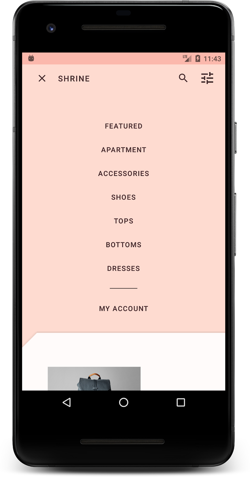
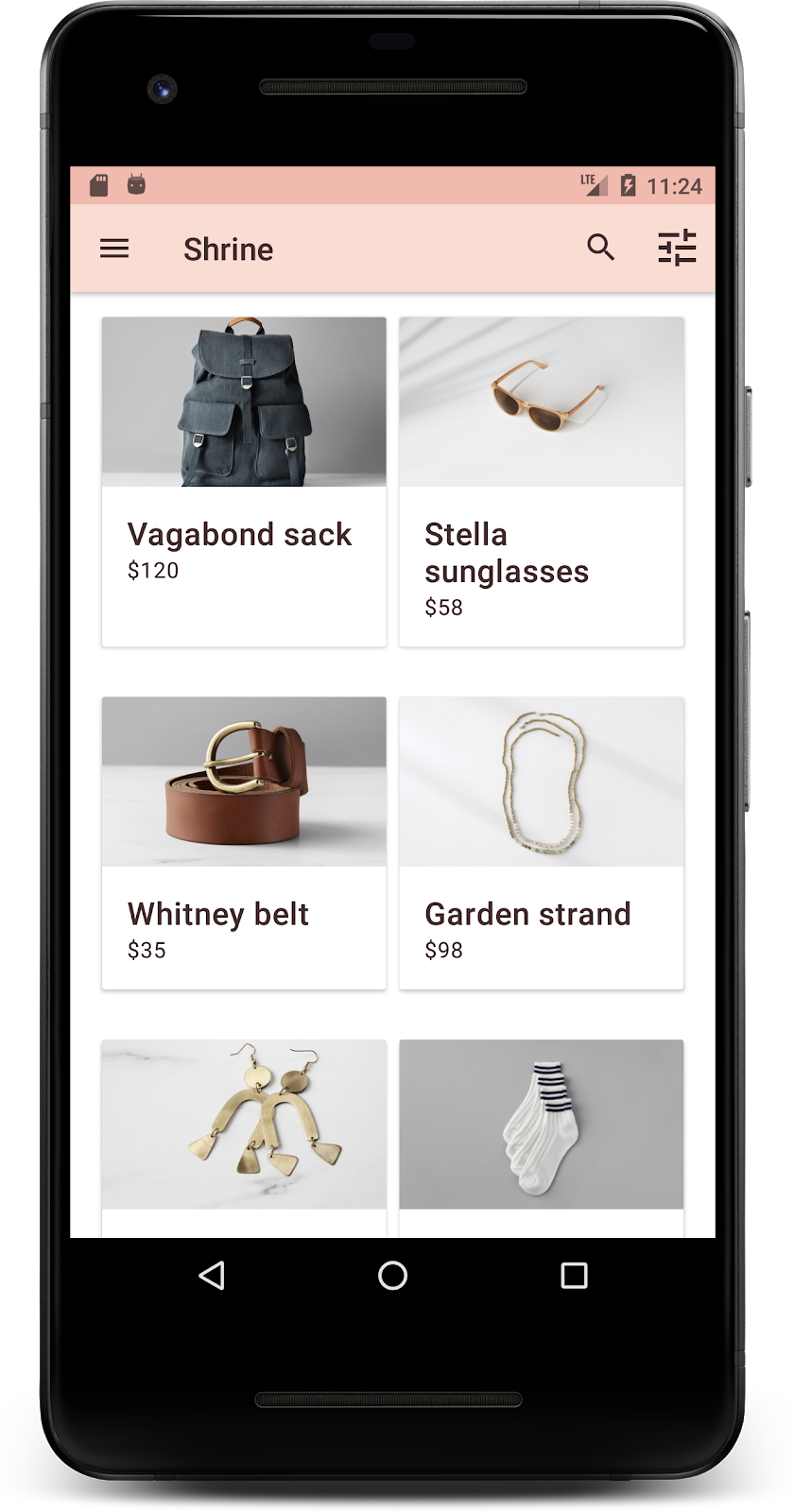
완료되었습니다. 기기나 에뮬레이터에서 Shrine의 로그인 페이지가 실행됩니다. 다음을 누르면 상단에 앱 바가 있고 그 아래에 제품 이미지 그리드가 있는 Shrine 홈페이지가 표시됩니다.
색상, 고도, 서체를 변경하여 상단 앱 바가 Shrine 브랜드와 일치하도록 해 보겠습니다.
이 색상 테마는 디자이너가 맞춤 색상으로 만든 것입니다(아래 그림 참고). 색상 테마는 Shrine 분기에서 선택되어 Material Theme Editor에 적용된 색상을 포함하고 있으며, 더 풍부한 팔레트를 만들기 위해 색상을 확장했습니다. 이러한 색상은 2014 머티리얼 색상 팔레트의 색상이 아닙니다.
Material Theme Editor는 색상을 숫자 라벨(각 색상에 지정된 50, 100, 200에서 900까지의 라벨 포함)이 지정된 셰이드로 구성합니다. Shrine은 분홍색 견본에서 셰이드 50, 100, 300만, 갈색 견본에서 900만 사용합니다.


이 색 구성표를 반영하도록 상단 앱 바의 색상을 변경해 보겠습니다.
colorPrimaryDark 및 colorAccent 설정
colors.xml에서 다음 줄을 수정합니다. colorAccent 속성은 상단 앱 바의 색상을 제어하고 colorPrimaryDark 속성은 상태 표시줄의 색상을 제어합니다.
colors.xml
<color name="colorPrimaryDark">#FBB8AC</color>
<color name="colorAccent">#FEDBD0</color>
상태 표시줄에 어두운 아이콘을 사용하려면 Theme.Shrine, Shrine 앱 테마에 다음을 추가하세요.
styles.xml
<item name="android:windowLightStatusBar" tools:targetApi="m">true</item>colors.xml 및 styles.xml은 다음과 같아야 합니다.
colors.xml
<?xml version="1.0" encoding="utf-8"?>
<resources>
   <color name="colorPrimary">#E0E0E0</color>
   <color name="colorPrimaryDark">#FBB8AC</color>
   <color name="colorAccent">#FEDBD0</color>
   <color name="toolbarIconColor">#FFFFFF</color>
   <color name="loginPageBackgroundColor">#FFFFFF</color>
   <color name="productGridBackgroundColor">#FFFFFF</color>
</resources>
styles.xml
<resources xmlns:android="http://schemas.android.com/tools">

   <!-- Base application theme. -->
   <style name="Theme.Shrine" parent="Theme.MaterialComponents.Light.NoActionBar">
       <!-- Customize your theme here. -->
       <item name="colorPrimary">@color/colorPrimary</item>
       <item name="colorPrimaryDark">@color/colorPrimaryDark</item>
       <item name="colorAccent">@color/colorAccent</item>
       <item name="android:windowLightStatusBar" tools:targetApi="m">true</item>
   </style>

   <style name="Widget.Shrine.Toolbar" parent="Widget.AppCompat.Toolbar">
       <item name="android:background">?attr/colorAccent</item>
       <item name="android:theme">@style/ThemeOverlay.AppCompat.Dark.ActionBar</item>
       <item name="popupTheme">@style/ThemeOverlay.AppCompat.Light</item>
   </style>

</resources>colors.xml에서 #442C2E로 설정된 새 textColorPrimary 색상 리소스를 추가하고 textColorPrimary 색상을 참조하도록 toolbarIconColor 속성을 업데이트합니다.
styles.xml 파일을 업데이트하여 android:textColorPrimary 속성을 textColorPrimary 색상으로 설정합니다.
Theme.Shrine에서 android:textColorPrimary를 설정하면 상단 앱 바와 상단 앱 바의 아이콘을 비롯한 모든 요소의 텍스트에 스타일이 지정됩니다.
한 가지 더 있습니다. Widget.Shrine.Toolbar 스타일의 android:theme 속성을 Theme.Shrine로 설정하세요.
colors.xml 및 styles.xml은 다음과 같아야 합니다.
colors.xml
<?xml version="1.0" encoding="utf-8"?>
<resources>
   <color name="colorPrimary">#E0E0E0</color>
   <color name="colorPrimaryDark">#FBB8AC</color>
   <color name="colorAccent">#FEDBD0</color>
   <color name="textColorPrimary">#442C2E</color>
   <color name="toolbarIconColor">@color/textColorPrimary</color>
   <color name="loginPageBackgroundColor">#FFFFFF</color>
   <color name="productGridBackgroundColor">#FFFFFF</color>
</resources>
styles.xml
<resources xmlns:android="http://schemas.android.com/tools">
<!-- Base application theme. -->
<style name="Theme.Shrine" parent="Theme.MaterialComponents.Light.NoActionBar">
<!-- Customize your theme here. -->
<item name="colorPrimary">@color/colorPrimary</item>
<item name="colorPrimaryDark">@color/colorPrimaryDark</item>
<item name="colorAccent">@color/colorAccent</item>
<item name="android:windowLightStatusBar" tools:targetApi="m">true</item>
<item name="android:textColorPrimary">@color/textColorPrimary</item>
</style>
<style name="Widget.Shrine.Toolbar" parent="Widget.AppCompat.Toolbar">
<item name="android:background">?attr/colorAccent</item>
<item name="android:theme">@style/Theme.Shrine</item>
<item name="popupTheme">@style/ThemeOverlay.AppCompat.Light</item>
</style>
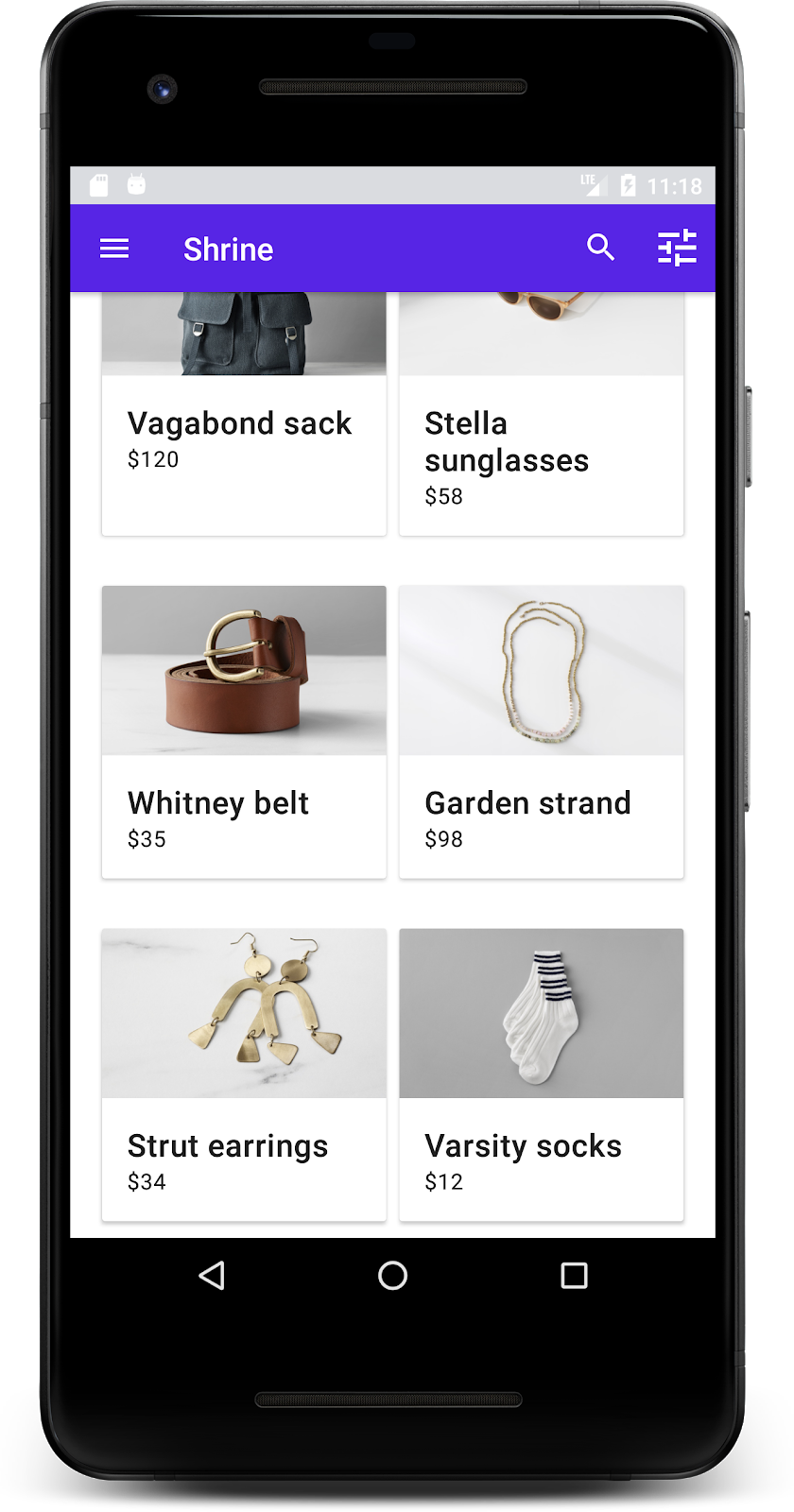
</resources>빌드하고 실행합니다. 이제 제품 그리드가 다음과 같이 표시됩니다.
색 구성표에 맞게 로그인 화면의 스타일을 변경해 보겠습니다.
텍스트 필드 스타일 지정
로그인 페이지의 텍스트 입력란을 윤곽선으로 변경하고 레이아웃에 더 나은 색상을 사용해 보겠습니다.
colors.xml 파일에 다음 색상 리소스를 추가합니다.
colors.xml
<color name="textInputOutlineColor">#FBB8AC</color>styles.xml에 두 가지 새로운 스타일을 추가합니다.
styles.xml
<style name="Widget.Shrine.TextInputLayout" parent="Widget.MaterialComponents.TextInputLayout.OutlinedBox">
   <item name="hintTextAppearance">@style/TextAppearance.Shrine.TextInputLayout.HintText</item>
   <item name="hintTextColor">@color/textColorPrimary</item>
   <item name="android:paddingBottom">8dp</item>
   <item name="boxStrokeColor">@color/textInputOutlineColor</item>
</style>

<style name="TextAppearance.Shrine.TextInputLayout.HintText" parent="TextAppearance.MaterialComponents.Subtitle2">
   <item name="android:textColor">?android:attr/textColorPrimary</item>
</style>
마지막으로 shr_login_fragment.xml에서 TextInputLayout XML 구성요소 둘 다의 스타일 속성을 새 스타일로 설정합니다.
shr_login_fragment.xml
<com.google.android.material.textfield.TextInputLayout
   style="@style/Widget.Shrine.TextInputLayout"
   android:layout_width="match_parent"
   android:layout_height="wrap_content"
   android:hint="@string/shr_hint_username">

   <com.google.android.material.textfield.TextInputEditText
       android:layout_width="match_parent"
       android:layout_height="wrap_content"
       android:inputType="text"
       android:maxLines="1" />
</com.google.android.material.textfield.TextInputLayout>

<com.google.android.material.textfield.TextInputLayout
   android:id="@+id/password_text_input"
   style="@style/Widget.Shrine.TextInputLayout"
   android:layout_width="match_parent"
   android:layout_height="wrap_content"
   android:hint="@string/shr_hint_password"
   app:errorEnabled="true">

   <com.google.android.material.textfield.TextInputEditText
       android:id="@+id/password_edit_text"
       android:layout_width="match_parent"
       android:layout_height="wrap_content"
       android:inputType="textPassword" />
</com.google.android.material.textfield.TextInputLayout>
버튼 색상 스타일 지정
마지막으로 로그인 페이지의 버튼 색상을 스타일 지정합니다. styles.xml에 다음 스타일을 추가합니다.
styles.xml
<style name="Widget.Shrine.Button" parent="Widget.MaterialComponents.Button">
   <item name="android:textColor">?android:attr/textColorPrimary</item>
   <item name="backgroundTint">?attr/colorPrimaryDark</item>
</style>

<style name="Widget.Shrine.Button.TextButton" parent="Widget.MaterialComponents.Button.TextButton">
   <item name="android:textColor">?android:attr/textColorPrimary</item>
</style>
Widget.Shrine.Button 스타일은 기본 MaterialButton 스타일에서 확장되며 버튼의 텍스트 색상과 배경 색조를 변경합니다. Widget.Shrine.Button.TextButton는 기본 text MaterialButton 스타일에서 확장되며 텍스트 색상만 변경합니다.
다음과 같이 Next 버튼에 Widget.Shrine.Button 스타일을 설정하고 Cancel 버튼에 Widget.Shrine.Button.TextButton 스타일을 설정합니다.
shr_login_fragment.xml
<RelativeLayout
   android:layout_width="match_parent"
   android:layout_height="wrap_content">

   <com.google.android.material.button.MaterialButton
       android:id="@+id/next_button"
       style="@style/Widget.Shrine.Button"
       android:layout_width="wrap_content"
       android:layout_height="wrap_content"
       android:layout_alignParentEnd="true"
       android:layout_alignParentRight="true"
       android:text="@string/shr_button_next" />

   <com.google.android.material.button.MaterialButton
       android:id="@+id/cancel_button"
       style="@style/Widget.Shrine.Button.TextButton"
       android:layout_width="wrap_content"
       android:layout_height="wrap_content"
       android:layout_marginEnd="12dp"
       android:layout_marginRight="12dp"
       android:layout_toStartOf="@id/next_button"
       android:layout_toLeftOf="@id/next_button"
       android:text="@string/shr_button_cancel" />

</RelativeLayout>
로그인 페이지에서 Shrine 로고의 색상을 업데이트합니다. 이를 위해서는 벡터 드로어블 shr_logo.xml을 약간 변경해야 합니다. 드로어블 파일을 열고 android:fillAlpha 속성을 1로 변경합니다. 드로어블은 다음과 같이 표시됩니다.
shr_logo.xml
<vector xmlns:android="http://schemas.android.com/apk/res/android"
   android:width="149dp"
   android:height="152dp"
   android:tint="?attr/colorControlNormal"
   android:viewportWidth="149"
   android:viewportHeight="152">
   <path
       android:fillAlpha="1"
       android:fillColor="#DADCE0"
       android:fillType="evenOdd"
       android:pathData="M42.262,0L0,38.653L74.489,151.994L148.977,38.653L106.723,0M46.568,11.11L21.554,33.998L99.007,33.998L99.007,11.11L46.568,11.11ZM110.125,18.174L110.125,33.998L127.416,33.998L110.125,18.174ZM80.048,45.116L80.048,123.296L131.426,45.116L80.048,45.116ZM17.551,45.116L33.976,70.101L68.93,70.101L68.93,45.116L17.551,45.116ZM41.284,81.219L68.93,123.296L68.93,81.219L41.284,81.219Z"
       android:strokeWidth="1"
       android:strokeAlpha="0.4"
       android:strokeColor="#00000000" />
</vector>
다음과 같이 shr_login_fragment.xml의 로고 <ImageView>에서 android:tint 속성을 ?android:attr/textColorPrimary로 설정합니다.
shr_login_fragment.xml
<ImageView
android:layout_width="64dp"
android:layout_height="64dp"
android:layout_gravity="center_horizontal"
android:layout_marginTop="48dp"
android:layout_marginBottom="16dp"
android:tint="?android:attr/textColorPrimary"
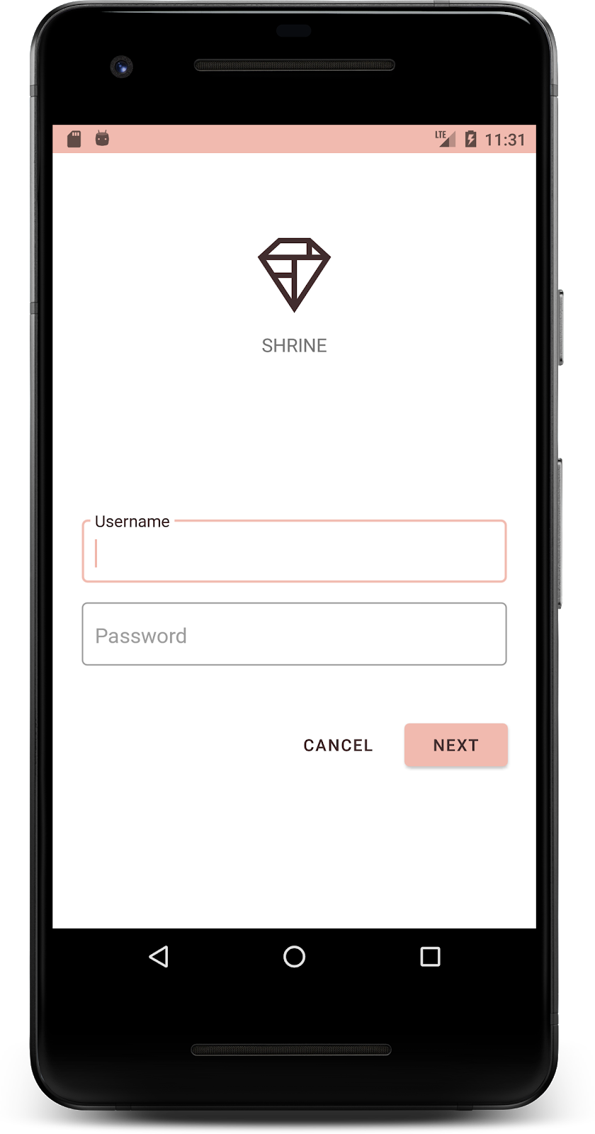
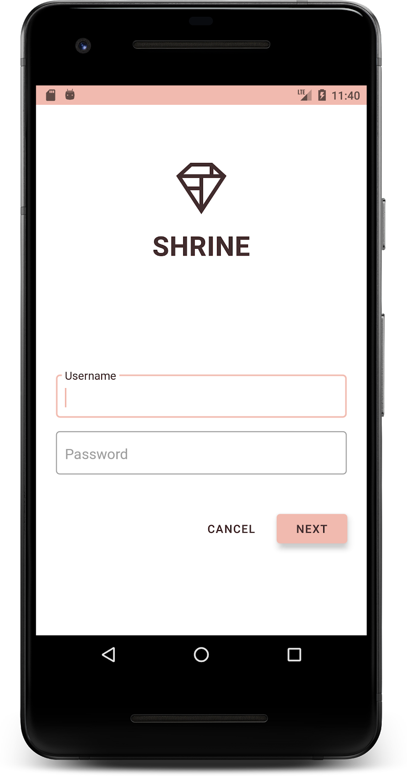
app:srcCompat="@drawable/shr_logo" />빌드하고 실행합니다. 이제 로그인 화면이 다음과 같이 표시됩니다.
색상 변경 외에도 디자이너는 사이트에서 사용할 특정 서체도 제공했습니다. 상단 앱 바에도 추가해 보겠습니다.
상단 앱 바 스타일 지정
디자이너가 제공한 사양과 일치하도록 상단 앱 바의 텍스트 모양을 스타일링합니다. 다음 텍스트 모양 스타일을 styles.xml에 추가하고 titleTextAppearance 속성을 설정하여 Widget.Shrine.Toolbar 스타일에서 이 스타일을 참조합니다.
styles.xml
<style name="Widget.Shrine.Toolbar" parent="Widget.AppCompat.Toolbar">
   <item name="android:background">?attr/colorAccent</item>
   <item name="android:theme">@style/Theme.Shrine</item>
   <item name="popupTheme">@style/ThemeOverlay.AppCompat.Light</item>
   <item name="titleTextAppearance">@style/TextAppearance.Shrine.Toolbar</item>
</style>

<style name="TextAppearance.Shrine.Toolbar" parent="TextAppearance.MaterialComponents.Button">
   <item name="android:textSize">16sp</item>
</style>
colors.xml 및 styles.xml은 다음과 같아야 합니다.
colors.xml
<?xml version="1.0" encoding="utf-8"?>
<resources>
   <color name="colorPrimary">#E0E0E0</color>
   <color name="colorPrimaryDark">#FBB8AC</color>
   <color name="colorAccent">#FEDBD0</color>
   <color name="textColorPrimary">#442C2E</color>
   <color name="toolbarIconColor">@color/textColorPrimary</color>
   <color name="loginPageBackgroundColor">#FFFFFF</color>
   <color name="productGridBackgroundColor">#FFFFFF</color>
   <color name="textInputOutlineColor">#FBB8AC</color>
</resources>
styles.xml
<resources xmlns:android="http://schemas.android.com/tools">

   <!-- Base application theme. -->
   <style name="Theme.Shrine" parent="Theme.MaterialComponents.Light.NoActionBar">
       <!-- Customize your theme here. -->
       <item name="colorPrimary">@color/colorPrimary</item>
       <item name="colorPrimaryDark">@color/colorPrimaryDark</item>
       <item name="colorAccent">@color/colorAccent</item>
       <item name="android:windowLightStatusBar" tools:targetApi="m">true</item>
       <item name="android:textColorPrimary">@color/textColorPrimary</item>
   </style>

   <style name="Widget.Shrine.TextInputLayout" parent="Widget.MaterialComponents.TextInputLayout.OutlinedBox">
       <item name="hintTextAppearance">@style/TextAppearance.Shrine.TextInputLayout.HintText</item>
       <item name="hintTextColor">@color/textColorPrimary</item>
       <item name="android:paddingBottom">8dp</item>
       <item name="boxStrokeColor">@color/textInputOutlineColor</item>
   </style>

   <style name="TextAppearance.Shrine.TextInputLayout.HintText" parent="TextAppearance.MaterialComponents.Subtitle2">
       <item name="android:textColor">?android:attr/textColorPrimary</item>
   </style>


   <style name="Widget.Shrine.Button" parent="Widget.MaterialComponents.Button">
       <item name="android:textColor">?android:attr/textColorPrimary</item>
       <item name="backgroundTint">?attr/colorPrimaryDark</item>
   </style>

   <style name="Widget.Shrine.Button.TextButton" parent="Widget.MaterialComponents.Button.TextButton">
       <item name="android:textColor">?android:attr/textColorPrimary</item>
   </style>

   <style name="Widget.Shrine.Toolbar" parent="Widget.AppCompat.Toolbar">
       <item name="android:background">?attr/colorAccent</item>
       <item name="android:theme">@style/Theme.Shrine</item>
       <item name="popupTheme">@style/ThemeOverlay.AppCompat.Light</item>
       <item name="titleTextAppearance">@style/TextAppearance.Shrine.Toolbar</item>
   </style>

   <style name="TextAppearance.Shrine.Toolbar" parent="TextAppearance.MaterialComponents.Button">
       <item name="android:textSize">16sp</item>
   </style>

</resources>
라벨 스타일 지정
올바른 텍스트 모양을 사용하고 카드 내에서 가로로 가운데에 오도록 제품 카드 라벨의 스타일을 지정합니다.
다음과 같이 제목 라벨의 서체를 textAppearanceHeadline6에서 textAppearanceSubtitle2로 업데이트합니다.
shr_product_card.xml
<TextView
   android:id="@+id/product_title"
   android:layout_width="match_parent"
   android:layout_height="wrap_content"
   android:text="@string/shr_product_title"
   android:textAppearance="?attr/textAppearanceSubtitle2" />
이미지 라벨을 가운데로 정렬하려면 shr_product_card.xml에서 라벨 <TextView>를 수정하여 android:textAlignment="center" 속성을 설정하세요.
shr_product_card.xml
<LinearLayout
android:layout_width="match_parent"
android:layout_height="wrap_content"
android:orientation="vertical"
android:padding="16dp">
<TextView
android:id="@+id/product_title"
android:layout_width="match_parent"
android:layout_height="wrap_content"
android:text="@string/shr_product_title"
android:textAlignment="center"
android:textAppearance="?attr/textAppearanceSubtitle2" />
<TextView
android:id="@+id/product_price"
android:layout_width="match_parent"
android:layout_height="wrap_content"
android:text="@string/shr_product_description"
android:textAlignment="center"
android:textAppearance="?attr/textAppearanceBody2" />
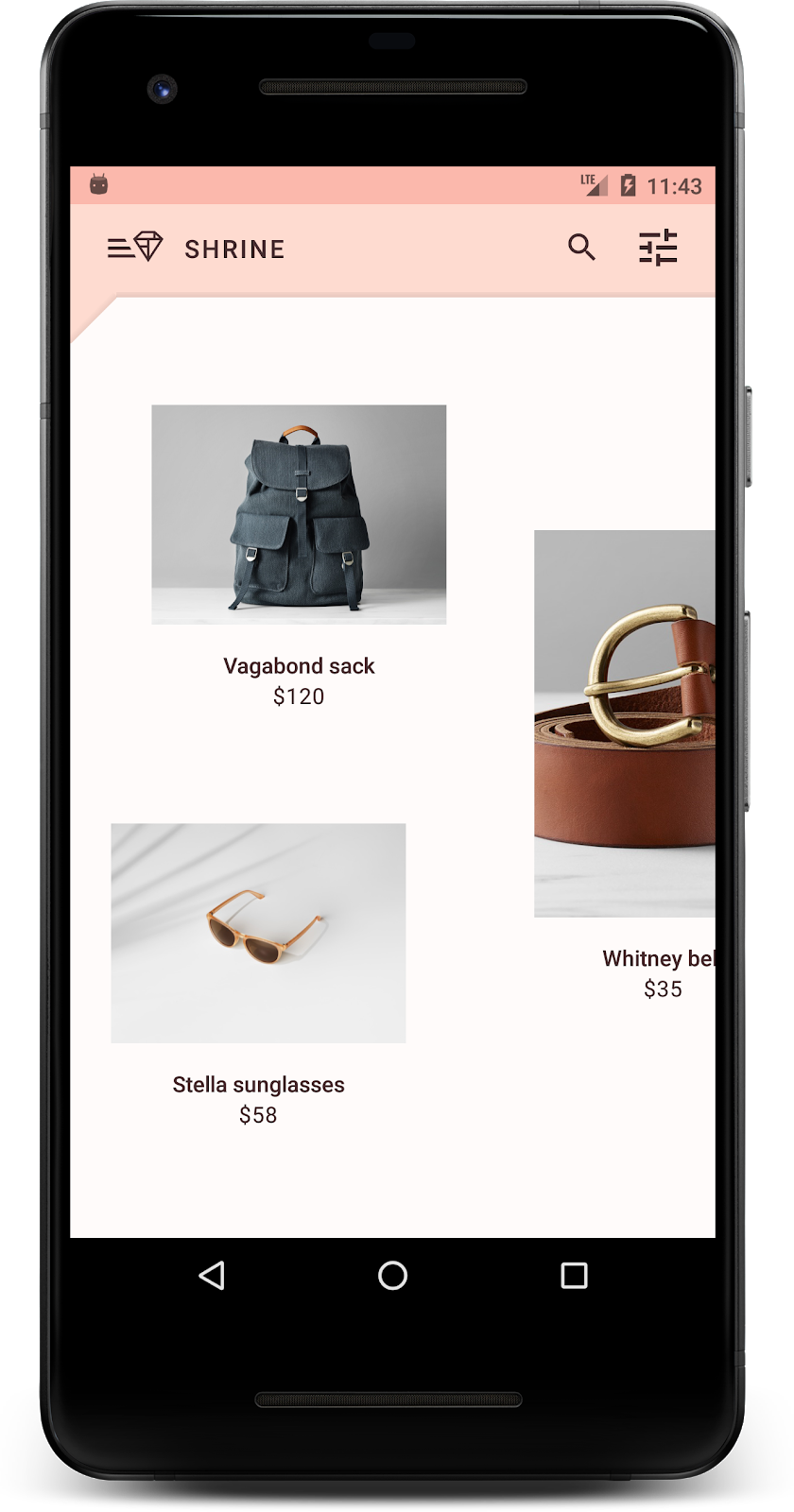
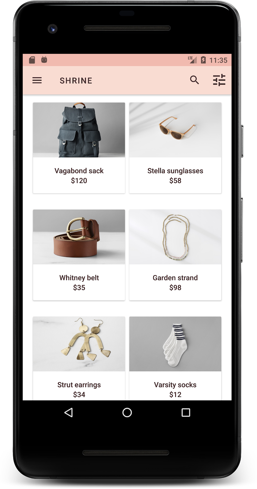
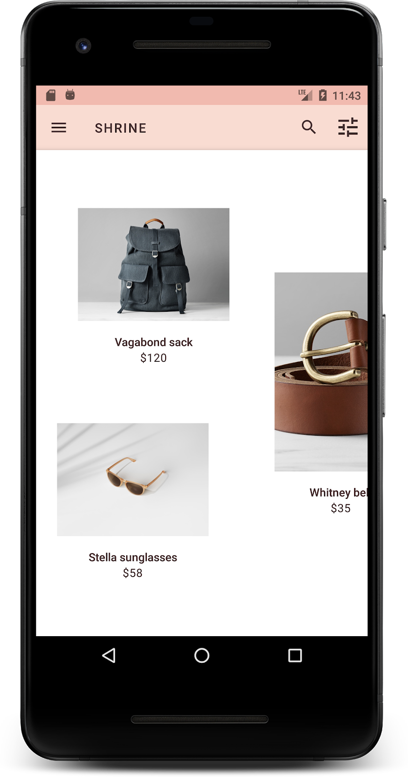
</LinearLayout>빌드하고 실행합니다. 이제 제품 그리드 화면이 다음과 같이 표시됩니다.
로그인 화면의 서체를 변경하여 일치시켜 보겠습니다.
로그인 화면의 서체 변경하기
styles.xml에서 다음 스타일을 추가합니다.
styles.xml
<style name="TextAppearance.Shrine.Title" parent="TextAppearance.MaterialComponents.Headline4">
   <item name="textAllCaps">true</item>
   <item name="android:textStyle">bold</item>
   <item name="android:textColor">?android:attr/textColorPrimary</item>
</style>shr_login_fragment.xml에서 새 스타일을 'SHRINE' 제목 <TextView>에 설정하고 textAllCaps 및 textSize 속성을 삭제합니다.
shr_login_fragment.xml
<TextView
android:layout_width="wrap_content"
android:layout_height="wrap_content"
android:layout_gravity="center_horizontal"
android:layout_marginBottom="132dp"
android:text="@string/shr_app_name"
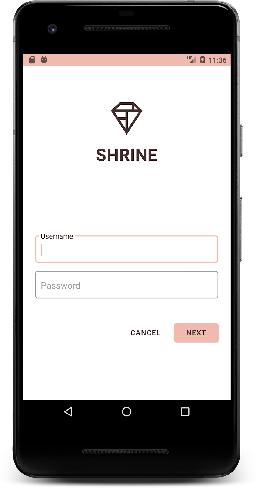
android:textAppearance="@style/TextAppearance.Shrine.Title" />빌드하고 실행합니다. 이제 로그인 화면이 다음과 같이 표시됩니다.
지금까지 Shrine에 어울리는 특정 색상과 서체로 페이지의 스타일을 지정했습니다. 이제 Shrine의 제품을 보여주는 카드를 살펴보겠습니다. 현재는 앱 탐색 아래의 흰색 노출 영역에 배치됩니다. 제품에 더 많은 강조를 주어 관심을 끌어보세요.
제품 그리드 고도 변경
콘텐츠가 상단 앱 바 위에 떠 있는 시트 위에 있는 것처럼 보이도록 상단 앱 바와 콘텐츠의 고도를 변경해 보겠습니다. 다음과 같이 AppBarLayout에 app:elevation 속성을 추가하고 shr_product_grid_fragment.xml의 NestedScrollView XML 구성요소에 android:elevation 속성을 추가합니다.
shr_product_grid_fragment.xml
<com.google.android.material.appbar.AppBarLayout
   android:layout_width="match_parent"
   android:layout_height="wrap_content"
   app:elevation="0dp">

   <androidx.appcompat.widget.Toolbar
       android:id="@+id/app_bar"
       style="@style/Widget.Shrine.Toolbar"
       android:layout_width="match_parent"
       android:layout_height="?attr/actionBarSize"
       app:navigationIcon="@drawable/shr_menu"
       app:title="@string/shr_app_name" />
</com.google.android.material.appbar.AppBarLayout>

<androidx.core.widget.NestedScrollView
   android:layout_width="match_parent"
   android:layout_height="match_parent"
   android:layout_marginTop="56dp"
   android:background="@color/productGridBackgroundColor"
   android:elevation="8dp"
   android:paddingStart="@dimen/shr_product_grid_spacing"
   android:paddingEnd="@dimen/shr_product_grid_spacing"
   app:layout_behavior="@string/appbar_scrolling_view_behavior">

   <androidx.appcompat.app.AlertController.RecycleListView
       android:id="@+id/recycler_view"
       android:layout_width="match_parent"
       android:layout_height="match_parent" />

</androidx.core.widget.NestedScrollView>
카드 고도 (및 색상) 변경하기
shr_product_card.xml의 app:cardElevation을 2dp에서 0dp로 변경하여 모든 카드의 고도를 조정할 수 있습니다. app:cardBackgroundColor도 @android:color/transparent로 변경합니다.
shr_product_card.xml
<com.google.material.card.MaterialCardView xmlns:android="http://schemas.android.com/apk/res/android"
   xmlns:app="http://schemas.android.com/apk/res-auto"
   android:layout_width="match_parent"
   android:layout_height="wrap_content"
   app:cardBackgroundColor="@android:color/transparent"
   app:cardElevation="0dp"
   app:cardPreventCornerOverlap="true">
확인해 보세요. 제품 그리드 페이지의 모든 카드의 고도를 조정했습니다.

Next 버튼의 고도 변경
styles.xml에서 Widget.Shrine.Button 스타일에 다음 속성을 추가합니다.
styles.xml
<item name="android:stateListAnimator" tools:ignore="NewApi">
    @animator/shr_next_button_state_list_anim
</item>Button의 스타일에서 android:stateListAnimator를 설정하면 제공된 애니메이터를 사용하도록 다음 버튼이 설정됩니다.
빌드하고 실행합니다. 이제 로그인 화면이 다음과 같이 표시됩니다.
각 카드가 서로 다르게 표시되도록 레이아웃을 변경해 다양한 가로세로 비율과 크기로 카드를 표시합니다.
스테거 RecyclerView 어댑터 사용
가로로 스크롤되도록 설계된 비대칭 스태거링 카드 레이아웃을 표시하는 새로운 RecyclerView 어댑터가 staggeredgridlayout 패키지에 제공됩니다. 이 코드를 직접 살펴보셔도 되지만 여기서는 구현 방법을 다루지 않습니다.
이 새 어댑터를 사용하려면 ProductGridFragment.java에서 onCreateView() 메서드를 수정하세요. 'RecyclerView 설정' 주석 뒤의 코드 블록을 다음으로 바꿉니다.
ProductGridFragment.java
// Set up the RecyclerView
RecyclerView recyclerView = view.findViewById(R.id.recycler_view);
recyclerView.setHasFixedSize(true);
GridLayoutManager gridLayoutManager = new GridLayoutManager(getContext(), 2, GridLayoutManager.HORIZONTAL, false);
gridLayoutManager.setSpanSizeLookup(new GridLayoutManager.SpanSizeLookup() {
   @Override
   public int getSpanSize(int position) {
       return position % 3 == 2 ? 2 : 1;
   }
});
recyclerView.setLayoutManager(gridLayoutManager);
StaggeredProductCardRecyclerViewAdapter adapter = new StaggeredProductCardRecyclerViewAdapter(
       ProductEntry.initProductEntryList(getResources()));
recyclerView.setAdapter(adapter);
int largePadding = getResources().getDimensionPixelSize(R.dimen.shr_staggered_product_grid_spacing_large);
int smallPadding = getResources().getDimensionPixelSize(R.dimen.shr_staggered_product_grid_spacing_small);
recyclerView.addItemDecoration(new ProductGridItemDecoration(largePadding, smallPadding));
다음과 같이 NestedScrollView에서 패딩을 삭제하기 위해 product_grid_fragment.xml도 약간 변경해야 합니다.
shr_product_grid_fragment.xml
<androidx.core.widget.NestedScrollView
   android:layout_width="match_parent"
   android:layout_height="match_parent"
   android:layout_marginTop="56dp"
   android:background="@color/productGridBackgroundColor"
   app:layout_behavior="@string/appbar_scrolling_view_behavior"
   android:elevation="6dp">
마지막으로 ProductGridItemDecoration.java을 수정하여 RecyclerView 내에서 카드 패딩도 조정합니다. 다음과 같이 ProductGridItemDecoration.java의 getItemOffsets() 메서드를 수정합니다.
ProductGridItemDecoration.java
@Override
public void getItemOffsets(Rect outRect, View view,
                          RecyclerView parent, RecyclerView.State state) {
   outRect.left = smallPadding;
   outRect.right = largePadding;
}
빌드하고 실행합니다. 이제 제품 그리드 항목이 다음과 같이 번갈아 표시됩니다.
색상은 브랜드를 표현하는 강력한 방법이므로, 작은 색상 변화도 사용자 경험에 큰 영향을 미칠 수 있습니다. 이를 테스트하기 위해 브랜드의 색 구성표가 완전히 달라지면 Shrine이 어떻게 표시되는지 살펴보겠습니다.
스타일 및 색상 수정하기
styles.xml에서 다음 새 테마를 추가합니다.
styles.xml
<style name="Theme.Shrine.Autumn" parent="Theme.Shrine">
   <item name="colorPrimary">#FFCF44</item>
   <item name="colorPrimaryDark">#FD9725</item>
   <item name="colorAccent">#FD9725</item>
   <item name="colorOnPrimary">#FFFFFF</item>
   <item name="colorError">#FD9725</item>
</style>AndroidManifest.xml에서는 애플리케이션에 이 새 테마를 사용합니다.
AndroidManifest.xml
<application
   android:allowBackup="true"
   android:icon="@mipmap/ic_launcher"
   android:label="@string/shr_app_name"
   android:roundIcon="@mipmap/ic_launcher_round"
   android:supportsRtl="true"
   android:name="com.google.codelabs.mdc.java.shrine.application.ShrineApplication"
   android:theme="@style/Theme.Shrine.Autumn">
   <activity android:name=".MainActivity">
       <intent-filter>
           <action android:name="android.intent.action.MAIN" />

           <category android:name="android.intent.category.LAUNCHER" />
       </intent-filter>
   </activity>
</application>
아래와 같이 colors.xml에서 툴바 아이콘 색상을 수정합니다.
colors.xml
<color name="toolbarIconColor">#FFFFFF</color>그런 다음 툴바 스타일의 android:theme 속성을 설정하여 하드 코딩하는 대신 '?theme' 속성을 사용하여 현재 테마를 참조합니다.
styles.xml
<style name="Widget.Shrine.Toolbar" parent="Widget.AppCompat.Toolbar">
   <item name="android:background">?attr/colorAccent</item>
   <item name="android:theme">?theme</item>
   <item name="popupTheme">@style/ThemeOverlay.AppCompat.Light</item>
   <item name="titleTextAppearance">@style/TextAppearance.Shrine.Toolbar</item>
</style>
다음으로 로그인 화면의 텍스트 필드에서 힌트 텍스트 색상을 밝게 합니다. 텍스트 필드의 스타일에 android:textColorHint 속성을 추가합니다.
styles.xml
<style name="Widget.Shrine.TextInputLayout" parent="Widget.MaterialComponents.TextInputLayout.OutlinedBox">
   <item name="hintTextAppearance">
@style/TextAppearance.Shrine.TextInputLayout.HintText
</item>
   <item name="android:paddingBottom">8dp</item>
   <item name="android:textColorHint">?attr/colorPrimaryDark</item>
</style>
빌드하고 실행합니다. 이제 새 테마가 미리보기로 표시됩니다.
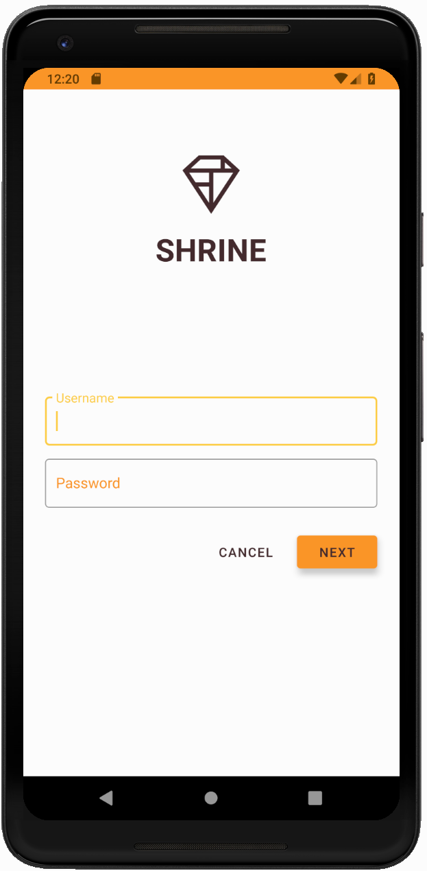
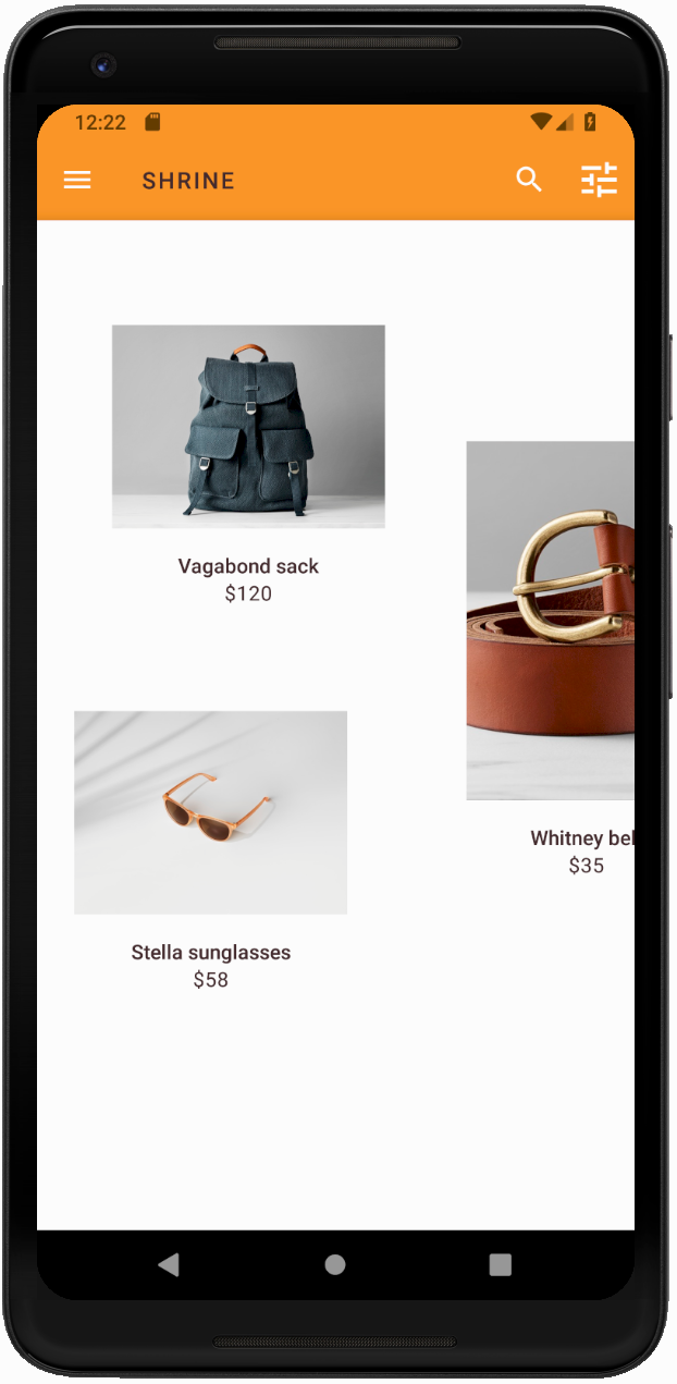
MDC-104로 넘어가기 전에 이 섹션에서 변경된 코드를 되돌립니다.
지금까지 디자이너의 디자인 사양과 유사한 앱을 만들어 보았습니다.
다음 단계
테마, 서체, 고도와 같은 MDC 구성요소를 사용했습니다. MDC-Android 카탈로그 MDC Android의 구성요소에서 더 많은 구성요소를 살펴볼 수 있습니다.
계획된 앱 디자인에 MDC 라이브러리의 구성요소가 없는 요소가 포함되어 있으면 어떻게 해야 할까요? MDC-104: Material Design 고급 구성요소에서는 MDC 라이브러리를 사용하여 맞춤 구성요소를 만들어 특별한 모습을 구현하는 방법을 알아봅니다.