
मटीरियल कॉम्पोनेंट (एमडीसी) की मदद से, डेवलपर मटीरियल डिज़ाइन लागू कर सकते हैं. Google के इंजीनियरों और यूएक्स डिज़ाइनरों की टीम ने MDC बनाया है. इसमें कई सुंदर और काम के यूज़र इंटरफ़ेस (यूआई) कॉम्पोनेंट शामिल हैं. यह Android, iOS, वेब, और Flutter के लिए उपलब्ध है. material.io/develop |
MDC-101 कोडलैब में, आपने लॉगिन पेज बनाने के लिए दो मटीरियल कॉम्पोनेंट (एमडीसी) का इस्तेमाल किया था: टेक्स्ट फ़ील्ड और बटन. अब हम इसमें नेविगेशन, स्ट्रक्चर, और डेटा जोड़कर इसे और बेहतर बनाते हैं.
आपको क्या बनाने को मिलेगा
इस कोडलैब में, आपको Shrine नाम के ऐप्लिकेशन के लिए होम स्क्रीन बनानी है. यह एक ई-कॉमर्स ऐप्लिकेशन है, जो कपड़े और घरेलू सामान बेचता है. इसमें ये चीज़ें शामिल होंगी:
- टॉप ऐप्लिकेशन बार
- प्रॉडक्ट की ग्रिड लिस्ट
इस कोडलैब में MDC-Android कॉम्पोनेंट
- AppBarLayout
- MaterialCardView
आपको इन चीज़ों की ज़रूरत होगी
- Android डेवलपमेंट की बुनियादी जानकारी
- Android Studio (अगर आपके पास यह पहले से नहीं है, तो इसे यहां से डाउनलोड करें)
- Android एम्युलेटर या डिवाइस (Android Studio के ज़रिए उपलब्ध है)
- सैंपल कोड (अगला चरण देखें)
Android ऐप्लिकेशन बनाने के अपने अनुभव को आप क्या रेटिंग देंगे?
क्या आपको MDC-101 से आगे बढ़ना है?
अगर आपने MDC-101 पूरा कर लिया है, तो आपका कोड इस कोडलैब के लिए तैयार होना चाहिए. तीसरे चरण पर जाएं: ऐप्लिकेशन में सबसे ऊपर मौजूद बार जोड़ना.
क्या आपको नए सिरे से शुरुआत करनी है?
स्टार्टर कोडलैब ऐप्लिकेशन डाउनलोड करना
स्टार्टर ऐप्लिकेशन, material-components-android-codelabs-102-starter/java डायरेक्ट्री में मौजूद होता है. शुरू करने से पहले, उस डायरेक्ट्री में cd करना न भूलें.
...या इसे GitHub से क्लोन करें
इस कोडलैब को GitHub से क्लोन करने के लिए, ये कमांड चलाएं:
git clone https://github.com/material-components/material-components-android-codelabs
cd material-components-android-codelabs/
git checkout 102-starter
Android Studio में स्टार्टर कोड लोड करना
- सेटअप विज़र्ड पूरा होने और Android Studio में आपका स्वागत है विंडो दिखने के बाद, मौजूदा Android Studio प्रोजेक्ट खोलें पर क्लिक करें. उस डायरेक्ट्री पर जाएं जहां आपने सैंपल कोड इंस्टॉल किया था. इसके बाद, Shrine प्रोजेक्ट खोलने के लिए java -> shrine चुनें. इसके अलावा, अपने कंप्यूटर पर shrine खोजकर भी Shrine प्रोजेक्ट खोला जा सकता है.
- Android Studio को प्रोजेक्ट बनाने और सिंक करने में कुछ समय लगेगा. Android Studio विंडो में सबसे नीचे मौजूद गतिविधि इंडिकेटर से पता चलता है कि प्रोजेक्ट बनाया जा रहा है और सिंक किया जा रहा है.
- इस समय, Android Studio कुछ बिल्ड गड़बड़ियां दिखा सकता है. ऐसा इसलिए, क्योंकि आपके पास Android SDK या बिल्ड टूल नहीं हैं. जैसे, यहां दिखाया गया है. इन्हें इंस्टॉल/अपडेट करने और अपने प्रोजेक्ट को सिंक करने के लिए, Android Studio में दिए गए निर्देशों का पालन करें.

प्रोजेक्ट की डिपेंडेंसी जोड़ना
प्रोजेक्ट में MDC Android support library की डिपेंडेंसी होनी चाहिए. आपने जो सैंपल कोड डाउनलोड किया है उसमें यह डिपेंडेंसी पहले से ही मौजूद होनी चाहिए. हालांकि, यह पक्का करने के लिए कि ऐसा हो, आपको यहां दिया गया तरीका अपनाना चाहिए.
appमॉड्यूल कीbuild.gradleफ़ाइल पर जाएं और पक्का करें किdependenciesब्लॉक में MDC Android पर डिपेंडेंसी शामिल हो:
api 'com.google.android.material:material:1.1.0-alpha06'
- (ज़रूरी नहीं) अगर ज़रूरी हो, तो
build.gradleफ़ाइल में बदलाव करके, ये डिपेंडेंसी जोड़ें और प्रोजेक्ट को सिंक करें.
dependencies {
    api 'com.google.android.material:material:1.1.0-alpha06'
    implementation 'androidx.legacy:legacy-support-v4:1.0.0'
    implementation 'com.android.volley:volley:1.1.1'
    implementation 'com.google.code.gson:gson:2.8.5'
    implementation "org.jetbrains.kotlin:kotlin-stdlib-jdk7:1.3.21"
    testImplementation 'junit:junit:4.12'
    androidTestImplementation 'androidx.test:core:1.1.0'
    androidTestImplementation 'androidx.test.ext:junit:1.1.0'
    androidTestImplementation 'androidx.test:runner:1.2.0-alpha05'
    androidTestImplementation 'androidx.test.espresso:espresso-core:3.2.0-alpha05'
}
स्टार्टर ऐप्लिकेशन चलाना
|

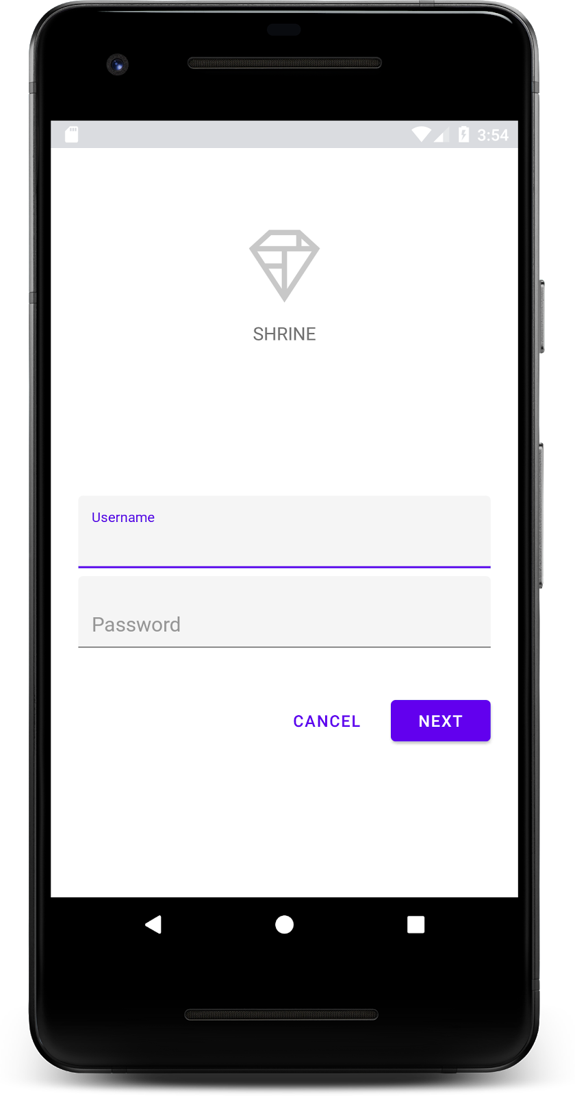
हो गया! आपको MDC-101 कोडलैब से Shrine का लॉगिन पेज दिखेगा.
अब जब लॉगिन स्क्रीन अच्छी दिख रही है, तो आइए ऐप्लिकेशन में कुछ प्रॉडक्ट जोड़ें.
लॉगिन पेज बंद होने पर, होम स्क्रीन दिखती है. इस पर "आपने कर लिया!" लिखा होता है. बहुत बढ़िया! हालांकि, अब उपयोगकर्ता को कोई कार्रवाई नहीं करनी है. साथ ही, उसे यह भी नहीं पता कि वह ऐप्लिकेशन में कहां है. इस समस्या को हल करने के लिए, नेविगेशन जोड़ते हैं.
मटीरियल डिज़ाइन में नेविगेशन के ऐसे पैटर्न उपलब्ध होते हैं जिनसे ऐप्लिकेशन को इस्तेमाल करना आसान हो जाता है. नेविगेशन के सबसे अहम कॉम्पोनेंट में से एक, ऐप्लिकेशन बार है.
नेविगेशन की सुविधा देने और उपयोगकर्ताओं को अन्य कार्रवाइयों का तुरंत ऐक्सेस देने के लिए, टॉप ऐप्लिकेशन बार जोड़ते हैं.
AppBar विजेट जोड़ना
shr_product_grid_fragment.xml में, "आपने कर दिखाया!" वाला <LinearLayout> टैग मिटाएं TextView और इसकी जगह यह डालें:
shr_product_grid_fragment.xml
<com.google.android.material.appbar.AppBarLayout
   android:layout_width="match_parent"
   android:layout_height="wrap_content">

   <androidx.appcompat.widget.Toolbar
       android:id="@+id/app_bar"
       style="@style/Widget.Shrine.Toolbar"
       android:layout_width="match_parent"
       android:layout_height="?attr/actionBarSize"
       app:title="@string/shr_app_name" />
</com.google.android.material.appbar.AppBarLayout>
आपका shr_product_grid_fragment.xml ऐसा दिखना चाहिए:
shr_product_grid_fragment.xml
<?xml version="1.0" encoding="utf-8"?>
<FrameLayout xmlns:android="http://schemas.android.com/apk/res/android"
   xmlns:app="http://schemas.android.com/apk/res-auto"
   xmlns:tools="http://schemas.android.com/tools"
   android:layout_width="match_parent"
   android:layout_height="match_parent"
   tools:context=".ProductGridFragment">

   <com.google.android.material.appbar.AppBarLayout
       android:layout_width="match_parent"
       android:layout_height="wrap_content">

       <androidx.appcompat.widget.Toolbar
           android:id="@+id/app_bar"
           style="@style/Widget.Shrine.Toolbar"
           android:layout_width="match_parent"
           android:layout_height="?attr/actionBarSize"
           app:title="@string/shr_app_name" />
   </com.google.android.material.appbar.AppBarLayout>

</FrameLayout>
कई ऐप्लिकेशन बार में, टाइटल के बगल में एक बटन होता है. आइए, हम अपने मेन्यू में एक आइकॉन जोड़ते हैं.
नेविगेशन आइकॉन जोड़ना
shr_product_grid_fragment.xml में रहते हुए, shr_product_grid_fragment.xml एक्सएमएल कॉम्पोनेंट में यह कोड जोड़ें. यह कॉम्पोनेंट, आपने अभी-अभी अपने लेआउट में जोड़ा है:Toolbar
shr_product_grid_fragment.xml
app:navigationIcon="@drawable/shr_menu"आपका shr_product_grid_fragment.xml ऐसा दिखना चाहिए:
shr_product_grid_fragment.xml
<?xml version="1.0" encoding="utf-8"?>
<FrameLayout xmlns:android="http://schemas.android.com/apk/res/android"
   xmlns:app="http://schemas.android.com/apk/res-auto"
   xmlns:tools="http://schemas.android.com/tools"
   android:layout_width="match_parent"
   android:layout_height="match_parent"
   tools:context=".ProductGridFragment">

   <com.google.android.material.appbar.AppBarLayout
       android:layout_width="match_parent"
       android:layout_height="wrap_content">

       <androidx.appcompat.widget.Toolbar
           android:id="@+id/app_bar"
           style="@style/Widget.Shrine.Toolbar"
           android:layout_width="match_parent"
           android:layout_height="?attr/actionBarSize"
           app:navigationIcon="@drawable/shr_menu"
           app:title="@string/shr_app_name" />
   </com.google.android.material.appbar.AppBarLayout>

</FrameLayout>
कार्रवाई वाले बटन जोड़ना और सबसे ऊपर मौजूद ऐप्लिकेशन बार को स्टाइल करना
ऐप्लिकेशन बार के आखिर में बटन भी जोड़े जा सकते हैं. Android में, इन्हें ऐक्शन बटन कहा जाता है.
हम प्रोग्राम के हिसाब से, सबसे ऊपर मौजूद ऐप्लिकेशन बार को स्टाइल करेंगे और उसके मेन्यू में ऐक्शन बटन जोड़ेंगे.
सबसे पहले, टूलबार सेट अप करने का तरीका बनाते हैं. इस तरीके से, टूलबार का रेफ़रंस पाने के लिए id का इस्तेमाल किया जाना चाहिए. साथ ही, गतिविधि का रेफ़रंस पाने के लिए getActivity() का इस्तेमाल किया जाना चाहिए. अगर गतिविधि शून्य नहीं है, तो Toolbar को setSupportActionBar का इस्तेमाल करके ActionBar के तौर पर इस्तेमाल करने के लिए सेट करें:
ProductGridFragment.java
private void setUpToolbar(View view) {
   Toolbar toolbar = view.findViewById(R.id.app_bar);
   AppCompatActivity activity = (AppCompatActivity) getActivity();
   if (activity != null) {
       activity.setSupportActionBar(toolbar);
   }
}
इसके बाद, हमने अभी जो setUpToolbar तरीका जोड़ा है उसके ठीक नीचे, टूलबार में shr_toolbar_menu.xml के कॉन्टेंट को बड़ा करने के लिए, onCreateOptionsMenu को बदलें:
ProductGridFragment.java
@Override
public void onCreateOptionsMenu(Menu menu, MenuInflater menuInflater) {
   menuInflater.inflate(R.menu.shr_toolbar_menu, menu);
   super.onCreateOptionsMenu(menu, menuInflater);
}अब setUpToolbar तरीके में एक कॉल जोड़ें. यह कॉल, onCreateView() तरीके के कॉन्टेंट में जोड़ा गया है. इसके लिए, यह जानकारी दें:
ProductGridFragment.java
@Override
public View onCreateView(
       @NonNull LayoutInflater inflater, ViewGroup container, Bundle savedInstanceState) {
   // Inflate the layout for this fragment with the ProductGrid theme
   View view = inflater.inflate(R.layout.shr_product_grid_fragment, container, false);

   // Set up the toolbar
   setUpToolbar(view);

   return view;
}
आखिर में, ProductGridFragment.java में onCreate() तरीका जोड़ें. मेथड बॉडी में, setHasOptionMenu के पैरामीटर को true के तौर पर सेट करें.
यह तरीका कुछ ऐसा दिखना चाहिए:
ProductGridFragment.java
@Override
public void onCreate(Bundle savedInstanceState) {
   super.onCreate(savedInstanceState);
   setHasOptionsMenu(true);
}
ऊपर दिया गया कोड, हमारे एक्सएमएल लेआउट से ऐप्लिकेशन बार को इस गतिविधि के लिए ऐक्शन बार के तौर पर सेट करता है. कॉलबैक onCreateOptionsMenu, गतिविधि को बताता है कि हमारे मेन्यू के तौर पर किसका इस्तेमाल करना है. इस मामले में, यह R.menu.shr_toolbar_menu से मेन्यू आइटम को ऐप्लिकेशन बार में रखेगा.
मेन्यू फ़ाइल में दो आइटम हैं: "खोजें" और "फ़िल्टर करें".
shr_toolbar_menu.xml
<?xml version="1.0" encoding="utf-8"?>
<menu xmlns:android="http://schemas.android.com/apk/res/android"
   xmlns:app="http://schemas.android.com/apk/res-auto">
   <item
       android:id="@+id/search"
       android:icon="@drawable/shr_search"
       android:title="@string/shr_search_title"
       app:showAsAction="always" />
   <item
       android:id="@+id/filter"
       android:icon="@drawable/shr_filter"
       android:title="@string/shr_filter_title"
       app:showAsAction="always" />
</menu>
उन बदलावों के बाद, आपकी ProductGridFragment.java फ़ाइल ऐसी दिखनी चाहिए:
ProductGridFragment.java
package com.google.codelabs.mdc.java.shrine;
import android.os.Bundle;
import android.view.LayoutInflater;
import android.view.Menu;
import android.view.MenuInflater;
import android.view.View;
import android.view.ViewGroup;
import android.widget.Toolbar;
import androidx.annotation.NonNull;
import androidx.appcompat.app.AppCompatActivity;
import androidx.fragment.app.Fragment;
public class ProductGridFragment extends Fragment {
@Override
public void onCreate(Bundle savedInstanceState) {
super.onCreate(savedInstanceState);
setHasOptionsMenu(true);
}
@Override
public View onCreateView(
@NonNull LayoutInflater inflater, ViewGroup container, Bundle savedInstanceState) {
// Inflate the layout for this fragment with the ProductGrid theme
View view = inflater.inflate(R.layout.shr_product_grid_fragment, container, false);
// Set up the toolbar
setUpToolbar(view);
return view;
}
private void setUpToolbar(View view) {
Toolbar toolbar = view.findViewById(R.id.app_bar);
AppCompatActivity activity = (AppCompatActivity) getActivity();
if (activity != null) {
activity.setSupportActionBar(toolbar);
}
}
@Override
public void onCreateOptionsMenu(Menu menu, MenuInflater menuInflater) {
menuInflater.inflate(R.menu.shr_toolbar_menu, menu);
super.onCreateOptionsMenu(menu, menuInflater);
}
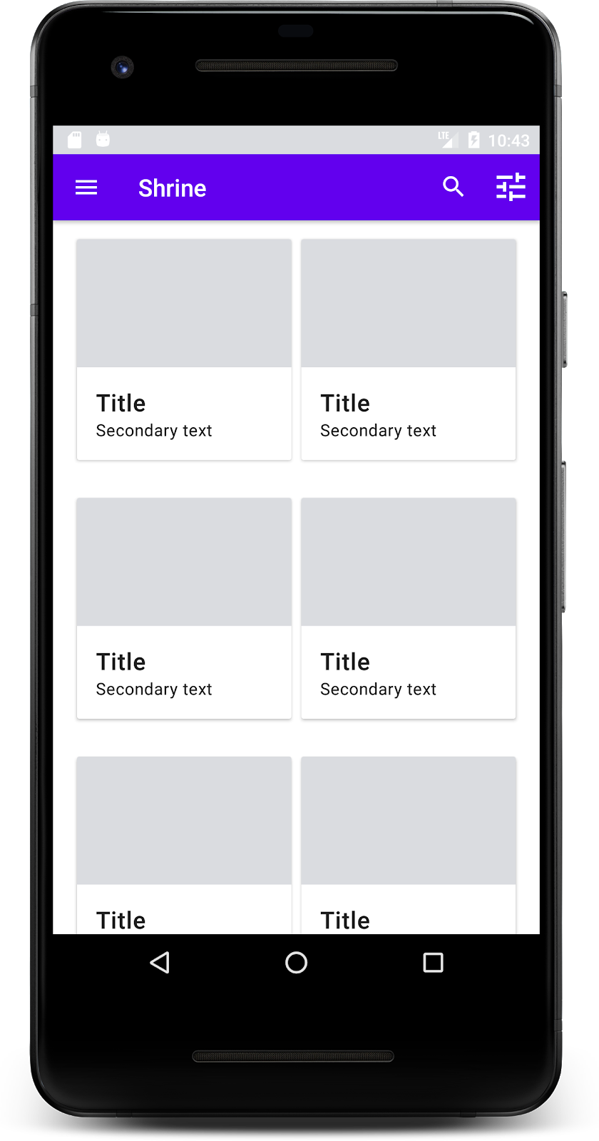
}बनाएं और चलाएं. आपकी होम स्क्रीन ऐसी दिखनी चाहिए:
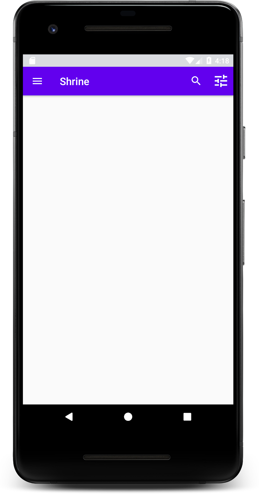
अब टूलबार में एक नेविगेशन आइकॉन, एक टाइटल, और दाईं ओर दो ऐक्शन आइकॉन हैं. टूलबार में एलिवेशन को भी दिखाया गया है. इसके लिए, हल्की शैडो का इस्तेमाल किया गया है. इससे पता चलता है कि यह कॉन्टेंट से अलग लेयर पर है.
अब हमारे ऐप्लिकेशन का स्ट्रक्चर तैयार हो गया है. इसलिए, कॉन्टेंट को कार्ड में रखकर व्यवस्थित करते हैं.
कार्ड जोड़ें
आइए, सबसे पहले टॉप ऐप्लिकेशन बार के नीचे एक कार्ड जोड़ते हैं. कार्ड में इमेज के लिए एक जगह, एक टाइटल, और सेकंडरी टेक्स्ट के लिए एक लेबल होना चाहिए.
shr_product_grid_fragment.xml में , AppBarLayout के नीचे यह जोड़ें:
shr_product_grid_fragment.xml
<com.google.android.material.card.MaterialCardView
   android:layout_width="160dp"
   android:layout_height="180dp"
   android:layout_marginBottom="16dp"
   android:layout_marginLeft="16dp"
   android:layout_marginRight="16dp"
   android:layout_marginTop="70dp"
   app:cardBackgroundColor="?attr/colorPrimaryDark"
   app:cardCornerRadius="4dp">

   <LinearLayout
       android:layout_width="match_parent"
       android:layout_height="wrap_content"
       android:layout_gravity="bottom"
       android:background="#FFFFFF"
       android:orientation="vertical"
       android:padding="8dp">

       <TextView
           android:layout_width="match_parent"
           android:layout_height="wrap_content"
           android:padding="2dp"
           android:text="@string/shr_product_title"
           android:textAppearance="?attr/textAppearanceHeadline6" />

       <TextView
           android:layout_width="match_parent"
           android:layout_height="wrap_content"
           android:padding="2dp"
           android:text="@string/shr_product_description"
           android:textAppearance="?attr/textAppearanceBody2" />
   </LinearLayout>
</com.google.android.material.card.MaterialCardView>
बनाएं और चलाएं:
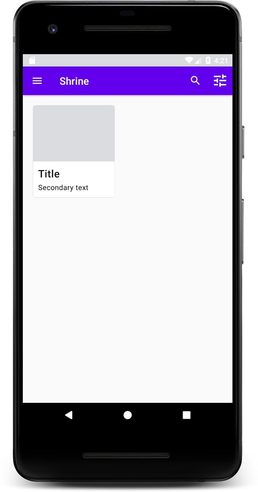
इस झलक में, आपको दिखेगा कि कार्ड, स्क्रीन के बाईं ओर से अंदर की ओर है. साथ ही, इसके कोने गोल हैं और इसमें शैडो है. इससे कार्ड की ऊंचाई का पता चलता है. पूरे क्षेत्र को "कंटेनर" कहा जाता है. कंटेनर के अलावा, इसमें मौजूद सभी एलिमेंट ज़रूरी नहीं हैं.
कंटेनर में ये एलिमेंट जोड़े जा सकते हैं: हेडर टेक्स्ट, थंबनेल या अवतार, सबहेड टेक्स्ट, डिवाइडर, और बटन और आइकॉन भी. उदाहरण के लिए, हमने अभी जो कार्ड बनाया है उसमें LinearLayout में दो TextView शामिल हैं. एक टाइटल के लिए और दूसरा सेकंडरी टेक्स्ट के लिए. ये कार्ड के सबसे नीचे अलाइन किए गए हैं.
आम तौर पर, कार्ड को अन्य कार्ड के साथ कलेक्शन में दिखाया जाता है. इस कोडलैब के अगले सेक्शन में, हम उन्हें ग्रिड में एक कलेक्शन के तौर पर दिखाएंगे.
जब किसी स्क्रीन पर एक से ज़्यादा कार्ड मौजूद होते हैं, तो उन्हें एक या उससे ज़्यादा कलेक्शन में ग्रुप किया जाता है. ग्रिड में मौजूद कार्ड एक ही प्लैनर पर होते हैं. इसका मतलब है कि वे एक-दूसरे के साथ एक ही एलिवेशन शेयर करते हैं. हालांकि, अगर उन्हें उठाया या खींचा जाता है, तो ऐसा नहीं होता. इस कोडलैब में हम इसके बारे में नहीं बताएंगे.
कार्ड का ग्रिड सेट अप करना
हमने आपके लिए जो shr_product_card.xml फ़ाइल उपलब्ध कराई है उसे देखें:
shr_product_card.xml
<?xml version="1.0" encoding="utf-8"?>
<com.google.android.material.card.MaterialCardView xmlns:android="http://schemas.android.com/apk/res/android"
   xmlns:app="http://schemas.android.com/apk/res-auto"
   android:layout_width="match_parent"
   android:layout_height="wrap_content"
   app:cardBackgroundColor="@android:color/white"
   app:cardElevation="2dp"
   app:cardPreventCornerOverlap="true">

   <LinearLayout
       android:layout_width="match_parent"
       android:layout_height="wrap_content"
       android:orientation="vertical">

       <com.android.volley.toolbox.NetworkImageView
           android:id="@+id/product_image"
           android:layout_width="match_parent"
           android:layout_height="@dimen/shr_product_card_image_height"
           android:background="?attr/colorPrimaryDark"
           android:scaleType="centerCrop" />

       <LinearLayout
           android:layout_width="match_parent"
           android:layout_height="wrap_content"
           android:orientation="vertical"
           android:padding="16dp">

           <TextView
               android:id="@+id/product_title"
               android:layout_width="match_parent"
               android:layout_height="wrap_content"
               android:text="@string/shr_product_title"
               android:textAppearance="?attr/textAppearanceHeadline6" />

           <TextView
               android:id="@+id/product_price"
               android:layout_width="match_parent"
               android:layout_height="wrap_content"
               android:text="@string/shr_product_description"
               android:textAppearance="?attr/textAppearanceBody2" />
       </LinearLayout>
   </LinearLayout>
</com.google.android.material.card.MaterialCardView>
इस कार्ड लेआउट में एक कार्ड है. इसमें एक इमेज (यहां NetworkImageView है, जिससे हमें यूआरएल से इमेज शामिल करने की अनुमति मिलती है) और दो TextViews शामिल हैं.
इसके बाद, हमने आपके लिए जो ProductCardRecyclerViewAdapter दिया है उसे देखें. यह ProductGridFragment वाले पैकेज में ही शामिल है.
ProductCardRecyclerViewAdapter.java
package com.google.codelabs.mdc.java.shrine;

import android.view.LayoutInflater;
import android.view.View;
import android.view.ViewGroup;
import androidx.annotation.NonNull;
import androidx.recyclerview.widget.RecyclerView;

import com.google.codelabs.mdc.java.shrine.network.ImageRequester;
import com.google.codelabs.mdc.java.shrine.network.ProductEntry;

import java.util.List;

/**
* Adapter used to show a simple grid of products.
*/
public class ProductCardRecyclerViewAdapter extends RecyclerView.Adapter<ProductCardViewHolder> {

   private List<ProductEntry> productList;
   private ImageRequester imageRequester;

   ProductCardRecyclerViewAdapter(List<ProductEntry> productList) {
       this.productList = productList;
       imageRequester = ImageRequester.getInstance();
   }

   @NonNull
   @Override
   public ProductCardViewHolder onCreateViewHolder(@NonNull ViewGroup parent, int viewType) {
       View layoutView = LayoutInflater.from(parent.getContext()).inflate(R.layout.shr_product_card, parent, false);
       return new ProductCardViewHolder(layoutView);
   }

   @Override
   public void onBindViewHolder(@NonNull ProductCardViewHolder holder, int position) {
       // TODO: Put ViewHolder binding code here in MDC-102
   }

   @Override
   public int getItemCount() {
       return productList.size();
   }
}
ऊपर दी गई अडैप्टर क्लास, हमारी ग्रिड के कॉन्टेंट को मैनेज करती है. हम जल्द ही onBindViewHolder() के लिए कोड लिखेंगे, ताकि यह तय किया जा सके कि हर व्यू को दिए गए कॉन्टेंट के साथ क्या करना चाहिए.
इसी पैकेज में, ProductCardViewHolder को भी देखा जा सकता है. यह क्लास, उन व्यू को सेव करती है जो हमारे कार्ड लेआउट पर असर डालते हैं, ताकि हम बाद में उनमें बदलाव कर सकें.
ProductCardViewHolder.java
package com.google.codelabs.mdc.java.shrine;

import androidx.annotation.NonNull;
import androidx.recyclerview.widget.RecyclerView;
import android.view.View;

public class ProductCardViewHolder extends RecyclerView.ViewHolder {

   public ProductCardViewHolder(@NonNull View itemView) {
       super(itemView);
       // TODO: Find and store views from itemView
   }
}
अपनी ग्रिड सेट अप करने के लिए, हमें सबसे पहले shr_product_grid_fragment.xml से प्लेसहोल्डर MaterialCardView को हटाना होगा. इसके बाद, आपको कार्ड की हमारी ग्रिड को दिखाने वाला कॉम्पोनेंट जोड़ना होगा. इस मामले में, अपने shr_product_grid_fragment.xml एक्सएमएल कॉम्पोनेंट के नीचे, AppBarLayout कॉम्पोनेंट में RecyclerView कॉम्पोनेंट जोड़ें:
shr_product_grid_fragment.xml
<androidx.core.widget.NestedScrollView
   android:layout_width="match_parent"
   android:layout_height="match_parent"
   android:layout_marginTop="56dp"
   android:background="@color/productGridBackgroundColor"
   android:paddingStart="@dimen/shr_product_grid_spacing"
   android:paddingEnd="@dimen/shr_product_grid_spacing"
   app:layout_behavior="@string/appbar_scrolling_view_behavior">

   <androidx.recyclerview.widget.RecyclerView
       android:id="@+id/recycler_view"
       android:layout_width="match_parent"
       android:layout_height="match_parent" />

</androidx.core.widget.NestedScrollView>
आपका shr_product_grid_fragment.xml ऐसा दिखना चाहिए:
shr_product_grid_fragment.xml
<?xml version="1.0" encoding="utf-8"?>
<FrameLayout xmlns:android="http://schemas.android.com/apk/res/android"
   xmlns:app="http://schemas.android.com/apk/res-auto"
   xmlns:tools="http://schemas.android.com/tools"
   android:layout_width="match_parent"
   android:layout_height="match_parent"
   tools:context=".ProductGridFragment">

   <com.google.android.material.appbar.AppBarLayout
       android:layout_width="match_parent"
       android:layout_height="wrap_content">

       <androidx.appcompat.widget.Toolbar
           android:id="@+id/app_bar"
           style="@style/Widget.Shrine.Toolbar"
           android:layout_width="match_parent"
           android:layout_height="?attr/actionBarSize"
           app:navigationIcon="@drawable/shr_menu"
           app:title="@string/shr_app_name" />
   </com.google.android.material.appbar.AppBarLayout>

   <androidx.core.widget.NestedScrollView
       android:layout_width="match_parent"
       android:layout_height="match_parent"
       android:layout_marginTop="56dp"
       android:background="@color/productGridBackgroundColor"
       android:paddingStart="@dimen/shr_product_grid_spacing"
       android:paddingEnd="@dimen/shr_product_grid_spacing"
       app:layout_behavior="@string/appbar_scrolling_view_behavior">

       <androidx.recyclerview.widget.RecyclerView
           android:id="@+id/recycler_view"
           android:layout_width="match_parent"
           android:layout_height="match_parent" />

   </androidx.core.widget.NestedScrollView>

</FrameLayout>
आखिर में, onCreateView() में, RecyclerView के इनिशियलाइज़ेशन कोड को ProductGridFragment.java में जोड़ें. इसके लिए, setUpToolbar(view) को कॉल करने के बाद और return स्टेटमेंट से पहले यह कोड जोड़ें:
ProductGridFragment.java
@Override
public View onCreateView(
       @NonNull LayoutInflater inflater, ViewGroup container, Bundle savedInstanceState) {
   ...
   setUpToolbar(view);

   // Set up the RecyclerView
   RecyclerView recyclerView = view.findViewById(R.id.recycler_view);
   recyclerView.setHasFixedSize(true);
   recyclerView.setLayoutManager(new GridLayoutManager(getContext(), 2, GridLayoutManager.VERTICAL, false));
   ProductCardRecyclerViewAdapter adapter = new ProductCardRecyclerViewAdapter(
           ProductEntry.initProductEntryList(getResources()));
   recyclerView.setAdapter(adapter);
   int largePadding = getResources().getDimensionPixelSize(R.dimen.shr_product_grid_spacing);
   int smallPadding = getResources().getDimensionPixelSize(R.dimen.shr_product_grid_spacing_small);
   recyclerView.addItemDecoration(new ProductGridItemDecoration(largePadding, smallPadding));

   return view;
}
ऊपर दिए गए कोड स्निपेट में, RecyclerView को सेट अप करने के लिए ज़रूरी शुरुआती चरण शामिल हैं. इसमें RecyclerView के लेआउट मैनेजर को सेट करने के साथ-साथ, RecyclerView के अडैप्टर को शुरू करना और सेट करना शामिल है.
अब आपकी ProductGridFragment.java फ़ाइल ऐसी दिखनी चाहिए:
ProductGridFragment.java
package com.google.codelabs.mdc.java.shrine;

import android.os.Bundle;
import androidx.recyclerview.widget.RecyclerView;
import android.view.LayoutInflater;
import android.view.Menu;
import android.view.MenuInflater;
import android.view.View;
import android.view.ViewGroup;
import android.widget.Toolbar;
import androidx.annotation.NonNull;
import androidx.appcompat.app.AppCompatActivity;
import androidx.fragment.app.Fragment;
import androidx.recyclerview.widget.GridLayoutManager;


import com.google.codelabs.mdc.java.shrine.network.ProductEntry;

public class ProductGridFragment extends Fragment {

   @Override
   public void onCreate(Bundle savedInstanceState) {
       super.onCreate(savedInstanceState);
       setHasOptionsMenu(true);
   }

   @Override
   public View onCreateView(
           @NonNull LayoutInflater inflater, ViewGroup container, Bundle savedInstanceState) {
       // Inflate the layout for this fragment with the ProductGrid theme
       View view = inflater.inflate(R.layout.shr_product_grid_fragment, container, false);

       // Set up the toolbar
       setUpToolbar(view);

       // Set up the RecyclerView
       RecyclerView recyclerView = view.findViewById(R.id.recycler_view);
       recyclerView.setHasFixedSize(true);
       recyclerView.setLayoutManager(new GridLayoutManager(getContext(), 2, GridLayoutManager.VERTICAL, false));
       ProductCardRecyclerViewAdapter adapter = new ProductCardRecyclerViewAdapter(
               ProductEntry.initProductEntryList(getResources()));
       recyclerView.setAdapter(adapter);
       int largePadding = getResources().getDimensionPixelSize(R.dimen.shr_product_grid_spacing);
       int smallPadding = getResources().getDimensionPixelSize(R.dimen.shr_product_grid_spacing_small);
       recyclerView.addItemDecoration(new ProductGridItemDecoration(largePadding, smallPadding));

       return view;
   }

   private void setUpToolbar(View view) {
       Toolbar toolbar = view.findViewById(R.id.app_bar);
       AppCompatActivity activity = (AppCompatActivity) getActivity();
       if (activity != null) {
           activity.setSupportActionBar(toolbar);
       }
   }

   @Override
   public void onCreateOptionsMenu(Menu menu, MenuInflater menuInflater) {
       menuInflater.inflate(R.menu.shr_toolbar_menu, menu);
       super.onCreateOptionsMenu(menu, menuInflater);
   }

}
बनाएं और चलाएं.
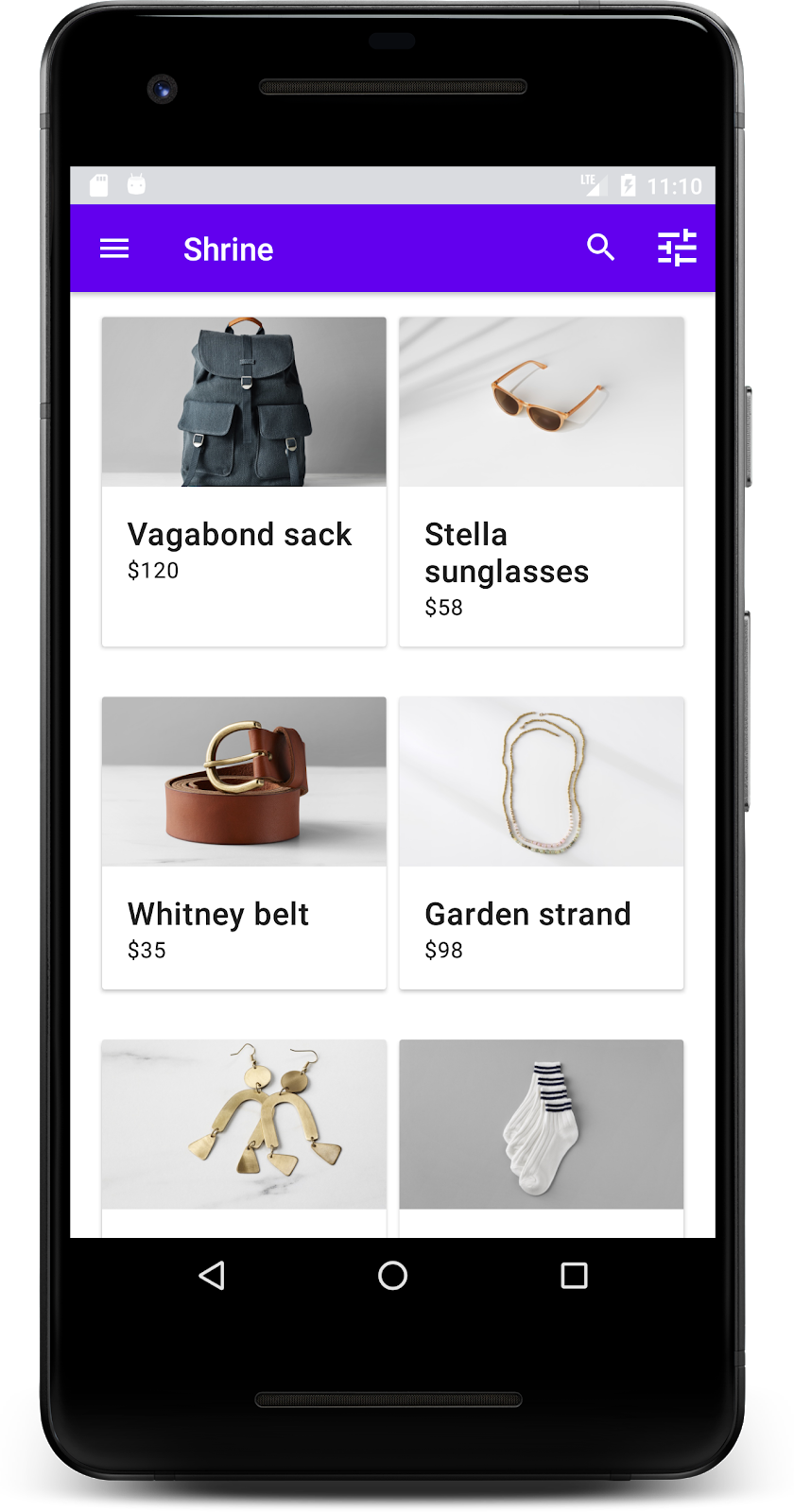
अब कार्ड दिख रहे हैं! इनमें अब तक कुछ भी नहीं दिख रहा है. इसलिए, चलिए कुछ प्रॉडक्ट डेटा जोड़ते हैं.
इमेज और टेक्स्ट जोड़ना
हर कार्ड के लिए, इमेज, प्रॉडक्ट का नाम, और कीमत जोड़ें. हमारे ViewHolder अबस्ट्रैक्शन में, हर कार्ड के व्यू सेव होते हैं. हमारे ViewHolder में, तीन व्यू इस तरह जोड़ें:
ProductCardViewHolder.java
package com.google.codelabs.mdc.java.shrine;

import androidx.recyclerview.widget.RecyclerView;
import android.view.View;
import android.widget.TextView;
import androidx.annotation.NonNull;

import com.android.volley.toolbox.NetworkImageView;

public class ProductCardViewHolder extends RecyclerView.ViewHolder {

   public NetworkImageView productImage;
   public TextView productTitle;
   public TextView productPrice;

   public ProductCardViewHolder(@NonNull View itemView) {
       super(itemView);
       productImage = itemView.findViewById(R.id.product_image);
       productTitle = itemView.findViewById(R.id.product_title);
       productPrice = itemView.findViewById(R.id.product_price);
   }
}
हमारे RecyclerView के अडैप्टर में, ViewHolder, में onBindViewHolder() तरीके को अपडेट करें, ताकि हर व्यू पर जानकारी सेट की जा सके:
ProductCardRecyclerViewAdapter.java
@Override
public void onBindViewHolder(@NonNull ProductCardViewHolder holder, int position) {
   if (productList != null && position < productList.size()) {
       ProductEntry product = productList.get(position);
       holder.productTitle.setText(product.title);
       holder.productPrice.setText(product.price);
       imageRequester.setImageFromUrl(holder.productImage, product.url);
   }
}
ऊपर दिया गया कोड, हमारे RecyclerView के अडैप्टर को बताता है कि हर कार्ड के साथ क्या करना है. इसके लिए, ViewHolder का इस्तेमाल किया जाता है.
यहां, हर ViewHolder के TextView पर टेक्स्ट डेटा सेट किया जाता है. साथ ही, यूआरएल से इमेज पाने के लिए ImageRequester को कॉल किया जाता है. ImageRequester एक क्लास है, जिसे हमने आपकी सुविधा के लिए उपलब्ध कराया है. यह Volley लाइब्रेरी का इस्तेमाल करती है. यह इस कोडलैब के दायरे से बाहर का विषय है. हालांकि, आपके पास कोड को खुद एक्सप्लोर करने का विकल्प है.
बनाएं और चलाएं:
हमारे प्रॉडक्ट अब ऐप्लिकेशन में दिख रहे हैं!
हमारे ऐप्लिकेशन में एक बेसिक फ़्लो है. इससे उपयोगकर्ता को लॉगिन स्क्रीन से होम स्क्रीन पर ले जाया जाता है. यहां प्रॉडक्ट देखे जा सकते हैं. हमने कोड की कुछ ही लाइनों में, टाइटल और तीन बटन वाला टॉप ऐप्लिकेशन बार जोड़ा है. साथ ही, ऐप्लिकेशन का कॉन्टेंट दिखाने के लिए कार्ड की एक ग्रिड जोड़ी है. हमारी होम स्क्रीन अब आसान और काम की है. इसमें बुनियादी स्ट्रक्चर और कार्रवाई करने लायक कॉन्टेंट शामिल है.
अगले चरण
हमने टॉप ऐप्लिकेशन बार, कार्ड, टेक्स्ट फ़ील्ड, और बटन के साथ, MDC-Android लाइब्रेरी के चार मुख्य Material Design कॉम्पोनेंट का इस्तेमाल किया है! MDC-Android कैटलॉग MDC Android में मौजूद कॉम्पोनेंट में जाकर, और भी कॉम्पोनेंट देखे जा सकते हैं.
यह ऐप्लिकेशन पूरी तरह से काम करता है, लेकिन इसमें अब तक किसी ब्रैंड का नाम नहीं बताया गया है. MDC-103: Material Design Theming with Color, Shape, Elevation and Type में, हम इन कॉम्पोनेंट की स्टाइल को पसंद के मुताबिक बनाएंगे, ताकि एक आकर्षक और आधुनिक ब्रैंड को दिखाया जा सके.