
This codelab is part of the Android Kotlin Fundamentals course. You'll get the most value out of this course if you work through the codelabs in sequence. All the course codelabs are listed on the Android Kotlin Fundamentals codelabs landing page.
Introduction
To make an app usable by the most users makes sense, whether you are developing for the joy of it, or for business purposes. There are multiple dimensions to accomplishing that.
- Support RTL Languages. European and many other languages read from left to right, and apps originating from those locales are commonly designed to fit well for those languages. Many other languages with a large number of speakers read from right to left, such as Arabic. Make your app work with right-to-left (RTL) languages to increase your potential audience.
- Scan for accessibility. Guessing at how someone else may experience your app is an option with pitfalls. The Accessibility Scanner app takes the guess work out of the loop and analyses your app, identifying where you could improve its accessibility.
- Design for TalkBack with content descriptions. Visual impairments are more common than one might think, and many users, not just blind ones, use a screen reader. Content descriptions are phrases for a screen reader to say when a user interacts with an element of the screen.
- Support night mode. For many visually impaired users, changing the screen colors improves contrast and helps them visually work with your app. Android makes it straightforward to support night mode, and you should always support night mode to give users a simple alternative to the default screen colors.
In this codelab, you explore each of these options and add support for it to the GDG Finder app.
You also learn how to use chips with your Android app. You can use chips to make your app more interesting, while keeping it accessible.
What you should already know
You should be familiar with:
- How to create apps that have activities and fragments, and navigate between fragments passing data.
- Using views and view groups to lay out a user interface, in particular, RecyclerView.
- How to use Architecture Components, including
ViewModel, with the recommended architecture to create a well-structured and efficient app. - Data binding, coroutines, and how to handle mouse clicks.
- How to connect to the internet and cache data locally using a Room database.
- How to set view properties, and how to extract resources into and use resources from XML resource files.
- How to use styles and themes to customize the the appearance of your app.
- How to use Material components, dimension resources, and custom coloring.
What you'll learn
- How to make your app usable by the largest number of users.
- How to make your app work for right-to-left (RTL) languages.
- How to evaluate your app's accessibility.
- How to use content descriptions to make your app work better with screen readers.
- How to use chips.
- How to make your app work with dark mode.
What you'll do
- Evaluate and extend a given app to improve accessibility by making it work for RTL languages.
- Scan your app to determine where accessibility could be improved.
- Use content descriptions for images.
- Learn how to use drawables.
- Add the ability to use night mode to your app.
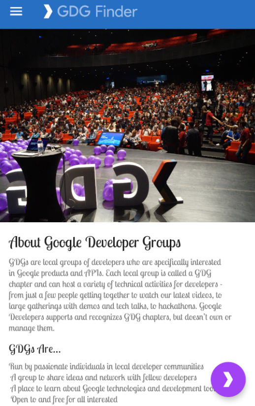
The GDG-finder starter app builds on everything you've learned so far in this course.
The app uses ConstraintLayout to lay out three screens. Two of the screens are just layout files that you'll use to explore colors and text on Android.
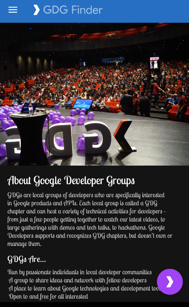
The third screen is a GDG finder. GDGs, or Google Developer Groups, are communities of developers that focus on Google technologies, including Android. GDGs around the world host meetups, conferences, study jams, and other events.
As you develop this app, you work on the real list of GDGs. The finder screen uses the device's location to sort the GDGs by distance.
If you're lucky and there's a GDG in your region, you can check out the website and sign up for their events! GDG events are a great way to meet other Android developers and learn industry best practices that didn't fit in this course.
The screenshots below show how your app will change from the beginning to the end of this codelab.
|
|
The main difference between left-to-right (LTR) and right-to-left (RTL) languages is the direction of the displayed content. When the UI direction is changed from LTR to RTL (or vice-versa), it is often called mirroring. Mirroring affects most of the screen, including text, text field icons, layouts, and icons with directions (such as arrows). Other items are not mirrored, such as numbers (clock, phone numbers), icons which do not have direction (airplane mode, WiFi), playback controls, and most charts and graphs.
Languages that use the RTL text direction are used by more than one billion people worldwide. Android developers are all over the world, and so a GDG Finder app needs to support RTL languages.
Step 1: Add RTL support
In this step, you make the GDG Finder app work with RTL languages.
- Download and run the GDGFinderMaterial app, which is the starter app for this codelab or continue from the final code of the previous codelab.
- Open the Android Manifest.
- In the
<application>section, add the following code to specify that the app supports RTL.
<application
        ...
android:supportsRtl="true">- Open activity_main.xml in the Design tab.
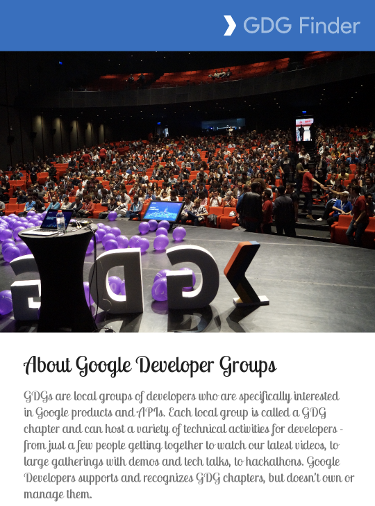
- From the Locale for Preview dropdown menu, choose Preview Right to Left. (If you don't find this menu, widen the pane or close the Attributes pane to uncover it.)
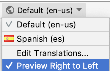
- In the Preview, notice that the header "GDG Finder" has moved to the right, and the rest of the screen remains pretty much the same. Overall, this screen is passable. But the alignment in the text view is now wrong, because it is aligned to the left, instead of to the right.
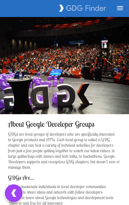
- To make this work on your device, in your device or emulator Settings, in Developer Options, select Force RTL layout. (If you need to turn on Developer Options, find the Build Number and click it until you get a toast indicating you are a developer. This varies by device and version of the Android system.)

- Run the app and verify on the device that the main screen appears the same as in the Preview. Notice that the FAB is now switched to the left, and the Hamburger menu to the right!
- In the app, open the navigation drawer and navigate to the Search screen. As shown below, the icons are still on the left, and no text is visible. It turns out that the text is off the screen, to the left of the icon. This is because the code uses left/right screen references in the view properties and layout constraints.
|
|
Step 2: Use start and end instead of left and right
"Left" and "right" on the screen (when you face the screen) don't change, even if the direction of the text changes. For example, layout_constraintLeft_toLeftOf always constrains the left side of the element to the left side of the screen. In your app's case, the text is off the screen in RTL languages, as shown in the screenshot above.
To fix this, instead of "left" and "right," use Start and End terminology. This terminology sets the start of the text and the end of the text appropriately for the direction of the text in the current language, so that margins and layouts are in the correct areas of the screens.
Openlist_item.xml.- Replace any references to
LeftandRightwith references toStartandEnd.
app:layout_constraintStart_toStartOf="parent"

app:layout_constraintStart_toEndOf="@+id/gdg_image"
app:layout_constraintEnd_toEndOf="parent"- Replace the
ImageView'slayout_marginLeftwithlayout_marginStart. This moves the margin to the correct place to move the icon away from the edge of the screen.
<ImageView
android:layout_marginStart="
?- Open
fragment_gdg_list.xml. Check the list of GDGs in the Preview pane. Notice that the icon is still pointing in the wrong direction because it is mirrored (If the icon is not mirrored, make sure you are still viewing the right to left preview). According to the Material Design guidelines, icons should not be mirrored. - Open res/drawable/ic_gdg.xml.
- In the first line of XML code, find and delete
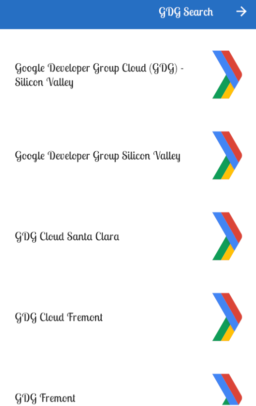
android:autoMirrored="true"to disable mirroring. - Check the Preview or run the app again and open the Search GDG screen. The layout should be fixed now!
Step 3: Let Android Studio do the work for you
In the previous exercise, you took your first steps to support RTL languages. Fortunately, Android Studio can scan your app and set up a lot of basics for you.
- In list_item.xml, in the
TextView, changelayout_marginStartback tolayout_marginLeft, so that the scanner has something to find.
<TextView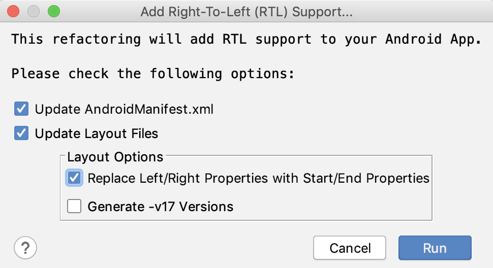
android:layout_marginLeft="@dimen/spacing_normal"- In Android Studio, choose Refactor > Add RTL support where possible and check the boxes for updating the manifest, and the layout files to use start and end properties.
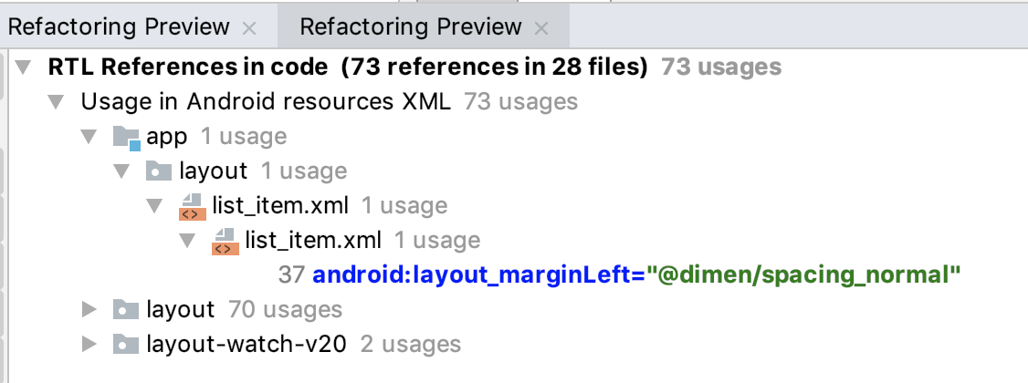
- In the Refactoring Preview pane, find the app folder, and expand until it is open to all the details.
- Under the app folder, notice that the
layout_marginLeftthat you just changed is listed as code to refactor.
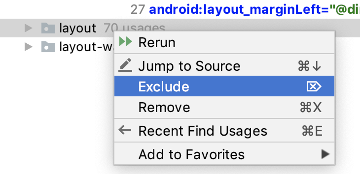
- Notice that the preview also lists system and library files. Right-click on layout and layout-watch-v20 and any other folders that are not part of app, and choose Exclude from the context menu.
- Go ahead and do the refactor now. (If you get a popup about system files, make sure you have excluded all folders that are not part of your app code.)
- Notice that
layout_marginLefthas been changed back tolayout_marginStart.
Step 3: Explore folders for locales
So far, you've just changed the direction of the default language used for the app. For a production app, you would send the strings.xml file to a translator to have it translated to a new language. For this codelab, the app provides a strings.xml file in Spanish (we used Google Translate to generate the translations, so they're not perfect.).
- In Android Studio, switch the project view to Project Files.
- Expand the res folder, and notice folders for res/values and res/values-es. The "es" in the folder name is the language code for Spanish. The values-"language code" folders contain values for each supported language. The values folder without an extension contains the default resources that apply otherwise.
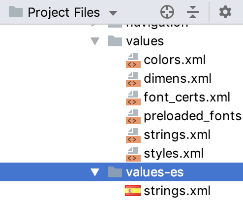
- In values-es, open strings.xml and notice that all the strings are in Spanish.
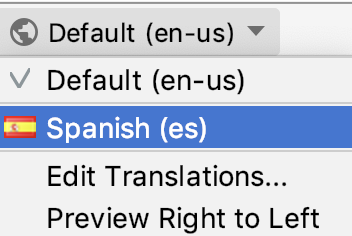
- In Android Studio, open
activity_main.xmlin the Design tab. - In the Locale for Preview dropdown choose Spanish. Your text should now be in Spanish.
- [Optional] If you are proficient in an RTL language, create a values folder and a strings.xml in that language and test how it appears on your device.
- [Optional] Change the language settings on your device and run the app. Make sure you don't change your device to a language you don't read, as it makes it a bit challenging to undo!
In the previous task, you changed your app manually and then used Android Studio to check for additional RTL improvements to make.
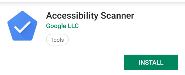
The Accessibility Scanner app is your best ally when it comes to making your app accessible. It scans your app on your target device and suggests improvements, such as making touch targets larger, increasing contrast, and providing descriptions for images to make your app more accessible. Accessibility Scanner is made by Google and you can install it from Play Store.
Step 1: Install and run Accessibility Scanner
- Open the Play Store and sign in if necessary. You can do this on your physical device or the emulator. This codelab uses the emulator.
- In the Play Store, search for Accessibility Scanner by Google LLC. Make sure you get the correct app, issued by Google, as any scanning requires a lot of permissions!
- Install the scanner on the emulator.
- Once installed, click Open.
- Click Get Started.
- Click OK to start Accessibility Scanner setup in Settings.
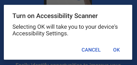
- Click the Accessibility Scanner to go to the device's Accessibility settings.
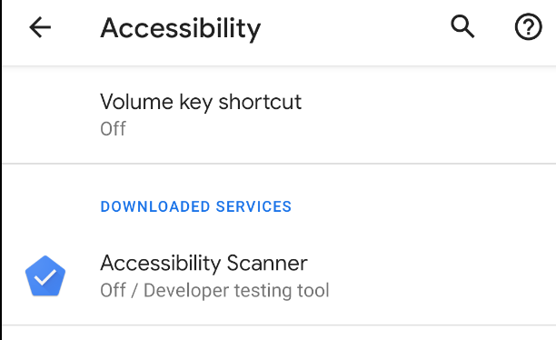
- Click Use service to enable it.
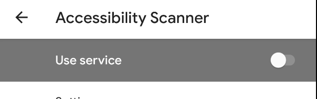
- Follow the on-screen instructions and grant all permissions.
- Then click OK Got it, and return to the home screen. You may see a blue button with a check mark somewhere on the screen. Clicking this button triggers testing for the app in the foreground. You can reposition the button by dragging it. This button stays on top of any apps, so you can trigger testing at any time.

- Open or run your app.
- Click the blue button and accept additional security warnings and permissions.
The first time you click the Accessibility Scanner icon, the app asks for permission to get everything displayed on your screen. This seems like a very scary permission, and it is.
You should almost never grant a permission like this one, because the permission lets apps read your email or even grab your bank account info! However, for Accessibility Scanner to do its work, it needs to examine your app the way a user would—that's why it needs this permission.
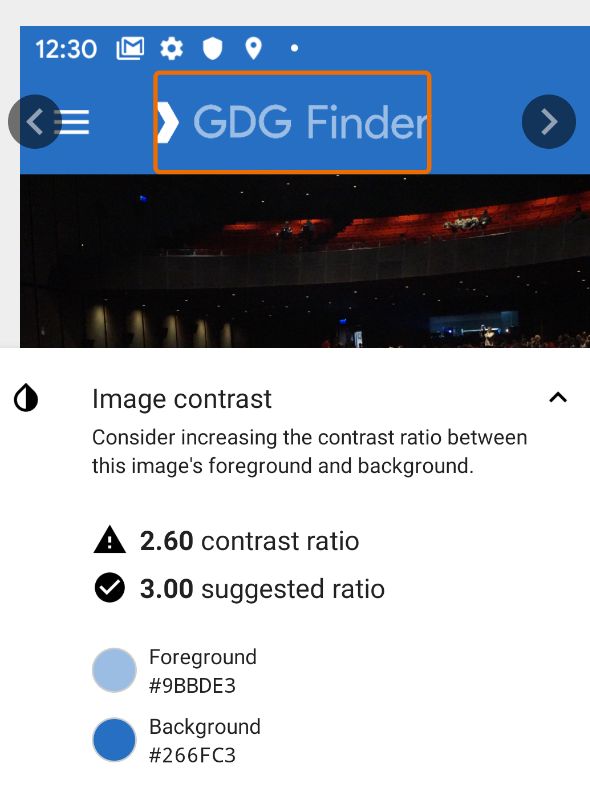
- Click the blue button and wait for the analysis to complete. You will see something like the screenshot below, with the title and FAB boxed in red. This indicates two suggestions for accessibility improvements on this screen.
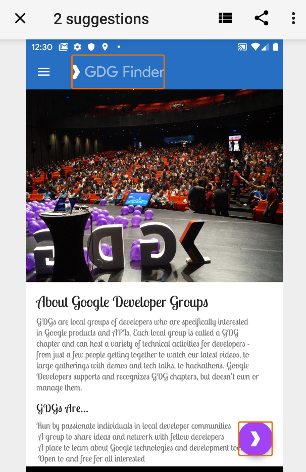
- Click on the box surrounding GDG Finder. This opens a pane with additional information, as shown below, indicating issues with the image contrast.
- Expand the Image Contrast information, and the tool suggests remedies.
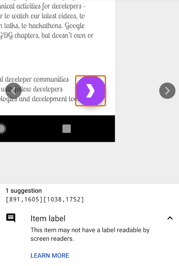
- Click the arrows to the right to get information for the next item.
|
|
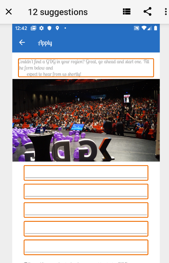
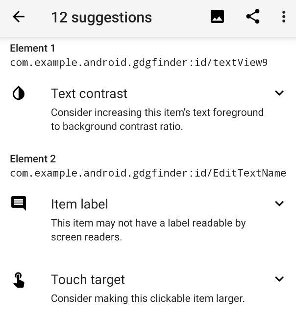
- In your app, navigate to the Apply for GDG screen and scan it with the Accessibility Scanner app. This gives quite a few suggestions, as shown below on the left. 12, to be exact. To be fair, some of those are duplicates for similar items.
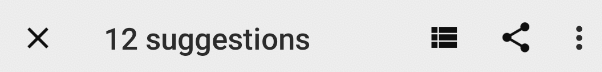
- Click the "stack"
 icon in the bottom toolbar to get a list of all suggestions, as shown below on the right screenshot. You address all of these issues in this codelab.
|
|
The Android Accessibility Suite, a collection of apps by Google, includes tools to help make apps more accessible. It includes tools such as TalkBack. TalkBack is a screen reader that offers auditory, haptic, and spoken feedback, which allows users to navigate and consume content on their devices without using their eyes.
It turns out TalkBack is not only used by blind people, but by many people who have visual impairments of some sort. Or even people who just want to rest their eyes!
So, Accessibility is for everyone! In this task, you try out TalkBack and update your app to work well with it.
Step 1: Install and run Accessibility Suite
TalkBack comes pre-installed on many physical devices, but on an emulator, you need to install it.
- Open the Play Store.
- Find the Accessibility Suite. Make sure it is the correct app by Google.
- If it is not installed, install the Accessibility Suite.
- To enable TalkBack on the device, navigate to Settings > Accessibility and turn TalkBack on by selecting Use Service. Just like the accessibility scanner, TalkBack requires permissions in order to read the contents on the screen. Once you accept the permission requests, TalkBack welcomes you with a list of tutorials to teach you how to use TalkBack effectively.
- Pause here and take the tutorials, if for no other reason than to learn how to turn TalkBack back off when you are done.
- To leave the tutorial, click the back button to select it, then double-tap anywhere on the screen.
- Explore using the GDG Finder app with TalkBack. Notice places where TalkBack gives you no useful information about the screen or a control. You are going to fix this in the next exercise.
Step 2: Add a content description
Content descriptors are descriptive labels that explain the meaning of views. Most of your views should have content descriptions.
- With the GDG Finder app running and Talback enabled, navigate to the Apply to run GDG screen.
- Tap on the main image ... and nothing happens.
- Open add_gdg_fragment.xml.
- In the
ImageView, add a content descriptor attribute as shown below. Thestage_image_descriptionstring is provided for you in strings.xml.
android:contentDescription="@string/stage_image_description"- Run your app.
- Navigate to Apply to run GDG and click on the image. You should now hear a short description of the image.
- [Optional] Add content descriptions for the other images in this app. In a production app, all images need to have content descriptions.
Step 3: Add hints to editable text fields
For editable elements, such as an EditText, you can use android:hint in the XML to help users figure out what to type. A hint always shows in the UI as it is the default text in an input field.
- Still in add_gdg_fragment.xml.
- Add content descriptions and hints, using the code below as guidance.
Add to textViewIntro:
android:contentDescription="@string/add_gdg"Add to the edit texts respectively:
android:hint="@string/your_name_label"

android:hint="@string/email_label"

android:hint="@string/city_label"

android:hint="@string/country_label"

android:hint="@string/region_label"- Add a content description to
labelTextWhy.
android:contentDescription="@string/motivation" - Add a hint to
EditTextWhy. Once you have labeled the edit boxes, add a content description to the label and also a hint to the box.
android:hint="@string/enter_motivation"- Add a content description for the submit button. All buttons need to have a description of what happens if they are pressed.
android:contentDescription="@string/submit_button_description"- Run your app with Talback enabled, and fill out the form to apply to run a GDG.
Step 4: Create a content group
For UI controls that TalkBack should treat as a group, you can use content grouping. Related content which is grouped together, is announced together. Users of assistive technology then won't need to swipe, scan, or wait as often to discover all information on the screen. This does not affect how the controls appear on the screen.
To group UI components, wrap them into a ViewGroup, such as a LinearLayout. In the GDG Finder app, the labelTextWhy and editTextWhy elements are excellent candidates for grouping since they belong together semantically.
- Open add_gdg_fragment.xml.
- Wrap a
LinearLayoutaroundLabelTextWhyandEditTextWhyto create a content group. Copy and paste the code below. ThisLinearLayoutalready contains some of the styling that you need. (Make sure thebuttonis OUTSIDE theLinearLayout.)
<LinearLayout android:id="@+id/contentGroup" android:layout_width="match_parent"
            android:layout_height="wrap_content" android:focusable="true"
            app:layout_constraintTop_toBottomOf="@id/EditTextRegion"
            android:orientation="vertical" app:layout_constraintStart_toStartOf="@+id/EditTextRegion"
            app:layout_constraintEnd_toEndOf="@+id/EditTextRegion"
            android:layout_marginTop="16dp" app:layout_constraintBottom_toTopOf="@+id/button"
            android:layout_marginBottom="8dp">

     <!-- label and edit text here –>

<LinearLayout/>- Choose Code > Reformat code to properly indent all the code.
- Remove all layout margins from
labelTextWhyandeditTextWhy. - In
labelTextWhy, change thelayout_constraintTop_toTopOfconstraint tocontentGroup.
app:layout_constraintTop_toTopOf="@+id/contentGroup" />- In
editTextWhychange thelayout_constraintBottom_toBottomOfconstraint tocontentGroup.
app:layout_constraintBottom_toBottomOf="@+id/contentGroup"- Constrain
EditTextRegionand theButtonto thecontentGroupto get rid of the errors.
app:layout_constraintBottom_toTopOf="@+id/contentGroup"- Add margins to the
LinearLayout. Optionally, extract this margin as a dimension.
android:layout_marginStart="32dp"
android:layout_marginEnd="32dp"
If you need help, check your code against the add_gdg_fragment.xml in the solution code.
- Run your app and explore the Apply to run GDG screen with TalkBack.
Step 5: Add a live region
Currently, the label on the submit button is OK. It would be better if the button had one label and description before the form is submitted, and dynamically changed to a different label and content description after the user clicks and the form has been submitted. You can do this using a live region.
A live region indicates to accessibility services whether the user should be notified when a view changes. For example, informing the user about an incorrect password or a network error is a great way to make your app more accessible. In this example, to keep it simple, you inform the user when the submit button changes its state.
- Open add_gdg_fragment.xml.
- Change the button's text assignment to Submit using the provided
submitstring resource.
android:text="@string/submit"- Add a live region to the button by setting the
android:accessibilityLiveRegionattribute. As you type, you have several options for its value. Depending on the importance of the change, you can choose whether to interrupt the user. With the value "assertive", the accessibility services interrupt ongoing speech to immediately announce changes to this view. If you set the value to "none", no changes are announced. Set to "polite", the accessibility services announce changes, but wait their turn. Set the value to "polite".
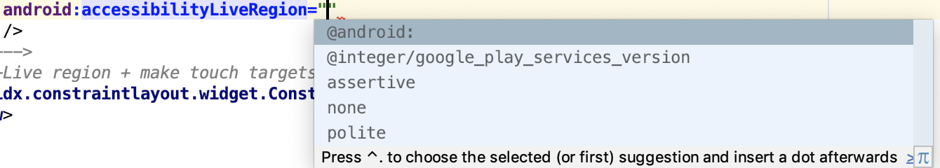
android:accessibilityLiveRegion="polite"- In the add package, open AddGdgFragment.kt.
- Inside the
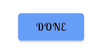
showSnackBarEventObserver, after you are done showing theSnackBar, set a new content description and text for the button.
binding.button.contentDescription=getString(R.string.submitted)
binding.button.text=getString(R.string.done)- Run your app and click the button. Unfortunately, the button and font are too small!
Step 6: Fix the button styling
- In add_gdg_fragment.xml, change the button's
widthandheighttowrap_content, so the full label is visible and the button is a good size.
android:layout_width="wrap_content"
android:layout_height="wrap_content"- Delete the
backgroundTint,textColor, andtextSizeattributes from the button so that the app uses the better theme styling. - Delete the
textColorattribute fromtextViewIntro. The theme colors should provide good contrast. - Run the app. Notice the much more usable Submit button. Click Submit and notice how it changes to Done.
|
|

Chips are compact elements that represent an attribute, text, entity, or action. They allow users to enter information, select a choice, filter content, or trigger an action.
The Chip widget is a thin view wrapper around the ChipDrawable, which contains all of the layout and draw logic. The extra logic exists to support touch, mouse, keyboard, and accessibility navigation. The main chip and close icon are considered to be separate logical sub-views, and contain their own navigation behavior and state.

Chips use drawables. Android drawables let you draw images, shapes, and animations on the screen, and they can have a fixed size or be dynamically sized. You can use images as drawables, such as the images in the GDG app. And you can use vector drawings to draw anything you can imagine. There is also a resizable drawable called a 9-patch drawable, that is not covered in this codelab. The GDG logo, in drawable/ic_gdg.xml, is another drawable.
Drawables are not views, so you cannot put a drawable directly inside a ConstraintLayout, you need to put it inside an ImageView. You can also use drawables to provide a background for a text view or a button, and the background draws behind the text.
Step 1: Add chips to the list of GDGs
The checked chip below uses three drawables. The background and the check mark are each a drawable. Touching the chip creates a ripple effect, which is done with a special RippleDrawable that shows a ripple effect in response to state changes.
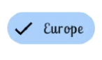
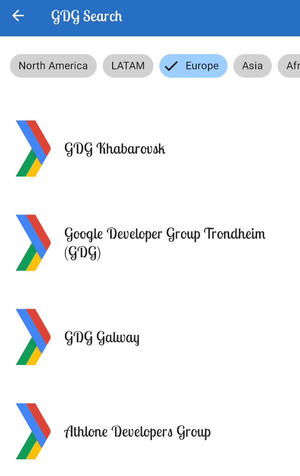
In this task, you add chips to the list of GDGs, and have them change state when they are selected. In this exercise, you add a row of buttons called chips to the top of the Search screen. Each button filters the GDG list so that the user receives only results from the selected region. When a button is selected, the button changes its background and shows a check mark.
- Open fragment_gdg_list.xml.
- Create a
com.google.android.material.chip.ChipGroupinside theHorizontalScrollView.Set itssingleLineproperty totrue, so that all chips are lined up on one horizontally scrollable line. Set thesingleSelectionproperty totrueso that only one chip in the group can be selected at a time. Here is the code.
<com.google.android.material.chip.ChipGroup
    android:id="@+id/region_list"
    android:layout_width="wrap_content"
    android:layout_height="wrap_content"
    app:singleSelection="true"
android:padding="@dimen/spacing_normal"/>- In the layout folder, create a new layout resource file called region.xml, for defining the layout for one
Chip. - In region.xml, replace all the code with the layout for one
Chipas given below. Notice that thisChipis a Material component. Also notice that you get the check mark by setting the propertyapp:checkedIconVisible. You will get an error for the missingselected_highlightcolor.
<?xml version="1.0" encoding="utf-8"?>

<com.google.android.material.chip.Chip
        xmlns:android="http://schemas.android.com/apk/res/android"
        xmlns:tools="http://schemas.android.com/tools"
        xmlns:app="http://schemas.android.com/apk/res-auto"
        android:layout_width="wrap_content"
        android:layout_height="wrap_content"
        style="@style/Widget.MaterialComponents.Chip.Choice"
        app:chipBackgroundColor="@color/selected_highlight"
        app:checkedIconVisible="true"
tools:checked="true"/>- To create the missing
selected_highlightcolor, put the cursor onselected_highlight, bring up the intention menu, and create color resource for selected highlight. The default options are fine, so just click OK. The file is created in the res/color folder. - Open res/color/selected_highlight.xml. In this color state list, encoded as a
<selector>, you can provide different colors for different states. Each state and associated color is encoded as an<item>. See Color Theming for more on these colors.
- Inside the
<selector>, add an item with a default colorcolorOnSurfaceto the state list. In state lists, it's important to always cover all the states. One way to do this is by having a default color.
<item android:alpha="0.18" android:color="?attr/colorOnSurface"/>- Above the default color, add an
itemwith a color ofcolorPrimaryVariant, and constrain its use to when the selected state istrue. State lists are worked through from the top to the bottom, like a case statement. If none of the states match, the default state applies.
<item android:color="?attr/colorPrimaryVariant"
         android:state_selected="true" />
Step 2: Display the row of chips
The GDG app creates a list of chips showing regions that have GDGs. When a chip is selected, the app filters results to only display GDG results for that region.
- In the search package, open GdgListFragment.kt.
- In
onCreateView(), just above thereturnstatement, add an observer onviewModel.regionListand overrideonChanged(). When the list of regions provided by the view model changes, the chips needs to be recreated. Add a statement to return immediately if the supplieddataisnull.
viewModel.regionList.observe(viewLifecycleOwner, object: Observer<List<String>> {
        override fun onChanged(data: List<String>?) {
             data ?: return
        }
})- Inside
onChanged(), below the null test, assignbinding.regionListto a new variable calledchipGroupto cache theregionList.
val chipGroup = binding.regionList- Below, create a new
layoutInflatorfor inflating chips fromchipGroup.context.
val inflator = LayoutInflater.from(chipGroup.context)- Clean and rebuild your project to get rid of the databinding error.
Below the inflator, you can now create the actual chips, one for each region in the regionList.
- Create a variable,
children, for holding all the chips. Assign it a mapping function on the passed indatato create and return each chip.
val children = data.map {} - Inside the map lambda, for each
regionName, create and inflate a chip. The completed code is below.
val children = data.map {
   val children = data.map { regionName ->
       val chip = inflator.inflate(R.layout.region, chipGroup, false) as Chip
       chip.text = regionName
       chip.tag = regionName
       // TODO: Click listener goes here.
       chip
   }
}- Inside the lambda, just before returning the
chip, add a click listener. When thechipis clicked, set its state tochecked. CallonFilterChanged()in theviewModel, which triggers a sequence of events that fetches the result for this filter.
chip.setOnCheckedChangeListener { button, isChecked ->
   viewModel.onFilterChanged(button.tag as String, isChecked)
}- At the end of the lamba, remove all current views from the
chipGroup, then add all the chips fromchildrento thechipGroup. (You can't update the chips, so you have to remove and recreate the contents of thechipGroup.)
chipGroup.removeAllViews()

for (chip in children) {
   chipGroup.addView(chip)
}
Your completed observer should be as follows:
   override fun onChanged(data: List<String>?) {
       data ?: return

       val chipGroup = binding.regionList
       val inflator = LayoutInflater.from(chipGroup.context)

       val children = data.map { regionName ->
           val chip = inflator.inflate(R.layout.region, chipGroup, false) as Chip
           chip.text = regionName
           chip.tag = regionName
           chip.setOnCheckedChangeListener { button, isChecked ->
               viewModel.onFilterChanged(button.tag as String, isChecked)
           }
           chip
       }
       chipGroup.removeAllViews()

       for (chip in children) {
           chipGroup.addView(chip)
       }
   }
})
- Run your app and search for GDGS to open the Search screen to use your new chips. As you click each chip, the app will display the filter groups below it.
Night mode lets your app change its colors to a dark theme, for example, when the device settings have been set to enable night mode. In night mode, apps change their default light backgrounds to be dark, and change all the other screen elements accordingly.
Step 1: Enable night mode
To provide the dark theme for your app, you change its theme from the Light theme to a theme called DayNight. The DayNight theme appears light or dark, depending on the mode.
- In
styles.xml,change theAppThemeparent theme fromLighttoDayNight.
<style name="AppTheme" parent="Theme.MaterialComponents.DayNight.NoActionBar">- In
MainActivity'sonCreate()method, callAppCompatDelegate.setDefaultNightMode()to programmatically turn on the dark theme.
AppCompatDelegate.setDefaultNightMode(AppCompatDelegate.MODE_NIGHT_YES)- Run the app and verify it has switched to the dark theme.
Step 2: Generate your own dark theme color palette
To customize the dark theme, create folders with the -night qualifier for the dark theme to use. For example, you can have specific colors in night mode by creating a folder called values-night.
- Visit the material.io color picker tool and create a night-theme color palette. For example, you could base it on a dark blue color.
- Generate and download the colors.xml file.
- Switch to Project Files view to list all the folders in your project.
- Find the res folder and expand it.
- Create a res/values-night resource folder.
- Add the new colors.xml file to the res/values-night resource folder.
- Run your app, still with night mode enabled, and the app should use the new colors you defined for res/values-night. Notice that the chips use the new secondary color.

Android Studio project: GDGFinderFinal.
Support RTL Languages
- In the Android Manifest, set
android:supportsRtl="true". - You can preview RTL in the emulator, and you can use your own language to check screen layouts. On a device or emulator, open Settings, and in Developer Options, select Force RTL layout.
- Replace references to
LeftandRightwith references toStartandEnd. - Disable mirroring for drawables by deleting
android:autoMirrored="true". - Choose Refactor > Add RTL support where possible to let Android Studio do the work for you.
- Use values-"language code" folders to store language-specific resources.
Scan for accessibility
- In the Play Store, get the Accessibility Scanner by Google LLC and run it to scan for screen elements to improve.
Design for TalkBack with content descriptions
- Install the Android Accessibility Suite, by Google, which includes TalkBack.
- Add content descriptions to all UI elements. For example:
android:contentDescription="@string/stage_image_description" - For an editable element such as an
EditText, use anandroid:hintattribute in the XML to provide a hint to the user about what to type. - Create content groups by wrapping related elements into a view group.
- Create a live region to give users additional feedback with
android:accessibilityLiveRegion.
Use Chips to implement a filter
- Chips are compact elements that represent an attribute, text, entity, or action.
- To create a group of chips, use a
com.google.android.material.chip.ChipGroup. - Define the layout for one
com.google.android.material.chip.Chip. - If you want your chips to change colors, provide a color state list as a
<selector>with stateful colors:<item android:color="?attr/colorPrimaryVariant"
android:state_selected="true" /> - Bind the chips to live data by adding an observer to the data in the view model.
- To display the chips, create an inflator for the chip group:
LayoutInflater.from(chipGroup.context) - Create the chips, add a click listener that triggers the desired action, and add the chips to the chip group.
Support dark mode
- Use the
DayNightAppThemeto support dark mode. - You can set dark mode programmatically:
AppCompatDelegate.setDefaultNightMode() - Create a res/values-night resource folder to provide custom colors and values for dark mode.
Android developer documentation:
LayoutDirection(RTL)- Bidirectionality
- Get started with Accessibility Scanner
- TalkBack
- TalkBack gestures
- Drawables overview docs
- Content descriptors
- Content grouping
- Live regions
- NinePatch drawables
- Draw 9-patch tool
- Chips
ChipGroup- Dark theme
- Color theming
- Color tool
- Animate drawable graphics
Other resources:
- Developing Android Apps with Kotlin (Udacity course)
- Kotlin Bootcamp for Programmers (Udacity course)
- Kotlin Bootcamp for Programmers codelabs
This section lists possible homework assignments for students who are working through this codelab as part of a course led by an instructor. It's up to the instructor to do the following:
- Assign homework if required.
- Communicate to students how to submit homework assignments.
- Grade the homework assignments.
Instructors can use these suggestions as little or as much as they want, and should feel free to assign any other homework they feel is appropriate.
If you're working through this codelab on your own, feel free to use these homework assignments to test your knowledge.
Question 1
Which of the following is mandatory for supporting RTL languages?
▢ Replace Left and Right in properties with Start and End
▢ Switch to an RTL language
▢ Make sure all icons use android:autoMirrored="true"
▢ Provide content descriptions
Question 2
Which of the following accessibility tools comes built in with most Android devices?
▢ TalkBack
▢ Accessibility Scanner
▢ In Android Studio, Refactor > Add RTL support where possible
▢ Lint
Question 3
Which of the following is not true about chips?
▢ You display chips as part of a ChipGroup.
▢ You can provide a color state list for a ChipGroup.
▢ Chips are compact elements that represent an input, attribute, or action.
▢ You must always enable DarkTheme if your app uses chips.
Question 4
Which theme gives you styling for dark and light modes?
▢ DayNight
▢ DarkTheme
▢ DarkAndLightTheme
▢ Light
Question 5
What is a live region?
▢ A node that contains information that is important for the user
▢ A region of the screen that changes shape according to Material guidelines
▢ A view that allows streaming video
▢ An animated drawable