
Google 數據分析可讓使用者免費建立即時互動式資訊主頁,並提供精美的資料視覺化效果。使用者可以從各種來源擷取資料,並在數據分析中建立報表,還能完整編輯及分享報表。以下是數據分析資訊主頁的範例:

Data Studio 提供多種內建圖表類型,包括折線圖、長條圖、圓餅圖和散布圖。社群視覺化功能可讓您在數據分析中,建立及使用自訂 JavaScript 視覺化效果。社群視覺呈現是由數據分析開發人員社群建立,任何開發人員都能建立。您也可以與他人分享社群視覺化效果,讓他們搭配自己的資料使用。
課程內容
在本程式碼研究室中,您將學到:
- Google 數據分析社群視覺化功能運作方式
- 如何使用 ds-component 輔助程式庫建立社群視覺呈現
- 如何將社群視覺化整合至數據分析資訊主頁
軟硬體需求
如要完成本程式碼研究室,請務必符合以下條件:
- 網路連線和網路瀏覽器
- Google 帳戶
- Google Cloud Platform 儲存空間值區的存取權
- 熟悉 JavaScript
你為什麼選擇這個程式碼研究室?
您打算如何使用這個程式碼研究室/教學課程?
您對 Google 數據分析的體驗滿意嗎?
以下哪一項敘述最符合你的背景?
您對哪些 JavaScript 視覺化程式庫感興趣?
前往下一頁提交問卷調查資訊。
您可以使用數據分析社群視覺化功能,建立及使用整合到資訊主頁的自訂 JavaScript 視覺化效果。
在本程式碼研究室中,您將建立長條圖社群視覺化效果,支援 1 個維度、1 個指標和長條顏色樣式。

如要建立社群視覺化效果,您需要在 Google Cloud Platform 儲存空間 bucket 中準備下列檔案 (您會在後續步驟中建立 bucket)。
檔案名稱 | 檔案類型 | 目的 |
manifest.json* | JSON | 提供視覺化效果的中繼資料,以及其他資源的位置。 |
myViz.json | JSON | 提供「資源」面板的資料和樣式設定選項。 |
myViz.js | JavaScript | 提供顯示視覺化效果所需的 JavaScript 程式碼。 |
myViz.css (選用) | CSS | 提供視覺化樣式。 |
*資訊清單是唯一需要命名的檔案。只要在資訊清單檔案中指定名稱/位置,其他檔案的名稱可以不同。
在本節中,您會在 JavaScript 檔案中加入處理資料、樣式變更和視覺化算繪所需的程式碼。
撰寫視覺化來源
步驟 1: 從 Data Studio 社群元件程式庫下載 dscc.min.js 檔案,然後複製到工作目錄。
步驟 2: 將下列程式碼複製到文字編輯器,然後儲存為本機工作目錄中的 myVizSource.js。
myVizSource.js
function drawViz(data) {

  // set margins + canvas size
  const margin = { top: 10, bottom: 50, right: 10, left: 10 };
  const height = dscc.getHeight() - margin.top - margin.bottom;
  const width = dscc.getWidth() - margin.left - margin.right;

  // remove the svg if it already exists
  if (document.querySelector("svg")) {
    let oldSvg = document.querySelector("svg");
    oldSvg.parentNode.removeChild(oldSvg);
  }

  const svg = document.createElementNS("http://www.w3.org/2000/svg", "svg");
  svg.setAttribute("height", `${height}px`);
  svg.setAttribute("width", `${width}px`);

  const rect = document.createElementNS("http://www.w3.org/2000/svg", "rect");
  rect.setAttribute('width', `${width/2}px`);
  rect.setAttribute('height', `${height/2}px`);
  rect.style.fill =  'blue';

  svg.append(rect);

  document.body.appendChild(svg);
}
// subscribe to data and style changes
dscc.subscribeToData(drawViz, { transform: dscc.objectTransform });
準備最終的 JavaScript 檔案
步驟 3: 將所有必要的 JavaScript 複製到名為 myViz.js 的新檔案中,藉此將所有 JavaScript 合併為單一檔案。請複製視覺化輔助程式庫 (dscc.min.js) 和 myVizSource.js 檔案的內容。執行下列指令來串連檔案。每次更新視覺化程式碼時,請重複這個步驟。
Linux/Mac OS 串連指令碼
cat dscc.min.js > myViz.js
echo >> myViz.js
cat myVizSource.js >> myViz.js
Windows 指令碼
del myViz.js
type nul > myViz.js
type dscc.min.js >> myViz.js
echo.>> myViz.js
type myVizSource.js >> myViz.js
這個 CSS 檔案會定義視覺化效果的樣式。複製下列程式碼,並儲存為 myViz.css.
myViz.css
#myVizTitle {
  color: black;
  font-size: 24px;
  text-align: center;
  margin: 0 auto;
}
視覺化設定 JSON 檔案會定義視覺化支援和必要的資料與樣式屬性。您在本程式碼研究室中建構的視覺化效果支援一個維度和一個指標,且需要一個樣式元素來選取顏色。進一步瞭解維度和指標。
複製下列程式碼,並儲存為 myViz.json.如要進一步瞭解可設定的屬性,請參閱設定參考資料說明文件。
myViz.json
{
  "data": [
    {
      "id": "concepts",
      "label": "Concepts",
      "elements": [
        {
          "id": "barDimension",
          "label": "Dimension",
          "type": "DIMENSION",
          "options": {
            "min": 1,
            "max": 1
          }
        },
        {
          "id": "barMetric",
          "label": "Metric",
          "type": "METRIC",
          "options": {
            "min": 1,
            "max": 1
          }
        }
      ]
    }
  ],
  "style": [
    {
      "id": "color",
      "label": "Colors",
      "elements": [
        {
          "type": "FONT_COLOR",
          "id": "barColor",
          "label": "Bar Color",
          "defaultValue": "black"
        }
      ]
    }
  ]
}
步驟 1: 建立 Google Cloud Platform (GCP) 專案
步驟 2: 建立 GCP bucket。建議的儲存空間級別為「區域」。如要瞭解免費層級的詳細資訊,請參閱 Cloud Storage 定價。如果使用 Regional 儲存空間級別,您的資料夾儲存空間不太可能產生任何費用。
步驟 3:記下值區名稱/路徑,從「Buckets/」後方的部分開始。Data Studio 將此稱為「元件 ID」,並用於識別及部署。

資訊清單檔案會提供有關視覺化位置和資源的資訊。必須命名為「manifest.json」,且必須位於上一步建立的值區中 (與元件 ID 使用的值區相同)。
將下列程式碼複製到文字編輯器,然後儲存為 manifest.json.
如要進一步瞭解資訊清單,請參閱資訊清單參考說明文件。
manifest.json
{
  "name": "Community Visualization",
  "logoUrl": "https://raw.githubusercontent.com/googledatastudio/community-visualizations/master/docs/codelab/img/bar_chart.png",
  "organization": "Data Studio Codelab",
  "supportUrl": "https://url",
  "packageUrl": "https://url",
  "privacyPolicyUrl": "https://url",
  "description": "Community Visualization Codelab",
  "devMode": true,
  "components": [{
    "id": "barChart",
    "name": "Bar Chart",
    "iconUrl": "https://raw.githubusercontent.com/googledatastudio/community-visualizations/master/docs/codelab/img/bar_chart.png",
    "description": "Bar chart written in d3.js",
    "resource": {
      "js": "MY_GOOGLE_CLOUD_STORAGE_BUCKET/myViz.js",
      "config": "MY_GOOGLE_CLOUD_STORAGE_BUCKET/myViz.json",
      "css": "MY_GOOGLE_CLOUD_STORAGE_BUCKET/myViz.css"
    }
  }]
}
- 使用網頁介面或 gsutil 指令列工具,將
manifest.json、myViz.js、myViz.json和myViz.css檔案上傳至 Google Cloud Storage 值區。每次更新視覺化效果時,請重複這個步驟。

gsutil 上傳指令
gsutil cp -a public-read manifest.json gs://MY_GOOGLE_CLOUD_STORAGE_BUCKET
gsutil cp -a public-read myViz.* gs://MY_GOOGLE_CLOUD_STORAGE_BUCKET
步驟 1: 複製社群視覺化範例資料集的網址。
步驟 2:前往 Data Studio,然後按一下「Start a new report」(建立新報表) 下方的「Blank」(空白報表)。
步驟 3:按一下右下方的「建立新資料來源」。

步驟 4:選取「Google 試算表」連結器。

步驟 5:在「網址」欄位中,輸入上述步驟 1 的 Google 試算表網址。
步驟 6:按一下頁面右上方的「連結」
步驟 7:在資料來源標題中,按一下「社群視覺呈現存取」,選取「開啟」,然後按一下「儲存」。
步驟 7:按一下顯示方塊中的「新增至報表」,將資料來源新增至報表。

步驟 6: 在工具列中,按一下社群視覺化按鈕  。系統隨即會開啟下拉式選單。

步驟 7:貼上以 gs:// (為前置字元的值區名稱,例如:gs://community-viz-docs/myViz),然後在「資訊清單路徑」的文字輸入欄中新增 barChart,並按一下「新增」。
系統會自動在畫布上繪製視覺化內容。右側的屬性面板應會反映 myViz.json 檔案中的元素。
視覺化圖表可顯示一個維度和一個指標。
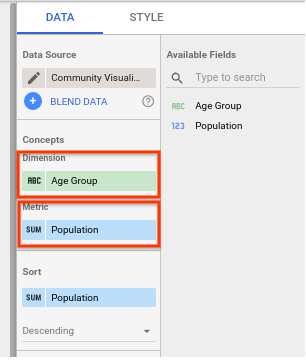
指定了一個樣式元素,因此系統會顯示標示為「Bar Color」的字型顏色選取器。在下一個步驟中,您將使用這個選取器來影響視覺化效果。

在本節中,您將使用顏色選取器樣式元素更新視覺化效果。
步驟 1: 將 myVizSource.js 檔案中的程式碼替換為下列程式碼。
myVizSource.js
function drawViz(data) {

  // set margins + canvas size
  const margin = { top: 10, bottom: 50, right: 10, left: 10 };
  const height = dscc.getHeight() - margin.top - margin.bottom;
  const width = dscc.getWidth() - margin.left - margin.right;

  // remove the svg if it already exists
  if (document.querySelector("svg")) {
    let oldSvg = document.querySelector("svg");
    oldSvg.parentNode.removeChild(oldSvg);
  }

  const svg = document.createElementNS("http://www.w3.org/2000/svg", "svg");
  svg.setAttribute("height", `${height}px`);
  svg.setAttribute("width", `${width}px`);

  const fillColor =  data.style.barColor.value
  ? data.style.barColor.value.color
  : data.style.barColor.defaultValue;

  const rect = document.createElementNS("http://www.w3.org/2000/svg", "rect");
  rect.setAttribute('width', `${width/2}px`);
  rect.setAttribute('height', `${height/2}px`);
  rect.style.fill =  fillColor;
  svg.append(rect);

  document.body.appendChild(svg);
}
// subscribe to data and style changes
dscc.subscribeToData(drawViz, { transform: dscc.objectTransform });
步驟 2: 建立合併的 JavaScript 檔案,然後將視覺化檔案重新上傳至 Google Cloud Storage。
步驟 3: 重新整理您測試社群視覺化效果的 Data Studio 報表。
您應該可以使用樣式選單中的選取器,變更矩形的顏色。

在本節中,您將更新視覺化效果,使用社群視覺化範例資料集中的資料繪製長條圖。注意:數據分析最多只會傳回 2,500 列資料,供圖表使用。
步驟 1: 將 myVizSource.js 檔案中的程式碼替換為下列程式碼。
myVizSource.js
function drawViz(data) {
  let rowData = data.tables.DEFAULT;

  // set margins + canvas size
  const margin = { top: 10, bottom: 50, right: 10, left: 10 };
  const padding = { top: 15, bottom: 15 };
  const height = dscc.getHeight() - margin.top - margin.bottom;
  const width = dscc.getWidth() - margin.left - margin.right;

  // remove the svg if it already exists
  if (document.querySelector("svg")) {
    let oldSvg = document.querySelector("svg");
    oldSvg.parentNode.removeChild(oldSvg);
  }

  const svg = document.createElementNS("http://www.w3.org/2000/svg", "svg");
  svg.setAttribute("height", `${height}px`);
  svg.setAttribute("width", `${width}px`);

  const fillColor =  data.style.barColor.value
  ? data.style.barColor.value.color
  : data.style.barColor.defaultValue;

  const maxBarHeight = height - padding.top - padding.bottom;
  const barWidth = width / (rowData.length * 2);

  // obtain the maximum bar metric value for scaling purposes
  let largestMetric = 0;

  rowData.forEach(function(row) {
    largestMetric = Math.max(largestMetric, row["barMetric"][0]);
  });

  rowData.forEach(function(row, i) {
    // 'barDimension' and 'barMetric' come from the id defined in myViz.json
    // 'dimId' is Data Studio's unique field ID, used for the filter interaction
    const barData = {
      dim: row["barDimension"][0],
      met: row["barMetric"][0],
      dimId: data.fields["barDimension"][0].id
    };

    // calculates the height of the bar using the row value, maximum bar
    // height, and the maximum metric value calculated earlier
    let barHeight = Math.round((barData["met"] * maxBarHeight) / largestMetric);

    // normalizes the x coordinate of the bar based on the width of the convas
    // and the width of the bar
    let barX = (width / rowData.length) * i + barWidth / 2;

    // create the "bar"
    let rect = document.createElementNS("http://www.w3.org/2000/svg", "rect");
    rect.setAttribute("x", barX);
    rect.setAttribute("y", maxBarHeight - barHeight);
    rect.setAttribute("width", barWidth);
    rect.setAttribute("height", barHeight);
    rect.setAttribute("data", JSON.stringify(barData));
    rect.style.fill = fillColor;
    svg.appendChild(rect);

    // add text labels
    let text = document.createElementNS("http://www.w3.org/2000/svg", "text");
    let textX = barX + barWidth / 2;
    text.setAttribute("x", textX);
    text.setAttribute("text-anchor", "middle");
    let textY = maxBarHeight + padding.top;
    text.setAttribute("y", textY);
    text.setAttribute("fill", fillColor)
    text.innerHTML = barData["dim"];

    svg.appendChild(text);
  });

  document.body.appendChild(svg);
}

// subscribe to data and style changes
dscc.subscribeToData(drawViz, { transform: dscc.objectTransform });
步驟 2: 建立合併的 JavaScript 檔案,然後將視覺化檔案重新上傳至 Google Cloud Storage。
步驟 3: 重新整理您測試社群視覺化效果的 Data Studio 報表。您應該會看到長條圖,其中包含根據 Google 試算表資料產生的標籤。如要變更長條的顏色,請在「樣式」「長條顏色」選取器中變更所選顏色。
在本節中,您將更新視覺化效果,使用社群視覺化範例資料集中的資料繪製長條圖。
步驟 1: 將 myVizSource.js 檔案中的程式碼替換為下列程式碼。
myVizSource.js
// create a title element
var titleElement = document.createElement('div');
titleElement.id = 'myVizTitle';
document.body.appendChild(titleElement);

function drawViz(data) {
  let rowData = data.tables.DEFAULT;

  // set margins + canvas size
  const margin = { top: 10, bottom: 50, right: 10, left: 10 };
  const padding = { top: 15, bottom: 15 };
  const height = dscc.getHeight() - margin.top - margin.bottom;
  const width = dscc.getWidth() - margin.left - margin.right;

  const fillColor =  data.style.barColor.value
  ? data.style.barColor.value.color
  : data.style.barColor.defaultValue;

  // remove the svg if it already exists
  if (document.querySelector("svg")) {
    let oldSvg = document.querySelector("svg");
    oldSvg.parentNode.removeChild(oldSvg);
  }

  const svg = document.createElementNS("http://www.w3.org/2000/svg", "svg");
  svg.setAttribute("height", `${height}px`);
  svg.setAttribute("width", `${width}px`);

  const maxBarHeight = height - padding.top - padding.bottom;
  const barWidth = width / (rowData.length * 2);

  // obtain the maximum bar metric value for scaling purposes
  let largestMetric = 0;

  rowData.forEach(function (row) {
    largestMetric = Math.max(largestMetric, row["barMetric"][0]);
  });

  rowData.forEach(function (row, i) {
    // 'barDimension' and 'barMetric' come from the id defined in myViz.json
    // 'dimId' is Data Studio's unique field ID, used for the filter interaction
    const barData = {
      dim: row["barDimension"][0],
      met: row["barMetric"][0],
      dimId: data.fields["barDimension"][0].id
    };

    // calculates the height of the bar using the row value, maximum bar
    // height, and the maximum metric value calculated earlier
    let barHeight = Math.round((barData["met"] * maxBarHeight) / largestMetric);

    // normalizes the x coordinate of the bar based on the width of the convas
    // and the width of the bar
    let barX = (width / rowData.length) * i + barWidth / 2;

    // create the "bar"
    let rect = document.createElementNS("http://www.w3.org/2000/svg", "rect");
    rect.setAttribute("x", barX);
    rect.setAttribute("y", maxBarHeight - barHeight);
    rect.setAttribute("width", barWidth);
    rect.setAttribute("height", barHeight);
    rect.setAttribute("data", JSON.stringify(barData));
    // use style selector from Data Studio
    rect.style.fill = fillColor;
    svg.appendChild(rect);

    // add text labels
    let text = document.createElementNS("http://www.w3.org/2000/svg", "text");
    let textX = barX + barWidth / 2;
    text.setAttribute("x", textX);
    text.setAttribute("text-anchor", "middle");
    let textY = maxBarHeight + padding.top;
    text.setAttribute("y", textY);
    text.setAttribute("fill", fillColor)
    text.innerHTML = barData["dim"];

    svg.appendChild(text);
  });

  document.body.appendChild(svg);

  // Get the human-readable name of the metric and dimension

  var metricName = data.fields['barMetric'][0].name;
  var dimensionName = data.fields['barDimension'][0].name;

  titleElement.innerText = metricName + ' by ' + dimensionName;

}

dscc.subscribeToData(drawViz, { transform: dscc.objectTransform });
步驟 2: 建立合併的 JavaScript 檔案,然後將視覺化檔案重新上傳至 Google Cloud Storage。
步驟 3: 重新整理您測試社群視覺化效果的 Data Studio 報表。您應該會看到長條圖,標題是根據資料產生,樣式則是使用 myViz.css 檔案設定。

恭喜!您已在數據分析中建立社群視覺化。本程式碼研究室到此結束。接著,我們來看看可以採取哪些後續步驟。
擴展視覺化效果
- 在視覺化內容中加入互動
- 瞭解如何在本機開發視覺化效果
- 進一步瞭解可用的樣式元素,並為資料檢視畫面新增其他樣式。
運用社群視覺呈現執行更多工作
- 請參閱 dscc 輔助程式庫、資訊清單和設定檔的參考資料。
- 將視覺化圖表提交至社群視覺化圖表展示。
- 為數據分析建立社群連接器 。
其他資源
下方提供各種資源,可協助您深入瞭解本程式碼研究室涵蓋的主題。
資源類型 | 使用者功能 | 開發人員功能 |
說明文件 | ||
最新消息與動態 | 在 Data Studio >「使用者設定」中註冊 | |
提問 | ||
影片 | 即將推出! | |
範例 |