
Accelerated Mobile Pages (AMP) is an open-source initiative that enables creation websites and ads that are consistently fast, beautiful, and high-performing.
If you're new to AMP, consider a quick overview with these resources:
Motivation
AMP supports rich, dynamic content with UI components like image carousels and lightboxes. AMP also supports some simple ways for one component to trigger an action in another component via AMP Actions.
However, what if I want to:
- Customize an AMP component?
- For example, display a custom label showing the current slide and total number of slides in an image carousel.
- Add stateful behaviors?
- For example, disable an "Add to cart" button if the user-selected quantity of product exceeds its current availability.
Previously, implementing features like those were difficult in AMP due to a lack of a robust communication channel between UI components and the inability to have mutable, shared state. We've built a powerful new component in AMP to solve these use cases.
<amp-bind>
<amp-bind> is a new AMP component that offers custom interactivity via data binding and JS-like expressions. This codelab will walk you through using <amp-bind> to build an AMP page with rich, custom interactivity.
What you will build
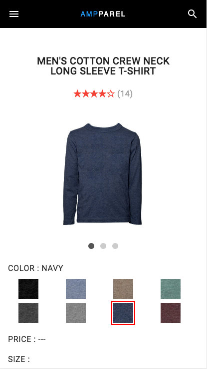
In this codelab, you'll build a ecommerce product detail page:
|
|
What you'll learn
- How to use data binding and expressions to build awesome, interactive AMP pages with
<amp-bind>!
What you'll need
- Browser of your choice
- Text editor of your choice
- Node.js and NPM
- The sample code
- Basic knowledge of HTML, CSS, and JavaScript
Download the code
First, get the download the starter code for the codelab either as a ZIP file:
Or via git:
git clone https://github.com/googlecodelabs/advanced-interactivity-in-amp.git
Install dependencies
Unzip the archive file (if necessary) and navigate into the directory. Install the dependencies by running npm install.
cd advanced-interactivity-in-amp-codelab
npm install
Run the development server
Start the development server with node.js:
node app.js
Navigate to http://localhost:3000 in your web browser to see the AMP page running!
AMP Boilerplate
An AMP page is an HTML page with some restrictions for reliable performance. AMP pages have a bit of special markup that identifies it as an AMP page to Google Search.
A barebones AMP page looks like this:
<!doctype html>
<html amp>
 <head>
   <meta charset="utf-8">
   <link rel="canonical" href="hello-world.html">
   <meta name="viewport" content="width=device-width,minimum-scale=1,initial-scale=1">
   <style amp-boilerplate>body{-webkit-animation:-amp-start 8s steps(1,end) 0s 1 normal both;-moz-animation:-amp-start 8s steps(1,end) 0s 1 normal both;-ms-animation:-amp-start 8s steps(1,end) 0s 1 normal both;animation:-amp-start 8s steps(1,end) 0s 1 normal both}@-webkit-keyframes -amp-start{from{visibility:hidden}to{visibility:visible}}@-moz-keyframes -amp-start{from{visibility:hidden}to{visibility:visible}}@-ms-keyframes -amp-start{from{visibility:hidden}to{visibility:visible}}@-o-keyframes -amp-start{from{visibility:hidden}to{visibility:visible}}@keyframes -amp-start{from{visibility:hidden}to{visibility:visible}}</style><noscript><style amp-boilerplate>body{-webkit-animation:none;-moz-animation:none;-ms-animation:none;animation:none}</style></noscript>
   <script async src="https://cdn.ampproject.org/v0.js"></script>
 </head>
 <body>Hello World!</body>
</html>
AMP Components
Our starter code (static/index.html) builds off the barebones AMP page with its page content (images, text, etc.) as well as the inclusion of a few AMP components:
<script async custom-element="amp-carousel" src="https://cdn.ampproject.org/v0/amp-carousel-0.1.js"></script>
<script async custom-template="amp-mustache" src="https://cdn.ampproject.org/v0/amp-mustache-0.1.js"></script>
<script async custom-element="amp-form" src="https://cdn.ampproject.org/v0/amp-form-0.1.js"></script>
<script async custom-element="amp-selector" src="https://cdn.ampproject.org/v0/amp-selector-0.1.js"></script>
AMP components offer additional functionality and UI components that add rich interactivity to AMP pages. The starter code uses the following AMP components:
<amp-carousel>- An image carousel that displays multiple views of the product.
<amp-mustache>- A templating system for rendering server responses from amp-form.
<amp-form>- Adds special functionality for
<form>elements that are necessary for AMP pages. <amp-selector>- Offers a semantic way to select one or many elements of a group of elements. Can be used as an input source to amp-form.
Basic interactivity
The starter code offers some basic interactivity:
- The image carousel (an
<amp-carousel>) displays multiple views of the product. - The product can be added to the user's cart (via
<amp-form>) by tapping the "Add to cart" button on the bottom of the page.
Try swiping the image carousel and tapping the "Add to cart" button.
Improve the experience
The starter code provides a pretty bare user experience. There are a couple ways we can improve it:
- Add an indicator that displays the current slide and total number of slides.
- When a user selects a different shirt color, change the image carousel to show images of shirts in the selected color.
Prior to the introduction of the <amp-bind> component, adding features like these weren't possible. Let's get a hands-on experience with <amp-bind> and add these new features to our sample code!
Install the <amp-bind> extension
<amp-bind> is a new AMP component that affords custom interactivity via data binding and JS-like expressions. To use <amp-bind>, you must install it in the page.
Open the static/index.html file and add the following script to the list of AMP components in the <head> section of the page:
<script async custom-element="amp-bind"
    src="https://cdn.ampproject.org/v0/amp-bind-0.1.js"></script>
Add a slide indicator
<amp-bind> works by binding element attributes to custom expressions. These expressions can reference the "state" (mutable JSON data). We can initialize this state through the <amp-state> component included with <amp-bind>.
Let's initialize a state variable to keep track of the index of the currently displayed slide in the image carousel. Open static/index.html and add the following to the top of the <body> of the page (before the header):
<amp-state id="selected">
  <script type="application/json">
    {
      "slide": 0
    }
  </script>
</amp-state>
The data within <amp-state> elements are accessible by their associated ID. For example, we can refer to this variable by the following expression fragment:
selected.slide // Evaluates to 0.Next, let's update this variable when the user changes slides on the carousel by adding a "on" action to the existing <amp-carousel> element:
<amp-carousel type="slides" layout="fixed-height" height=250 id="carousel"
    on="slideChange:AMP.setState({selected: {slide: event.index}})">
Now, whenever the <amp-carousel>'s displayed slide changes, the action AMP.setState will be called with the following argument:
{
  selected: {
    slide: event.index
  }
}
The event.index expression evaluates to the new slide index, and the AMP.setState() action merges this object literal into the current state. This replaces the current value of selected.slide with the value of event.index.
Next, let's make use of this state variable that tracks the currently displayed slide, and create a slide indicator. Find the slide indicator element (look for <!-- TODO: "Add a slide indicator" -->) and add the following bindings to its children:
<!-- TODO: "Add a slide indicator" -->
<p class="dots">
  <!-- The <span> element corresponding to the current displayed slide
       will have the 'current' CSS class. -->
  <span [class]="selected.slide == 0 ? 'current' : ''" class="current"></span>
  <span [class]="selected.slide == 1 ? 'current' : ''"></span>
  <span [class]="selected.slide == 2 ? 'current' : ''"></span>
</p>
[class] is a binding that changes the class attribute and you can use it to add or remove CSS classes from any element.
Now, refresh the page and try it out! By changing the slide on the carousel, it:
- Triggers the
slideChangeevent... - Which calls the
AMP.setStateaction... - Which updates the state variable
selected.slide... - Which updates the
[class]binding on the indicator<span>elements!
Nice! Now we have a working slide indicator.
Changing the images in <amp-carousel>
It would be nice if we could see images of different shirt colors when we change the selected color. With amp-bind we can do this by binding [src] on the <amp-img> elements within the <amp-carousel>.
First, however, we need to initialize the state data with the image source URLs of each color shirt. Let's do this with a new <amp-state> element:
<!-- Available shirts. Maps unique string identifier to color and image URL string. -->
<amp-state id="shirts">
  <script type="application/json">
    {
      "1001": {
        "color": "black",
        "image": "./shirts/black.jpg"
      },
      "1002": {
        "color": "blue",
        "image": "./shirts/blue.jpg"
      },
      "1010": {
        "color": "brown",
        "image": "./shirts/brown.jpg"
      },
      "1014": {
        "color": "dark green",
        "image": "./shirts/dark-green.jpg"
      },
      "1015": {
        "color": "gray",
        "image": "./shirts/gray.jpg"
      },
      "1016": {
        "color": "light gray",
        "image": "./shirts/light-gray.jpg"
      },
      "1021": {
        "color": "navy",
        "image": "./shirts/navy.jpg"
      },
      "1030": {
        "color": "wine",
        "image": "./shirts/wine.jpg"
      }
    }
  </script>
</amp-state>
This <amp-state> element contains a JSON object that maps a shirt identifier string (i.e., a SKU) to the color and image URL of the corresponding shirt. A JSON array would also work here, but using an object allows us to do some more cool stuff that you'll see soon.
Now, we can access the image URL via a shirt's identifier. For example, shirts['10014'].color evaluates to "dark green" and shirts['10030'].image returns the image URL for the "wine" shirt color.
If we add another state variable that tracks the selected SKU, we can bind an expression to the <amp-img> elements to update their src attributes when the selected SKU changes. Add a new sku key to the existing amp-state#selected element's JSON:
<amp-state id="selected">
  <script type="application/json">
    {
      "slide": 0,
      "sku": "1001"
    }
  </script>
</amp-state>
Add an "on" action to the <amp-selector> that updates the selected.sku variable whenever a new color is selected:
<amp-selector name="color"
on="select:AMP.setState({selected: {sku: event.targetOption}})">Then, add bindings to the <amp-img> elements inside the <amp-carousel> (look for <!-- TODO: "Changing images in amp-carousel-->"):
<!-- Update the `src` of each <amp-img> when the `selected.sku` variable changes. -->
<amp-img width=200 height=250 src="./shirts/black.jpg"
    [src]="shirts[selected.sku].image"></amp-img>
<amp-img width=300 height=375 src="./shirts/black.jpg"
    [src]="shirts[selected.sku].image"></amp-img>
<amp-img width=400 height=500 src="./shirts/black.jpg"
    [src]="shirts[selected.sku].image"></amp-img>
Note: In practice, each image in the carousel would likely have a different src. This could be done by replacing the single image with an array of images. For simplicity, this codelab uses a single image at different magnifications.
Now, refresh the page and select a different color for a shirt. When you do, the carousel's images are updated to show shirts of the selected color.
What if your bindable data is too large or complex to retrieve at page load? Or what if each SKU has a price that takes a long time to look up? Looking up prices for SKUs for non-viewed items is wasted work.
Fetching available sizes for a shirt
Let's make use of the ability to fetch remote data to look up prices of SKUs on our codelab sample. Our Express.js development server in app.js already has an endpoint /shirts/sizes?shirt=<sku> which, given a shirt SKU, returns the available sizes and price for each size. It sends the response with an artificial delay of one second to simulate network latency.
Request | Response |
|
|
Similar to the JSON data within <amp-state> elements, the remote data returned from these fetches are merged into and available under the element's id attribute. For example, the data returned from the example response above can be accessed in an expression:
Expression | Result |
|
|
Now, let's apply this to our e-commerce example. First let's fetch this shirt data when a new SKU is selected. Add a [src] binding to our amp-state#shirts element:
<!-- When `selected.sku` changes, update the `src` attribute and fetch
     JSON at the new URL. Then, merge that data under `id` ("shirts"). -->
<amp-state id="shirts" [src]="'/shirts/sizesAndPrices?sku=' + selected.sku">
Next, let's clearly mark unavailable sizes as such for a given SKU. The "unavailable" CSS class adds a diagonal line through an element -- we can add it to the elements within amp-selector[name="size"] corresponding to unavailable sizes:
<amp-selector name="size">
  <table>
    <tr>
      <!-- If 'XS' size is available for selected SKU, return empty string.
           Otherwise, return 'unavailable'. -->
      <td [class]="shirts[selected.sku].sizes['XS'] ? '' : 'unavailable'">
        <div option="XS">XS</div>
      </td>
      <td [class]="shirts[selected.sku].sizes['S'] ? '' : 'unavailable'">
        <div option="S">S</div>
      </td>
      <td [class]="shirts[selected.sku].sizes['M'] ? '' : 'unavailable'">
        <div option="M">M</div>
      </td>
      <td [class]="shirts[selected.sku].sizes['L'] ? '' : 'unavailable'">
        <div option="L">L</div>
      </td>
      <td [class]="shirts[selected.sku].sizes['XL'] ? '' : 'unavailable'">
        <div option="XL">XL</div>
      </td>
    </tr>
  </table>
</amp-selector>
Now reload the page and try it out. Selecting a new SKU (shirt color) will cause unavailable sizes to be crossed-out (after a short delay).
There's a small problem though -- what about the black shirt, the default selected color? We'll need to add the size and price data of the black shirt to amp-state#shirts...
<amp-state id="shirts" [src]="'/shirts/sizesAndPrices?sku=' + selected.sku">
  <script type="application/json">
    {
      "1001": {
        "color": "black",
        "image": "./shirts/black.jpg",
        "sizes": {
          "XS": 8.99,
          "S": 9.99
        }
      },
<!-- ... -->
...as well as update the default state of relevant elements.
<amp-selector name="size">
  <table>
    <tr>
      <!-- If 'XS' size is available for selected SKU, return empty string.
           Otherwise, return 'unavailable'. -->
      <td [class]="shirts[selected.sku].sizes['XS'] ? '' : 'unavailable'">
        <div option="XS">XS</div>
      </td>
      <td [class]="shirts[selected.sku].sizes['S'] ? '' : 'unavailable'">
        <div option="S">S</div>
      </td>
      <!-- Add the ‘unavailable' class to the next three <td> elements
           to be consistent with the available sizes of the default SKU. -->
      <td class="unavailable"
          [class]="shirts[selected.sku].sizes['M'] ? '' : 'unavailable'">
        <div option="M">M</div>
      </td>
      <td class="unavailable"
          [class]="shirts[selected.sku].sizes['L'] ? '' : 'unavailable'">
        <div option="L">L</div>
      </td>
      <td class="unavailable"
          [class]="shirts[selected.sku].sizes['XL'] ? '' : 'unavailable'">
        <div option="XL">XL</div>
      </td>
    </tr>
  </table>
</amp-selector>Variable shirt prices
Now that we correctly display the available sizes, let's make sure the correct price is also displayed.
Our AMPPAREL store is peculiar in that shirt price is specific to both color AND size. That means we need a new variable to track the user-selected size. Add a new action to our size <amp-selector> element:
<!-- When an element is selected, set the `selectedSize` variable to the
     value of the "option" attribute of the selected element.  -->
<amp-selector name="size"
    on="select:AMP.setState({selectedSize: event.targetOption})">
Note that we're not initializing the value of selectedSize via the amp-state#selected element. That's because we intentionally don't provide a default selected size and instead want to force the user to choose a size.
Add a new <span> element wrapping the price label and change the default text to "---" since there's no default size selection.
<h6>PRICE :
  <!-- Display the price of the selected shirt in the selected size if available.
       Otherwise, display the placeholder text '---'. -->
  <span [text]="shirts[selected.sku].sizes[selectedSize] || '---'">---</span>
</h6>
And we have correct prices! Try it out.
Conditionally enabled button
We're almost done! Now let's disable the "Add to cart" button when the selected size is unavailable:
<!-- Disable the "ADD TO CART" button when:
     1. There is no selected size, OR
     2. The available sizes for the selected SKU haven't been fetched yet
-->
<input type="submit" value="ADD TO CART" disabled
    class="mdl-button mdl-button--raised mdl-button--accent"
    [disabled]="!selectedSize || !shirts[selected.sku].sizes[selectedSize]">
We have an interactive e-commerce product detail page with variable sizes and prices for each SKU, fetched on-demand from a remote JSON endpoint.
If you got stuck, see static/final.html for the complete solution.
We hope this codelab shows you the power and flexibility of building interactive AMP pages with <amp-bind>. For more information, check out the <amp-bind> documentation.
We love to receive feedback -- please send us your feature requests, suggestions or bug reports. If you're interested in testing out <amp-bind> with real users, consider applying for an origin trial.
We're excited to launch <amp-bind> soon and see what you can build with it!