Google Wallet offers powerful tools to customize the appearance and layout of any pass, from Event Tickets and Boarding Passes to Loyalty and Gift Cards. This guide provides a comprehensive overview of how you can tailor the user experience by defining the structure of the card and displaying dynamic, user-specific information.
Before you begin, be sure to consult the specific REST API reference documentation for your pass type to see a full list of available fields.
The Foundation: cardTemplateOverride
The primary tool for customizing the layout of a pass is the classTemplateInfo.cardTemplateOverride object, which you define in the pass's Class resource (e.g., EventTicketClass, LoyaltyClass). This object lets you to structure the pass by defining rows and the items within them, giving you control over how information is presented.
You can reference data from both the Class resource (for information shared across all users) and the Object resource (for user-specific details).
1. Customizing with Predefined Wallet Fields
Predefined fields are the standard properties available in the Google Wallet API for a specific pass type. These fields have specific names and are rendered by Wallet in a consistent way. Examples include a barcode, an event name, a flight number, or a gift card balance.
By referencing the fieldPath of these predefined fields, you can arrange them anywhere on your pass.
Example: Displaying Barcode and Pass-Specific Details
This pass example has a "Top row" and 3 data fields inside the 2nd row. The first item displays the user's specific values from the Object like points or seat number specific to the user. The second item displays the details from the Class like an event name or loyalty program tier, and the third again displays the user's specific values from the Object like secondary point or section / coach number.

Class Definition:
...
"classTemplateInfo": {
      "cardTemplateOverride": {
        "cardRowTemplateInfos": [
          {
            "threeItems": {
              "startItem": {
                "firstValue": {
                  "fields": [
                    {
                     "fieldPath": "object.loyaltyPoints.label",
                     "fieldPath": "object.loyaltyPoints.balance",
                    }
                  ]
                }
              },
              "middleItem": {
                "firstValue": {
                  "fields": [
                    {
                      "fieldPath": "class.rewardsTierLabel",
                      "fieldPath": "class.rewardsTier",
                    }
                  ]
                }
              },
              "endItem": {
                "firstValue": {
                  "fields": [
                    {
                     "fieldPath": "object.secondaryLoyaltyPoints.label",
                     "fieldPath": "object.secondaryLoyaltyPoints.balance",
                    }
                  ]
                }
              }
            }
          },
        ]
      }
    }
...
"rewardsTier": "Gold",
"rewardsTierLabel": "Tier",
...
Object Definition
...
"loyaltyPoints": {
    "balance": {
        "string": "1500"
    },
    "label": "Points"
},
"secondaryLoyaltyPoints" : {
    "balance": {
        "money": {
            "micros" : "28250000",
            "currencyCode": "USD",
        }
    },
    "label": "Balance"
}
...
Format Date and Time Fields
For any date or time field in supported passes, you can specify a custom format using the dateFormat property. This lets you to control how the date is displayed on the pass, such as showing only the time, the full date and time, or just the date. If dateFormat is not specified, a default format will be used.
"fields": [
  {
    "fieldPath": "object.validTimeInterval.start.date",
    "dateFormat": "DATE_ONLY"
  }
]
For a complete list of available formats, see the DateFormat documentation.
2. Customizing with Developer-Defined Fields
For ultimate flexibility, Google Wallet lets you to create your own custom data fields using textModulesData. This is perfect for displaying unique information that doesn't fit into the predefined fields, such as custom short notes, member benefits, or location-specific details.
You define a textModulesData item with a unique id in the Object or Class, and then reference that id in the cardTemplateOverride.
Structure Card Rows
You can design a pass with one, two, or three data items per pass, allowing you to organize information logically. There's no hard limit to the number of rows you can add, but for a clean user experience, consider what is most important to display on the card face.
- Best Practice: For supplementary information, use the pass details view or other Wallet features like
messages,linksModuleData, orlinkedOfferIds. This keeps the main pass view uncluttered.
Example: A Three-Item Row with Custom Data
Create a row to display custom details. For a loyalty card, this could be points, tier, and balance. For an event ticket, it could be "Section," "Row," and "Seat."

Class Definition:
The cardTemplateOverride references three unique IDs: detail1, detail2, and detail3.
...
"classTemplateInfo": {
      "cardTemplateOverride": {
        "cardRowTemplateInfos": [
        {
            "oneItem": {
              "item": {
                "firstValue": {
                  "fields": [
                    {
                      "fieldPath": "object.accountName",
                    }
                  ]
                }
              }
            }
          },
          {
            "threeItems": {
              "startItem": {
                "firstValue": {
                  "fields": [
                    {
                     "fieldPath": "object.loyaltyPoints.label",
                     "fieldPath": "object.loyaltyPoints.balance",
                    }
                  ]
                }
              },
              "middleItem": {
                "firstValue": {
                  "fields": [
                    {
                      "fieldPath": "class.rewardsTierLabel",
                      "fieldPath": "class.rewardsTier",
                    }
                  ]
                }
              },
              "endItem": {
                "firstValue": {
                  "fields": [
                    {
                     "fieldPath": "object.secondaryLoyaltyPoints.label",
                     "fieldPath": "object.secondaryLoyaltyPoints.balance",
                    }
                  ]
                }
              }
            }
          },
          {
            "threeItems": {
              "startItem": {
                "firstValue": {
                  "fields": [
                    {
                      "fieldPath": "object.textModulesData['row1left']",
                    }
                  ]
                }
              },
              "middleItem": {
                "firstValue": {
                  "fields": [
                    {
                      "fieldPath": "object.textModulesData['row1mid']"
                    }
                  ]
                }
              },
              "endItem": {
                "firstValue": {
                  "fields": [
                    {
                      "fieldPath": "object.textModulesData['row1right']"
                    }
                  ]
                }
              }
            }
          },
          {
            "twoItems": {
              "startItem": {
                "firstValue": {
                  "fields": [
                    {
                     "fieldPath": "object.textModulesData['mem_since']",
                    }
                  ]
                }
              },
              "endItem": {
                "firstValue": {
                  "fields": [
                    {
                     "fieldPath": "object.textModulesData['park']",
                    }
                  ]
                }
              }
            }
          },
        ]
      }
    }
...
"rewardsTier": "Gold",
"rewardsTierLabel": "Tier",
Object Definition:
The Object provides the data and corresponding IDs for each field.
...
"accountName": "Lorenaisabel Aliwarringlen",
"loyaltyPoints": {
    "balance": {
        "string": "1500"
    },
    "label": "Points"
},
"secondaryLoyaltyPoints" : {
    "balance": {
        "money": {
            "micros" : "28250000",
            "currencyCode": "USD",
        }
    },
    "label": "Balance"
},
"textModulesData": [
{
    "header": "Visits",
    "body": "17",
    "id": "row1left"
  },
  {
    "header": "Rides",
    "body": "259",
    "id": "row1mid"
  },
  {
    "header": "Park hours",
    "body": "140",
    "id": "row1right"
  },
  {
    "header": "Member since",
    "body": "Mar 01, 2017",
    "id": "mem_since"
  },
  {
    "header": "Parking",
    "body": "Included (Free)",
    "id": "park"
  }
]
...
Class versus Object Data for Variations
You can combine class-level and object-level data to create dynamic, personalized passes. This is useful for creating different versions of the same pass.
- Class-level
textModulesData: Use this for details that are the same for a group of users (e.g., a "Welcome to VIP" message for all VIP ticket holders). - Object-level
textModulesData: Use this for details specific to one user (e.g., "Jane, your seat has a restricted view").
Example: Displaying Tier-Specific Passes
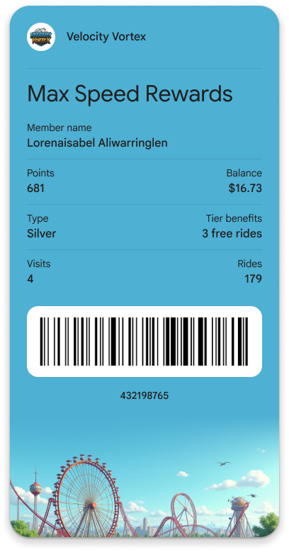
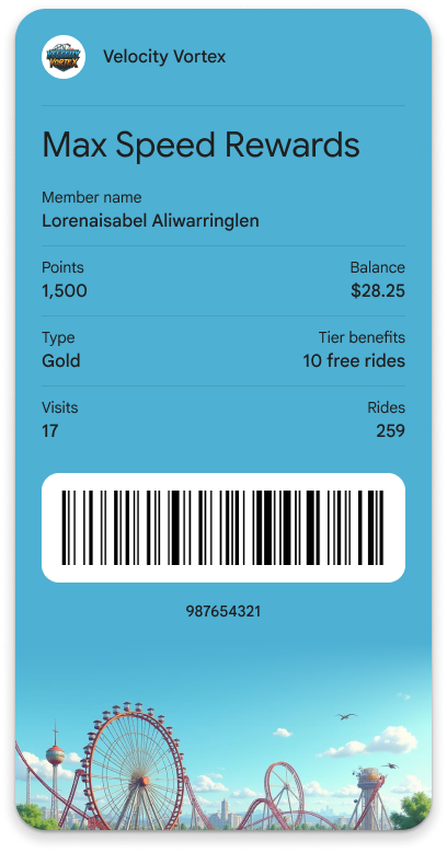
You can create different Class resources for different pass variations, such as "General Admission" versus "VIP" for an event, or "Economy" versus "Business" for a flight. Each class can have a unique design (hero image, color) and default text.
 |
 |
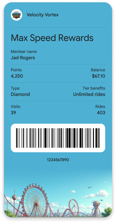 |
| Member starting with Silver | Member upgraded to Gold | Another Member in Diamond Tier |
Content in the Pass Details View
Fields from linksModuleData, imageModulesData are not rendered on the front of the pass when referenced in cardTemplateOverride. This content is automatically displayed in the Pass Details view (the "back of the pass"), providing users with better access to customer service links, promotional images, terms and conditions, and other supplementary information.
3. Beyond the Card Face: Other Template Overrides
The classTemplateInfo object offers more than just cardTemplateOverride. You can customize other parts of the Google Wallet experience to provide a richer and more intuitive presentation of your passes.
For full details on all available overrides, refer to the ClassTemplateInfo reference documentation.
listTemplateOverride: Customizes the row layout in the main list view of the Google Wallet app, allowing you to highlight the most important fields before a user even opens their pass.detailsTemplateOverride: Structures the rows and layout of the "Pass details" view (the back of the pass), giving you a flexible space for supplementary information, links, and text.cardBarcodeSectionDetails: Lets you customize the barcode section on the pass.