Page Summary
-
Google Wallet buttons are available in various formats and languages for adding and viewing passes, with "Save to phone" buttons specifically for Russia.
-
Button design guidelines emphasize minimum size, clear space, and localization, with placement recommendations across different platforms.
-
Logo and image guidelines specify preferred file types, sizes, and aspect ratios for optimal display within Google Wallet passes.
-
Passes can incorporate modules for displaying user information, links, and text, with specific formatting and content policies to follow.
-
Partner platforms can integrate their deep links or website URIs within passes to facilitate user navigation and engagement.
If you're developing for users in RU, please use the “Save to phone” buttons as Google Wallet isn't live in these countries. Please see the relevant assets and guidelines. If you are developing for users outside of RU, please update your Add to Google Wallet button by downloading the assets below.
This section of the documentation is designed to help you create images and other user interface elements so that they look great in the Google Wallet app.
Assets
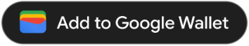
Add to Google Wallet button
The Add to Google Wallet button is used whenever you are directing users to save a pass or card from your app or website to their wallet. The Add to Google Wallet button must call one of the Google Wallet API flows. These flows surface the Google Wallet app where users can follow the instructions to save passes to their Android device and their Google Account. This button can be used in apps, websites or emails.
Add to Google Wallet buttons are available in Android XML, SVG, and PNG format.
Download assets - Android XML Download assets - SVG Download assets - PNGView in Google Wallet button
The View in Google Wallet button is used to deep link a user to their wallet to view a previously saved pass or card. This button can be used in apps, websites or emails.
View in Google Wallet buttons are available in SVG and PNG format.
Download assets - SVG Download assets - PNGAll buttons displayed on your site, app, or email communications must adhere to the brand guidelines outlined on this page. Examples of these guidelines include but aren't limited to, the following:
- Size relative to other similar buttons or elements of the page
- Shape and color of buttons must not be altered
- Clear space
Localized buttons
Localized Google Wallet buttons are provided for all markets where Wallet is available. If you're developing for users in these markets, always use the buttons linked above. Do not create your own version of the buttons. If a localized version of the button is not available in your market, use the English version of the button.
Add to Google Wallet buttons are available in the Albanian, Arabic, Armenian, Azerbaijan, Bosnian, Bulgarian, Catalan, Chinese (Hong Kong), Chinese (Traditional), Croatian, Czech, Danish, Dutch, English (India, Singapore, South Africa, Australia, Canada, Great Britain, United States), Estonian, Filipino, Finnish, French (Canada), French (France), Georgian, German, Greek, Hebrew, Hungarian, Icelandic, Indonesian, Italian, Japanese, Kazakh, Kyrgyz, Latvian, Lithuanian, Macedonian, Malay, Norwegian, Polish, Portuguese (Brazil), Portuguese (Portugal), Romanian, Russian (Belarus), Serbian, Slovak, Slovenian, Spanish (Latin America), Spanish (Spain), Swedish, Thai, Turkish, Ukrainian, Uzbek, and Vietnamese languages.
Localized name
For user clarity, the Google Wallet product name is localized in select markets. If you're developing for users in these countries, always use the localized name below for web, email, and print. Do not create your own localized version of “Google Wallet.” If your market isn't listed below, use “Google Wallet” in English.
| Country | Name |
|---|---|
| Belarus | Google Кошелек |
| Brazil | Carteira do Google |
| Chile | Billetera de Google |
| Czechia | Peněženka Google |
| Greece | Πορτοφόλι Google |
| Hong Kong | Google 錢包 |
| Lithuania | Google Piniginė |
| Poland | Portfel Google |
| Portugal | Carteira da Google |
| Romania | Portofel Google |
| Slovakia | Peňaženka Google |
| Taiwan | Google 錢包 |
| Turkey | Google Cüzdan |
| UAE | محفظة Google |
| Ukraine | Google Гаманець |
|
United States (Spanish)
*Use this name in the US if your UI is in Spanish |
Billetera de Google |
Size
Adjust the height and width of the Add to Google Wallet button to fit your layout. If there are other buttons on the page, the Add to Google Wallet button needs to be equal or larger in size. Don't make the Add to Google Wallet button smaller than other buttons.
Style
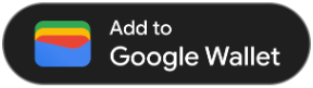
Add to Google Wallet buttons are available in two variations: primary and condensed. The Add to Google Wallet button only comes in black. Localized versions of the button are provided. Do not create buttons with your own localized text.
| Primary | Condensed |
|---|---|
|
|
| Use the primary button on white and light backgrounds. | Use the condensed button if there is not enough space for the primary or full-width. |
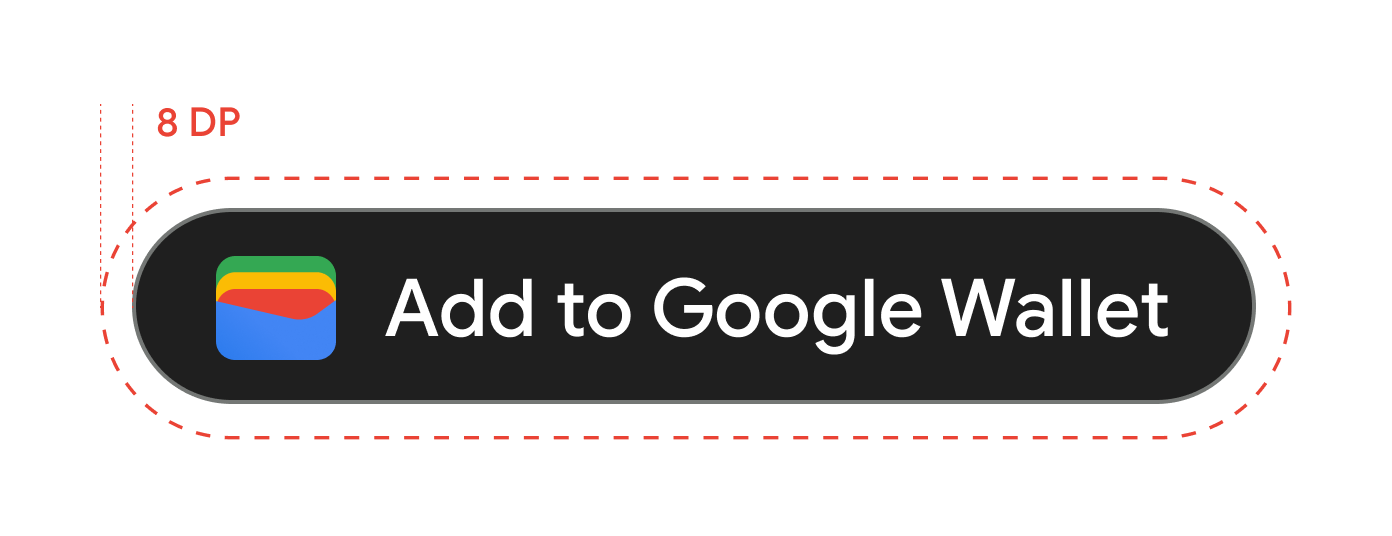
Clear space
Always maintain the minimum clear space of 8 dp on all sides of the Add to Google Wallet button. Ensure that the clear space is never broken with graphics or text.
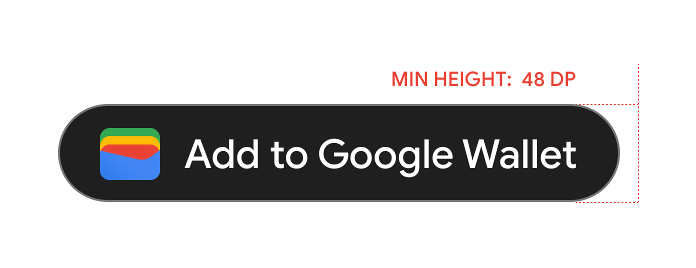
Minimum height
All Add to Google Wallet buttons need to have a minimum height of 48 dp.
Dos and don'ts
| Dos | Don'ts |
|---|---|
| Do: Use only the Add to Google Wallet buttons provided by Google. | Don't: Create your own Add to Google Wallet buttons or alter the font, color, button radius, or padding within the button in any way. |
| Do: Use the same style of button throughout your site. | Don't: Make the Add to Google Wallet buttons smaller than other buttons. |
| Do: Ensure that the size of the Add to Google Wallet buttons remain equal to or larger than other buttons. | Don't: Alter the button color. |
| Do: Keep the button ratio the same when resizing the Add to Google Wallet buttons. | Don't: Free-scale the button. |
| Do: Use the provided localized version of the buttons. | Don't: Create your own localized version of the button. |
Best practices for button placement
Display the Add to Google Wallet button on confirmation app screens, web pages, or emails. Refer to the following best practices to guide your UI design.
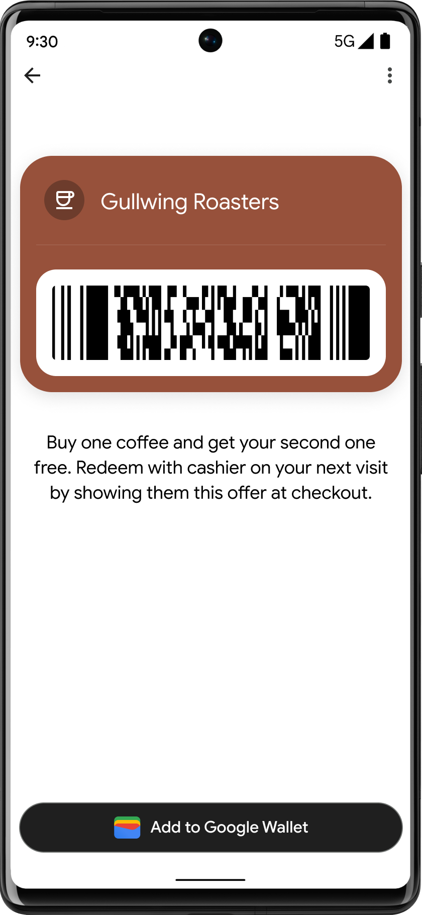
Loyalty, Gift cards, Offers
Display the Add to Google Wallet button on confirmation screens. You can also display the button on your website or app, or include it in relevant emails.
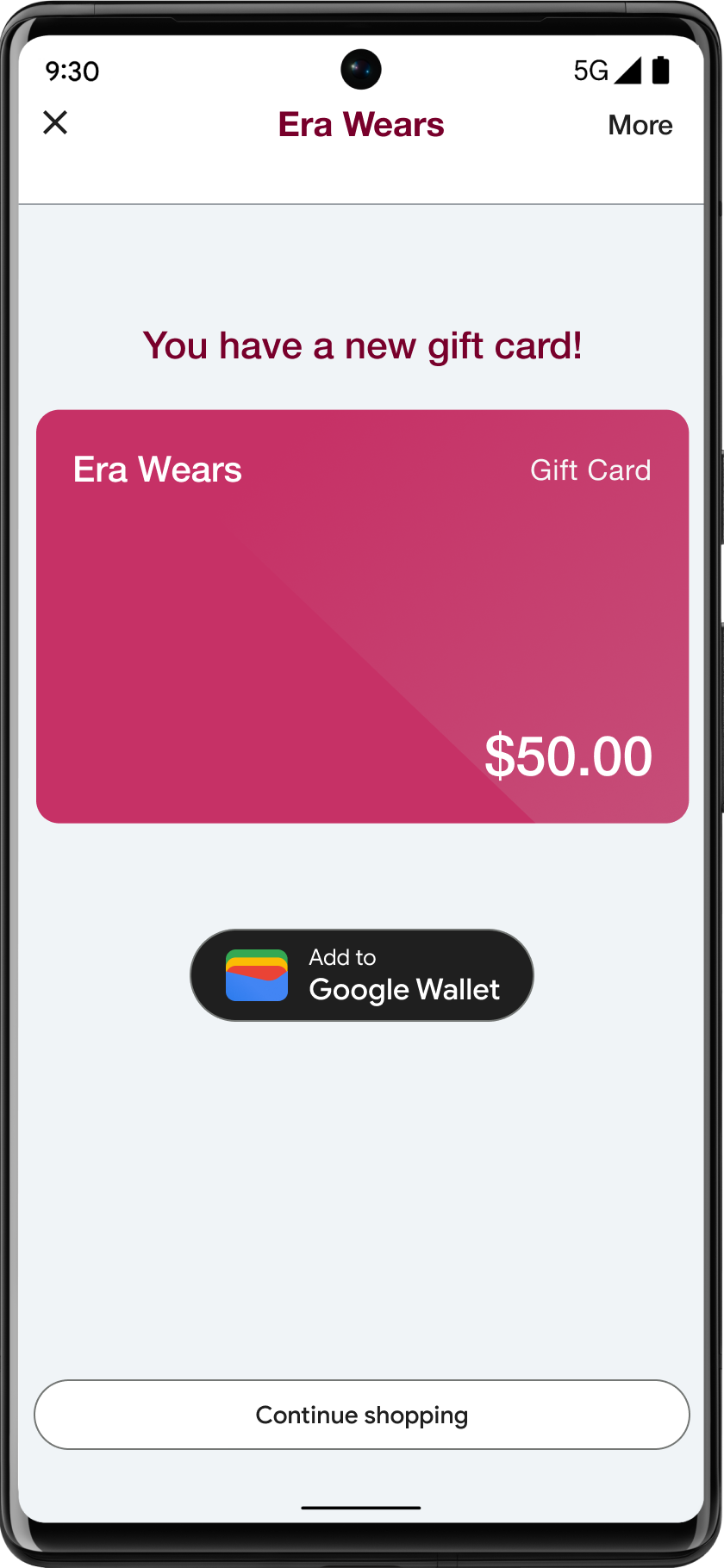
Use of the Google Wallet product name in text
You can use text to indicate to the user that their gift card is saved to their device.
Capitalize the letters "G" and "W"
Always use an uppercase "G" and an uppercase "W" followed by lowercase letters to refer to Google Wallet. Don't capitalize the full name "Google Wallet" unless it's to match the typographic style in your UI.
Don't abbreviate Google Wallet
Always write out the words "Google" and "Wallet."
Match the style in your UI
Set "Google Wallet" in the same font and typographic style as the rest of the text in your UI. Don't mimic Google's typographic style.
Always use the localized version of "Google Wallet"
Always write "Google Wallet" in the provided localized copy.
Design
Use the height and size fields of the
g:savetoandroidpay HTML tag to modify the height and width of the
Add to Google Wallet buttons. Use the
textsize=large specification to dramatically increase text and
button sizes for mobile implementations or cases with special UI requirements.
Use the theme to set the color of the buttons. The following
table shows how these settings affect the
Add to Google Wallet button.
Pass Creation Guidelines
To ensure your passes look great and function well, please adhere to the following guidelines for character limits, notifications, background colors, and hero images.
Card Background Color
You can set the background color with the field
hexBackgroundColor. If you don't set the value, an algorithm
analyzes the logo, finds the dominant color, and uses it for the background
color.
Avoid high-saturation "Vibrant" zones (for example, neon green #00FF00 or electric cyan #00FFFF). These colors create intense eye strain and cause text to "bleed" or vanish into the background. Use one of the recommended colors instead.
Recommended colors
#1a1a1a
#677088
#e8eaed
#f8f9fa
#ffffff
#d6322d
#f78f48
#f9bb2d
#1e7e3b
#216acf
#9147df
#fce8e6
#e6fffa
#e8f0fe
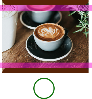
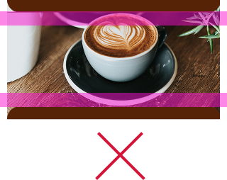
Hero images
The class.heroImage field appears as a full-width image under
the data fields of your pass.
Consider adding an image if you don’t have one already. If you do have an image, make sure to follow the specifications below. If you don’t select an image, we will show a fallback image of the pass category.
The following is a list of user interface recommendations for hero images:
| Guideline | Description | ||||||||
|---|---|---|---|---|---|---|---|---|---|
| Preferred file type | PNG. If you want the background color of the pass to show through, use a transparent PNG. | ||||||||
| Recommended size | 1032x812 px | ||||||||
| Aspect ratio | 1032:812 (approximately 5:4) | ||||||||
| Dos and don'ts |
|
Content
Titles, subtitles, field labels, & field data: To increase user comprehension, keep titles and other fields as short as possible. The following character limits apply to English, but these will be translated into other languages resulting in a varied user experience across devices and regions. When in doubt, simplify content while still conveying key details.
| Field | Limit |
|---|---|
| Title label | < 47 characters |
| Subtitle label | < 88 characters |
| Field/title label (e.g. Date, Description, Class, Passenger name) | < 20 characters |
| Field data label (e.g. Oct 19, 2026, Economy Plus) | < 15 characters |
To ensure legibility, limit data to two fields per row, and up to 3 rows if possible.
Notifications
| Field | Limit |
|---|---|
| Title | < 29 characters |
| Collapsed body | < 40 characters |
| Expanded body | < 80 characters |
Adherence to character limits is recommended to prevent truncation for users with small devices or increased font sizes. Refer to Notifications | Mobile | Android Developers for more information.
Logos
Logo image guidelines
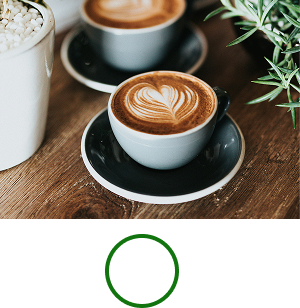
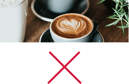
Google Wallet masks your logo into a circular shape.
The following is a list of user interface recommendations for logo images:| Guideline | Description |
|---|---|
| Preferred file type | PNG |
| Minimum size | 660 px by 660 px |
| Image aspect ratio | 1:1 |
| Artwork aspect ratio | 1:1 |
| Actual pixel size | Scale to device size |
| Logo circular mask |
Your logo is masked to fit within a circular design. Ensure that your logo fits within the Safe Area. Don't pre-mask your logo. Leave the logo in a square with a full bleed background color. The logo needs to have a 15% margin so that it isn't cut off when masked. 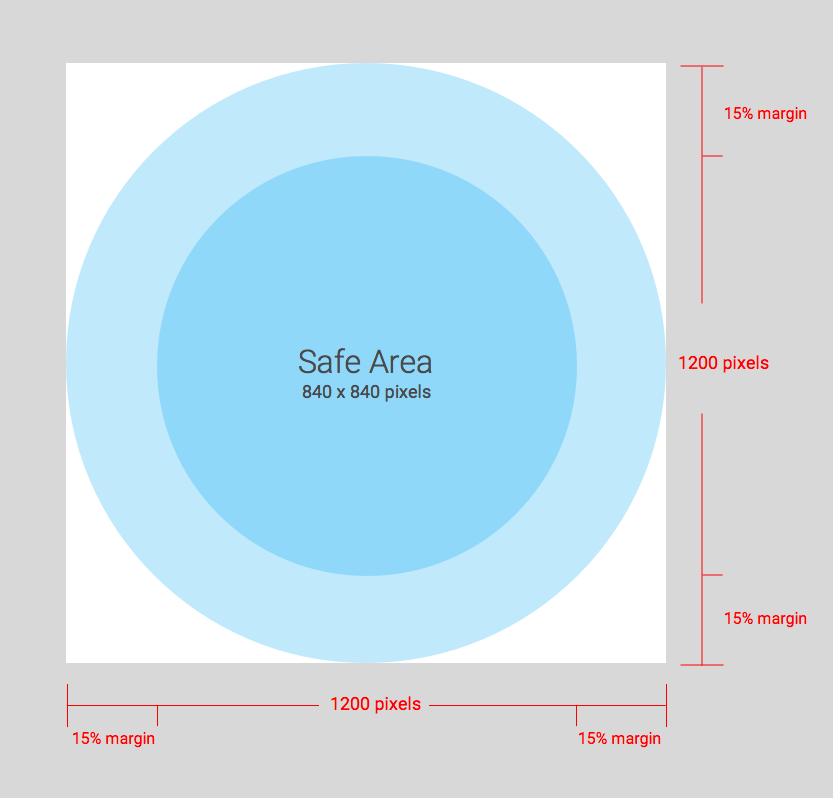
|
Google Wallet masks your logo into a circular shape.
Wide logo image guidelines
Wide logo images are supported by event tickets, boarding passes, QR code transit passes, loyalty cards, offers, gift cards, generic passes, and generic private passes. The following is a list of user interface recommendations for wide logo images:
| Guideline | Description |
|---|---|
| File type | Transparent PNG |
| Recommended size | 1280 px by 400 px |
| Minimum size |
400 px for height, width is proportional (more guidance in the aspect ratio section) Use wide, rectangular images. |
| Aspect ratio |
16:5 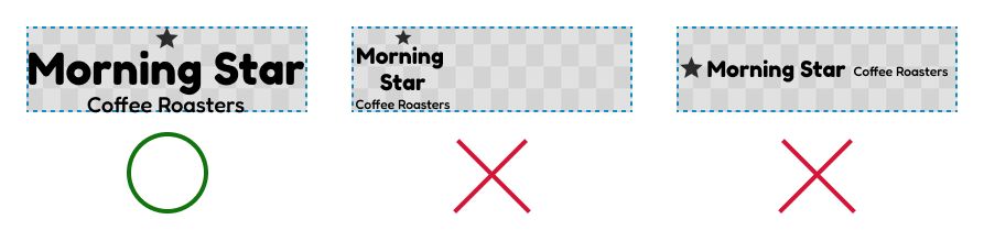
|
| Color |
Use a very light color that has high contrast (such as white) for passes with a dark background. Use a very dark color that has high contrast (such as black) for passes with a light background. 
|
Additional images
The *.imageModulesData.mainImage field in a class or object
appears as a full-width image in a pass below the hero image. Only use if
your pass requires an additional image for better user comprehension.
Additional image guidelines
The following is a list of user interface recommendations for additional images:
| Guideline | Description |
|---|---|
| Preferred file type | PNG |
| Minimum size |
1860 px wide, variable height. Use wide, rectangular images. Use an image with a colored background for best results. |
| Display size |
The full width of the template, and proportional height. 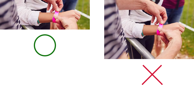
|
Barcode images
Certain verticals allow for images above and below the barcode.
Images above the barcode
The following is a list of user interface recommendations for the images above the barcode:
| Guideline | Description |
|---|---|
| Preferred file type | PNG |
| Maximum height |
20 dp (at maximum aspect ratio) Recommended size is 80 px tall and 80-780 px wide if two images are present. This lets them be side by side. If one image is a square and the other is a rectangle, then the images need to be 80x80 px and 780x80 px. |
| Aspect ratio |
Unconstrained. For maximum 20 dp height and width of a single image, use a 20:1 aspect ratio. If you only want a single image above the barcode, take the full width (exclude padding). The image needs to be 1600x80 px. |
| Maximum display size (single image) | 20 dp high and 400 dp wide |
Image below the barcode
The following is a list of user interface recommendations for the image below the barcode:
| Guideline | Description |
|---|---|
| Preferred file type | PNG |
| Maximum height |
20 dp (at maximum aspect ratio) Recommended size is 80 px tall and 80-1600 px wide. If square, 80x80 px. If rectangular, 1600x80 px. |
| Unconstrained aspect ratio. For maximum 20 dp height and width, use a 20:1 aspect ratio. | If you want a full width image (exclude padding), the image must be 1600x80 px. |
| Maximum display size is 20 dp high and 400 dp wide. |
Modules
A module represents a group of fields in a specific section of a template. The following table contains guidelines for the number of modules that you must include in your classes and objects to ensure that your cards display correctly in the Google Wallet app.
| Guideline | Description |
|---|---|
imageModulesData
|
Use only one imageModulesData either in your class or in
the objects you create.
|
infoModuleData
|
Use up to two
An |
linksModuleData
|
Use up to four
You might have two |
textModulesData
|
Use up to two
You might have one |
infoModuleData
InfoModuleData contains member and customizable information and
appears in the expanded view. Use this module to store information such as
expiration dates, second point balances, or stored value balances.
linksModuleData
The links module contains URIs to web pages, telephone numbers, and email addresses. The following is a list of user interface recommendations for the links module:
| Guideline | Example setting | Example image |
|---|---|---|
Use the http: prefix when you assign a URI to a website or
a location in Google maps. This prefix lets a consumer touch on the
link and navigate to the website or view the location in Google Maps.
This prefix also causes an icon of a link or map in front of the
description in your card.
|
'uri': 'http://maps.google.com/?q=google'
|

|
'uri': 'http://developer.google.com/wallet/'
|

|
|
Use the tel: prefix when you define a phone number. This
prefix lets a consumer touch on the link to dial the number. This prefix
also creates an icon of a telephone in front of the text description on
the card.
|
'uri': 'tel:6505555555'
|

|
Use the mailto: prefix when you define an email address.
This prefix lets a consumer touch on the link to send an email to the
address. This prefix also creates an icon of an email in front of the
text description on the card.
|
'uri': 'mailto:jonsmith@email.com'
|

|
Headings, labels, and names
Write headings, labels, and names in title case, so that each word starts with a capital letter.
Content policies
The contents of each field in a Pass must adhere to the Payments content policies. The contents of the websites that you reference in the class must also adhere to these policies.
Partner platform data placement
To make sure users can get to your feature-rich app or website about the
Pass, make sure to incorporate your app deep link or
website in the Pass's class or object
linksModuleData.* property. This lets a user navigate to your
platform from the Pass, which appears in
Google Wallet. To see how it's rendered, go to the design sections of the
Pass verticals.