本文件將說明如何遵循 Glass 樣式 並在使用 GDK 時實作常見的 UI 最佳做法
玻璃主題
Glass 會為 Glassware 套用標準主題 與使用者介面的其他部分一致 主題具有以下特性:
- 使用 Roboto 字體
- 以全螢幕顯示活動,但不顯示狀態列或動作列
- 套用純黑色背景
如要套用 Glass 主題,請勿在 Android 資訊清單中宣告主題。
如果 Glassware 零件有自訂樣式
而且想讓所有其他項目使用預設的 Glass 主題
繼承自 Theme.DeviceDefault 並採用 parent 屬性:
<resources>
    <style name="CustomTheme" parent="@android:style/Theme.DeviceDefault">
        <!-- Theme customization goes here. -->
    </style>
</resources>
如需相關 Android 開發人員指南 樣式與主題 進一步瞭解如何製作主題
玻璃風格的卡片
CardBuilder
類別會根據一組屬性建立格式完善的資訊卡。使用版面配置
提供者:CardBuilder.Layout
讓您的內容在
玻璃。
如何使用「CardBuilder」:
- 建立
CardBuilder的執行個體,提供您想要的版面配置CardBuilder.Layout。 - 設定資訊卡的屬性,例如文字、註腳和時間戳記。
- 呼叫
CardBuilder.getView()將卡片轉換為 AndroidView,或CardBuilder.getRemoteViews()轉換成RemoteViews物件。 - 在活動、版面配置或
ViewCardScrollView,或使用LiveCard中的RemoteViews。
常見的 UI 功能
CardBuilder 提供的許多版面配置都支援常見的使用者介面
功能。如需個別版面配置的說明,請參閱:
CardBuilder.Layout敬上
即可查看各類型資訊卡支援的功能清單。
出處圖示
歸屬圖示是選用的 36 × 36 像素圖示,會顯示在
資訊卡右下角和時間戳記右側。設定此項目
呼叫
CardBuilder.setAttributionIcon()敬上
識別您的應用程式,特別是在即時資訊卡上
資訊卡上的資訊來源
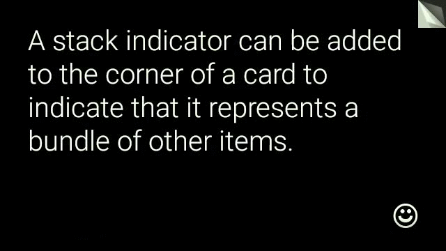
堆疊指標
堆疊指標
CardBuilder.showStackIndicator()、
是顯示在資訊卡右上角的角落折疊。使用做為
這張視覺指標代表卡片
代表卡片中一組
使用者只要直接輕觸即可
View view = new CardBuilder(context, CardBuilder.Layout.TEXT)
    .setText("A stack indicator can be added to the corner of a card...")
    .setAttributionIcon(R.drawable.ic_smile)
    .showStackIndicator(true)
    .getView();
版面配置
下列範例顯示使用
CardBuilder。
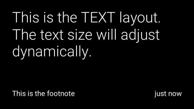
TEXT和TEXT_FIXED
CardBuilder.Layout.TEXT
版面配置會顯示全出血文字,並視需要顯示
繪製圖片馬賽克系統會根據
可用的儲存空間。
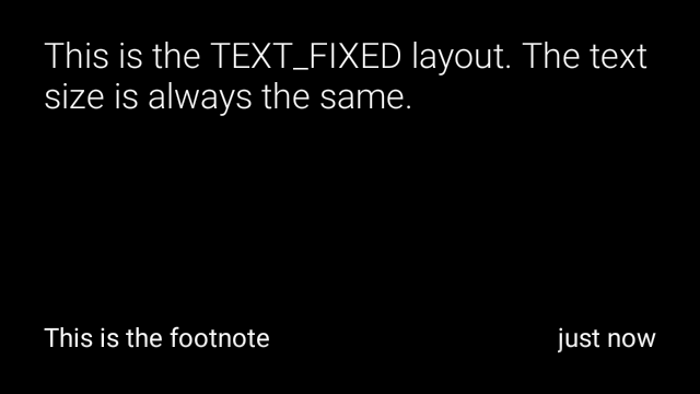
CardBuilder.Layout.TEXT_FIXED敬上
但會將文字調整為較小尺寸。
View view1 = new CardBuilder(context, CardBuilder.Layout.TEXT)
.setText("This is the TEXT layout. The text size will adjust dynamically.")
.setFootnote("This is the footnote")
.setTimestamp("just now")
.getView();
View view2 = new CardBuilder(context, CardBuilder.Layout.TEXT)
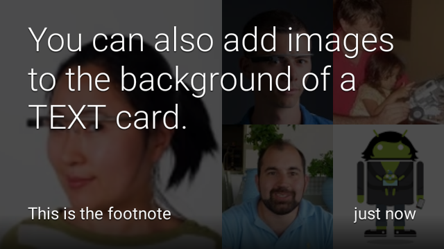
.setText("You can also add images to the background of a TEXT card.")
.setFootnote("This is the footnote")
.setTimestamp("just now")
.addImage(R.drawable.image1)
.addImage(R.drawable.image2)
.addImage(R.drawable.image3)
.addImage(R.drawable.image4)
.addImage(R.drawable.image5)
.getView();
View view3 = new CardBuilder(context, CardBuilder.Layout.TEXT_FIXED)
.setText("This is the TEXT_FIXED layout. The text size is always the same.")
.setFootnote("This is the footnote")
.setTimestamp("just now")
.getView();
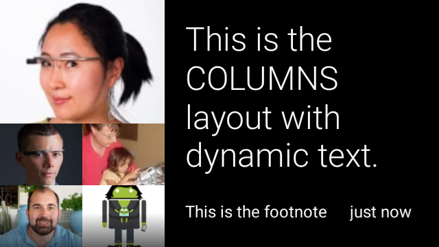
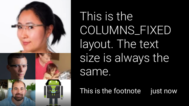
COLUMNS和COLUMNS_FIXED
CardBuilder.Layout.COLUMNS敬上
版面配置會顯示圖片的馬賽克圖片或圖示
資訊卡左側,而右側文字則放在右側。系統會動態調整文字大小
以符合可用空間大小如要固定文字大小,請使用
CardBuilder.Layout.COLUMNS_FIXED。
View view1 = new CardBuilder(context, CardBuilder.Layout.COLUMNS)
.setText("This is the COLUMNS layout with dynamic text.")
.setFootnote("This is the footnote")
.setTimestamp("just now")
.addImage(R.drawable.image1)
.addImage(R.drawable.image2)
.addImage(R.drawable.image3)
.addImage(R.drawable.image4)
.addImage(R.drawable.image5)
.getView();
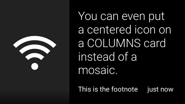
View view2 = new CardBuilder(context, CardBuilder.Layout.COLUMNS)
.setText("You can even put a centered icon on a COLUMNS card instead of a mosaic.")
.setFootnote("This is the footnote")
.setTimestamp("just now")
.setIcon(R.drawable.ic_wifi)
.getView();
View view3 = new CardBuilder(context, CardBuilder.Layout.COLUMNS_FIXED)
.setText("This is the COLUMNS_FIXED layout. The text size is always the same.")
.setFootnote("This is the footnote")
.setTimestamp("just now")
.addImage(R.drawable.image1)
.addImage(R.drawable.image2)
.addImage(R.drawable.image3)
.addImage(R.drawable.image4)
.addImage(R.drawable.image5)
.getView();
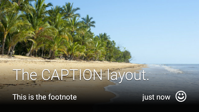
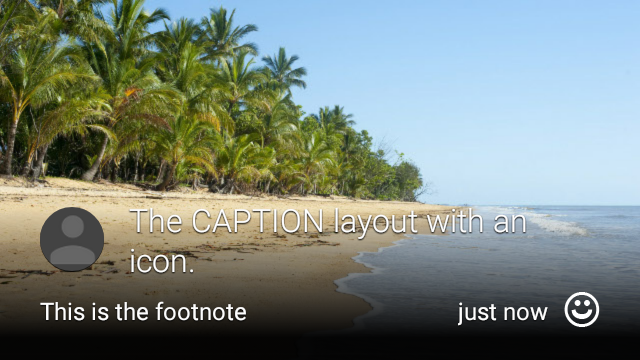
CAPTION
CardBuilder.Layout.CAPTION敬上
版面配置的背景有圖片馬賽克
加上簡短的說明文字圖示也可能是
圖示,例如:
與資訊卡內容相關
View view1 = new CardBuilder(context, CardBuilder.Layout.CAPTION)
    .setText("The caption layout.")
    .setFootnote("This is the footnote")
    .setTimestamp("just now")
    .addImage(R.drawable.beach)
    .setAttributionIcon(R.drawable.ic_smile)
    .getView();

View view2 = new CardBuilder(context, CardBuilder.Layout.CAPTION)
    .setText("The caption layout with an icon.")
    .setFootnote("This is the footnote")
    .setTimestamp("just now")
    .addImage(R.drawable.beach)
    .setIcon(R.drawable.ic_avatar)
    .setAttributionIcon(R.drawable.ic_smile)
    .getView();
TITLE
CardBuilder.Layout.TITLE敬上
版面配置的背景有圖片馬賽克
。卡片底部置中顯示標題和選用圖示。這個版面配置
通常用於代表聯絡人或共用目標。註腳與時間戳記
這個版面配置不支援這項功能

View view = new CardBuilder(context, CardBuilder.Layout.TITLE)
    .setText("TITLE Card")
    .setIcon(R.drawable.ic_phone)
    .addImage(R.drawable.beach)
    .getView();
AUTHOR
使用
CardBuilder.Layout.AUTHOR敬上
顯示訊息或會話群組的版面配置
焦點為作者。支援在背景執行圖片馬賽克
做為作者顯示圖片的圖示,以及供您選取
列出識別資訊
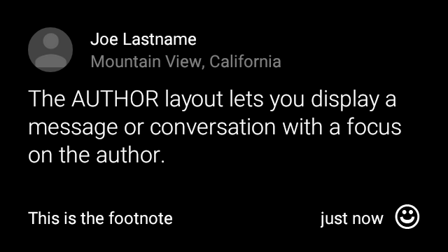
View view = new CardBuilder(context, CardBuilder.Layout.AUTHOR)
    .setText("The AUTHOR layout lets you display a message or conversation "
            + " with a focus on the author.")
    .setIcon(R.drawable.ic_avatar)
    .setHeading("Joe Lastname")
    .setSubheading("Mountain View, California")
    .setFootnote("This is the footnote")
    .setTimestamp("just now")
    .getView();
MENU
CardBuilder.Layout.MENU敬上
版面配置看起來就會像標準的 Glass 選單。這個平台提供
置中的圖示和標題,以及選擇性的註腳。將這個版面配置用於下列用途:
確認畫面 (使用者從「刪除」轉換為「已刪除」
選取選單項目)。如果需要菜單,最好使用
標準選項選單。
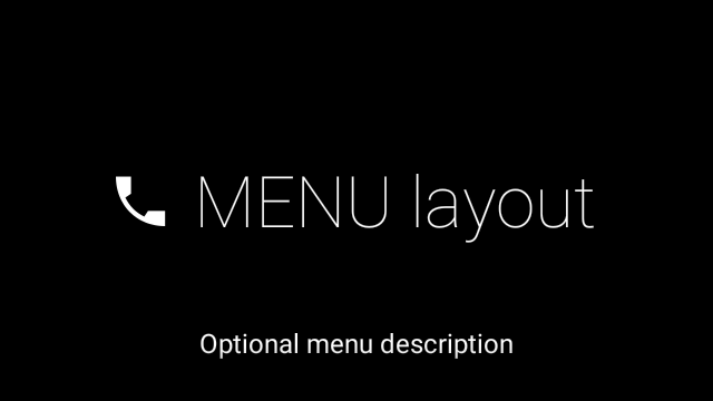
View view = new CardBuilder(context, CardBuilder.Layout.MENU)
    .setText("MENU layout")
    .setIcon(R.drawable.ic_phone)
    .setFootnote("Optional menu description")
    .getView();
EMBED_INSIDE
CardBuilder.Layout.EMBED_INSIDE敬上
Layout 可將您設計的自訂版面配置 XML 嵌入標準 Google Glass
資訊卡範本這樣一來,您就能為應用程式設計自訂使用者介面,但
資訊卡的註腳、時間戳記、出處圖示和
或堆疊指標
通話後
CardBuilder.getView()、
使用
findViewById()。
結果,即可存取嵌入版面配置中的檢視畫面。同樣地
通話
CardBuilder.getRemoteViews()、
如要操控嵌入版面配置的檢視畫面,請直接傳遞
插入
RemoteViews。
setter 方法。
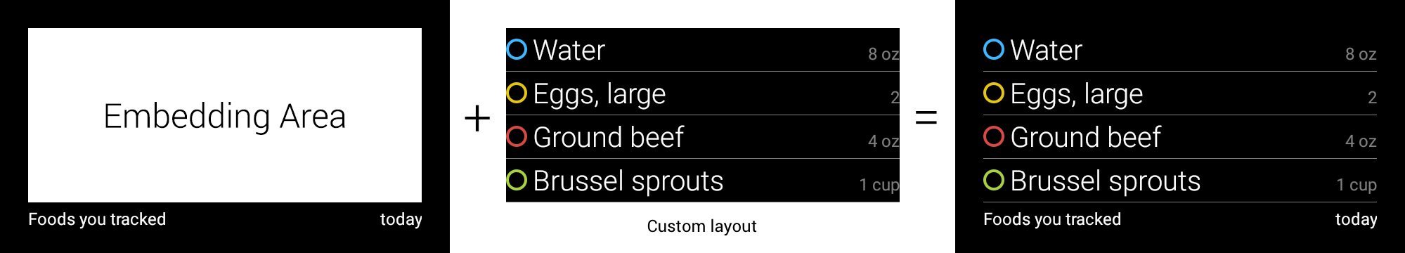
View view = new CardBuilder(context, CardBuilder.Layout.EMBED_INSIDE)
    .setEmbeddedLayout(R.layout.food_table)
    .setFootnote("Foods you tracked")
    .setTimestamp("today")
    .getView();
TextView textView1 = (TextView) view.findViewById(R.id.text_view_1);
textView1.setText("Water");
// ...and so on
如需更詳細的範例,請前往 GitHub ApiDemo 專案。
ALERT
CardBuilder.Layout.ALERT敬上
版面配置包含「置中」和「
主要訊息和註腳將此版面配置用於
Dialog 到
在 Glassware 中顯示重要訊息、警告或錯誤訊息。


下例是 AlertDialog 的實作方式,會關閉
資訊卡,並在使用者輕觸資訊卡時開啟 Wi-Fi 設定:
- 建立可擴充
Dialog的類別。 - 使用
CardBuilder搭配CardBuilder.Layout.ALERT版面配置建立資訊卡,然後使用這張資訊卡設定內容檢視畫面。 (選用) 建立
GestureDetector來處理這張資訊卡的使用者手勢。public class AlertDialog extends Dialog { private final DialogInterface.OnClickListener mOnClickListener; private final AudioManager mAudioManager; private final GestureDetector mGestureDetector; /** * Handles the tap gesture to call the dialog's * onClickListener if one is provided. */ private final GestureDetector.BaseListener mBaseListener = new GestureDetector.BaseListener() { @Override public boolean onGesture(Gesture gesture) { if (gesture == Gesture.TAP) { mAudioManager.playSoundEffect(Sounds.TAP); if (mOnClickListener != null) { // Since Glass dialogs do not have buttons, // the index passed to onClick is always 0. mOnClickListener.onClick(AlertDialog.this, 0); } return true; } return false; } }; public AlertDialog(Context context, int iconResId, int textResId, int footnoteResId, DialogInterface.OnClickListener onClickListener) { super(context); mOnClickListener = onClickListener; mAudioManager = (AudioManager) context.getSystemService(Context.AUDIO_SERVICE); mGestureDetector = new GestureDetector(context).setBaseListener(mBaseListener); setContentView(new CardBuilder(context, CardBuilder.Layout.ALERT) .setIcon(iconResId) .setText(textResId) .setFootnote(footnoteResId) .getView()); } /** Overridden to let the gesture detector handle a possible tap event. */ @Override public boolean onGenericMotionEvent(MotionEvent event) { return mGestureDetector.onMotionEvent(event) || super.onGenericMotionEvent(event); } }(選用) 在活動中實作
OnClickListener敬上 在使用者輕觸時處理任何其他流程。如要進一步瞭解 開始設定活動 (例如 Wi-Fi),請參閱 起始設定。呼叫
AlertDialog建構函式以顯示快訊資訊卡。public class MyActivity extends Activity { ... private final DialogInterface.OnClickListener mOnClickListener = new DialogInterface.OnClickListener() { @Override public void onClick(DialogInterface dialog, int button) { // Open WiFi Settings startActivity(new Intent(Settings.ACTION_WIFI_SETTINGS)); } }; @Override protected void onCreate(Bundle bundle) { ... new AlertDialog(context, R.drawable.ic_cloud_sad_150, R.string.alert_text, R.string.alert_footnote_text, mOnClickListener).show(); ... } }
XML 版面配置
如果 CardBuilder 類別支援,您可以使用以下兩種基本資訊卡版面配置 不符合您的需求
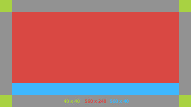
主要版面配置
這個版面配置定義了資訊卡的標準邊框間距和頁尾。自訂
次檢視。RelativeLayout
<?xml version="1.0" encoding="utf-8"?>
<FrameLayout xmlns:android="http://schemas.android.com/apk/res/android"
    xmlns:tools="http://schemas.android.com/tools"
    android:id="@+id/layout"
    android:layout_width="match_parent"
    android:layout_height="match_parent"
    >

    <RelativeLayout
        android:id="@+id/body_layout"
        android:layout_width="match_parent"
        android:layout_height="@dimen/glass_card_body_height"
        android:layout_marginLeft="@dimen/glass_card_margin"
        android:layout_marginTop="@dimen/glass_card_margin"
        android:layout_marginRight="@dimen/glass_card_margin"
        tools:ignore="UselessLeaf"
        >

        <!-- Put your widgets inside this RelativeLayout. -->

    </RelativeLayout>

    <LinearLayout
        android:id="@+id/footer_container"
        android:layout_width="match_parent"
        android:layout_height="wrap_content"
        android:layout_gravity="bottom|left"
        android:layout_marginLeft="@dimen/glass_card_margin"
        android:layout_marginBottom="@dimen/glass_card_footer_margin"
        android:layout_marginRight="@dimen/glass_card_margin"
        android:orientation="horizontal"
        >

        <!-- The footer view will grow to fit as much content as possible while the
             timestamp view keeps a fixed width. If the footer text is too long, it
             will be ellipsized with a 40px margin between it and the timestamp. -->

        <TextView
            android:id="@+id/footer"
            android:layout_width="0dip"
            android:layout_height="wrap_content"
            android:layout_weight="1"
            android:ellipsize="end"
            android:singleLine="true"
            android:textAppearance="?android:attr/textAppearanceSmall"
            />

        <TextView
            android:id="@+id/timestamp"
            android:layout_width="wrap_content"
            android:layout_height="wrap_content"
            android:layout_marginLeft="@dimen/glass_card_margin"
            android:ellipsize="end"
            android:singleLine="true"
            android:textAppearance="?android:attr/textAppearanceSmall"
            />

    </LinearLayout>

</FrameLayout>
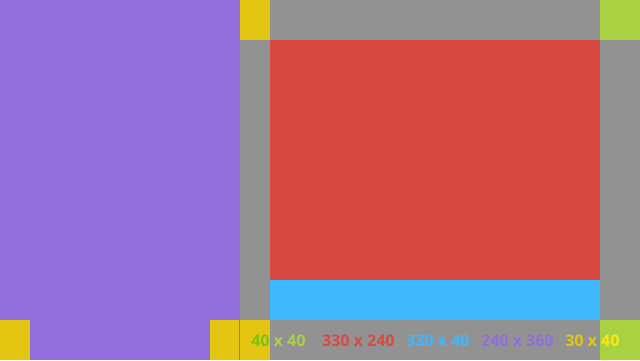
左欄版面配置
這會定義左欄和右欄 240 像素,以兩個 RelativeLayout 的格式定義。
可以放在影片上
<?xml version="1.0" encoding="utf-8"?>
<RelativeLayout xmlns:android="http://schemas.android.com/apk/res/android"
    xmlns:tools="http://schemas.android.com/tools"
    android:layout_width="match_parent"
    android:layout_height="match_parent"
    >

    <RelativeLayout
        android:id="@+id/left_column"
        android:layout_width="@dimen/glass_card_left_column_width"
        android:layout_height="match_parent"
        >

        <!-- Put widgets for the left column inside this RelativeLayout. -->

    </RelativeLayout>

    <RelativeLayout
        android:layout_width="wrap_content"
        android:layout_height="@dimen/glass_card_body_height"
        android:layout_alignParentRight="true"
        android:layout_alignParentTop="true"
        android:layout_marginLeft="@dimen/glass_card_two_column_margin"
        android:layout_marginRight="@dimen/glass_card_margin"
        android:layout_marginTop="@dimen/glass_card_margin"
        android:layout_toRightOf="@+id/left_column"
        tools:ignore="UselessLeaf"
        >

        <!-- Put widgets for the right column inside this RelativeLayout. -->

    </RelativeLayout>

    <LinearLayout
        android:id="@+id/footer_container"
        android:layout_width="wrap_content"
        android:layout_height="wrap_content"
        android:layout_alignParentBottom="true"
        android:layout_alignParentRight="true"
        android:layout_gravity="bottom|left"
        android:layout_marginBottom="@dimen/glass_card_footer_margin"
        android:layout_marginLeft="@dimen/glass_card_two_column_margin"
        android:layout_marginRight="@dimen/glass_card_margin"
        android:layout_toRightOf="@+id/left_column"
        android:orientation="horizontal"
        >

        <!--
             The footer view will grow to fit as much content as possible while the
             timestamp view keeps a fixed width. If the footer text is too long, it
             will be ellipsized with a 40px margin between it and the timestamp.
        -->

        <TextView
            android:id="@+id/footer"
            android:layout_width="0dip"
            android:layout_height="wrap_content"
            android:layout_weight="1"
            android:ellipsize="end"
            android:singleLine="true"
            android:textAppearance="?android:attr/textAppearanceSmall"
            />

        <TextView
            android:id="@+id/timestamp"
            android:layout_width="wrap_content"
            android:layout_height="wrap_content"
            android:layout_marginLeft="@dimen/glass_card_margin"
            android:ellipsize="end"
            android:singleLine="true"
            android:textAppearance="?android:attr/textAppearanceSmall"
            />

    </LinearLayout>

</RelativeLayout>
標準尺寸
只要將這個檔案與先前的版面配置或自己的版面配置搭配使用,
以符合標準的玻璃風格建立這個檔案時使用的名稱
res/values/dimens.xml。
<?xml version="1.0" encoding="utf-8"?>

<resources>

    <!-- The recommended margin for the top, left, and right edges of a card. -->
    <dimen name="glass_card_margin">40px</dimen>

    <!-- The recommended margin between the bottom of the card and the footer. This is
         an adjusted value so that the baseline of the text in the footer sits 40px
         from the bottom of the card, matching the other margins. -->
    <dimen name="glass_card_footer_margin">33px</dimen>

    <!-- The recommended margin for the left column of the two-column card. -->
    <dimen name="glass_card_two_column_margin">30px</dimen>

    <!-- The maximum height of the body content inside a card. -->
    <dimen name="glass_card_body_height">240px</dimen>

    <!-- The width of the left column in the two-column layout. -->
    <dimen name="glass_card_left_column_width">240px</dimen>

</resources>