Tài liệu này trình bày cách sử dụng kiểu Google Glass và triển khai các phương pháp hay nhất về giao diện người dùng khi sử dụng GDK.
Giao diện Glass
Glass áp dụng giao diện chuẩn cho Đồ thuỷ tinh của bạn, vì vậy luôn nhất quán với phần còn lại của giao diện người dùng. Chiến lược phát hành đĩa đơn giao diện có các đặc điểm sau:
- Sử dụng kiểu chữ Roboto
- Hiển thị hoạt động ở chế độ toàn màn hình mà không có thanh trạng thái hoặc thanh tác vụ
- Áp dụng nền đen đồng nhất
Để áp dụng giao diện Glass, không khai báo giao diện trong Tệp kê khai Android.
Nếu bạn có kiểu tuỳ chỉnh cho các bộ phận của Đồ thuỷ tinh
và muốn có giao diện Glass mặc định cho mọi thứ khác,
kế thừa từ Theme.DeviceDefault với thuộc tính parent:
<resources>
    <style name="CustomTheme" parent="@android:style/Theme.DeviceDefault">
        <!-- Theme customization goes here. -->
    </style>
</resources>
Xem hướng dẫn cho nhà phát triển Android trên Kiểu và giao diện để biết thêm thông tin về cách tạo giao diện.
Thẻ kiểu thuỷ tinh
CardBuilder
sẽ tạo thẻ có định dạng phù hợp dựa trên một tập hợp các thuộc tính. Sử dụng bố cục
do CardBuilder.Layout cung cấp
bất cứ khi nào có thể để nội dung của bạn trông giống như nội dung khác
Thuỷ tinh.
Cách sử dụng CardBuilder:
- Tạo một thực thể của
CardBuilder, cung cấp cho nó bố cục mong muốn từCardBuilder.Layout. - Thiết lập các thuộc tính của thẻ, chẳng hạn như văn bản, chú thích cuối trang và dấu thời gian.
- Gọi
CardBuilder.getView()để chuyển đổi thẻ thành mộtViewhoặcCardBuilder.getRemoteViews()để chuyển đổi thànhRemoteViews. - Sử dụng
Viewtrong các hoạt động, bố cục hoặc trong mộtCardScrollViewhoặc sử dụngRemoteViewstrongLiveCard.
Các tính năng giao diện người dùng phổ biến
Nhiều bố cục do CardBuilder cung cấp hỗ trợ giao diện người dùng phổ biến
được mô tả bên dưới. Hãy xem tài liệu về từng bố cục trong
CardBuilder.Layout
để xem danh sách các tính năng mà từng loại thẻ hỗ trợ.
Biểu tượng phân bổ
Biểu tượng phân bổ là biểu tượng pixel 36 × 36 không bắt buộc xuất hiện trên
góc dưới cùng bên phải của thẻ và ở bên phải dấu thời gian. Thiết lập
biểu tượng bằng cách gọi
CardBuilder.setAttributionIcon()
để xác định ứng dụng của bạn, đặc biệt là trên các thẻ trực tiếp để người dùng có thể nhanh chóng
và xem nguồn của thông tin trên thẻ đó.
Chỉ báo ngăn xếp
Chỉ báo ngăn xếp, được kiểm soát bởi
CardBuilder.showStackIndicator()!
là đường ranh giới phần hiển thị ở góc trên cùng bên phải của thẻ. Dùng làm
một chỉ báo trực quan cho biết thẻ của bạn đại diện cho một nhóm các thẻ khác mà
người dùng có thể nhấn trực tiếp vào.
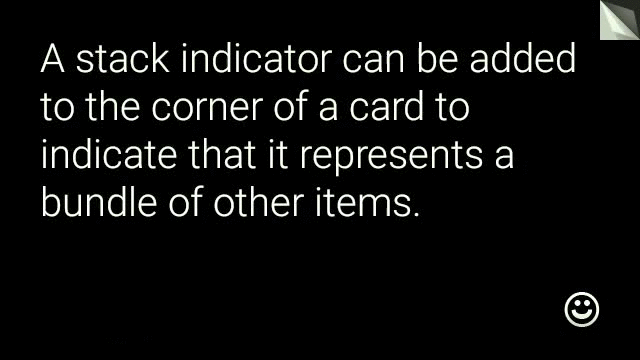
View view = new CardBuilder(context, CardBuilder.Layout.TEXT)
    .setText("A stack indicator can be added to the corner of a card...")
    .setAttributionIcon(R.drawable.ic_smile)
    .showStackIndicator(true)
    .getView();
Bố cục
Ví dụ sau đây minh hoạ các bố cục có sẵn bằng cách sử dụng
CardBuilder.
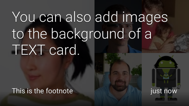
TEXT và TEXT_FIXED
CardBuilder.Layout.TEXT
bố cục hiển thị văn bản tràn lề kèm theo một tuỳ chọn
tranh mosaic trong nền. Văn bản sẽ tự động đổi kích thước cho phù hợp nhất với
dung lượng còn trống.
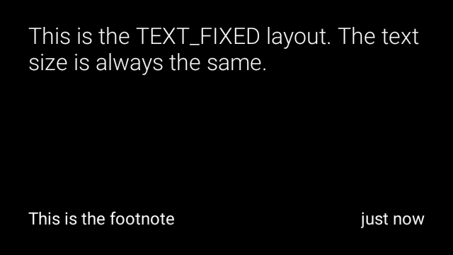
CardBuilder.Layout.TEXT_FIXED
cũng tương tự nhưng sửa văn bản ở kích thước nhỏ hơn.
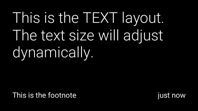
View view1 = new CardBuilder(context, CardBuilder.Layout.TEXT)
    .setText("This is the TEXT layout. The text size will adjust dynamically.")
    .setFootnote("This is the footnote")
    .setTimestamp("just now")
    .getView();
View view2 = new CardBuilder(context, CardBuilder.Layout.TEXT)
    .setText("You can also add images to the background of a TEXT card.")
    .setFootnote("This is the footnote")
    .setTimestamp("just now")
    .addImage(R.drawable.image1)
    .addImage(R.drawable.image2)
    .addImage(R.drawable.image3)
    .addImage(R.drawable.image4)
    .addImage(R.drawable.image5)
    .getView();
View view3 = new CardBuilder(context, CardBuilder.Layout.TEXT_FIXED)
    .setText("This is the TEXT_FIXED layout. The text size is always the same.")
    .setFootnote("This is the footnote")
    .setTimestamp("just now")
    .getView();
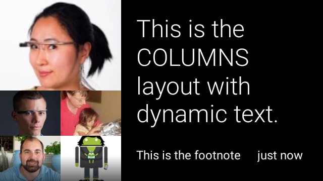
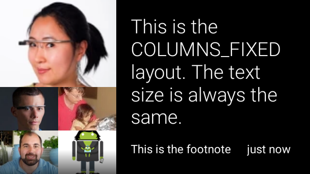
COLUMNS và COLUMNS_FIXED
Chiến lược phát hành đĩa đơn
CardBuilder.Layout.COLUMNS
hiển thị một hình ảnh mosaic hoặc biểu tượng trên
bên trái của thẻ và văn bản ở bên phải. Văn bản được định kích thước động
cho phù hợp nhất với không gian hiện có. Để cố định kích thước văn bản, hãy sử dụng
CardBuilder.Layout.COLUMNS_FIXED.
View view1 = new CardBuilder(context, CardBuilder.Layout.COLUMNS)
.setText("This is the COLUMNS layout with dynamic text.")
.setFootnote("This is the footnote")
.setTimestamp("just now")
.addImage(R.drawable.image1)
.addImage(R.drawable.image2)
.addImage(R.drawable.image3)
.addImage(R.drawable.image4)
.addImage(R.drawable.image5)
.getView();
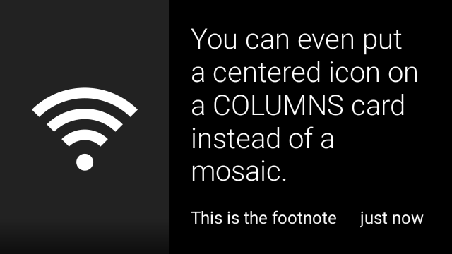
View view2 = new CardBuilder(context, CardBuilder.Layout.COLUMNS)
.setText("You can even put a centered icon on a COLUMNS card instead of a mosaic.")
.setFootnote("This is the footnote")
.setTimestamp("just now")
.setIcon(R.drawable.ic_wifi)
.getView();
View view3 = new CardBuilder(context, CardBuilder.Layout.COLUMNS_FIXED)
.setText("This is the COLUMNS_FIXED layout. The text size is always the same.")
.setFootnote("This is the footnote")
.setTimestamp("just now")
.addImage(R.drawable.image1)
.addImage(R.drawable.image2)
.addImage(R.drawable.image3)
.addImage(R.drawable.image4)
.addImage(R.drawable.image5)
.getView();
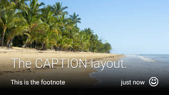
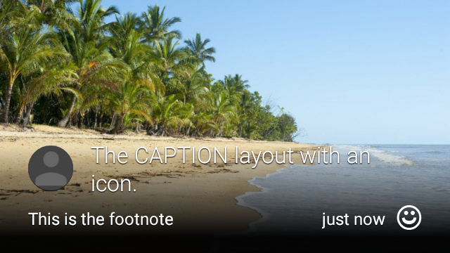
CAPTION
Chiến lược phát hành đĩa đơn
CardBuilder.Layout.CAPTION
bố cục có một hình ảnh tranh mosaic trong nền
và văn bản phụ đề ngắn gọn được căn chỉnh ở cuối thẻ. Biểu tượng cũng có thể là
đặt bên cạnh chú thích để thể hiện danh tính của một người, chẳng hạn như
được liên kết với nội dung của thẻ.
View view1 = new CardBuilder(context, CardBuilder.Layout.CAPTION)
    .setText("The caption layout.")
    .setFootnote("This is the footnote")
    .setTimestamp("just now")
    .addImage(R.drawable.beach)
    .setAttributionIcon(R.drawable.ic_smile)
    .getView();

View view2 = new CardBuilder(context, CardBuilder.Layout.CAPTION)
    .setText("The caption layout with an icon.")
    .setFootnote("This is the footnote")
    .setTimestamp("just now")
    .addImage(R.drawable.beach)
    .setIcon(R.drawable.ic_avatar)
    .setAttributionIcon(R.drawable.ic_smile)
    .getView();
TITLE
Chiến lược phát hành đĩa đơn
CardBuilder.Layout.TITLE
bố cục có một hình ảnh tranh mosaic trong nền
có tiêu đề ở chính giữa và biểu tượng tuỳ chọn ở cuối thẻ. Bố cục này
thường được dùng để đại diện cho địa chỉ liên hệ hoặc chia sẻ mục tiêu. Chú thích cuối trang và dấu thời gian là
không được hỗ trợ trên bố cục này.
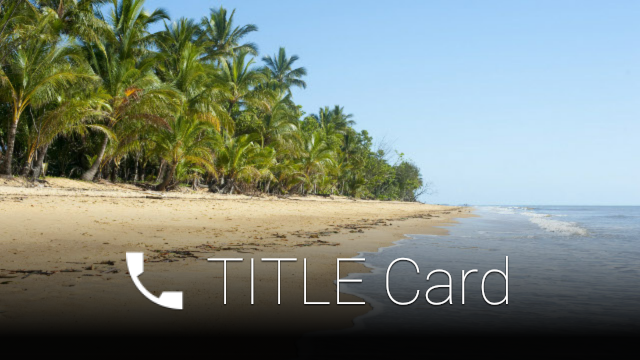
View view = new CardBuilder(context, CardBuilder.Layout.TITLE)
    .setText("TITLE Card")
    .setIcon(R.drawable.ic_phone)
    .addImage(R.drawable.beach)
    .getView();
AUTHOR
Sử dụng
CardBuilder.Layout.AUTHOR
bố cục để hiển thị một tin nhắn hoặc cuộc trò chuyện
tập trung vào tác giả. Công cụ này hỗ trợ tranh mosaic ở chế độ nền,
một biểu tượng được dùng làm hình đại diện của tác giả, một tiêu đề và tiêu đề phụ để bạn có thể
liệt kê thông tin nhận dạng.

View view = new CardBuilder(context, CardBuilder.Layout.AUTHOR)
    .setText("The AUTHOR layout lets you display a message or conversation "
            + " with a focus on the author.")
    .setIcon(R.drawable.ic_avatar)
    .setHeading("Joe Lastname")
    .setSubheading("Mountain View, California")
    .setFootnote("This is the footnote")
    .setTimestamp("just now")
    .getView();
MENU
Chiến lược phát hành đĩa đơn
CardBuilder.Layout.MENU
bố cục trông giống như trình đơn Glass chuẩn. Chiến dịch này có
biểu tượng và tiêu đề ở giữa và chú thích cuối trang tuỳ chọn. Sử dụng bố cục này cho
màn hình xác nhận (chuyển từ "Xoá" sang "Đã xoá" sau khi người dùng
chọn một mục trong trình đơn). Nếu cần một trình đơn thực, bạn nên sử dụng
trình đơn tuỳ chọn chuẩn.
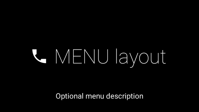
View view = new CardBuilder(context, CardBuilder.Layout.MENU)
    .setText("MENU layout")
    .setIcon(R.drawable.ic_phone)
    .setFootnote("Optional menu description")
    .getView();
EMBED_INSIDE
Chiến lược phát hành đĩa đơn
CardBuilder.Layout.EMBED_INSIDE
bố cục nhúng XML bố cục tuỳ chỉnh của thiết kế của riêng bạn vào Glass tiêu chuẩn
mẫu thẻ. Điều này cho phép bạn thiết kế giao diện người dùng tuỳ chỉnh cho ứng dụng của mình nhưng vẫn
có vị trí chính xác cho chú thích cuối trang, dấu thời gian, biểu tượng phân bổ của thẻ và
chỉ báo ngăn xếp nếu cần.
Sau khi gọi
CardBuilder.getView()!
sử dụng
findViewById()
vào kết quả để truy cập vào các chế độ xem bên trong bố cục được nhúng. Tương tự, nếu bạn
cuộc gọi
CardBuilder.getRemoteViews()!
bạn có thể thao tác với các khung hiển thị của bố cục nhúng bằng cách chuyển trực tiếp mã nhận dạng của các khung hiển thị đó
vào
RemoteViews
phương thức setter.
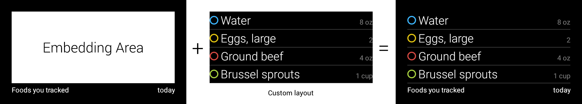
View view = new CardBuilder(context, CardBuilder.Layout.EMBED_INSIDE)
    .setEmbeddedLayout(R.layout.food_table)
    .setFootnote("Foods you tracked")
    .setTimestamp("today")
    .getView();
TextView textView1 = (TextView) view.findViewById(R.id.text_view_1);
textView1.setText("Water");
// ...and so on
Để biết ví dụ chi tiết hơn, hãy xem GitHub Dự án Api Demo.
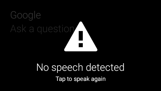
ALERT
Chiến lược phát hành đĩa đơn
CardBuilder.Layout.ALERT
bố cục chứa một biểu tượng lớn ở giữa
thông báo chính và chú thích cuối trang. Sử dụng bố cục này theo
Dialog đến
hiển thị thông báo thông tin, cảnh báo hoặc lỗi quan trọng trong Đồ thuỷ tinh của bạn.

Ví dụ sau đây minh hoạ cách triển khai AlertDialog và loại bỏ
và mở cài đặt Wi-Fi khi người dùng nhấn vào thẻ:
- Tạo một lớp mở rộng
Dialog. - Tạo thẻ bằng
CardBuildervới bố cụcCardBuilder.Layout.ALERT, sau đó đặt chế độ xem nội dung bằng thẻ này. (Không bắt buộc) Tạo một
GestureDetectorđể xử lý các cử chỉ của người dùng trên thẻ này.public class AlertDialog extends Dialog { private final DialogInterface.OnClickListener mOnClickListener; private final AudioManager mAudioManager; private final GestureDetector mGestureDetector; /** * Handles the tap gesture to call the dialog's * onClickListener if one is provided. */ private final GestureDetector.BaseListener mBaseListener = new GestureDetector.BaseListener() { @Override public boolean onGesture(Gesture gesture) { if (gesture == Gesture.TAP) { mAudioManager.playSoundEffect(Sounds.TAP); if (mOnClickListener != null) { // Since Glass dialogs do not have buttons, // the index passed to onClick is always 0. mOnClickListener.onClick(AlertDialog.this, 0); } return true; } return false; } }; public AlertDialog(Context context, int iconResId, int textResId, int footnoteResId, DialogInterface.OnClickListener onClickListener) { super(context); mOnClickListener = onClickListener; mAudioManager = (AudioManager) context.getSystemService(Context.AUDIO_SERVICE); mGestureDetector = new GestureDetector(context).setBaseListener(mBaseListener); setContentView(new CardBuilder(context, CardBuilder.Layout.ALERT) .setIcon(iconResId) .setText(textResId) .setFootnote(footnoteResId) .getView()); } /** Overridden to let the gesture detector handle a possible tap event. */ @Override public boolean onGenericMotionEvent(MotionEvent event) { return mGestureDetector.onMotionEvent(event) || super.onGenericMotionEvent(event); } }(Không bắt buộc) Trong hoạt động của bạn, hãy triển khai một
OnClickListenerđể xử lý bất kỳ luồng nào khác khi người dùng nhấn. Để biết thêm thông tin về bắt đầu các hoạt động cài đặt như Wi-Fi, xem Bắt đầu cài đặt.Gọi hàm khởi tạo
AlertDialogđể cho thấy thẻ cảnh báo.public class MyActivity extends Activity { ... private final DialogInterface.OnClickListener mOnClickListener = new DialogInterface.OnClickListener() { @Override public void onClick(DialogInterface dialog, int button) { // Open WiFi Settings startActivity(new Intent(Settings.ACTION_WIFI_SETTINGS)); } }; @Override protected void onCreate(Bundle bundle) { ... new AlertDialog(context, R.drawable.ic_cloud_sad_150, R.string.alert_text, R.string.alert_footnote_text, mOnClickListener).show(); ... } }
Bố cục XML
Dưới đây là 2 bố cục thẻ cơ bản mà bạn có thể sử dụng nếu lớp CardBuilder có không đáp ứng nhu cầu của bạn.
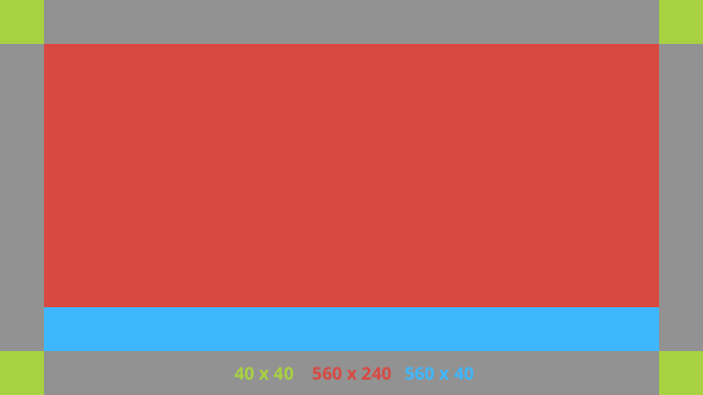
Bố cục chính
Bố cục này xác định khoảng đệm và chân trang tiêu chuẩn cho thẻ. Đặt câu hỏi của riêng bạn
chế độ xem trong RelativeLayout trống.
<?xml version="1.0" encoding="utf-8"?>
<FrameLayout xmlns:android="http://schemas.android.com/apk/res/android"
    xmlns:tools="http://schemas.android.com/tools"
    android:id="@+id/layout"
    android:layout_width="match_parent"
    android:layout_height="match_parent"
    >

    <RelativeLayout
        android:id="@+id/body_layout"
        android:layout_width="match_parent"
        android:layout_height="@dimen/glass_card_body_height"
        android:layout_marginLeft="@dimen/glass_card_margin"
        android:layout_marginTop="@dimen/glass_card_margin"
        android:layout_marginRight="@dimen/glass_card_margin"
        tools:ignore="UselessLeaf"
        >

        <!-- Put your widgets inside this RelativeLayout. -->

    </RelativeLayout>

    <LinearLayout
        android:id="@+id/footer_container"
        android:layout_width="match_parent"
        android:layout_height="wrap_content"
        android:layout_gravity="bottom|left"
        android:layout_marginLeft="@dimen/glass_card_margin"
        android:layout_marginBottom="@dimen/glass_card_footer_margin"
        android:layout_marginRight="@dimen/glass_card_margin"
        android:orientation="horizontal"
        >

        <!-- The footer view will grow to fit as much content as possible while the
             timestamp view keeps a fixed width. If the footer text is too long, it
             will be ellipsized with a 40px margin between it and the timestamp. -->

        <TextView
            android:id="@+id/footer"
            android:layout_width="0dip"
            android:layout_height="wrap_content"
            android:layout_weight="1"
            android:ellipsize="end"
            android:singleLine="true"
            android:textAppearance="?android:attr/textAppearanceSmall"
            />

        <TextView
            android:id="@+id/timestamp"
            android:layout_width="wrap_content"
            android:layout_height="wrap_content"
            android:layout_marginLeft="@dimen/glass_card_margin"
            android:ellipsize="end"
            android:singleLine="true"
            android:textAppearance="?android:attr/textAppearanceSmall"
            />

    </LinearLayout>

</FrameLayout>
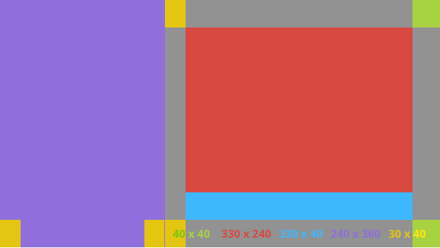
Bố cục cột bên trái
Thao tác này xác định cột bên trái 240px và cột bên phải 400px có dạng hai RelativeLayout
để bạn có thể đưa chế độ xem của mình vào.
<?xml version="1.0" encoding="utf-8"?>
<RelativeLayout xmlns:android="http://schemas.android.com/apk/res/android"
    xmlns:tools="http://schemas.android.com/tools"
    android:layout_width="match_parent"
    android:layout_height="match_parent"
    >

    <RelativeLayout
        android:id="@+id/left_column"
        android:layout_width="@dimen/glass_card_left_column_width"
        android:layout_height="match_parent"
        >

        <!-- Put widgets for the left column inside this RelativeLayout. -->

    </RelativeLayout>

    <RelativeLayout
        android:layout_width="wrap_content"
        android:layout_height="@dimen/glass_card_body_height"
        android:layout_alignParentRight="true"
        android:layout_alignParentTop="true"
        android:layout_marginLeft="@dimen/glass_card_two_column_margin"
        android:layout_marginRight="@dimen/glass_card_margin"
        android:layout_marginTop="@dimen/glass_card_margin"
        android:layout_toRightOf="@+id/left_column"
        tools:ignore="UselessLeaf"
        >

        <!-- Put widgets for the right column inside this RelativeLayout. -->

    </RelativeLayout>

    <LinearLayout
        android:id="@+id/footer_container"
        android:layout_width="wrap_content"
        android:layout_height="wrap_content"
        android:layout_alignParentBottom="true"
        android:layout_alignParentRight="true"
        android:layout_gravity="bottom|left"
        android:layout_marginBottom="@dimen/glass_card_footer_margin"
        android:layout_marginLeft="@dimen/glass_card_two_column_margin"
        android:layout_marginRight="@dimen/glass_card_margin"
        android:layout_toRightOf="@+id/left_column"
        android:orientation="horizontal"
        >

        <!--
             The footer view will grow to fit as much content as possible while the
             timestamp view keeps a fixed width. If the footer text is too long, it
             will be ellipsized with a 40px margin between it and the timestamp.
        -->

        <TextView
            android:id="@+id/footer"
            android:layout_width="0dip"
            android:layout_height="wrap_content"
            android:layout_weight="1"
            android:ellipsize="end"
            android:singleLine="true"
            android:textAppearance="?android:attr/textAppearanceSmall"
            />

        <TextView
            android:id="@+id/timestamp"
            android:layout_width="wrap_content"
            android:layout_height="wrap_content"
            android:layout_marginLeft="@dimen/glass_card_margin"
            android:ellipsize="end"
            android:singleLine="true"
            android:textAppearance="?android:attr/textAppearanceSmall"
            />

    </LinearLayout>

</RelativeLayout>
Phương diện chuẩn
Sử dụng tệp này cùng với các bố cục trước đó hoặc bố cục của riêng bạn để
tuân theo kiểu Google Glass tiêu chuẩn. Tạo tệp này dưới dạng
res/values/dimens.xml trong dự án Android của bạn.
<?xml version="1.0" encoding="utf-8"?>

<resources>

    <!-- The recommended margin for the top, left, and right edges of a card. -->
    <dimen name="glass_card_margin">40px</dimen>

    <!-- The recommended margin between the bottom of the card and the footer. This is
         an adjusted value so that the baseline of the text in the footer sits 40px
         from the bottom of the card, matching the other margins. -->
    <dimen name="glass_card_footer_margin">33px</dimen>

    <!-- The recommended margin for the left column of the two-column card. -->
    <dimen name="glass_card_two_column_margin">30px</dimen>

    <!-- The maximum height of the body content inside a card. -->
    <dimen name="glass_card_body_height">240px</dimen>

    <!-- The width of the left column in the two-column layout. -->
    <dimen name="glass_card_left_column_width">240px</dimen>

</resources>