Este documento mostra como seguir o estilo do Glass e implementar práticas recomendadas comuns de IU ao usar o GDK.
Tema de vidro
O Google Glass aplica um tema padrão ao Glassware, para que permanece consistente com o restante da interface do usuário. A tem as seguintes características:
- Usa a família tipográfica Roboto
- Exibe as atividades em tela cheia sem barra de status ou de ações
- Aplica um plano de fundo preto sólido
Para aplicar o tema do Glass, não declare um tema no manifesto do Android.
Se você tem um estilo personalizado para partes dos seus Glassware
e quiser o tema padrão do Glass para todo o restante,
herdar de Theme.DeviceDefault com o atributo parent:
<resources>
    <style name="CustomTheme" parent="@android:style/Theme.DeviceDefault">
        <!-- Theme customization goes here. -->
    </style>
</resources>
Consulte o guia do desenvolvedor Android sobre Estilos e temas para mais informações sobre como criar temas.
Cards com estilo de vidro
O CardBuilder
cria cards bem formados com base em um conjunto de propriedades. Usar os layouts
fornecido por CardBuilder.Layout
sempre que possível para que seu conteúdo se pareça com outros
Google Glass.
Para usar o app CardBuilder:
- Crie uma instância de
CardBuilder, atribuindo a ela o layout desejadoCardBuilder.Layout. - Defina as propriedades do card, como texto, nota de rodapé e carimbo de data/hora.
- Chamar
CardBuilder.getView()para converter o cartão em um cartão de créditoViewouCardBuilder.getRemoteViews()para convertê-lo em umRemoteViewsobjeto. - Use o
Viewnas suas atividades, layouts ou em umaCardScrollViewou use oRemoteViewsem umaLiveCard.
Recursos comuns da interface
Muitos dos layouts fornecidos pelo CardBuilder oferecem suporte à interface de usuário comum
os recursos descritos abaixo. Consulte a documentação dos layouts individuais em
CardBuilder.Layout
para uma lista dos recursos suportados em cada tipo de card.
Ícone de atribuição
O ícone de atribuição é um ícone opcional de 36 x 36 pixels que aparece
no canto inferior direito de um cartão e à direita do carimbo de data/hora. Definir isto
ícone chamando
CardBuilder.setAttributionIcon()
para identificar seu aplicativo, especialmente em cartões ao vivo, para que o usuário possa
e conferir a fonte das informações nesse card.
Indicador de pilha
O indicador de pilha, controlado pela
CardBuilder.showStackIndicator(),
é uma dobra de canto que aparece no canto superior direito de um cartão. Usar como
um indicador visual de que seu card representa um pacote de outros cards que o
que o usuário pode tocar diretamente.
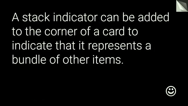
View view = new CardBuilder(context, CardBuilder.Layout.TEXT)
    .setText("A stack indicator can be added to the corner of a card...")
    .setAttributionIcon(R.drawable.ic_smile)
    .showStackIndicator(true)
    .getView();
Layouts
Os exemplos a seguir mostram os layouts disponíveis usando o
CardBuilder:
TEXT e TEXT_FIXED
O CardBuilder.Layout.TEXT
o layout mostra texto sem margens com um sinal
mosaico de imagens em segundo plano. O texto é redimensionado dinamicamente para se ajustar melhor ao
disponível.
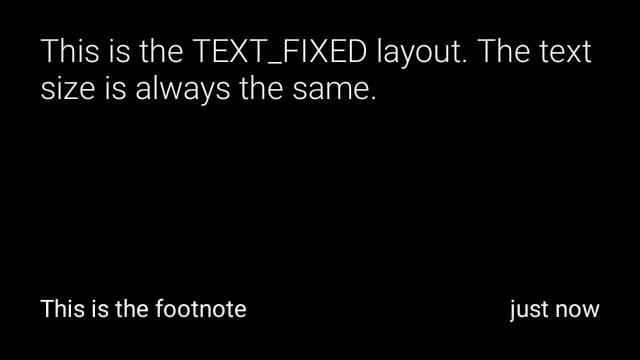
CardBuilder.Layout.TEXT_FIXED
é semelhante, mas corrige seu texto para um tamanho menor.
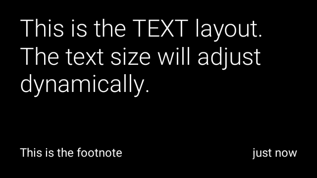

View view1 = new CardBuilder(context, CardBuilder.Layout.TEXT)
    .setText("This is the TEXT layout. The text size will adjust dynamically.")
    .setFootnote("This is the footnote")
    .setTimestamp("just now")
    .getView();
View view2 = new CardBuilder(context, CardBuilder.Layout.TEXT)
    .setText("You can also add images to the background of a TEXT card.")
    .setFootnote("This is the footnote")
    .setTimestamp("just now")
    .addImage(R.drawable.image1)
    .addImage(R.drawable.image2)
    .addImage(R.drawable.image3)
    .addImage(R.drawable.image4)
    .addImage(R.drawable.image5)
    .getView();
View view3 = new CardBuilder(context, CardBuilder.Layout.TEXT_FIXED)
    .setText("This is the TEXT_FIXED layout. The text size is always the same.")
    .setFootnote("This is the footnote")
    .setTimestamp("just now")
    .getView();
COLUMNS e COLUMNS_FIXED
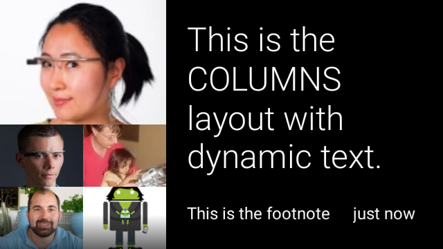
A
CardBuilder.Layout.COLUMNS
mostra um mosaico ou ícone de imagem na
lado esquerdo do card e texto no lado direito. O texto é dimensionado dinamicamente
para se adequar melhor ao espaço disponível. Para manter o tamanho do texto fixo, use
CardBuilder.Layout.COLUMNS_FIXED
View view1 = new CardBuilder(context, CardBuilder.Layout.COLUMNS)
.setText("This is the COLUMNS layout with dynamic text.")
.setFootnote("This is the footnote")
.setTimestamp("just now")
.addImage(R.drawable.image1)
.addImage(R.drawable.image2)
.addImage(R.drawable.image3)
.addImage(R.drawable.image4)
.addImage(R.drawable.image5)
.getView();
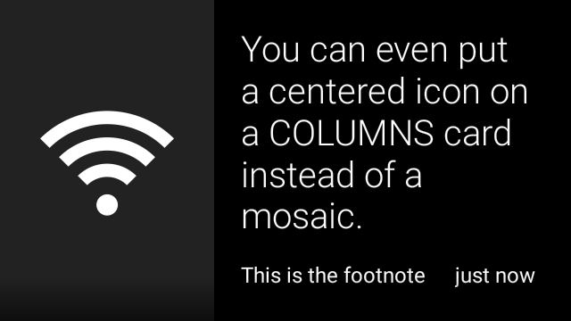
View view2 = new CardBuilder(context, CardBuilder.Layout.COLUMNS)
.setText("You can even put a centered icon on a COLUMNS card instead of a mosaic.")
.setFootnote("This is the footnote")
.setTimestamp("just now")
.setIcon(R.drawable.ic_wifi)
.getView();
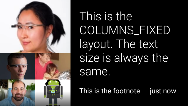
View view3 = new CardBuilder(context, CardBuilder.Layout.COLUMNS_FIXED)
.setText("This is the COLUMNS_FIXED layout. The text size is always the same.")
.setFootnote("This is the footnote")
.setTimestamp("just now")
.addImage(R.drawable.image1)
.addImage(R.drawable.image2)
.addImage(R.drawable.image3)
.addImage(R.drawable.image4)
.addImage(R.drawable.image5)
.getView();
CAPTION
A
CardBuilder.Layout.CAPTION
o layout tem um mosaico de imagens no plano de fundo
e um texto de legenda curto alinhado na parte de baixo do card. Um ícone também pode ser
colocado ao lado da legenda para representar, por exemplo, a identidade de uma pessoa
associados ao conteúdo do card.
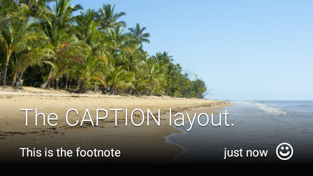
View view1 = new CardBuilder(context, CardBuilder.Layout.CAPTION)
.setText("The caption layout.")
.setFootnote("This is the footnote")
.setTimestamp("just now")
.addImage(R.drawable.beach)
.setAttributionIcon(R.drawable.ic_smile)
.getView();
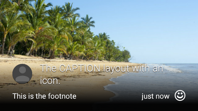
View view2 = new CardBuilder(context, CardBuilder.Layout.CAPTION)
.setText("The caption layout with an icon.")
.setFootnote("This is the footnote")
.setTimestamp("just now")
.addImage(R.drawable.beach)
.setIcon(R.drawable.ic_avatar)
.setAttributionIcon(R.drawable.ic_smile)
.getView();
TITLE
A
CardBuilder.Layout.TITLE
o layout tem um mosaico de imagens no plano de fundo
com um título centralizado e um ícone opcional na parte inferior do card. Este layout
é frequentemente usado para representar contatos ou alvos de compartilhamento. A nota de rodapé e o carimbo de data/hora são
não é compatível com este layout.

View view = new CardBuilder(context, CardBuilder.Layout.TITLE)
    .setText("TITLE Card")
    .setIcon(R.drawable.ic_phone)
    .addImage(R.drawable.beach)
    .getView();
AUTHOR
Use o
CardBuilder.Layout.AUTHOR
layout para exibir uma mensagem ou conversa
com foco no autor. Ele suporta um mosaico de imagens em segundo plano,
um ícone usado como avatar do autor e um título e subtítulo onde você pode
lista de informações de identificação.
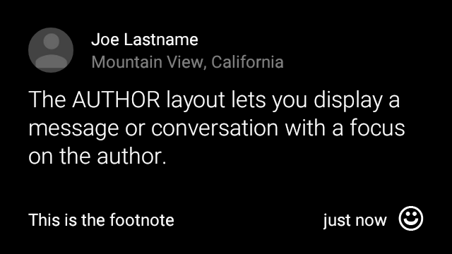
View view = new CardBuilder(context, CardBuilder.Layout.AUTHOR)
    .setText("The AUTHOR layout lets you display a message or conversation "
            + " with a focus on the author.")
    .setIcon(R.drawable.ic_avatar)
    .setHeading("Joe Lastname")
    .setSubheading("Mountain View, California")
    .setFootnote("This is the footnote")
    .setTimestamp("just now")
    .getView();
MENU
A
CardBuilder.Layout.MENU
o layout padrão parece um menu de vidro padrão. Ele tem um
ícone e título centralizados e uma nota de rodapé opcional. Usar este layout para
telas de confirmação (transição de "Exclusão" para "Excluído" depois que o usuário
seleciona um item de menu, por exemplo). Se você precisa de um menu real, deve usar uma
no menu de opções padrão.
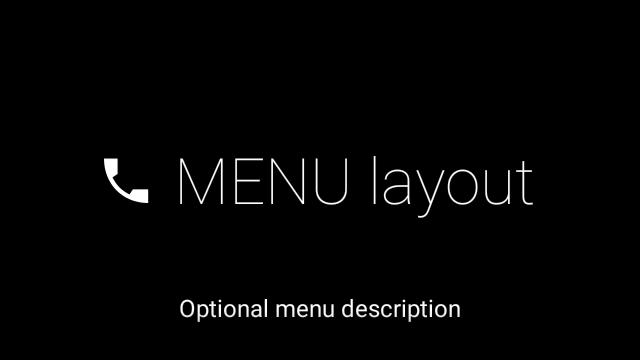
View view = new CardBuilder(context, CardBuilder.Layout.MENU)
    .setText("MENU layout")
    .setIcon(R.drawable.ic_phone)
    .setFootnote("Optional menu description")
    .getView();
EMBED_INSIDE
A
CardBuilder.Layout.EMBED_INSIDE
incorpora um XML de layout personalizado do seu próprio design ao Glass padrão
modelo de card. Isso permite que você projete uma IU personalizada para o aplicativo, mas ainda
têm o posicionamento correto da nota de rodapé, carimbo de data/hora, ícone de atribuição e
da pilha se forem necessários.
Após a ligação
CardBuilder.getView(),
usam
findViewById()
no resultado para acessar as visualizações dentro do layout incorporado. Da mesma forma, se você
ligar
CardBuilder.getRemoteViews(),
você pode manipular as visualizações do layout incorporado transmitindo seus IDs diretamente
no
RemoteViews
setter.
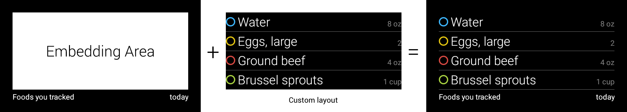
View view = new CardBuilder(context, CardBuilder.Layout.EMBED_INSIDE)
    .setEmbeddedLayout(R.layout.food_table)
    .setFootnote("Foods you tracked")
    .setTimestamp("today")
    .getView();
TextView textView1 = (TextView) view.findViewById(R.id.text_view_1);
textView1.setText("Water");
// ...and so on
Para um exemplo mais detalhado, consulte a documentação Projeto ApiDemo.
ALERT
A
CardBuilder.Layout.ALERT
layout contém um grande ícone centralizado com um
mensagem principal e nota de rodapé. Use esse layout em uma
Dialog para
mostrar uma mensagem informativa, aviso ou erro importante no Glassware.

O exemplo abaixo mostra uma implementação de AlertDialog e dispensa o
e abre as configurações de Wi-Fi quando o usuário toca no cartão:
- Crie uma classe que estenda o
Dialog. - Crie o card usando
CardBuildercom o layoutCardBuilder.Layout.ALERTe defina a visualização de conteúdo com ele. (Opcional) Crie um
GestureDetectorpara processar os gestos do usuário nesse card.public class AlertDialog extends Dialog { private final DialogInterface.OnClickListener mOnClickListener; private final AudioManager mAudioManager; private final GestureDetector mGestureDetector; /** * Handles the tap gesture to call the dialog's * onClickListener if one is provided. */ private final GestureDetector.BaseListener mBaseListener = new GestureDetector.BaseListener() { @Override public boolean onGesture(Gesture gesture) { if (gesture == Gesture.TAP) { mAudioManager.playSoundEffect(Sounds.TAP); if (mOnClickListener != null) { // Since Glass dialogs do not have buttons, // the index passed to onClick is always 0. mOnClickListener.onClick(AlertDialog.this, 0); } return true; } return false; } }; public AlertDialog(Context context, int iconResId, int textResId, int footnoteResId, DialogInterface.OnClickListener onClickListener) { super(context); mOnClickListener = onClickListener; mAudioManager = (AudioManager) context.getSystemService(Context.AUDIO_SERVICE); mGestureDetector = new GestureDetector(context).setBaseListener(mBaseListener); setContentView(new CardBuilder(context, CardBuilder.Layout.ALERT) .setIcon(iconResId) .setText(textResId) .setFootnote(footnoteResId) .getView()); } /** Overridden to let the gesture detector handle a possible tap event. */ @Override public boolean onGenericMotionEvent(MotionEvent event) { return mGestureDetector.onMotionEvent(event) || super.onGenericMotionEvent(event); } }(Opcional) Na sua atividade, implemente uma
OnClickListenerpara lidar com fluxos adicionais quando o usuário tocar. Para mais informações sobre iniciando atividades de configuração, como Wi-Fi, consulte Configurações iniciais.Chame o construtor
AlertDialogpara exibir o card de alerta.public class MyActivity extends Activity { ... private final DialogInterface.OnClickListener mOnClickListener = new DialogInterface.OnClickListener() { @Override public void onClick(DialogInterface dialog, int button) { // Open WiFi Settings startActivity(new Intent(Settings.ACTION_WIFI_SETTINGS)); } }; @Override protected void onCreate(Bundle bundle) { ... new AlertDialog(context, R.drawable.ic_cloud_sad_150, R.string.alert_text, R.string.alert_footnote_text, mOnClickListener).show(); ... } }
Layouts XML
Aqui estão dois layouts básicos de cartão que você pode usar se a classe CardBuilder fizer isso não atende às suas necessidades.
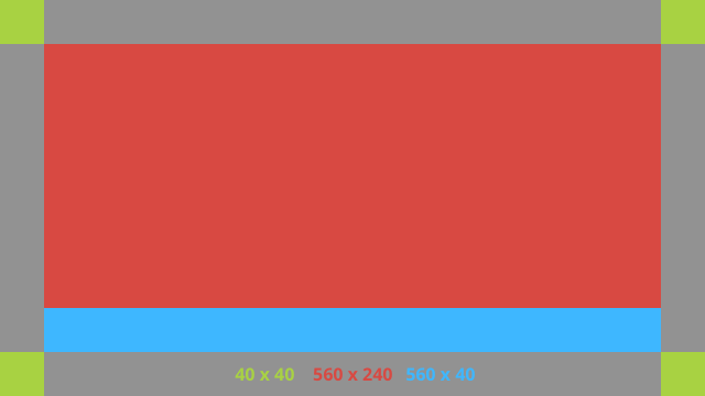
Layout principal
Esse layout define o padding e o rodapé padrão de um card. Coloque o seu
visualizações na RelativeLayout vazia.
<?xml version="1.0" encoding="utf-8"?>
<FrameLayout xmlns:android="http://schemas.android.com/apk/res/android"
    xmlns:tools="http://schemas.android.com/tools"
    android:id="@+id/layout"
    android:layout_width="match_parent"
    android:layout_height="match_parent"
    >

    <RelativeLayout
        android:id="@+id/body_layout"
        android:layout_width="match_parent"
        android:layout_height="@dimen/glass_card_body_height"
        android:layout_marginLeft="@dimen/glass_card_margin"
        android:layout_marginTop="@dimen/glass_card_margin"
        android:layout_marginRight="@dimen/glass_card_margin"
        tools:ignore="UselessLeaf"
        >

        <!-- Put your widgets inside this RelativeLayout. -->

    </RelativeLayout>

    <LinearLayout
        android:id="@+id/footer_container"
        android:layout_width="match_parent"
        android:layout_height="wrap_content"
        android:layout_gravity="bottom|left"
        android:layout_marginLeft="@dimen/glass_card_margin"
        android:layout_marginBottom="@dimen/glass_card_footer_margin"
        android:layout_marginRight="@dimen/glass_card_margin"
        android:orientation="horizontal"
        >

        <!-- The footer view will grow to fit as much content as possible while the
             timestamp view keeps a fixed width. If the footer text is too long, it
             will be ellipsized with a 40px margin between it and the timestamp. -->

        <TextView
            android:id="@+id/footer"
            android:layout_width="0dip"
            android:layout_height="wrap_content"
            android:layout_weight="1"
            android:ellipsize="end"
            android:singleLine="true"
            android:textAppearance="?android:attr/textAppearanceSmall"
            />

        <TextView
            android:id="@+id/timestamp"
            android:layout_width="wrap_content"
            android:layout_height="wrap_content"
            android:layout_marginLeft="@dimen/glass_card_margin"
            android:ellipsize="end"
            android:singleLine="true"
            android:textAppearance="?android:attr/textAppearanceSmall"
            />

    </LinearLayout>

</FrameLayout>
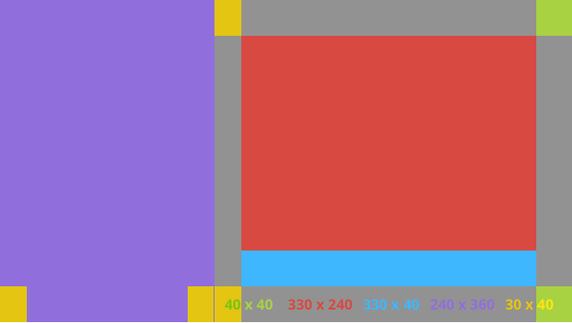
Layout da coluna esquerda
Isso define uma coluna esquerda de 240 px e uma coluna direita de 400 px na forma de duas RelativeLayouts
para colocar suas visualizações.
<?xml version="1.0" encoding="utf-8"?>
<RelativeLayout xmlns:android="http://schemas.android.com/apk/res/android"
    xmlns:tools="http://schemas.android.com/tools"
    android:layout_width="match_parent"
    android:layout_height="match_parent"
    >

    <RelativeLayout
        android:id="@+id/left_column"
        android:layout_width="@dimen/glass_card_left_column_width"
        android:layout_height="match_parent"
        >

        <!-- Put widgets for the left column inside this RelativeLayout. -->

    </RelativeLayout>

    <RelativeLayout
        android:layout_width="wrap_content"
        android:layout_height="@dimen/glass_card_body_height"
        android:layout_alignParentRight="true"
        android:layout_alignParentTop="true"
        android:layout_marginLeft="@dimen/glass_card_two_column_margin"
        android:layout_marginRight="@dimen/glass_card_margin"
        android:layout_marginTop="@dimen/glass_card_margin"
        android:layout_toRightOf="@+id/left_column"
        tools:ignore="UselessLeaf"
        >

        <!-- Put widgets for the right column inside this RelativeLayout. -->

    </RelativeLayout>

    <LinearLayout
        android:id="@+id/footer_container"
        android:layout_width="wrap_content"
        android:layout_height="wrap_content"
        android:layout_alignParentBottom="true"
        android:layout_alignParentRight="true"
        android:layout_gravity="bottom|left"
        android:layout_marginBottom="@dimen/glass_card_footer_margin"
        android:layout_marginLeft="@dimen/glass_card_two_column_margin"
        android:layout_marginRight="@dimen/glass_card_margin"
        android:layout_toRightOf="@+id/left_column"
        android:orientation="horizontal"
        >

        <!--
             The footer view will grow to fit as much content as possible while the
             timestamp view keeps a fixed width. If the footer text is too long, it
             will be ellipsized with a 40px margin between it and the timestamp.
        -->

        <TextView
            android:id="@+id/footer"
            android:layout_width="0dip"
            android:layout_height="wrap_content"
            android:layout_weight="1"
            android:ellipsize="end"
            android:singleLine="true"
            android:textAppearance="?android:attr/textAppearanceSmall"
            />

        <TextView
            android:id="@+id/timestamp"
            android:layout_width="wrap_content"
            android:layout_height="wrap_content"
            android:layout_marginLeft="@dimen/glass_card_margin"
            android:ellipsize="end"
            android:singleLine="true"
            android:textAppearance="?android:attr/textAppearanceSmall"
            />

    </LinearLayout>

</RelativeLayout>
Dimensões padrão
Use este arquivo em conjunto com os layouts anteriores ou seus próprios layouts para
para aderir ao estilo padrão do Google Glass. Criar este arquivo como
res/values/dimens.xml no projeto Android.
<?xml version="1.0" encoding="utf-8"?>

<resources>

    <!-- The recommended margin for the top, left, and right edges of a card. -->
    <dimen name="glass_card_margin">40px</dimen>

    <!-- The recommended margin between the bottom of the card and the footer. This is
         an adjusted value so that the baseline of the text in the footer sits 40px
         from the bottom of the card, matching the other margins. -->
    <dimen name="glass_card_footer_margin">33px</dimen>

    <!-- The recommended margin for the left column of the two-column card. -->
    <dimen name="glass_card_two_column_margin">30px</dimen>

    <!-- The maximum height of the body content inside a card. -->
    <dimen name="glass_card_body_height">240px</dimen>

    <!-- The width of the left column in the two-column layout. -->
    <dimen name="glass_card_left_column_width">240px</dimen>

</resources>