इस दस्तावेज़ में Glass स्टाइल फ़ॉलो करने का तरीका बताया गया है और GDK का इस्तेमाल करते समय यूज़र इंटरफ़ेस (यूआई) के सबसे सही तरीकों को लागू करें.
Glass थीम
Glass आपके ग्लासवेयर पर एक मानक थीम लागू करता है, इसलिए यह बाकी यूज़र इंटरफ़ेस से मेल खाता है. कॉन्टेंट बनाने थीम की विशेषताएं ये हैं:
- रोबोटो टाइपफ़ेस का इस्तेमाल किया जाता है
- यह बिना किसी स्टेटस बार या ऐक्शन बार के गतिविधियों को फ़ुल-स्क्रीन पर दिखाता है
- ठोस, काले रंग का बैकग्राउंड लागू हो जाता है
Glass थीम लागू करने के लिए, अपने Android मेनिफ़ेस्ट में किसी थीम का एलान न करें.
अगर आपके पास कांच के बर्तनों के लिए पसंद के मुताबिक अलग स्टाइल है
और अन्य सभी चीज़ों के लिए डिफ़ॉल्ट Glass थीम चाहिए,
parent एट्रिब्यूट वाले Theme.DeviceDefault से इनहेरिट करें:
<resources>
    <style name="CustomTheme" parent="@android:style/Theme.DeviceDefault">
        <!-- Theme customization goes here. -->
    </style>
</resources>
यहां Android डेवलपर गाइड देखें स्टाइल और थीम देखें.
ग्लास स्टाइल वाले कार्ड
CardBuilder
क्लास, प्रॉपर्टी के सेट के आधार पर बेहतर कार्ड बनाता है. लेआउट का इस्तेमाल करें
CardBuilder.Layout की ओर से दिया गया
ताकि आपका कॉन्टेंट, YouTube पर मौजूद अन्य कॉन्टेंट की तरह दिखे
कांच.
CardBuilder का इस्तेमाल करने के लिए:
CardBuilderका एक इंस्टेंस बनाएं, ताकि इसे अपनी पसंद का लेआउट दिया जा सकेCardBuilder.Layout.- कार्ड की प्रॉपर्टी सेट करें, जैसे कि टेक्स्ट, फ़ुटनोट, और टाइमस्टैंप.
CardBuilder.getView()पर कॉल करें कार्ड को Android में बदलने के लिएViewयाCardBuilder.getRemoteViews()इसे एकRemoteViewsऑब्जेक्ट है.Viewका इस्तेमाल अपनी गतिविधियों, लेआउट याCardScrollViewयाLiveCardमेंRemoteViews.
यूज़र इंटरफ़ेस (यूआई) की सामान्य सुविधाएं
CardBuilder के कई लेआउट, सामान्य यूज़र इंटरफ़ेस के साथ काम करते हैं
सुविधाओं के बारे में ज़्यादा जानें. इसमें अलग-अलग लेआउट के दस्तावेज़ देखें
CardBuilder.Layout
हर तरह के कार्ड के साथ काम करने वाली सुविधाओं की सूची देखें.
एट्रिब्यूशन का आइकॉन
एट्रिब्यूशन आइकॉन एक वैकल्पिक 36 × 36 पिक्सल का आइकॉन है, जो
कार्ड के निचले दाएं कोने और टाइमस्टैंप के दाईं ओर मौजूद होता है. इसे सेट करें
कॉल करके आइकॉन
CardBuilder.setAttributionIcon()
आपके ऐप्लिकेशन की पहचान करने के लिए, खासकर लाइव कार्ड पर, ताकि उपयोगकर्ता
एक नज़र में देखकर उस कार्ड पर मौजूद जानकारी का स्रोत देख सकते हैं.
स्टैक इंडिकेटर
स्टैक इंडिकेटर, इसे कंट्रोल करता है
CardBuilder.showStackIndicator()
कॉर्नर फ़ोल्ड मौजूद है, जो कार्ड के सबसे ऊपर दाएं कोने में दिखता है. इसका इस्तेमाल इस तौर पर करें
यह एक विज़ुअल इंडिकेटर है कि आपका कार्ड उन कार्ड के बंडल को दिखाता है जिन्हें
जिस पर उपयोगकर्ता सीधे टैप कर सकते हैं.
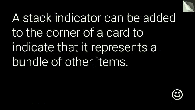
View view = new CardBuilder(context, CardBuilder.Layout.TEXT)
    .setText("A stack indicator can be added to the corner of a card...")
    .setAttributionIcon(R.drawable.ic_smile)
    .showStackIndicator(true)
    .getView();
लेआउट
नीचे दिए गए उदाहरणों में, वे लेआउट दिखाए गए हैं जो
CardBuilder.
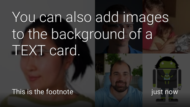
TEXT और TEXT_FIXED
CardBuilder.Layout.TEXT
लेआउट में वैकल्पिक टेक्स्ट के साथ फ़ुल-ब्लीड टेक्स्ट दिखता है
बैकग्राउंड में इमेज मोज़ेक दिख रहा है. टेक्स्ट के साइज़ में डाइनैमिक तौर पर बदलाव होता है, ताकि वह इमेज के
खाली जगह.
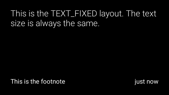
CardBuilder.Layout.TEXT_FIXED
समान है लेकिन इसके टेक्स्ट को छोटे आकार में ठीक कर देता है.
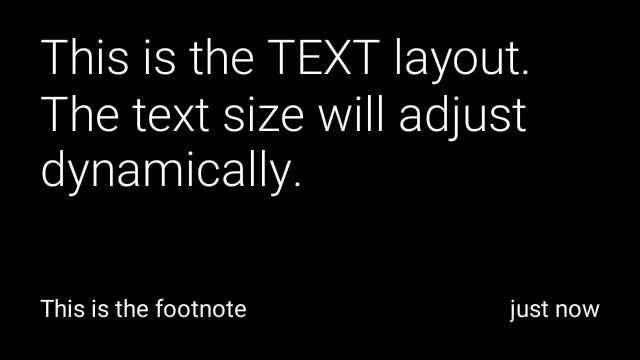
View view1 = new CardBuilder(context, CardBuilder.Layout.TEXT)
    .setText("This is the TEXT layout. The text size will adjust dynamically.")
    .setFootnote("This is the footnote")
    .setTimestamp("just now")
    .getView();
View view2 = new CardBuilder(context, CardBuilder.Layout.TEXT)
    .setText("You can also add images to the background of a TEXT card.")
    .setFootnote("This is the footnote")
    .setTimestamp("just now")
    .addImage(R.drawable.image1)
    .addImage(R.drawable.image2)
    .addImage(R.drawable.image3)
    .addImage(R.drawable.image4)
    .addImage(R.drawable.image5)
    .getView();
View view3 = new CardBuilder(context, CardBuilder.Layout.TEXT_FIXED)
    .setText("This is the TEXT_FIXED layout. The text size is always the same.")
    .setFootnote("This is the footnote")
    .setTimestamp("just now")
    .getView();
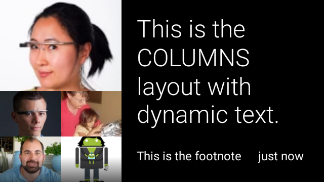
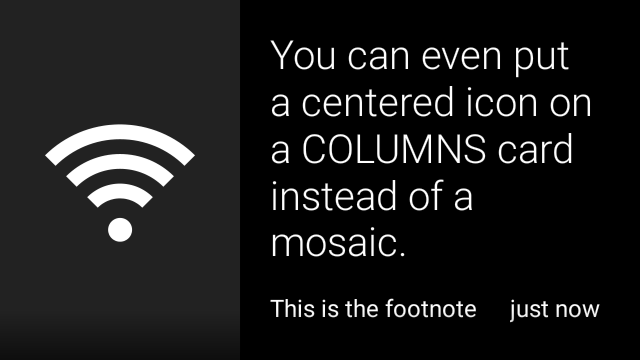
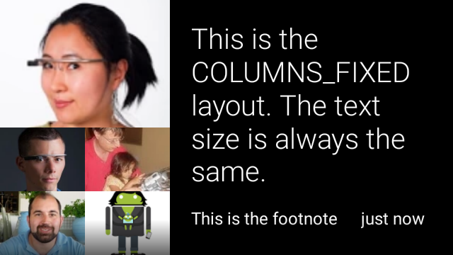
COLUMNS और COLUMNS_FIXED
कॉन्टेंट बनाने
CardBuilder.Layout.COLUMNS
लेआउट, होम पेज पर इमेज मोज़ेक या आइकॉन को दिखाता है
कार्ड के बाईं ओर और दाईं ओर टेक्स्ट. टेक्स्ट का साइज़ डाइनैमिक होना चाहिए
जो उपलब्ध जगह के हिसाब से सबसे सही हो. टेक्स्ट का आकार तय रखने के लिए, इसका इस्तेमाल करें
CardBuilder.Layout.COLUMNS_FIXED.
View view1 = new CardBuilder(context, CardBuilder.Layout.COLUMNS)
    .setText("This is the COLUMNS layout with dynamic text.")
    .setFootnote("This is the footnote")
    .setTimestamp("just now")
    .addImage(R.drawable.image1)
    .addImage(R.drawable.image2)
    .addImage(R.drawable.image3)
    .addImage(R.drawable.image4)
    .addImage(R.drawable.image5)
    .getView();
View view2 = new CardBuilder(context, CardBuilder.Layout.COLUMNS)
    .setText("You can even put a centered icon on a COLUMNS card instead of a mosaic.")
    .setFootnote("This is the footnote")
    .setTimestamp("just now")
    .setIcon(R.drawable.ic_wifi)
    .getView();
View view3 = new CardBuilder(context, CardBuilder.Layout.COLUMNS_FIXED)
    .setText("This is the COLUMNS_FIXED layout. The text size is always the same.")
    .setFootnote("This is the footnote")
    .setTimestamp("just now")
    .addImage(R.drawable.image1)
    .addImage(R.drawable.image2)
    .addImage(R.drawable.image3)
    .addImage(R.drawable.image4)
    .addImage(R.drawable.image5)
    .getView();
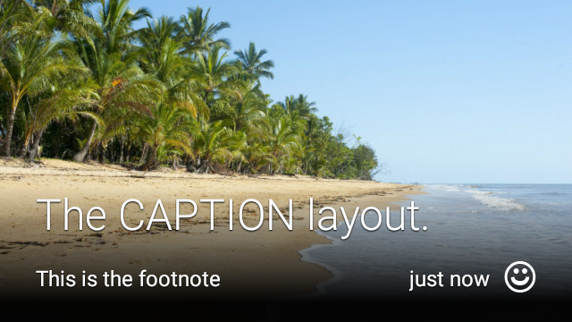
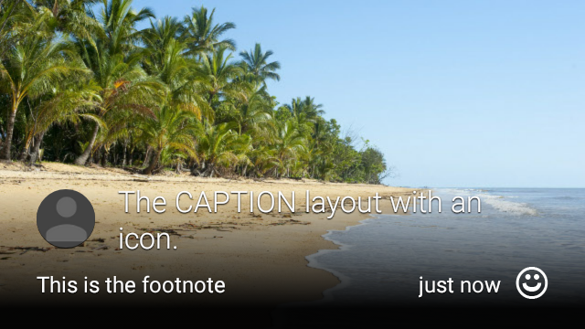
CAPTION
कॉन्टेंट बनाने
CardBuilder.Layout.CAPTION
लेआउट में बैकग्राउंड में इमेज मोज़ेक है
और छोटे कैप्शन टेक्स्ट को कार्ड के निचले हिस्से में अलाइन किया गया है. आइकॉन ऐसा भी हो सकता है
जिसे कैप्शन के बगल में रखा जाता है. उदाहरण के लिए, किसी व्यक्ति की पहचान
जो कार्ड के कॉन्टेंट से जुड़ा हो.
View view1 = new CardBuilder(context, CardBuilder.Layout.CAPTION)
    .setText("The caption layout.")
    .setFootnote("This is the footnote")
    .setTimestamp("just now")
    .addImage(R.drawable.beach)
    .setAttributionIcon(R.drawable.ic_smile)
    .getView();

View view2 = new CardBuilder(context, CardBuilder.Layout.CAPTION)
    .setText("The caption layout with an icon.")
    .setFootnote("This is the footnote")
    .setTimestamp("just now")
    .addImage(R.drawable.beach)
    .setIcon(R.drawable.ic_avatar)
    .setAttributionIcon(R.drawable.ic_smile)
    .getView();
TITLE
कॉन्टेंट बनाने
CardBuilder.Layout.TITLE
लेआउट में बैकग्राउंड में इमेज मोज़ेक है
जिसमें कार्ड के निचले हिस्से में बीच वाला टाइटल और वैकल्पिक आइकॉन शामिल है. यह लेआउट
का इस्तेमाल अक्सर संपर्कों को दिखाने या टारगेट शेयर करने के लिए किया जाता है. फ़ुटनोट और टाइमस्टैंप
इस लेआउट पर काम नहीं करता है.
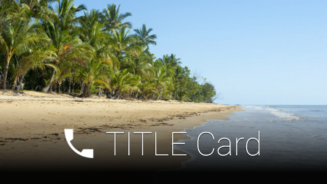
View view = new CardBuilder(context, CardBuilder.Layout.TITLE)
    .setText("TITLE Card")
    .setIcon(R.drawable.ic_phone)
    .addImage(R.drawable.beach)
    .getView();
AUTHOR
इसका इस्तेमाल करें
CardBuilder.Layout.AUTHOR
मैसेज या बातचीत दिखाने के लिए लेआउट
जहाँ फ़ोकस लेखक पर होता है. यह बैकग्राउंड में इमेज मोज़ेक के साथ काम करता है,
एक आइकॉन का इस्तेमाल किया जाता है, जिसका इस्तेमाल लेखक के अवतार के तौर पर किया जाता है. साथ ही, एक हेडिंग और सबटाइटल
पहचान करने वाली जानकारी की सूची.
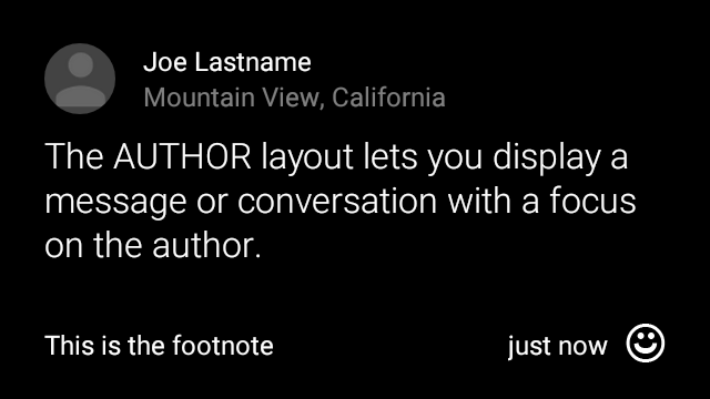
View view = new CardBuilder(context, CardBuilder.Layout.AUTHOR)
    .setText("The AUTHOR layout lets you display a message or conversation "
            + " with a focus on the author.")
    .setIcon(R.drawable.ic_avatar)
    .setHeading("Joe Lastname")
    .setSubheading("Mountain View, California")
    .setFootnote("This is the footnote")
    .setTimestamp("just now")
    .getView();
MENU
कॉन्टेंट बनाने
CardBuilder.Layout.MENU
लेआउट, स्टैंडर्ड Glass मेन्यू जैसा दिखता है. इसमें
बीच में आइकॉन और टाइटल के साथ-साथ फ़ुटनोट का विकल्प भी मौजूद है. इस लेआउट का इस्तेमाल इसके लिए करें
पुष्टि करने वाली स्क्रीन (उपयोगकर्ता के बाद "मिटाई जा रही है" से "मिटाई गई" में बदलना
मेन्यू आइटम चुनता है, उदाहरण के लिए). अगर आपको असली मेन्यू की ज़रूरत है, तो
के बजाय स्टैंडर्ड विकल्प मेन्यू का इस्तेमाल करें.
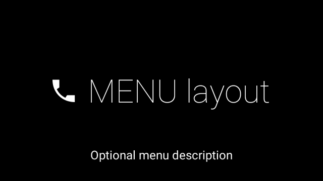
View view = new CardBuilder(context, CardBuilder.Layout.MENU)
    .setText("MENU layout")
    .setIcon(R.drawable.ic_phone)
    .setFootnote("Optional menu description")
    .getView();
EMBED_INSIDE
कॉन्टेंट बनाने
CardBuilder.Layout.EMBED_INSIDE
लेआउट, आपके डिज़ाइन का कस्टम लेआउट एक्सएमएल को स्टैंडर्ड Glass में एम्बेड करता है
कार्ड टेम्प्लेट. इससे आप अपने ऐप्लिकेशन के लिए कस्टम यूज़र इंटरफ़ेस (यूआई) डिज़ाइन कर सकते हैं
कार्ड के फ़ुटनोट, टाइमस्टैंप, एट्रिब्यूशन आइकॉन, और
ज़रूरी होने पर स्टैक इंडिकेटर.
कॉल करने के बाद
CardBuilder.getView()
इस्तेमाल
findViewById()
नतीजे पर, एम्बेड किए गए लेआउट में व्यू ऐक्सेस करने के लिए. इसी तरह, अगर आपको
कॉल करें
CardBuilder.getRemoteViews()
आप अपने एम्बेड किए गए लेआउट के व्यू में बदलाव कर सकते हैं. इसके लिए आपको उनका आईडी सीधे पास करना होगा
में
RemoteViews
सेटर तरीके.
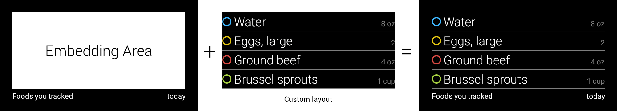
View view = new CardBuilder(context, CardBuilder.Layout.EMBED_INSIDE)
    .setEmbeddedLayout(R.layout.food_table)
    .setFootnote("Foods you tracked")
    .setTimestamp("today")
    .getView();
TextView textView1 = (TextView) view.findViewById(R.id.text_view_1);
textView1.setText("Water");
// ...and so on
ज़्यादा जानकारी वाले उदाहरण के लिए, GitHub देखें ApiDemo प्रोजेक्ट.
ALERT
कॉन्टेंट बनाने
CardBuilder.Layout.ALERT
लेआउट में बीच में एक आइकॉन होता है, जिसमें
मुख्य मैसेज और फ़ुटनोट. इस लेआउट का इस्तेमाल इसमें
Dialog से
आपके Glassware में कोई महत्वपूर्ण सूचनात्मक संदेश, चेतावनी या गड़बड़ी दिखाई जाती है.

नीचे दिए गए उदाहरण में, AlertDialog को लागू करने के बारे में बताया गया है और
कार्ड पर क्लिक करता है और उपयोगकर्ता के कार्ड पर टैप करने पर वाई-फ़ाई सेटिंग खोलता है:
Dialogका दायरा बढ़ाने वाली क्लास बनाएं.CardBuilder.Layout.ALERTलेआउट के साथCardBuilderका इस्तेमाल करके कार्ड बनाएं. इसके बाद, इस कार्ड के साथ कॉन्टेंट व्यू सेट करें.(ज़रूरी नहीं) इस कार्ड पर उपयोगकर्ता के जेस्चर मैनेज करने के लिए, एक
GestureDetectorबनाएं.public class AlertDialog extends Dialog { private final DialogInterface.OnClickListener mOnClickListener; private final AudioManager mAudioManager; private final GestureDetector mGestureDetector; /** * Handles the tap gesture to call the dialog's * onClickListener if one is provided. */ private final GestureDetector.BaseListener mBaseListener = new GestureDetector.BaseListener() { @Override public boolean onGesture(Gesture gesture) { if (gesture == Gesture.TAP) { mAudioManager.playSoundEffect(Sounds.TAP); if (mOnClickListener != null) { // Since Glass dialogs do not have buttons, // the index passed to onClick is always 0. mOnClickListener.onClick(AlertDialog.this, 0); } return true; } return false; } }; public AlertDialog(Context context, int iconResId, int textResId, int footnoteResId, DialogInterface.OnClickListener onClickListener) { super(context); mOnClickListener = onClickListener; mAudioManager = (AudioManager) context.getSystemService(Context.AUDIO_SERVICE); mGestureDetector = new GestureDetector(context).setBaseListener(mBaseListener); setContentView(new CardBuilder(context, CardBuilder.Layout.ALERT) .setIcon(iconResId) .setText(textResId) .setFootnote(footnoteResId) .getView()); } /** Overridden to let the gesture detector handle a possible tap event. */ @Override public boolean onGenericMotionEvent(MotionEvent event) { return mGestureDetector.onMotionEvent(event) || super.onGenericMotionEvent(event); } }(ज़रूरी नहीं) अपनी गतिविधि में,
OnClickListenerका इस्तेमाल करें. अगर आपको ज़्यादा जानकारी चाहिए, तो वाई-फ़ाई जैसी सेटिंग गतिविधियाँ शुरू कर रहे हैं, देखें शुरुआती सेटिंग.अलर्ट कार्ड दिखाने के लिए,
AlertDialogकंस्ट्रक्टर को कॉल करें.public class MyActivity extends Activity { ... private final DialogInterface.OnClickListener mOnClickListener = new DialogInterface.OnClickListener() { @Override public void onClick(DialogInterface dialog, int button) { // Open WiFi Settings startActivity(new Intent(Settings.ACTION_WIFI_SETTINGS)); } }; @Override protected void onCreate(Bundle bundle) { ... new AlertDialog(context, R.drawable.ic_cloud_sad_150, R.string.alert_text, R.string.alert_footnote_text, mOnClickListener).show(); ... } }
एक्सएमएल लेआउट
यहां दो बेसिक कार्ड लेआउट दिए गए हैं. अगर CardBuilder क्लास से आपकी साइट को कनेक्ट किया जाता है, तो इन लेआउट का इस्तेमाल किया जा सकता है आपकी ज़रूरतों को पूरा नहीं करता.
मुख्य लेआउट
यह लेआउट, कार्ड के लिए स्टैंडर्ड पैडिंग (जगह) और फ़ुटर के बारे में बताता है. अपने हिसाब से लगाएं
खाली RelativeLayout में व्यू.
<?xml version="1.0" encoding="utf-8"?>
<FrameLayout xmlns:android="http://schemas.android.com/apk/res/android"
    xmlns:tools="http://schemas.android.com/tools"
    android:id="@+id/layout"
    android:layout_width="match_parent"
    android:layout_height="match_parent"
    >

    <RelativeLayout
        android:id="@+id/body_layout"
        android:layout_width="match_parent"
        android:layout_height="@dimen/glass_card_body_height"
        android:layout_marginLeft="@dimen/glass_card_margin"
        android:layout_marginTop="@dimen/glass_card_margin"
        android:layout_marginRight="@dimen/glass_card_margin"
        tools:ignore="UselessLeaf"
        >

        <!-- Put your widgets inside this RelativeLayout. -->

    </RelativeLayout>

    <LinearLayout
        android:id="@+id/footer_container"
        android:layout_width="match_parent"
        android:layout_height="wrap_content"
        android:layout_gravity="bottom|left"
        android:layout_marginLeft="@dimen/glass_card_margin"
        android:layout_marginBottom="@dimen/glass_card_footer_margin"
        android:layout_marginRight="@dimen/glass_card_margin"
        android:orientation="horizontal"
        >

        <!-- The footer view will grow to fit as much content as possible while the
             timestamp view keeps a fixed width. If the footer text is too long, it
             will be ellipsized with a 40px margin between it and the timestamp. -->

        <TextView
            android:id="@+id/footer"
            android:layout_width="0dip"
            android:layout_height="wrap_content"
            android:layout_weight="1"
            android:ellipsize="end"
            android:singleLine="true"
            android:textAppearance="?android:attr/textAppearanceSmall"
            />

        <TextView
            android:id="@+id/timestamp"
            android:layout_width="wrap_content"
            android:layout_height="wrap_content"
            android:layout_marginLeft="@dimen/glass_card_margin"
            android:ellipsize="end"
            android:singleLine="true"
            android:textAppearance="?android:attr/textAppearanceSmall"
            />

    </LinearLayout>

</FrameLayout>
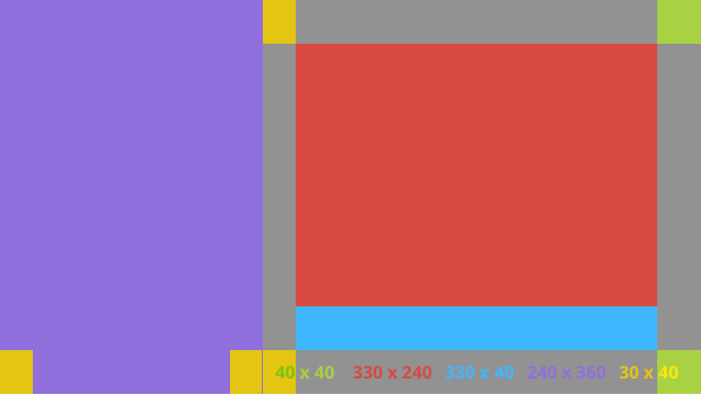
बाएं कॉलम का लेआउट
यह 240 पिक्सल के बाएं कॉलम और 400 पिक्सल के दाएं कॉलम के बारे में दो RelativeLayouts के तौर पर बताता है
जिनमें अपने व्यू जोड़े जा सकते हैं.
<?xml version="1.0" encoding="utf-8"?>
<RelativeLayout xmlns:android="http://schemas.android.com/apk/res/android"
    xmlns:tools="http://schemas.android.com/tools"
    android:layout_width="match_parent"
    android:layout_height="match_parent"
    >

    <RelativeLayout
        android:id="@+id/left_column"
        android:layout_width="@dimen/glass_card_left_column_width"
        android:layout_height="match_parent"
        >

        <!-- Put widgets for the left column inside this RelativeLayout. -->

    </RelativeLayout>

    <RelativeLayout
        android:layout_width="wrap_content"
        android:layout_height="@dimen/glass_card_body_height"
        android:layout_alignParentRight="true"
        android:layout_alignParentTop="true"
        android:layout_marginLeft="@dimen/glass_card_two_column_margin"
        android:layout_marginRight="@dimen/glass_card_margin"
        android:layout_marginTop="@dimen/glass_card_margin"
        android:layout_toRightOf="@+id/left_column"
        tools:ignore="UselessLeaf"
        >

        <!-- Put widgets for the right column inside this RelativeLayout. -->

    </RelativeLayout>

    <LinearLayout
        android:id="@+id/footer_container"
        android:layout_width="wrap_content"
        android:layout_height="wrap_content"
        android:layout_alignParentBottom="true"
        android:layout_alignParentRight="true"
        android:layout_gravity="bottom|left"
        android:layout_marginBottom="@dimen/glass_card_footer_margin"
        android:layout_marginLeft="@dimen/glass_card_two_column_margin"
        android:layout_marginRight="@dimen/glass_card_margin"
        android:layout_toRightOf="@+id/left_column"
        android:orientation="horizontal"
        >

        <!--
             The footer view will grow to fit as much content as possible while the
             timestamp view keeps a fixed width. If the footer text is too long, it
             will be ellipsized with a 40px margin between it and the timestamp.
        -->

        <TextView
            android:id="@+id/footer"
            android:layout_width="0dip"
            android:layout_height="wrap_content"
            android:layout_weight="1"
            android:ellipsize="end"
            android:singleLine="true"
            android:textAppearance="?android:attr/textAppearanceSmall"
            />

        <TextView
            android:id="@+id/timestamp"
            android:layout_width="wrap_content"
            android:layout_height="wrap_content"
            android:layout_marginLeft="@dimen/glass_card_margin"
            android:ellipsize="end"
            android:singleLine="true"
            android:textAppearance="?android:attr/textAppearanceSmall"
            />

    </LinearLayout>

</RelativeLayout>
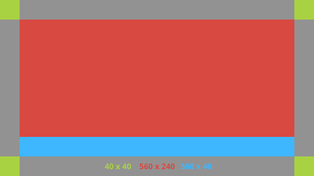
स्टैंडर्ड डाइमेंशन
इस फ़ाइल का इस्तेमाल पिछले लेआउट या अपने खुद के लेआउट के साथ करें
का पालन करना होगा. यह फ़ाइल इस रूप में बनाएं
आपके Android प्रोजेक्ट में res/values/dimens.xml है.
<?xml version="1.0" encoding="utf-8"?>

<resources>

    <!-- The recommended margin for the top, left, and right edges of a card. -->
    <dimen name="glass_card_margin">40px</dimen>

    <!-- The recommended margin between the bottom of the card and the footer. This is
         an adjusted value so that the baseline of the text in the footer sits 40px
         from the bottom of the card, matching the other margins. -->
    <dimen name="glass_card_footer_margin">33px</dimen>

    <!-- The recommended margin for the left column of the two-column card. -->
    <dimen name="glass_card_two_column_margin">30px</dimen>

    <!-- The maximum height of the body content inside a card. -->
    <dimen name="glass_card_body_height">240px</dimen>

    <!-- The width of the left column in the two-column layout. -->
    <dimen name="glass_card_left_column_width">240px</dimen>

</resources>