
マテリアル コンポーネント(MDC)は、デベロッパーがマテリアル デザインを実装する際に役立ちます。Google のエンジニアと UX デザイナーのチームが作成した MDC には、美しく機能的な UI コンポーネントが多数含まれており、Android、iOS、ウェブ、Flutter に利用可能です。 material.io/develop |
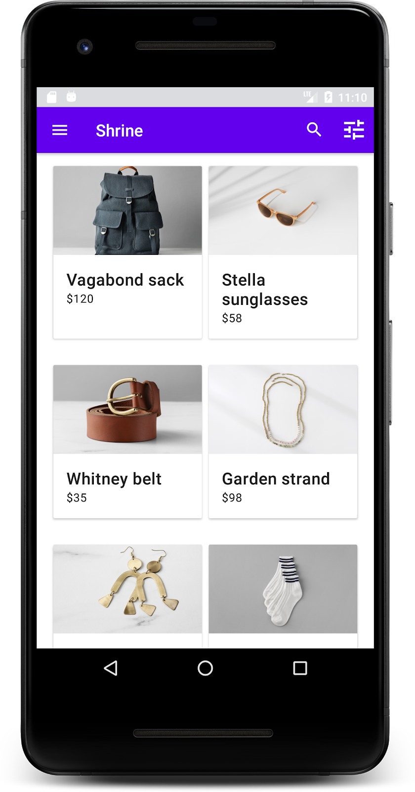
Codelab MDC-101 および MDC-102 では、マテリアル コンポーネント(MDC)を使用して、Shrine というアプリの土台を構築しました。Shrine は、衣服と生活雑貨を販売する e コマースアプリです。このアプリのユーザーフローは、最初にログイン画面を表示し、次に商品を表示するホーム画面に移動します。
マテリアル デザインの最新の拡張では、デザイナーとデベロッパーが商品のブランドを表現するための柔軟性が向上しています。MDC を使用して Shrine をカスタマイズし、独自のスタイルを反映できるようになりました。
作成するアプリの概要
この Codelab では、以下を使用して Shrine をカスタマイズし、ブランドを反映させます。
- 色
- タイポグラフィ
- 高度
- レイアウト
この Codelab で使用する MDC Android コンポーネントとサブシステム:
- テーマ
- タイポグラフィ
- 高度
必要なもの
- Android 開発に関する基本的な知識
- Android Studio (まだお持ちでない場合はこちらからダウンロードしてください)
- Android Emulator または Android デバイス(Android Studio から入手可能)
- サンプルコード(次の手順を参照)
Android アプリ作成のご経験についてお答えください。
MDC-102 から続行する場合
MDC-102 が完了済みであれば、コードはこの Codelab を進められる状態になっています。ステップ 3: 色を変更するに進みます。
Codelab のスターター アプリをダウンロードする
スターター アプリは material-components-android-codelabs-103-starter/kotlin ディレクトリにあります。開始する前に、必ずそのディレクトリに cd してください。
GitHub からクローンを作成する
GitHub からこの Codelab のクローンを作成するには、次のコマンドを実行します。
git clone https://github.com/material-components/material-components-android-codelabs
cd material-components-android-codelabs/
git checkout 103-starter
Android Studio にスターター コードを読み込む
- 設定ウィザードが終了し、[Welcome to Android Studio] ウィンドウが表示されたら、[Open an existing Android Studio project] をクリックします。サンプルコードをインストールしたディレクトリに移動し、[kotlin -> shrine](または、パソコンで shrine を検索)を選択して Shipping プロジェクトを開きます。
- Android Studio がプロジェクトをビルドして同期するまで待ちます。進捗状況は、Android Studio ウィンドウ下部のアクティビティ インジケーターに表示されます。
- この時点では、Android SDK やビルドツール(以下に示すものなど)が不足しているため、Android Studio でビルドエラーが発生する場合があります。Android Studio の指示に従って、それをインストール/更新して、プロジェクトを同期させます。

プロジェクトの依存関係を追加する
プロジェクトには、MDC Android サポート ライブラリへの依存関係が必要です。ダウンロードしたサンプルコードにはこの依存関係がすでにリストされているはずですが、次の手順で確認することをおすすめします。
appモジュールのbuild.gradleファイルに移動し、MDC Android への依存関係がdependenciesブロックに含まれていることを確認します。
api 'com.google.android.material:material:1.1.0-alpha06'
- (省略可)必要に応じて、
build.gradleファイルを編集して次の依存関係を追加し、プロジェクトを同期します。
dependencies {
    api 'com.google.android.material:material:1.1.0-alpha06'
    implementation 'androidx.legacy:legacy-support-v4:1.0.0'
    implementation 'com.android.volley:volley:1.1.1'
    implementation 'com.google.code.gson:gson:2.8.5'
    implementation "org.jetbrains.kotlin:kotlin-stdlib-jdk7:1.3.21"
    testImplementation 'junit:junit:4.12'
    androidTestImplementation 'androidx.test:core:1.1.0'
    androidTestImplementation 'androidx.test.ext:junit:1.1.0'
    androidTestImplementation 'androidx.test:runner:1.2.0-alpha05'
    androidTestImplementation 'androidx.test.espresso:espresso-core:3.2.0-alpha05'
}
スターター アプリを実行する
|

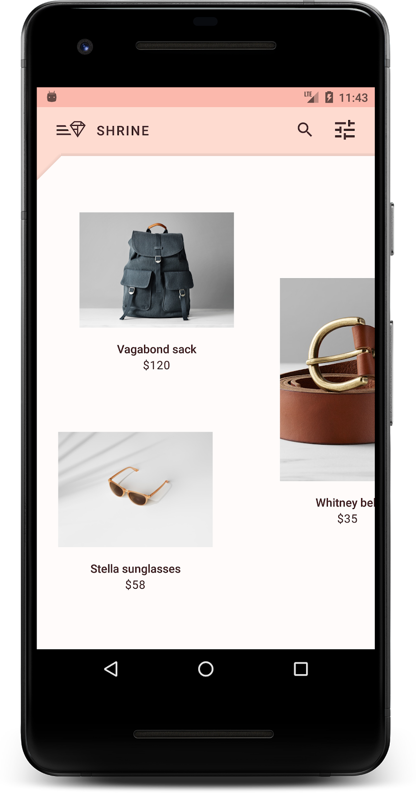
完了しました。デバイスまたはエミュレータで Shrine のログインページが実行されているはずです。[Next] を押すと、Shrine のホームページが表示されます。上部にアプリバーがあり、その下に商品の画像がグリッド状に並んでいます。
色、高さ、タイポグラフィを変更して、トップ アプリバーを Shrine ブランドに合わせましょう。
このカラーテーマは、デザイナーがカスタムカラーを使って作成したものです(下記の画像を参照)。これには Shrine のブランドから選択されたカラーが含まれており、Material Theme Editor に適用されています。Material Theme Editor では、それらのカラーが拡張され、より完全なパレットが作成されています(これらのカラーは、2014 マテリアル カラーパレットに由来するものではありません)。
Material Theme Editor では、カラーは数字のラベルが付いたシェードに分類され、各カラーのラベルは 50、100、200、....900 となっています。Shrine では、ピンクの見本からの 50、100、300 と、ブラウンの見本からの 900 のシェードのみを使用します。


このカラーパターンを反映するように、トップアプリバーの色を変更しましょう。
colorPrimaryDark と colorAccent を設定する
colors.xml で、次の行を変更します。colorAccent 属性は、上部のアプリバーの色などを制御し、colorPrimaryDark 属性はステータスバーの色を制御します。
colors.xml
<color name="colorPrimaryDark">#FBB8AC</color>
<color name="colorAccent">#FEDBD0</color>
ステータスバーで暗いアイコンを使用するには、Shrine のアプリテーマである Theme.Shrine に次の行を追加します。
styles.xml
<item name="android:windowLightStatusBar" tools:targetApi="m">true</item><resources xmlns:tools="http://schemas.android.com/tools">colors.xml と styles.xml は次のようになります。
colors.xml
<?xml version="1.0" encoding="utf-8"?>
<resources>
   <color name="colorPrimary">#E0E0E0</color>
   <color name="colorPrimaryDark">#FBB8AC</color>
   <color name="colorAccent">#FEDBD0</color>
   <color name="toolbarIconColor">#FFFFFF</color>
   <color name="loginPageBackgroundColor">#FFFFFF</color>
   <color name="productGridBackgroundColor">#FFFFFF</color>
</resources>
styles.xml
<resources xmlns:android="http://schemas.android.com/tools">

   <!-- Base application theme. -->
   <style name="Theme.Shrine" parent="Theme.MaterialComponents.Light.NoActionBar">
       <!-- Customize your theme here. -->
       <item name="colorPrimary">@color/colorPrimary</item>
       <item name="colorPrimaryDark">@color/colorPrimaryDark</item>
       <item name="colorAccent">@color/colorAccent</item>
       <item name="android:windowLightStatusBar" tools:targetApi="m">true</item>
   </style>

   <style name="Widget.Shrine.Toolbar" parent="Widget.AppCompat.Toolbar">
       <item name="android:background">?attr/colorAccent</item>
       <item name="android:theme">@style/ThemeOverlay.AppCompat.Dark.ActionBar</item>
       <item name="popupTheme">@style/ThemeOverlay.AppCompat.Light</item>
   </style>

</resources>
colors.xml で、#442C2E に設定された新しい textColorPrimary カラーリソースを追加し、textColorPrimary カラーを参照するように toolbarIconColor 属性を更新します。
styles.xml ファイルを更新して、
属性を、先ほど定義した textColorPrimary 色に設定します。
もう 1 つ、Widget.Shrine.Toolbar スタイルの android:theme 属性を Theme.Shrine に設定します。
colors.xml と styles.xml は次のようになります。
colors.xml
<?xml version="1.0" encoding="utf-8"?>
<resources>
   <color name="colorPrimary">#E0E0E0</color>
   <color name="colorPrimaryDark">#FBB8AC</color>
   <color name="colorAccent">#FEDBD0</color>
   <color name="textColorPrimary">#442C2E</color>
   <color name="toolbarIconColor">@color/textColorPrimary</color>
   <color name="loginPageBackgroundColor">#FFFFFF</color>
   <color name="productGridBackgroundColor">#FFFFFF</color>
</resources>
styles.xml
<resources xmlns:android="http://schemas.android.com/tools">

   <!-- Base application theme. -->
   <style name="Theme.Shrine" parent="Theme.MaterialComponents.Light.NoActionBar">
       <!-- Customize your theme here. -->
       <item name="colorPrimary">@color/colorPrimary</item>
       <item name="colorPrimaryDark">@color/colorPrimaryDark</item>
       <item name="colorAccent">@color/colorAccent</item>
       <item name="android:windowLightStatusBar" tools:targetApi="m">true</item>
       <item name="android:textColorPrimary">@color/textColorPrimary</item>
   </style>

   <style name="Widget.Shrine.Toolbar" parent="Widget.AppCompat.Toolbar">
       <item name="android:background">?attr/colorAccent</item>
       <item name="android:theme">@style/Theme.Shrine</item>
       <item name="popupTheme">@style/ThemeOverlay.AppCompat.Light</item>
   </style>

</resources>
ビルドして実行します。商品グリッドは次のようになります。
カラーパターンに合わせてログイン画面のスタイルを変更しましょう。
テキスト フィールドのスタイルを設定する
ログイン ページのテキスト入力のスタイルをアウトラインに変更し、レイアウトに適切な色を使用しましょう。
次のカラーリソースを colors.xml ファイルに追加します。
colors.xml
<color name="textInputOutlineColor">#FBB8AC</color>styles.xml に 2 つの新しいスタイルを追加します。
styles.xml
<style name="Widget.Shrine.TextInputLayout" parent="Widget.MaterialComponents.TextInputLayout.OutlinedBox">
   <item name="hintTextAppearance">@style/TextAppearance.Shrine.TextInputLayout.HintText</item>
   <item name="hintTextColor">@color/textColorPrimary</item>
   <item name="android:paddingBottom">8dp</item>
   <item name="boxStrokeColor">@color/textInputOutlineColor</item>
</style>

<style name="TextAppearance.Shrine.TextInputLayout.HintText" parent="TextAppearance.MaterialComponents.Subtitle2">
   <item name="android:textColor">?android:attr/textColorPrimary</item>
</style>最後に、shr_login_fragment.xml の TextInputLayout XML コンポーネントの両方に、新しいスタイルを設定します。
shr_login_fragment.xml
<com.google.android.material.textfield.TextInputLayout
   style="@style/Widget.Shrine.TextInputLayout"
   android:layout_width="match_parent"
   android:layout_height="wrap_content"
   android:hint="@string/shr_hint_username">

   <com.google.android.material.textfield.TextInputEditText
       android:layout_width="match_parent"
       android:layout_height="wrap_content"
       android:inputType="text"
       android:maxLines="1" />
</com.google.android.material.textfield.TextInputLayout>

<com.google.android.material.textfield.TextInputLayout
   android:id="@+id/password_text_input"
   style="@style/Widget.Shrine.TextInputLayout"
   android:layout_width="match_parent"
   android:layout_height="wrap_content"
   android:hint="@string/shr_hint_password"
   app:errorEnabled="true">

   <com.google.android.material.textfield.TextInputEditText
       android:id="@+id/password_edit_text"
       android:layout_width="match_parent"
       android:layout_height="wrap_content"
       android:inputType="textPassword" />
</com.google.android.material.textfield.TextInputLayout>
ボタンの色をスタイル設定する
最後に、ログイン ページのボタンの色をスタイル設定します。styles.xml に次のスタイルを追加します。
styles.xml
<style name="Widget.Shrine.Button" parent="Widget.MaterialComponents.Button">
   <item name="android:textColor">?android:attr/textColorPrimary</item>
   <item name="backgroundTint">?attr/colorPrimaryDark</item>
</style>

<style name="Widget.Shrine.Button.TextButton" parent="Widget.MaterialComponents.Button.TextButton">
   <item name="android:textColor">?android:attr/textColorPrimary</item>
</style>
Widget.Shrine.Button スタイルはデフォルトの MaterialButton スタイルを拡張し、ボタンのテキストの色と背景のティントを変更します。Widget.Shrine.Button.TextButton はデフォルトのテキスト MaterialButton スタイルを拡張し、テキストの色のみを変更します。
次のように、[次へ] ボタンに Widget.Shrine.Button スタイルを、[キャンセル] ボタンに Widget.Shrine.Button.TextButton スタイルを設定します。
shr_login_fragment.xml
<RelativeLayout
   android:layout_width="match_parent"
   android:layout_height="wrap_content">

   <com.google.android.material.button.MaterialButton
       android:id="@+id/next_button"
       style="@style/Widget.Shrine.Button"
       android:layout_width="wrap_content"
       android:layout_height="wrap_content"
       android:layout_alignParentEnd="true"
       android:layout_alignParentRight="true"
       android:text="@string/shr_button_next" />

   <com.google.android.material.button.MaterialButton
       android:id="@+id/cancel_button"
       style="@style/Widget.Shrine.Button.TextButton"
       android:layout_width="wrap_content"
       android:layout_height="wrap_content"
       android:layout_marginEnd="12dp"
       android:layout_marginRight="12dp"
       android:layout_toStartOf="@id/next_button"
       android:layout_toLeftOf="@id/next_button"
       android:text="@string/shr_button_cancel" />

</RelativeLayout>
ログインページの Shrine ロゴの色を更新します。これには、ベクター型ドローアブル shr_logo.xml の小さな変更が必要です。ドローアブル ファイルを開き、android:fillAlpha プロパティを 1 に変更します。ドローアブルは次のようになります。
shr_logo.xml
<vector xmlns:android="http://schemas.android.com/apk/res/android"
   android:width="149dp"
   android:height="152dp"
   android:tint="?attr/colorControlNormal"
   android:viewportWidth="149"
   android:viewportHeight="152">
   <path
       android:fillAlpha="1"
       android:fillColor="#DADCE0"
       android:fillType="evenOdd"
       android:pathData="M42.262,0L0,38.653L74.489,151.994L148.977,38.653L106.723,0M46.568,11.11L21.554,33.998L99.007,33.998L99.007,11.11L46.568,11.11ZM110.125,18.174L110.125,33.998L127.416,33.998L110.125,18.174ZM80.048,45.116L80.048,123.296L131.426,45.116L80.048,45.116ZM17.551,45.116L33.976,70.101L68.93,70.101L68.93,45.116L17.551,45.116ZM41.284,81.219L68.93,123.296L68.93,81.219L41.284,81.219Z"
       android:strokeWidth="1"
       android:strokeAlpha="0.4"
       android:strokeColor="#00000000" />
</vector>
次に、次のように shr_login_fragment.xml のロゴ <ImageView> の android:tint 属性を ?android:attr/textColorPrimary に設定します。
shr_login_fragment.xml
<ImageView
android:layout_width="64dp"
android:layout_height="64dp"
android:layout_gravity="center_horizontal"
android:layout_marginTop="48dp"
android:layout_marginBottom="16dp"
android:tint="?android:attr/textColorPrimary"
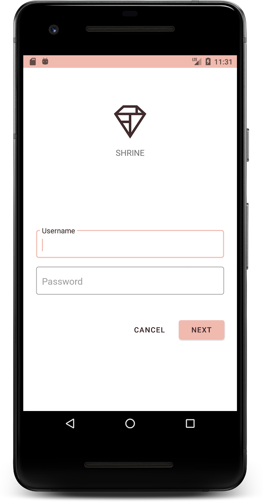
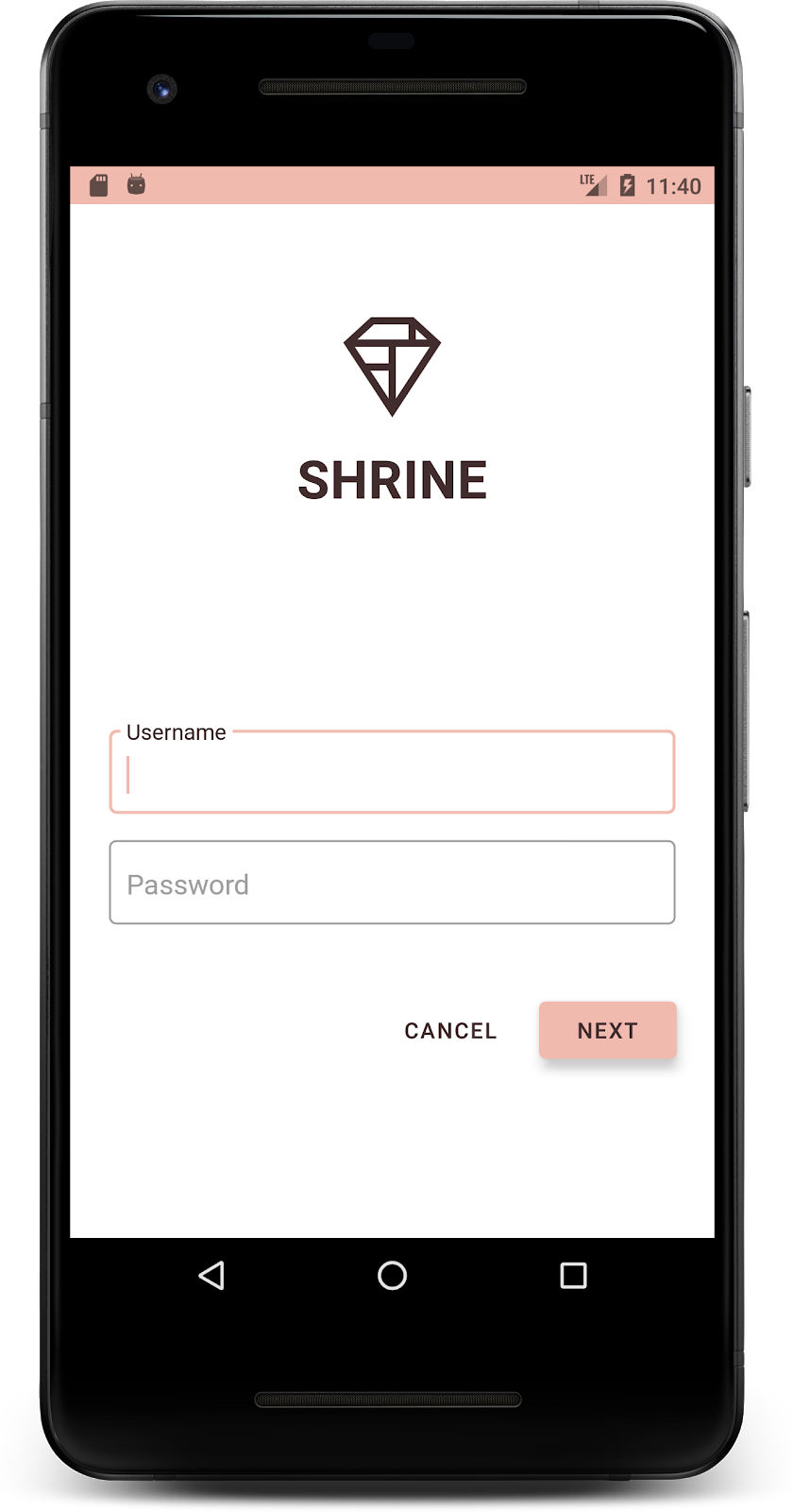
app:srcCompat="@drawable/shr_logo" />ビルドして実行します。ログイン画面は次のようになります。
デザイナーは、色の変更に加えて、サイトで使用可能な特定のタイポグラフィも用意してくれています。トップ アプリバーにも追加しましょう。
トップ アプリバーのスタイルを設定する
トップ アプリバーのテキストのスタイルを、デザイナーが提供した仕様に合わせて設定します。次のテキスト外観スタイルを styles.xml に追加し、Widget.Shrine.Toolbar スタイルでこのスタイルを参照するように titleTextAppearance プロパティを設定します。
styles.xml
<style name="Widget.Shrine.Toolbar" parent="Widget.AppCompat.Toolbar">
   <item name="android:background">?attr/colorAccent</item>
   <item name="android:theme">@style/Theme.Shrine</item>
   <item name="popupTheme">@style/ThemeOverlay.AppCompat.Light</item>
   <item name="titleTextAppearance">@style/TextAppearance.Shrine.Toolbar</item>
</style>

<style name="TextAppearance.Shrine.Toolbar" parent="TextAppearance.MaterialComponents.Button">
   <item name="android:textSize">16sp</item>
</style>
colors.xml と styles.xml は次のようになります。
colors.xml
<?xml version="1.0" encoding="utf-8"?>
<resources>
   <color name="colorPrimary">#E0E0E0</color>
   <color name="colorPrimaryDark">#FBB8AC</color>
   <color name="colorAccent">#FEDBD0</color>
   <color name="textColorPrimary">#442C2E</color>
   <color name="toolbarIconColor">@color/textColorPrimary</color>
   <color name="loginPageBackgroundColor">#FFFFFF</color>
   <color name="productGridBackgroundColor">#FFFFFF</color>
   <color name="textInputOutlineColor">#FBB8AC</color>
</resources>
styles.xml
<resources xmlns:android="http://schemas.android.com/tools">

   <!-- Base application theme. -->
   <style name="Theme.Shrine" parent="Theme.MaterialComponents.Light.NoActionBar">
       <!-- Customize your theme here. -->
       <item name="colorPrimary">@color/colorPrimary</item>
       <item name="colorPrimaryDark">@color/colorPrimaryDark</item>
       <item name="colorAccent">@color/colorAccent</item>
       <item name="android:windowLightStatusBar" tools:targetApi="m">true</item>
       <item name="android:textColorPrimary">@color/textColorPrimary</item>
   </style>

   <style name="Widget.Shrine.TextInputLayout" parent="Widget.MaterialComponents.TextInputLayout.OutlinedBox">
       <item name="hintTextAppearance">@style/TextAppearance.Shrine.TextInputLayout.HintText</item>
       <item name="hintTextColor">@color/textColorPrimary</item>
       <item name="android:paddingBottom">8dp</item>
       <item name="boxStrokeColor">@color/textInputOutlineColor</item>
   </style>

   <style name="TextAppearance.Shrine.TextInputLayout.HintText" parent="TextAppearance.MaterialComponents.Subtitle2">
       <item name="android:textColor">?android:attr/textColorPrimary</item>
   </style>

   <style name="Widget.Shrine.Button" parent="Widget.MaterialComponents.Button">
       <item name="android:textColor">?android:attr/textColorPrimary</item>
       <item name="backgroundTint">?attr/colorPrimaryDark</item>
   </style>

   <style name="Widget.Shrine.Button.TextButton" parent="Widget.MaterialComponents.Button.TextButton">
       <item name="android:textColor">?android:attr/textColorPrimary</item>
   </style>

   <style name="Widget.Shrine.Toolbar" parent="Widget.AppCompat.Toolbar">
       <item name="android:background">?attr/colorAccent</item>
       <item name="android:theme">@style/Theme.Shrine</item>
       <item name="popupTheme">@style/ThemeOverlay.AppCompat.Light</item>
       <item name="titleTextAppearance">@style/TextAppearance.Shrine.Toolbar</item>
   </style>

   <style name="TextAppearance.Shrine.Toolbar" parent="TextAppearance.MaterialComponents.Button">
       <item name="android:textSize">16sp</item>
   </style>

</resources>
ラベルのスタイルを設定する
商品カードのラベルのスタイルを設定して、正しいテキストの見た目を使用し、カード内で水平方向に中央揃えにします。
次のように、タイトルラベルのタイポグラフィを textAppearanceHeadline6 から textAppearanceSubtitle2 に更新します。
shr_product_card.xml
<TextView
   android:id="@+id/product_title"
   android:layout_width="match_parent"
   android:layout_height="wrap_content"
   android:text="@string/shr_product_title"
android:textAppearance="?attr/textAppearanceSubtitle2" />画像ラベルを中央に配置するには、shr_product_card.xml のラベル <TextView> を変更して、属性 android:textAlignment="center" を設定します。
shr_product_card.xml
<LinearLayout
android:layout_width="match_parent"
android:layout_height="wrap_content"
android:orientation="vertical"
android:padding="16dp">
<TextView
android:id="@+id/product_title"
android:layout_width="match_parent"
android:layout_height="wrap_content"
android:text="@string/shr_product_title"
android:textAlignment="center"
android:textAppearance="?attr/textAppearanceSubtitle2" />
<TextView
android:id="@+id/product_price"
android:layout_width="match_parent"
android:layout_height="wrap_content"
android:text="@string/shr_product_description"
android:textAlignment="center"
android:textAppearance="?attr/textAppearanceBody2" />
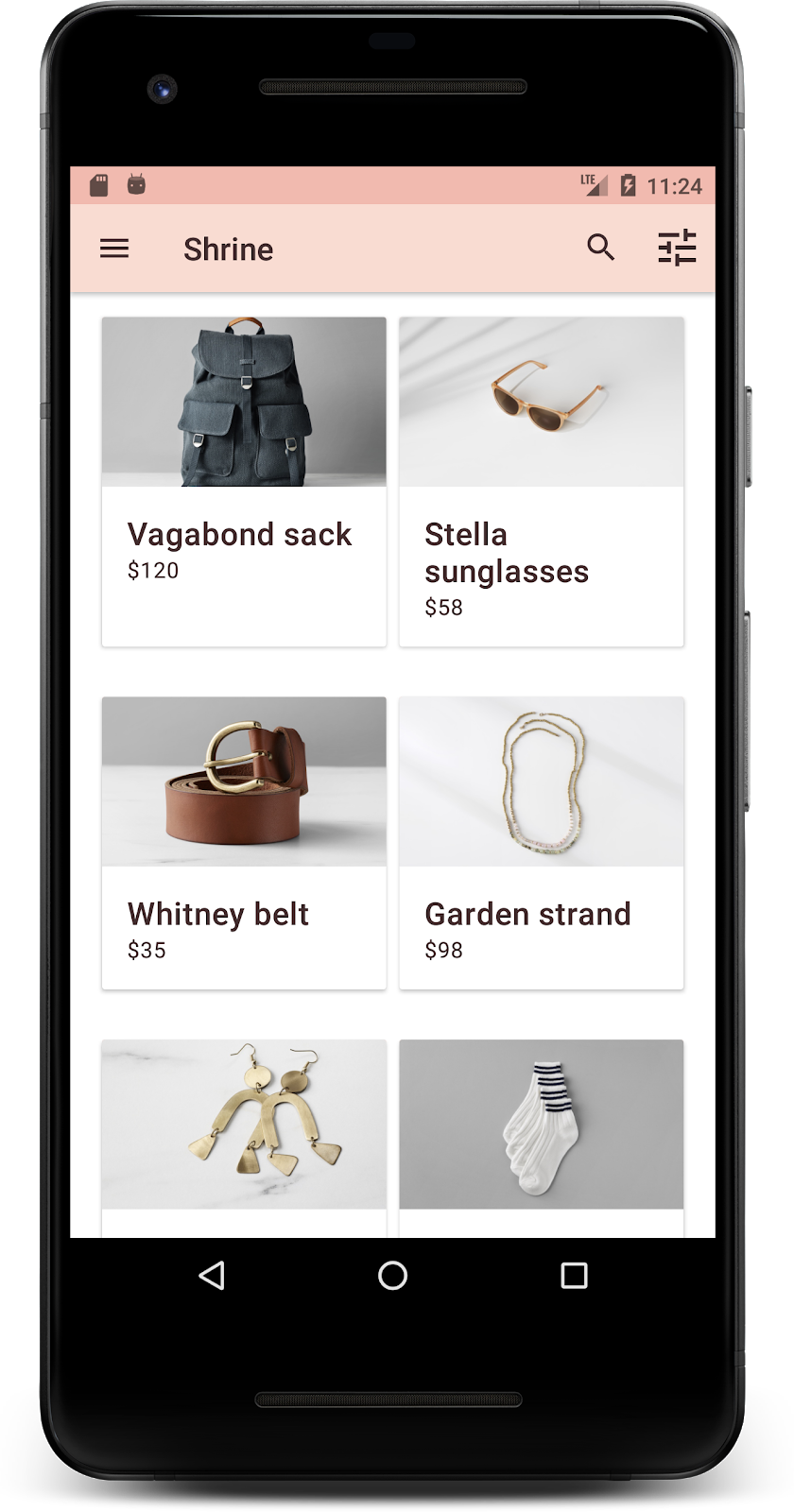
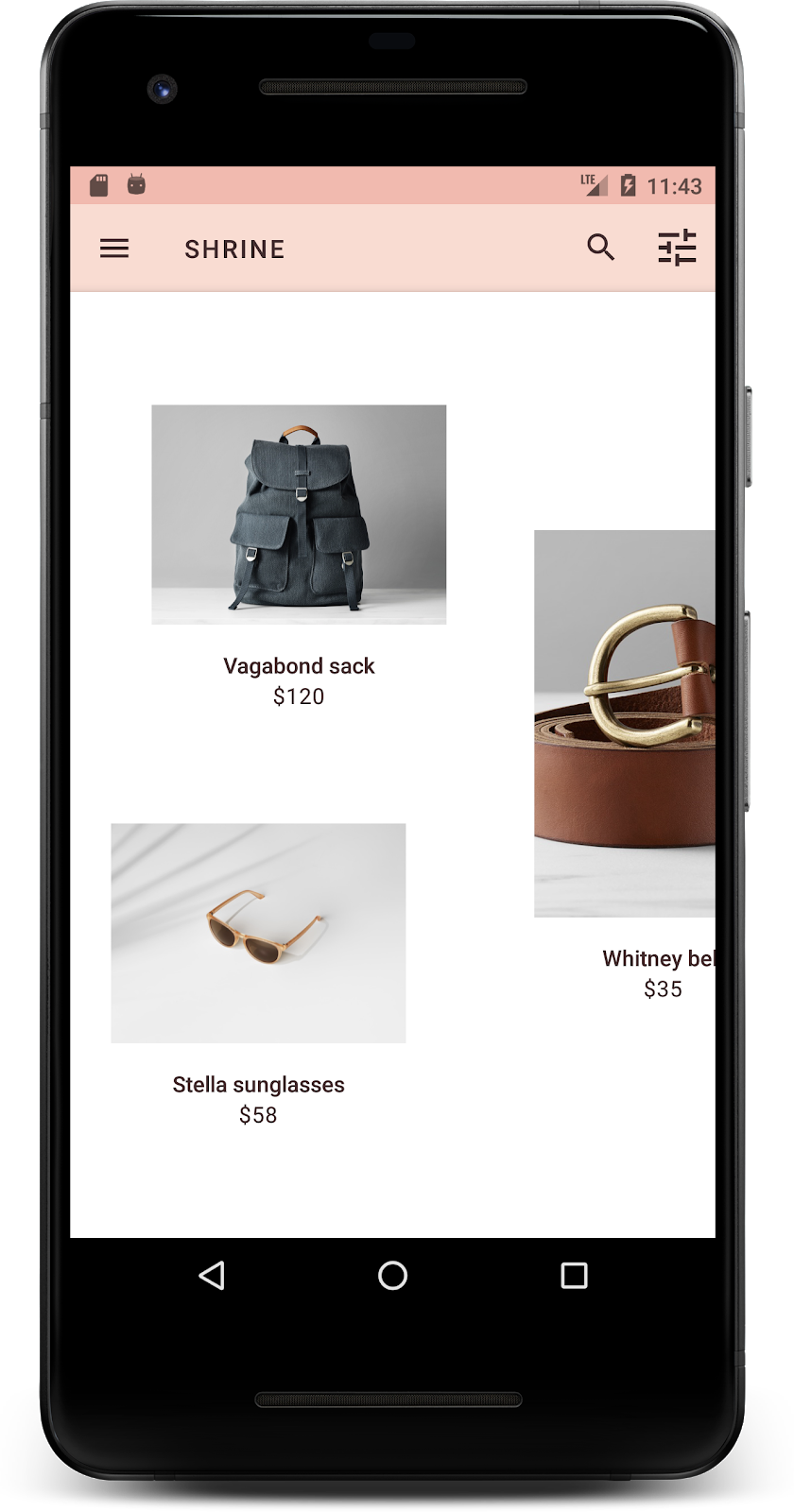
</LinearLayout>ビルドして実行します。商品グリッド画面は次のようになります。
ログイン画面のタイポグラフィもこれに合わせて変更しましょう。
ログイン画面の書体を変更する
styles.xml に次のスタイルを追加します。
styles.xml
<style name="TextAppearance.Shrine.Title" parent="TextAppearance.MaterialComponents.Headline4">
   <item name="textAllCaps">true</item>
   <item name="android:textStyle">bold</item>
   <item name="android:textColor">?android:attr/textColorPrimary</item>
</style>
shr_login_fragment.xml で、新しいスタイルを「SHRINE」というタイトルの <TextView> に設定します(また、そこにある textAllCaps 属性と textSize 属性を削除します)。
shr_login_fragment.xml
<TextView
android:layout_width="wrap_content"
android:layout_height="wrap_content"
android:layout_gravity="center_horizontal"
android:layout_marginBottom="132dp"
android:text="@string/shr_app_name"
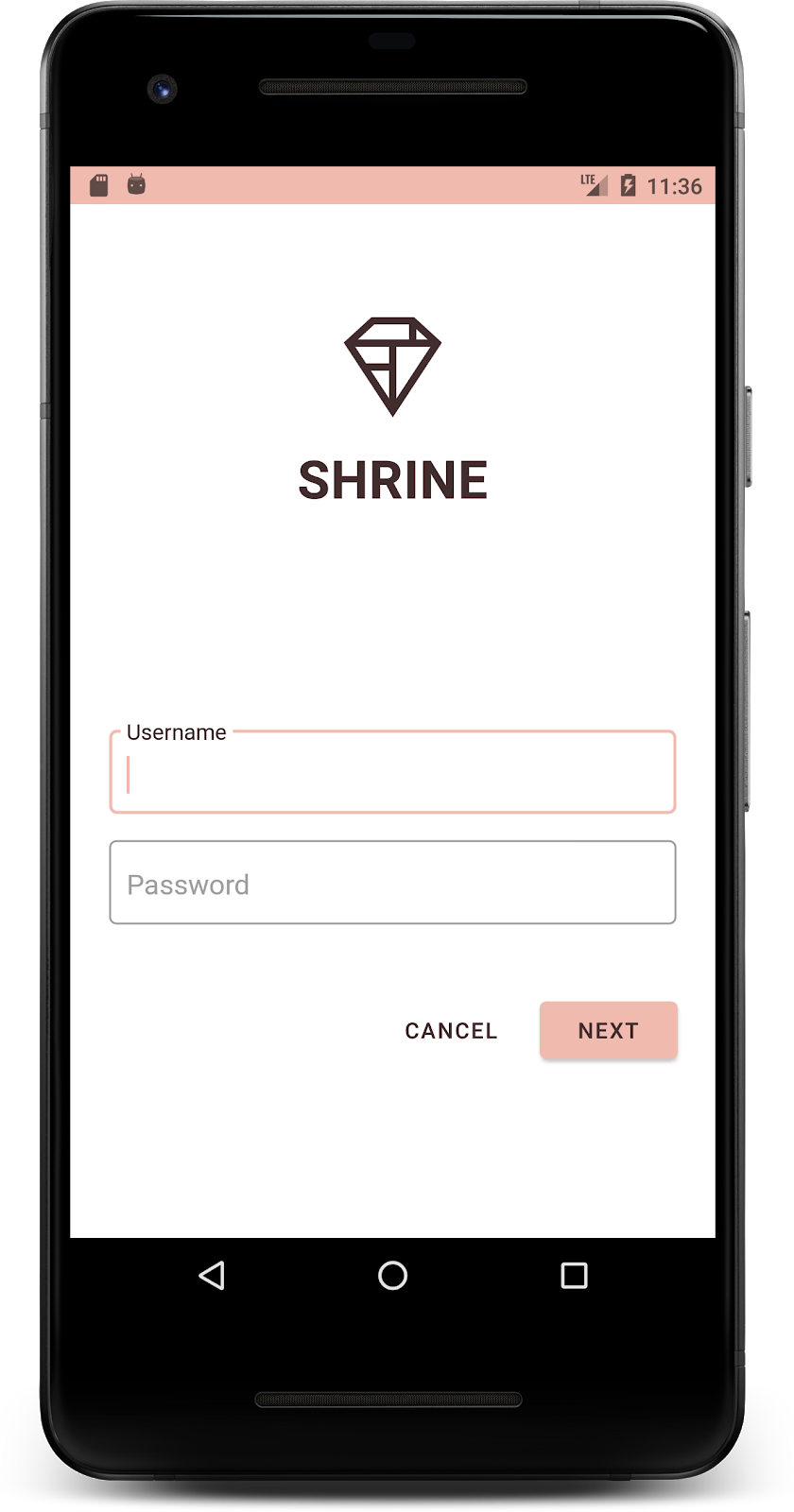
android:textAppearance="@style/TextAppearance.Shrine.Title" />ビルドして実行します。ログイン画面は次のようになります。
ここまでは、Shrine に合った特定の色とタイポグラフィを使用してページのスタイルを設定しました。次は、Shrine の商品を表示するカードを見てみましょう。現在、カードはアプリのナビゲーションの下の白いサーフェス上にあります。商品に注目を集めるため、商品を強調しましょう。
商品グリッドの標高を変更する
コンテンツがトップ アプリバーの上に浮かぶシートにあるように見せるには、トップ アプリバーの標高を変更します。次のように、app:elevation 属性を AppBarLayout に、android:elevation 属性を shr_product_grid_fragment.xml の NestedScrollView XML コンポーネントに追加します。
shr_product_grid_fragment.xml
<com.google.android.material.appbar.AppBarLayout
   android:layout_width="match_parent"
   android:layout_height="wrap_content"
   app:elevation="0dp">

   <androidx.appcompat.widget.Toolbar
       android:id="@+id/app_bar"
       style="@style/Widget.Shrine.Toolbar"
       android:layout_width="match_parent"
       android:layout_height="?attr/actionBarSize"
       app:navigationIcon="@drawable/shr_menu"
       app:title="@string/shr_app_name" />
</com.google.android.material.appbar.AppBarLayout>

<androidx.core.widget.NestedScrollView
   android:layout_width="match_parent"
   android:layout_height="match_parent"
   android:layout_marginTop="56dp"
   android:background="@color/productGridBackgroundColor"
   android:elevation="8dp"
   android:paddingStart="@dimen/shr_product_grid_spacing"
   android:paddingEnd="@dimen/shr_product_grid_spacing"
   app:layout_behavior="@string/appbar_scrolling_view_behavior">

   <androidx.recyclerview.widget.RecyclerView
       android:id="@+id/recycler_view"
       android:layout_width="match_parent"
       android:layout_height="match_parent" />

</androidx.core.widget.NestedScrollView>
カードの高度(と色)を変更する
shr_product_card.xml の app:cardElevation を 2dp から 0dp に変更して、すべてのカードの高度を調整します。app:cardBackgroundColor も @android:color/transparent に変更します。
shr_product_card.xml
<com.google.android.material.card.MaterialCardView xmlns:android="http://schemas.android.com/apk/res/android"
   xmlns:app="http://schemas.android.com/apk/res-auto"
   android:layout_width="match_parent"
   android:layout_height="wrap_content"
   app:cardBackgroundColor="@android:color/transparent"
   app:cardElevation="0dp"
   app:cardPreventCornerOverlap="true">
ぜひご覧ください。商品グリッドページのすべてのカードの高度を調整しました。

[Next] ボタンの高度を変更する
styles.xml で、Widget.Shrine.Button スタイルに次のプロパティを追加します。
styles.xml
<item name="android:stateListAnimator" tools:ignore="NewApi">
    @animator/shr_next_button_state_list_anim
</item>Button のスタイルで android:stateListAnimator を設定すると、[次へ] ボタンが提供されたアニメーターを使用するように設定されます。
ビルドして実行します。ログイン画面は次のようになります。
レイアウトを変更して、カードをさまざまなアスペクト比とサイズで表示し、各カードの違いを際立たせましょう。
スタッガード RecyclerView アダプターを使用する
staggeredgridlayout パッケージに新しい RecyclerView アダプタが用意されています。これは、水平方向にスクロールすることを想定した非対称のスタッガード カード レイアウトを表示します。このコードはご自身で確認していただいて構いませんが、ここでは実装方法については説明しません。
この新しいアダプターを使用するには、ProductGridFragment.kt の onCreateView() メソッドを変更します。「set up the RecyclerView」というコメントの後のコードブロックを次のように置き換えます。
ProductGridFragment.kt
// Set up the RecyclerView
view.recycler_view.setHasFixedSize(true)
val gridLayoutManager = GridLayoutManager(context, 2, RecyclerView.HORIZONTAL, false)
gridLayoutManager.spanSizeLookup = object : GridLayoutManager.SpanSizeLookup() {
   override fun getSpanSize(position: Int): Int {
       return if (position % 3 == 2) 2 else 1
   }
}
view.recycler_view.layoutManager = gridLayoutManager
val adapter = StaggeredProductCardRecyclerViewAdapter(
       ProductEntry.initProductEntryList(resources))
view.recycler_view.adapter = adapter
val largePadding = resources.getDimensionPixelSize(R.dimen.shr_staggered_product_grid_spacing_large)
val smallPadding = resources.getDimensionPixelSize(R.dimen.shr_staggered_product_grid_spacing_small)
view.recycler_view.addItemDecoration(ProductGridItemDecoration(largePadding, smallPadding))
また、次のように shr_product_grid_fragment.xml を少し変更して、NestedScrollView からパディングを削除する必要があります。
shr_product_grid_fragment.xml
<androidx.core.widget.NestedScrollView
   android:layout_width="match_parent"
   android:layout_height="match_parent"
   android:layout_marginTop="56dp"
   android:background="@color/productGridBackgroundColor"
   app:layout_behavior="@string/appbar_scrolling_view_behavior"
android:elevation="6dp">最後に、ProductGridItemDecoration.kt を変更して、RecyclerView 内のカードのパディングも調整します。ProductGridItemDecoration.kt の getItemOffsets() メソッドを次のように変更します。
ProductGridItemDecoration.kt
override fun getItemOffsets(outRect: Rect, view: View,
parent: RecyclerView, state: RecyclerView.State?) {
outRect.left = smallPadding
outRect.right = largePadding
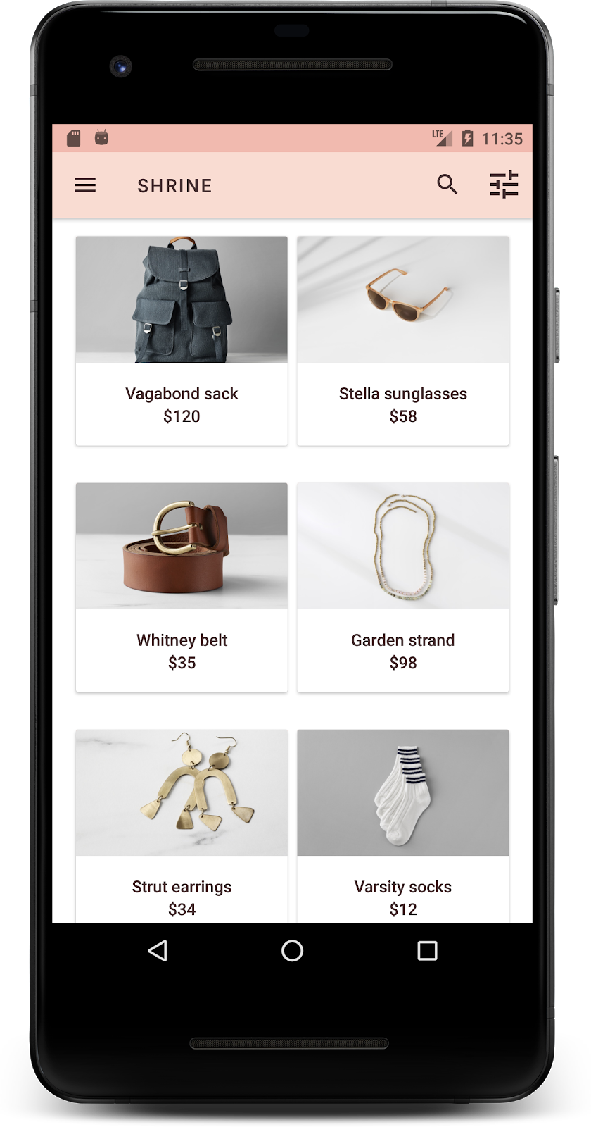
}ビルドして実行します。商品グリッド アイテムがずらして表示されるようになりました。
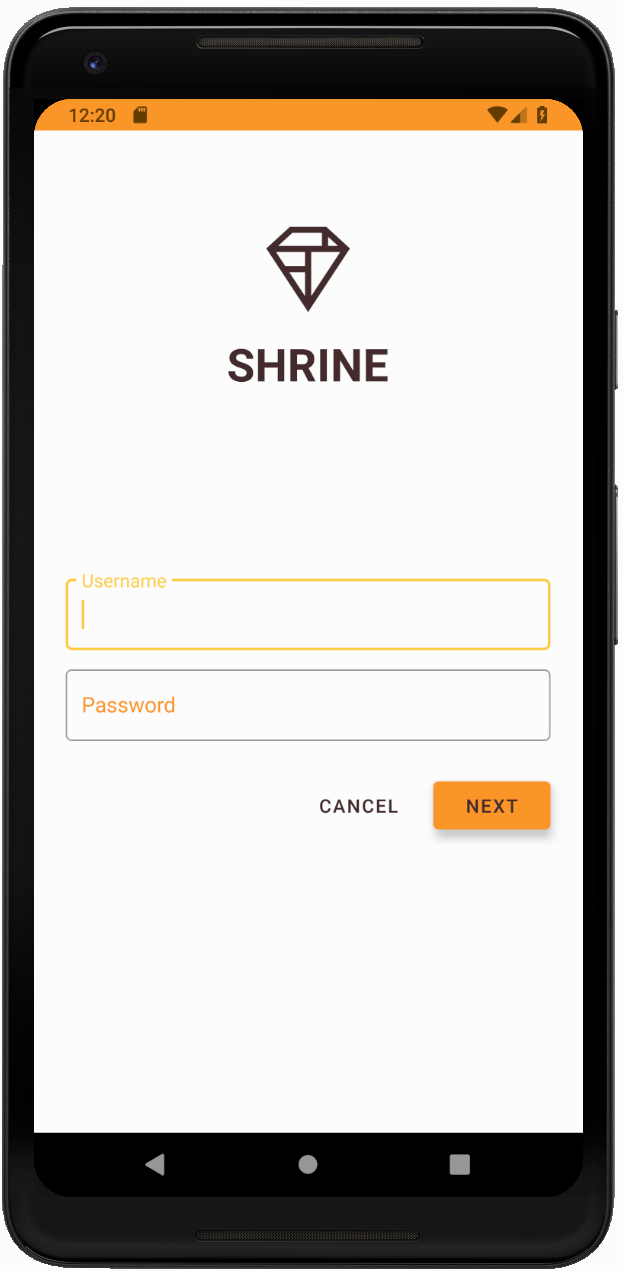
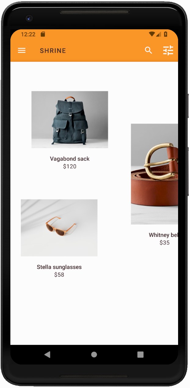
色はブランドを表現するための強力な手段です。色を少し変えるだけで、ユーザー エクスペリエンスに大きく影響します。これを試すために、ブランドのカラーパターンをまったく違うものに変更すると Shrine がどのように見えるかを確認してみましょう。
スタイルと色を変更する
styles.xml に次の新しいテーマを追加します。
styles.xml
<style name="Theme.Shrine.Autumn" parent="Theme.Shrine">
   <item name="colorPrimary">#FFCF44</item>
   <item name="colorPrimaryDark">#FD9725</item>
   <item name="colorAccent">#FD9725</item>
   <item name="colorOnPrimary">#FFFFFF</item>
   <item name="colorError">#FD9725</item>
</style>また、AndroidManifest.xml で、この新しいテーマをアプリで使用します。
AndroidManifest.xml
<application
   android:allowBackup="true"
   android:icon="@mipmap/ic_launcher"
   android:label="@string/shr_app_name"
   android:roundIcon="@mipmap/ic_launcher_round"
   android:supportsRtl="true"
  android:name="com.google.codelabs.mdc.kotlin.shrine.application.ShrineApplication"
   android:theme="@style/Theme.Shrine.Autumn">
   <activity android:name=".MainActivity">
       <intent-filter>
           <action android:name="android.intent.action.MAIN" />

           <category android:name="android.intent.category.LAUNCHER" />
       </intent-filter>
   </activity>
</application>
以下のように colors.xml でツールバー アイコンの色を変更します。
colors.xml
<color name="toolbarIconColor">#FFFFFF</color>次に、ツールバー スタイルの android:theme 属性を設定して、ハードコードするのではなく、「?theme」属性を使用して現在のテーマを参照します。
styles.xml
<style name="Widget.Shrine.Toolbar" parent="Widget.AppCompat.Toolbar">
   <item name="android:background">?attr/colorAccent</item>
   <item name="android:theme">?theme</item>
   <item name="popupTheme">@style/ThemeOverlay.AppCompat.Light</item>
   <item name="titleTextAppearance">@style/TextAppearance.Shrine.Toolbar</item>
</style>
次に、ログイン画面のテキスト フィールドのヒント テキストの色を明るくします。テキスト フィールドのスタイルに android:textColorHint 属性を追加します。
styles.xml
<style name="Widget.Shrine.TextInputLayout" parent="Widget.MaterialComponents.TextInputLayout.OutlinedBox">
   <item name="hintTextAppearance">
@style/TextAppearance.Shrine.TextInputLayout.HintText
</item>
   <item name="android:paddingBottom">8dp</item>
   <item name="android:textColorHint">?attr/colorPrimaryDark</item>
</style>
ビルドして実行します。新しいテーマがプレビューに表示されます。
MDC-104 に進む前に、このセクションで変更したコードを元に戻してください。
以上で、デザイナーのデザイン仕様に近いアプリが作成されました。
次のステップ
この Codelab では、MDC コンポーネントとして、テーマ、タイポグラフィ、高度を使用しました。[MDC ウェブ ライブラリ] には、もっと多くのコンポーネントとサブシステムがあります。
計画しているアプリのデザインの要素に、MDC ライブラリのコンポーネントがない場合はどうしますか?MDC-104: マテリアル デザインの高度なコンポーネントでは、MDC ライブラリを使用して、特定の外観を備えたカスタム コンポーネントを作成する方法について説明します。