
Thành phần Material (MDC) giúp nhà phát triển triển khai Material Design. Được tạo bởi một nhóm kỹ sư và nhà thiết kế trải nghiệm người dùng tại Google, MDC có hàng chục thành phần giao diện người dùng đẹp mắt và hữu ích, đồng thời có sẵn cho Android, iOS, web và Flutter. material.io/develop |
Trong các lớp học lập trình MDC-101 và MDC-102, bạn đã sử dụng Thành phần Material (MDC) để xây dựng các thành phần cơ bản của một ứng dụng có tên là Shrine, một ứng dụng thương mại điện tử bán quần áo và đồ gia dụng. Ứng dụng này có một quy trình dành cho người dùng, bắt đầu bằng màn hình đăng nhập và đưa người dùng đến màn hình chính hiển thị các sản phẩm.
Việc mở rộng gần đây của Material Design giúp các nhà thiết kế và nhà phát triển tăng tính linh hoạt để thể hiện thương hiệu của sản phẩm. Giờ đây, bạn có thể sử dụng MDC để tuỳ chỉnh Shrine và thể hiện phong cách độc đáo của ứng dụng này hơn bao giờ hết.
Sản phẩm bạn sẽ tạo ra
Trong lớp học lập trình này, bạn sẽ tuỳ chỉnh Shrine để thể hiện thương hiệu của ứng dụng bằng cách sử dụng:
- Màu
- Kiểu chữ
- Độ cao
- Bố cục


Các thành phần và hệ thống con của MDC Android được dùng trong lớp học lập trình này
- Giao diện
- Kiểu chữ
- Độ cao
Bạn cần có
- Kiến thức cơ bản về hoạt động phát triển Android
- Android Studio (tải xuống tại đây nếu bạn chưa có)
- Một trình mô phỏng hoặc thiết bị Android (có trong Android Studio)
- Mã mẫu (xem bước tiếp theo)
Bạn đánh giá kinh nghiệm của mình trong việc tạo ứng dụng Android ở mức nào?
Tiếp tục từ MDC-102?
Nếu bạn đã hoàn thành MDC-102, thì mã của bạn sẽ sẵn sàng cho lớp học lập trình này. Chuyển sang bước 3: Thay đổi màu sắc.
Tải ứng dụng khởi đầu của lớp học lập trình xuống
Ứng dụng khởi đầu nằm trong thư mục material-components-android-codelabs-103-starter/java. Hãy nhớ cd vào thư mục đó trước khi bắt đầu.
...hoặc sao chép từ GitHub
Để sao chép lớp học lập trình này từ GitHub, hãy chạy các lệnh sau:
git clone https://github.com/material-components/material-components-android-codelabs
cd material-components-android-codelabs/
git checkout 103-starter
Tải mã khởi đầu trong Android Studio
- Sau khi trình hướng dẫn thiết lập hoàn tất và cửa sổ Welcome to Android Studio (Chào mừng bạn đến với Android Studio) xuất hiện, hãy nhấp vào Open an existing Android Studio project (Mở một dự án hiện có trong Android Studio). Chuyển đến thư mục nơi bạn đã cài đặt mã mẫu rồi chọn java -> shrine (hoặc tìm shrine trên máy tính) để mở dự án Shrine.
- Chờ một lát để Android Studio tạo và đồng bộ hoá dự án, như được thể hiện bằng các chỉ báo hoạt động ở cuối cửa sổ Android Studio.
- Tại thời điểm này, Android Studio có thể phát sinh một số lỗi bản dựng vì bạn thiếu SDK Android hoặc các công cụ bản dựng, chẳng hạn như lỗi được minh hoạ bên dưới. Hãy làm theo hướng dẫn trong Android Studio để cài đặt/cập nhật các thành phần này và đồng bộ hoá dự án của bạn.

Thêm các phần phụ thuộc của dự án
Dự án cần có một phần phụ thuộc trên thư viện hỗ trợ MDC Android. Mã mẫu mà bạn đã tải xuống có thể đã liệt kê phần phụ thuộc này, nhưng bạn nên thực hiện các bước sau để đảm bảo.
- Chuyển đến tệp
build.gradlecủa mô-đunappvà đảm bảo rằng khốidependenciescó một phần phụ thuộc vào MDC Android:
api 'com.google.android.material:material:1.1.0-alpha06'
- (Không bắt buộc) Nếu cần, hãy chỉnh sửa tệp
build.gradleđể thêm các phần phụ thuộc sau và đồng bộ hoá dự án.
dependencies {
    api 'com.google.android.material:material:1.1.0-alpha06'
    implementation 'androidx.legacy:legacy-support-v4:1.0.0'
    implementation 'com.android.volley:volley:1.1.1'
    implementation 'com.google.code.gson:gson:2.8.5'
    implementation "org.jetbrains.kotlin:kotlin-stdlib-jdk7:1.3.21"
    testImplementation 'junit:junit:4.12'
    androidTestImplementation 'androidx.test:core:1.1.0'
    androidTestImplementation 'androidx.test.ext:junit:1.1.0'
    androidTestImplementation 'androidx.test:runner:1.2.0-alpha05'
    androidTestImplementation 'androidx.test.espresso:espresso-core:3.2.0-alpha05'
}
Chạy ứng dụng khởi đầu
|

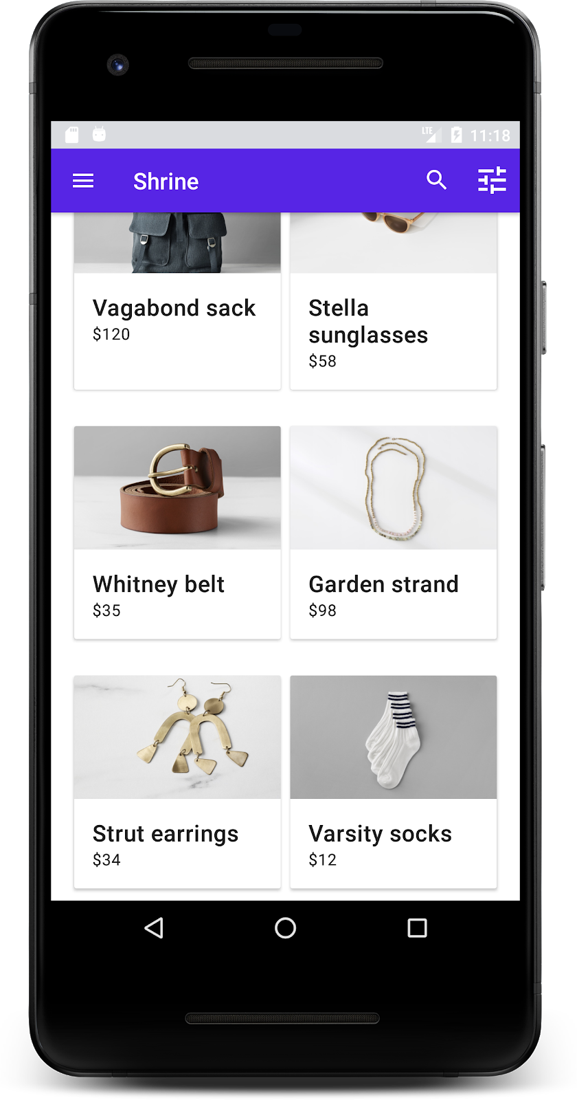
Thành công! Bạn sẽ thấy trang đăng nhập của Shrine đang chạy trong thiết bị hoặc trình mô phỏng. Khi bạn nhấn vào Next (Tiếp theo), trang chủ Shrine sẽ xuất hiện với một thanh ứng dụng ở trên cùng và một lưới hình ảnh sản phẩm ở bên dưới.
Hãy điều chỉnh thanh ứng dụng trên cùng cho phù hợp với thương hiệu Shrine bằng cách thay đổi màu sắc, độ cao và kiểu chữ.
Giao diện màu này do một nhà thiết kế tạo ra bằng các màu tuỳ chỉnh (như trong hình bên dưới). Tệp này chứa các màu được chọn từ thương hiệu của Shrine và được áp dụng cho Trình chỉnh sửa giao diện Material. Trình chỉnh sửa này đã mở rộng các màu đó để tạo ra một bảng màu đầy đủ hơn. (Những màu này không có trong bảng màu Material năm 2014.)
Trình chỉnh sửa giao diện Material đã sắp xếp các sắc thái này thành các sắc thái được gắn nhãn bằng số, bao gồm cả nhãn 50, 100, 200, ... đến 900 của mỗi màu. Shrine chỉ sử dụng các sắc độ 50, 100 và 300 trong mẫu màu hồng và 900 trong mẫu màu nâu.


Hãy thay đổi màu của thanh ứng dụng trên cùng để phản ánh bảng phối màu đó.
Đặt colorPrimaryDark và colorAccent
Trong colors.xml, hãy sửa đổi các dòng sau. Thuộc tính colorAccent kiểm soát màu của thanh ứng dụng trên cùng, trong số những thứ khác, và thuộc tính colorPrimaryDark kiểm soát màu của thanh trạng thái.
colors.xml
<color name="colorPrimaryDark">#FBB8AC</color>
<color name="colorAccent">#FEDBD0</color>
Để sử dụng biểu tượng tối trong thanh trạng thái, hãy thêm nội dung sau vào Theme.Shrine, giao diện ứng dụng của Shrine:
styles.xml
<item name="android:windowLightStatusBar" tools:targetApi="m">true</item>colors.xml và styles.xml của bạn sẽ có dạng như sau:
colors.xml
<?xml version="1.0" encoding="utf-8"?>
<resources>
   <color name="colorPrimary">#E0E0E0</color>
   <color name="colorPrimaryDark">#FBB8AC</color>
   <color name="colorAccent">#FEDBD0</color>
   <color name="toolbarIconColor">#FFFFFF</color>
   <color name="loginPageBackgroundColor">#FFFFFF</color>
   <color name="productGridBackgroundColor">#FFFFFF</color>
</resources>
styles.xml
<resources xmlns:android="http://schemas.android.com/tools">

   <!-- Base application theme. -->
   <style name="Theme.Shrine" parent="Theme.MaterialComponents.Light.NoActionBar">
       <!-- Customize your theme here. -->
       <item name="colorPrimary">@color/colorPrimary</item>
       <item name="colorPrimaryDark">@color/colorPrimaryDark</item>
       <item name="colorAccent">@color/colorAccent</item>
       <item name="android:windowLightStatusBar" tools:targetApi="m">true</item>
   </style>

   <style name="Widget.Shrine.Toolbar" parent="Widget.AppCompat.Toolbar">
       <item name="android:background">?attr/colorAccent</item>
       <item name="android:theme">@style/ThemeOverlay.AppCompat.Dark.ActionBar</item>
       <item name="popupTheme">@style/ThemeOverlay.AppCompat.Light</item>
   </style>

</resources>
Trong colors.xml, hãy thêm một tài nguyên màu textColorPrimary mới được đặt thành #442C2E, rồi cập nhật thuộc tính toolbarIconColor để tham chiếu màu textColorPrimary.
Cập nhật tệp styles.xml để đặt thuộc tính android:textColorPrimary thành màu textColorPrimary.
Việc đặt android:textColorPrimary trong Theme.Shrine sẽ tạo kiểu cho văn bản trên tất cả các phần tử, bao gồm cả thanh ứng dụng trên cùng và các biểu tượng trong thanh ứng dụng trên cùng.
Một điều nữa: hãy đặt thuộc tính android:theme trong kiểu Widget.Shrine.Toolbar thành Theme.Shrine.
colors.xml và styles.xml của bạn sẽ có dạng như sau:
colors.xml
<?xml version="1.0" encoding="utf-8"?>
<resources>
   <color name="colorPrimary">#E0E0E0</color>
   <color name="colorPrimaryDark">#FBB8AC</color>
   <color name="colorAccent">#FEDBD0</color>
   <color name="textColorPrimary">#442C2E</color>
   <color name="toolbarIconColor">@color/textColorPrimary</color>
   <color name="loginPageBackgroundColor">#FFFFFF</color>
   <color name="productGridBackgroundColor">#FFFFFF</color>
</resources>
styles.xml
<resources xmlns:android="http://schemas.android.com/tools">

   <!-- Base application theme. -->
   <style name="Theme.Shrine" parent="Theme.MaterialComponents.Light.NoActionBar">
       <!-- Customize your theme here. -->
       <item name="colorPrimary">@color/colorPrimary</item>
       <item name="colorPrimaryDark">@color/colorPrimaryDark</item>
       <item name="colorAccent">@color/colorAccent</item>
       <item name="android:windowLightStatusBar" tools:targetApi="m">true</item>
       <item name="android:textColorPrimary">@color/textColorPrimary</item>
   </style>

   <style name="Widget.Shrine.Toolbar" parent="Widget.AppCompat.Toolbar">
       <item name="android:background">?attr/colorAccent</item>
       <item name="android:theme">@style/Theme.Shrine</item>
       <item name="popupTheme">@style/ThemeOverlay.AppCompat.Light</item>
   </style>

</resources>
Tạo bản dựng và chạy. Lúc này, lưới sản phẩm của bạn sẽ có dạng như sau:

Hãy thay đổi kiểu của màn hình đăng nhập cho phù hợp với bảng phối màu của chúng ta.
Tạo kiểu cho trường văn bản
Hãy thay đổi các thành phần nhập văn bản trên trang đăng nhập thành dạng đường viền và sử dụng màu sắc phù hợp hơn cho bố cục.
Thêm tài nguyên màu sau vào tệp colors.xml:
colors.xml
<color name="textInputOutlineColor">#FBB8AC</color>Thêm 2 kiểu mới vào styles.xml:
styles.xml
<style name="Widget.Shrine.TextInputLayout" parent="Widget.MaterialComponents.TextInputLayout.OutlinedBox">
   <item name="hintTextAppearance">@style/TextAppearance.Shrine.TextInputLayout.HintText</item>
   <item name="hintTextColor">@color/textColorPrimary</item>
   <item name="android:paddingBottom">8dp</item>
   <item name="boxStrokeColor">@color/textInputOutlineColor</item>
</style>

<style name="TextAppearance.Shrine.TextInputLayout.HintText" parent="TextAppearance.MaterialComponents.Subtitle2">
   <item name="android:textColor">?android:attr/textColorPrimary</item>
</style>
Cuối cùng, hãy đặt thuộc tính kiểu trên cả hai thành phần TextInputLayout XML trong shr_login_fragment.xml thành kiểu mới:
shr_login_fragment.xml
<com.google.android.material.textfield.TextInputLayout
   style="@style/Widget.Shrine.TextInputLayout"
   android:layout_width="match_parent"
   android:layout_height="wrap_content"
   android:hint="@string/shr_hint_username">

   <com.google.android.material.textfield.TextInputEditText
       android:layout_width="match_parent"
       android:layout_height="wrap_content"
       android:inputType="text"
       android:maxLines="1" />
</com.google.android.material.textfield.TextInputLayout>

<com.google.android.material.textfield.TextInputLayout
   android:id="@+id/password_text_input"
   style="@style/Widget.Shrine.TextInputLayout"
   android:layout_width="match_parent"
   android:layout_height="wrap_content"
   android:hint="@string/shr_hint_password"
   app:errorEnabled="true">

   <com.google.android.material.textfield.TextInputEditText
       android:id="@+id/password_edit_text"
       android:layout_width="match_parent"
       android:layout_height="wrap_content"
       android:inputType="textPassword" />
</com.google.android.material.textfield.TextInputLayout>
Tạo kiểu cho màu nút
Cuối cùng, hãy tạo kiểu cho màu sắc của các nút trên trang đăng nhập. Thêm các kiểu sau vào styles.xml:
styles.xml
<style name="Widget.Shrine.Button" parent="Widget.MaterialComponents.Button">
   <item name="android:textColor">?android:attr/textColorPrimary</item>
   <item name="backgroundTint">?attr/colorPrimaryDark</item>
</style>

<style name="Widget.Shrine.Button.TextButton" parent="Widget.MaterialComponents.Button.TextButton">
   <item name="android:textColor">?android:attr/textColorPrimary</item>
</style>
Kiểu Widget.Shrine.Button mở rộng từ kiểu MaterialButton mặc định và thay đổi màu văn bản cũng như sắc thái nền của nút. Widget.Shrine.Button.TextButton mở rộng từ kiểu văn bản MaterialButton mặc định và chỉ thay đổi màu văn bản.
Đặt kiểu Widget.Shrine.Button trên nút Next (Tiếp theo) và kiểu Widget.Shrine.Button.TextButton trên nút Cancel (Huỷ) như sau:
shr_login_fragment.xml
<RelativeLayout
   android:layout_width="match_parent"
   android:layout_height="wrap_content">

   <com.google.android.material.button.MaterialButton
       android:id="@+id/next_button"
       style="@style/Widget.Shrine.Button"
       android:layout_width="wrap_content"
       android:layout_height="wrap_content"
       android:layout_alignParentEnd="true"
       android:layout_alignParentRight="true"
       android:text="@string/shr_button_next" />

   <com.google.android.material.button.MaterialButton
       android:id="@+id/cancel_button"
       style="@style/Widget.Shrine.Button.TextButton"
       android:layout_width="wrap_content"
       android:layout_height="wrap_content"
       android:layout_marginEnd="12dp"
       android:layout_marginRight="12dp"
       android:layout_toStartOf="@id/next_button"
       android:layout_toLeftOf="@id/next_button"
       android:text="@string/shr_button_cancel" />

</RelativeLayout>
Cập nhật màu của biểu trưng Shrine trong trang đăng nhập. Bạn sẽ cần thực hiện một thay đổi nhỏ đối với vectơ có thể vẽ, shr_logo.xml. Mở tệp có thể vẽ và thay đổi thuộc tính android:fillAlpha thành 1. Tài nguyên có thể vẽ sẽ có dạng như sau:
shr_logo.xml
<vector xmlns:android="http://schemas.android.com/apk/res/android"
   android:width="149dp"
   android:height="152dp"
   android:tint="?attr/colorControlNormal"
   android:viewportWidth="149"
   android:viewportHeight="152">
   <path
       android:fillAlpha="1"
       android:fillColor="#DADCE0"
       android:fillType="evenOdd"
       android:pathData="M42.262,0L0,38.653L74.489,151.994L148.977,38.653L106.723,0M46.568,11.11L21.554,33.998L99.007,33.998L99.007,11.11L46.568,11.11ZM110.125,18.174L110.125,33.998L127.416,33.998L110.125,18.174ZM80.048,45.116L80.048,123.296L131.426,45.116L80.048,45.116ZM17.551,45.116L33.976,70.101L68.93,70.101L68.93,45.116L17.551,45.116ZM41.284,81.219L68.93,123.296L68.93,81.219L41.284,81.219Z"
       android:strokeWidth="1"
       android:strokeAlpha="0.4"
       android:strokeColor="#00000000" />
</vector>
Đặt thuộc tính android:tint trên biểu trưng <ImageView> trong shr_login_fragment.xml thành ?android:attr/textColorPrimary, như sau:
shr_login_fragment.xml
<ImageView
   android:layout_width="64dp"
   android:layout_height="64dp"
   android:layout_gravity="center_horizontal"
   android:layout_marginTop="48dp"
   android:layout_marginBottom="16dp"
   android:tint="?android:attr/textColorPrimary"
   app:srcCompat="@drawable/shr_logo" />
Tạo bản dựng và chạy. Màn hình đăng nhập của bạn hiện sẽ có dạng như sau:

Ngoài các thay đổi về màu sắc, nhà thiết kế cũng đã cung cấp cho bạn kiểu chữ cụ thể để sử dụng trên trang web. Hãy thêm nút đó vào thanh ứng dụng trên cùng.
Tạo kiểu cho thanh ứng dụng trên cùng
Tạo kiểu cho giao diện văn bản của thanh ứng dụng trên cùng để phù hợp với quy cách do nhà thiết kế của bạn cung cấp. Thêm kiểu giao diện văn bản sau vào styles.xml và đặt thuộc tính titleTextAppearance để tham chiếu kiểu này trong kiểu Widget.Shrine.Toolbar của bạn.
styles.xml
<style name="Widget.Shrine.Toolbar" parent="Widget.AppCompat.Toolbar">
   <item name="android:background">?attr/colorAccent</item>
   <item name="android:theme">@style/Theme.Shrine</item>
   <item name="popupTheme">@style/ThemeOverlay.AppCompat.Light</item>
   <item name="titleTextAppearance">@style/TextAppearance.Shrine.Toolbar</item>
</style>

<style name="TextAppearance.Shrine.Toolbar" parent="TextAppearance.MaterialComponents.Button">
   <item name="android:textSize">16sp</item>
</style>
colors.xml và styles.xml của bạn sẽ có dạng như sau:
colors.xml
<?xml version="1.0" encoding="utf-8"?>
<resources>
   <color name="colorPrimary">#E0E0E0</color>
   <color name="colorPrimaryDark">#FBB8AC</color>
   <color name="colorAccent">#FEDBD0</color>
   <color name="textColorPrimary">#442C2E</color>
   <color name="toolbarIconColor">@color/textColorPrimary</color>
   <color name="loginPageBackgroundColor">#FFFFFF</color>
   <color name="productGridBackgroundColor">#FFFFFF</color>
   <color name="textInputOutlineColor">#FBB8AC</color>
</resources>
styles.xml
<resources xmlns:android="http://schemas.android.com/tools">

   <!-- Base application theme. -->
   <style name="Theme.Shrine" parent="Theme.MaterialComponents.Light.NoActionBar">
       <!-- Customize your theme here. -->
       <item name="colorPrimary">@color/colorPrimary</item>
       <item name="colorPrimaryDark">@color/colorPrimaryDark</item>
       <item name="colorAccent">@color/colorAccent</item>
       <item name="android:windowLightStatusBar" tools:targetApi="m">true</item>
       <item name="android:textColorPrimary">@color/textColorPrimary</item>
   </style>

   <style name="Widget.Shrine.TextInputLayout" parent="Widget.MaterialComponents.TextInputLayout.OutlinedBox">
       <item name="hintTextAppearance">@style/TextAppearance.Shrine.TextInputLayout.HintText</item>
       <item name="hintTextColor">@color/textColorPrimary</item>
       <item name="android:paddingBottom">8dp</item>
       <item name="boxStrokeColor">@color/textInputOutlineColor</item>
   </style>

   <style name="TextAppearance.Shrine.TextInputLayout.HintText" parent="TextAppearance.MaterialComponents.Subtitle2">
       <item name="android:textColor">?android:attr/textColorPrimary</item>
   </style>


   <style name="Widget.Shrine.Button" parent="Widget.MaterialComponents.Button">
       <item name="android:textColor">?android:attr/textColorPrimary</item>
       <item name="backgroundTint">?attr/colorPrimaryDark</item>
   </style>

   <style name="Widget.Shrine.Button.TextButton" parent="Widget.MaterialComponents.Button.TextButton">
       <item name="android:textColor">?android:attr/textColorPrimary</item>
   </style>

   <style name="Widget.Shrine.Toolbar" parent="Widget.AppCompat.Toolbar">
       <item name="android:background">?attr/colorAccent</item>
       <item name="android:theme">@style/Theme.Shrine</item>
       <item name="popupTheme">@style/ThemeOverlay.AppCompat.Light</item>
       <item name="titleTextAppearance">@style/TextAppearance.Shrine.Toolbar</item>
   </style>

   <style name="TextAppearance.Shrine.Toolbar" parent="TextAppearance.MaterialComponents.Button">
       <item name="android:textSize">16sp</item>
   </style>

</resources>
Tạo kiểu cho nhãn
Chúng tôi sẽ tạo kiểu cho nhãn thẻ sản phẩm để sử dụng giao diện văn bản phù hợp và được căn giữa theo chiều ngang trong thẻ.
Cập nhật kiểu chữ trên nhãn tiêu đề từ textAppearanceHeadline6 thành textAppearanceSubtitle2 như sau:
shr_product_card.xml
<TextView
   android:id="@+id/product_title"
   android:layout_width="match_parent"
   android:layout_height="wrap_content"
   android:text="@string/shr_product_title"
   android:textAppearance="?attr/textAppearanceSubtitle2" />
Để căn giữa nhãn hình ảnh, hãy sửa đổi <TextView>s nhãn trong shr_product_card.xml để đặt thuộc tính android:textAlignment="center":
shr_product_card.xml
<LinearLayout
   android:layout_width="match_parent"
   android:layout_height="wrap_content"
   android:orientation="vertical"
   android:padding="16dp">

   <TextView
       android:id="@+id/product_title"
       android:layout_width="match_parent"
       android:layout_height="wrap_content"
       android:text="@string/shr_product_title"
       android:textAlignment="center"
       android:textAppearance="?attr/textAppearanceSubtitle2" />

   <TextView
       android:id="@+id/product_price"
       android:layout_width="match_parent"
       android:layout_height="wrap_content"
       android:text="@string/shr_product_description"
       android:textAlignment="center"
       android:textAppearance="?attr/textAppearanceBody2" />
</LinearLayout>
Tạo bản dựng và chạy. Màn hình lưới sản phẩm của bạn hiện sẽ có dạng như sau:

Hãy thay đổi kiểu chữ của màn hình đăng nhập cho phù hợp.
Thay đổi kiểu chữ của màn hình đăng nhập
Trong styles.xml, hãy thêm kiểu sau:
styles.xml
<style name="TextAppearance.Shrine.Title" parent="TextAppearance.MaterialComponents.Headline4">
   <item name="textAllCaps">true</item>
   <item name="android:textStyle">bold</item>
   <item name="android:textColor">?android:attr/textColorPrimary</item>
</style>
Trong shr_login_fragment.xml, hãy đặt kiểu mới cho tiêu đề "SHRINE" <TextView> (và xoá các thuộc tính textAllCaps và textSize có trong đó):
shr_login_fragment.xml
<TextView
   android:layout_width="wrap_content"
   android:layout_height="wrap_content"
   android:layout_gravity="center_horizontal"
   android:layout_marginBottom="132dp"
   android:text="@string/shr_app_name"
   android:textAppearance="@style/TextAppearance.Shrine.Title" />
Tạo bản dựng và chạy. Màn hình đăng nhập của bạn hiện sẽ có dạng như sau:

Bây giờ, bạn đã tạo kiểu cho trang bằng màu sắc và kiểu chữ cụ thể phù hợp với Shrine, hãy xem các thẻ hiển thị sản phẩm của Shrine. Hiện tại, các nút này được đặt trên một bề mặt màu trắng trong phần điều hướng của ứng dụng. Hãy nhấn mạnh hơn vào sản phẩm để thu hút sự chú ý đến sản phẩm.
Thay đổi độ nâng của lưới sản phẩm
Hãy thay đổi độ nâng của thanh ứng dụng trên cùng và nội dung để nội dung trông giống như nằm trên một trang nổi phía trên thanh ứng dụng trên cùng. Thêm thuộc tính app:elevation vào AppBarLayout và thuộc tính android:elevation vào các thành phần NestedScrollView XML trong shr_product_grid_fragment.xml như sau:
shr_product_grid_fragment.xml
<com.google.android.material.appbar.AppBarLayout
   android:layout_width="match_parent"
   android:layout_height="wrap_content"
   app:elevation="0dp">

   <androidx.appcompat.widget.Toolbar
       android:id="@+id/app_bar"
       style="@style/Widget.Shrine.Toolbar"
       android:layout_width="match_parent"
       android:layout_height="?attr/actionBarSize"
       app:navigationIcon="@drawable/shr_menu"
       app:title="@string/shr_app_name" />
</com.google.android.material.appbar.AppBarLayout>

<androidx.core.widget.NestedScrollView
   android:layout_width="match_parent"
   android:layout_height="match_parent"
   android:layout_marginTop="56dp"
   android:background="@color/productGridBackgroundColor"
   android:elevation="8dp"
   android:paddingStart="@dimen/shr_product_grid_spacing"
   android:paddingEnd="@dimen/shr_product_grid_spacing"
   app:layout_behavior="@string/appbar_scrolling_view_behavior">

   <androidx.appcompat.app.AlertController.RecycleListView
       android:id="@+id/recycler_view"
       android:layout_width="match_parent"
       android:layout_height="match_parent" />

</androidx.core.widget.NestedScrollView>
Thay đổi độ nâng (và màu sắc) của thẻ
Bạn có thể điều chỉnh độ cao của từng thẻ bằng cách thay đổi app:cardElevation trong shr_product_card.xml từ 2dp thành 0dp. Thay đổi app:cardBackgroundColor thành @android:color/transparent.
shr_product_card.xml
<com.google.material.card.MaterialCardView xmlns:android="http://schemas.android.com/apk/res/android"
   xmlns:app="http://schemas.android.com/apk/res-auto"
   android:layout_width="match_parent"
   android:layout_height="wrap_content"
   app:cardBackgroundColor="@android:color/transparent"
   app:cardElevation="0dp"
   app:cardPreventCornerOverlap="true">
Hãy xem ngay! Bạn đã điều chỉnh độ nâng của từng thẻ trên trang lưới sản phẩm.

Thay đổi độ nâng của nút Tiếp theo
Trong styles.xml, hãy thêm thuộc tính sau vào kiểu Widget.Shrine.Button:
styles.xml
<item name="android:stateListAnimator" tools:ignore="NewApi">
    @animator/shr_next_button_state_list_anim
</item>Việc đặt android:stateListAnimator trong kiểu của Button sẽ đặt nút Tiếp theo để sử dụng trình tạo hiệu ứng động mà chúng tôi đã cung cấp.
Tạo bản dựng và chạy. Màn hình đăng nhập của bạn hiện sẽ có dạng như sau:

Thay đổi bố cục để hiển thị các thẻ ở nhiều tỷ lệ khung hình và kích thước, sao cho mỗi thẻ trông khác biệt so với các thẻ khác.
Sử dụng bộ chuyển đổi RecyclerView so le
Chúng tôi đã cung cấp một bộ chuyển đổi RecyclerView mới trong gói staggeredgridlayout. Bộ chuyển đổi này hiển thị bố cục thẻ so le bất đối xứng, có nghĩa là sẽ cuộn theo chiều ngang. Bạn có thể tự tìm hiểu đoạn mã đó, nhưng chúng ta sẽ không xem xét cách triển khai đoạn mã đó ở đây.
Để sử dụng bộ chuyển đổi mới này, hãy sửa đổi phương thức onCreateView() trong ProductGridFragment.java. Thay thế khối mã sau phần chú thích "set up the RecyclerView" bằng nội dung sau:
ProductGridFragment.java
// Set up the RecyclerView
RecyclerView recyclerView = view.findViewById(R.id.recycler_view);
recyclerView.setHasFixedSize(true);
GridLayoutManager gridLayoutManager = new GridLayoutManager(getContext(), 2, GridLayoutManager.HORIZONTAL, false);
gridLayoutManager.setSpanSizeLookup(new GridLayoutManager.SpanSizeLookup() {
   @Override
   public int getSpanSize(int position) {
       return position % 3 == 2 ? 2 : 1;
   }
});
recyclerView.setLayoutManager(gridLayoutManager);
StaggeredProductCardRecyclerViewAdapter adapter = new StaggeredProductCardRecyclerViewAdapter(
       ProductEntry.initProductEntryList(getResources()));
recyclerView.setAdapter(adapter);
int largePadding = getResources().getDimensionPixelSize(R.dimen.shr_staggered_product_grid_spacing_large);
int smallPadding = getResources().getDimensionPixelSize(R.dimen.shr_staggered_product_grid_spacing_small);
recyclerView.addItemDecoration(new ProductGridItemDecoration(largePadding, smallPadding));
Chúng ta cũng cần thực hiện một thay đổi nhỏ đối với product_grid_fragment.xml để xoá khoảng đệm khỏi NestedScrollView, như sau:
shr_product_grid_fragment.xml
<androidx.core.widget.NestedScrollView
   android:layout_width="match_parent"
   android:layout_height="match_parent"
   android:layout_marginTop="56dp"
   android:background="@color/productGridBackgroundColor"
   app:layout_behavior="@string/appbar_scrolling_view_behavior"
   android:elevation="6dp">
Cuối cùng, chúng ta cũng sẽ điều chỉnh khoảng đệm của thẻ trong RecyclerView bằng cách sửa đổi ProductGridItemDecoration.java. Sửa đổi phương thức getItemOffsets() của ProductGridItemDecoration.java như sau:
ProductGridItemDecoration.java
@Override
public void getItemOffsets(Rect outRect, View view,
                          RecyclerView parent, RecyclerView.State state) {
   outRect.left = smallPadding;
   outRect.right = largePadding;
}
Tạo bản dựng và chạy. Các mục trong lưới sản phẩm hiện sẽ được sắp xếp xen kẽ:

Màu sắc là một cách hiệu quả để thể hiện thương hiệu của bạn và một thay đổi nhỏ về màu sắc có thể ảnh hưởng lớn đến trải nghiệm người dùng. Để thử nghiệm, hãy xem Shrine sẽ trông như thế nào nếu bảng phối màu của thương hiệu hoàn toàn khác.
Sửa đổi kiểu và màu sắc
Trong styles.xml, hãy thêm giao diện mới sau:
styles.xml
<style name="Theme.Shrine.Autumn" parent="Theme.Shrine">
   <item name="colorPrimary">#FFCF44</item>
   <item name="colorPrimaryDark">#FD9725</item>
   <item name="colorAccent">#FD9725</item>
   <item name="colorOnPrimary">#FFFFFF</item>
   <item name="colorError">#FD9725</item>
</style>
Và trong AndroidManifest.xml, hãy sử dụng giao diện mới này trong ứng dụng của bạn:
AndroidManifest.xml
<application
   android:allowBackup="true"
   android:icon="@mipmap/ic_launcher"
   android:label="@string/shr_app_name"
   android:roundIcon="@mipmap/ic_launcher_round"
   android:supportsRtl="true"
   android:name="com.google.codelabs.mdc.java.shrine.application.ShrineApplication"
   android:theme="@style/Theme.Shrine.Autumn">
   <activity android:name=".MainActivity">
       <intent-filter>
           <action android:name="android.intent.action.MAIN" />

           <category android:name="android.intent.category.LAUNCHER" />
       </intent-filter>
   </activity>
</application>
Sửa đổi màu biểu tượng trên thanh công cụ trong colors.xml như minh hoạ dưới đây:
colors.xml
<color name="toolbarIconColor">#FFFFFF</color>Sau đó, hãy đặt thuộc tính android:theme của kiểu thanh công cụ để tham chiếu giao diện hiện tại bằng thuộc tính "?theme" thay vì mã hoá cứng:
styles.xml
<style name="Widget.Shrine.Toolbar" parent="Widget.AppCompat.Toolbar">
   <item name="android:background">?attr/colorAccent</item>
   <item name="android:theme">?theme</item>
   <item name="popupTheme">@style/ThemeOverlay.AppCompat.Light</item>
   <item name="titleTextAppearance">@style/TextAppearance.Shrine.Toolbar</item>
</style>
Tiếp theo, hãy làm sáng màu văn bản gợi ý trên các trường văn bản của màn hình đăng nhập. Thêm thuộc tính android:textColorHint vào kiểu của các trường văn bản:
styles.xml
<style name="Widget.Shrine.TextInputLayout" parent="Widget.MaterialComponents.TextInputLayout.OutlinedBox">
   <item name="hintTextAppearance">
@style/TextAppearance.Shrine.TextInputLayout.HintText
</item>
   <item name="android:paddingBottom">8dp</item>
   <item name="android:textColorHint">?attr/colorPrimaryDark</item>
</style>
Tạo bản dựng và chạy. Lúc này, bạn sẽ thấy giao diện mới để xem trước.


Huỷ bỏ mã đã thay đổi trong phần này trước khi chuyển sang MDC-104.
Đến đây, bạn đã tạo một ứng dụng giống với các quy cách thiết kế của nhà thiết kế.
Các bước tiếp theo
Bạn đã sử dụng các thành phần MDC sau: giao diện, kiểu chữ và độ nâng. Bạn có thể khám phá thêm nhiều thành phần trong các thành phần Danh mục MDC-Android trong MDC Android.
Điều gì sẽ xảy ra nếu thiết kế ứng dụng mà bạn dự định có chứa những phần tử không có thành phần trong thư viện MDC? Trong MDC-104: Thành phần nâng cao của Material Design, chúng ta sẽ tìm hiểu cách tạo các thành phần tuỳ chỉnh bằng thư viện MDC để đạt được một giao diện cụ thể.