
मटीरियल कॉम्पोनेंट (एमडीसी) की मदद से, डेवलपर मटीरियल डिज़ाइन लागू कर सकते हैं. Google के इंजीनियरों और यूएक्स डिज़ाइनरों की टीम ने MDC बनाया है. इसमें कई सुंदर और काम के यूज़र इंटरफ़ेस (यूआई) कॉम्पोनेंट शामिल हैं. यह Android, iOS, वेब, और Flutter के लिए उपलब्ध है. material.io/develop |
MDC-101 और MDC-102 कोडलैब में, आपने Material Components (MDC) का इस्तेमाल करके, Shrine नाम के ऐप्लिकेशन की बुनियादी सुविधाएं बनाई थीं. यह एक ई-कॉमर्स ऐप्लिकेशन है, जो कपड़े और घर के सामान बेचता है. इस ऐप्लिकेशन में, उपयोगकर्ता के लिए एक फ़्लो मौजूद है. यह फ़्लो, लॉगिन स्क्रीन से शुरू होता है और उपयोगकर्ता को उस होम स्क्रीन पर ले जाता है जहां प्रॉडक्ट दिखाए जाते हैं.
हाल ही में, Material Design को और बेहतर बनाया गया है. इससे डिज़ाइनर और डेवलपर को अपने प्रॉडक्ट के ब्रैंड को बेहतर तरीके से दिखाने में मदद मिलती है. अब एमडीसी का इस्तेमाल करके, Shrine को अपनी पसंद के मुताबिक बनाया जा सकता है. साथ ही, इसकी यूनीक स्टाइल को पहले से ज़्यादा बेहतर तरीके से दिखाया जा सकता है.
आपको क्या बनाने को मिलेगा
इस कोडलैब में, Shrine को उसके ब्रैंड के हिसाब से पसंद के मुताबिक बनाया जाएगा. इसके लिए, इन चीज़ों का इस्तेमाल किया जाएगा:
- रंग
- मुद्रण कला
- ऊंचाई
- लेआउट
इस कोडलैब में इस्तेमाल किए गए MDC Android कॉम्पोनेंट और सबसिस्टम
- थीम
- मुद्रण कला
- ऊंचाई
आपको इन चीज़ों की ज़रूरत होगी
- Android डेवलपमेंट की बुनियादी जानकारी
- Android Studio (अगर आपके पास यह पहले से नहीं है, तो इसे यहां से डाउनलोड करें)
- Android एम्युलेटर या डिवाइस (Android Studio के ज़रिए उपलब्ध है)
- सैंपल कोड (अगला चरण देखें)
Android ऐप्लिकेशन बनाने के अपने अनुभव को आप क्या रेटिंग देंगे?
क्या आपको MDC-102 से आगे बढ़ना है?
अगर आपने MDC-102 कोडलैब पूरा कर लिया है, तो आपका कोड इस कोडलैब के लिए तैयार होना चाहिए. तीसरे चरण पर जाएं: रंग बदलना.
स्टार्टर कोडलैब ऐप्लिकेशन डाउनलोड करना
स्टार्टर ऐप्लिकेशन, material-components-android-codelabs-103-starter/java डायरेक्ट्री में मौजूद होता है. शुरू करने से पहले, उस डायरेक्ट्री में cd करना न भूलें.
...या इसे GitHub से क्लोन करें
इस कोडलैब को GitHub से क्लोन करने के लिए, ये कमांड चलाएं:
git clone https://github.com/material-components/material-components-android-codelabs
cd material-components-android-codelabs/
git checkout 103-starter
Android Studio में स्टार्टर कोड लोड करना
- सेटअप विज़र्ड पूरा होने और Android Studio में आपका स्वागत है विंडो दिखने के बाद, मौजूदा Android Studio प्रोजेक्ट खोलें पर क्लिक करें. उस डायरेक्ट्री पर जाएं जहां आपने सैंपल कोड इंस्टॉल किया था. इसके बाद, Shrine प्रोजेक्ट खोलने के लिए java -> shrine चुनें. इसके अलावा, अपने कंप्यूटर पर shrine खोजकर भी Shrine प्रोजेक्ट खोला जा सकता है.
- Android Studio को प्रोजेक्ट बनाने और सिंक करने में कुछ समय लगेगा. Android Studio विंडो में सबसे नीचे मौजूद गतिविधि इंडिकेटर से पता चलता है कि प्रोजेक्ट बनाया जा रहा है और सिंक किया जा रहा है.
- इस समय, Android Studio कुछ बिल्ड गड़बड़ियां दिखा सकता है. ऐसा इसलिए, क्योंकि आपके पास Android SDK या बिल्ड टूल नहीं हैं. जैसे, यहां दिखाया गया है. इन्हें इंस्टॉल/अपडेट करने और अपने प्रोजेक्ट को सिंक करने के लिए, Android Studio में दिए गए निर्देशों का पालन करें.

प्रोजेक्ट की डिपेंडेंसी जोड़ना
प्रोजेक्ट में MDC Android support library की डिपेंडेंसी होनी चाहिए. आपने जो सैंपल कोड डाउनलोड किया है उसमें यह डिपेंडेंसी पहले से ही मौजूद होनी चाहिए. हालांकि, यह पक्का करने के लिए कि ऐसा हो, आपको यहां दिया गया तरीका अपनाना चाहिए.
appमॉड्यूल कीbuild.gradleफ़ाइल पर जाएं और पक्का करें किdependenciesब्लॉक में MDC Android पर डिपेंडेंसी शामिल हो:
api 'com.google.android.material:material:1.1.0-alpha06'
- (ज़रूरी नहीं) अगर ज़रूरी हो, तो
build.gradleफ़ाइल में बदलाव करके, ये डिपेंडेंसी जोड़ें और प्रोजेक्ट को सिंक करें.
dependencies {
    api 'com.google.android.material:material:1.1.0-alpha06'
    implementation 'androidx.legacy:legacy-support-v4:1.0.0'
    implementation 'com.android.volley:volley:1.1.1'
    implementation 'com.google.code.gson:gson:2.8.5'
    implementation "org.jetbrains.kotlin:kotlin-stdlib-jdk7:1.3.21"
    testImplementation 'junit:junit:4.12'
    androidTestImplementation 'androidx.test:core:1.1.0'
    androidTestImplementation 'androidx.test.ext:junit:1.1.0'
    androidTestImplementation 'androidx.test:runner:1.2.0-alpha05'
    androidTestImplementation 'androidx.test.espresso:espresso-core:3.2.0-alpha05'
}
स्टार्टर ऐप्लिकेशन चलाना
|

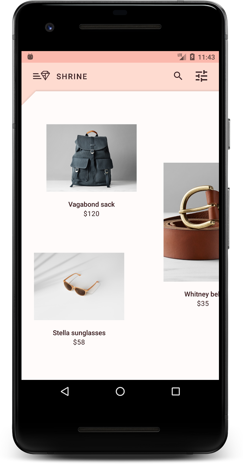
हो गया! आपको अपने डिवाइस या एम्युलेटर पर Shrine का लॉगिन पेज दिखेगा. 'आगे बढ़ें' बटन दबाने पर, Shrine का होम पेज दिखेगा. इसमें सबसे ऊपर ऐप्लिकेशन बार और उसके नीचे प्रॉडक्ट की इमेज की ग्रिड दिखेगी.
आइए, ऐप्लिकेशन बार के रंग, एलिवेशन, और टाइपोग्राफ़ी को बदलकर, इसे Shrine ब्रैंड के हिसाब से बनाएं.
इस कलर थीम को एक डिज़ाइनर ने बनाया है. इसमें कस्टम कलर का इस्तेमाल किया गया है. ये कलर नीचे दी गई इमेज में दिखाए गए हैं. इसमें ऐसे रंग शामिल हैं जिन्हें Shrine के ब्रैंड से चुना गया है. साथ ही, इन्हें Material Theme Editor पर लागू किया गया है. Material Theme Editor ने इन्हें बड़ा करके, पूरा पैलेट बनाया है. (ये रंग, 2014 के मटीरियल कलर पैलेट से नहीं लिए गए हैं.)
Material Theme Editor में, इन्हें संख्या के हिसाब से लेबल किए गए शेड में व्यवस्थित किया गया है. इसमें हर रंग के लिए 50, 100, 200, .... से लेकर 900 तक के लेबल शामिल हैं. Shrine, गुलाबी रंग के स्वैच से सिर्फ़ 50, 100, और 300 शेड का इस्तेमाल करता है. साथ ही, भूरे रंग के स्वैच से 900 शेड का इस्तेमाल करता है.


आइए, टॉप ऐप्लिकेशन बार का रंग बदलकर, उसे कलर स्कीम के हिसाब से सेट करें.
colorPrimaryDark और colorAccent सेट करना
colors.xml में, इन लाइनों में बदलाव करें. colorAccent एट्रिब्यूट, टॉप ऐप्लिकेशन बार के रंग को कंट्रोल करता है. इसके अलावा, यह अन्य चीज़ों को भी कंट्रोल करता है. वहीं, colorPrimaryDark एट्रिब्यूट, स्टेटस बार के रंग को कंट्रोल करता है.
colors.xml
<color name="colorPrimaryDark">#FBB8AC</color>
<color name="colorAccent">#FEDBD0</color>
स्टेटस बार में गहरे रंग वाले आइकॉन इस्तेमाल करने के लिए, Theme.Shrine, Shrine की ऐप्लिकेशन थीम में यह जोड़ें:
styles.xml
<item name="android:windowLightStatusBar" tools:targetApi="m">true</item>आपके colors.xml और styles.xml ऐसे दिखने चाहिए:
colors.xml
<?xml version="1.0" encoding="utf-8"?>
<resources>
   <color name="colorPrimary">#E0E0E0</color>
   <color name="colorPrimaryDark">#FBB8AC</color>
   <color name="colorAccent">#FEDBD0</color>
   <color name="toolbarIconColor">#FFFFFF</color>
   <color name="loginPageBackgroundColor">#FFFFFF</color>
   <color name="productGridBackgroundColor">#FFFFFF</color>
</resources>
styles.xml
<resources xmlns:android="http://schemas.android.com/tools">

   <!-- Base application theme. -->
   <style name="Theme.Shrine" parent="Theme.MaterialComponents.Light.NoActionBar">
       <!-- Customize your theme here. -->
       <item name="colorPrimary">@color/colorPrimary</item>
       <item name="colorPrimaryDark">@color/colorPrimaryDark</item>
       <item name="colorAccent">@color/colorAccent</item>
       <item name="android:windowLightStatusBar" tools:targetApi="m">true</item>
   </style>

   <style name="Widget.Shrine.Toolbar" parent="Widget.AppCompat.Toolbar">
       <item name="android:background">?attr/colorAccent</item>
       <item name="android:theme">@style/ThemeOverlay.AppCompat.Dark.ActionBar</item>
       <item name="popupTheme">@style/ThemeOverlay.AppCompat.Light</item>
   </style>

</resources>
colors.xml में, #442C2E में नया textColorPrimary रंग संसाधन सेट जोड़ें. साथ ही, toolbarIconColor एट्रिब्यूट को अपडेट करके, textColorPrimary रंग का रेफ़रंस दें.
styles.xml एट्रिब्यूट को textColorPrimary रंग पर सेट करने के लिए, अपनी styles.xml फ़ाइल अपडेट करें.android:textColorPrimary
Theme.Shrine में android:textColorPrimary सेट करने से, सभी एलिमेंट में टेक्स्ट का स्टाइल बदल जाएगा. इनमें टॉप ऐप्लिकेशन बार और हमारे टॉप ऐप्लिकेशन बार में मौजूद आइकॉन भी शामिल हैं.
एक और बात: Widget.Shrine.Toolbar स्टाइल में android:theme एट्रिब्यूट को Theme.Shrine पर सेट करें.
आपके colors.xml और styles.xml ऐसे दिखने चाहिए:
colors.xml
<?xml version="1.0" encoding="utf-8"?>
<resources>
   <color name="colorPrimary">#E0E0E0</color>
   <color name="colorPrimaryDark">#FBB8AC</color>
   <color name="colorAccent">#FEDBD0</color>
   <color name="textColorPrimary">#442C2E</color>
   <color name="toolbarIconColor">@color/textColorPrimary</color>
   <color name="loginPageBackgroundColor">#FFFFFF</color>
   <color name="productGridBackgroundColor">#FFFFFF</color>
</resources>
styles.xml
<resources xmlns:android="http://schemas.android.com/tools">

   <!-- Base application theme. -->
   <style name="Theme.Shrine" parent="Theme.MaterialComponents.Light.NoActionBar">
       <!-- Customize your theme here. -->
       <item name="colorPrimary">@color/colorPrimary</item>
       <item name="colorPrimaryDark">@color/colorPrimaryDark</item>
       <item name="colorAccent">@color/colorAccent</item>
       <item name="android:windowLightStatusBar" tools:targetApi="m">true</item>
       <item name="android:textColorPrimary">@color/textColorPrimary</item>
   </style>

   <style name="Widget.Shrine.Toolbar" parent="Widget.AppCompat.Toolbar">
       <item name="android:background">?attr/colorAccent</item>
       <item name="android:theme">@style/Theme.Shrine</item>
       <item name="popupTheme">@style/ThemeOverlay.AppCompat.Light</item>
   </style>

</resources>
बनाएं और चलाएं. अब आपकी प्रॉडक्ट ग्रिड ऐसी दिखनी चाहिए:
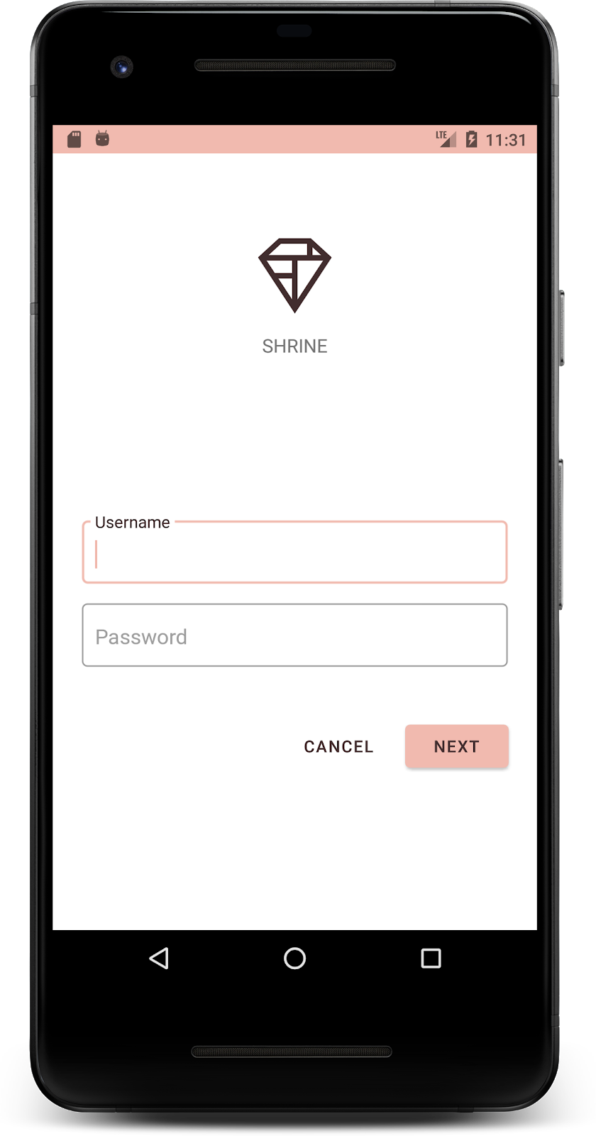
आइए, लॉगिन स्क्रीन की स्टाइल को अपनी कलर स्कीम के हिसाब से बदलें.
टेक्स्ट फ़ील्ड का फ़ॉर्मैट तय करना
आइए, लॉगिन पेज पर टेक्स्ट इनपुट को आउटलाइन में बदलते हैं और अपने लेआउट के लिए बेहतर रंगों का इस्तेमाल करते हैं.
अपनी colors.xml फ़ाइल में यह कलर रिसॉर्स जोड़ें:
colors.xml
<color name="textInputOutlineColor">#FBB8AC</color>अपनी styles.xml में दो नई स्टाइल जोड़ें:
styles.xml
<style name="Widget.Shrine.TextInputLayout" parent="Widget.MaterialComponents.TextInputLayout.OutlinedBox">
   <item name="hintTextAppearance">@style/TextAppearance.Shrine.TextInputLayout.HintText</item>
   <item name="hintTextColor">@color/textColorPrimary</item>
   <item name="android:paddingBottom">8dp</item>
   <item name="boxStrokeColor">@color/textInputOutlineColor</item>
</style>

<style name="TextAppearance.Shrine.TextInputLayout.HintText" parent="TextAppearance.MaterialComponents.Subtitle2">
   <item name="android:textColor">?android:attr/textColorPrimary</item>
</style>
आखिर में, shr_login_fragment.xml में मौजूद TextInputLayout एक्सएमएल कॉम्पोनेंट के दोनों पर स्टाइल एट्रिब्यूट को अपनी नई स्टाइल पर सेट करें:
shr_login_fragment.xml
<com.google.android.material.textfield.TextInputLayout
   style="@style/Widget.Shrine.TextInputLayout"
   android:layout_width="match_parent"
   android:layout_height="wrap_content"
   android:hint="@string/shr_hint_username">

   <com.google.android.material.textfield.TextInputEditText
       android:layout_width="match_parent"
       android:layout_height="wrap_content"
       android:inputType="text"
       android:maxLines="1" />
</com.google.android.material.textfield.TextInputLayout>

<com.google.android.material.textfield.TextInputLayout
   android:id="@+id/password_text_input"
   style="@style/Widget.Shrine.TextInputLayout"
   android:layout_width="match_parent"
   android:layout_height="wrap_content"
   android:hint="@string/shr_hint_password"
   app:errorEnabled="true">

   <com.google.android.material.textfield.TextInputEditText
       android:id="@+id/password_edit_text"
       android:layout_width="match_parent"
       android:layout_height="wrap_content"
       android:inputType="textPassword" />
</com.google.android.material.textfield.TextInputLayout>
बटन के रंगों को स्टाइल करना
आखिर में, लॉगिन पेज पर मौजूद बटन के रंगों को स्टाइल करें. अपनी styles.xml फ़ाइल में ये स्टाइल जोड़ें:
styles.xml
<style name="Widget.Shrine.Button" parent="Widget.MaterialComponents.Button">
   <item name="android:textColor">?android:attr/textColorPrimary</item>
   <item name="backgroundTint">?attr/colorPrimaryDark</item>
</style>

<style name="Widget.Shrine.Button.TextButton" parent="Widget.MaterialComponents.Button.TextButton">
   <item name="android:textColor">?android:attr/textColorPrimary</item>
</style>
Widget.Shrine.Button स्टाइल, डिफ़ॉल्ट MaterialButton स्टाइल से मिलती-जुलती है. इससे बटन के टेक्स्ट का रंग और बैकग्राउंड का रंग बदल जाता है. Widget.Shrine.Button.TextButton, डिफ़ॉल्ट टेक्स्ट MaterialButton स्टाइल से मिलता-जुलता है. हालांकि, इससे सिर्फ़ टेक्स्ट का रंग बदलता है.
अपने 'आगे बढ़ें' बटन पर Widget.Shrine.Button स्टाइल और 'रद्द करें' बटन पर Widget.Shrine.Button.TextButton स्टाइल सेट करें. इसके लिए, यह तरीका अपनाएं:
shr_login_fragment.xml
<RelativeLayout
   android:layout_width="match_parent"
   android:layout_height="wrap_content">

   <com.google.android.material.button.MaterialButton
       android:id="@+id/next_button"
       style="@style/Widget.Shrine.Button"
       android:layout_width="wrap_content"
       android:layout_height="wrap_content"
       android:layout_alignParentEnd="true"
       android:layout_alignParentRight="true"
       android:text="@string/shr_button_next" />

   <com.google.android.material.button.MaterialButton
       android:id="@+id/cancel_button"
       style="@style/Widget.Shrine.Button.TextButton"
       android:layout_width="wrap_content"
       android:layout_height="wrap_content"
       android:layout_marginEnd="12dp"
       android:layout_marginRight="12dp"
       android:layout_toStartOf="@id/next_button"
       android:layout_toLeftOf="@id/next_button"
       android:text="@string/shr_button_cancel" />

</RelativeLayout>
लॉगिन पेज पर Shrine के लोगो का रंग अपडेट करें. इसके लिए, ड्रॉ करने लायक वेक्टर shr_logo.xml में थोड़ा बदलाव करना होगा. ड्रॉएबल फ़ाइल खोलें और android:fillAlpha प्रॉपर्टी को 1 पर सेट करें. ड्रॉएबल ऐसा दिखना चाहिए:
shr_logo.xml
<vector xmlns:android="http://schemas.android.com/apk/res/android"
   android:width="149dp"
   android:height="152dp"
   android:tint="?attr/colorControlNormal"
   android:viewportWidth="149"
   android:viewportHeight="152">
   <path
       android:fillAlpha="1"
       android:fillColor="#DADCE0"
       android:fillType="evenOdd"
       android:pathData="M42.262,0L0,38.653L74.489,151.994L148.977,38.653L106.723,0M46.568,11.11L21.554,33.998L99.007,33.998L99.007,11.11L46.568,11.11ZM110.125,18.174L110.125,33.998L127.416,33.998L110.125,18.174ZM80.048,45.116L80.048,123.296L131.426,45.116L80.048,45.116ZM17.551,45.116L33.976,70.101L68.93,70.101L68.93,45.116L17.551,45.116ZM41.284,81.219L68.93,123.296L68.93,81.219L41.284,81.219Z"
       android:strokeWidth="1"
       android:strokeAlpha="0.4"
       android:strokeColor="#00000000" />
</vector>
shr_login_fragment.xml में मौजूद लोगो <ImageView> के लिए, android:tint एट्रिब्यूट को ?android:attr/textColorPrimary पर सेट करें. इसके लिए, यह तरीका अपनाएं:
shr_login_fragment.xml
<ImageView
android:layout_width="64dp"
android:layout_height="64dp"
android:layout_gravity="center_horizontal"
android:layout_marginTop="48dp"
android:layout_marginBottom="16dp"
android:tint="?android:attr/textColorPrimary"
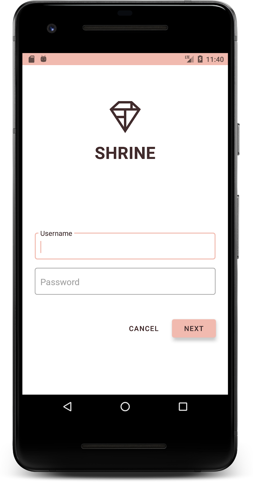
app:srcCompat="@drawable/shr_logo" />बनाएं और चलाएं. अब आपकी लॉगिन स्क्रीन ऐसी दिखनी चाहिए:
रंगों में बदलाव के साथ-साथ, आपके डिज़ाइनर ने आपको साइट पर इस्तेमाल करने के लिए खास टाइपोग्राफ़ी भी दी है. इसे टॉप ऐप्लिकेशन बार में भी जोड़ते हैं.
टॉप ऐप्लिकेशन बार का स्टाइल बदलना
अपने डिज़ाइनर की दी गई खास जानकारी के मुताबिक, टॉप ऐप्लिकेशन बार के टेक्स्ट के रंगरूप को स्टाइल करें. styles.xml में टेक्स्ट दिखने की यह स्टाइल जोड़ें. साथ ही, titleTextAppearance प्रॉपर्टी को सेट करें, ताकि Widget.Shrine.Toolbar स्टाइल में इस स्टाइल का रेफ़रंस दिया जा सके.
styles.xml
<style name="Widget.Shrine.Toolbar" parent="Widget.AppCompat.Toolbar">
   <item name="android:background">?attr/colorAccent</item>
   <item name="android:theme">@style/Theme.Shrine</item>
   <item name="popupTheme">@style/ThemeOverlay.AppCompat.Light</item>
   <item name="titleTextAppearance">@style/TextAppearance.Shrine.Toolbar</item>
</style>

<style name="TextAppearance.Shrine.Toolbar" parent="TextAppearance.MaterialComponents.Button">
   <item name="android:textSize">16sp</item>
</style>
आपके colors.xml और styles.xml ऐसे दिखने चाहिए:
colors.xml
<?xml version="1.0" encoding="utf-8"?>
<resources>
   <color name="colorPrimary">#E0E0E0</color>
   <color name="colorPrimaryDark">#FBB8AC</color>
   <color name="colorAccent">#FEDBD0</color>
   <color name="textColorPrimary">#442C2E</color>
   <color name="toolbarIconColor">@color/textColorPrimary</color>
   <color name="loginPageBackgroundColor">#FFFFFF</color>
   <color name="productGridBackgroundColor">#FFFFFF</color>
   <color name="textInputOutlineColor">#FBB8AC</color>
</resources>
styles.xml
<resources xmlns:android="http://schemas.android.com/tools">

   <!-- Base application theme. -->
   <style name="Theme.Shrine" parent="Theme.MaterialComponents.Light.NoActionBar">
       <!-- Customize your theme here. -->
       <item name="colorPrimary">@color/colorPrimary</item>
       <item name="colorPrimaryDark">@color/colorPrimaryDark</item>
       <item name="colorAccent">@color/colorAccent</item>
       <item name="android:windowLightStatusBar" tools:targetApi="m">true</item>
       <item name="android:textColorPrimary">@color/textColorPrimary</item>
   </style>

   <style name="Widget.Shrine.TextInputLayout" parent="Widget.MaterialComponents.TextInputLayout.OutlinedBox">
       <item name="hintTextAppearance">@style/TextAppearance.Shrine.TextInputLayout.HintText</item>
       <item name="hintTextColor">@color/textColorPrimary</item>
       <item name="android:paddingBottom">8dp</item>
       <item name="boxStrokeColor">@color/textInputOutlineColor</item>
   </style>

   <style name="TextAppearance.Shrine.TextInputLayout.HintText" parent="TextAppearance.MaterialComponents.Subtitle2">
       <item name="android:textColor">?android:attr/textColorPrimary</item>
   </style>


   <style name="Widget.Shrine.Button" parent="Widget.MaterialComponents.Button">
       <item name="android:textColor">?android:attr/textColorPrimary</item>
       <item name="backgroundTint">?attr/colorPrimaryDark</item>
   </style>

   <style name="Widget.Shrine.Button.TextButton" parent="Widget.MaterialComponents.Button.TextButton">
       <item name="android:textColor">?android:attr/textColorPrimary</item>
   </style>

   <style name="Widget.Shrine.Toolbar" parent="Widget.AppCompat.Toolbar">
       <item name="android:background">?attr/colorAccent</item>
       <item name="android:theme">@style/Theme.Shrine</item>
       <item name="popupTheme">@style/ThemeOverlay.AppCompat.Light</item>
       <item name="titleTextAppearance">@style/TextAppearance.Shrine.Toolbar</item>
   </style>

   <style name="TextAppearance.Shrine.Toolbar" parent="TextAppearance.MaterialComponents.Button">
       <item name="android:textSize">16sp</item>
   </style>

</resources>
लेबल का फ़ॉर्मैट अपने हिसाब से बनाना
हम प्रॉडक्ट कार्ड के लेबल को स्टाइल करेंगे, ताकि सही टेक्स्ट दिखे और कार्ड में हॉरिज़ॉन्टल तौर पर बीच में दिखे.
टाइटल लेबल पर मौजूद टाइपोग्राफ़ी को, textAppearanceHeadline6 से बदलकर textAppearanceSubtitle2 पर अपडेट करें. इसके लिए, यह तरीका अपनाएं:
shr_product_card.xml
<TextView
   android:id="@+id/product_title"
   android:layout_width="match_parent"
   android:layout_height="wrap_content"
   android:text="@string/shr_product_title"
   android:textAppearance="?attr/textAppearanceSubtitle2" />
इमेज लेबल को बीच में लाने के लिए, shr_product_card.xml में मौजूद लेबल <TextView> में बदलाव करके एट्रिब्यूट android:textAlignment="center" सेट करें:
shr_product_card.xml
<LinearLayout
android:layout_width="match_parent"
android:layout_height="wrap_content"
android:orientation="vertical"
android:padding="16dp">
<TextView
android:id="@+id/product_title"
android:layout_width="match_parent"
android:layout_height="wrap_content"
android:text="@string/shr_product_title"
android:textAlignment="center"
android:textAppearance="?attr/textAppearanceSubtitle2" />
<TextView
android:id="@+id/product_price"
android:layout_width="match_parent"
android:layout_height="wrap_content"
android:text="@string/shr_product_description"
android:textAlignment="center"
android:textAppearance="?attr/textAppearanceBody2" />
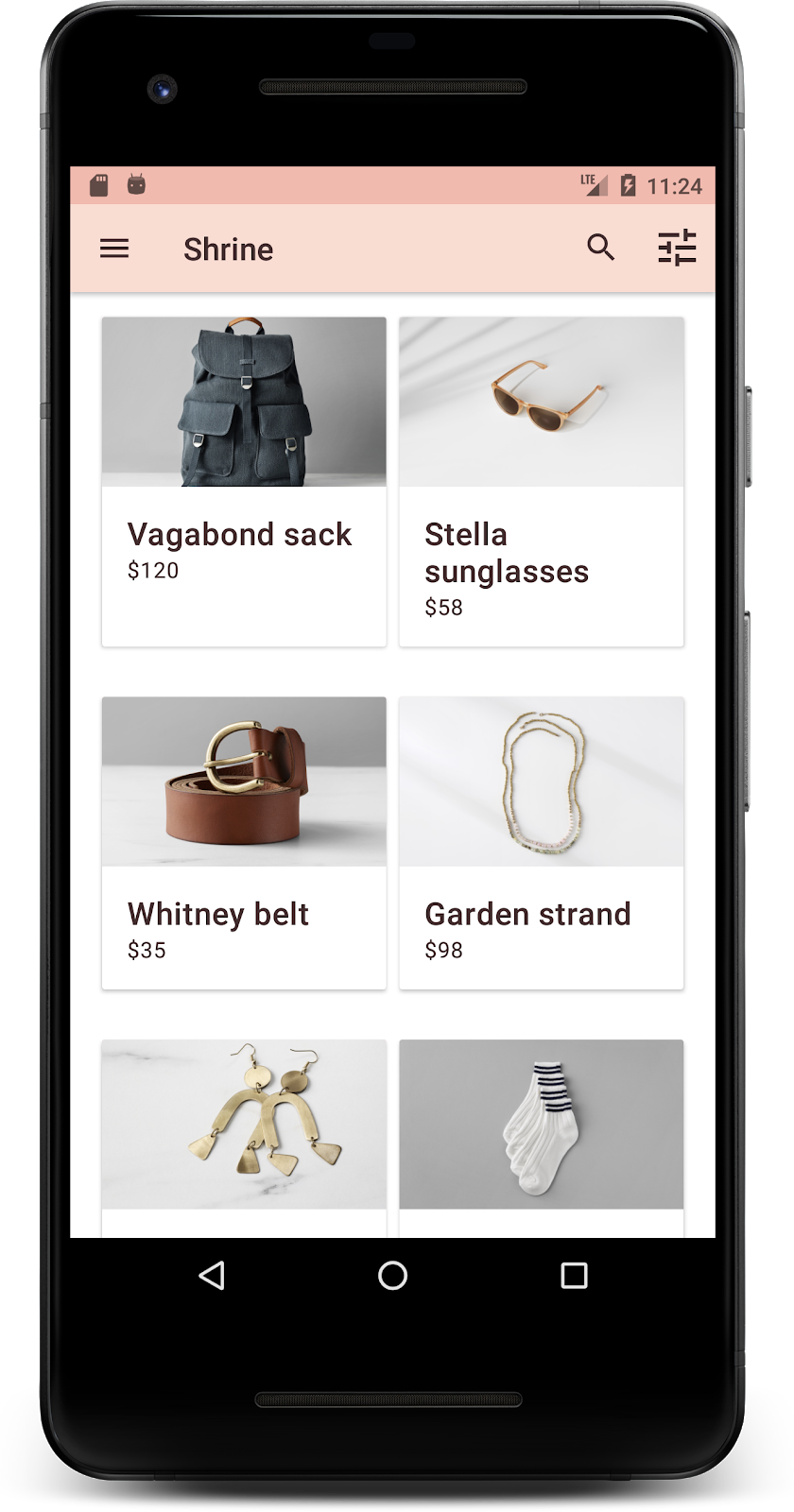
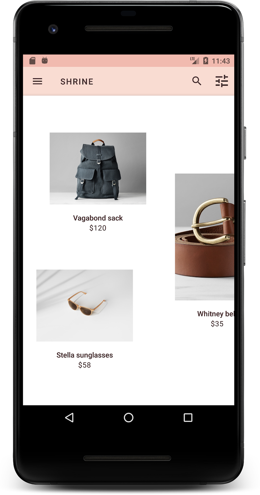
</LinearLayout>बनाएं और चलाएं. अब आपकी प्रॉडक्ट ग्रिड स्क्रीन ऐसी दिखनी चाहिए:
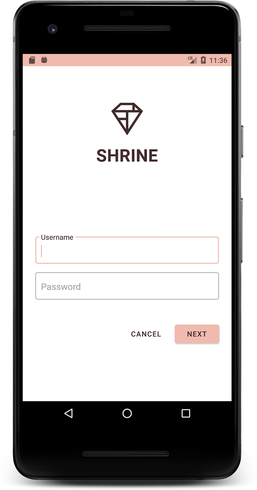
आइए, लॉगिन स्क्रीन की टाइपोग्राफ़ी को मैच करने के लिए बदलें.
लॉगिन स्क्रीन का टाइपफ़ेस बदलना
styles.xml में, यह स्टाइल जोड़ें:
styles.xml
<style name="TextAppearance.Shrine.Title" parent="TextAppearance.MaterialComponents.Headline4">
   <item name="textAllCaps">true</item>
   <item name="android:textStyle">bold</item>
   <item name="android:textColor">?android:attr/textColorPrimary</item>
</style>
shr_login_fragment.xml में, "SHRINE" टाइटल <TextView> के लिए नई स्टाइल सेट करें. साथ ही, textAllCaps और textSize एट्रिब्यूट मिटाएं:
shr_login_fragment.xml
<TextView
   android:layout_width="wrap_content"
   android:layout_height="wrap_content"
   android:layout_gravity="center_horizontal"
   android:layout_marginBottom="132dp"
   android:text="@string/shr_app_name"
   android:textAppearance="@style/TextAppearance.Shrine.Title" />
बनाएं और चलाएं. अब आपकी लॉगिन स्क्रीन ऐसी दिखनी चाहिए:
आपने पेज को Shrine के हिसाब से खास रंग और टाइपोग्राफ़ी दी है. अब, उन कार्ड पर एक नज़र डालते हैं जिनमें Shrine के प्रॉडक्ट दिखाए गए हैं. फ़िलहाल, इन्हें ऐप्लिकेशन के नेविगेशन के नीचे, सफ़ेद रंग के बैकग्राउंड पर रखा गया है. आइए, प्रॉडक्ट पर ज़्यादा ज़ोर दें, ताकि लोगों का ध्यान उन पर जाए.
प्रॉडक्ट ग्रिड की ऊंचाई बदलना
आइए, टॉप ऐप्लिकेशन बार और कॉन्टेंट की ऊंचाई में बदलाव करें, ताकि ऐसा लगे कि कॉन्टेंट, टॉप ऐप्लिकेशन बार के ऊपर तैर रही किसी शीट पर है. shr_product_grid_fragment.xml में, अपने AppBarLayout में app:elevation एट्रिब्यूट और NestedScrollView एक्सएमएल कॉम्पोनेंट में android:elevation एट्रिब्यूट इस तरह जोड़ें:
shr_product_grid_fragment.xml
<com.google.android.material.appbar.AppBarLayout
   android:layout_width="match_parent"
   android:layout_height="wrap_content"
   app:elevation="0dp">

   <androidx.appcompat.widget.Toolbar
       android:id="@+id/app_bar"
       style="@style/Widget.Shrine.Toolbar"
       android:layout_width="match_parent"
       android:layout_height="?attr/actionBarSize"
       app:navigationIcon="@drawable/shr_menu"
       app:title="@string/shr_app_name" />
</com.google.android.material.appbar.AppBarLayout>

<androidx.core.widget.NestedScrollView
   android:layout_width="match_parent"
   android:layout_height="match_parent"
   android:layout_marginTop="56dp"
   android:background="@color/productGridBackgroundColor"
   android:elevation="8dp"
   android:paddingStart="@dimen/shr_product_grid_spacing"
   android:paddingEnd="@dimen/shr_product_grid_spacing"
   app:layout_behavior="@string/appbar_scrolling_view_behavior">

   <androidx.appcompat.app.AlertController.RecycleListView
       android:id="@+id/recycler_view"
       android:layout_width="match_parent"
       android:layout_height="match_parent" />

</androidx.core.widget.NestedScrollView>
कार्ड का एलिवेशन (और रंग) बदलना
हर कार्ड की ऊंचाई को अडजस्ट किया जा सकता है. इसके लिए, 2dp से 0dp तक shr_product_card.xml में मौजूद app:cardElevation को बदलें. app:cardBackgroundColor को @android:color/transparent में भी बदलें.
shr_product_card.xml
<com.google.material.card.MaterialCardView xmlns:android="http://schemas.android.com/apk/res/android"
   xmlns:app="http://schemas.android.com/apk/res-auto"
   android:layout_width="match_parent"
   android:layout_height="wrap_content"
   app:cardBackgroundColor="@android:color/transparent"
   app:cardElevation="0dp"
   app:cardPreventCornerOverlap="true">
एक नज़र डालें! आपने प्रॉडक्ट ग्रिड पेज पर मौजूद हर कार्ड की ऊंचाई में बदलाव किया हो.

'आगे बढ़ें' बटन की ऊंचाई बदलना
styles.xml में, अपनी Widget.Shrine.Button स्टाइल में यह प्रॉपर्टी जोड़ें:
styles.xml
<item name="android:stateListAnimator" tools:ignore="NewApi">
    @animator/shr_next_button_state_list_anim
</item>Button की स्टाइल में android:stateListAnimator को सेट करने से, 'आगे बढ़ें' बटन, हमारे दिए गए ऐनिमेशन का इस्तेमाल करता है.
बनाएं और चलाएं. अब आपकी लॉगिन स्क्रीन ऐसी दिखनी चाहिए:
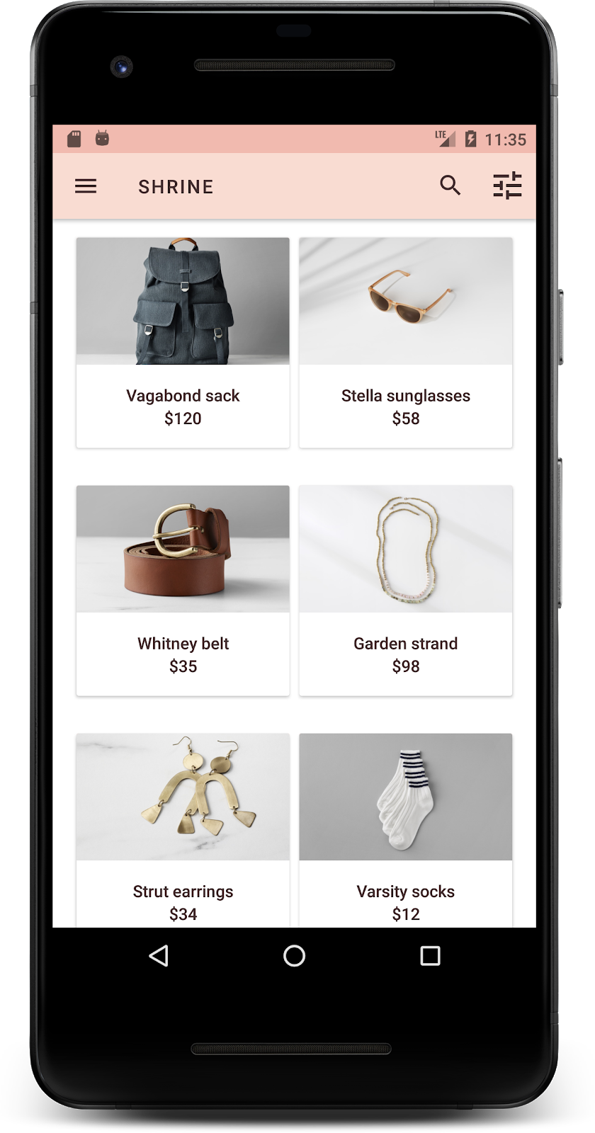
कार्ड को अलग-अलग आसपेक्ट रेशियो और साइज़ में दिखाने के लिए, लेआउट बदलें. इससे हर कार्ड, दूसरे कार्ड से अलग दिखेगा.
स्टैगर्ड RecyclerView अडैप्टर का इस्तेमाल करना
हमने staggeredgridlayout पैकेज में एक नया RecyclerView अडैप्टर उपलब्ध कराया है. यह अडैप्टर, एसिमेट्रिक स्टैगर्ड कार्ड लेआउट दिखाता है. इसे हॉरिज़ॉन्टल तरीके से स्क्रोल किया जा सकता है. आपके पास इस कोड को खुद से समझने का विकल्प है. हालांकि, हम यहां यह नहीं बताएंगे कि इसे कैसे लागू किया जाता है.
इस नए अडैप्टर का इस्तेमाल करने के लिए, ProductGridFragment.java में onCreateView() तरीके में बदलाव करें. "set up the RecyclerView" टिप्पणी के बाद मौजूद कोड ब्लॉक को इससे बदलें:
ProductGridFragment.java
// Set up the RecyclerView
RecyclerView recyclerView = view.findViewById(R.id.recycler_view);
recyclerView.setHasFixedSize(true);
GridLayoutManager gridLayoutManager = new GridLayoutManager(getContext(), 2, GridLayoutManager.HORIZONTAL, false);
gridLayoutManager.setSpanSizeLookup(new GridLayoutManager.SpanSizeLookup() {
   @Override
   public int getSpanSize(int position) {
       return position % 3 == 2 ? 2 : 1;
   }
});
recyclerView.setLayoutManager(gridLayoutManager);
StaggeredProductCardRecyclerViewAdapter adapter = new StaggeredProductCardRecyclerViewAdapter(
       ProductEntry.initProductEntryList(getResources()));
recyclerView.setAdapter(adapter);
int largePadding = getResources().getDimensionPixelSize(R.dimen.shr_staggered_product_grid_spacing_large);
int smallPadding = getResources().getDimensionPixelSize(R.dimen.shr_staggered_product_grid_spacing_small);
recyclerView.addItemDecoration(new ProductGridItemDecoration(largePadding, smallPadding));
हमें अपने product_grid_fragment.xml में भी थोड़ा बदलाव करना होगा, ताकि हम अपने NestedScrollView से पैडिंग हटा सकें. इसके लिए, हमें यह तरीका अपनाना होगा:
shr_product_grid_fragment.xml
<androidx.core.widget.NestedScrollView
   android:layout_width="match_parent"
   android:layout_height="match_parent"
   android:layout_marginTop="56dp"
   android:background="@color/productGridBackgroundColor"
   app:layout_behavior="@string/appbar_scrolling_view_behavior"
   android:elevation="6dp">
आखिर में, हम RecyclerView में कार्ड की पैडिंग को भी अडजस्ट करेंगे. इसके लिए, ProductGridItemDecoration.java में बदलाव किया जाएगा. ProductGridItemDecoration.java के getItemOffsets() तरीके में इस तरह बदलाव करें:
ProductGridItemDecoration.java
@Override
public void getItemOffsets(Rect outRect, View view,
RecyclerView parent, RecyclerView.State state) {
outRect.left = smallPadding;
outRect.right = largePadding;
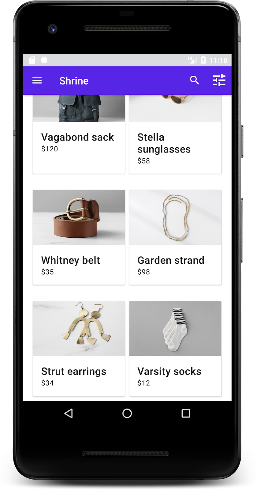
}बनाएं और चलाएं. प्रॉडक्ट ग्रिड के आइटम अब इस तरह से दिखने चाहिए:
रंग, अपने ब्रैंड को दिखाने का एक असरदार तरीका है. रंग में थोड़ा सा बदलाव करने से, उपयोगकर्ता अनुभव पर काफ़ी असर पड़ सकता है. इसे आज़माने के लिए, आइए देखते हैं कि अगर ब्रैंड की कलर स्कीम पूरी तरह से अलग हो, तो Shrine कैसा दिखेगा.
स्टाइल और रंगों में बदलाव करना
styles.xml में, यह नई थीम जोड़ें:
styles.xml
<style name="Theme.Shrine.Autumn" parent="Theme.Shrine">
   <item name="colorPrimary">#FFCF44</item>
   <item name="colorPrimaryDark">#FD9725</item>
   <item name="colorAccent">#FD9725</item>
   <item name="colorOnPrimary">#FFFFFF</item>
   <item name="colorError">#FD9725</item>
</style>
इसके बाद, AndroidManifest.xml में अपने ऐप्लिकेशन में इस नई थीम का इस्तेमाल करें:
AndroidManifest.xml
<application
   android:allowBackup="true"
   android:icon="@mipmap/ic_launcher"
   android:label="@string/shr_app_name"
   android:roundIcon="@mipmap/ic_launcher_round"
   android:supportsRtl="true"
   android:name="com.google.codelabs.mdc.java.shrine.application.ShrineApplication"
   android:theme="@style/Theme.Shrine.Autumn">
   <activity android:name=".MainActivity">
       <intent-filter>
           <action android:name="android.intent.action.MAIN" />

           <category android:name="android.intent.category.LAUNCHER" />
       </intent-filter>
   </activity>
</application>
नीचे दिखाए गए तरीके से, colors.xml में टूलबार के आइकॉन के रंग में बदलाव करें:
colors.xml
<color name="toolbarIconColor">#FFFFFF</color>इसके बाद, टूलबार स्टाइल के android:theme एट्रिब्यूट को सेट करें, ताकि "?theme" एट्रिब्यूट का इस्तेमाल करके मौजूदा थीम को रेफ़रंस दिया जा सके. इसके लिए, इसे हार्ड कोड करने के बजाय यह तरीका अपनाएं:
styles.xml
<style name="Widget.Shrine.Toolbar" parent="Widget.AppCompat.Toolbar">
   <item name="android:background">?attr/colorAccent</item>
   <item name="android:theme">?theme</item>
   <item name="popupTheme">@style/ThemeOverlay.AppCompat.Light</item>
   <item name="titleTextAppearance">@style/TextAppearance.Shrine.Toolbar</item>
</style>
इसके बाद, लॉगिन स्क्रीन के टेक्स्ट फ़ील्ड में मौजूद हिंट टेक्स्ट के रंग को हल्का करें. टेक्स्ट फ़ील्ड की स्टाइल में android:textColorHint एट्रिब्यूट जोड़ें:
styles.xml
<style name="Widget.Shrine.TextInputLayout" parent="Widget.MaterialComponents.TextInputLayout.OutlinedBox">
<item name="hintTextAppearance">
@style/TextAppearance.Shrine.TextInputLayout.HintText
</item>
<item name="android:paddingBottom">8dp</item>
<item name="android:textColorHint">?attr/colorPrimaryDark</item>
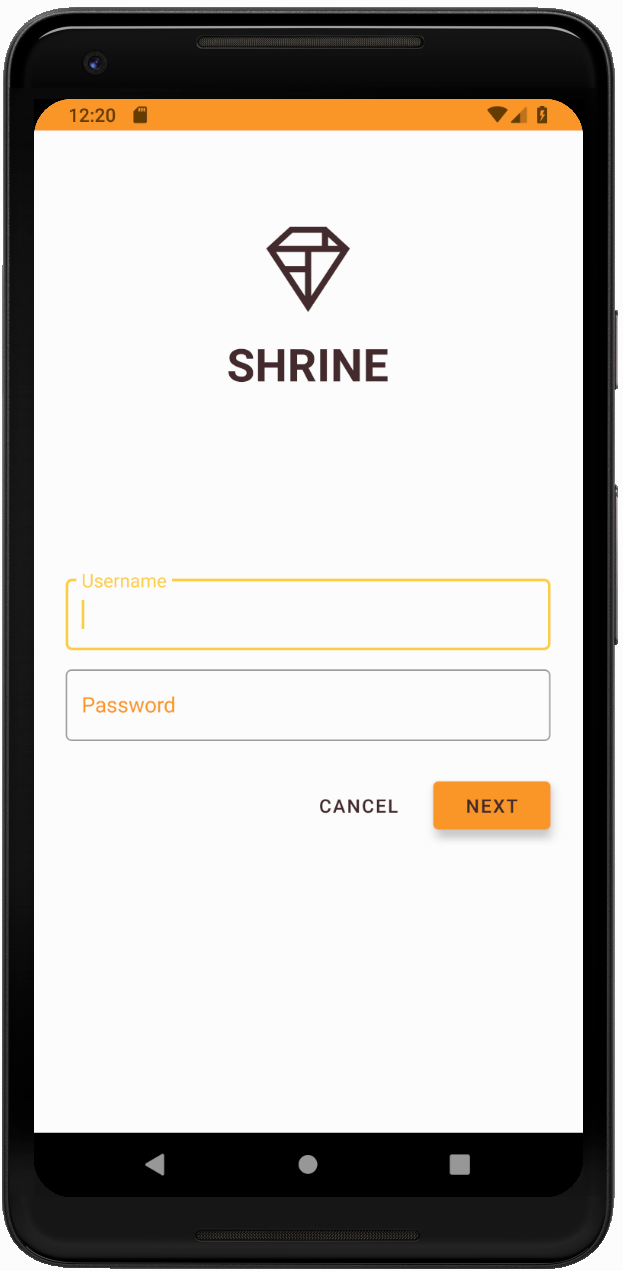
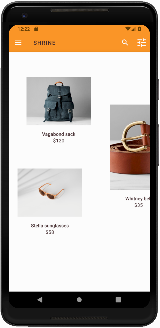
</style>बनाएं और चलाएं. अब आपको नई थीम की झलक दिखेगी.
MDC-104 पर जाने से पहले, इस सेक्शन में बदले गए कोड को पहले जैसा करें.
अब तक, आपने एक ऐसा ऐप्लिकेशन बना लिया है जो आपके डिज़ाइनर की डिज़ाइन स्पेसिफ़िकेशन से मिलता-जुलता है.
अगले चरण
आपने इन MDC कॉम्पोनेंट का इस्तेमाल किया है: थीम, टाइपोग्राफ़ी, और एलिवेशन. MDC-Android कैटलॉग MDC Android में मौजूद कॉम्पोनेंट में जाकर, और भी कॉम्पोनेंट देखे जा सकते हैं.
अगर आपके ऐप्लिकेशन के डिज़ाइन में ऐसे एलिमेंट शामिल हैं जिनके कॉम्पोनेंट, MDC लाइब्रेरी में मौजूद नहीं हैं, तो क्या होगा? MDC-104: Material Design के ऐडवांस कॉम्पोनेंट में, हम MDC लाइब्रेरी का इस्तेमाल करके कस्टम कॉम्पोनेंट बनाने का तरीका जानेंगे, ताकि किसी खास लुक को हासिल किया जा सके.