
This codelab is part of the Android Kotlin Fundamentals course. You'll get the most value out of this course if you work through the codelabs in sequence. All the course codelabs are listed on the Android Kotlin Fundamentals codelabs landing page.
Introduction to design
The focus in this series of codelabs is on one of the most important aspects of Android development, app design. Obvious aspects of app design are views, text, and buttons, and where they are on the screen, as well as the colors and fonts they use. Hints to the user about what to do next are also an essential aspect of design. Users need to be able to tell at a glance what they are looking at, what is important, and what they can do.
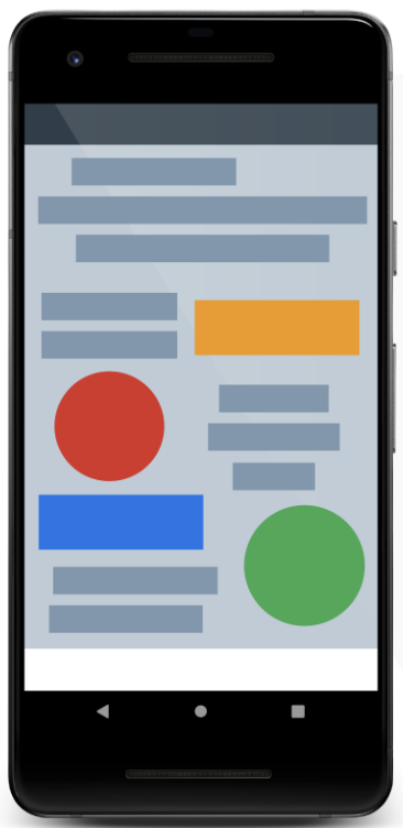
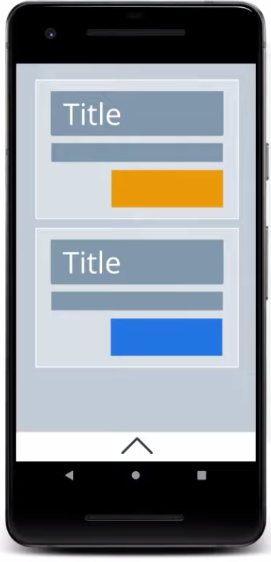
Compare the two screens below. Notice that by moving elements around and drawing focus to what's important, you can help the user understand what's going on. For simple screens, good design often means showing less. For screens with lots of important information, good design makes dense information understandable at a glance. As you work on Android Apps you may hear this concept called information architecture (IA).
Another level of design is building coherent user flows, or use cases, that let users accomplish tasks. This form of design is called user experience design (UXD), and some designers specialize in it.
|
|
If you don't have access to a designer, here are a few tips for getting started:
- Define use cases. Write up what users should accomplish with your app, and how.
- Implement a design. Don't be attached to your first draft, and only make it "good enough," because you'll change it after you see how real users interact with it.
- Get feedback. Find anyone who you can talk into testing your app—your family, friends, or even people you just met at a Google Developer Group. Ask them to use your app to perform a use case while you watch and take detailed notes.
- Refine! With all that information, make the app better, and then test it again.
Here are some other questions to ask yourself when designing a great app experience. You learned techniques for tackling these issues in preceding codelabs:
- Does the app lose its state when the user rotates their device?
- What happens when the user opens the app? Does the user see a loading spinner, or is the data ready in an offline cache?
- Is the app coded in a way that is efficient and ensures that the app is always responsive to user touch?
- Does the app interact with backend systems in a way that never leads to odd, incorrect, or stale data being presented to the user?
As you work on apps for larger audiences, it's essential to make your apps accessible to as many types of users as possible. For example:
- Many users interact with computer systems in different ways. Many users are color blind, and colors that contrast for one user may not work for another. Many users have vision impairments, from needing reading glasses all the way through blindness.
- Some users can't use touch screens, and they interact via other input devices such as buttons.
Good design is the most important way to get users using your app.
These codelabs are too short to teach you everything about design for Android, but they'll get you started in a good direction, and you can continue to learn and develop on your own.
What you should already know
You should be familiar with:
- How to create apps with activities and fragments, and navigate between fragments passing data
- Using views and view groups to lay out a user interface (UI), including
RecyclerView - How to use Architecture Components, including
ViewModel, with the recommended architecture to create a well-structured and efficient app - Data binding, coroutines, and how to handle clicks
- How to connect to the internet and cache data locally using a
Roomdatabase - How to set view properties
- How to extract resources into and use resources from XML resource files
What you'll learn
- The basics of Android's styling system
- How to use attributes, styles, and themes to customize your app
What you'll do
- Improve the design of a starter app with view attributes, styles, and themes
The GDG-finder starter app builds on everything you've learned so far in this course.
The app uses ConstraintLayout to lay out three screens. Two of the screens are just layout files that you'll use to explore colors and text on Android.
The third screen is a GDG finder. GDGs, or Google Developer Groups, are communities of developers that focus on Google technologies, including Android. GDGs around the world host meetups, conferences, study jams, and other events.
As you develop this app, you work on the real list of GDGs. The finder screen uses the device's location to sort the GDGs by distance.
If you're lucky and there's a GDG in your region, you can check out the website and sign up for their events! GDG events are a great way to meet other Android developers and learn industry best practices that didn't fit in this course.
The screenshots below show how your app will change from the beginning to the end of this codelab.
|
|

Android provides a rich styling system that lets you control the appearance of all the views in your app. You can use themes, styles, and view attributes to affect styling. The diagram shown below summarizes the precedence of each method of styling. The pyramid diagram shows the order in which styling methods are applied by the system, from the bottom up. For example, if you set the text size in the theme, and then set the text size differently in the view attributes, the view attributes will override the theme styling.
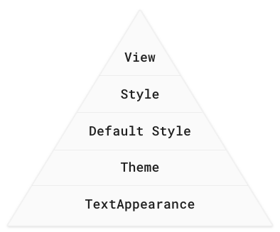
View attributes
- Use view attributes to set attributes explicitly for each view. (View attributes are not reusable, as styles are.)
- You can use every property that can be set via styles or themes.
Use for custom or one-off designs such as margins, paddings, or constraints.
Styles
- Use a style to create a collection of reusable styling information, such as font size or colors.
- Good for declaring small sets of common designs used throughout your app.
Apply a style to several views, overriding the default style. For example, use a style to make consistently styled headers or a set of buttons.
Default style
- This is the default styling provided by the Android system.
Themes
- Use a theme to define colors for your whole app.
- Use a theme to set the default font for the whole app.
- Apply to all views, such as text views or radio buttons.
- Use to configure properties that you can apply consistently for the whole app.
TextAppearance
- For styling with text attributes only, such as
fontFamily.
When Android styles a view, it applies a combination of themes, styles, and attributes, which you can customize. Attributes always overwrite anything specified in a style or theme. And styles always overwrite anything specified in a theme.
The screenshots below show the GDG-finder app with light theme (left) and a dark theme (right), as well as with a custom font and header sizes. This can be implemented in several ways, and you learn some of them in this codelab.
|
|

In this task, you use attributes to style headers for the text in the app layout.
- Download and run the GDG-finder starter app.
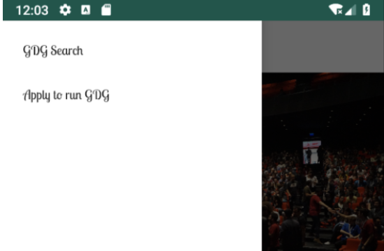
- Notice that the home screen has a lot of uniformly formatted text, which makes it hard to figure out what the page is about, and what's important.
- Open the
home_fragment.xmllayout file. - Notice that the layout uses
ConstraintLayoutto position elements inside aScrollView. - Notice that for each view, the constraint and margin layout attributes are set in the view, because these attributes tend to be customized for each view and screen.
- In the
titletext view, add atextSizeattribute to change the size of the text to24sp.
As a reminder,spstands for scale-independent pixels, which are scaled by both the pixel density and the font-size preference that the user sets in their device settings. Android figures out how large the text should be on the screen when it draws the text. Always usespfor text sizes.
<TextView
       android:id="@+id/title"
...

android:textSize="24sp"- Set the
textColorof thetitletext view to opaque gray, by setting it to an aRGB value of#FF555555.
<TextView
       android:id="@+id/title"
...

android:textColor="#FF555555"- To open the Preview tab in Android Studio, select View > Tool Windows > Preview, or click the vertical Preview button on the right edge of the Layout Editor. In the preview, verify that the title is gray and larger than it was before, as shown below.
- Style the subtitle to have the same color as the header, with a smaller font,
18sp. (The default alpha isFF, opaque. You can omit the alpha value if you are not changing it.)
<TextView
       android:id="@+id/subtitle"
...
android:textSize="18sp"
android:textColor="#555555"
- In this codelab, the goal is to style the app to be a bit whimsical while looking professional, but you can style it any way you wish. Try the following attributes for the
subtitletext view. Use the Preview tab to see how your app's appearance changes. Then remove these attributes.
<TextView
       android:id="@+id/subtitle"
       ...
       android:textAllCaps="true"
       android:textStyle="bold"
android:background="#ff9999"- Don't forget to undo the
textAllCaps,textStyle, andbackgroundattributes from thesubtitleview before you continue. - Run your app, and it should already look better.

When using fonts with your app, you could ship the necessary font files as part of your APK. While simple, this solution is usually not recommended, because it makes your app take longer to download and install.
Android lets apps download fonts at runtime using the Downloadable Fonts API. If your app uses the same font as another app on the device, Android only downloads the font once, saving the device's storage space.
In this task, you use downloadable fonts to set the font of every view in your app that uses the theme.
Step 1: Apply a downloadable font
- Open the
home_fragment.xmlin the Design tab. - In the Component Tree pane, select the
titletext view. - In the Attributes pane, find the
fontFamilyattribute. You can find it in the All Attributes section, or you can just search for it. - Click the drop-down arrow.
- Scroll to More Fonts and select it. A Resources window opens.
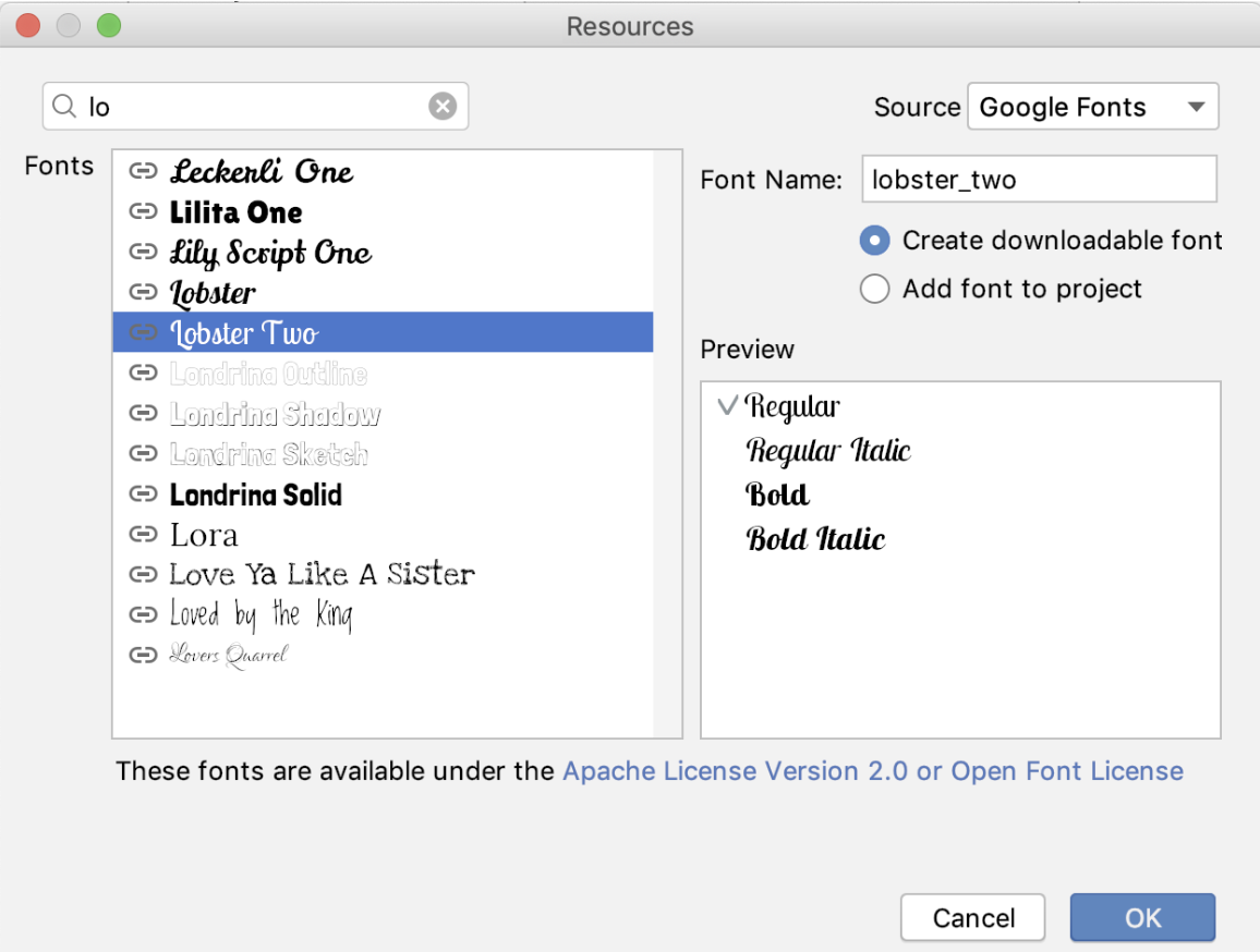
- In the Resources window, search for
lobster, or justlo. - In the results, select Lobster Two.
- To the right, below the font name, select the Create downloadable font radio button. Click OK.
- Open the Android Manifest file.
- Near the bottom of the manifest, find the new
<meta-data>tag with thenameandresourceattributes set to"preloaded_fonts". This tag tells Google Play Services that this app wants to use downloaded fonts. When your app runs and requests the Lobster Two font, the font provider downloads the font from the internet, if the font is not already available on the device.
<meta-data android:name="preloaded_fonts" android:resource="@array/preloaded_fonts"/>- In the
res/valuesfolder, find thepreloaded_fonts.xmlfile, which defines the array that lists all the downloadable fonts for this app. - Likewise, the
res/fonts/lobster_two.xmlfile has information about the font. - Open
home_fragment.xmland notice in the code and preview that the Lobster Two font is applied to thetitleTextView, and thus applied to the title.

- Open
res/values/styles.xmland examine the defaultAppThemetheme that was created for the project. It currently looks as shown below. To apply the new Lobster Two font to all the text, you'll need to update this theme. - In the
<style>tag, notice theparentattribute. Every style tag can specify a parent and inherit all the parent's attributes. The code specifies theThemedefined by the Android libraries. TheMaterialComponentstheme that specifies everything from how buttons work to how to draw toolbars. The theme has sensible defaults, so you can customize just the parts you want. The app uses theLightversion of this theme without the action bar (NoActionBar), as you can see in the screenshot above.
<!-- Base application theme. -->
<style name="AppTheme" parent="Theme.MaterialComponents.Light.NoActionBar">
   <!-- Customize your theme here. -->
   <item name="colorPrimary">@color/colorPrimary</item>
   <item name="colorPrimaryDark">@color/colorPrimaryDark</item>
   <item name="colorAccent">@color/colorAccent</item>
</style>- Inside the
AppThemestyle, set the font family tolobster_two. You need to set bothandroid:fontFamilyandfontFamily, because the parent theme uses both. You can checkhome_fragment.xmlin the Design tab to preview your changes.
<style name="AppTheme"
...
        <item name="android:fontFamily">@font/lobster_two</item>
<item name="fontFamily">@font/lobster_two</item>- Run the app again. The new font is applied to all the text! Open the navigation drawer and move to the other screens, and you see that the font is applied there as well.
| |
|
|

Step 2: Apply the theme to the title
- In
home_fragment.xml, find thetitletext view, which has the attribute for thelobster_twofont. Delete thefontFamilyattribute and run the app. Because the theme sets the same font family, there is no change. - Put a different
fontFamilyattribute back into thetitletext view:app:fontFamily="serif-monospace"appspace!
<TextView
       android:id="@+id/title"
       ...
app:fontFamily="serif-monospace"- Run the app, and you see that the attribute local to the view overrides the theme.

- Remove the
fontFamilyattribute from thetitletext view.
Themes are great for applying general theming to your app, such as a default font and primary colors. Attributes are great for styling a specific view and adding layout information such as margins, padding, and constraints, which tend to be specific to each screen.
In the middle of the style-hierarchy pyramid are styles. Styles are reusable "groups" of attributes that you can apply to views of your choice. In this task, you use a style for the title and subtitle.
Step 1: Create a style
- Open
res/values/styles.xml. - Inside the
<resources>tag, define a new style using the<style>tag, as shown below.
<style name="TextAppearance.Title" parent="TextAppearance.MaterialComponents.Headline6">
</style>
It's important to think about style names as semantic when you name them. Select a style name based on what the style will be used for, not based on the properties that the style affects. For example, call this style Title, not something like LargeFontInGrey. This style will be used by any title anywhere in your app. As a convention, TextAppearance styles are called TextAppearance.Name, so in this case, the name is TextAppearance.Title.
The style has a parent, just as a theme can have a parent. But this time, instead of extending a theme, the style extends a style, TextAppearance.MaterialComponents.Headline6. This style is a default text style for the MaterialComponents theme, so by extending it you modify the default style instead of starting from scratch.
- Inside the new style, define two items. In one item, set the
textSizeto24sp. In the other item, set thetextColorto the same dark gray used before.
 <item name="android:textSize">24sp</item>
<item name="android:textColor">#555555</item>- Define another style for the subtitles. Name it
TextAppearance.Subtitle. - Because the only difference from
TextAppearance.Titlewill be in the text size, make this style a child ofTextAppearance.Title. - Inside the
Subtitlestyle, set the text size to18sp. Here's the completed style:
<style name="TextAppearance.Subtitle" parent="TextAppearance.Title" >
   <item name="android:textSize">18sp</item>
</style>
Step 2: Apply the style that you created
- In
home_fragment.xml, add theTextAppearance.Titlestyle to thetitletext view. Delete thetextSizeandtextColorattributes.
Themes override anyTextAppearancestyling that you set. (The pyramid diagram at the beginning of the codelab shows the order in which styling is applied.) Use thetextAppearanceproperty to apply the style as aTextAppearanceso that the font set in theThemeoverrides what you set here.
<TextView
       android:id="@+id/title"
android:textAppearance="@style/TextAppearance.Title"- Also add the
TextAppearance.Subtitlestyle to thesubtitletext view, and delete thetextSizeandtextColorattributes. You have to apply this style as atextAppearancealso, so that the font set in the theme overrides what you set here.
<TextView
       android:id="@+id/subtitle"
android:textAppearance="@style/TextAppearance.Subtitle"- Run the app and your text is now consistently styled.

Android Studio project: GDGFinderStyles.
- Use themes, styles, and attributes on views to change the appearance of views.
- Themes affect the styling of your whole app and come with many preset values for colors, fonts, and font sizes.
- An attribute applies to the view in which the attribute is set. Use attributes if you have styling that applies to only one view, such as padding, margins, and constraints.
- Styles are groups of attributes that can be used by multiple views. For example, you can have a style for all your content headers, buttons, or text views.
- Themes and styles inherit from their parent theme or style. You can create a hierarchy of styles.
- Attribute values (which are set in views) override styles. Styles override the default style. Styles override themes. Themes override any styling set by the
textAppearanceproperty.
- Define styles in the
styles.xmlresource file using the<style>and<item>tags.
<style name="TextAppearance.Subtitle" parent="TextAppearance.Title" >
   <item name="android:textSize">18sp</item>
</style>
Using downloadable fonts makes fonts available to users without increasing the size of your APK. To add a downloadable font for a view:
- Select the view in the Design tab, and select More fonts from the drop-down menu of the
fontFamilyattribute. - In the Resources dialog, find a font and select the Create downloadable font radio button.
- Verify that the Android manifest includes a meta-data tag for preloaded fonts.
When the app first requests a font, and the font is not already available, the font provider downloads it from the internet.
Android developer documentation:
- Styles and Themes
- Downloadable Fonts
- Fonts in XML
- Understanding sp
TextViewattributes- Style resource
MaterialComponentstheme
Other resources:
- What is your text's appearance
- Hexadecimal
- Developing Android Apps with Kotlin (Udacity course)
- Kotlin Bootcamp for Programmers (Udacity course)
- Kotlin Bootcamp for Programmers codelabs
This section lists possible homework assignments for students who are working through this codelab as part of a course led by an instructor. It's up to the instructor to do the following:
- Assign homework if required.
- Communicate to students how to submit homework assignments.
- Grade the homework assignments.
Instructors can use these suggestions as little or as much as they want, and should feel free to assign any other homework they feel is appropriate.
If you're working through this codelab on your own, feel free to use these homework assignments to test your knowledge.
Answer these questions
Question 1
Which tag is used to define themes?
▢ <style>
▢ <theme>
▢ <meta-tag>
▢ <styling>
Question 2
Which of the following is NOT a good use of styles?
▢ Specify the constraints of a view.
▢ Specify the background color of headings.
▢ Unify the font size across views.
▢ Specify the text color for a group of views.
Question 3
What is the difference between themes and styles?
▢ Themes apply to the entire app, while you can apply styles to specific views.
▢ Themes cannot inherit from other themes, but styles can inherit from other styles.
▢ Styles cannot inherit from other styles, but themes can inherit from other themes.
▢ Themes are provided by the Android system, while styles are defined by the developer.
Question 4
If a TextView in your app has a Theme that sets the font size to 12sp, a defined style that sets it to 14sp, and a fontSize attribute of 16sp, what is the size of the displayed font on the screen?
▢ 12sp
▢ 14sp
▢ 16sp
▢ 18sp
Start the next lesson:
For links to other codelabs in this course, see the Android Kotlin Fundamentals codelabs landing page.