
This codelab is part of the Android Kotlin Fundamentals course. You'll get the most value out of this course if you work through the codelabs in sequence. All the course codelabs are listed on the Android Kotlin Fundamentals codelabs landing page.
What you should already know
- Creating a basic Android app in Kotlin.
- Running an Android app on an emulator or on a device.
- The basics of
LinearLayout. - Creating a simple app that uses
LinearLayoutand aTextView.
What you'll learn
- How to work with
ViewandViewGroup. - How to arrange views in an
Activity, usingLinearLayout. - How to use
ScrollViewfor displaying the scrollable content. - How to change the visibility of a
View. - How to create and use string and dimension resources.
- How to create a linear layout using Android Studio's Layout Editor.
What you'll do
- Create the AboutMe app.
- Add a
TextViewto the layout to display your name. - Add an
ImageView. - Add a
ScrollViewto display scrollable text.
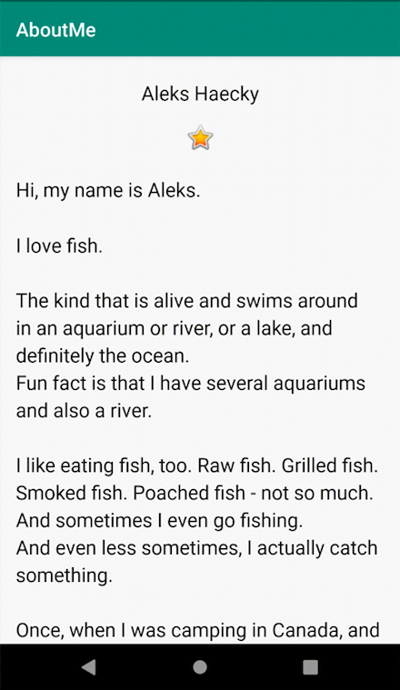
In the AboutMe app, you can showcase interesting facts about yourself, or you can customize the app for a friend, family member, or pet. This app displays a name, a DONE button, a star image, and some scrollable text.
In this task, you create the AboutMe Android Studio project.
- Open Android Studio, if it's not already open.
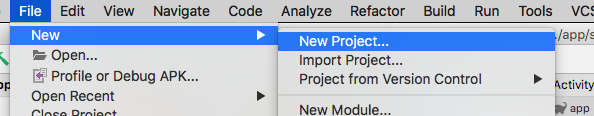
- If a project is already open in Android Studio, select File > New > New Project.
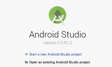
- If a project is not already open, select + Start a new Android Studio project in the Welcome to Android Studio dialog.
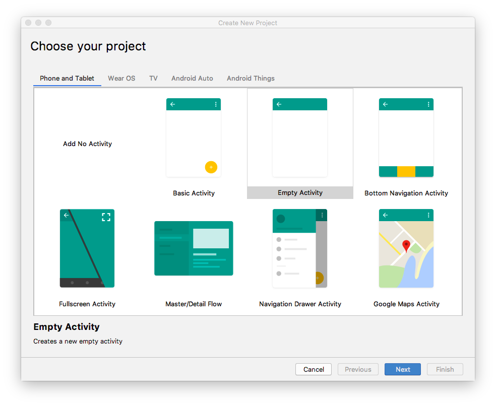
- In the Create New Project dialog, in the Phone and Tablet tab, select the Empty Activity template. Click Next.
- In the next Create New Project dialog, set the following parameters and click Finish.
Attribute | Value |
Application Name | AboutMe |
Company Name android |
|
Save location | Leave the default location, or change it to your preferred directory. |
Language | Kotlin |
Minimum API level | API 19: Android 4.4 (KitKat) |
This project will support instant apps | Leave this checkbox cleared. |
Use AndroidX artifacts | Select this checkbox. |
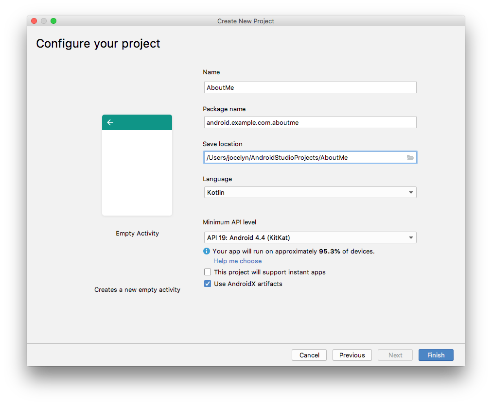
Android Studio will take a moment to generate the project files.
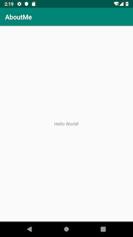
- Run your app. You will see the string "Hello World" on the blank screen.
The Empty Activity template creates a single empty activity, Mainactivity.kt. The template also creates a layout file called activity_main.xml. The layout file has ConstraintLayout as its root ViewGroup, and it has a single TextView as its content.
In this task, you change the generated root ViewGroup to a LinearLayout. You also arrange the UI elements vertically.
View groups
A ViewGroup is a view that can contain child views, which are other views and view groups. Views that make up a layout are organized as a hierarchy of views with a view group as the root.
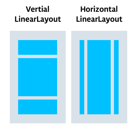
In a LinearLayout view group, the UI elements are arranged either horizontally or vertically.
Change the root layout so that it uses a LinearLayout view group:
- Select the Project > Android pane. In the
app/res/layoutfolder, open theactivity_main.xmlfile. - Select the Text tab and change the root view group from
ConstraintLayouttoLinearLayout. - Remove the
TextView. In theLinearLayoutelement, add theandroid:orientationattribute and set it tovertical.
Before:
<androidx.constraintlayout.widget.ConstraintLayout xmlns:android="http://schemas.android.com/apk/res/android"
   xmlns:app="http://schemas.android.com/apk/res-auto"
   xmlns:tools="http://schemas.android.com/tools"
   android:layout_width="match_parent"
   android:layout_height="match_parent"
   tools:context=".MainActivity">

   <TextView
       android:layout_width="wrap_content"
       android:layout_height="wrap_content"
       android:text="Hello World!"
       app:layout_constraintBottom_toBottomOf="parent"
       app:layout_constraintLeft_toLeftOf="parent"
       app:layout_constraintRight_toRightOf="parent"
       app:layout_constraintTop_toTopOf="parent" />

</androidx.constraintlayout.widget.ConstraintLayout>
After:
<LinearLayout
       xmlns:android="http://schemas.android.com/apk/res/android"
       xmlns:tools="http://schemas.android.com/tools"
       xmlns:app="http://schemas.android.com/apk/res-auto"
       android:layout_width="match_parent"
       android:layout_height="match_parent"
       android:orientation="vertical"
       tools:context=".MainActivity">

</LinearLayout>
The Layout Editor is a visual-design tool inside Android Studio. Instead of writing XML code by hand to build your app's layout, you can use the Layout Editor to drag UI elements into the design editor.
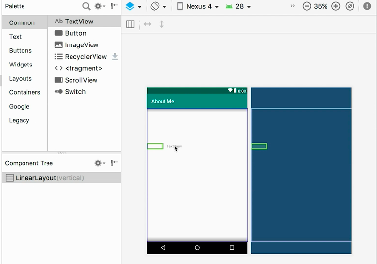
To see the Layout Editor, click the Design tab. The screenshot below shows the parts of the Layout Editor.
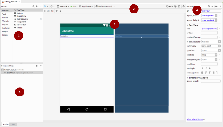
 Design editor: Displays a visual representation of your screen layout in design view, blueprint view, or both. The design editor is the main part of the Layout Editor.
 Toolbar: Provides buttons to configure your layout's appearance in the design editor, and to change some layout attributes. For example, to change the display of your layout in the design editor, use the Select Design Surface
  drop-down menu:
- Use Design for a real-world preview of your layout.
- Use Blueprint to see only outlines for each view.
- Use Design + Blueprint to see both displays side by side.
 Palette: Provides a list of views and view groups that you can drag into your layout or into the Component Tree pane.
 Attributes: Shows attributes for the currently selected view or view group. To toggle between a complete list of attributes and commonly used attributes, use the
  icon at the top of the pane.
 Component Tree: Displays the layout hierarchy as a tree of views. The Component Tree is useful when you have small, hidden, or overlapping views that you could not otherwise select in the design editor.
Step 1: Add a TextView
- Open the
res/layout/activity_main.xmlfile, if it's not already open. - Switch to the Text tab
 and inspect the code. The code has a
 LinearLayoutas its root view group. (View groups are views that contain other views.)
TheLinearLayouthas the required attributeslayout_height,layout_width, andorientation, which isverticalby default. - Switch to the Design tab to open the Layout Editor.
- Drag a text view from the Palette pane onto the design editor.
- Notice the Component Tree pane. The new text view is placed as a child element of the parent view group, which is the
LinearLayout.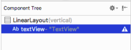
- Open the Attributes pane, if it's not open already. (To open the pane, double-click the newly added
TextViewin the design editor.) - Set the following attributes in the Attributes pane:
Attribute | Value |
ID |
|
text | Set it to your name. (One of the text fields shows a wrench icon to indicate that it's for the |
textAppearance > textSize |
|
textAppearance > textColor |
|
textAppearance > textAlignment | Center |

Step 2: Create a string resource
In the Component Tree, next to the TextView, you will notice a warning icon  . To see the warning text, click the icon or point to it, as shown in the screenshot below.
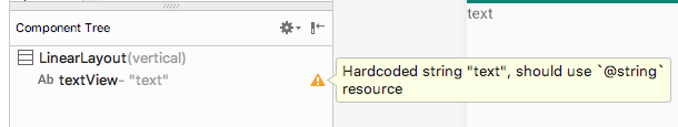
To resolve the warning, create a string resource:
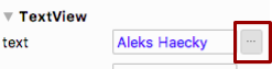
- In the Attributes pane, click the three dots next to the text attribute that you set to your name. The resource editor opens.
- In the Resources dialog, select Add new resource > New string Value.
- In the New String Value Resource dialog, set the Resource name field to
name. Set the Resource value field to your own name. Click OK. Notice that the warning is gone.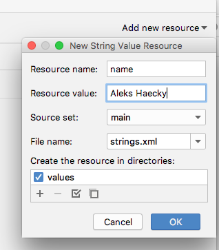
- Open the
res/values/strings.xmlfile and look for the newly created string resource calledname.
<string name="name">Aleks Haecky</string>Step 3: Create a dimension resource
You just added a resource using the resource editor. You can also extract resources in the XML code editor to create new resources:
- In the
activity_main.xmlfile, switch to the Text tab. - On the
textSizeline, click on the number (20sp) and typeAlt+Enter(Option+Enteron a Mac). Select Extract dimension resource from the popup menu. - In the Extract Resource dialog, enter
text_sizein the Resource name field. Click OK.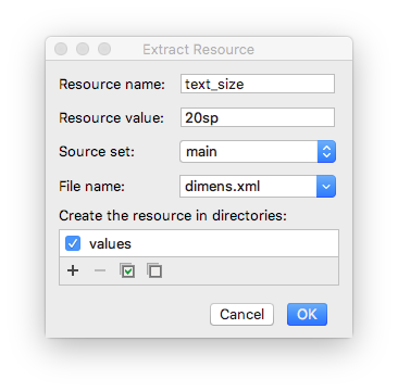
- Open the
res/values/dimens.xmlfile to see the following generated code:
<dimen name="text_size">20sp</dimen>- Open
MainActivity.ktfile, and look for the following code at the end of theonCreate()function:
setContentView(R.layout.activity_main)The setContentView() function connects the layout file with the Activity. The specified layout resource file is R.layout.activity_main:
Ris a reference to the resource. It is an auto-generated class with definitions for all the resources in your app.layout.activity_mainindicates that the resource is a layout namedactivity_main.
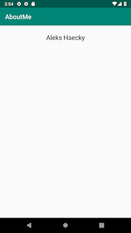
- Run your app. A
TextViewwith your name is displayed.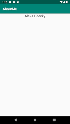
When you look at your app screen, your name is pushed up against the top of the screen, so now you add padding and a margin.
Padding versus margin
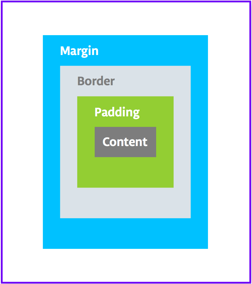
Padding is the space inside the boundaries of a view or element. It is the space between the edges of the view and the view's content, as shown in the figure below.
A view's size includes its padding. The following are commonly used padding attributes:
android:paddingspecifies padding for all four edges of the view.android:paddingTopspecifies padding for the top edge.android:paddingBottomspecifies padding for the bottom edge.android:paddingStartspecifies padding for the "starting" edge of the view.android:paddingEndspecifies padding for the "ending" edge of the view.android:paddingLeftspecifies padding for the left edge.android:paddingRightspecifies padding for the right edge.
Margin is the space added outside of the view's borders. It is the space from the edge of the view to its parent, as shown in the figure above. The following are commonly used margin attributes:
android:layout_marginspecifies a margin for all four sides of the view.android:layout_marginBottomspecifies space outside the bottom side of this view.android:layout_marginStartspecifies space outside the "starting" side of this view.android:layout_marginEndspecifies space on the end side of this view.android:layout_marginLeftspecifies space on the left side of this view.android:layout_marginRightspecifies space on the right side of this view.
Step 1: Add padding
To put space between your name and the top edge of the name text view, add top padding.
- Open
activity_main.xmlfile in the Design tab. - In the Component Tree or in the design editor, click the text view to open its Attributes pane.
- At the top of the Attributes pane, click the double-arrow icon
 to see all the available attributes.
 - Search for Padding, expand it, and click the three dots ... next to the top attribute. The Resources dialog appears.
- In the Resources dialog, select Add new resource > New dimen Value.
- In the New Dimension Value Resource dialog, create a new
dimenresource calledsmall_paddingwith a value of8dp.
The dp abbreviation stands for density-independent. If you want a UI element to look the same size on screens with different densities, use dp as your unit of measurement. When specifying text size, however, always use sp (scalable pixels). - Click OK.
Step 2: Add a margin
To move the name text view away from the edge of the parent element, add a top margin.
- In the Attributes pane, search for "margin" to find Layout_Margin.
- Expand Layout_Margin, and click the three dots ... next to the top attribute.
- Create a new
dimenresource calledlayout_marginand make it16dp. Click OK.
Step 3: Add a font
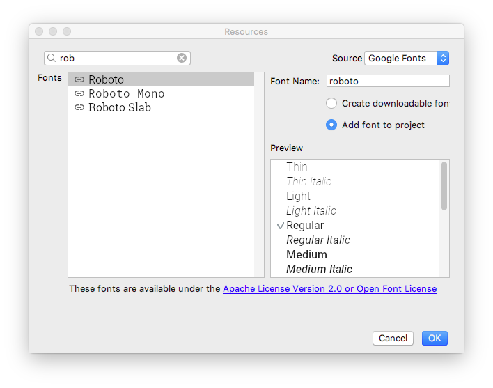
To make the name text view look better, use the Android Roboto font. This font is part of the support library, and you add the font as a resource.
- In the Attributes pane, search for "fontFamily".
- In the fontFamily field, click the drop-down arrow, scroll to the bottom of the list, and select More Fonts.
- In the Resources dialog, search for
roband choose Roboto. In the Preview list, select Regular. - Select the Add font to project radio button.
- Click OK.
The res folder now has a font folder that contains a roboto.ttf font file. The @font/roboto attribute is added to your TextView.
Step 4: Extract the style
A style is a collection of attributes that specify the appearance and format for a view. A style can include font color, font size, background color, padding, margin, and other common attributes.
You can extract the name text view's formatting into a style and reuse the style for any number of views in your app. Reusing a style gives your app a consistent look when you have multiple views. Using styles also allows you to keep these common attributes in one location.
- Right-click the
TextViewin the Component Tree and select Refactor > Extract Style. - In the Extract Android Style dialog, clear the
layout_widthcheckbox, thelayout_heightcheckbox, and thetextAlignmentcheckbox. These attributes are usually different for each view, so you don't want them to be part of the style. - In the Style name field, enter
NameStyle. - Click OK.
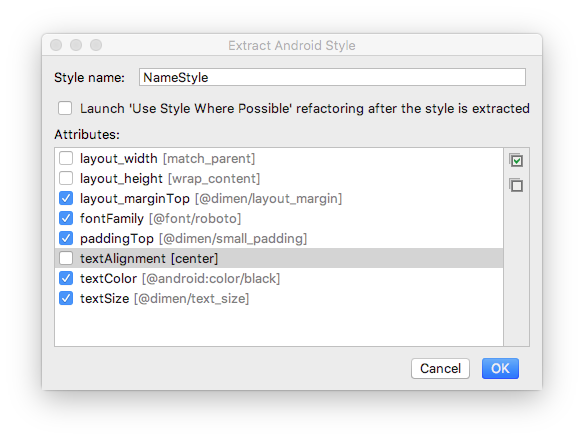
- A style is also a resource, so the style is saved in the
res/values/folder in astyles.xmlfile. Openstyles.xmland examine the generated code for theNameStylestyle, which will look similar to this:
<style name="NameStyle">
   <item name="android:layout_marginTop">@dimen/layout_margin</item>
   <item name="android:fontFamily">@font/roboto</item>
   <item name="android:paddingTop">@dimen/small_padding</item>
   <item name="android:textColor">@android:color/black</item>
   <item name="android:textSize">@dimen/text_size</item>
</style>- Open
activity_main.xmland switch to the Text tab. Notice that the generated style is being used in the text view asstyle="@style/NameStyle". - Run the app and notice the changes in the font and the padding around your
TextView.
Most real-world Android apps consist of a combination of views to display images, display text, and accept input from the user in the form of text or click events. In this task, you add a view to display an image.
An ImageView is a view for displaying image resources. For example, an ImageView can display Bitmap resources such as PNG, JPG, GIF, or WebP files, or it can display a Drawable resource such as a vector drawing.
There are image resources that come with Android, such as sample icons, avatars, and backgrounds. You will add one of these resources to your app.
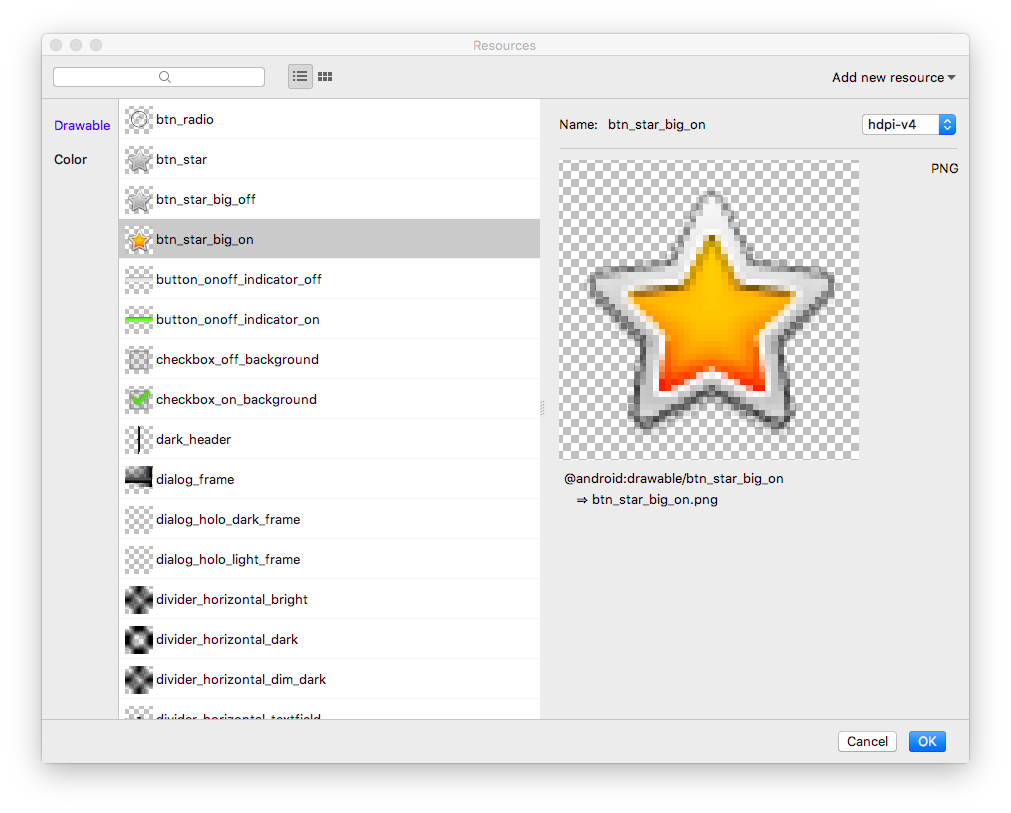
- Display the layout file In the Design tab, then drag an ImageView from the Palette pane to below
name_textin the Component Tree. The Resources dialog opens. - Select Drawable if it's not already selected.
- Expand android, scroll, and select btn_star_big_on. It's the yellow star
 .
. - Click OK.
The star image is added to the layout below your name. Because you have a verticalLinearLayout, views you add are vertically aligned.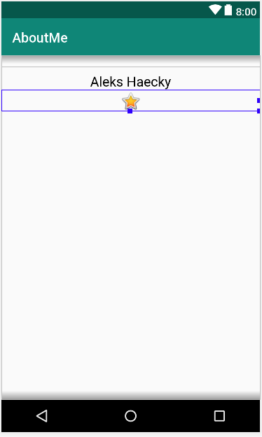
- Switch to the Text tab and look at the generated
ImageViewcode. The width is set tomatch_parent, so the view will be as wide as its parent element. The height is set towrap_content, so the view will be as tall as its content. TheImageViewreferences thebtn_star_big_ondrawable.
<ImageView
   android:id="@+id/imageView"
   android:layout_width="match_parent"
   android:layout_height="wrap_content"
app:srcCompat="@android:drawable/btn_star_big_on" />- To rename the
idof theImageView, right-click on"@+id/imageView"and select Refactor > Rename. - In the Rename dialog, set the
idto@+id/star_image. Click Refactor.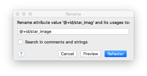
- In the Design tab, in the Component Tree, click the warning icon
 next to
 star_image. The warning is for a missingcontentDescription, which screen readers use to describe images to the user. - In the Attributes pane, click the three dots ... next to the
contentDescriptionattribute. The Resources dialog opens. - In the Resources dialog, select Add new resource > New string Value. Set the Resource name field to
yellow_star, and set the Resource value field toYellow star. Click OK. - Use the Attributes pane to add a top margin of
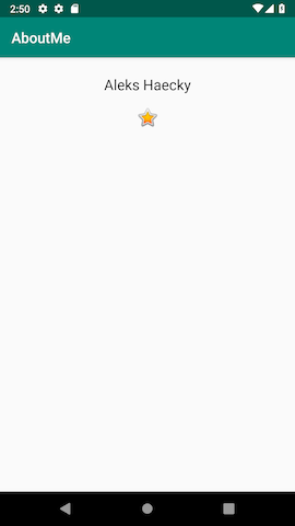
16dp(which is@dimen/layout_margin) to theyellow_star, to separate the star image from the name. - Run your app. Your name and the star image are displayed in your app's UI.
A ScrollView is a view group that allows the view hierarchy placed within it to be scrolled. A scroll view can contain only one other view, or view group, as a child. The child view is commonly a LinearLayout. Inside a LinearLayout, you can add other views.
The following image shows an example of a ScrollView that contains a LinearLayout that contains several other views.

In this task, you will add a ScrollView that allows the user to scroll a text view that displays a brief biography. If you are only making one view scrollable, you can put the view directly into the ScrollView, which is what you do in this task.

Step 1: Add a ScrollView that contains a TextView
- Open the
activity_main.xmlfile in the Design tab. - Drag a scroll view into the layout by dragging it into the design editor, or into the Component Tree. Put the scroll view below the star image.
- Switch to the Text tab to inspect the generated code.
// Auto generated code
<ScrollView
   android:layout_width="match_parent"
   android:layout_height="match_parent">

   <LinearLayout
       android:layout_width="match_parent"
       android:layout_height="wrap_content"
       android:orientation="vertical" />
</ScrollView>
The height and width of the ScrollView match the parent element. Once the name_text text view and the star_image image view have used enough vertical space to display their contents, the Android system lays out the ScrollView to fill the rest of the available space on the screen.
- Add an
idto theScrollViewand call itbio_scroll. Adding anidto theScrollViewgives the Android system a handle for the view so that when the user rotates the device, the system preserves the scroll position. - Inside the
ScrollView, remove theLinearLayoutcode, because your app will only have one view that's scrollable—aTextView. - Drag a
TextViewfrom the Palette to the Component Tree. Put theTextViewunder thebio_scroll, as a child element ofbio_scroll.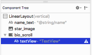
- Set the id of the new text view to
bio_text. - Next you add a style for the new text view. In the Attributes pane, click the three dots ... next to the style attribute to open the Resources dialog.
- In the Resources dialog, search for
NameStyle. SelectNameStylefrom the list, and click OK. The text view now uses theNameStylestyle, which you created in a prior task.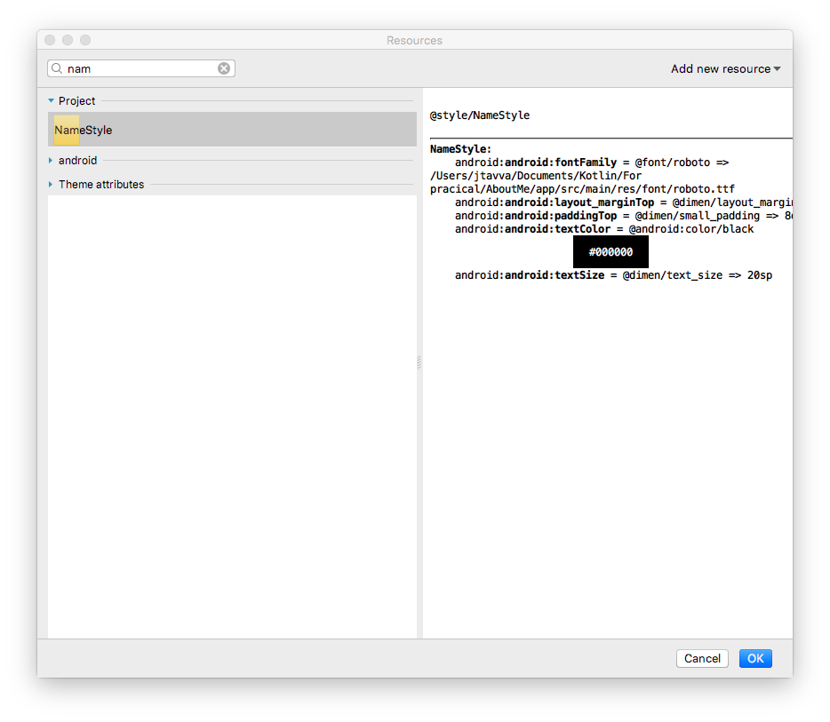
Step 2: Add your biography to the new TextView
- Open
strings.xml, create a string resource calledbio, and put in some long text about yourself, or about anything that you want.
Here is a sample biography:
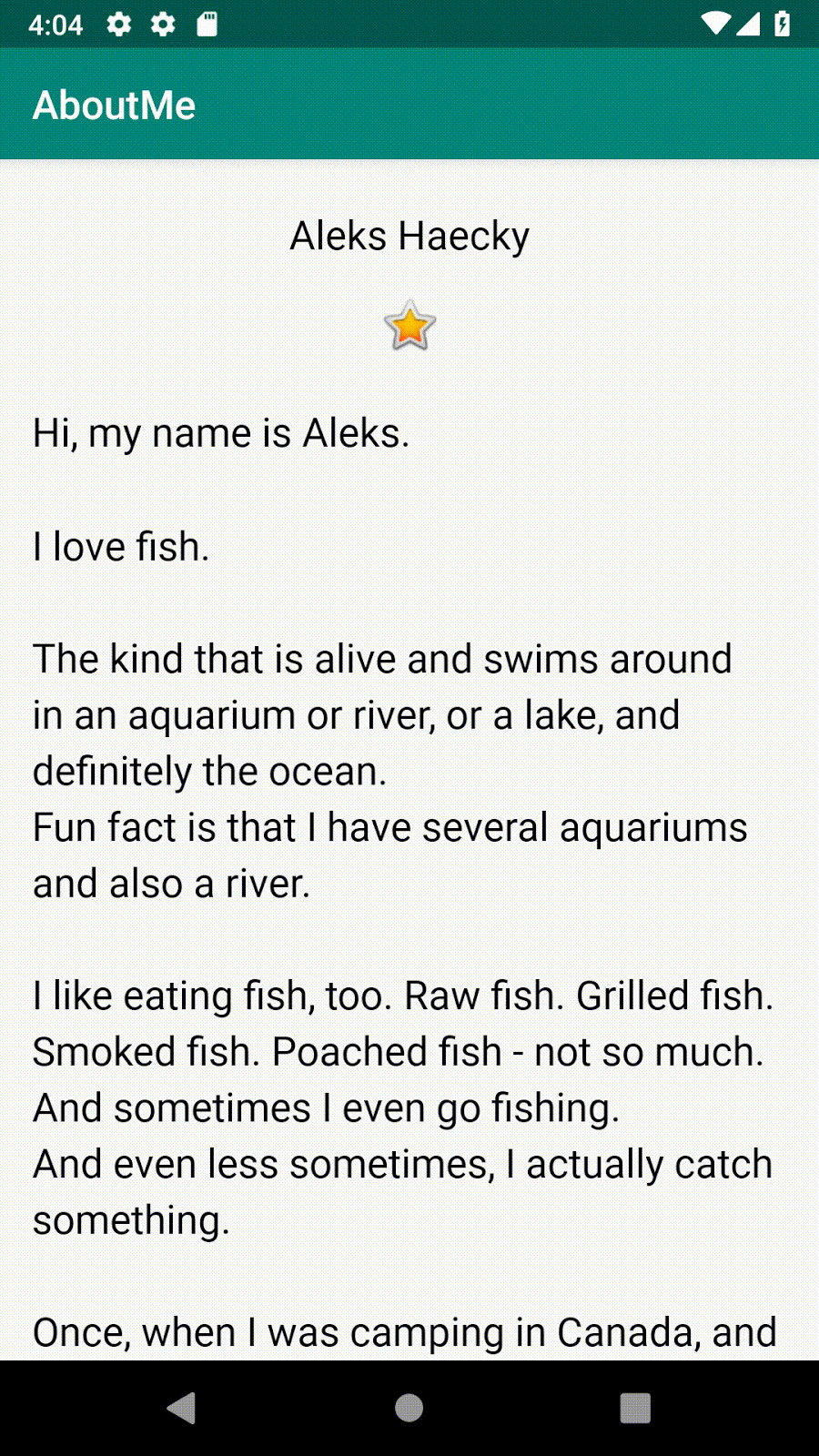
<string name="bio">Hi, my name is Aleks.
\n\nI love fish.
\n\nThe kind that is alive and swims around in an aquarium or river, or a lake, and definitely the ocean.
\nFun fact is that I have several aquariums and also a river.
\n\nI like eating fish, too. Raw fish. Grilled fish. Smoked fish. Poached fish - not so much.
\nAnd sometimes I even go fishing.
\nAnd even less sometimes, I actually catch something.
\n\nOnce, when I was camping in Canada, and very hungry, I even caught a large salmon with my hands.
\n\nI\'ll be happy to teach you how to make your own aquarium.
\nYou should ask someone else about fishing, though.\n\n</string>- In the
bio_texttext view, set the value of thetextattribute to thebiostring resource that contains your biography. - To make the
bio_texttext easier to read, add spacing between the lines. Use thelineSpacingMultiplierattribute, and give it a value of1.2.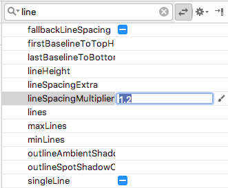
Notice how in the design editor, thebiotext runs all the way to the side edges of the screen. To fix this problem, you can add left, start, right, and end padding attributes to the rootLinearLayout. You do not need to add bottom padding, because text that runs right up to the bottom signals to the user that the text is scrollable. - Add start and end padding of
16dpto the rootLinearLayout. - Switch to the Text tab, extract the dimension resource, and name it
layout_padding.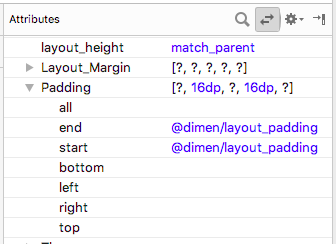
- Run your app and scroll through the text.
Congratulations!
You have created a complete app from scratch, and it looks great!
Android Studio project: AboutMe
Inside the ScrollView, add an ImageView above the TextView. When you run the app, this image, unlike the star, scrolls out of view as the text scrolls up.
Hint: The scroll view can only have one child view. You have to wrap the two scrollable views, the ImageView and the TextView, into a LinearLayout.
- A
ViewGroupis a view that can contain other views.LinearLayoutandScrollVieware view groups. LinearLayoutis a view group that arranges its child views horizontally or vertically.- Use a
ScrollViewwhen you need to display content on the screen, such as long text or a collection of images. A scroll view can contain only one child view. If you want to scroll more than one view, then add aViewGroupsuch as aLinearLayoutto theScrollView, and put the views to be scrolled inside thatViewGroup. - The Layout Editor is a visual design editor inside Android Studio. You can use the Layout Editor to build your app's layout by dragging UI elements into the layout.
- A style is a collection of attributes that specify the appearance for a view. For example, a style can specify font color, font size, background color, padding, and margin.
- You can extract and collect all the formatting of a view into a style. To give your app a consistent look, reuse the style for other views.
Udacity course:
Android developer documentation:
This section lists possible homework assignments for students who are working through this codelab as part of a course led by an instructor. It's up to the instructor to do the following:
- Assign homework if required.
- Communicate to students how to submit homework assignments.
- Grade the homework assignments.
Instructors can use these suggestions as little or as much as they want, and should feel free to assign any other homework they feel is appropriate.
If you're working through this codelab on your own, feel free to use these homework assignments to test your knowledge.
Answer these questions
Question 1
Which of the following is a view group?
▢ EditText
▢ LinearLayout
▢ TextView
▢ Button
Question 2
Which of the following listed view hierarchies is not valid?
▢ LinearLayout > TextView, TextView, ImageView
▢ ScrollView > LinearLayout > TextView, Button, Button, ScrollView > TextView
▢ TextView > TextView, ImageView, ScrollView
Question 3
Styles are resources defined in styles.xml. Using styles, you can define colors, fonts, text size, and many other characteristics of a view. True or false?
▢ True
▢ False
Question 4
A ScrollView is a view group that can contain any number of views or view groups as its children. True or false?
▢ True
▢ False
Question 5
Which UI element can be used to display images in your app?
▢ TextView
▢ ImageView
▢ Button
▢ ScrollView
Start the next lesson:
For links to other codelabs in this course, see the Android Kotlin Fundamentals codelabs landing page.