
This codelab is part of the Advanced Android in Kotlin course. You'll get the most value out of this course if you work through the codelabs in sequence, but it is not mandatory. All the course codelabs are listed on the Advanced Android in Kotlin codelabs landing page.
Introduction
Android offers a large set of View subclasses, such as Button, TextView, EditText, ImageView, CheckBox, or RadioButton. You can use these subclasses to construct a UI that enables user interaction and displays information in your app. If none of the View subclasses meet your needs, you can create a View subclass known as a custom view.
To create a custom view you can either extend an existing View subclass (such as a Button or EditText), or create your own subclass of View. By extending View directly, you can create an interactive UI element of any size and shape by overriding the onDraw() method for the View to draw it.
After you create a custom view, you can add it to your activity layouts in the same way you would add a TextView or Button.
This lesson shows you how to create a custom view from scratch by extending View.
What you should already know
- How to create an app with an Activity and run it using Android Studio.
What you'll learn
- How to extend
Viewto create a custom view. - How to draw a custom view that is circular in shape.
- How to use listeners to handle user interaction with the custom view.
- How to use a custom view in a layout.
What you'll do
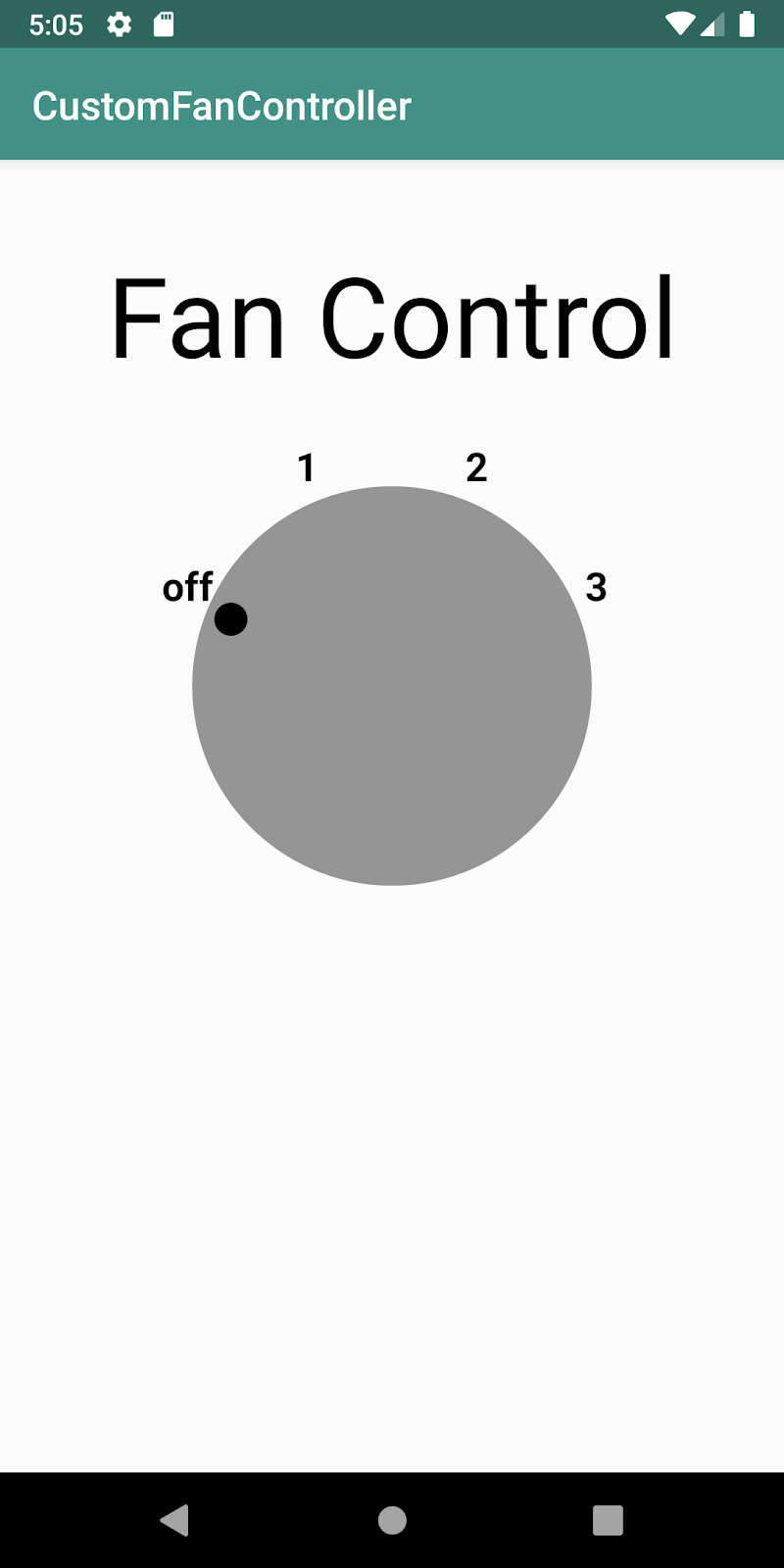
The CustomFanController app demonstrates how to create a custom view subclass by extending the View class. The new subclass is called DialView.
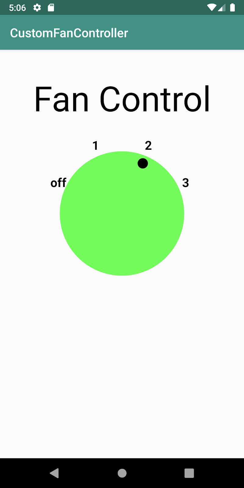
The app displays a circular UI element that resembles a physical fan control, with settings for off (0), low (1), medium (2), and high (3). When the user taps on the view, the selection indicator moves to the next position: 0-1-2-3, and back to 0. Also, if the selection is 1 or higher, the background color of the circular part of the view changes from gray to green (indicating that the fan power is on).
Views are the basic building blocks of an app's UI. The View class provides many subclasses, referred to as UI widgets, that cover many of the needs of a typical Android app's user interface.
UI building blocks such as Button and TextView are subclasses that extend the View class. To save time and development effort, you can extend one of these View subclasses. The custom view inherits the look and behavior of its parent, and you can override the behavior or aspect of the appearance that you want to change. For example, if you extend EditText to create a custom view, the view acts just like an EditText view, but could also be customized to show, for example, an X button that clears text from the text entry field.
You can extend any View subclass, such as EditText, to get a custom view—pick the one closest to what you want to accomplish. You can then use the custom view like any other View subclass in one or more layouts as an XML element with attributes.
To create your own custom view from scratch, extend the View class itself. Your code overrides View methods to define the view's appearance and functionality. Key to creating your own custom view is that you are responsible for drawing the entire UI element of any size and shape to the screen. If you subclass an existing view such as Button, that class handles drawing for you. (You'll learn more about drawing later in this codelab.)
To create a custom view follow these general steps:
- Create a custom view class that extends
View, or extends aViewsubclass (such asButtonorEditText). - If you extend an existing
Viewsubclass, override only the behavior or aspects of the appearance that you want to change. - If you extend the
Viewclass, draw the custom view's shape and control its appearance by overridingViewmethods such asonDraw()andonMeasure()in the new class. - Add code to respond to user interaction and, if necessary, redraw the custom view.
- Use the custom view class as a UI widget in your activity's XML layout. You can also define custom attributes for the view, to provide customization for the view in different layouts.
In this task you will:
- Create an app with an
ImageViewas a temporary placeholder for the custom view. - Extend
Viewto create the custom view. - Initialize the custom view with drawing and painting values.
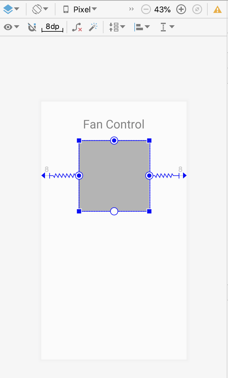
Step 1: Create an app with an ImageView placeholder
- Create a Kotlin app with the title
CustomFanControllerusing the Empty Activity template. Make sure the package name iscom.example.android.customfancontroller. - Open
activity_main.xmlin the Text tab to edit the XML code. - Replace the existing
TextViewwith this code. This text acts as a label in the activity for the custom view.
<TextView
       android:id="@+id/customViewLabel"
       android:textAppearance="@style/Base.TextAppearance.AppCompat.Display3"
       android:layout_width="wrap_content"
       android:layout_height="wrap_content"
       android:padding="16dp"
       android:textColor="@android:color/black"
       android:layout_marginStart="8dp"
       android:layout_marginEnd="8dp"
       android:layout_marginTop="24dp"
       android:text="Fan Control"
       app:layout_constraintLeft_toLeftOf="parent"
       app:layout_constraintRight_toRightOf="parent"
app:layout_constraintTop_toTopOf="parent"/>- Add this
ImageViewelement to the layout. This is a placeholder for the custom view you will create in this codelab.
<ImageView
       android:id="@+id/dialView"
       android:layout_width="200dp"
       android:layout_height="200dp"
       android:background="@android:color/darker_gray"
       app:layout_constraintTop_toBottomOf="@+id/customViewLabel"
       app:layout_constraintLeft_toLeftOf="parent"
       app:layout_constraintRight_toRightOf="parent"
       android:layout_marginLeft="8dp"
       android:layout_marginRight="8dp"
android:layout_marginTop="8dp"/>- Extract string and dimension resources in both UI elements.
- Click the Design tab. The layout should look like this:
Step 2. Create your custom view class
- Create a new Kotlin class called
DialView. - Modify the class definition to extend
View. Importandroid.view.Viewwhen prompted. - Click on
Viewand then click the red bulb. Choose Add Android View constructors using '@JvmOverloads'. Android Studio adds the constructor from theViewclass. The@JvmOverloadsannotation instructs the Kotlin compiler to generate overloads for this function that substitute default parameter values.
class DialView @JvmOverloads constructor(
   context: Context,
   attrs: AttributeSet? = null,
   defStyleAttr: Int = 0
) : View(context, attrs, defStyleAttr) {- Above the
DialViewclass definition, just below the imports, add a top-levelenumto represent the available fan speeds. Note that thisenumis of typeIntbecause the values are string resources rather than actual strings. Android Studio will show errors for the missing string resources in each of these values; you'll fix that in a later step.
private enum class FanSpeed(val label: Int) {
   OFF(R.string.fan_off),
   LOW(R.string.fan_low),
   MEDIUM(R.string.fan_medium),
   HIGH(R.string.fan_high);
}- Below the
enum, add these constants. You'll use these as part of drawing the dial indicators and labels.
private const val RADIUS_OFFSET_LABEL = 30
private const val RADIUS_OFFSET_INDICATOR = -35- Inside the
DialViewclass, define several variables you need in order to draw the custom view. Importandroid.graphics.PointFif requested.
private var radius = 0.0f                   // Radius of the circle.
private var fanSpeed = FanSpeed.OFF         // The active selection.
// position variable which will be used to draw label and indicator circle position
private val pointPosition: PointF = PointF(0.0f, 0.0f)- The
radiusis the current radius of the circle. This value is set when the view is drawn on the screen. - The
fanSpeedis the current speed of the fan, which is one of the values in theFanSpeedenumeration. By default that value isOFF. - Finally
postPositionis an X,Y point that will be used for drawing several of the view's elements on the screen.
These values are created and initialized here instead of when the view is actually drawn, to ensure that the actual drawing step runs as fast as possible.
- Also inside the
DialViewclass definition, initialize aPaintobject with a handful of basic styles. Importandroid.graphics.Paintandandroid.graphics.Typefacewhen requested. As previously with the variables, these styles are initialized here to help speed up the drawing step.
private val paint = Paint(Paint.ANTI_ALIAS_FLAG).apply {
   style = Paint.Style.FILL
   textAlign = Paint.Align.CENTER
   textSize = 55.0f
   typeface = Typeface.create( "", Typeface.BOLD)
}- Open
res/values/strings.xmland add the string resources for the fan speeds:
<string name="fan_off">off</string>
<string name="fan_low">1</string>
<string name="fan_medium">2</string>
<string name="fan_high">3</string>
Once you have created a custom view, you need to be able to draw it. When you extend a View subclass such as EditText, that subclass defines the view's appearance and attributes and draws itself on the screen. Consequently, you don't have to write code to draw the view. You can override methods of the parent to customize your view instead.
If you are creating your own view from scratch (by extending View), you are responsible for drawing the entire view each time the screen refreshes, and for overriding the View methods that handle drawing. In order to properly draw a custom view that extends View, you need to:
- Calculate the view's size when it first appears, and each time that view's size changes, by overriding the
onSizeChanged()method. - Override the
onDraw()method to draw the custom view, using aCanvasobject styled by aPaintobject. - Call the
invalidate()method when responding to a user click that changes how the view is drawn to invalidate the entire view, thereby forcing a call toonDraw()to redraw the view.
The onDraw() method is called every time the screen refreshes, which can be many times a second. For performance reasons and to avoid visual glitches, you should do as little work as possible in onDraw(). In particular, don't place allocations in onDraw(), because allocations may lead to a garbage collection that may cause a visual stutter.
The Canvas and Paint classes offer a number of useful drawing shortcuts:
- Draw text using
drawText(). Specify the typeface by callingsetTypeface(), and the text color by callingsetColor(). - Draw primitive shapes using
drawRect(),drawOval(), anddrawArc(). Change whether the shapes are filled, outlined, or both by callingsetStyle(). - Draw bitmaps using
drawBitmap().
You'll learn more about Canvas and Paint in a later codelab. To learn more about how Android draws views, see How Android Draws Views.
In this task you will draw the fan controller custom view onto the screen—the dial itself, the current position indicator, and the indicator labels—with the onSizeChanged() and onDraw() methods. You'll also create a helper method, computeXYForSpeed(), to calculate the current X,Y position of the indicator label on the dial.
Step 1. Calculate positions and draw the view
- In the
DialViewclass, below the initializations, override theonSizeChanged()method from theViewclass to calculate the size for the custom view's dial. Importkotlin.math.minwhen requested.
TheonSizeChanged()method is called any time the view's size changes, including the first time it is drawn when the layout is inflated. OverrideonSizeChanged()to calculate positions, dimensions, and any other values related to your custom view's size, instead of recalculating them every time you draw. In this case you useonSizeChanged()to calculate the current radius of the dial's circle element.
override fun onSizeChanged(width: Int, height: Int, oldWidth: Int, oldHeight: Int) {
   radius = (min(width, height) / 2.0 * 0.8).toFloat()
}- Below
onSizeChanged(), add this code to define acomputeXYForSpeed()extension function for thePointFclass. Importkotlin.math.cosandkotlin.math.sinwhen requested. This extension function on thePointFclass calculates the X, Y coordinates on the screen for the text label and current indicator (0, 1, 2, or 3), given the currentFanSpeedposition and radius of the dial. You'll use this inonDraw().
private fun PointF.computeXYForSpeed(pos: FanSpeed, radius: Float) {
   // Angles are in radians.
   val startAngle = Math.PI * (9 / 8.0)
   val angle = startAngle + pos.ordinal * (Math.PI / 4)
   x = (radius * cos(angle)).toFloat() + width / 2
   y = (radius * sin(angle)).toFloat() + height / 2
}- Override the
onDraw()method to render the view on the screen with theCanvasandPaintclasses. Importandroid.graphics.Canvaswhen requested. This is the skeleton override:
override fun onDraw(canvas: Canvas) {
   super.onDraw(canvas)

}- Inside
onDraw(), add this line to set the paint color to gray (Color.GRAY) or green (Color.GREEN) depending on whether the fan speed isOFFor any other value. Importandroid.graphics.Colorwhen requested.
// Set dial background color to green if selection not off.
paint.color = if (fanSpeed == FanSpeed.OFF) Color.GRAY else Color.GREEN- Add this code to draw a circle for the dial, with the
drawCircle()method. This method uses the current view width and height to find the center of the circle, the radius of the circle, and the current paint color. Thewidthandheightproperties are members of theViewsuperclass and indicate the current dimensions of the view.
// Draw the dial.
canvas.drawCircle((width / 2).toFloat(), (height / 2).toFloat(), radius, paint)- Add this following code to draw a smaller circle for the fan speed indicator mark, also with the
drawCircle()method This part uses thePointF.computeXYforSpeed()extension method to calculate the X,Y coordinates for the indicator center based on the current fan speed.
// Draw the indicator circle.
val markerRadius = radius + RADIUS_OFFSET_INDICATOR
pointPosition.computeXYForSpeed(fanSpeed, markerRadius)
paint.color = Color.BLACK
canvas.drawCircle(pointPosition.x, pointPosition.y, radius/12, paint)- Finally, draw the fan speed labels (0, 1, 2, 3) at the appropriate positions around the dial. This part of the method calls
PointF.computeXYForSpeed()again to get the position for each label, and reuses thepointPositionobject each time to avoid allocations. UsedrawText()to draw the labels.
// Draw the text labels.
val labelRadius = radius + RADIUS_OFFSET_LABEL
for (i in FanSpeed.values()) {
   pointPosition.computeXYForSpeed(i, labelRadius)
   val label = resources.getString(i.label)
   canvas.drawText(label, pointPosition.x, pointPosition.y, paint)
}
The completed onDraw() method looks like this:
override fun onDraw(canvas: Canvas) {
   super.onDraw(canvas)
   // Set dial background color to green if selection not off.
   paint.color = if (fanSpeed == FanSpeed.OFF) Color.GRAY else Color.GREEN
   // Draw the dial.
   canvas.drawCircle((width / 2).toFloat(), (height / 2).toFloat(), radius, paint)
   // Draw the indicator circle.
   val markerRadius = radius + RADIUS_OFFSET_INDICATOR
   pointPosition.computeXYForSpeed(fanSpeed, markerRadius)
   paint.color = Color.BLACK
   canvas.drawCircle(pointPosition.x, pointPosition.y, radius/12, paint)
   // Draw the text labels.
   val labelRadius = radius + RADIUS_OFFSET_LABEL
   for (i in FanSpeed.values()) {
       pointPosition.computeXYForSpeed(i, labelRadius)
       val label = resources.getString(i.label)
       canvas.drawText(label, pointPosition.x, pointPosition.y, paint)
   }
}
Step 2. Add the view to the layout
To add a custom view to an app's UI, you specify it as an element in the activity's XML layout. Control its appearance and behavior with XML element attributes, as you would for any other UI element.
- In
activity_main.xml, change theImageViewtag for thedialViewtocom.example.android.customfancontroller.DialView, and delete theandroid:backgroundattribute. BothDialViewand the originalImageViewinherit the standard attributes from theViewclass, so there is no need to change any of the other attributes. The newDialViewelement looks like this:
<com.example.android.customfancontroller.DialView
       android:id="@+id/dialView"
       android:layout_width="@dimen/fan_dimen"
       android:layout_height="@dimen/fan_dimen"
       app:layout_constraintTop_toBottomOf="@+id/customViewLabel"
       app:layout_constraintLeft_toLeftOf="parent"
       app:layout_constraintRight_toRightOf="parent"
       android:layout_marginLeft="@dimen/default_margin"
       android:layout_marginRight="@dimen/default_margin"
android:layout_marginTop="@dimen/default_margin" />- Run the app. Your fan control view appears in the activity.
The final task is to enable your custom view to perform an action when the user taps the view. Each tap should move the selection indicator to the next position: off-1-2-3 and back to off. Also, if the selection is 1 or higher, change the background from gray to green, indicating that the fan power is on.
To enable your custom view to be clickable, you:
- Set the view's
isClickableproperty totrue. This enables your custom view to respond to clicks. - Implement the
Viewclass'sperformClick()to perform operations when the view is clicked. - Call the
invalidate()method. This tells the Android system to call theonDraw()method to redraw the view.
Normally, with a standard Android view, you implement OnClickListener() to perform an action when the user clicks that view. For a custom view, you implement the View class's performClick() method instead, and call super.performClick(). The default performClick() method also calls onClickListener(), so you can add your actions to performClick() and leave onClickListener() available for further customization by you or other developers that might use your custom view.
- In
DialView.kt, inside theFanSpeedenumeration, add an extension functionnext()that changes the current fan speed to the next speed in the list (fromOFFtoLOW,MEDIUM, andHIGH, and then back toOFF). The complete enumeration now looks like this:
private enum class FanSpeed(val label: Int) {
   OFF(R.string.fan_off),
   LOW(R.string.fan_low),
   MEDIUM(R.string.fan_medium),
   HIGH(R.string.fan_high);

   fun next() = when (this) {
       OFF -> LOW
       LOW -> MEDIUM
       MEDIUM -> HIGH
       HIGH -> OFF
   }
}- Inside the
DialViewclass, just before theonSizeChanged()method, add aninit()block. Setting the view'sisClickableproperty to true enables that view to accept user input.
init {
   isClickable = true
}- Below
init(),override theperformClick()method with the code below.
override fun performClick(): Boolean {
   if (super.performClick()) return true

   fanSpeed = fanSpeed.next()
   contentDescription = resources.getString(fanSpeed.label)

   invalidate()
   return true
}
The call to super.performClick() must happen first, which enables accessibility events as well as calls onClickListener().
The next two lines increment the speed of the fan with the next() method, and set the view's content description to the string resource representing the current speed (off, 1, 2 or 3).
FInally, the invalidate() method invalidates the entire view, forcing a call to onDraw() to redraw the view. If something in your custom view changes for any reason, including user interaction, and the change needs to be displayed, call invalidate().
- Run the app. Tap the
DialViewelement to move the indicator from off to 1. The dial should turn green. With each tap, the indicator should move to the next position. When the indicator returns to off, the dial should turn gray again.
This example shows the basic mechanics of using custom attributes with your custom view. You define custom attributes for the DialView class with a different color for each fan dial position.
- Create and open
res/values/attrs.xml. - Inside
<resources>, add a<declare-styleable>resource element. - Inside the
<declare-styleable>resource element, add threeattrelements, one for each attribute, with anameandformat. Theformatis like a type, and in this case, it'scolor.
<?xml version="1.0" encoding="utf-8"?>
<resources>
       <declare-styleable name="DialView">
           <attr name="fanColor1" format="color" />
           <attr name="fanColor2" format="color" />
           <attr name="fanColor3" format="color" />
       </declare-styleable>
</resources>- Open the
activity_main.xmllayout file. - In the
DialView, add attributes forfanColor1,fanColor2, andfanColor3, and set their values to the colors shown below. Useapp:as the preface for the custom attribute (as inapp:fanColor1) rather thanandroid:because your custom attributes belong to theschemas.android.com/apk/res/your_app_package_namenamespace rather than theandroidnamespace.
app:fanColor1="#FFEB3B"
app:fanColor2="#CDDC39"
app:fanColor3="#009688"
In order to use the attributes in your DialView class, you need to retrieve them. They are stored in an AttributeSet, which is handed to your class upon creation, if it exists. You retrieve the attributes in init, and assign the attribute values to local variables for caching.
- Open the
DialView.ktclass file. - Inside the
DialView, declare variables to cache the attribute values.
private var fanSpeedLowColor = 0
private var fanSpeedMediumColor = 0
private var fanSeedMaxColor = 0- In the
initblock, add the following code using thewithStyledAttributesextension function. You supply the attributes and view, and set your local variables. ImportingwithStyledAttributeswill also import the rightgetColor()function.
context.withStyledAttributes(attrs, R.styleable.DialView) {
   fanSpeedLowColor = getColor(R.styleable.DialView_fanColor1, 0)
   fanSpeedMediumColor = getColor(R.styleable.DialView_fanColor2, 0)
   fanSeedMaxColor = getColor(R.styleable.DialView_fanColor3, 0)
}- Use the local variables in
onDraw()to set the dial color based on the current fan speed. Replace the line where the paint color is set (paint.color=if(fanSpeed== FanSpeed.OFF) Color.GRAYelseColor.GREEN) with the code below.
paint.color = when (fanSpeed) {
FanSpeed.OFF -> Color.GRAY
FanSpeed.LOW -> fanSpeedLowColor
FanSpeed.MEDIUM -> fanSpeedMediumColor
FanSpeed.HIGH -> fanSeedMaxColor
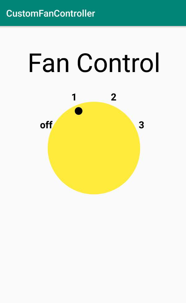
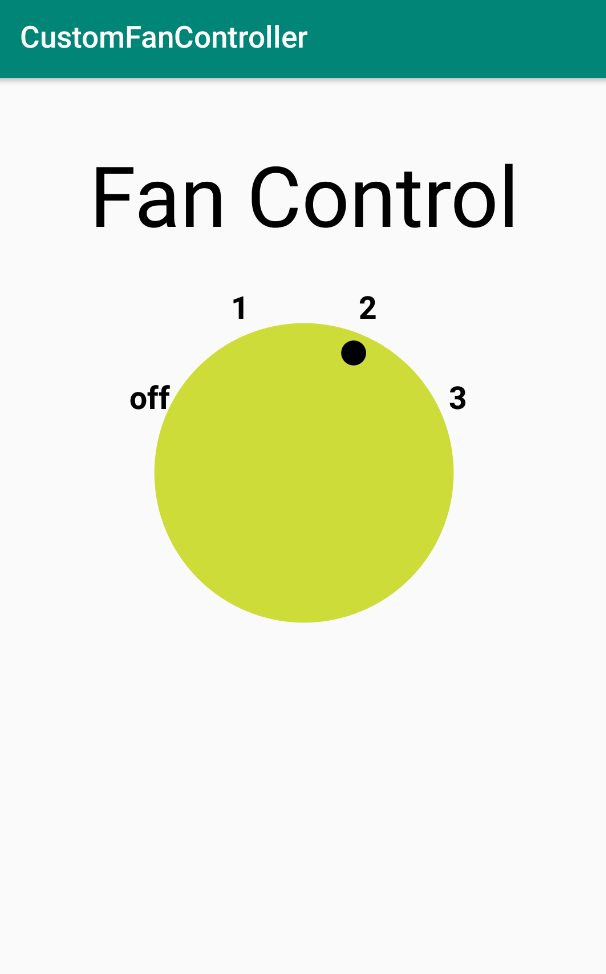
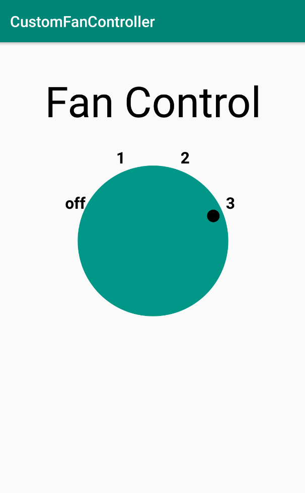
} as Int- Run your app, click on the dial, and the color setting should be different for each position, as shown below.
|
|
|
|

To learn more about custom view attributes, see Creating a View Class.
Accessibility is a set of design, implementation, and testing techniques that enable your app to be usable by everyone, including people with disabilities.
Common disabilities that can affect a person's use of an Android device include blindness, low vision, color blindness, deafness or hearing loss, and restricted motor skills. When you develop your apps with accessibility in mind, you make the user experience better not only for users with these disabilities, but also for all of your other users.
Android provides several accessibility features by default in the standard UI views such as TextView and Button. When you create a custom view, however, you need to consider how that custom view will provide accessible features such as spoken descriptions of on-screen content.
In this task you'll learn about TalkBack, Android's screen reader, and modify your app to include speakable hints and descriptions for the DialView custom view.
Step 1. Explore TalkBack
TalkBack is Android's built-in screen reader. With TalkBack enabled, the user can interact with their Android device without seeing the screen, because Android describes screen elements aloud. Users with visual impairments might rely on TalkBack to use your app.
In this task, you enable TalkBack to understand how screen readers work and how to navigate apps.
- On an Android device or emulator, navigate to Settings > Accessibility > TalkBack.
- Tap the On/Off toggle button to turn on TalkBack.
- Tap OK to confirm permissions.
- Confirm your device password, if asked. If this is the first time you've run TalkBack, a tutorial launches. (The tutorial may not be available on older devices.)
- It may be helpful to navigate the tutorial with your eyes closed. To open the tutorial again in the future, navigate to Settings > Accessibility > TalkBack > Settings > Launch TalkBack tutorial.
- Compile and run the
CustomFanControllerapp, or open it with the Overview or Recents button on your device. With TalkBack on, notice that the name of the app is announced, as well as the text of the labelTextView("Fan Control"). However, if you tap on theDialViewview itself, no information is spoken about either the state of the view (the current setting for the dial) or the action that will take place when you tap the view to activate it.
Step 2. Add content descriptions for dial labels
Content descriptions describe the meaning and purpose of the views in your app. These labels allow screen readers such as Android's TalkBack feature to explain the function of each element accurately. For static views such as ImageView, you can add the content description to the view in the layout file with the contentDescription attribute. Text views (TextView and EditText) automatically use the text in the view as the content description.
For the custom fan control view, you need to dynamically update the content description each time the view is clicked, to indicate the current fan setting.
- At the bottom of the
DialViewclass, declare a functionupdateContentDescription()with no arguments or return type.
fun updateContentDescription() {
}- Inside
updateContentDescription(), change thecontentDescriptionproperty for the custom view to the string resource associated with the current fan speed (off, 1, 2, or 3). These are the same labels as used inonDraw()when the dial is drawn on the screen.
fun updateContentDescription() {
   contentDescription = resources.getString(fanSpeed.label)
}- Scroll up to the
init()block, and at the end of that block add a call toupdateContentDescription(). This initializes the content description when the view is initialized.
init {
   isClickable = true
   // ...

   updateContentDescription()
}- Add another call to
updateContentDescription()in theperformClick()method, just beforeinvalidate().
override fun performClick(): Boolean {
   if (super.performClick()) return true
   fanSpeed = fanSpeed.next()
   updateContentDescription()
   invalidate()
   return true
}- Compile and run the app, and ensure TalkBack is turned on. Tap to change the setting for the dial view and notice that now that TalkBack announces the current label (off, 1, 2, 3) as well as the phrase "Double-tap to activate."
Step 3. Add more information for the click action
You could stop there and your view would be usable in TalkBack. But it would be helpful if your view could indicate not only that it can be activated ("Double-tap to activate") but also to explain what will happen when the view is activated ("Double-tap to change." or "Double-tap to reset.")
To do this, you add information about the view's action (here, a click or tap action) to an accessibility node info object, by way of an accessibility delegate. An accessibility delegate enables you to customize the accessibility-related features of your app through composition (rather than inheritance).
For this task you will use the accessibility classes in the Android Jetpack libraries (androidx.*), to ensure backwards compatibility.
- In
DialView.kt, in theinitblock, set an accessibility delegate on the view as a newAccessibilityDelegateCompatobject. Importandroidx.core.view.ViewCompatandandroidx.core.view.AccessibilityDelegateCompatwhen requested. This strategy enables the greatest amount of backward compatibility in your app.
ViewCompat.setAccessibilityDelegate(this, object : AccessibilityDelegateCompat() {

})- Inside the
AccessibilityDelegateCompatobject, override theonInitializeAccessibilityNodeInfo()function with aAccessibilityNodeInfoCompatobject, and call the super's method. Importandroidx.core.view.accessibility.AccessibilityNodeInfoCompatwhen prompted.
ViewCompat.setAccessibilityDelegate(this, object : AccessibilityDelegateCompat() {
   override fun onInitializeAccessibilityNodeInfo(host: View,
                            info: AccessibilityNodeInfoCompat) {
      super.onInitializeAccessibilityNodeInfo(host, info)

   }
})
Every view has a tree of accessibility nodes, which may or may not correspond to the actual layout components of the view. Android's accessibility services navigates those nodes in order to find out information about the view (such as speakable content descriptions, or possible actions that can be performed on that view.) When you create a custom view you may also need to override the node information in order to provide custom information for accessibility. In this case you will be overriding the node info to indicate that there is custom information for the view's action.
- Inside
onInitializeAccessibilityNodeInfo(), create a newAccessibilityNodeInfoCompat.AccessibilityActionCompatobject, and assign it to thecustomClickvariable. Pass into the constructor theAccessibilityNodeInfo.ACTION_CLICKconstant, and a placeholder string. ImportAccessibilityNodeInfowhen requested.
ViewCompat.setAccessibilityDelegate(this, object : AccessibilityDelegateCompat() {
   override fun onInitializeAccessibilityNodeInfo(host: View,
                            info: AccessibilityNodeInfoCompat) {
      super.onInitializeAccessibilityNodeInfo(host, info)
      val customClick = AccessibilityNodeInfoCompat.AccessibilityActionCompat(
         AccessibilityNodeInfo.ACTION_CLICK,
        "placeholder"
      )
   }
})
The AccessibilityActionCompat class represents an action on a view for accessibility purposes. A typical action is a click or tap, as you use here, but other actions can include gaining or losing the focus, a clipboard operation (cut/copy/paste) or scrolling within the view. The constructor for this class requires an action constant (here, AccessibilityNodeInfo.ACTION_CLICK), and a string that is used by TalkBack to indicate what the action is.
- Replace the
"placeholder"string with a call tocontext.getString()to retrieve a string resource. For the specific resource, test for the current fan speed. If the speed is currentlyFanSpeed.HIGH, the string is"Reset". If the fan speed is anything else, the string is"Change."You'll create these string resources in a later step.
ViewCompat.setAccessibilityDelegate(this, object : AccessibilityDelegateCompat() {
   override fun onInitializeAccessibilityNodeInfo(host: View,
                            info: AccessibilityNodeInfoCompat) {
      super.onInitializeAccessibilityNodeInfo(host, info)
      val customClick = AccessibilityNodeInfoCompat.AccessibilityActionCompat(
         AccessibilityNodeInfo.ACTION_CLICK,
        context.getString(if (fanSpeed !=  FanSpeed.HIGH) R.string.change else R.string.reset)
      )
   }
})- After the closing parentheses for the
customClickdefinition, use theaddAction()method to add the new accessibility action to the node info object.
ViewCompat.setAccessibilityDelegate(this, object : AccessibilityDelegateCompat() {
   override fun onInitializeAccessibilityNodeInfo(host: View,
                            info: AccessibilityNodeInfoCompat) {
       super.onInitializeAccessibilityNodeInfo(host, info)
       val customClick = AccessibilityNodeInfoCompat.AccessibilityActionCompat(
           AccessibilityNodeInfo.ACTION_CLICK,
           context.getString(if (fanSpeed !=  FanSpeed.HIGH)
                                 R.string.change else R.string.reset)
       )
       info.addAction(customClick)
   }
})- In
res/values/strings.xml, add the string resources for "Change" and "Reset".
<string name="change">Change</string>
<string name="reset">Reset</string>- Compile and run the app and ensure TalkBack is turned on. Notice now that the phrase "Double-tap to activate" is now either "Double-tap to change" (if the fan speed is less than high or 3) or "Double-tap to reset" (if the fan speed is already at high or 3). Note that the prompt "Double-tap to..." is supplied by the TalkBack service itself.
Download the code for the finished codelab..
$ git clone https://github.com/googlecodelabs/android-kotlin-drawing-custom-views
Alternatively you can download the repository as a Zip file, unzip it, and open it in Android Studio.
- To create a custom view that inherits the look and behavior of a
Viewsubclass such asEditText, add a new class that extends that subclass, and make adjustments by overriding some of the subclass's methods. - To create a custom view of any size and shape, add a new class that extends
View. - Override
Viewmethods such asonDraw()to define the view's shape and basic appearance. - Use
invalidate()to force a draw or redraw of the view. - To optimize performance, allocate variables and assign any required values for drawing and painting before using them in
onDraw(), such as in the initialization of member variables. - Override
performClick()rather thanOnClickListener() to the custom view to provide the view's interactive behavior. This enables your or other Android developers that may use your custom view class to useonClickListener()to provide further behavior. - Add the custom view to an XML layout file with attributes to define its appearance, as you would with other UI elements.
- Create the
attrs.xmlfile in thevaluesfolder to define custom attributes. You can then use the custom attributes for the custom view in the XML layout file.
Udacity course:
Android developer documentation:
- Creating Custom Views
@JvmOverloads- Custom Components
- How Android Draws Views
onMeasure()onSizeChanged()onDraw()CanvasPaintdrawText()setTypeface()setColor()drawRect()drawOval()drawArc()drawBitmap()setStyle()invalidate()- View
- Input Events
- Paint
- Kotlin extension library android-ktx
withStyledAttributes- Android KTX documentation
- Android KTX original announcement blog
- Make custom views more accessible
AccessibilityDelegateCompatAccessibilityNodeInfoCompatAccessibilityNodeInfoCompat.AccessibilityActionCompat
Videos:
This section lists possible homework assignments for students who are working through this codelab as part of a course led by an instructor. It's up to the instructor to do the following:
- Assign homework if required.
- Communicate to students how to submit homework assignments.
- Grade the homework assignments.
Instructors can use these suggestions as little or as much as they want, and should feel free to assign any other homework they feel is appropriate.
If you're working through this codelab on your own, feel free to use these homework assignments to test your knowledge.
Question 1
To calculate the positions, dimensions, and any other values when the custom view is first assigned a size, which method do you override?
▢ onMeasure()
▢ onSizeChanged()
▢ invalidate()
▢ onDraw()
Question 2
To indicate that you'd like your view to be redrawn with onDraw(), which method do you call from the UI thread, after an attribute value has changed?
▢ onMeasure()
▢ onSizeChanged()
▢ invalidate()
▢ getVisibility()
Question 3
Which View method should you override to add interactivity to your custom view?
▢ setOnClickListener()
▢ onSizeChanged()
▢ isClickable()
▢ performClick()
For links to other codelabs in this course, see the Advanced Android in Kotlin codelabs landing page.